5 Best Shopify Jewelry Stores for UX Inspiration in 2026

Bringing luxury and e-commerce together demands a flawless user experience. Many jewelry stores have perfected this art with Shopify. These examples show how you can create a jewelry shop that looks great, is easy to use, and converts better.
Let’s explore what makes these Shopify jewelry stores stand out and how you can use their successful strategies in your shop.
1. Saint Valentine
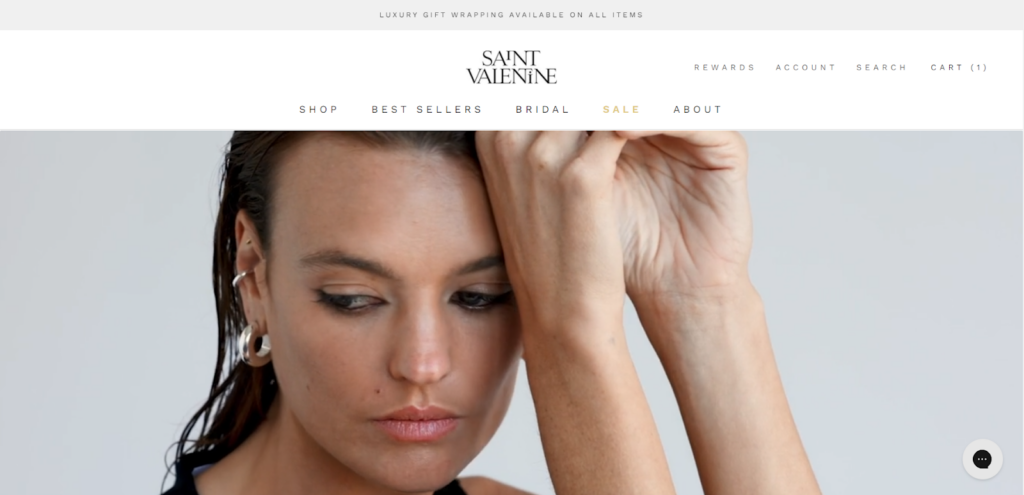
Saint Valentine is a Sydney-based jewelry brand established in 2016. It specializes in handmade, high-quality pieces, including earrings, necklaces, bracelets, and rings in sterling silver and gold-plated finishes. The brand aims to offer timeless, must-have jewelry at accessible price points.
Visual Design
Saint Valentine’s website exudes sophistication and minimalism. The clean layout, with ample white space, draws attention to the product images, which are of high resolution and impeccably styled.
The consistent use of a soft, neutral color palette complements the brand’s aesthetic, creating a serene and luxurious shopping environment. This visual simplicity helps to keep the focus on the jewelry, highlighting its details and craftsmanship.
Navigation and Interactivity
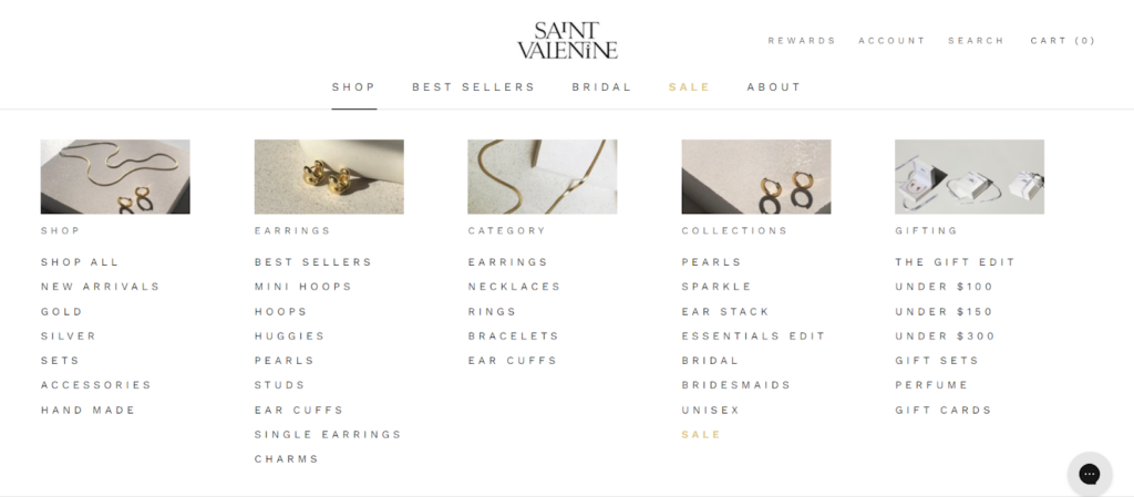
The site features a straightforward top navigation bar with key categories like Shop, Best Sellers, Bridal, and Sale. A drop-down menu reveals an extensive, well-organized list of product categories, making it easy for customers to find exactly what they’re looking for.
With its fast loading times and interactive elements like hover effects on product images, the site aims to satisfy customers without overwhelming them.
Collection and Product Pages
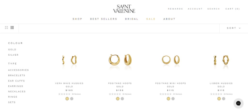
The collection and product pages are thoughtfully designed to showcase the jewelry beautifully. The collection pages display products in a grid layout with the option to change the grid size, as well as clear pricing, rating, and color details.
Large, high-quality images of each product are displayed on the product page so customers can see the details up close.
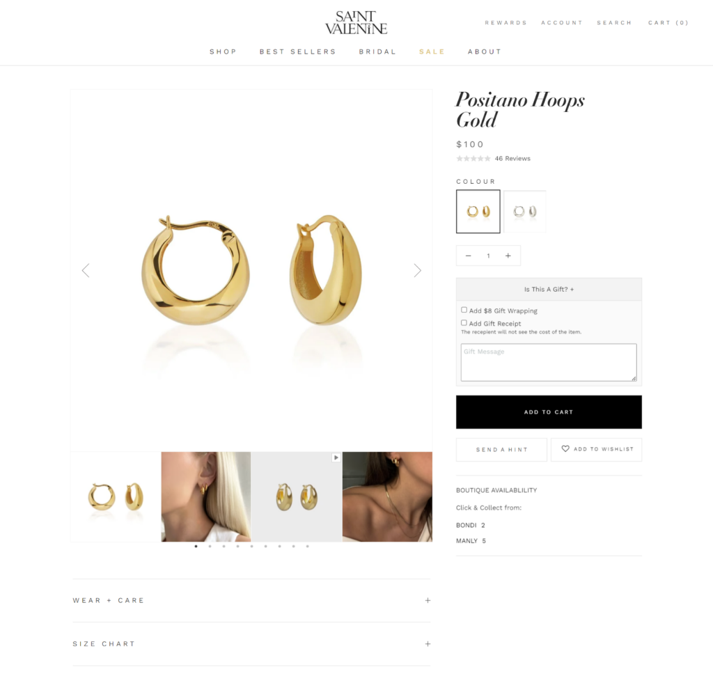
The product descriptions are concise yet informative, offering essential details like materials, dimensions, and care instructions.
Cart & Checkout
The checkout process is quick and secure, so shopping is hassle-free. The user can easily review their cart items, apply discounts, and choose their preferred method of payment.
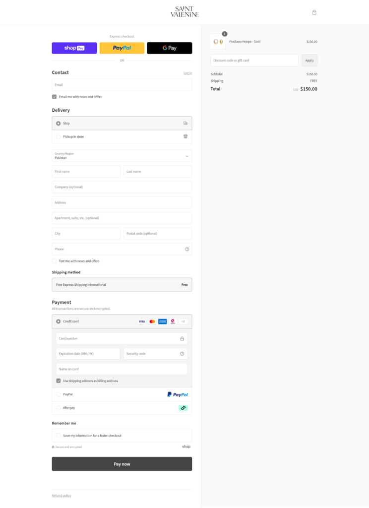
The site supports various payment options, including express checkout for PayPal, G Pay, and Shop Pay, to meet diverse customer preferences. The shipping options are clearly outlined. There is also a clearly defined refund policy, so customers can easily return any items they are not satisfied with.
What We Love About It
Saint Valentine stands out with its VIP loyalty program and luxury gift-wrapping service, adding a premium touch to the customer experience.
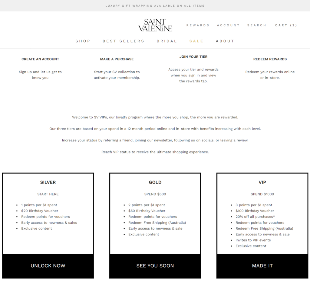
The brand offers free express worldwide shipping on orders over $120, which is a great incentive for international customers. For local shoppers, they offer omnichannel experiences in their physical stores in Bondi and Manly.
2. POCHÉ
POCHÉ is a vibrant and innovative Shopify jewelry brand known for its bold and playful designs. The brand stands out for its unique approach to jewelry, often incorporating unconventional materials and vibrant colors. POCHÉ not only focuses on aesthetics but also commits to sustainability, making its products appeal to environmentally conscious consumers.
Visual Design
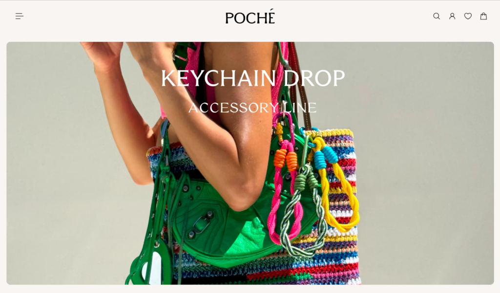
The POCHÉ homepage greets you with a clean, airy aesthetic the moment you land. White space dominates the design, letting the brand’s high-quality product photography shine.

Pops of neon yellow accent colors and playful fonts add a touch of whimsy, which reflects POCHÉ’s commitment to making everyday jewelry fun. The overall aesthetic is modern and youthful, perfectly aligning with their bold jewelry designs.
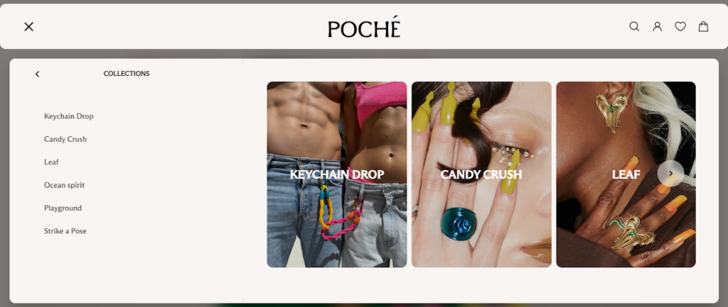
Navigation and Interactivity
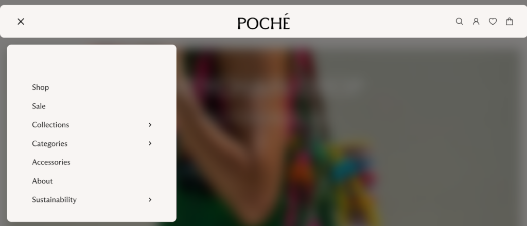
The website’s navigation is smooth. The hamburger menu consolidates all necessary links, such as collections and categories, without cluttering the view.
Throughout the site, interactive elements like hover animations and quick views allow users to explore products without multiple clicks, enhancing its overall interactivity.
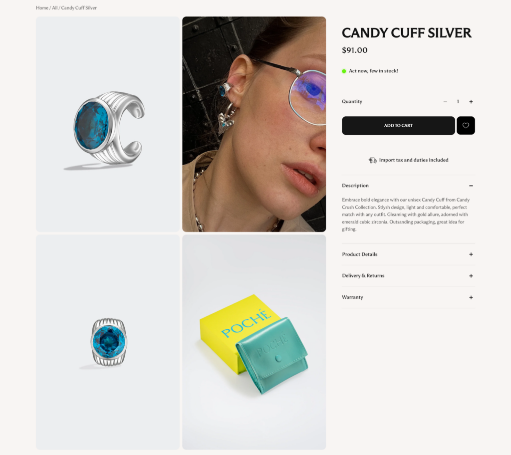
Collection and Product Pages
POCHÉ’s collection pages are well-organized and easy to navigate. Products are displayed against a clean backdrop that does not distract from the items. A standout feature is the “QUICK VIEW” option on hover that displays more details without leaving the page.
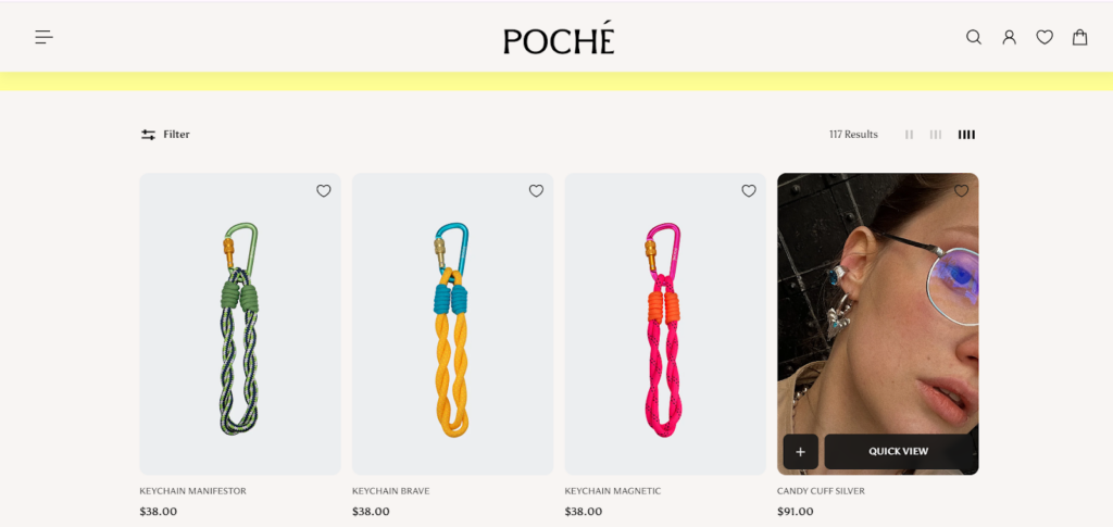
Each product page is detailed with descriptions that not only talk about the item’s aesthetic appeal but also its materials and craftsmanship.
The layout is optimized for an engaging user experience. Its suggestions for similar products and recently viewed items encourage further exploration.
Cart & Checkout
The checkout process on POCHÉ’s website is simple. The cart clearly lists items with options to edit quantities or remove them entirely.
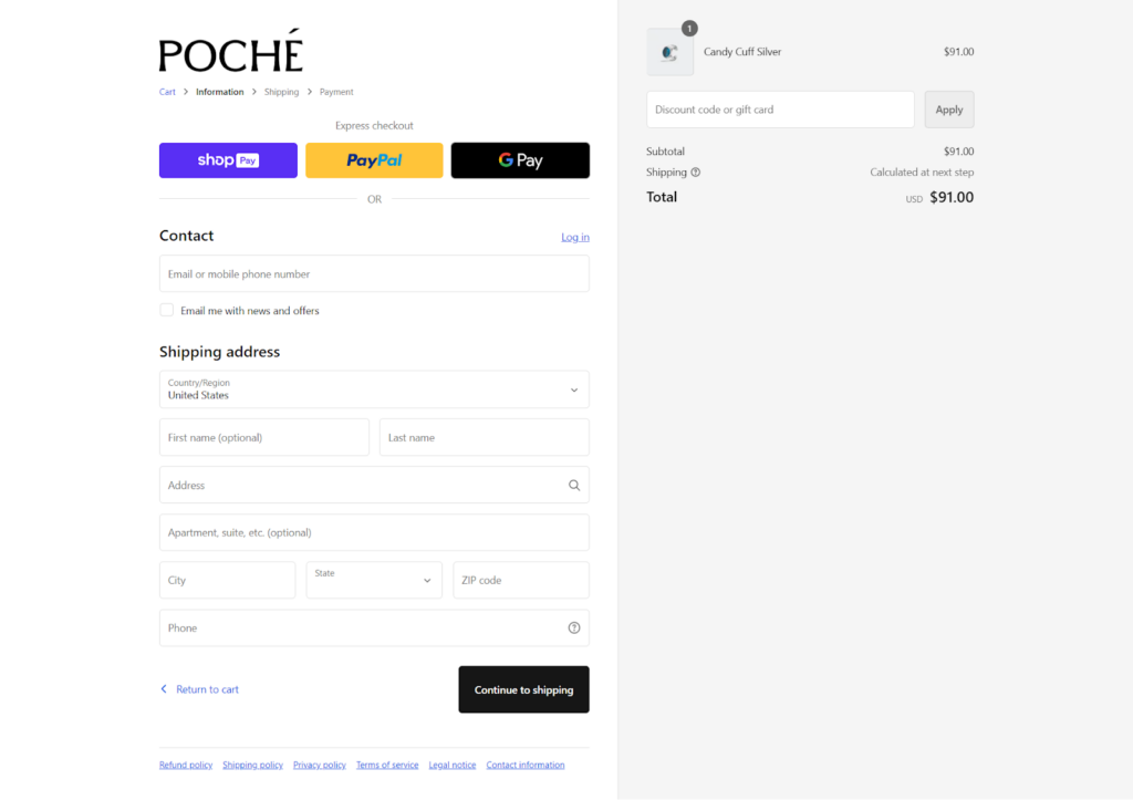
The checkout page offers multiple payment options, including Shop Pay, PayPal, and Google Pay, facilitating a quick and secure checkout experience.
What We Love About It
POCHÉ’s website truly shines in its product presentation. We love the “QUICK VIEW” feature on the collection page, which enhances the shopping experience.
The hamburger menu expands further links, especially those with images or sliders, which is a smart design choice. It keeps the main navigation uncluttered and still provides easy access to all product types.
Throughout the site, bold, colorful product images against the clean white background create a visually striking contrast that captures the brand’s unconventional spirit.
3. VRAI
VRAI is a distinguished jewelry brand known for its commitment to sustainability and ethical practices. Founded in 2014 in Los Angeles, VRAI has quickly risen to prominence, specializing in lab-grown diamonds produced at their zero-emission foundry.
The brand is part of Diamond Foundry, a company backed by notable figures like Leonardo DiCaprio. It emphasizes the use of renewable energy to create diamonds that are both beautiful and responsible.
Visual Design
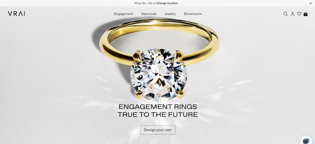
VRAI’s website showcases a sleek and elegant design that reflects minimalism and modernity. Clean lines, ample white space, and high-quality imagery that highlights the lustrous detail of each jewelry piece make the site visually appealing.
The design uses a subdued color scheme and adds bold colors occasionally to draw attention to key areas like calls to action.
Navigation and Interactivity
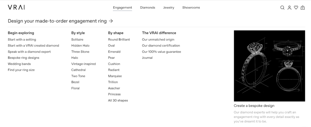
On VRAI’s site, visitors can navigate through categories such as Engagement, Diamonds, Jewelry, and Showrooms using a clear and concise top menu. A user-friendly dropdown menu with featured banners allows users to browse detailed subcategories to find specific items.
Overall, the site uses interactive elements such as hover effects and responsive sliders to enhance the browsing experience, making it engaging and fluid.
Collection and Product Pages
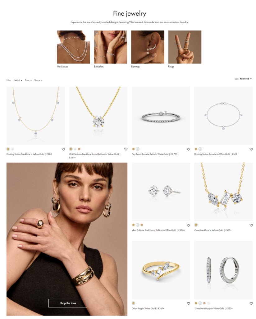
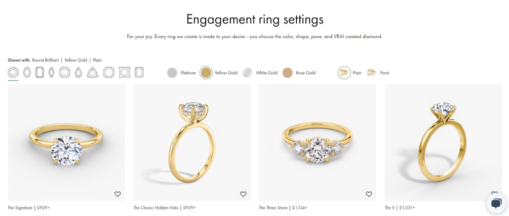
The collection pages display high-quality product images in grid layouts. They clearly show each product’s name, colors, and price, and the hover effect transitions to show how the product looks when worn. Images of models wearing jewelry sets feature the call to action “Shop the look.” Customers can click on the image of the model to view the jewelry she is wearing.
Each product page offers a wealth of information, including detailed descriptions of the jewelry’s features and the ethical sourcing of its materials.
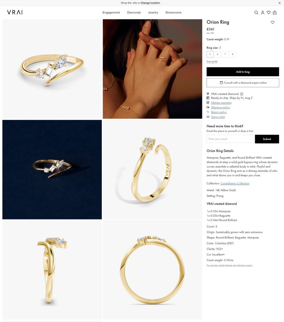
High-resolution images and options for different views give customers a thorough look at each piece.
Cart & Checkout
The cart and checkout process at VRAI is made simple for efficiency. The cart clearly itemizes products, prices, and the next steps for checkout. Options for express checkout with platforms like Shop Pay, PayPal, and Google Pay are prominently displayed, simplifying the process further.
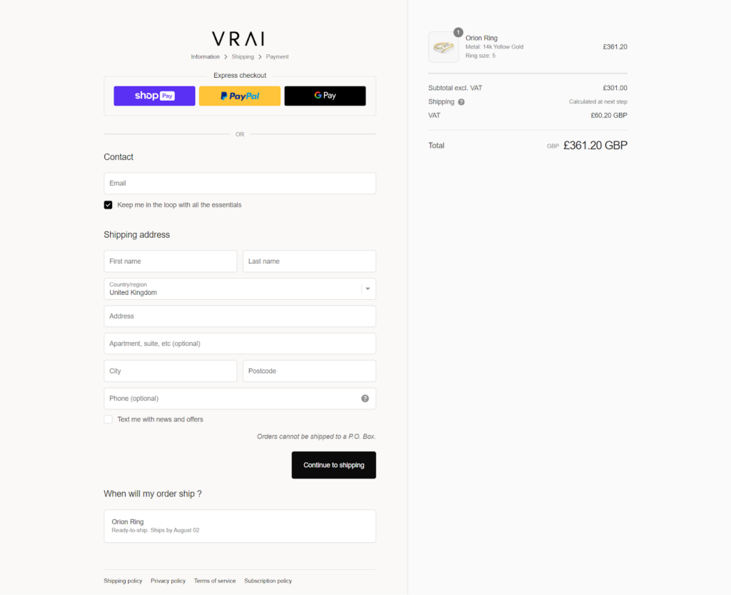
With a clean interface and minimal distractions, the checkout experience is quick and convenient.
What We Love About It
We love VRAI’s engagement ring customization tool, which offers a personalized shopping experience. The “Design your made-to-order engagement ring” gives multiple entry points for customers of different preferences and knowledge levels.
We also love the clear presentation of VRAI’s unique selling points, such as their diamond certification and 100% value guarantee, which builds trust and transparency.
4. Daphine
Daphine is a London-based jewelry brand founded in 2017 by friends Damasia Ball and Philippine de Follin. They offer timeless, elegant jewelry pieces at accessible price points. The brand crafts its handcrafted designs in Jaipur using 18ct gold laid over recycled brass certified by the Responsible Jewellery Council. Daphine draws inspiration from vintage styles and designs its pieces to be versatile for everyday wear.
Visual Design
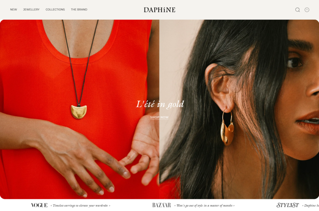
Daphine’s website has a clean, minimalist aesthetic with a white background. The homepage features large, high-quality images showcasing their jewelry on models, creating a luxurious yet approachable vibe.
The use of warm, soft, muted colors throughout the site creates a serene and luxurious shopping experience. In this minimalist design, the jewelry remains the main attraction.
Navigation and Interactivity
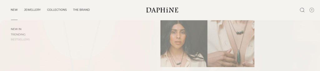
The site has a straightforward top navigation bar with categories like “New,” “Jewellery,” “Collections,” and “The Brand.” A drop-down menu reveals subcategories like “New In,” “Trending,” and “Bestsellers,” making it easy for shoppers to find what they’re looking for. The designers placed the search icon and shopping bag in the top right corner for quick access.
Collection and Product Pages
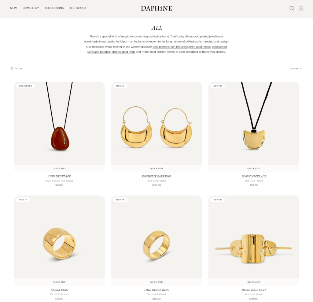
The collection page displays products in a clean grid layout with clear pricing and “Quick Add” options. Each product image is crisp and well-lit, showcasing the jewelry details.
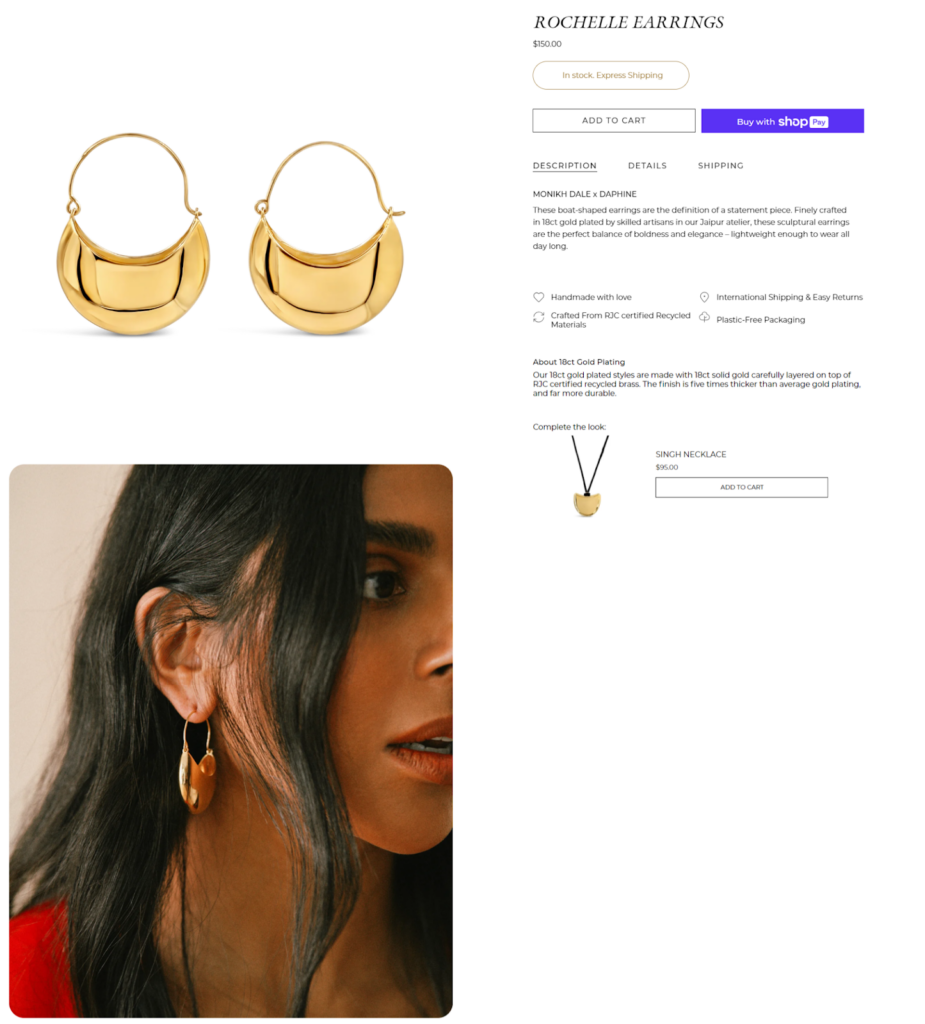
The product page features multiple images, including close-ups and on-model shots. Information like product description, material details, and sizing are provided. The “Add to Bag” button and “Shop Pay” button is prominently displayed.
Cart & Checkout
The checkout page offers many payment options, including credit cards, PayPal, Klarna, and Revolut Pay, so customers can pay however they like. The express checkout options, including Shop Pay, PayPal, and Google Pay, offer convenience for returning customers.
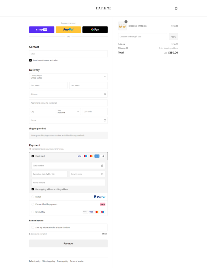
Customers find it easy to complete their purchases quickly and efficiently with clearly labeled form fields and a clean, uncluttered overall layout.
What We Love About It
- Bold, vibrant photos on the homepage instantly set a positive tone.
- The subtle integration of press mentions (like Vogue and Harper’s Bazaar) on the homepage adds credibility without cluttering the navigation.
5. Bonito
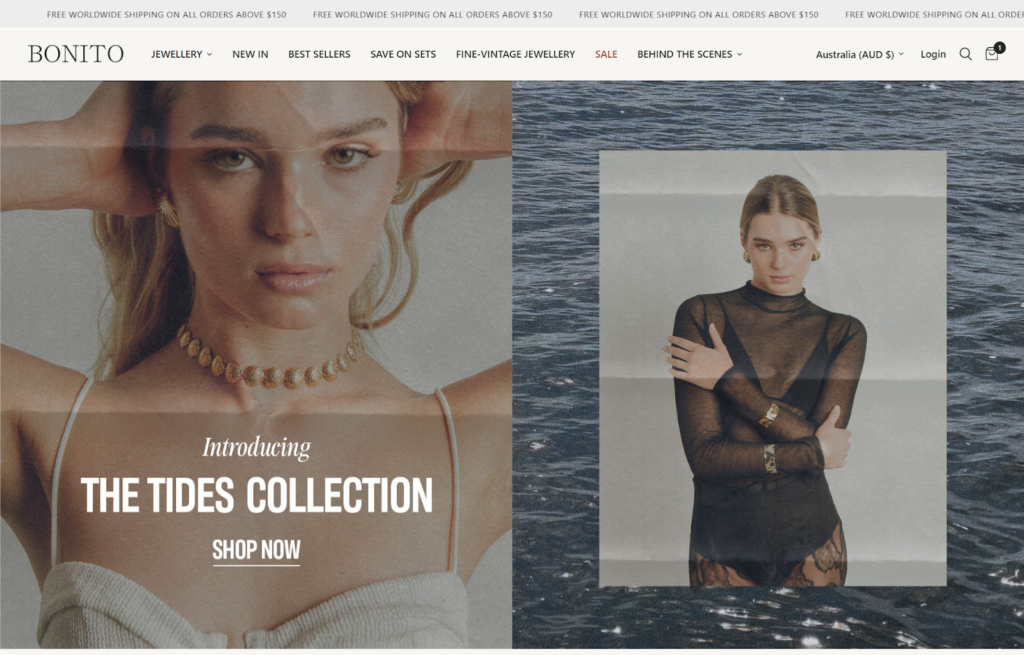
Bonito Jewelry is renowned for its handcrafted, demi-fine jewelry pieces that blend traditional craftsmanship with modern designs. Based in Sydney, Australia, and with craftsmanship roots in Bali, Bonito offers a range of jewelry that spans from everyday wear to pieces perfect for special occasions.
The brand donates a portion of every sale to various charitable causes worldwide, enhancing its appeal to socially conscious consumers.
Visual Design
Bonito Jewelry’s website has a clean, minimalist aesthetic that brings out the beauty of its handcrafted pieces. The use of soft, earthy tones in the background allows the vibrant jewelry photos to stand out, which makes the site visually appealing.

The overall design reflects the brand’s commitment to simplicity and elegance, creating a welcoming and user-friendly online shopping experience.
Navigation and Interactivity
The designers built the website for ease of use and included a clear, concise navigation menu with categories like “Jewelry,” “Best Sellers,” and “New In.”
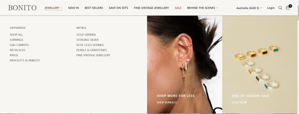
The site organizes the drop-down menu well and includes a featured banner section with calls to action like “Shop Bundles” and “Shop Now.” Visitors can easily find products by specific categories and metals.
The site uses interactive elements like hover effects on product images to make browsing more appealing.
Collection and Product Pages
Collection pages have detailed filters to help users find products according to specific criteria such as price, material, and style, making the shopping process straightforward and personalized.
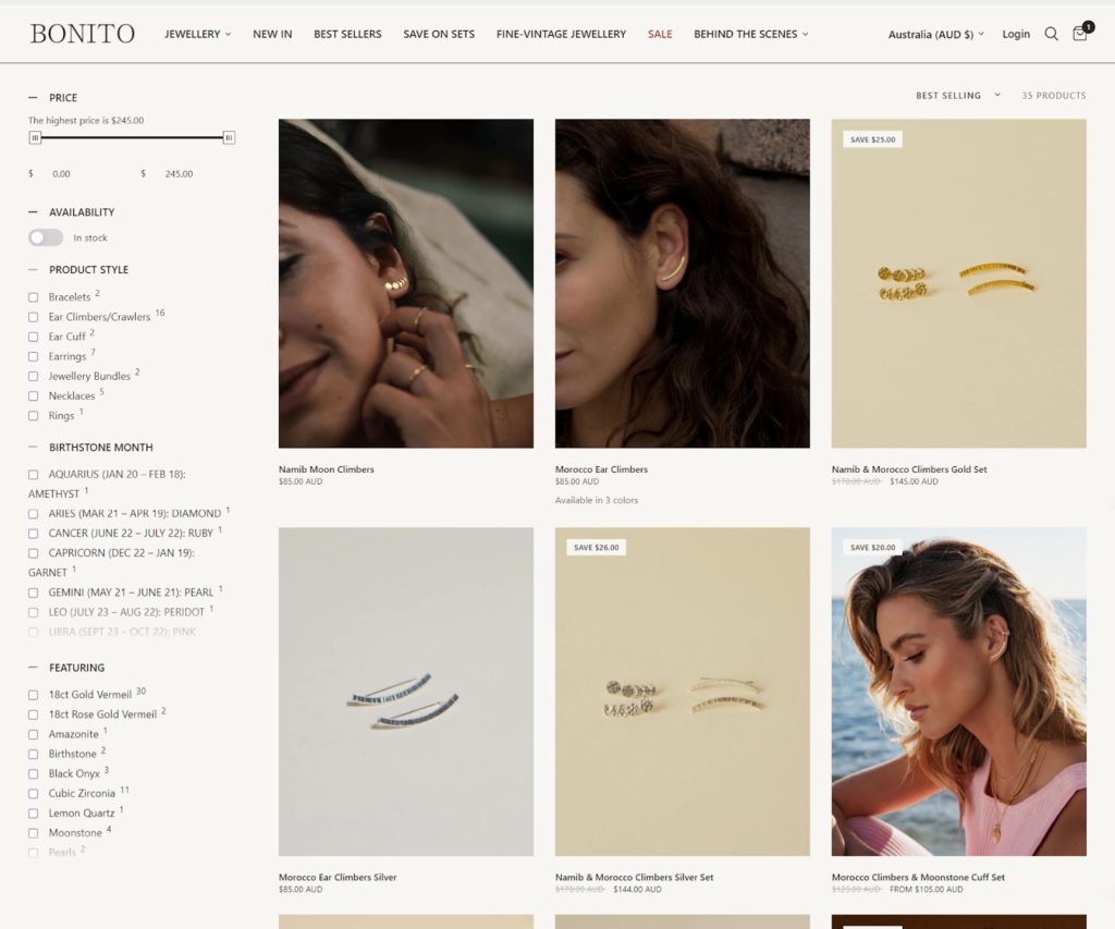
Bonito’s website presents each product page with meticulous detail and features high-quality images that let customers view products from multiple angles.
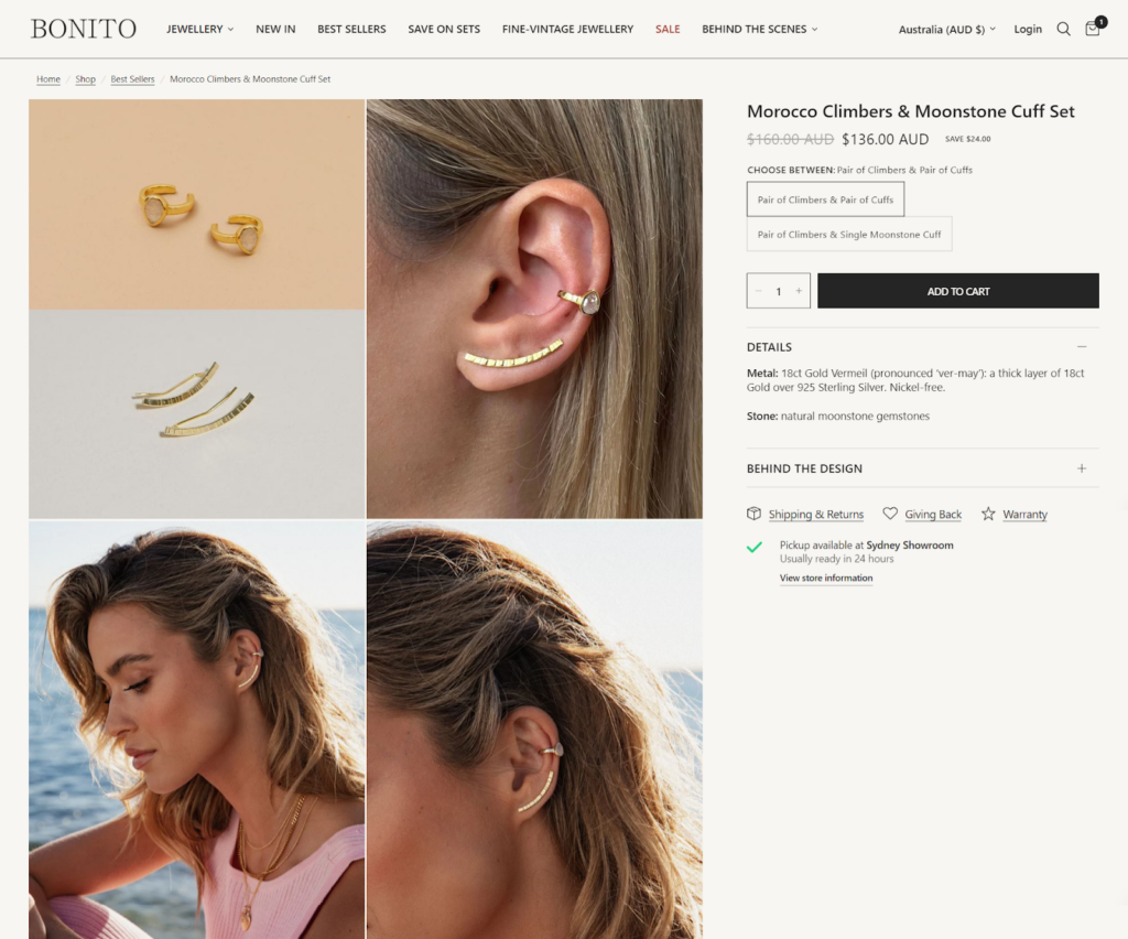
Descriptions are comprehensive, including information about the materials used, sizing, and care instructions. The pages also suggest complementary pieces, encouraging further exploration and potential purchases.
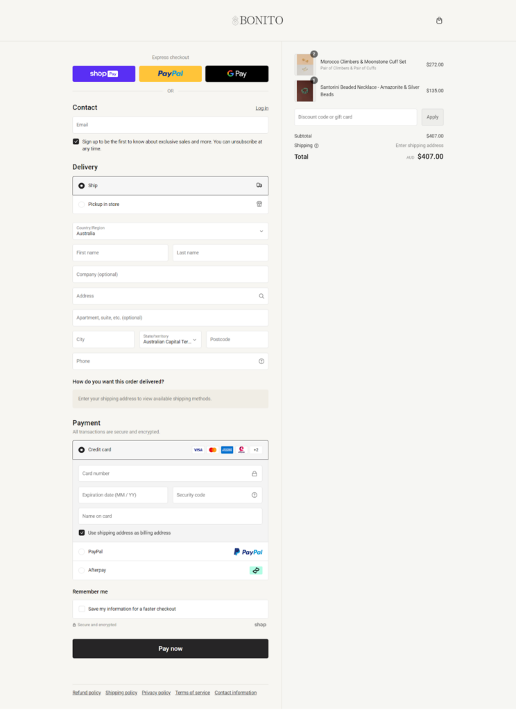
Cart & Checkout
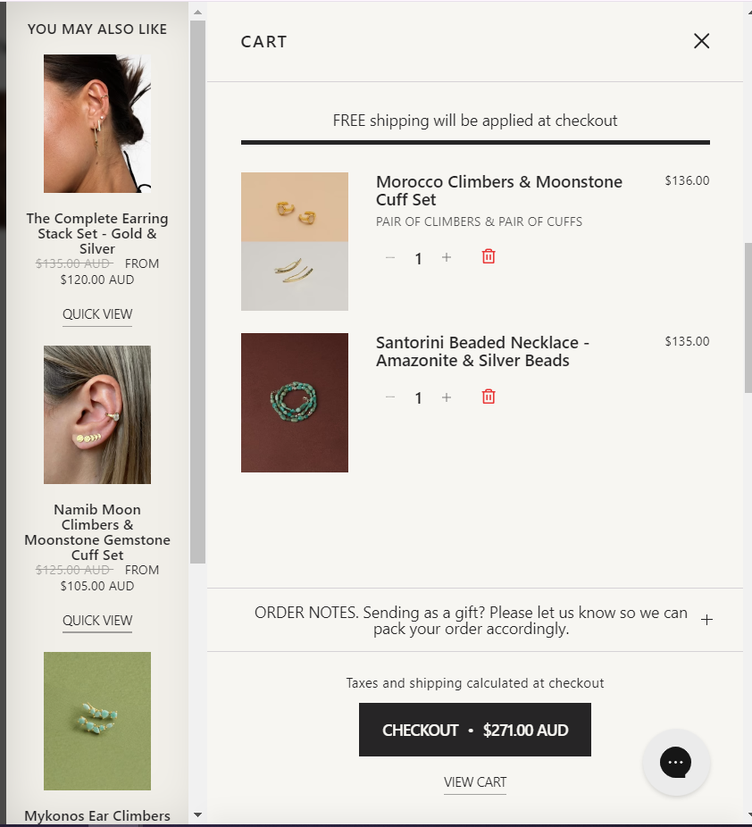
The mini cart is clean, with clear options for adjusting quantities and the checkout button. It also displays upsell and cross-sell products, helping customers find other items they may like.
During checkout, customers can easily apply discount codes and view an itemized list of costs before finalizing their purchase. Multiple payment methods, including express checkout options such as G Pay, PayPal, and Shop Pay, are also available for a convenient shopping experience.
What We Love About It
What sets Bonito apart from other best Shopify jewelry stores is its strong focus on design and social responsibility. The website not only showcases beautiful products but also tells the story behind each piece and the brand’s ethical initiatives. This transparency builds customer trust and loyalty.
We love the clear presentation of product variations, like the different metal options for ear climbers. The “You May Also Like” section on the cart page is another standout feature suggesting related products that can lead to more sales.
Bottom Line
A great-looking site that’s also easy to navigate can help you sell more and keep customers coming back. Using these best Shopify jewelry stores as inspiration, you can enhance your own store’s user experience. With some thoughtful design choices, your jewelry store can shine just as bright as the pieces you sell.
Contact our experienced team today to learn more about how we can help you design your perfect store.


Post a Comment
Got a question? Have a feedback? Please feel free to leave your ideas, opinions, and questions in the comments section of our post! ❤️