Fashion Nova: CRO Inspiration for Fashion Stores [Shopify Plus]

Everyone wants to drive traffic to their fashion website and convert them within a snap effort.
There’s no such magic trick, however, following CRO (conversion rate optimization) strategies can help the best.
In this article, we will dissect Fashion Nova, a global leader in the fashion world, for their CRO strategies.
We’ll understand what they do differently to provide a better user experience and improve shopping journeys on their Shopify Plus store, helping them:
- Keep up with better conversion rates
- Lower their CAC (Customer Acquisition Cost), and also
- Increase AOV (Average Order Value)
If you’re a fashion store owner on Shopify Plus, this is your guide to taking inspiration from Fashion Nova and optimizing conversion rate.
Let’s start chatting & explaining then.
What Makes “Fashion Nova” Stand Out As a Fashion Brand?
We know Fashion Nova is a global brand with a great customer base and a good reputation in the fashion industry. However, competition in the fashion industry is at its peak.
So, they surely need to make efforts and stand out. And they do.
I took a closer look at their website and here are some areas that might be helping them.
Let’s read through them.
#1 – Conversion-focused User Interface
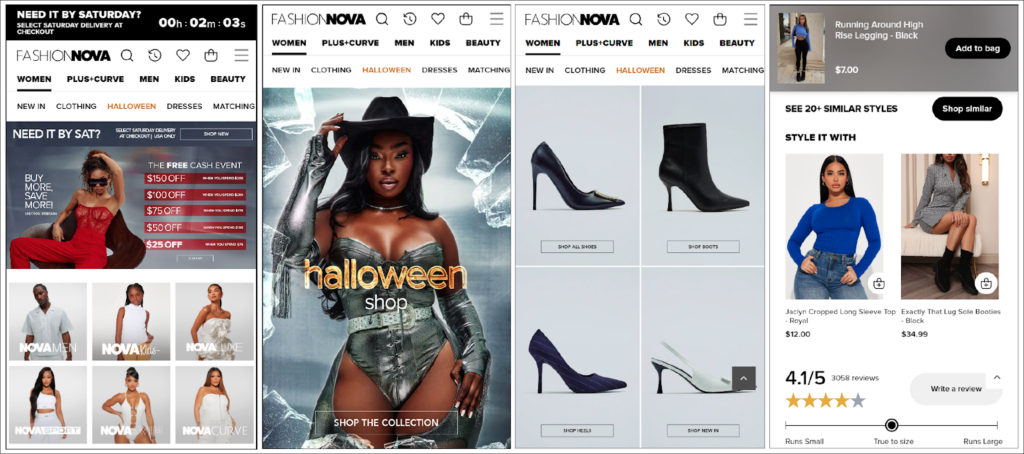
I had a first look at Fashion Nova’s website, and tbh, my jaw dropped. 🔥
Each area on the website is designed so strategically and prominently that works in their favor of providing a mindblowing shopping experience. Be it the home page, category page, mega menu, product page, or cart page, everything makes it fun for visitors to explore products, find their favorites, and make an informed purchase decision.
For example;
- In the header section, you can find logically grouped products and collections.
- On the product detail page, you can find a greater view of beautiful models wearing their collections.
- On the home page, they have all the necessary details and links placed strategically, helping them divide visitors into the right sections of their website.
Overall, I feel, their UI is user-centric helping with easy navigation and helping users flow further smoothly in the sales funnel.
#2 – Diverse Product Catalog
Another thing, they have a variety of products to offer.

Every eCommerce shopper wants to explore hundreds of products before finalizing a product or two.
And Fashion Nova offers a vast catalog that caters to a wide range of customers. The range of options ensures that customers can find something that suits their individual tastes and preferences.
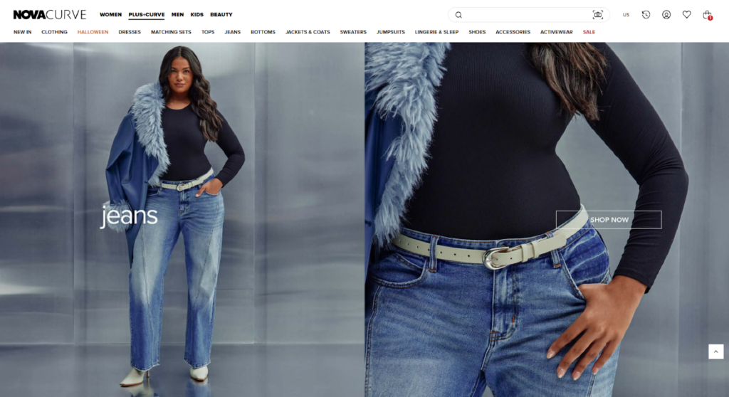
On top of offering vast product collections, they also have a specific catalog named Nova Curve (Plus+Curve) inclusive to all shapes and sizes, helping them attract a broader customer base. Additionally, to stay relevant and meet the ever-evolving needs of customers, they consistently introduce new collections that align with the latest trends and seasons.
So yes, keeping the catalog updated is another CRO strategy to learn from them.
#3 – High-quality Product Visuals
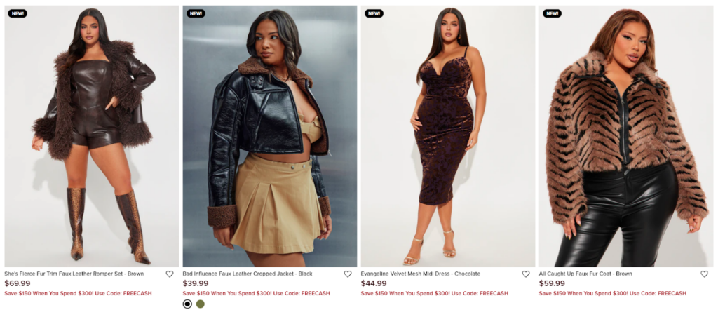
In eCommerce, shoppers rely heavily on product photos to make up their minds about purchases.
And it’s not just about the quantity of images — quality is equally important because that plays a big role in how customers perceive your product. You will find this especially true with fashion brands as the quality of fabric, style, and patterns matter the most.
So yes, conversions are highly influenced by product visual quality on the website.
Fashion Nova invests huge efforts in maintaining high-quality product images and videos all over their website, which is one of their strategies to appeal to visitors.
#4 – Offers & Discounts Are Everywhere
Also, when we go through Fashion Nova’s eCommerce store, there are multiple places where they’ve added discounts and offers. And online shoppers love discounts !!!
Maybe that’s a common habit for all of us. Like, don’t we look forward to investing in things that provide more value compared to the money we spend for it?
And Fashion Nova has mastered that art by infusing the best discounts all over their website.
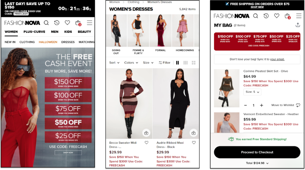
Starting with their Homepage, they have placed an attractive banner with all the available discounts based on order values. Moving further in the sales funnel, they have added product-specific discounts on each product listing.
And till the time of checkout, a web visitor will have their eye on available discounts – which is a great move to invite users and take part in their sales funnel.
#5 – Early Adoption of eCommerce Trends & Market Trends
Earning a loyal customer base and making a space in the market is a race that each eCommerce store runs at. And in this race, everyone wants to be a front-runner and win it.
All of them follow different strategies to win.
In the case of Fashion Nova, they try their best to stay ahead of the curve by quickly adopting emerging trends in the fashion market.
One of the features I love on their website is ‘Shop Similar’.
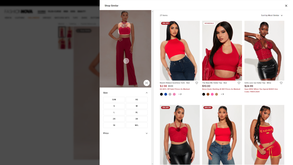
This feature allows users to explore products that are similar to the one they are currently browsing.
Instead of browsing page by page, customers can now easily find a list of products with similar patterns, styles, and textures. This works great for their sales strategy as the more products people explore, the higher the chances of them making a purchase.
;
That was all about the overview of what helps them make a better online store to shop at.
I know you are looking for some exact CRO elements to implement in your fashion store. Don’t worry, the next section is just for that.
Top CRO Elements for your Fashion Brand — Inspired by Fashion Nova
Fashion Nova has become a quick go-to brand when people need trendy and affordable clothing, especially young women. The brand is known for quickly translating celebrity trends into accessible fashion.
Do you need a fit similar to what Kim Kardashian posted on her Instagram feed today?
You’ll definitely find it within Fashion Nova’s product collection at an affordable price yet with the same great quality. And all of it didn’t work out for them overnight.
They surely use some great strategies to let their eCommerce store conversions grow.
In this section, we will dissect each CRO element from their website that’s been helping them. Here’s the list for your easier access.
Top CRO Elements Used By Fashion Nova – A Global Fashion Brand
- Body-Positive Fashion
- Shop Similar
- Share your Bag
- Clear Mega menu
- Wish List Management
- Outfit Suggestions
- Personalized Upsells
- High-quality and Inclusive Product Visuals
- UGC Video Tutorials As Product Visuals
- Before & After
- Instagram Feed Integration
- Personalized Reminder Pop-ups
- Get Notified
- Quick Shop Option
- Detailed Customer Reviews
- CTAs Everywhere
- Labels over Products
- Back to top button
- Free Shipping Threshold
- Customer Registration Process
- Cart Reservation Timer
- Personalized Add-ons at Checkout
- Current Offers Displayed at Checkout
- Guest Checkout
If you’re done glancing over this list, an in-depth explanation is waiting for you right below. I’ve also added some action tips on how you can enhance these CRO elements even more for your eCommerce store.
Let’s start.
1. Body-positive Fashion
For fashion brands, it’s necessary to embrace body positivity to stand on the right side and attract more customers. It creates a sense of invitation for customers with each size and shape, helping the brand stay relatable and relevant.
Fashion Nova, honestly, has mastered this strategy.
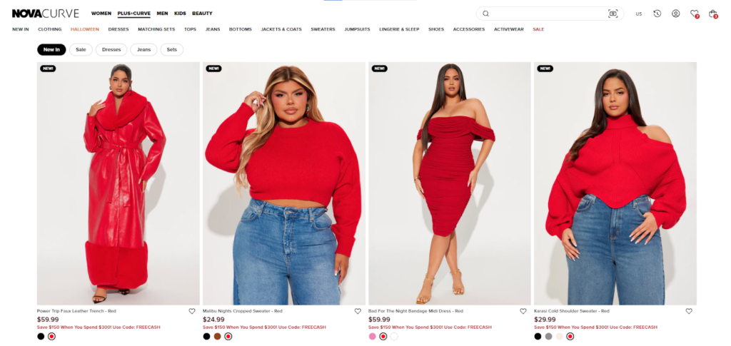
To be part of this initiative, they have added an entirely new collection page named Nova Curve that specifically offers plus-size clothing for women. And their initiative of body positivity and making fashion accessible to customers of all shapes and sizes helps them in multiple ways.
This strategy works because when brands feature models of different shapes and sizes, they show their audience that their products can help them feel confident and comfortable, no matter their body type.
Another thing, Fashion Nova has not only introduced a product collection specific to plus-size women but also uses inclusive product visuals for all of their products. They show models of different sizes wearing the same product, giving customers a better idea of how the clothing will fit their body type.
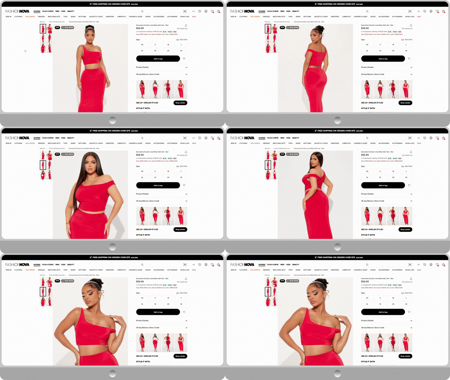
The reason why it works is that younger generations increasingly prefer brands that stand on the right side of the issue. So, if your brand is taking the initiative to cater to your fashion audience without being biased toward a single body type, you can expect real support from the audience.
Here are additional tips on how you can bring body positivity trends to your eCommerce store.
ACTIONS TO PERFORM:
- Feature models of different sizes, shapes, and ethnicities in your product photos and videos.
- Present models in their natural beauty without excessive editing.
- Introduce product collections with a variety of sizes, including plus-size options.
- Avoid terms like “flattering” or “slimming” and instead use terms like “all-body” or “inclusive” in product descriptions.
- Collaborate with influencers who promote body positivity
2. Shop Similar
When we shop online there are multiple times when we like a fit, still, there’s just one or two particular details that stop you from buying that.
And you want to explore more products with similar colors, styles, and patterns.
What happens is that we try running through product collections and end up abandoning websites as we lose interest in exploration over time.
Because who wants to break mountains just to find a similar product?
To provide customers with a better shopping experience, Fashion Nova has introduced a feature named “Shop Similar”. For easy access, they’ve labeled it right on the top left corner of the product image.
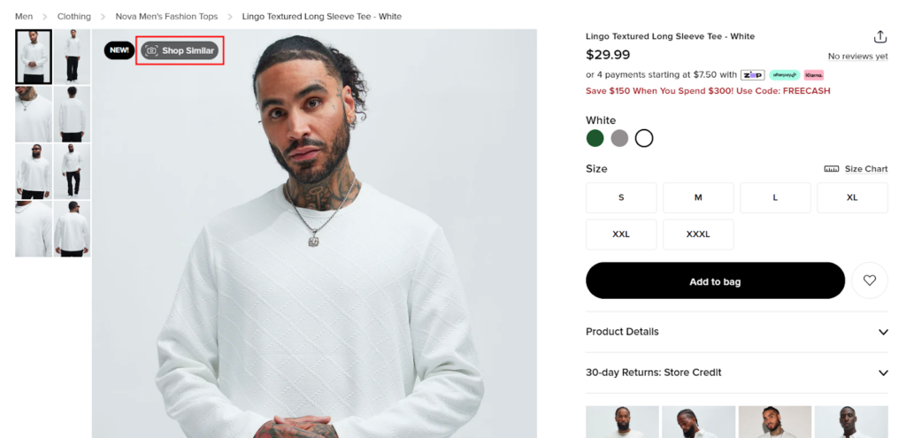
When a customer clicks on it, in the backend, all the similar products are fetched out and displayed to users for quick exploration.
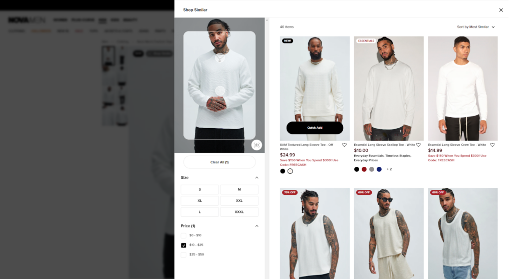
Their Shop Similar feature also helps customers filter products based on price and size, helping to find alternative products, compare pricing, and make an informed purchase decision.
Moreover, here are some suggestions you can follow when you introduce a similar feature on your fashion eCommerce store.
ACTIONS TO PERFORM:
- Use advanced algorithms to analyze customer data and recommend personalized products.
- Factor in color, style, price, brand, and occasion when suggesting similar items.
- Compare product images to find visually similar options.
- Make the “Shop Similar” feature easy to find and use, with options to sort by price and size.
- Consider patterns, textures, and silhouettes when assessing visual similarity.
- Monitor feature performance and refine algorithms to enhance accuracy.
3. Clear Mega Menu
If your fashion brand consists of a vast amount of products, there are chances for your customers to either get lost in a maze of options or not find things that they need.
A mega menu works best to let users explore your product collection easily without making any hassle.

As you can see, Fashion Nova has added their mega menu in a grid layout, presenting each category and subcategory in rows and columns instead of in a single line.
They also have top-level menus, second-level menu items, and so on that organize a large amount of information for users to navigate between. To further avoid clutter, their mega menus have plenty of white space and images to maintain visual balance.
With this detailed and well-structured mega menu, Fashion Nova can quickly help customers find their desired products. Now, let’s jump in for suggestions you can follow when designing a mega menu.
ACTIONS TO PERFORM:
- Maintain a consistent hierarchy within the menu.
- Use hover effects to indicate that a menu item can be expanded.
- Use visual cues to indicate that a submenu is available.
- Design your mega menu to be responsive and adapt to different screen sizes.
4. Outfit Suggestions
There are multiple titles under which eCommerce stores suggest outfit ideas, such as “pair it with”, “style with”, “complete the look recommendations”, and more. All of these are great CRO strategies that help them convince users to purchase more of their products and increase AOV.
Fashion Nova also provides styling tips to their customers.
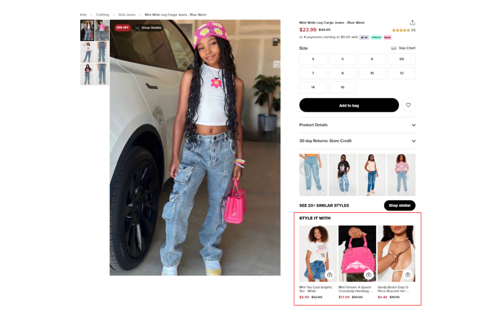
Apart from being a better brand that provides better outfit inspo, they have multiple other goals to achieve with this feature. Here I’ve outlined how this feature in particular helps them.
Benefits of providing outfit suggestions:
- At first, it helps them convey their brand to be a fashion expert.
- Helps customers visualize how they can combine items and make their wardrobe even better.
- Increases AOV, as they are suggesting customers buy more items.
And all of these work in favor of conversions, the ultimate motive of any business.
So yes, the outfit suggestions provided by Fashion Nova are a great hope for CRO. Moreover, if you implement them effectively, they can work well for your fashion store as well.
Let’s check some tips on how you do it.
ACTIONS TO PERFORM:
- Use AI technology that uses thoughtful combinations that provide suggestions based on the latest fashion trends.
- Keep it in the first fold of the Product Detail Page (PDP).
- Allow a quick add-to-cart option with a pop-up.
Moreover, technology is quite advanced, so, you can also go the extra mile and add a section where users can see a visual presentation of combined products worn together as an outfit.
5. Personalized Upsells
We all know that upselling is one of the most profitable strategies.
Upselling is where you take in your current customers and attract them to buy better or more products. So, basically, it helps increase revenue without spending on acquiring new customers.
For an eCommerce store, suggesting personalized upselling products helps in multiple ways, including:
- Engaging well with customers
- Building long term with your customers
- Customer retention
AKA — a steady flow of revenue!
And Fashion Nova is totally in for it. Whether it’s about scrolling through their homepage or product detail page, users are offered personalized product recommendations based on their browsing history and past orders.
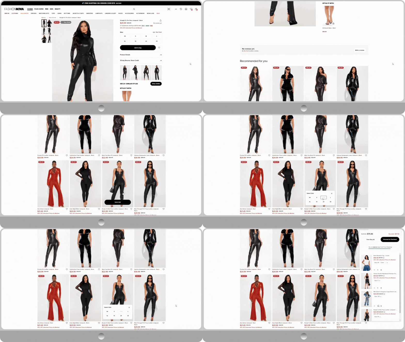
Personalization helps them bring in a factor of relevancy, which definitely attracts visitors to explore more from their recommendations.
If you also want to add personalized recommendations to your fashion store and have a steady flow of revenue, these tips might help you strategize things better.
ACTIONS TO PERFORM:
- Always keep it personalized and accurate.
- Test different algorithms to find the ones that provide the most accurate and relevant recommendations.
- Place in strategic locations on your website, such as homepage, product pages, or checkout page.
- Track key metrics like click-through rates, conversion rates, and average order value to measure its effectiveness.
6. High-quality and Inclusive Product Visuals
When shopping online, users often depend on product visuals solely to visualize what they are exploring and looking to purchase.
Like in physical shopping, they don’t have the option to touch the fabric and understand the texture of the fabric or even try it on. All they do is visualize and figure out if that piece of cloth will be a better match for their wardrobe.
So, yes, we need to provide them with high-quality product visuals that share a better view of your products.
And Fashion Nova definitely excels at this !!!
They have high-quality product images for each of their products that allow their users to understand the quality of their products, making them more interested in investing in them.
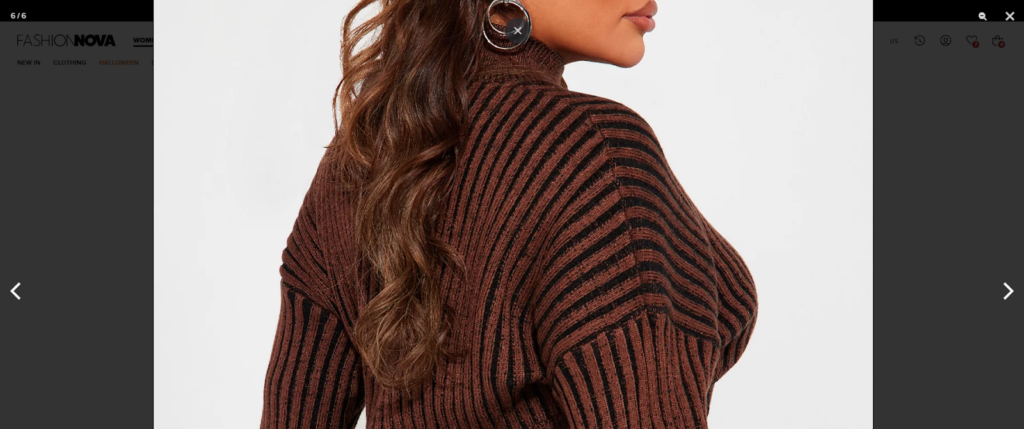
What I found better in their strategy of adding visuals is that they add images of models of multiple shapes and sizes to bring the inclusivity factor — helping them connect well with customers.
And the attention to detail is subpar. Not just women but they have added product images worn by diverse models not just for their women’s clothing (which is quite biased in the fashion industry) but also for men’s collections.
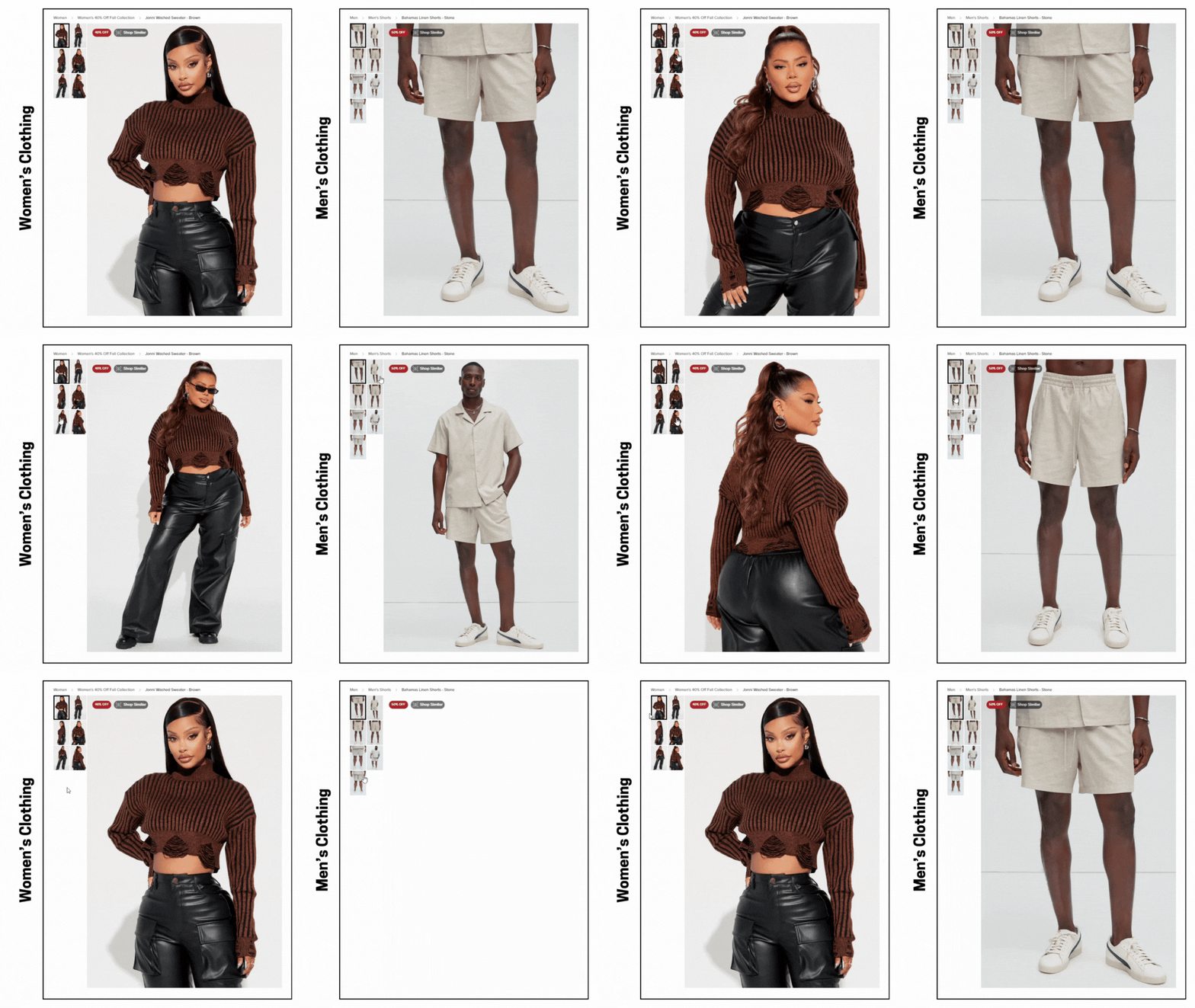
Such attention to detail helps them welcome a diverse customer base wholeheartedly conveying to them that Fashion Nova has them covered for their styling requirements.
You can also follow this exact strategy for your fashion store, and if you want to try things that are even better to make your offerings better product visuals while adding an inclusivity factor, we have some tips for you.
ACTIONS TO PERFORM:
- Feature models of various ages, sizes, ethnicities, and abilities in your product images.
- Show products being used in various contexts and settings to help customers visualize themselves wearing or using them.
- Feature products in different environments to appeal to a wider audience.
- Provide close-up shots of product fabric.
7. CTAs Everywhere
There should not be a single place on the website without a CTA.
Every corner of your website must remind customers to take action, no matter what page they are on. Be it a product page, home page, collection page, add-to-cart, checkout, or about us page — you need a CTA button that encourages customers to step forward in the sales funnel.
Let’s check how Fashion Nova is mindful about it.
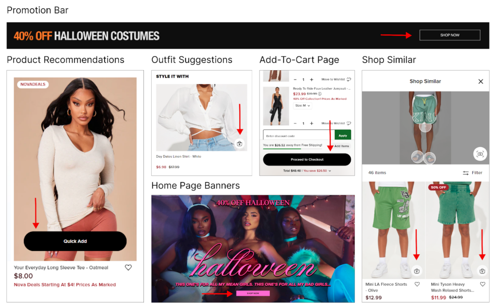
Just as I’ve highlighted in the image, throughout their website CTAs are placed strategically. When you also add CTA everywhere, you’re basically guiding your web visitors further into the sales funnel.
Apart from these, they have a “quick add” option for each of their product recommendations and let’s not forget a sticky add-to-cart button on their mobile version of the website. Yes, a sticky CTA helps improve user experience to a greater extent by increasing its accessibility even when users scroll through the page – acting like a reminder without a cancel button.
Let’s check a few tips on how you place CTAs in your fashion store.
ACTIONS TO PERFORM:
- Place the sticky CTA either at the top or bottom of the PDP on both desktop and mobile versions of your website.
- Include necessary details (image, price, variants) along with CTA.
8. Instagram Integration
Another great CRO element for your fashion eCommerce store is user-generated content (UGC).
And, Instagram Integration is a great strategy.
See, normally each brand these days is active on social media platforms to engage with users. When you show all your customers and the products worn by them on your eCommerce website – people will engage with your brand.
The first thing that a user gets is trust in your brand and products as they see real people like them wearing your products. This helps them visualize how they look wearing those outfits.
Secondly, UGC integration (Instagram gallery) is about providing a more realistic perspective of your fashion products as product visuals on the website are somewhat photoshopped to enhance its quality, which users sometimes fail to trust. In short, integrating Instagram will address user hesitation over purchasing, helping them move forward in the purchase process.
When it comes to placement, you can integrate a Reels section, posts, or a brand-specific hashtag feed directly onto your homepage or product pages.
With Instagram eCommerce marketing, businesses can efficiently establish an online store within their Instagram profile, enabling seamless shopping experiences for customers without having to exit the app.
Here’s how Fashion Nova has added it.
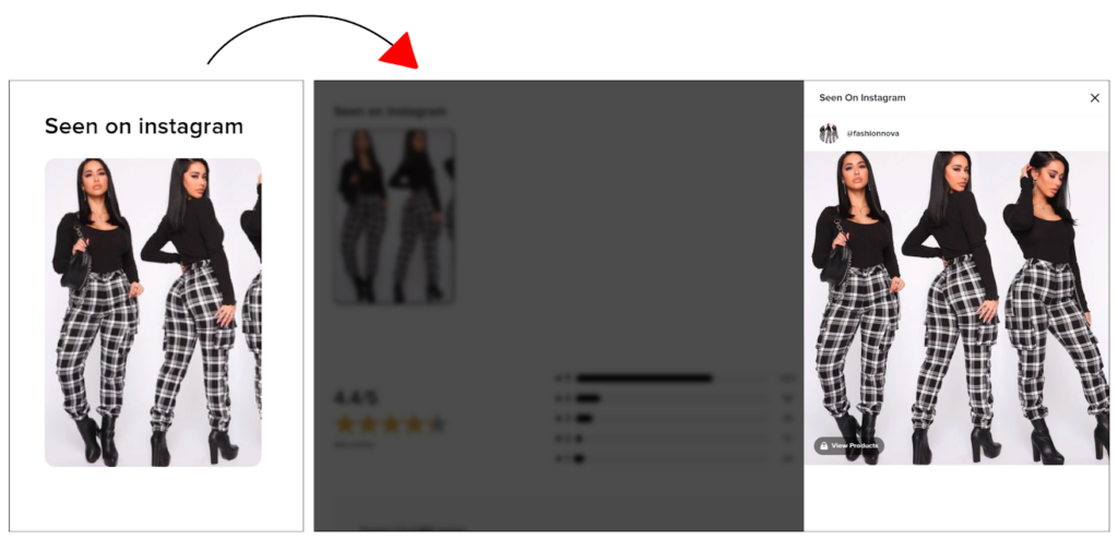
On the product page, they have added a section where users can check products worn by fellow customers, which is really inspiring.
However, I’ve added some tips for you to follow when integrating Instagram with your fashion store. Let’s check.
ACTIONS TO PERFORM:
- Place the Instagram gallery near the bottom of your homepage, just above the footer to let your users first understand your necessary sections.
- Create a dedicated “Lookbook” or “Inspiration” page where users can explore a curated gallery of your Instagram posts.
- Don’t display every post. Only select UGC posts
- Make sure the images in your Instagram gallery are shoppable.
- Place it on the Home Page for your universal product collection worn and reviewed by customers
- And for the Product Page, add product-specific posts from past customers.
9. Sale Labels Over Product Cards
Sale labels help you highlight products for the variety of benefits they come with.
In the image, you can see how Fashion Nova has incorporated both text-based and percentage discounts into their product cards.
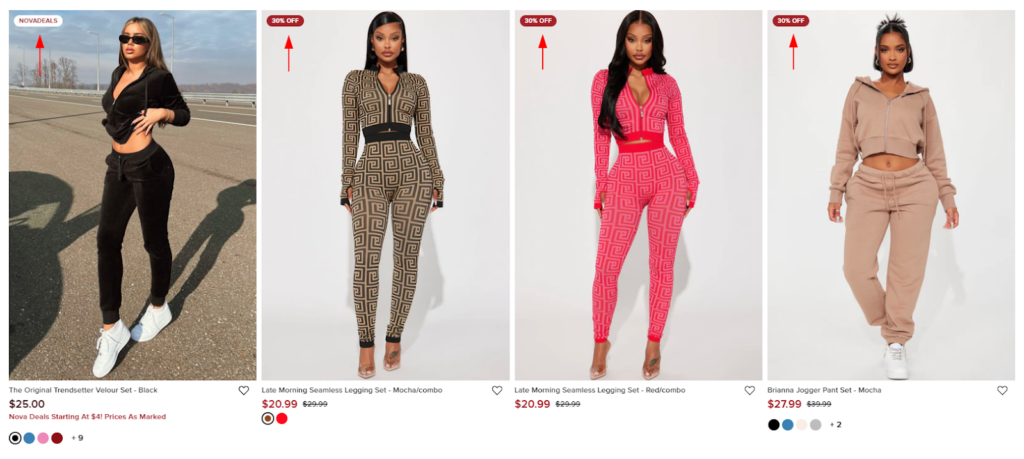
You can also add sale labels all over your websites. Btw, here are some additional tips you can consider for placing labels on your product cards.
ACTIONS TO FOLLOW
- Use popping colors.
- Indicate popular products with “Best Seller” or “Popular” tags.
- Use labels like “New” or “Just In” for recently added products.
- Highlight discounts with “Sale,” “% Off,” or similar labels.
- Keep it brief & to the point.
- Keep it either in the top-left or top-right corner.
- Add a “Low Stock” or “Last Chance” label for products nearing the end of their inventory.
- Add a “Limited Time Offer” label when a promotion is about to end.
10. Share your Bag
This is another great feature I found on the website of Fashion Nova.
This feature allows customers to share their cart items with their friends/family to take their review in purchasing further.
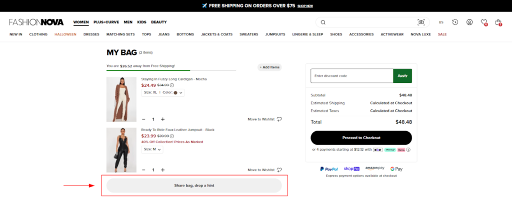
Not every fashion store owner but many of them have added this feature. And I feel it’s a great addition to a fashion store as we always need the opinions of our loved ones on what may suit our styling preferences.
So yes, when you click on the Share Bag button, you get a mini pop-up with a link and the option to share it on multiple social platforms.
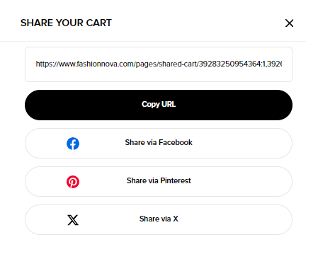
You can also implement it in the same way. Let’s check some actions you can take when implementing the “Share Your Bag” feature in your fashion store.
ACTIONS TO PERFORM:
- Keep it visible and in the first fold of the add-to-cart page.
11. Get Notified
Another CRO element on their website was the “Get Notified” option for their new arrivals.
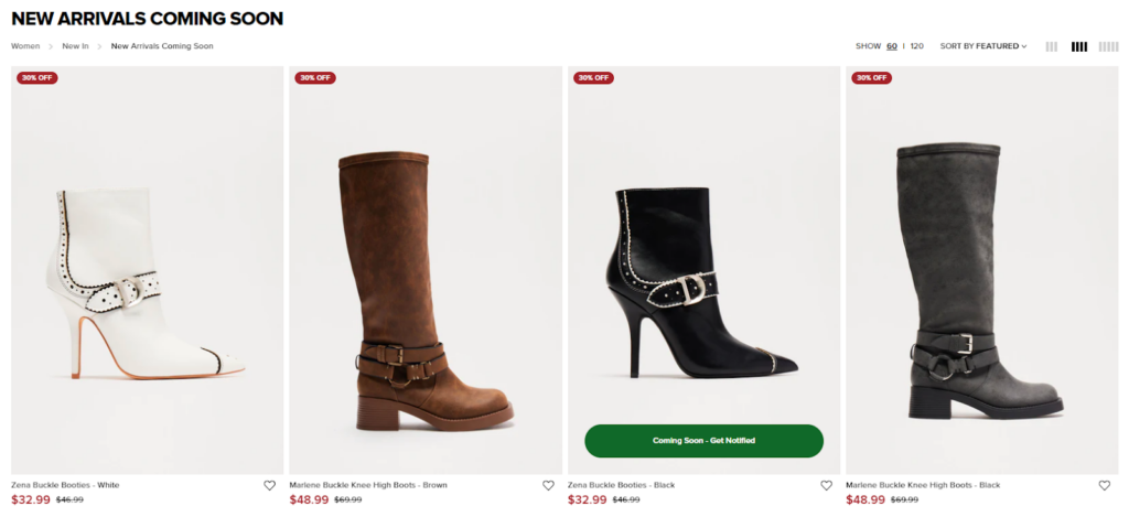
By offering users the chance to “Get Notified” about new arrivals in advance, Fashion Nova taps into the psychology of anticipation and exclusivity. Customers feel special when they are among the first to know about new products.
Also, they no longer need to frequently check the site for new arrivals.
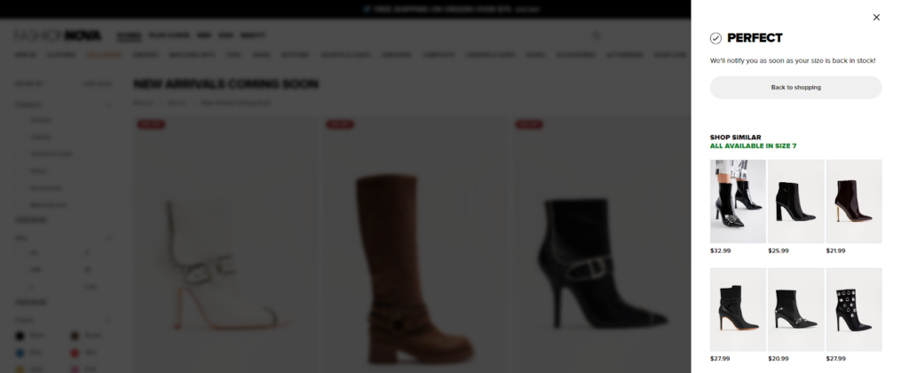
So yes, they will feel excited about purchasing right after its launch to avoid sold-out situations. The fear of missing out (FOMO) created by this feature helps Fashion Nova drive faster purchase decisions.
If you are looking to launch a new collection this feature can be your go-to choice for creating urgency. Or, you can also use this feature for out-of-stock products. Do you need quick tips to implement this feature?
Let’s check on how you can introduce the Get Notified feature effectively in your fashion store.
ACTIONS TO PERFORM:
- Place the “Get Notified” option prominently on product and collection pages, and other recommended areas across the website.
- If you have an entire collection of new arrivals, on the collection page, add a banner with an engaging copy (similar to – “Be the First to Know About New Arrivals”)
- Use a simple, short signup form that requires only essential information (e.g., name and email)
12. Detailed Customer Reviews
We all have a habit of checking reviews when we think of purchasing online. And we can’t blame ourselves as it’s the only way we get to understand product quality when shopping online.
Fashion Nova also has a detailed review section that allows customers to share feedback on fit, quality, star ratings, and written reviews, while also mentioning the color variant they ordered.
This helps future customers gain insights into the product’s quality and make an informed purchasing decision.
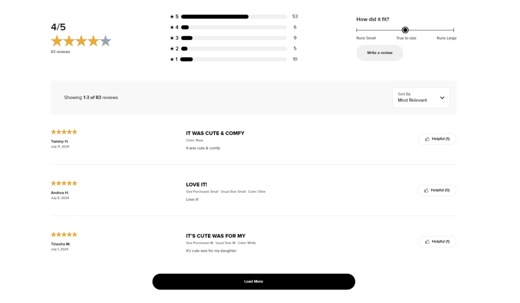
And for any online store a detailed review section is highly necessary.
Below I’m sharing tips on how you can design a review section even better for your fashion store. Let’s check.
ACTIONS TO PERFORM:
- Allow ratings for the fit, quality, material, and comfort level of your product.
- Allow them to add photos and videos.
- Provide filters for rating, size, and color.
- Highlight verified buyer reviews to maintain credibility.
- Include body type and size info in reviews.
- Try replying to reviews, be it negative/positive to solve or appreciate customers’ efforts for adding feedback.
13. Express Delivery Timer
On the website of Fashion Nova, I added a product to the cart, and within a while, a timer asked me to quickly checkout and avail an express delivery option. Here is the screenshot for the same.
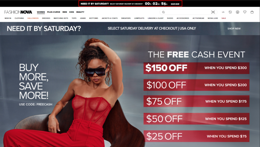
This is a very strategic feature for any online store to have.
Knowing that they have a limited time to take advantage of next-day delivery or express delivery, customers will act quickly rather than delay their purchase decision. And every online store wants that to happen!!!
Express delivery timer can help you reduce cart abandonment rate, create urgency, and overall help convince users to take quick action. Let’s check some more tips on how you convey or place it well for your fashion store.
ACTIONS TO PERFORM:
- Convey it through a countdown timer in the header section, a mini banner, an email, or a notification.
- Keep the message to the point.
14. Back-to-top Button
This may seem a basic feature yet is very helpful to have on your fashion website.
See, usually, users keep scrolling to explore offerings on your web pages. What they find hectic is to scroll up.
So, if your website consists of long pages, a back-to-top button is a must. Having this feature will help you save user’s time and efforts of scrolling all the way up by allowing them to jump within a click.
Here’s how Fashion Nova has implemented this feature.
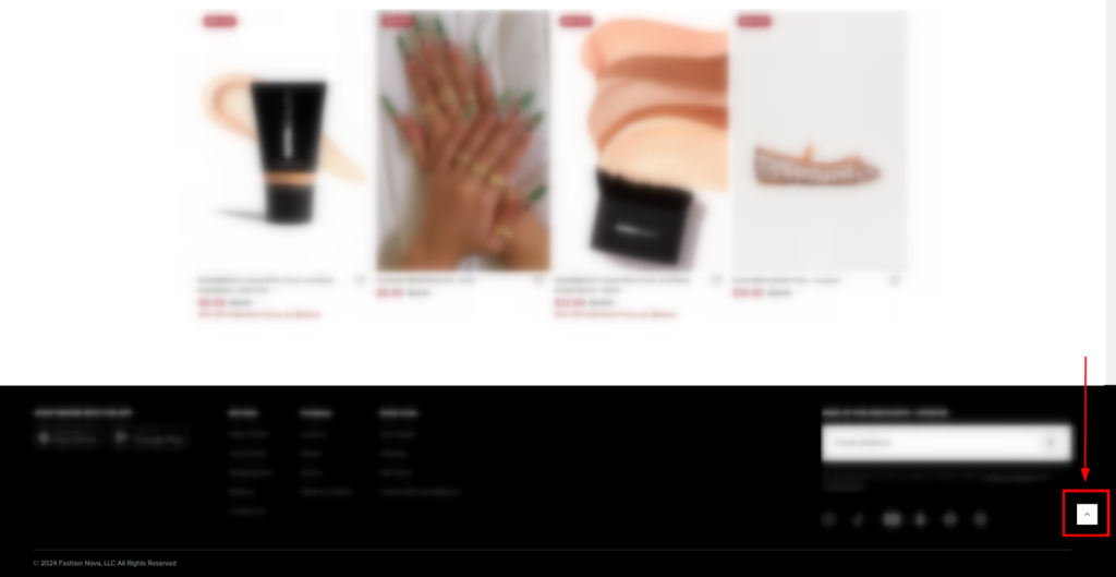
Let’s check some implementation tips.
ACTIONS TO PERFORM:
- Keep the button easily visible
- Ensure it appears from the second or third fold of the webpage and all the way down to the footer.
15. Free Shipping Threshold
Online shoppers often choose to avoid shipping charges. So yes, offering free shipping is a true tactic for encouraging customers to place orders. If you also aim to increase the Average Order Value (AOV), adding a free shipping threshold to your website will be a great help.
Fashion Nova also offers a free shipping progress bar to track their eligibility, encouraging users to add more products to their purchase and avail it.
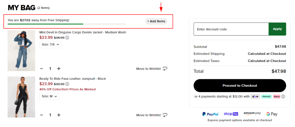
Here are some tips to implement a free shipping threshold on your fashion store.
ACTIONS TO PERFORM:
- Set a free shipping threshold that aligns with your average order value (AOV) and shipping costs.
- Use a progress bar to keep your users informed.
- Display it clearly on product pages, the cart page, and the checkout page for maximum visibility.
16. Customer Registration Process
Store owners often make mistakes to avoid optimizing the customer registration process.
Believe it or not, it has a huge impact on conversions!!! A lengthy and complicated registration form will prevent users from completing the process or even the checkout.
Fashion Nova has kept it easy. To Sign In, a user is only required to put in an email address.
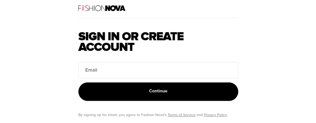
Once they do, they’ll receive a verification email. And that’s it. The account is created.

And that’s it. The account is created.
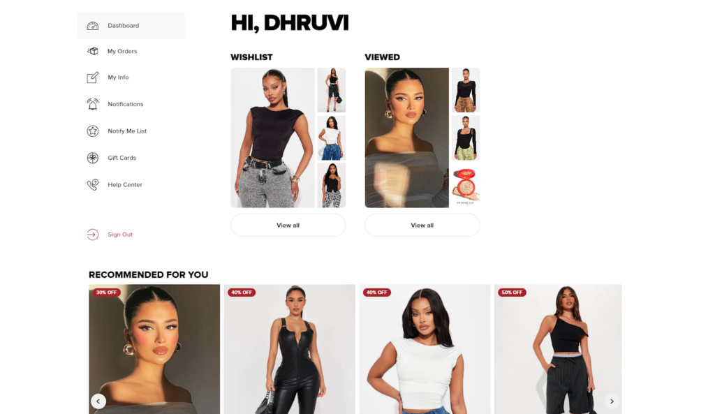
Also, if we talk further on their customer account page, it’s so well organized that users can find all the necessary information easily over a single glance.
Here are some tips on how you design a customer registration process to keep it conversion-optimized.
ACTION TO PERFORM:
- Ask for the least amount of information.
- Do not ask for the address and other contact information at this point.
- Allow social login options (Google, Facebook, and more).
- If the process involves multiple steps, use a progress bar or steps indicator.
17. Offers On the Cart Page
Cart abandonment is a significant issue for online stores.
Instead of seeing the cart page as the final step of purchase, customers view it as a place where they can still benefit from offers and discounts. To keep up with user expectations, many (to most) eCommerce stores offer a coupon or discount redemption feature on their cart page — If a customer has any coupon they can use and avail the offer for it.
Fashion Nova, on the other hand, goes the extra mile and displays all the available offers on their cart page.
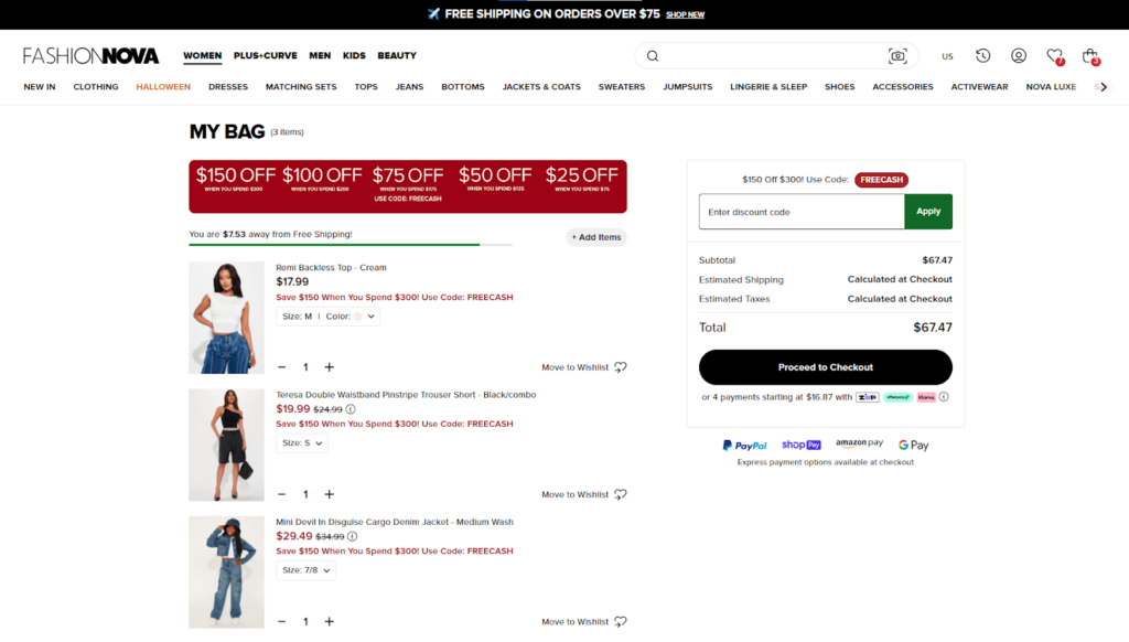
Displaying all the available coupons helps them engage better with their customers and ultimately shows that users can pay less for all the favorites they’ve added to their cart.
This encourages customers to invest in their offerings, improving their conversions, as well as AOV in many cases.
It’s a great CRO element for your fashion store. If you need tips on how you place it well on your website, here are some tips to consider.
ACTIONS TO PERFORM:
- Keep it easily visible and accessible.
- Place the coupon code directly.
- Or, you can display a button named “Current Offers” with a pop-up and keep offers organized in it.
18. Personalized Add-ons at Checkout
During online shopping, there are often times when we need products that complement what we’ve added to the cart.
And yeah recently, I was looking to order a dress online, and on the cart page, they suggested a bag that was a perfect match for the dress. I was impressed and ended up buying both together.
So, I feel, it’s true that when you present your customers with relevant suggestions, they’ll trust their current purchase as well as buy more from you. Because when you suggest them, there’s a reduced likelihood of second-guessing and hesitation.
All they have to do is visit its product page and buy it as a pair.
Fashion Nova clearly understands this concept.
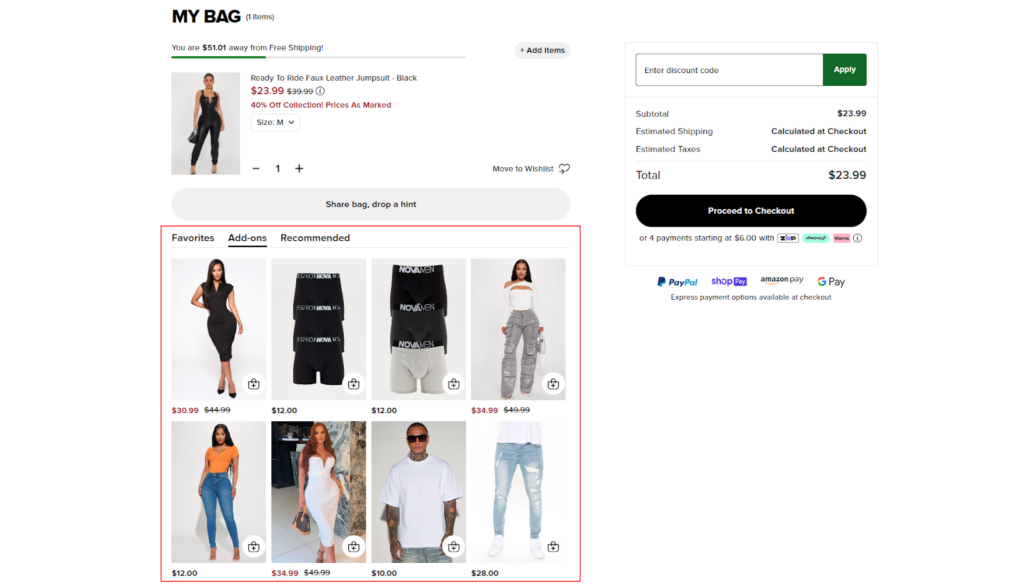
They provide valuable, relevant suggestions at checkout, based on cart items, previous product views, and browsing patterns.
If you want to suggest the Add-on section on your cart page, here are some tips to consider.
ACTIONS TO PERFORM:
- The first rule is to keep it relevant.
- Offer limited-time deals on recommended add-ons.
- Ensure the product card in the add-on section is visible and includes an option to visit the product page.
- Label the product card in the add-on section with ongoing offers or mark it as a “bestseller”.
19. Guest Checkout
A lengthy and complex checkout process is a major turnoff for customers. To keep users engaged in purchasing, you need to provide a seamless checkout option.
Fashion Nova removes all the hurdles coming along the way of checkout by providing a guest checkout option.
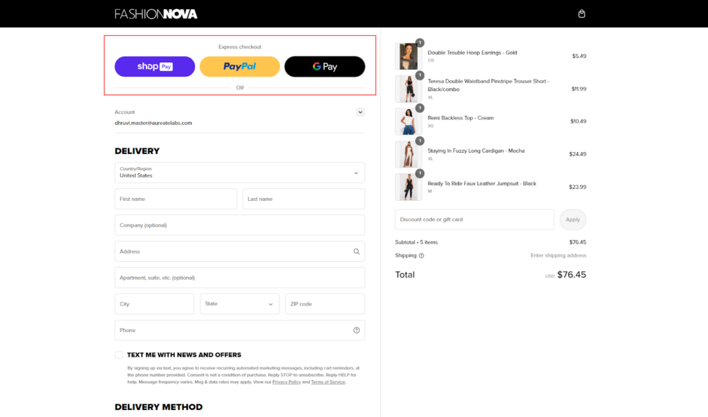
It’s the perfect solution to simplify things and make checkout faster.
Also, the Shopify Plus plan comes with greater capabilities to customize the checkout process — so it will be an exciting journey when you choose to do so. But wait… you still need some tips to do it the right way.
Here you go.
ACTIONS TO FOLLOW:
- Keep it clearly visible on the checkout page.
- Also, try implementing address autofill features to speed up the shipping information input.
Conclusion
And that’s all !!!!!!!!!!!
Throughout the article, we saw how the CRO strategies used by Fashion Nova help them provide an improved shopping experience and earn better revenue. I hope the overall explanation has provided you with a clear idea of how Fashion Nova has strategized each element and how you take inspiration from it.
Key Takeaways for Shopify Plus Fashion Stores
Here I’ve listed some key takeaways, just to help you easily digest the motive of this article.
- Understand your target audience 👪
- Create strategies that might improve their shopping journey 🛍️
- Aim to build an online store that your customers dream to shop at 🛒
- Never fear experimenting with new trends 📈
And here ends my duty.
Now is your turn to get passionate and plan out things that might work well for your fashion store conversions.
And yeah, CRO might seem easy, but there are multiple things to research before you implement any feature or strategy. What might help best is — CRO-focused UI/UX designing.
CRO-focused UI/UX designing is when your store’s Customer Experience (CX) is improved with a strategic design derived from personalized audits and user behavior on your website.
If you’re unsure about the implementation of these CRO strategies, you can Consult CRO Experts and get suggestions based on a personalized CRO audit of your eCommerce store.
Seems relieving, right?
Looking forward to hearing from you. 😊
;
ADDITIONAL RESOURCES:
Here are some additional CRO guides from my teammate, written for different niches.
(It’s all for Shopify Plus. 😀)


Post a Comment
Got a question? Have a feedback? Please feel free to leave your ideas, opinions, and questions in the comments section of our post! ❤️