American Girl: CRO Inspiration for Toy Stores [Shopify Plus]

Strategies drive success — this is what comes to my mind when I see successful brands.
One such brand that has captured millions of hearts worldwide is American Girl, a toy brand renowned for its dolls and accessories! Their success not only lies in their adorable products but also in their exceptional customer experience.
As a Shopify Plus merchant, you can draw valuable insights from American Girl’s website to optimize your own toy store and drive conversions. And, this blog will help you to understand the secret CRO strategies that make American Girl stand out in the competitive toy market.
By analyzing American Girl’s website and their approach to customer engagement, we’ll reveal valuable insights into:
- What makes American Girl stand out as a global toy brand
- The essential CRO elements that drive conversions
- How American Girl focuses on UX design to create a seamless shopping experience
And don’t miss the valuable takeaways waiting for you at the end!
What makes ‘American Girl’ stand out as a Toy Brand?
American Girl has created a truly exceptional toy brand that captivates and inspires girls of all ages. Here, we’ll discuss in detail exactly how they set their brand apart from every other toy company on the market—even from her Mattel sister Barbie.
So. let’s get started!
Brand recognition and heritage
Established in 1986, American Girl has created a strong brand identity and earned the trust of generations of customers.

American Girl has cultivated a powerful connection with generations of children and their parents. Their collection of dolls represents more than just toys. They’re characters with stories, historical significance (for some dolls), and a focus on positive values.
And, this timeless appeal ensures the brand stays relevant across generations.
I agree that building brand recognition and heritage takes time and dedication. But by focusing on engaging storytelling, and fostering a sense of community, you can create a brand that resonates with your target audience.
Diversified product portfolio
Sure, they have the core dolls — historical characters and contemporary girls — each with their own unique backstory and personality. But they go beyond just dolls.
American Girl complements their dolls with a vast array of complementary products such as doll clothes, playsets, accessories, books, and even in-store experiences (with online reservations) like doll hairstyling or attending doll-themed events.
This creates a holistic experience for their customers and allows them to build a world around their favorite dolls and truly engage with the brand.
High-quality products and focus on innovation
American Girl has a rich history of creating high-quality dolls that represent diversity and historical periods. Their detailed costumes, accessories, and engaging narratives spark a child’s imagination and inspire them to learn more about different cultures and times.
And their product pages (PDPs) proudly showcase their product quality!
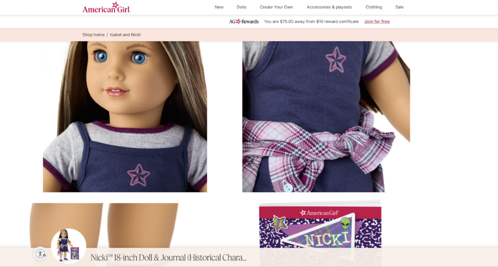
This commitment to quality and storytelling has built an immense amount of brand trust. Parents who cherished their own American Girl dolls as children are now eager to share that same experience with their own kids.
Again, they constantly introduce new historical characters, update doll designs to reflect modern trends, and develop creative new accessories and storylines. This keeps their products fresh and exciting for the upcoming generations.
Product Personalization — Create your Own Doll!
American Girl empowers girls to create a doll that reflects their individuality. Their “Create Your Own” section allows customers to customize a doll’s features, from eye color and hairstyle to skin tone and face type. Shoppers can also choose their outfits and accessories from a range of options.
Once done with designing, they can share their creations with a shareable link.
This level of personalization creates a deeper connection between child and doll, creating a cherished companion rather than just another plaything.
Think about it from your own store’s perspective. Can you offer a similar level of customization for your products?
Even if it’s not as in-depth as American Girl’s dolls, such as allowing customers to add a name, choose a specific color, or pick a personalized message can significantly enhance the shopping experience. A small effort can transform a simple purchase into a memorable one.
Exceptional website Speed and Performance
One of the first things you’ll notice when you visit the American Girl website is its lightning-fast speed and smooth performance. This might seem like a basic detail, but in the tough eCommerce race where every second matters, it can make a huge difference.
The Shopify Plus experts behind their store design and development made sure their website performs well and the store size doesn’t affect the user experience.
Customers are impatient, and if your site takes too long to load, they’ll simply bounce to a competitor. Thus, American Girl ensures a positive brand experience right from the first click.
So, this section may give you the major aspects to focus on! But, the next section will provide you with a list of strategies you need to implement in your online toy store.
Let’s move ahead!
What are American Girl’s CRO Strategies that you must have?
CRO is nothing but making your eCommerce website more effective at turning browsers into buyers. And here, we’ll discuss the strategies behind American Girl’s CRO.
1. Shop by Age
The very first question asked when we visit a toy store is — How old is your child???
That’s why their website offers a special way of product discovery — Shop by Age. This simple yet effective strategy caters to the specific needs and interests of different age groups.
When exploring their navigation menus, you’ll find a dedicated section for “Shop by Age”.

Plus, their product listing page has an age filter to narrow down your searches to specific products, be it dolls, playsets, or clothing.
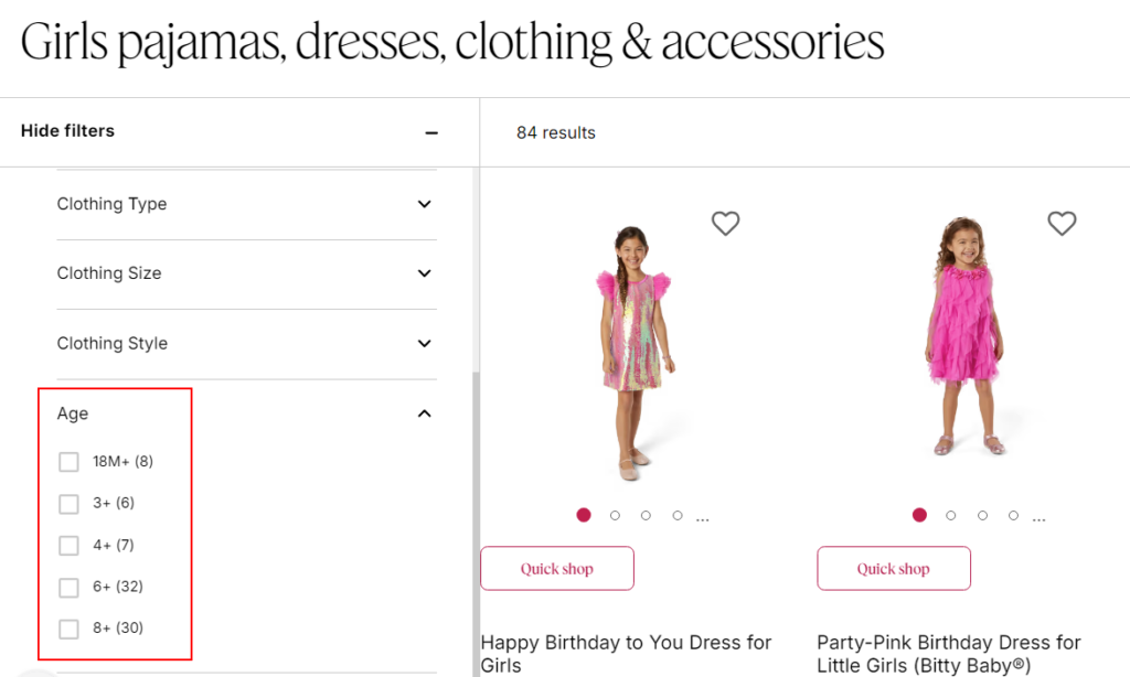
This makes it easier for parents to find age-appropriate toys that their children will genuinely enjoy. So, as a toy merchant, you should implement the “Shop by Age” strategy on your Shopify Plus store.
Actions to perform!
- Identify your ideal customer segments like age, gender, interests, and budget.
- Categorize your products according to these segments.
- Incorporate age-based filters and navigation options throughout your product discovery process.
2. Loyalty Reward Program
What I loved most about American Girl is their loyalty program!
When it comes to building brand loyalty, there’s no substitute for a well-designed reward program. American Girl understands this perfectly.
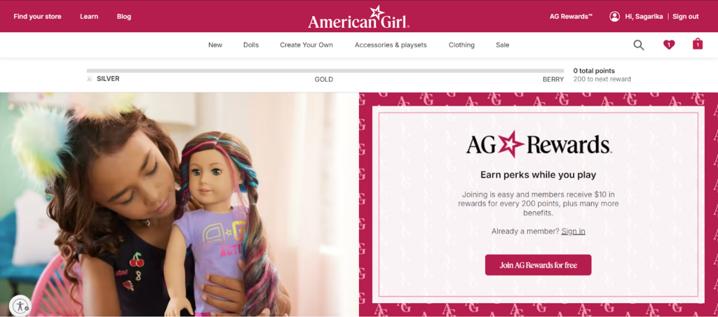
Their “AG Rewards” is a tiered loyalty program that incentivizes customers to keep coming back again and again. By making purchases, attending events, and engaging with the brand online, members earn points that can be redeemed for exclusive rewards like discounts, early access to new products, and even personalized experiences in their stores.
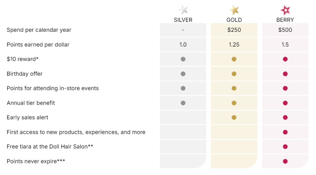
This program isn’t just about discounts; it’s about creating a sense of community and exclusivity. Members feel valued and appreciated, which creates a deeper connection with the brand. The tiered structure keeps them engaged, constantly aiming to unlock the next level of rewards.
Not only this, they also encourage shoppers to earn reward points by highlighting the benefits of reward points and how their actions can bring those benefits (as shown below).
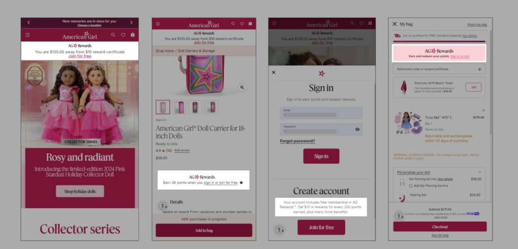
So, if you want to gain more repeat customers, this is what you can implement in your online store.
Actions to perform!
- Create a tiered loyalty program with increasing rewards for higher-tier members.
- Determine how points will be earned and redeemed. Consider offering tiered rewards for different levels of spending.
- Create a dedicated landing page to educate customers about the benefits.
- Promote the loyalty program throughout the website (homepage, product page, etc.).
- Host exclusive events or experiences for loyal customers.
- Make it easy for customers to sign up and track their rewards progress.
- Provide FAQs and Terms and conditions for your loyalty program.
3. Share your Bag
You belong to a niche where the customers or buyers (adults) are not the actual users (children). Or, sometimes purchases involve multiple decision-makers.
American Girl has implemented a clever feature called “Share your Bag” which allows customers to create a shareable link to their entire shopping cart.
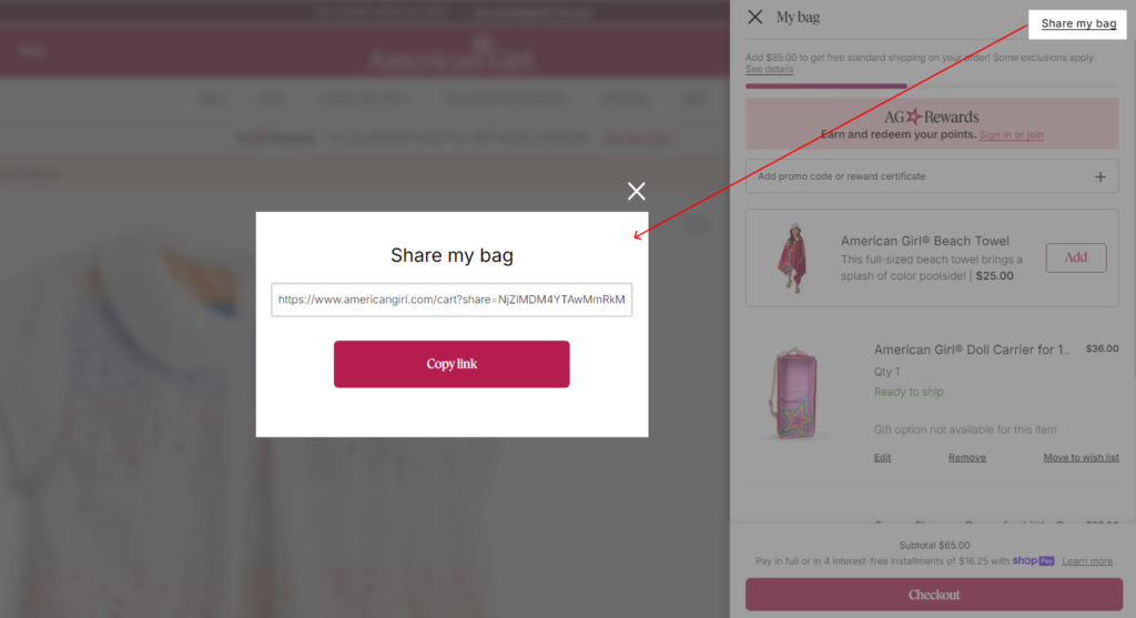
Maybe a child wants a specific doll but needs parental approval on the outfit or accessories. They can easily generate a link and send it to parents, grandparents, or anyone who might be considering a gift.
This eliminates the back-and-forth of describing desired items and ensures they get exactly what they want.
In your store, this can be helpful for targeting family purchases or group gifting scenarios.
Actions to perform!
- Integrate a “Share Your Bag” feature into your Shopify Plus store.
- Make it easy for shoppers to copy the sharable cart link.
4. Finding a store
If you have physical stores, why not invite shoppers to visit your store?
To make it easy for customers to find a nearby store, they prominently feature a “Find a Store” navigation and a dedicated page on their website.
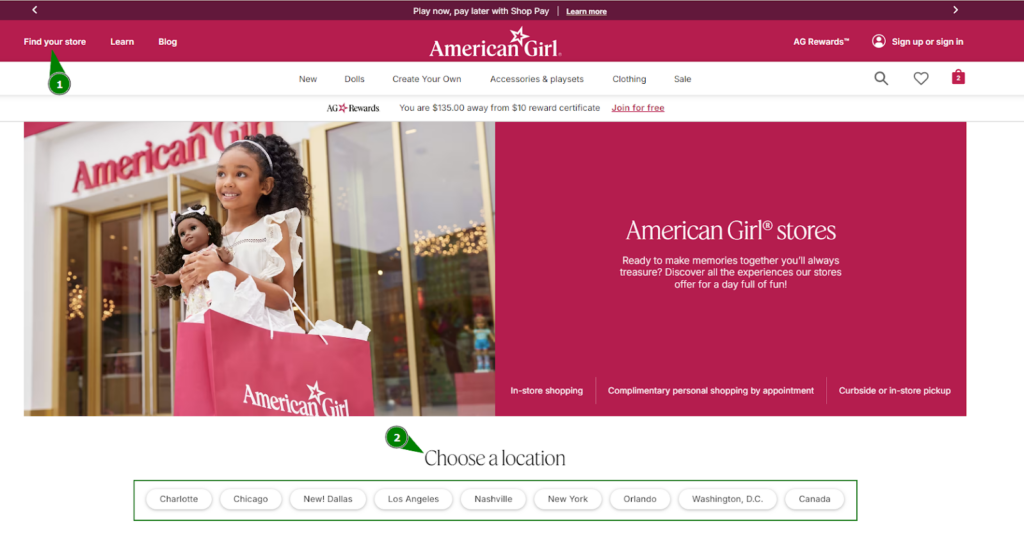
This page virtually takes shoppers on their store tour and lets them choose which store they want to visit based on the locations. Furthermore, they can book reservations (we’ll discuss this further) at the stores, and explore the in-store experiences offered.
This strategy not only boosts in-store sales but also creates a stronger connection with the brand.
Actions to perform!
- If you have physical stores, prominently display their locations on your website.
- Provide detailed store information, including address, phone number, hours of operation, and any specific services or amenities offered.
- Also, try to showcase how your physical store looks like if possible.
- Consider adding a map feature to visually guide customers to your stores.
- Consider offering in-store pickup options for online orders to encourage more visits.
5. Personalized Reminder Pop-ups
Online shoppers are easily distracted.
When you have so many good things to explore on your website, it’s easy for them to get sidetracked and abandon their carts. American Girl combats this by strategically using personalized reminder pop-ups.
These pop-ups appear after a shopper has viewed a product for a certain amount of time or has shown interest in a particular category. The pop-up features an image of the product they were considering with a simple call-to-action as shown below.
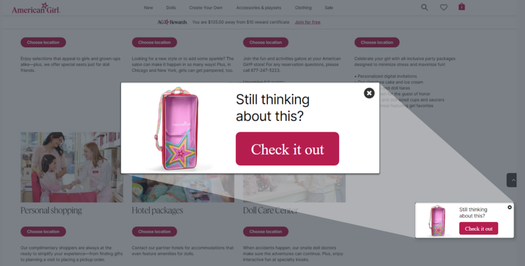
This way, American Girl brings the product back to the forefront of their mind and encourages them to take the next step.
Even they reminded me when I left a product in the shopping cart but didn’t return the cart for longer. Check out the reminder below.
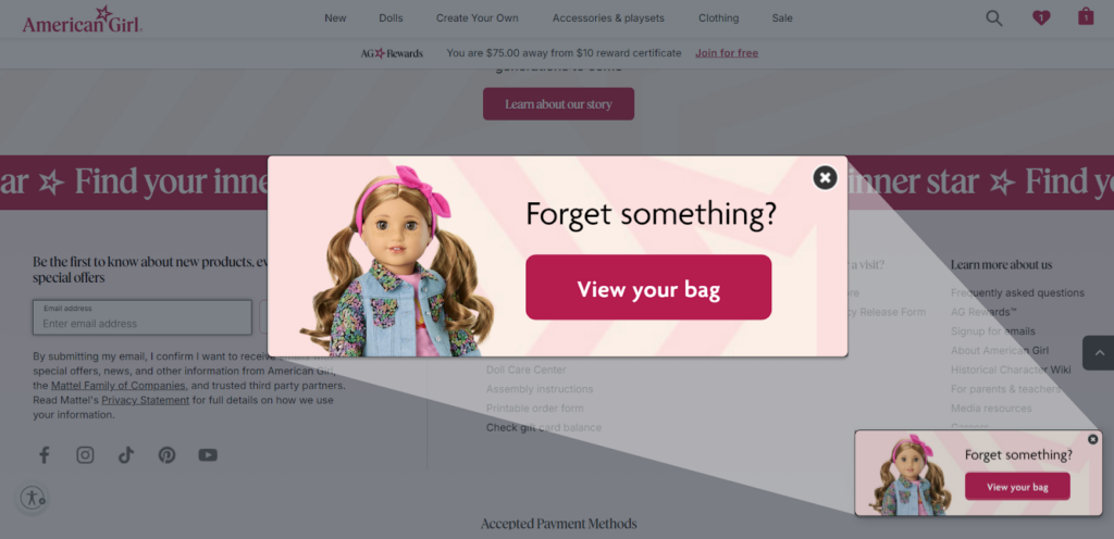
This tactic is a subtle yet effective way to nudge shoppers back towards a potential purchase.
Actions to perform!
- Experiment with different pop-up triggers, such as abandoned cart reminders, product recommendations, or exit intent pop-ups.
- Set triggers based on specific user behaviors, such as abandoned carts, viewed products, or time spent on the site.
- Test different pop-up designs and timing to determine what works best for your audience.
6. Wish List Management
American Girl’s wish list feature reminds me of my Spotify playlist!
Just like we curate playlists to organize your favorite songs, shoppers can create multiple wish lists to categorize their desired toys or accessories. This feature is incredibly useful for customers who are planning for birthdays, holidays, or just want to save items for later.
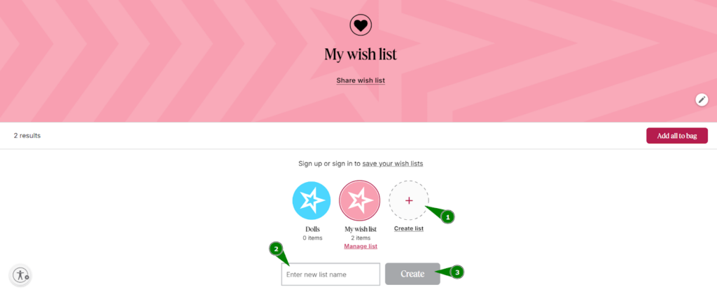
To make it even more convenient, American Girl allows customers to share their wish lists with others using a shareable link (just as their shopping cart sharing we’ve discussed above).
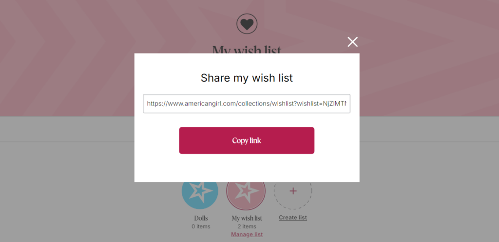
Not only this, American Girl has thought of everything when it comes to wishlist management. You can easily:
- sign up or sign in to save your wishlists,
- add all the products to your cart with a single click,
- change the wishlist theme,
- remove products,
- rename wishlists, and
- even edit product details.
This way American Girl has provided a complete wishlist management that puts the power of customization in your hands.
Actions to perform!
- Integrate a wish list feature into your Shopify Plus store.
- Make it easy for customers to add products to their wish list.
- Allow customers to share their wish lists with others.
- Offer personalized recommendations based on their saved items.
7. Accessibility Mode
American Girl’s website is designed to be accessible to all users, regardless of their abilities. The company offers an “Accessibility Mode” that can be easily enabled with a single click. This mode makes the website’s user interface components and navigation more usable for people with disabilities.
So, what difference can you see when the Accessibility Mode is enabled?
Links, buttons, and other calls to action become more prominent when you hover over them with your mouse. This visual enhancement makes it easier for individuals with visual challenges to identify and interact with website elements.
And by providing an extra step towards usability you can reach a wider audience and broaden their customer base.
Actions to perform!
- Regularly test your website to ensure it meets accessibility standards like WCAG (Web Content Accessibility Guidelines).
- Improve your website’s accessibility with eCommerce UI/UX designing.
8. Bundled Products
There are many reasons why eCommerce websites implement product bundles but the two most common are —
- bundling can encourage customers to purchase more items at once (boost AOV),
- by combining slow-moving items with popular ones, businesses can reduce excess stock and improve inventory turnover.
See how American Girl offers a bundle that includes a doll, clothes, accessories, and a book.
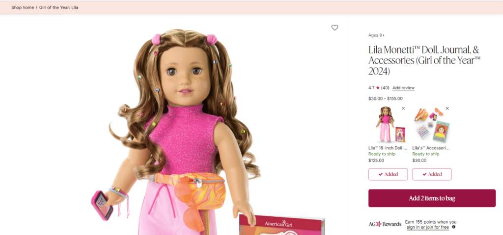
This bundle would be more appealing to customers than purchasing each item separately, as it offers a complete package tailored to a specific theme or interest.
Actions to perform!
- Identify complementary products within your toy range.
- Create bundles that offer a compelling value proposition for your customers.
- Showcase the list of products added explicitly to your PDP (above the fold).
9. Free Shipping Threshold
Offering free shipping is a tried-and-true tactic to increase sales and encourage larger order values. Almost every eCommerce store offers free shipping but it’s even smarter to ask for eligibility.
American Girl not only provides a free shipping progress bar to track their offer eligibility, but it also encourages customers to explore their available shipping options.
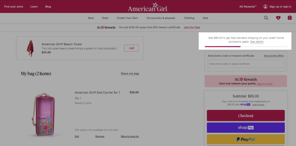
Actions to perform!
- Determine a suitable free shipping threshold based on your average order value (AOV) and shipping costs.
- Use a progress bar to show customers how close they are to reaching the threshold.
- Make sure the threshold is prominently displayed on your product pages, cart page, and even on the checkout page.
10. Current Offers Display
You might have seen eCommerce stores offering a coupon or discount redemption feature. But have you found stores that display all the available discount offers in one place?
Very few do that. And American Girl’s one of them!
Shoppers can easily find the best deals and promotions when they click on “See current offers” on the shopping cart.
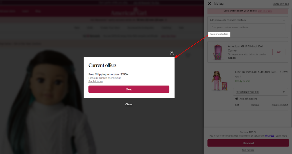
Generally, it shows multiple offers (currently showing 1 offer) with individual terms and eligibility criteria.
Now, each of these offers is associated with minimum spending requirements. This encourages the customer to purchase additional items to meet the requirements and take advantage of the discount.
Actions to perform!
- Highlight the most valuable offers at first.
- Regularly update the offers list.
- Explain the terms and conditions of each offer.
11. Personalized Upsells
I believe you know much more about upselling, so we won’t discuss how it can help you increase your store revenue.
Here, we’ll see how effectively American Girl has personalized the upsell opportunities.
When the shopper adds a specific doll to their cart, they are provided with options to customize their doll with accessories. These accessories are carefully selected to complement the chosen doll, making the upsell offer more relevant and appealing.
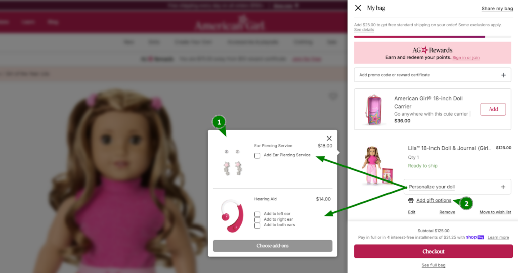
Also, they can opt for gift options which include adding a complimentary gift message and gift wrap services.
Actions to perform!
- Research which products are often purchased together and offer them as upsells.
- Consider offering add-on services like gift wrapping or engraving.
- Find a suitable Shopify app or develop a custom functionality.
12. Look-alike Suggestion for Sold-out Products
What do you do when one of your best-selling toys goes out of stock??
Some eCommerce advisors suggest to have an email notifier to update the shoppers about the product restocking.
But just think about it—toys, dolls, playsets, and other games are usually purchased for special occasions like birthdays or holidays. And, these events don’t wait for products to be back in stock.
By understanding the real challenge, American Girl thinks a step ahead and implements a more effective strategy to offer look-alike suggestions for sold-out products.
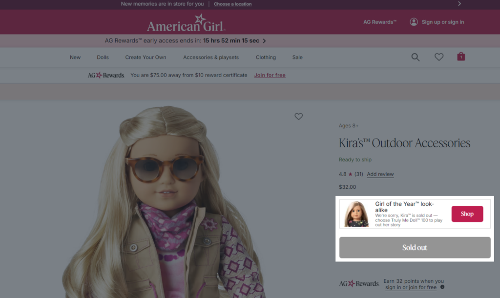
This reduces the customer’s disappointment of finding the desired doll and encourages them to explore another best option that can be equally appealing.
Actions to perform!
- Use product tagging or attributes to categorize your products based on similar features or styles.
- Display “Look-alike Suggestion” recommendations prominently on product pages, especially when a product is out of stock.
13. Real-time Store Availability Checker
Some shoppers just use the website to explore the products and prefer to buy offline. The reason could be anything from:
- Don’t trust online shopping
- Want to save on shipping cost
- Need to check the product quality
- Can’t wait for the delivery time, urgently required, etc.
Well, these are the common human psychology that American Girl addresses by enabling shoppers to check the product availability at their physical stores. You can find this option on their product page.
When users click on “Check all stores”, they can see a list of stores and know the real-time status of whether the specific doll, book, accessories, or playset is available there or not.
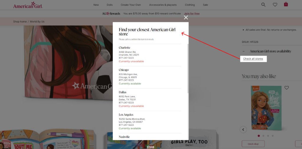
This feature provides a seamless shopping experience for customers who want the convenience of online browsing combined with the tangible experience of in-store shopping.
If you have retail stores and you want to promote them to drive foot traffic, this CRO strategy is a must try! Consult with experts to know the best ways to implement this in your Shopify Plus store.
Actions to perform!
- Place a user-friendly store locator on your PDP.
- Allow customers to search for specific products and see if they’re available in nearby stores.
- For more convenience, let them place online orders and pick them up at their nearest store.
14. Detailed Customer Reviews
A section in the PDP where the shoppers spend most of the time after the product images is the product review section.
Here’s where they make the purchase decision. So, this section needs to be detailed and helpful.
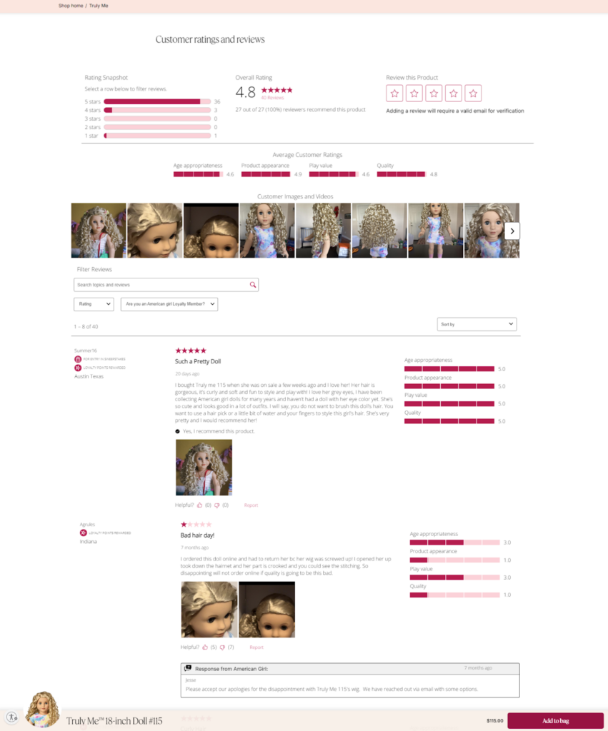
Looking at this image, we can see how American Girl has effectively used customer reviews to enhance the online shopping experience.
The reviews themselves are detailed and informative, with customers sharing their experiences, opinions, and even including images of their dolls. They have categorized the product reviews into 4 different categories based on the product (here it’s a doll):
- Age appropriateness
- Product appearance
- Play value
- Quality
This shows the stars ratings based on different aspects of the product which gives the buyers a more comprehensive understanding of what to expect.
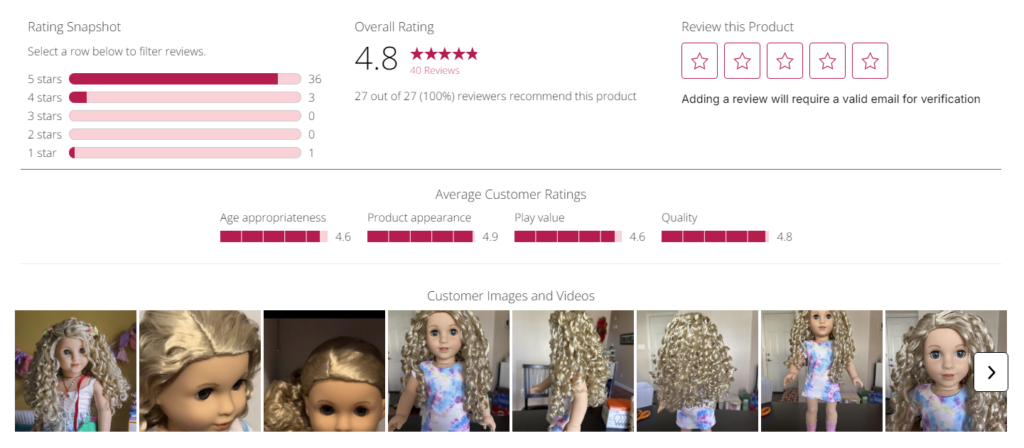
Shoppers always want to see how the product exactly looks. And the review section is the best place where the customers add images of the actual product they received. American Girl has shared easy access to all the images to make their investigation effortless.
Next comes the option to filter reviews based on specific criteria, such as star rating or keyword. This allows customers to find the reviews that are most relevant to them
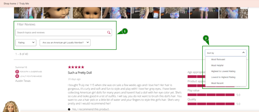
The shoppers can also find reviewer’s membership status (indicated by “Loyalty Points Rewarded”). This suggests that the reviewer is a loyal customer who has made previous purchases and has earned reward points. This can add credibility to their review as a satisfied and engaged customer.
Additionally, the review section includes a “Helpful” button that allows other customers to indicate whether they found a particular review helpful. This can help highlight the most valuable reviews and encourage other customers to share their experiences.

Actions to perform!
- Encourage customers to leave reviews after their purchases.
- Allow customers to rate all the different aspects of your product (e.g. quality, size, appearance, etc.).
- Don’t shy away from displaying negative reviews.
- Address negative feedback transparently and constructively to build trust.
- Allow customers to filter reviews by star rating, date, or keyword.
- Provide incentives for customers to share their reviews on social media.
- Let the shoppers find all the review images at once.
- If your store serves a global audience, consider translating reviews into multiple languages.
15. Product Video Tutorials
When shoppers are looking for products, they like to learn about the product usage. That’s why some big brands stay updated with their product tutorials or use cases.
Suppose, you’re considering buying a new toy for your child, wouldn’t you want to see it in action first?
American Girl’s product videos do just that. They have a ton of product video tutorials on their website. These videos show how the dolls can be used in different play scenarios, like having a tea party or going to school.
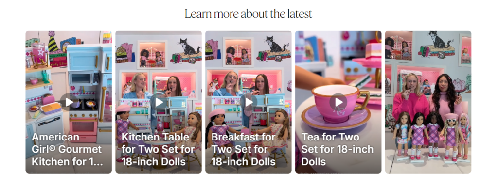
This is super helpful for parents and kids alike, as it gives them a better idea of how the dolls will fit into their lives.
Actions to perform!
- Create high-quality product video tutorials that showcase your products in action.
- Highlight key features and benefits in the videos.
- Include instructions on product usage, care, and assembly.
- Embed the videos on product pages and create dedicated tutorial sections on your website.
16. Quick Shop Option
When you know you have tons of repeat customers, you need to think about their convenience too.
American Girl does a great job with this by offering a ‘Quick Shop’ option. Basically, it allows customers to add items to their cart without having to view the full product page.
When you click on the Quick Shop button below the product image, a pop-up opens which lets you see more details about the product without having to leave the page.
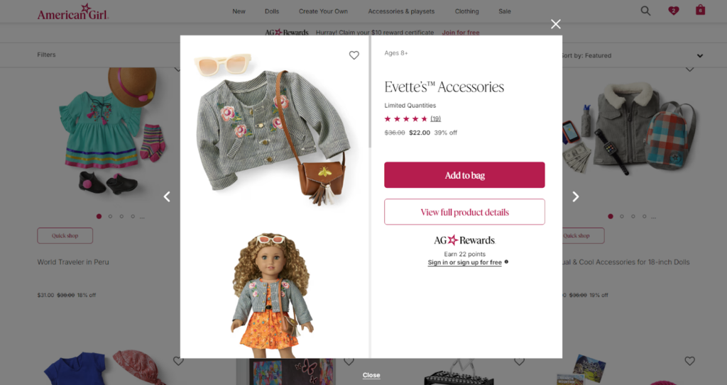
It’s like having a mini-product page right there on the main page. This can be an expressway for customers who already know what they want and don’t need all the extra details.
Actions to perform!
- Allow customers to add products to their cart directly from the product listing page (PLP) or category page.
- If you think, your customers shouldn’t add the products without basic knowledge, you can implement this “Quick View” feature.
17. Reservations at Local stores
Now we’ve discussed how American Girl helps you locate the local physical stores in the above points. Not only this, we have to witness how they go beyond that.
When you land on a specific location page on their website, you are served with lots of services and even a calendar where you can select a date and time for your visit.
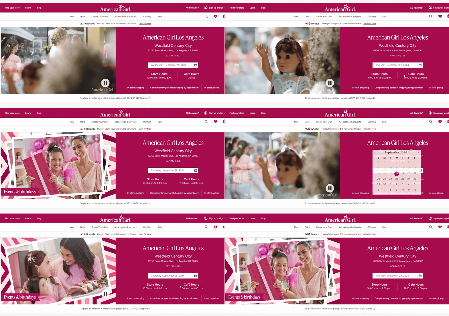
They offer a ‘Book Reservations’ section on their website. When you’ll click on any service (like a salon), you can see all the packages for the girls, their dolls, and both.
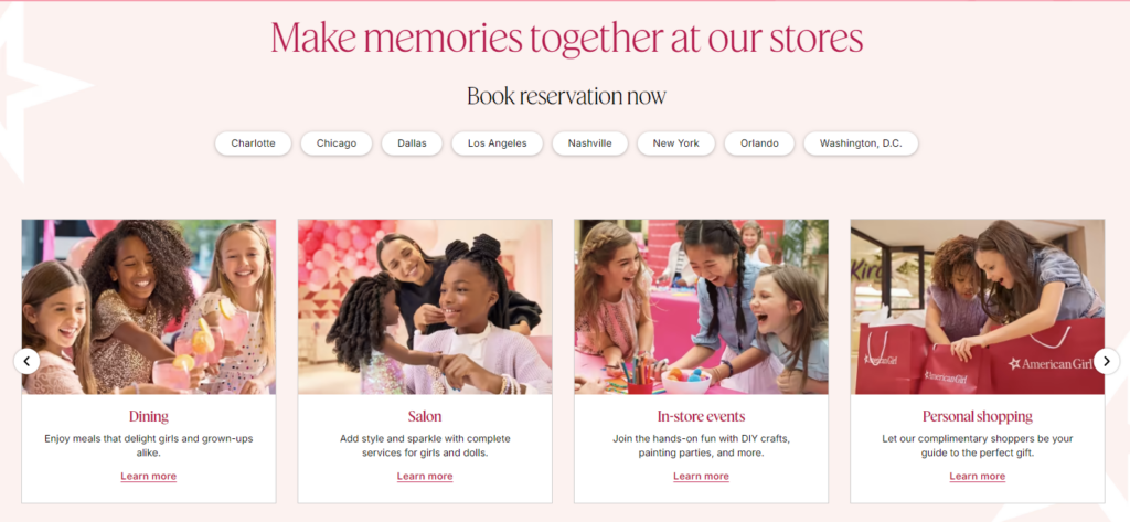
Now you can choose from the available options and book your appointment at the physical store location.
This is a brilliant strategy because it allows customers to book appointments for events like tea parties or doll customization.
Actions to perform!
- If you have a physical store then you can implement personal shopping appointment booking.
18. Customer Registration Process
The customer registration process is often overlooked, but it can have a significant impact on conversions. A lengthy or complicated registration form can prevent customers from completing the registration or even the checkout process.
On American Girl’s website, this is how you are invited to register your account. Whether shoppers want to register or log into their account, they are given a reason why they should take the step:
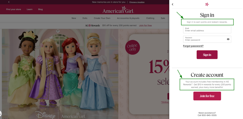
On clicking on the “Join for free” button, the registration form opens in the same slider. The form is concise and only asks for essential information, such as name, email address, password, and date of birth.
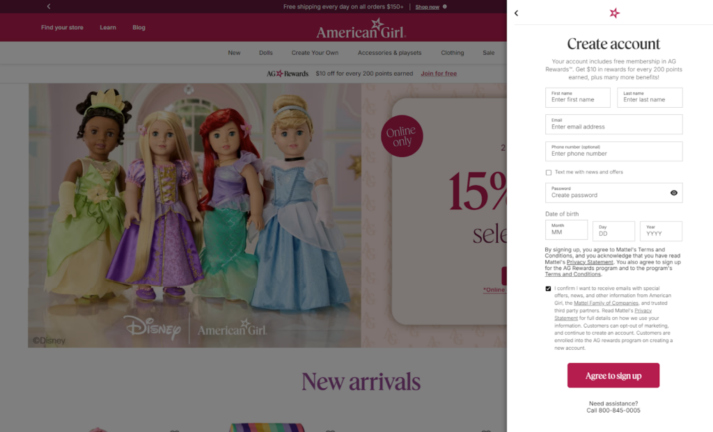
Next, you’ll get a link to verify your email id and successfully complete your registration process. Now, you can login to your account and enjoy a great dashboard view as shown below:
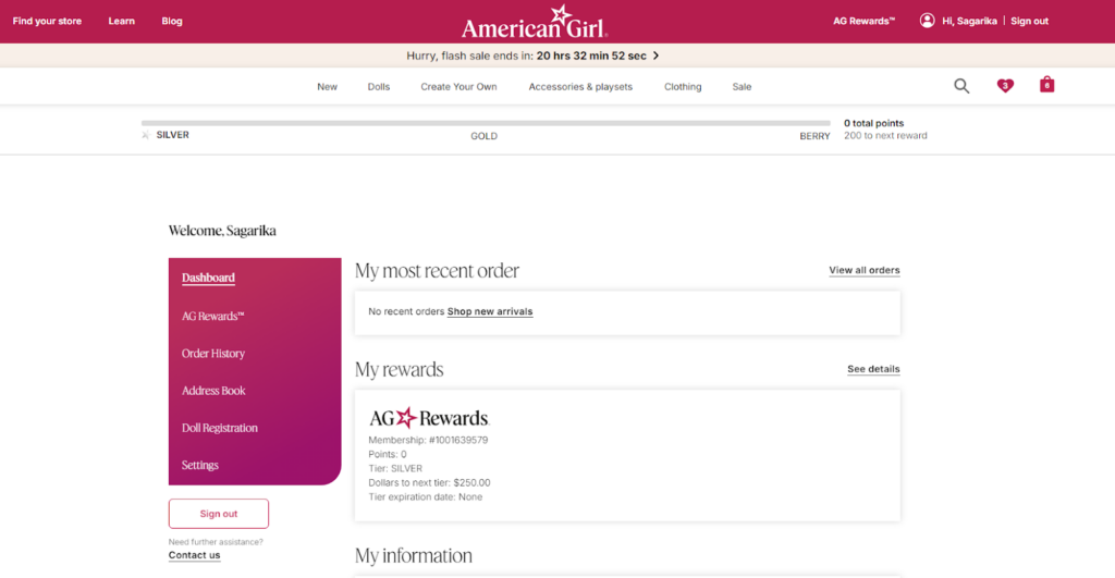
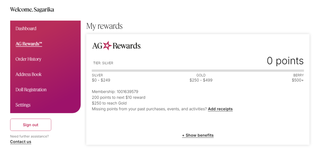
American Girl has created a custom dashboard that provides a personalized and engaging experience for their customers. The menu on the left side of the page provides easy access to different sections of the account, such as Dashboard, AG Rewards, Order History, Address Book, Doll Registration, and Settings. It also shows the customer’s most recent order and provides a link to view all orders.
Additionally, there’s a section dedicated to AG Rewards, where customers can see their points balance and tier status.
What I want you to see is the unique approach American Girl has to offer to their existing customers. It’s not like the other brands using the default templates available in Shopify. This attention to detail shows that American Girl wants to provide them with the best possible experience that ultimately boost customer retention and loyalty.
Actions to perform!
- Only collect essential information to avoid overwhelming customers.
- Consider providing rewards or benefits for creating an account.
- Create a personalized and engaging dashboard experience for logged-in customers.
- Allow customers to update their information and preferences easily.
19. Cart Reservation Timer
It’s a universal truth that the feeling of missing out (FOMO) is a powerful motivation for persuasion. That’s why eCommerce brands run flash sales campaigns.
American Girl has taken this concept a step further with their cart reservation timer.
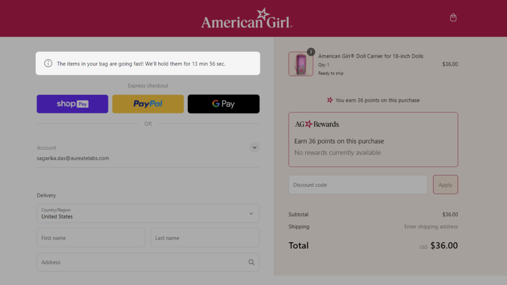
As you can see in the image, the timer shows that the items in your cart are going fast and will be held for a limited time. This psychological trick can be effective in preventing abandoned carts and increasing conversions.
Again this is important to notice that American Girl has customized their checkout page by adding many custom elements (including the cart urgency timer) as shown below:
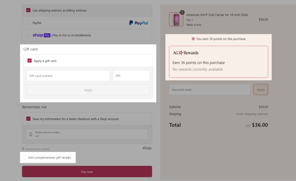
It’s a privilege for Shopify Plus merchants to be able to customize and personalize the checkout experience for their customers. If you’re wondering how you can also customize your default Shopify checkout page, here you go — 25 Use Cases For Shopify Plus Checkout Page Customization!
Actions to perform!
- Explain to customers why the timer is in place and what it means.
- Choose a time limit that is long enough for customers to complete their purchase but short enough to create a sense of urgency.
- A visual countdown timer can add to the sense of urgency.
- Think what would happen if the shoppers miss to complete the purchase within the time limit (American Girl shows “Items in your bag are not reserved, checkout now while they’re still available.”).
20. Sticky CTA Bar
Last, but my favorite — the element that every eCommerce website should have!
Here’s why sticky CTA bars are so important:
- They stay visible no matter where the customer scrolls, so they can’t be missed.
- They make it easy for customers to take action with a single click.
- They can help you increase conversions and sales.
The sticky CTA bar at the bottom of the page is a brilliant move by American Girl.
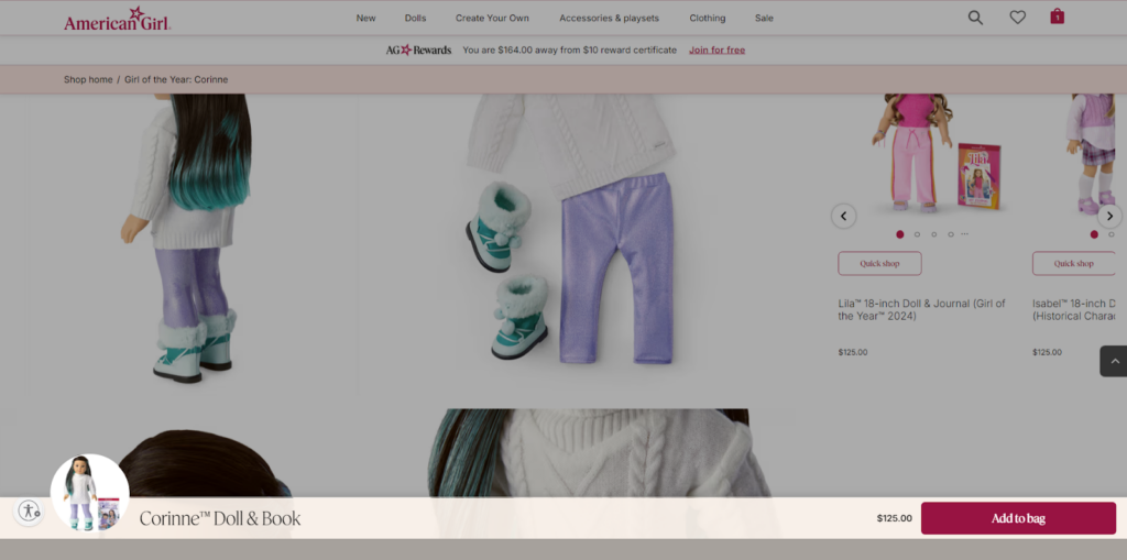
As you scroll the product page, this bar stays fixed at the bottom of the screen which makes it always visible and easy to click. With a CTA, it becomes a subtle nudge that encourages customers to take action without being too pushy.
Actions to perform!
- Place the sticky CTA either at the top or bottom of the product page.
- Include the product name (or image), price, or even the selected variant along with the CTA, to ensure shoppers have all the information right away and don’t need to scroll for the same.
Wrapping Up!
Up until now, we saw how the CRO strategies used by American Girl, helping them provide seamless customer experience and earn better revenue. While dissecting their CRO strategies, we also discovered areas that make their brand unique.
I hope the overall explanation has provided you with a clear idea on how well American Girl has strategized each element and how you can draw inspiration from it.
Key Takeaways for Shopify Plus Toy Stores!
To make all this information easily digestible, here are some key takeaway.
- Choose colors that evoke joy, excitement, and childhood wonder. 🎨
- Use storytelling to highlight the unique features and benefits of your products. 📖
- Make it easy for customers to find the toys they’re looking for. 🔍
- Encourage customers to create accounts for personalized experiences.😊
- Build excitement for upcoming events with a countdown timer. ⏰
- Never fear experimenting on new trends 📈
With that, my duty ends! Now, it’s your time to turn up your planning mode and experiment with CRO strategies that might work for your toy store.
Let me also remind you that CRO optimization requires a holistic approach and won’t be as easy as it seems. What might help is — CRO-focused UI/UX designing.
This is where Customer Experience (CX) is improved with a strategic design derived from personalized audits and user behaviour on your website.
If you’re unsure about implementation of these CRO strategies, you can Consult CRO Experts and get suggestions based on a personalized CRO audit of your eCommerce store.
Seems relieving, right?
Looking forward to hearing from you. 😊
Yes, you can explore our other CRO guides for different niches:


Post a Comment
Got a question? Have a feedback? Please feel free to leave your ideas, opinions, and questions in the comments section of our post! ❤️