5 Best Shopify Skincare Stores for UX Inspiration (2026)

Shopify is a top choice for online stores, with millions of merchants using it across many industries. If you’re looking for UX inspiration for a skincare brand, you’re in the right place. We’re highlighting five of the best Shopify skincare stores that excel at creating beautiful and user-friendly shopping experiences.
To see what makes these amazing stores stand out, let’s explore their design, user-friendliness, unique features, checkout experience, and more.
1. Meow Meow Tweet
Meow Meow Tweet is a quirky and eco-friendly skincare brand that emphasizes vegan, cruelty-free products. Their website is a fantastic example of excellent UX design on Shopify. It masterfully combines playful aesthetics with functionality.
Information about eco-friendly practices and compostable packaging is prominently featured, aligning with the brand’s values and resonating with environmentally conscious consumers.
Visual Design & Branding
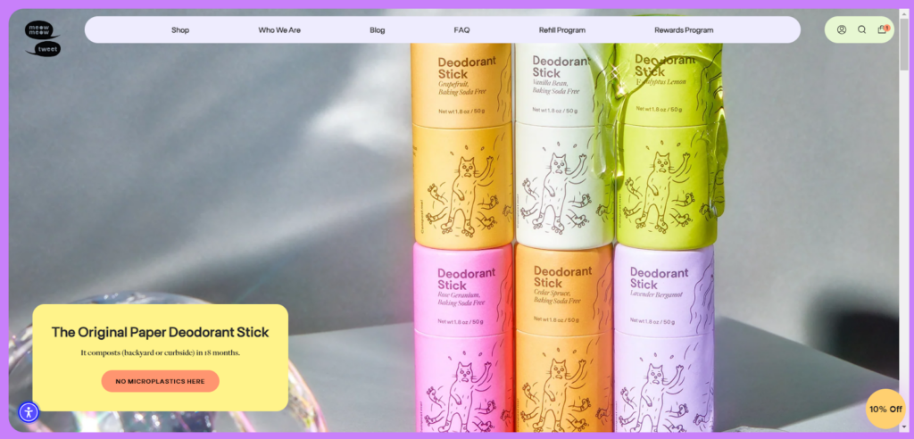
The homepage immediately grabs attention with its bright pastel color palette—yellows, greens, and soft purples—that sets a cheerful and inviting tone.

The minimalist elements reflect a playful nature brand across the site. This consistency helps reinforce the brand identity and create a memorable user experience.
Navigation & Interactivity
The navigation is intuitive and user-friendly. The top menu includes clear categories such as “Shop,” “Who We Are,” “Blog,” “FAQ,” “Refill Program,” and “Rewards Program.” Hovering over “Shop” reveals a dropdown menu with subcategories for different product types like “Deodorant Creams,” “Cleansers,” “Moisturizers,” and more, all neatly organized.
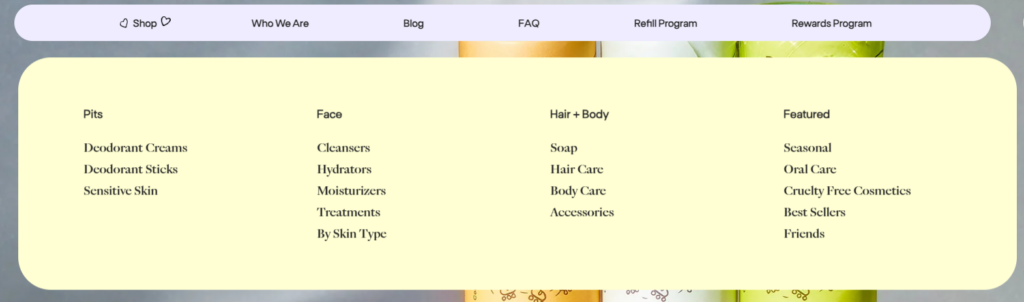
This dropdown menu features a light yellow background with clean, readable text, enhancing usability and ensuring users can easily find what they’re looking for.
Product Pages
Each product page is designed to be informative and visually appealing. High-resolution product images, product names, prices, and informative descriptions are presented in a clean layout, making it easy for users to understand the product. Users can quickly see the star rating and number of reviews, which boosts credibility and trust.
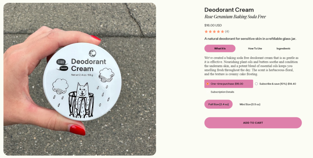
Below the primary product details, the page is divided into user-friendly sections like “What It Is,” “How to Use,” and “Ingredients.” These tabs keep the information organized and easily accessible without overwhelming the user.
Mobile Responsiveness
The website is fully optimized for mobile devices. Whether you’re browsing on a desktop, tablet, or smartphone, the design adapts beautifully while maintaining functionality and readability.
Checkout Process
The checkout process is straightforward. Users can easily view their cart, adjust quantities, and proceed to checkout with multiple secure payment options, including Shop Pay, PayPal, and G Pay.
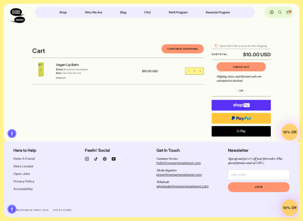
The clear calls to action and prominently displayed promotions, like free shipping and discounts, enhance the shopping experience.
2. Fenty Beauty
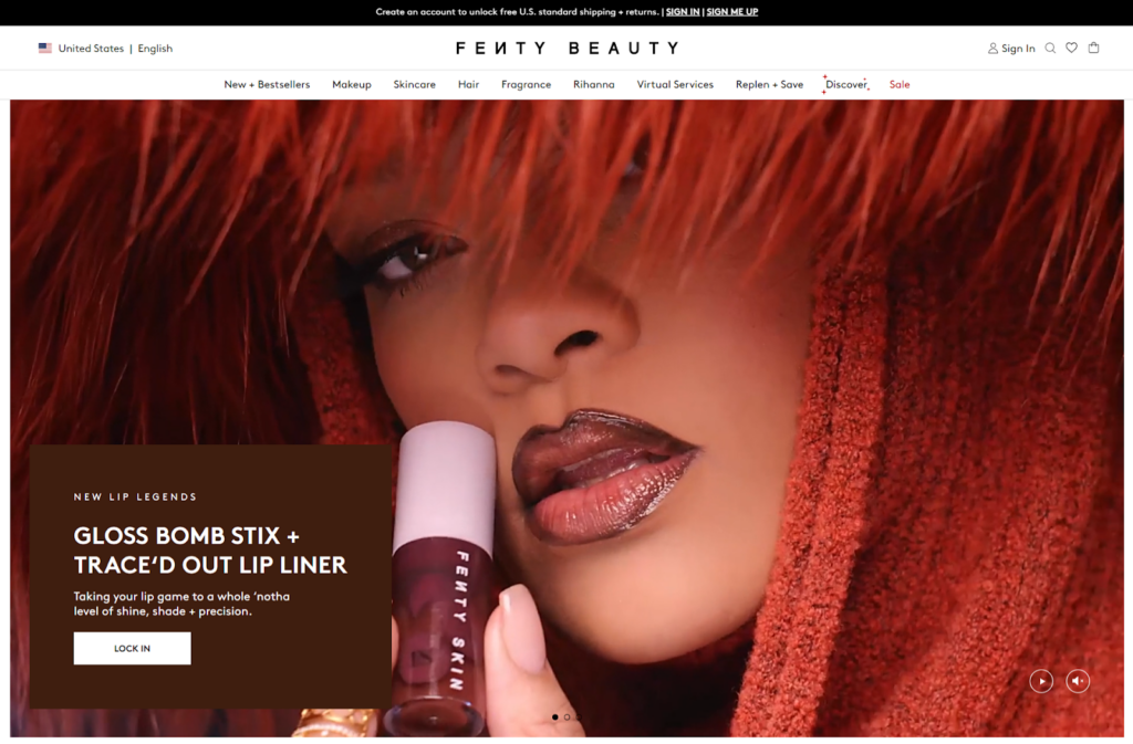
Fenty Beauty, founded by the globally renowned artist Rihanna, has redefined the beauty industry with its inclusive and innovative approach. The brand is known for its extensive range of beauty and skincare products. Its website is designed to be visually stunning and super easy to use. You can find what you need without any hassle.
Visual Design & Branding
The homepage of Fenty Beauty is a feast for the eyes, filled with soft pinks, nudes, and pastels. High-quality images and videos dominate the page, creating an immersive experience.

The branding is consistent, with every element, from fonts to color schemes, reinforcing Fenty Beauty’s luxurious identity. This design approach makes the site visually appealing and instantly recognizable as Fenty Beauty.
Navigation & Interactivity
The top navigation bar is clear and well-organized, featuring categories like “New,” “Best Sellers,” “Makeup,” “Skincare,” “Hair,” and more. The dropdown menus are designed with usability in mind.
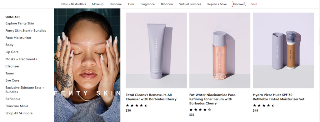
Each subcategory is clearly labeled, and some even include product images, providing a quick visual reference.
This site’s “Shade Finder” tool is a standout feature. It can help users find their perfect foundation shade through a simple quiz and virtual try-on options.
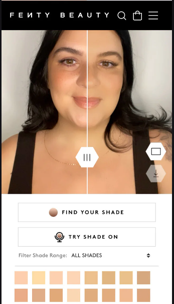
This tool enhances user engagement and gives a more personalized shopping experience.
Product Pages
Fenty Beauty’s product pages are a great example of detailed and user-friendly design. The product page features high-resolution images. There’s also a gallery on the left side that includes close-ups and application images, giving a comprehensive view of the product.
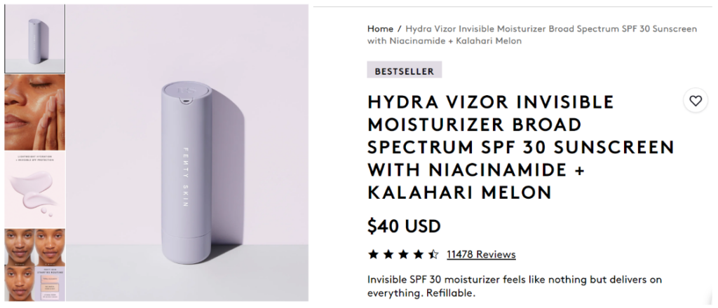
The main section includes the product name, price, and a concise yet informative description. Key features and benefits are highlighted with icons, making it easy to scan and understand at a glance.
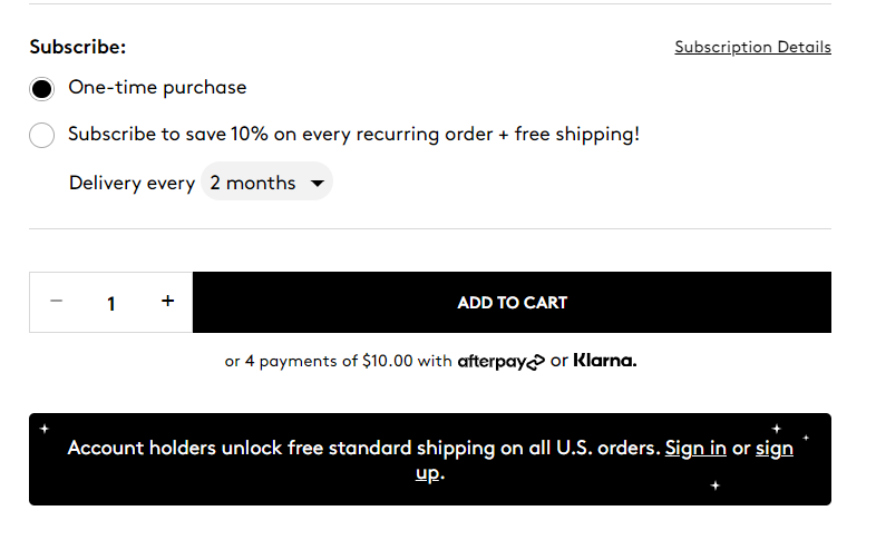
Options like one-time purchases or subscriptions, along with quantity selection, are user-friendly and straightforward. Clear call-to-action buttons like “Add to Cart” are prominently displayed.
Below the primary product information, there are detailed sections that expand upon various aspects of the product:
- Details: This section provides an in-depth description, benefits, and unique selling points.
- Ingredients: Both active and inactive ingredients are listed, complete with descriptions of key ingredients and their benefits.
- How To: Usage instructions are given to guide customers on how to best use the product.
- FAQs: Common questions of potential concerns are addressed.
- Earth-Conscious Details: Information about the product’s sustainability and eco-friendly aspects are highlighted.
User reviews are prominently displayed, including a rating summary and detailed customer feedback. This social proof helps build trust and credibility. Plus, there’s a section for related products or complementary items, encouraging additional purchases.
Mobile Responsiveness
Fenty Beauty’s website is designed to work beautifully on mobile devices. The layout adapts seamlessly to fit various screen sizes, and interactive features like the Shade Finder and product carousels work perfectly on mobile.
Checkout Process
Fenty Beauty’s checkout process is quick and simple. You can use express checkout options like Shop Pay and PayPal to make fast transactions. Just fill in your contact and delivery details, choose your shipping method, and select from various payment options like credit cards, Afterpay, and Klarna.
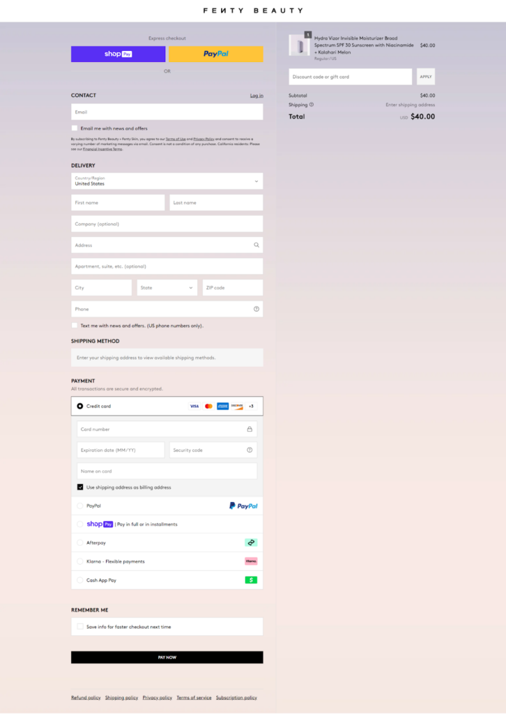
The order summary shows your items, discounts, and total cost clearly. Finish up by hitting the “Pay Now” button. It’s straightforward and easy to complete your purchase.
Read more: Fenty Beauty: CRO Inspiration for Skincare Brands [Shopify Plus]
3. Kylie Cosmetics
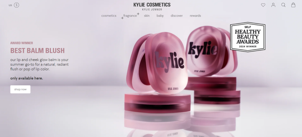
Kylie Cosmetics, founded by Kylie Jenner, has become one of the most successful beauty brands globally. Launched initially with the iconic Kylie Lip Kits, the brand quickly expanded to offer a full range of makeup and skincare products. Kylie Cosmetics’ website is designed to be visually appealing and highly functional, with a great user experience.
Visual Design & Branding
The website is drenched in soft pinks and whites, giving it a lush, sweet, and modern feel.

High-quality images and banners show off the latest collections and must-haves. The sleek fonts and clean layout make everything look polished and consistent, reflecting the brand’s luxurious vibe.
Navigation & Interactivity
The top navigation bar is clear and well-organized, featuring categories like “New,” “Best Sellers,” “Makeup,” “Skincare,” and “Baby.” Hover effects and drop-down menus make it easy to explore subcategories such as “Lip Oils,” “Cleansers,” and “Serums.”
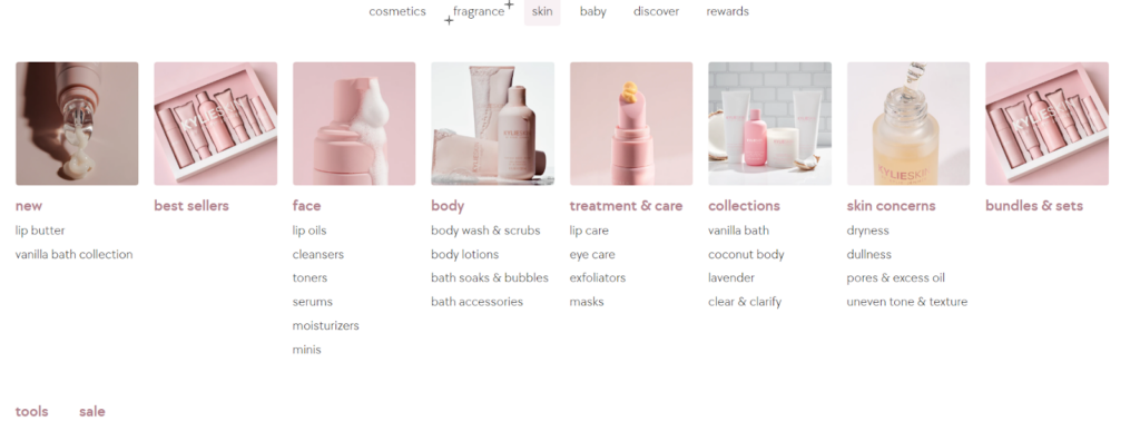
The homepage also includes interactive elements like product carousels and embedded videos, enhancing user engagement.
Product Pages
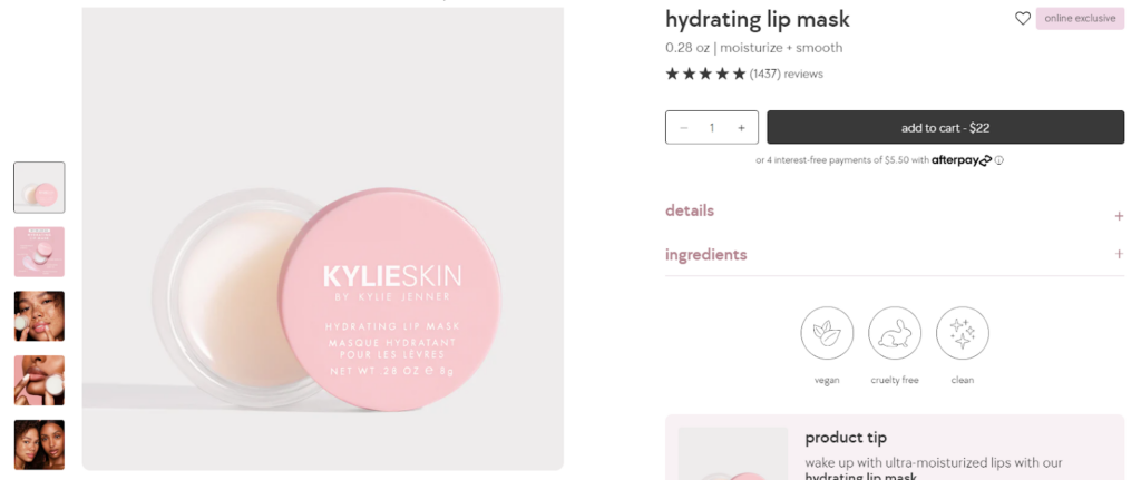
Kylie Cosmetics’ product pages are sleek and user-friendly. Here’s a closer look at what makes them effective:
- Multiple high-resolution images.
- Key benefits and ingredient lists.
- Star ratings and detailed feedback from customers.
- Sections like “How to Use” and “Real Results” with practical guidance and before-and-after photos.
- Consistent color scheme and well-organized information.
- The “You May Also Like” section suggests complementary items.
Mobile Responsiveness
Kylie Cosmetics’ website is fully optimized for mobile use. The layout adjusts seamlessly to different screen sizes, maintaining a smooth browsing experience. Touch-friendly navigation and quick-loading images ensure that users can easily explore products and complete purchases on mobile devices without any hassle.
Checkout Process
The checkout process is straightforward and user-friendly. Express options like Shop Pay, PayPal, and Google Pay allow for quick transactions. Contact and shipping forms are easy to fill out, and multiple payment methods are available.
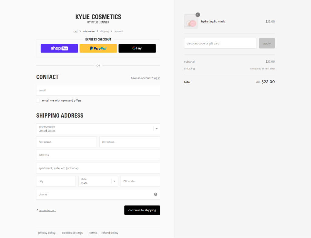
An order summary clearly displays item details and total costs, ensuring transparency before finalizing the purchase. This setup makes for a fast and secure checkout experience.
4. Kopari Beauty
Kopari Beauty, founded in 2015 by Gigi Goldman and Kiana Cabell, is renowned for its clean, coconut-based beauty products. The brand emphasizes natural beauty with a commitment to using 100% organic, sustainably sourced coconut oil. Kopari’s products range from skincare and body care to personal hygiene, all designed to nourish and protect the skin while promoting sustainability and ethical sourcing practices.
Visual Design & Branding
The homepage uses a clean and modern design with a soothing color palette dominated by aqua blues, light beige, and whites, reflecting the brand’s emphasis on clean and natural beauty.

Navigation & Interactivity
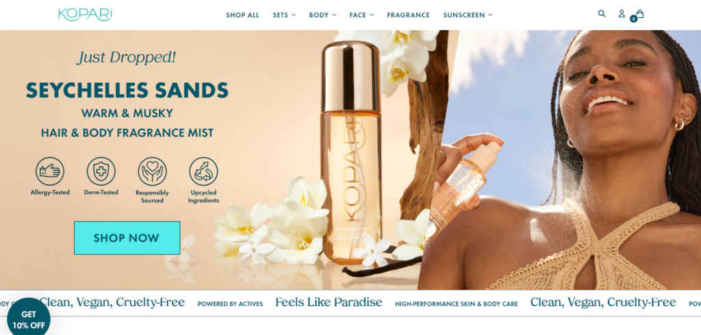
At the top, the navigation bar is neatly organized with categories like “Shop All,” “Sets,” “Face,” “Body,” “Fragrance,” and “Sunscreen.” Hover over these categories, and you get dropdown menus with subcategories for easy access to specific products. Interactive features like product carousels and trending video clips keep things lively and engaging.
Right at the top, there’s a big banner showcasing the latest product launch with a clear “Shop Now” button encouraging exploration.
Product Pages
Kopari Beauty’s product pages are a delight to navigate. They’re packed with useful details while still looking clean and inviting. You’ll find high-quality images including how it looks when used.
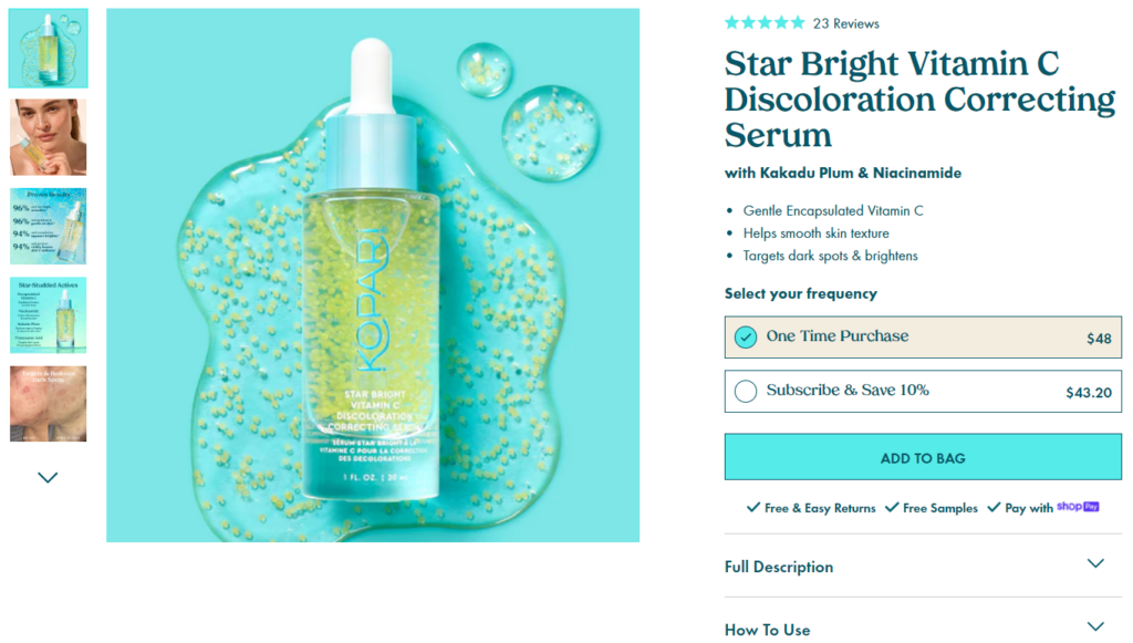
Detailed descriptions give you the lowdown on the key benefits and ingredients, so you know exactly what you’re getting. Practical info on how to use the product and a full list of ingredients is also neatly organized.
User reviews and elements like the “Pairs Well With” section suggest other products that go well with what you’re viewing, making it fun to explore more.
Mobile Responsiveness
Kopari Beauty’s website looks and works great on mobile devices. The layout adapts smoothly to any screen size. Images load quickly and maintain their high quality, making the mobile experience just as enjoyable as on a desktop.
Checkout Process
The checkout process on Kopari Beauty’s site is straightforward and hassle-free. You can use express options like Shop Pay, PayPal, and Google Pay for quick transactions. Filling in your contact and shipping details is simple, with clear forms. Multiple payment methods are available, including credit cards, PayPal, and Afterpay, giving you plenty of choices.
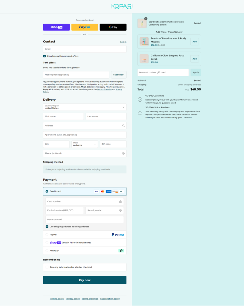
The order summary keeps you informed about your items and total cost, ensuring transparency before you complete the purchase. Overall, it’s a secure and easy process that makes online shopping a pleasure.
5. Pixi
Pixi Beauty, founded by Petra Strand over 20 years ago in London, has gained a loyal following for its skin-loving products. Petra, with her extensive experience as a makeup artist and product developer, creates formulations that combine botanicals with beneficial ingredients. Pixi Beauty’s website is vibrant, user-friendly, and designed to draw the user’s attention.
Visual Design & Branding
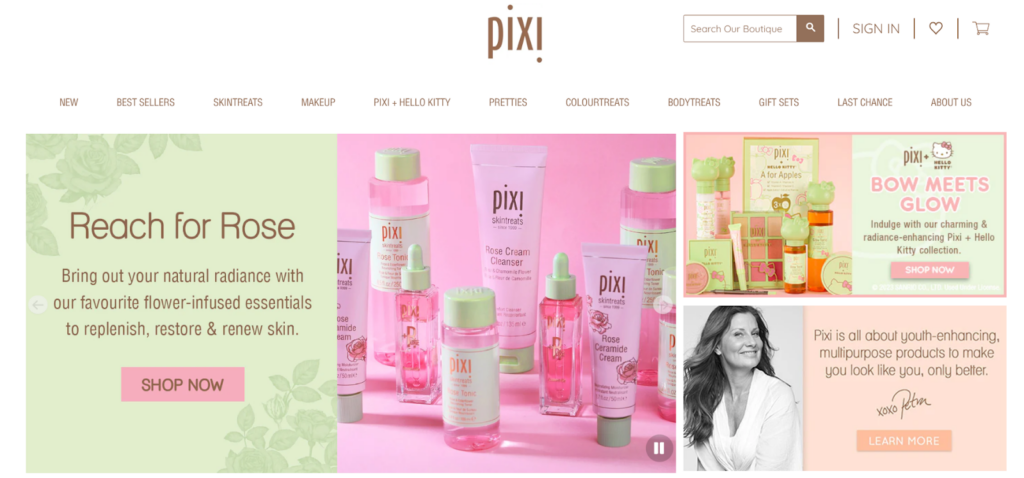
Pixi Beauty’s homepage greets you with fresh pastel pink & green color palettes and elegant typography. The design is clean and modern, perfectly aligning with Pixi’s focus on gentle ingredients and youthful glow.

Navigation & Interactivity
Right at the top, there’s a prominent banner featuring the latest products or promotions. This section includes a clear call-to-action button, encouraging users to explore new offerings.
Sections like “Petra’s Picks for You” and “Most Loved of the Moment” highlight popular and recommended products. These areas use high-quality images and brief descriptions with easy access to more information and purchase options.
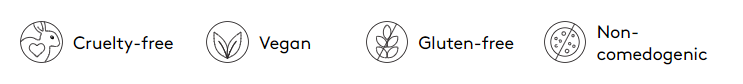
Scrolling down, you’ll see “The Pixi Promise” section. Here, they showcase their commitment to cruelty-free, multipurpose products.

Icons represent their core values like being cruelty-free, skin-loving, and using quality ingredients. It’s a reassuring touch that builds trust and aligns with their brand values.
Product Pages
On Pixi Beauty’s product page, you’re greeted with high-quality images of the product, accompanied by a brief, informative description. This gives you a quick look at the product’s key benefits. The reward points system is prominently displayed, reminding you of the perks of shopping with Pixi.
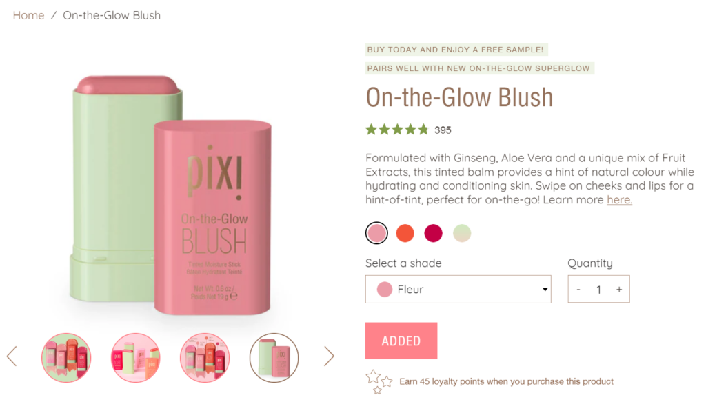
The layout is clean, with expandable tabs for details, how to use, and ingredients, keeping everything organized and easy to find. Interactive sections like “Complete Your Look” and “People Also Bought” suggest additional products, encouraging you to explore more.
Mobile Responsiveness
Pixi’s site adapts well to smaller screens, maintaining its clean and organized layout. Navigation is straightforward with a collapsible menu that makes it easy to explore different product categories. The images and text resize appropriately, ensuring readability without overwhelming the user.
Checkout Process
The checkout page is designed to be simple and efficient, guiding users through the process. A progress bar at the top shows the steps (Cart, Information, Shipping, Payment), providing a clear visual of where you are in the checkout process.
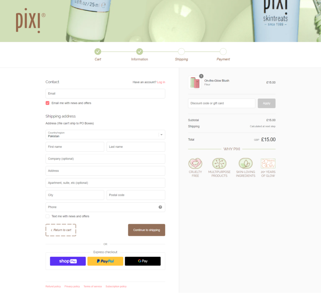
Starting with contact and shipping information, the layout is clear, and the fields are easy to fill out. Express checkout options like Shop Pay, PayPal, and Google Pay are prominently displayed for quick payments. Overall, the checkout process results in a positive end-to-end shopping experience.
Bottom Line
A well-designed store is more than just aesthetics; it’s a strategic tool that can improve the user experience, build brand loyalty, and increase conversions. These Shopify skincare stores are a great source of inspiration for creating an amazing shopping experience.
We hope you found this blog helpful. You can use their ideas to build a better store. If you need further help, check out our Shopify development services. Let’s build something amazing together!


Post a Comment
Got a question? Have a feedback? Please feel free to leave your ideas, opinions, and questions in the comments section of our post! ❤️