Top 10 Proven Ways to Reduce Shopping Cart Abandonment Rate

If you ask any eCommerce business store owner, one thing that keeps them all up all night in stress is the high shopping cart abandonment rate.
As a user, we all have done this at one time or the other! We visit a store, check a few products on the store, add them to the cart, and forget about it!
The issue of cart abandonment rate is so common that almost 7 out of 10 shoppers abandon their cart resulting in $18 billion of annual loss for an average eCommerce store.
This can be the most painful situation for any eCommerce business regardless of their scale.
Sometimes the reasons to abandon a cart can be obvious human behavior like window shopping and comparing products at multiple stores.
Other times, it can also be because of customer journey flows on your store – which can be easily solved with conversion-focused UI/UX designing.
The good news is for every problem, there’s a solution.
As we have helped many store owners reduce their shopping cart abandonment rate and boost conversions, we decided to document the strategies that have worked for us again and again.
In this comprehensive guide, we have covered everything starting from –
- what cart abandonment is,
- how common it is,
- why do shoppers leave their carts in between,
- how it hurts your business, and
- what you can do to reduce the shopping cart abandonment rate.
So, let’s get started without any further delay!
What is Shopping Cart abandonment?
Shopping cart abandonment is when a user visits your online store, adds some products to their cart, and leaves the store/website without buying anything.
Imagine this, a customer lands on your store by searching for you on Google or by clicking on your ad and adds some products to their cart but doesn’t complete the purchase. That’s the phenomenon of cart abandonment.
What’s the Average Cart Abandonment Rate?
The average cart abandonment rate is 70.19%. However, this average may differ from industry to industry.
You can calculate your store’s cart abandonment rate by using the given formula:
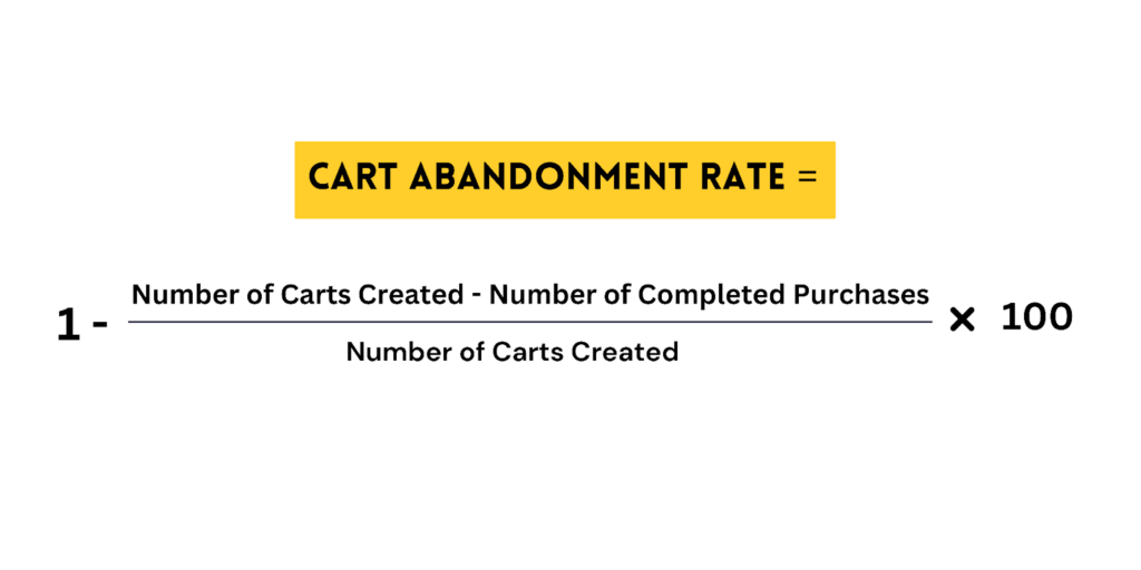
To understand the formula of cart abandonment rate even better, let’s take the example of a store. The store attracts 3000 new users every week. Out of those 3000, 1000 add products to their carts and only 400 make a purchase.
Applying the above formula, the cart abandonment rate would be 60%!
So you now know how to calculate the cart abandonment rate of your store, but have you ever thought about why shoppers leave in between their checkout process? Let’s find out that in the next section.
Why Users Abandon Their Cart – Common Reasons
There are many reasons why shoppers may decide to abandon their carts. The most common reason is window shopping and comparing products at multiple stores. However, there are many more reasons that make shoppers abandon their carts.
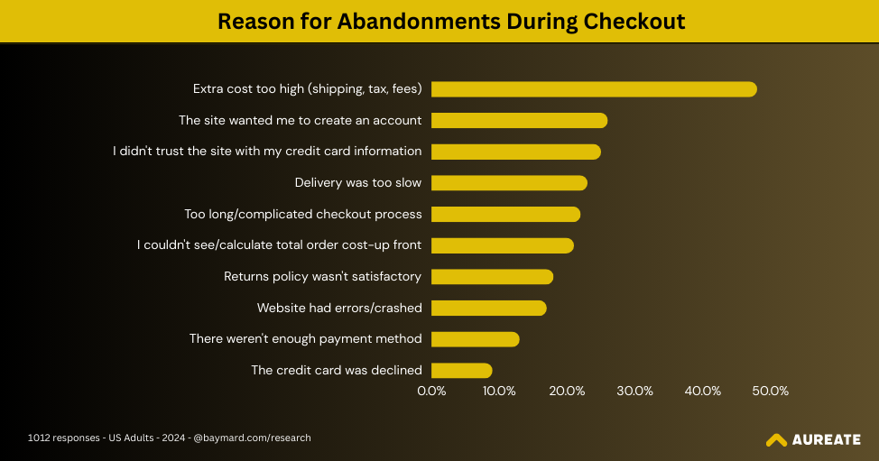
- Unexpected costs like high shipping fees and taxes or additional charges – 48%
- The site wanted me to create an account – 26%
- I didn’t trust the site with my credit card information – 25%
- Delivery was too slow – 23%
- Too long/complicated checkout process – 22%
- I couldn’t see/calculate total order cost up-front – 21%
- The return policy wasn’t satisfactory – 18%
- Website had errors/crashed – 17%
- There weren’t enough payment methods – 13%
- The credit card was declined – 9%
When your eCommerce store has any of these factors present, it increases the cart abandonment rate, impacting the profitability of your business.
Do you know exactly how it happens? Let’s have a look at it!
How Cart Abandonment Disturbs Your eCommerce Store Growth?

There are mainly two ways in which your eCommerce store growth gets affected due to high shopping cart abandonment:
1. Higher Marketing and Customer Acquisition Cost
Now let’s again go back to the example we looked at where 3000 people land at your store every week. Now, when a huge chunk of these shoppers don’t buy from your store, it hampers your returns on investments in many ways.
And the first way it affects your profitability is by increasing the cost of customer acquisition. Let’s suppose you are spending $1000 to bring in these 3000 shoppers to your store and only 400 are buying products from you. In this case, your CAC would be $2.5.
However, if the shopping cart abandonment rate increases and only 200 people buy from your store, your CAC would increase to $5. If your store has higher customer acquisition costs, implement these tips to lower your customer acquisition rate.
2. Disturbed Inventory Judgements and Lost Revenue
Another way cart abandonment affects your eCommerce growth is by directly impacting your judgments and management of inventories.
Let’s have one more example. You have 10 shoes in your stock and 5 of them are in the carts. Technically, you haven’t sold those shoes yet but in your inventory, it shows only 5 items left.
Now when you have to plan your next manufacturing or buying cycle, you can’t exactly judge how much you need to produce/buy to keep your inventory at optimal levels.
Not only that, if more 5 shoppers want to buy the same products, they can’t do it as they are already added to the cart by other shoppers.
And if the first set of shoppers who have added products to their cart don’t buy, you lose two times; first – you lose the potential revenue from that cart and second, you lose the opportunity to sell to genuine buyers.
But like they say, there’s a solution for every problem and so it is for high shopping cart abandonment too. Let’s find that out in the upcoming section.
10 Ways to Reduce Shopping Cart Abandonment
Reducing shopping cart abandonment is not as hard as you think, especially when you have the right strategies in place like having effective shopping cart UX optimization and others as mentioned below:
- Analyzing shoppers’ behaviour on the website
- Being transparent about the shipping and extra costs
- Implementing exit-intent popups
- Focusing on a mobile-first approach
- Optimizing the checkout page process
- Offering free shipping
- Accepting multiple payment options
- Building trust with social proof
- Encouraging purchases by showing savings
Let’s have a look at each strategy in detail.
1. Analyzing Shoppers’ Behaviour on the Website:
One of the most amazing keys you have to unlock the mystery of a high shopping cart abandonment rate is having a thorough look at how shoppers are interacting with your website.
And to trace their footprints, you can tap into the hidden gems of Google’s Advanced E-commerce Analytics.
Ask yourself these questions to figure out where and why your shoppers are abandoning the carts:
- At what stage (and pages), are users dropping the most? Is it a product page, cart page, shipping page, or payment page? Many times shoppers abandon the cart after finding the final amount of the products.
- What’s the product view to cart add ratio? Are users checking the products again after adding them to the cart? If yes, where they are clicking the most, and what’s stopping them from moving further?
- How many times do they return the cart before finally buying the product? If they are not returning to the cart again, you need to use strategies that make them visit the cart page.
- Which device type has the higher shopping cart abandonment? This will give you an idea of where users are facing challenges the most.
- Is the user checking more pages after adding products to the cart or leaving the store immediately? This will give you an idea if they are looking for more similar products and the lack of it has led to abandonment.
- Are users removing items from their carts or encountering issues when applying coupons? How often is this happening? This will help you check if it is these experiences that are resulting in cart abandonment.
Based on the observations and answers you get by asking these questions to yourself (or discussing this with your eCommerce consultancy partner), you can make changes to your UI/UX design keeping the user journey in mind.
So let’s say while analyzing your shoppers’ behaviour on the site, you found that most of them are abandoning the cart after coming to the payment page – and that’s what gives you your next clue to reduce the shopping cart abandonment rate.
2. Be Transparent About Upcoming Costs
48% of the shoppers abandon their carts due to high unexpected costs like high shipping fees and taxes or additional charges.
This gives you a clear idea that they hadn’t had the idea of full pricing and this surprise element of additional cost has made them abandon their favorite products in between.
The best way to solve this issue and reduce the shopping cart abandonment rate is by being transparent about the pricing from the beginning.
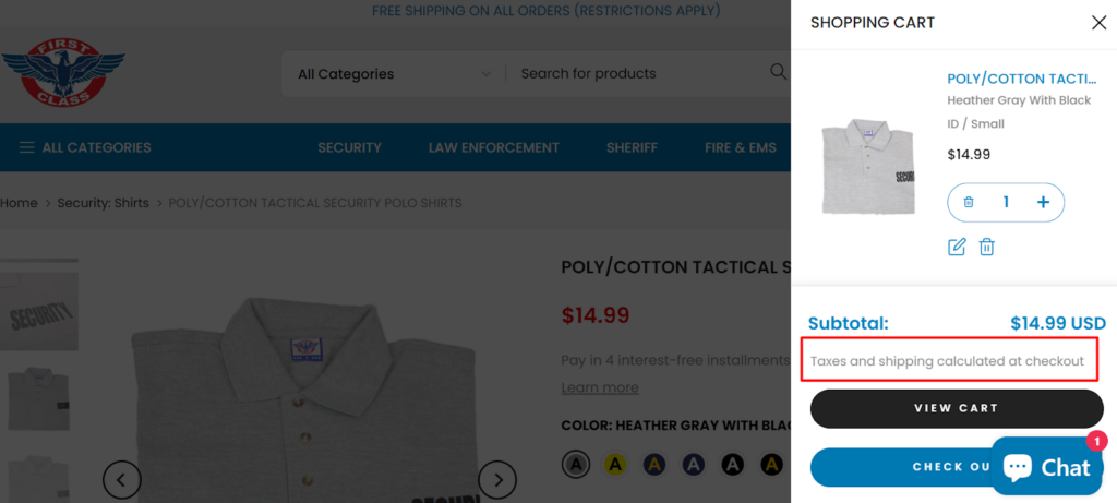
So for example, if you charge additional for shipping, you can have a clear section on the product page that lets users know about upcoming extra costs.
We recently worked with this client who are manufacturer and reseller of uniforms and accessories for security officers and law enforcement. They have clearly mentioned the additional cost of shipping and taxes on the cart page itself so that it doesn’t come as a surprise when the user goes to the checkout page.
Other than analyzing shoppers’ behaviour and being transparent about your costs, you can also reduce the shopping cart abandonment rate by having exit-intent popups in your store.
3. Implementing exit-intent popups
I’m sure, it has been with you when you are about to leave a website or an online store, you are presented with a nice offer that you can’t resist but move forward with your buying journey and maybe feel guilty about it later!
But this is a very effective strategy that you can use to tap into the right nerve of your shoppers and give them more reasons to buy from your store.
So let’s say you see that most of your users are visiting the product pages again and again but not buying the product, you can implement behavior-based exit-intent pop-ups where if a user is visiting the same page more than three or four times, you show them a banner that has so compelling copy that drives them to add product in the cart and buy immediately.
You can have multiple exit-intent popups for multiple pages/areas of the website. Think one for a home page, category pages, location pages, product pages, cart pages, and payment pages.
By experimenting with a good amount of popups, and implementing A/B testing, you can double down on the strategies that are working for you.
Two important points to keep in mind while using popups on your site –
💡Don’t overuse it. It may irritate your users and they may leave the website immediately.
💡Make it visible and easy for users to dismiss the popup to continue their shopping journey.
So now you know how to make your popups mobile-friendly but is it all to reduce shopping cart abandonment? No!
You need to shift your whole focus to a mobile-first approach as discussed in the next para.
4. Focus on Mobile-first Approach
While we were working with one of our clients, we figured out that their store had the highest shopping cart abandonment from mobile devices and there’s no wonder why!
According to the Baymard Institute, around 70% of mobile shoppers abandon their carts.
But why? Despite we all know that the amount of the population that has access to mobile is increasing, sometimes we tend to overlook the simplicity and effortlessness it requires to build a store for Android and iOS devices.
While designing a store for mobile devices, keep these points in mind –
- Make all your pages load as fast as possible. One second of delay and you lose their attention.
- Ensure web core vitals are in place to optimize your store’s smooth performance across devices. You can check this with your eCommerce technical partners.
- Provide an “undo” feature because due to the small screen, users may press some buttons by mistake.
- Make it easy to switch between pages where users don’t have to go “back” again and again.
- Have navigation that is flawless to experience even on smaller screens. Think of the Hamburger menu.
- Design your pages in a way where it’s easy to access even with one thumb.
When you implement these changes, you will automatically see that more and more users are moving up in their journey toward the checkout page because everything feels smooth and easy on mobile devices.
However, the journey doesn’t end here! This is where it actually starts – the checkout page – the most important page on your store. Let’s find out how eCommerce checkout page optimization can help you reduce shopping cart abandonment rates.
5. Optimize Your Checkout Process

Think of the checkout page as a dead end. Not quite literally – but technically you should design it that way. What do we mean by that?
It means that once a user reaches the checkout page – they shouldn’t be distracted by any other pages or aspects of the store but his focus should be driven towards buying the products.
Based on our experience designing multiple checkout page experiences, here are some recommendations that can help you reduce shopping cart abandonment in your store:
- Make it a two-click process. Or the minimum number of clicks you can make it. Ask only the information that is SUPER IMPORTANT to make the transaction.
- Don’t try to upsell or cross-sell at the time of checkout in a way where users need to leave their carts. This may distract the user from their original intent and they may abandon the cart if something doesn’t fit their basket.
- Use already saved information to speed up the checkout process and save users time. This information includes their basic information like name, shipping address, billing address, and credit card information.
- Show the progress bar so the user doesn’t leave the process in between. Don’t keep your checkout page too lengthy and messy. Use a collapsed menu to keep it clutter-free.
- Highlight the wrong or incorrect information field with red highlights. So the users know why they can’t move ahead with the process. Don’t complicate the process at all.
- Enable autofill of OTPs, codes, and common fields. Let your shoppers spend time when it’s required and not where it can be saved.
- Apply relevant offers and coupon codes automatically and make it easier to add and remove items from the carts with “+” and “-” buttons.
- Integrate digital wallets to enable “one-tap” payments. Make it possible to view and edit carts while shoppers browse other pages.
- Highlight essential information like total amount, promotions, and estimated delivery time upfront.
Zara is a good example to take inspiration for your checkout process. If you look at their checkout page, you will see that they have only five to six fields to fill for a user to make a purchase.
Plus, they have added the predictive search functionality for users to easily add their precise location.
Lastly, they have also added the total amount of bills at the end so the user knows how much exactly they are getting charged for the items they have added to the cart.
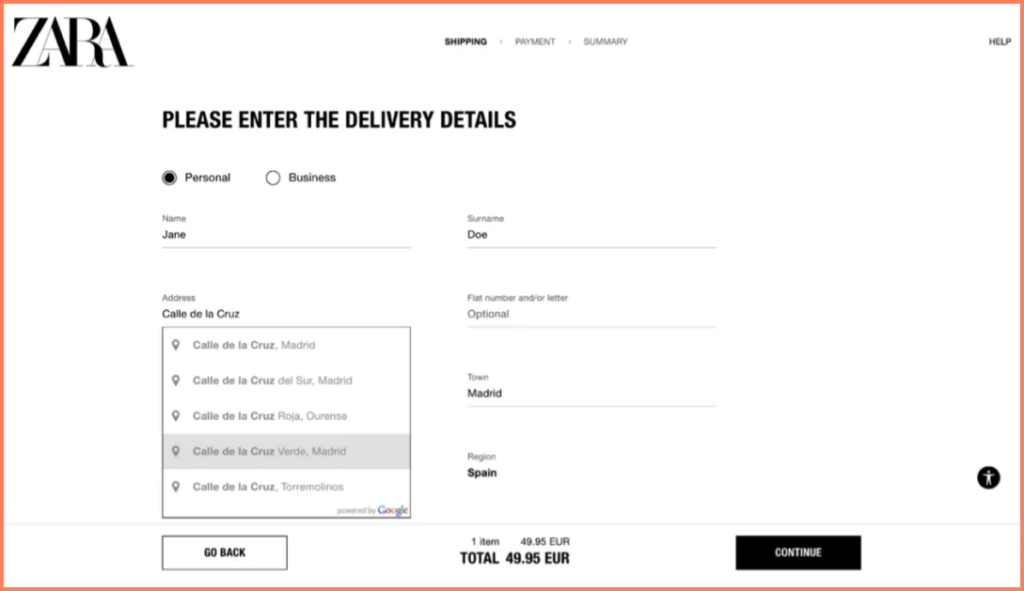
If you have built your store on Shopify One, implement these strategies to skyrocket your sales.
But what if you have a good checkout page and still have a high shopping cart abandonment rate? Let’s find out what can be the other possibilities for this strange shoppers’ behaviour.
6. Allow Guest Checkout
Sometimes all the strategies that we just talked about optimizing the checkout page may not work. Not because they are not effective, but because 26% of the shoppers don’t prefer to make an account!
That’s almost ¼ of all the people who want to make a purchase. By simply allowing your users to checkout as guests, you can reduce the shopping cart abandonment rate to a great extent.
With guest checkout, customers don’t need to give too much of their personal details like names, phone numbers, emails, and credit cards to make a purchase.
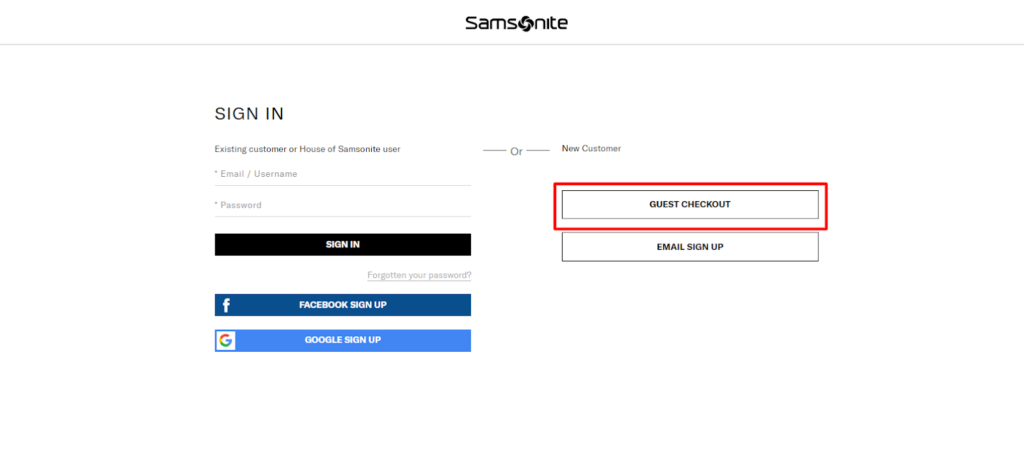
As you can see in the example above, one of our clients, Samsonite has enabled this functionality for their shoppers where they have to give minimum details to make the purchase and don’t need to register themselves on the site.
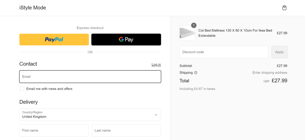
Moreover, other than guest checkout, you can also offer your shoppers an express checkout option where they can complete the payment with popular platforms like Google Pay or PayPal to save time in filling the card details manually.
After providing the facility of guest checkout, if you want to add the cherry on the cake? Offer them free shipping!
7. Offer Free Shipping
Almost 70% of shoppers prefer free shipping over paying extra for delivery.
Keeping this significant customer preference in mind, it becomes very important for you to find a sweet spot where it’s a win-win situation for you and your customers.
Take the example of Amazon. They provide free shipping on holiday specials and festive offers and this helps them attract a major share of the customers.
So, if you are planning to reduce the shopping cart abandonment rate by offering free shipping, here are some practices you can follow:
- Offer free delivery for standard shipping but charge more for express deliveries.
- Set a threshold or minimum order value to avail of free shipping
- Provide an option to use low-cost carriers and offer free shipping if the customer chooses to go for them
Though free shipping is a great motivation for shoppers to complete their purchases, they may need to abandon their cart if they have limited payment options and this brings us to our next point –
8. Accept Several Payment Options
Imagine you got it all – your favorite products, quick checkout, and free delivery too! You have almost bought the product but….
You don’t see your preferred payment method! Such a big loss – to you and the eCommerce store that had you almost complete the purchase – impacting important eCommerce metrics such as abandonment rates/checkout rate, customer acquisition cost, sales conversion rates, and store sales.
There was a time when the credit card was the only option to make payments during checkout and it was popular too. But today, the times have changed and shoppers are looking for more and more options to make their purchases.
Have all the popular digital wallets integrated like Google Pay, Apple Pay, PayPal, and Stripe to reduce shopping cart abandonment in your store.
Recently, we worked on a project that deals with the fashion industry and they wanted to provide robust and multiple payment options to their customers.
As you can see, we helped them integrate options like paying with UPI, wallet, EMI, Cards, Netbanking, and Cash on Delivery (COD) so the customer doesn’t get any chance to abandon their cart.
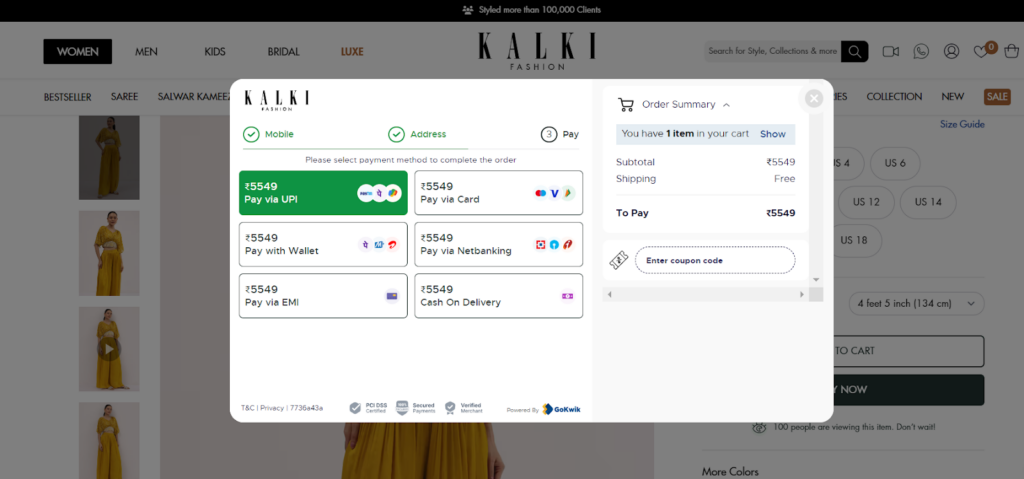
When we talk about money and payment, it’s all about building trust with the customers and providing them secure payment options but is that all it takes to build trust?
No! There is one more way to build trust with your customers and it’s through social proofs!
9. Build their Trust With Social Proof

Have you been in a situation where liked the product, you loved the features and you loved the pricing but there’s something missing to it? You can’t pinpoint it exactly but you feel a little hesitant to buy the product?
The higher the chances it is because of lack of social proof present to you. Being social creatures, we trust and want validation of our choices from other people! When we see other people loving the product, it reduces the chances of shopping cart abandonment.
You can win the trust of your customers by incorporating these aspects on your product description pages (PDP):
- Client Testimonials,
- Online Ratings,
- Behind the Scenes,
- User Generated Content,
- Social Media Presence.
When shoppers see genuine high ratings and reviews on your store, it makes them buy the product instantly without having double thoughts about their decision.
Look how Cluse, a watch brand, has incorporated user-generated content on their store to win the hearts of their customers.

Other than social proof on your site, you can also have trust badges on your store to give a sense of security to your customers.
According to data, 61% of the people, don’t make a purchase if they don’t see the trust badges on the website. That’s a huge number. And it’s not just any random logos but seeing trusted logos – because 75% of the shoppers didn’t make a purchase when they didn’t see a popular trust logo.
So for you to make sure that customers don’t abandon their cart, it’s highly recommended to place trust logos on your home page, product detail page, and checkout pages.

Based on Baymard Institute research, these are the most popular trust logos:
- The Norton seal
- The McAfee seal
- PayPal
- Better Business Bureau
- GeoTrust
- VISA
- Mastercard
- American Express
10. Show Total Savings at Checkout
Want to know one more strategy that can probably beat all the strategies that we have talked about so far? It’s showing your customers how much they are saving by making the purchase.
For example, if there’s a new user with a discount code on your store, you can highlight the deducted amount from their final pricing to show them how much they are saving on the purchase.
Not just the new customers, you can do the same for existing clients by offering them time-sensitive offers at the checkout page that save them extra bucks.
We are sure implementing these strategies to reduce cart abandonment rates will surely help you get higher conversion rates.
However, due to external distractions, some users may abandon the cart and that doesn’t mean you should lose hope because of that.
There are two subtle and impactful ways in which you can bring those users back to the website to complete their purchase. Let’s explore them in the following section.
How to Optimize Shopping Cart Abandonment Rate? 2 Ways to Bring Back Users

Bringing back customers who have abandoned carts is not as tough as you may think. There are many strategies for abandonment cart recovery, but here are the two most effective ones.
- Personalized Follow-up on Emails and WhatsApp
What’s the first notification that you get as soon as you leave the store without buying? The reminder email with nice, creative, and compelling messaging, right?
A few years back, this used to happen only on emails but as more and more people are becoming active on WhatsApp, eCommerce businesses are changing how they communicate with their customers.
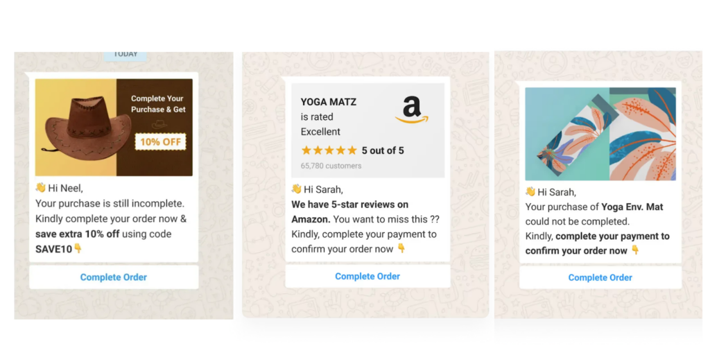
If you look at the way brands have kept their messaging short and to the point with a clear call to action button, it’s very easy for users to recall what they have forgotten in their carts.
Simple and subtle elements like the images of the products they have left in the cart combined with offers and online ratings encourage users to complete their purchase.
Here’s how you can make your shopping cart abandonment messages impactful –
- Highlight the abandoned items with their respective images and videos so users can recall what they’ve left behind
- Give personalized offers such as birthday special (if their birthday is nearby), discounts on completing the 2nd or 3rd order (whatever their order number is), and some amount discount for making an immediate purchase
- Show online ratings and reviews by customers for that product to show its credibility and popularity
- In the end, give a CTA with a direct link to the products they have added to the cart to make it easier for people to buy in one click

The above example of cart abandonment follow-up email is a perfect example of how you can capture the attention of your users and urge them to buy the product in their carts.
Moreover, as shown in the example, you can create a sense of urgency and FOMO by showing the limited stocks of the product.
However, keep in mind that there’s a difference between personalization and customization in eCommerce.
- Retargeting Ads
The game doesn’t stop at personalized cart reminders. As soon as you leave the products in your cart, we are sure, you see so many ads of the same brand all across your social media accounts and in multiple formats – that’s the power of retargeting ads.
You can use cookies-based targeting with advanced programming that displays the exact same product that the customer has added to their basket. The more and more time a customer sees your ad, it increases the chances of brand recall and reduces shopping cart abandonment. This is especially effective for shoppers who tend to compare multiple products before buying.
Finding an agency that can help you implement these strategies and help you get more sales on Shopify store is the sure shot way to reduce cart abandonment rate and get better ROI but how exactly?
Reduce the Shopping Cart Abandonment Rate and Increase ROI
Working with more than 100 clients now, we are sure implementing these strategies will not only reduce shopping cart abandonment in your store but will also bring back customers who have abandoned their carts, helping you improve your recovery rate and get better returns on your investments.
Once you figure out what’s working best for your store, you just need to double down on that!
However, while you execute these strategies, you may find yourself stuck in some technical aspects like enabling exit-intent popups or ensuring the robust performance of your website.
Or it could be making your website mobile-friendly while optimizing your checkout process; whatever the requirement is – Aureate Labs is always here to be your partner in your growth journey.
We’ve helped many eCommerce businesses grow by not only making their online business but generating revenue for them! You can have a look at our portfolio to see the work we have done in the past and get in touch with our team to discuss your requirements.
FAQs – Reducing Shopping Cart Abandonment Rate
How to reduce the shopping cart abandonment rate?
The best way to reduce shopping cart abandonment includes transparency of shipping and extra costs, implementing exit-intent popups, a mobile-first approach, a smooth checkout page experience, free shipping, multiple payment options, social proof, and highlighting savings.
How do you fix cart abandonment?
To fix the cart abandonment use strategies like highlighting return policy or bringing back customers to your store with retargeting campaigns. Also, consider optimizing your abandonment cart emails if they aren’t getting you the desired results!
What is the abandonment rate of shopping carts?
The abandonment rate varies across industries from 56% to 81% – however, the average documented rate is 70%!
What is a good cart abandonment recovery rate?
The good cart abandonment recovery rate is 10% or more. If your store has lower recovery rates than this – there’s a clear scope for improvement.


Post a Comment
Got a question? Have a feedback? Please feel free to leave your ideas, opinions, and questions in the comments section of our post! ❤️