7 Ways To Make Product Description A Conversion Tool

A product description is the marketing segment that endorses your product and explains to customers why these items deserve to be in their wish-kitty.
It describes the essential information and quintessential reasons for driving purchase decision-making.
As 86% of the buyers consider content an essential crutch for simplifying the buying decision, succinct and to-the-point copy descriptions can help reduce the friction from the sales funnel. A study manifests that the total purchase falls short by 20% due to unclear or non-coherent product descriptions.
While some items sell without proper description— courtesy to catchy images and arresting titles; others don’t seem to meet their threshold selling units despite pouring all the verbiage of the world.
But does product description really sell products for you?
Of course, it does— provided that the piece of information pleases customers and search engines simultaneously.
The product description is trickier than you think as it involves ‘unsorted semantics’ without which selling will be a difficult task.
Most of the brands, entrepreneurs, and copywriters don’t seem to follow the semantics because there’s no particular path to “selling with the product descriptions.”
It only comes with the practices you deploy.
The problem starts when you consider product description merely as “describing your products.”
It’s more like every syllable has meaning to it and persuade your customers as they read forward.
As you may be curious to discover what description sells and what doesn’t, you can simply put in these words for defining the two: the description which covers all the doubts of the customers and the descriptions which leave them confused.
Let’s persuade your customers with some of the tested product describing methods.
How to write appealing product descriptions?
1. Sketch the persona of your customers before you jump into writing.
Before you dive into explaining the product, you should first learn about the customer persona, i.e., the person who’s going to buy your product.
If you don’t have the vivid picture of your customers— the one who’s going to buy your product— you can’t put persuasion into effect.
Here’s an example from one of the leading blade-makers in the industry— Dollar Shave Club.
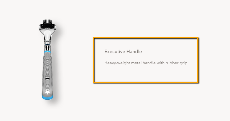
Since the product is self-explanatory, and the purpose of the product can be assumed from the image and the title, this company does exceptionally well in targeting everyone with a crispy verbal one-liner.
It understands that a razor is useful to everyone; hence, it didn’t find it imperative to decode the persona of its users.
Ustraa is another company which takes care of the skin and hair and has already attained the “Dollar shave club of India” tag.
Most of you wouldn’t have heard of two-in-one trimmer-cum-razor.
While the word is self-understandable, you’d still have to explore the minor details for correct functioning.
Here’s a classic example where the company finds it necessary to explain how to operate both the functions with exceptional description and technical specifications.
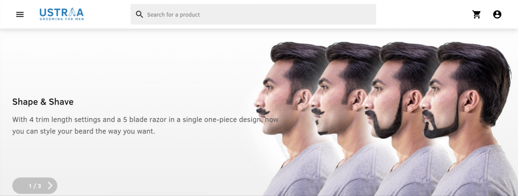

“Their description is for people who have a beard and may not know how duality works with this product.
Here’s how Samsung displays two different types of the product description for Galaxy note 9.
In customer-dominated web spaces like Amazon, the seller demonstrates brief pointers about the product. Samsung, on the other hand, scribbles a long monologue on its website.
In the former case, the seller assumes that customers understand the tech-details, henceforth, he briefs them.
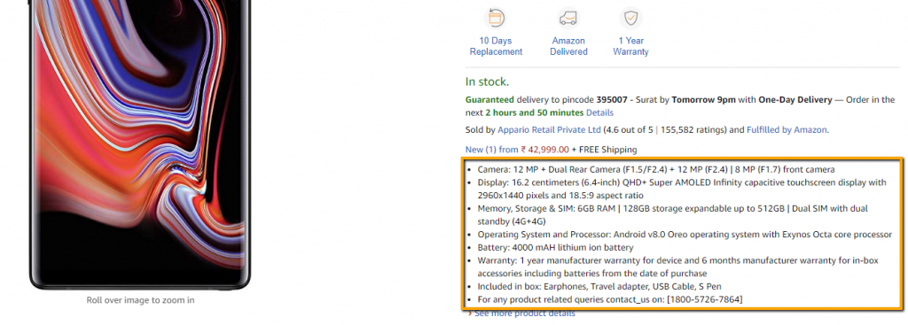
In the latter case, the company wants to touch all the corners, thereby educating the new customers too.

You should stick to specific attributes while you are building the persona of your customers.
Take these things into account.
- Demography
- Age
- Language
- Interest
- Gender
2. Let the features and benefits of the product dictate conversion.
It has to be one of the essential description-writing skills.
Millions of sellers sell the same product as you do.
The only way to get ahead of them is by explaining how your features and benefits supersede their products.
Take this descriptional pick from minimal cloth designing brand— Aristobrat.

Apart from adding cliche details, it sums up how anti-bacterial and anti-odor properties make this product a unique fit for its customers looking for a sturdy fabric.
Take a look at two contrasting product description on the same website.

The above product conveys that you don’t need to put all the details while describing a tee as it’s understandable. However, the purpose of the tee is not clear.
The second brand in the same website gives you the purpose for buying the item as it slyly puts the description and where you can use it.
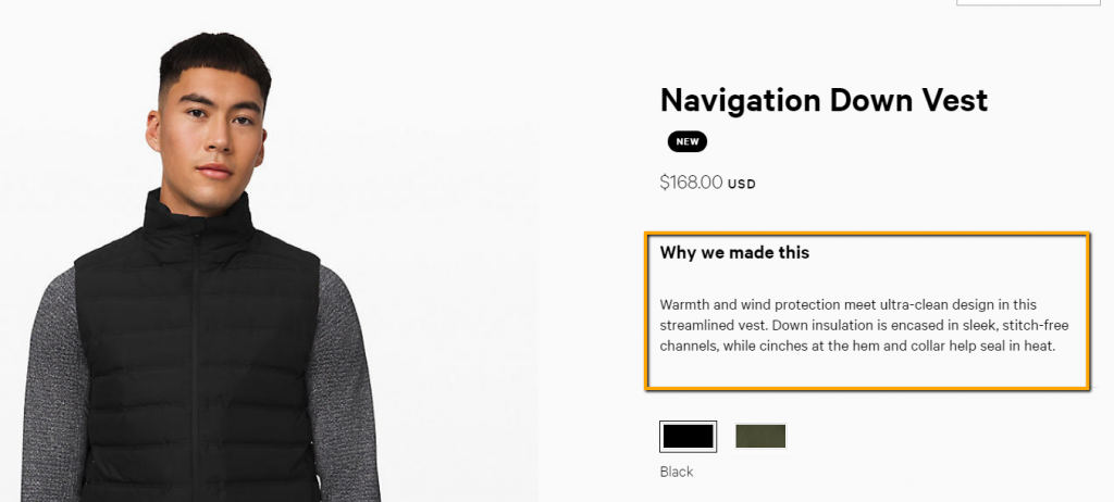
Specifying the benefits of products rather than generalizing them motivates the buyers and gives them reasons to go for it.
Because you can sell the product once, but to have a consistent conversion, you will have to sell the features.
When you decide to mention the features of products, you should consider the following points.
- Don’t overdo it while writing features. Explain the 2-4 top-most features.
- Mention how the benefits of the product can change the industry and customers’ lives.
- Share the advantages which overcome the existing issues.
3. Your tone matters while describing it.
How do shopkeepers deal with you in the store outlets?
You want their tones to hit the right persuasive chord.
You have to apply a similar strategy while describing a product
The tone of the language does define your brand; however, it should be gregarious enough to bring appealing adjectives for the customers. And honestly, your beauty supply store business plan should factor this in from day one, because tone isn’t fluff; it’s strategy.
For example, Nykaa projects “sexiness and beauty” when it describes the lipstick.
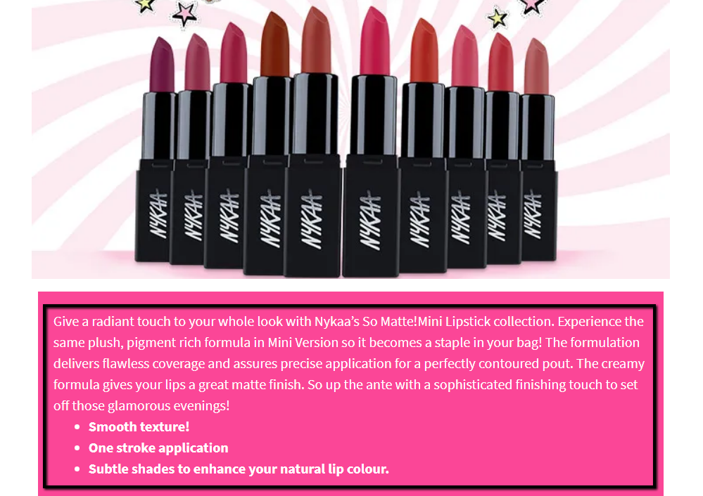
They emphasized more on “how you’d look” after using the product, instead of “how the product looks” before use.
It’s a good call for tentative buyers, since they want to know how the product grooms them.
More straightforwardly, the tone of your brand can influence the customers into believing your adjectives.
Some brands use a formal tone, and they are doing fine. However, they stick to the same tone across all pages.
Here’s how Gant produces description content for a graphic crew sweatshirt.

The tone of description is formal and strictly talks about the product. They use the same strategy across the webspace with precise words like classics and lightweight.
Bringing an unusual tone and format can help you dream significant with conversion numbers.
With most of the web spaces stuffed with formal and long monologue description, a change can immediately attract users’ attention.
By placing unusually funny product descriptions, the tone of this company brings a smile in a jiffy.
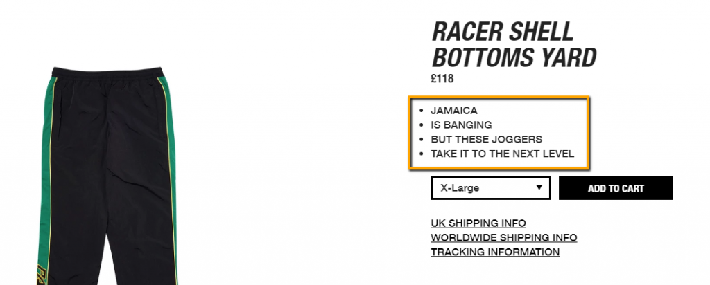
That’s a good start when you are pushing hard to persuade the skimmers.
4. Enough of Self-eccentric descriptive approach.
Although your product is remarkable and exactly suits the requirement of the customers, avoid manifesting self-eccentric descriptions.
Overused phrases like “we maintain quality,” “our standard products,” etc. repel customers into believing “Yeah, it’s your product. Why would you criticize it?”
We don’t want them to think this about us as these phrases betray the lack of original thought.
How about stating them the real deal about your product?
Take a sneak peek at Yamaha Guitar which blends the features and purpose of the instrument without being too narcissistic about its item.

Remember the phrase— “you don’t need to speak for the quality, the quality will speak for itself.”
If you can’t get past your eccentricity, make sure that you come up with unique and funny product description which hides your eccentricity with customers’ giggle.
Dollar Shave Club again bets to tickle few bones with formal and informal descriptions which educate and crack-jokes at the same time.
After sewing garland of praises, the company says that its hair gel doesn’t work with sandwiches or wallpaper.
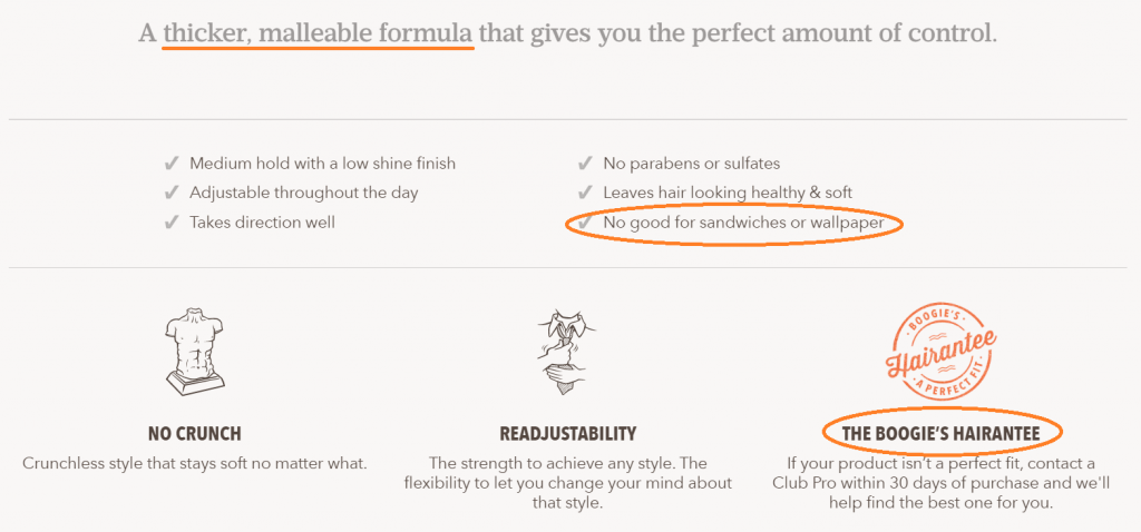
Another way to get a quick customer bite is by reversing the trite description phrase into something fresh.
One of the haberdashery brands points “boring stuff” in its page for threatening the users beforehand from the ultimate overused terms and conditions.
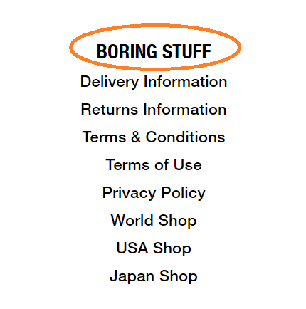
Comic retrospection and notices allow users to forget about their previous experience. This approach expands your chance to rivet them to your product page.
5. The giant clipboard is a big no.
Your users are always in a hurry.
Aim to minimize their purchase time by making your points bold, scannable, and readable.
Yes, it takes a lot of effort to write a spaceless giant clipboard; however, they deter users from buying your items— and that’s not our ultimate aim.
The product description sometimes has to be the subtle mixture of features with screaming confidence and encouragement with soft-lilting voice.
Nobody is really interested in going through the extended clipboard. The same information can be passed through scannable bullet points.
In the Woodland Apparel section, the company wheedles its customers with easy on eyes bullet points.
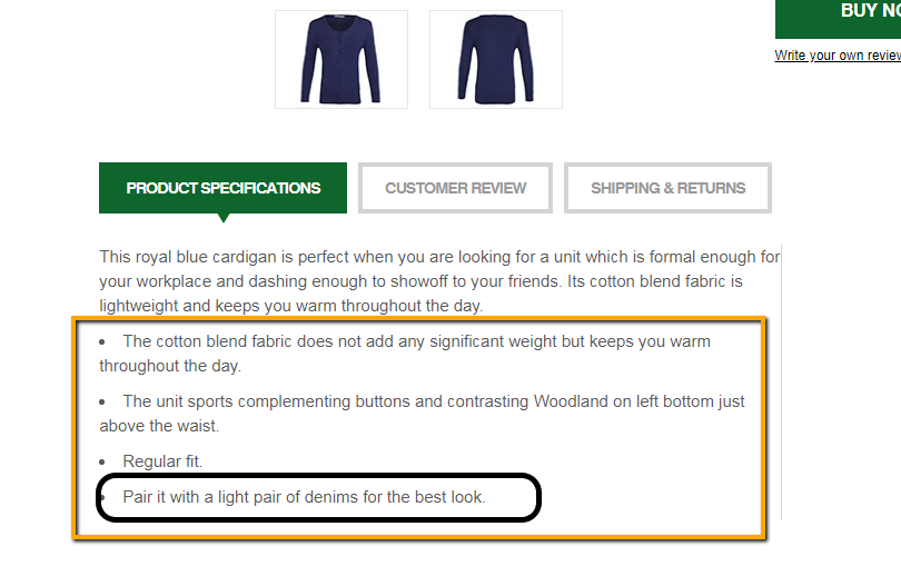
Additionally, it beautifully mentions about the perfect match for the product, thereby taking users into their confidence.
There’s a poetic way to grab users’ attention, and Kallo— the dutch organic food makers prove as an excellent specimen for this.
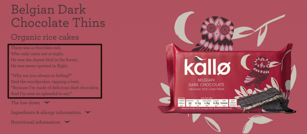
They use short-readable poems for all the products which radiate soft energy into the reader’s mind.
Although the company doesn’t sell them online, the lingual explanatory approach gives warm regard to the customers.
Some brands use a little chunk of information in the hidden tabs with the bullets.
The idea of having bullets is that even when we are skimming through the product copy, we know that something important is getting scrolled up.
The tab information covers the need of people who want to go into further details of the product.
Old spice uses bullet and tab information components together to stretch its reach for both kinds of readers.
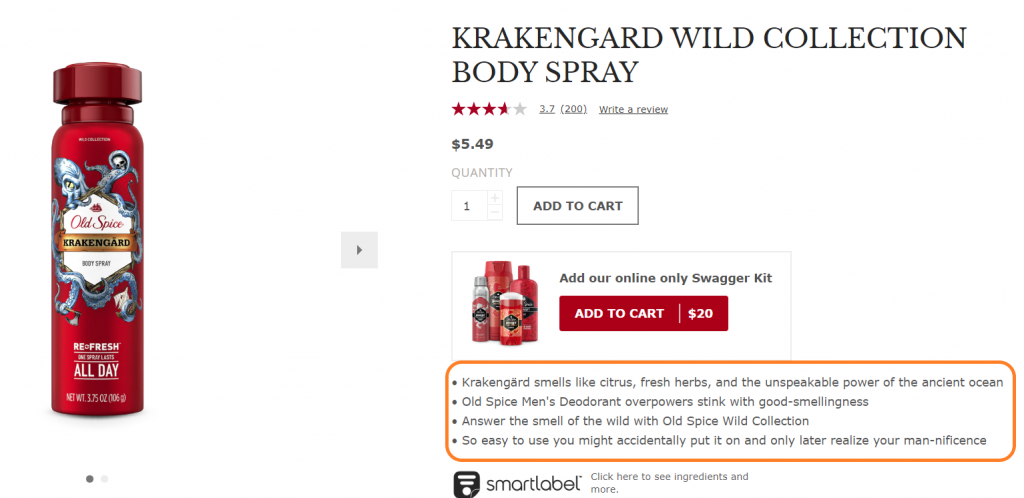
Going a step further, Amazon astutely places product information with general product information in the bullets and features in the sub-bullet forms.

In the same page, it puts all the important adjectives in capital, henceforth drawing a quick catch.
While bullet points are really big and you may argue that they don’t really look skimmable, you’d still feel the trick of it.
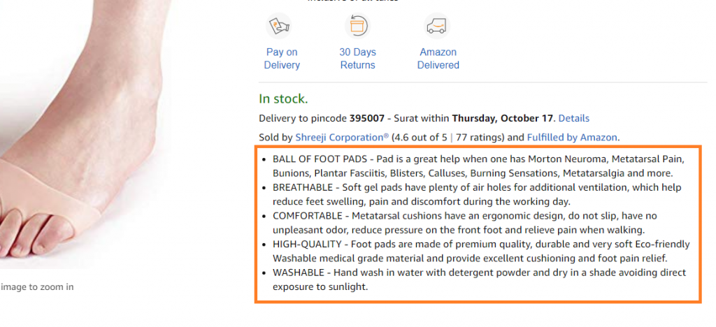
Anyway, they look far more readable and better than the long chunky paragraph.
6. The feel good and influential words which entice buying.
Words are important when it comes to describing your products.
Customers don’t like verbal diarrhea.
You must hit the user psych with specific words which feel good and sound influential before they make the final purchase.
There are words which can evoke an emotional response in the minds of the readers, and you want to make sure that you aren’t missing them from your copy piece.
Use powerful “feel-good” words into your copy, and trigger the dopamine-oxytocin secretion with the moving description.
Since dopamine induces happy-state, the purchase experience becomes less stressful and hassle-free.
Bonus: Here’s the list of 101 powerful words which accustom homeliness and friendliness among the customers.
You can put your customers into work with words which pushes them to act, and avoid the words which touch the hostile sensation.
Remember— the words you have been using for your products indirectly sits on your customers too.
If you are using words such as “flamboyant” or “cult-match” for the product; you are indirectly implying that the user who uses it would look flamboyant and cultish.
Having words like elegant, adventurous and hardened mineral, the description establishes a firm picture around you even before you buy them— and Nixon watches do exactly the same.
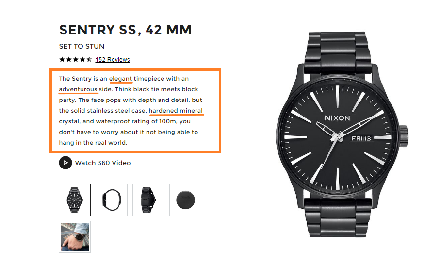
These words let you slip into the imaginative world where you can see yourself bedecked before finally opting for it.
7. Product copy is copying the product on the page.
It’s an injustice if you restrict product copying with merely explaining the products using texts.
Product copy should actually mean that you are carrying the closest replica of the product on the web page so that users get to feel the immersive buying experience.
For example, Woodland Wallet doesn’t need much explanation as even with the minimum information; you know what you are going to do with it.
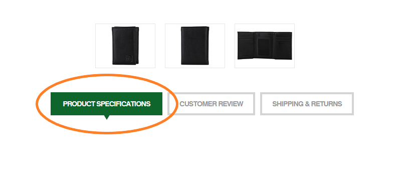
But for something like intricate watches manufactured by GeekThink, a customer needs much more than just texts.
They need more images and mixed media to understand the gist of the product, and this company does exactly the same.
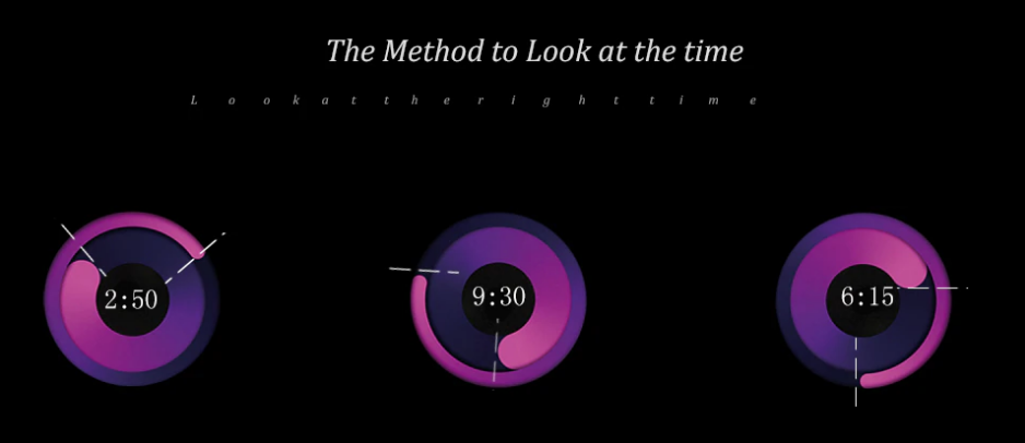
First of all, it has a different dialer which takes a bit of decoding expertise.
GeekThink accurately explains the methods to look at the time with eye-candy images, and also covers the strap adjustment method with animated graphics.
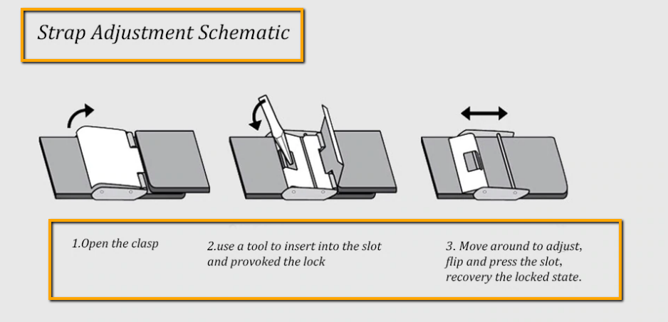
Furthermore, it creatively describes the water-proofing properties with scope application using a striking table.
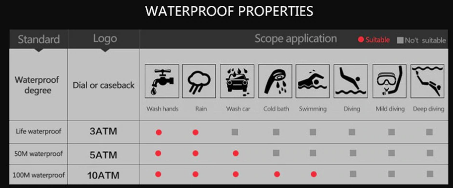
Since visual marketing, i.e., clear images of the products do worlds of good for the customers, look to place all the media details of the products.
63% of the customers emphasize that images produce a strong buying idea rather than product-descriptions, there’s no way you can miss on this.
Conclusion
Of course, these aren’t some hardwired formulas for writing a successful product description; however, borrowing ideas is never a bad idea when you have a window of trying.
Some practice works, and some don’t.
Eventually, you want to inform your readers and if they don’t seem to be interested— try different methods.
Ensure that you are stuffing the search-engine-friendly keywords, and if there’s no way to fit them— try to meet them in the product title.
Permute around power words and keywords, and stitch a readable product description.
If it’s easy to read; sit back and observe, if it clicks, stick to the formula, and if it doesn’t, read more use cases.
What’s your biggest challenge when you write product copies? Let us know that in the comment section. You can also join us on our twitter handle and ask your queries directly there.


After study a few of the blog posts on your website now, and I truly like your way of blogging. I bookmarked it to my bookmark website list and will be checking back soon.
Appreciate????
Major thanks for the blog.Thanks Again. Keep writing.
Hi Nick,
Thanks for the lovely comment.