5 Best Shopify Clothing Stores for UX Inspiration

Shopify is home to over five million businesses, with a significant presence in the fashion industry. Almost 500,000 fashion merchants use Shopify to build their stores, which dominates all other sectors using the platform.
To inspire you in creating amazing online experiences with Shopify, we have selected some of the best examples. The stores below demonstrate how you can create a clothing shop that is convenient, looks fantastic, and converts well.
Let’s explore what makes these stores unique.
1. Fashion Nova
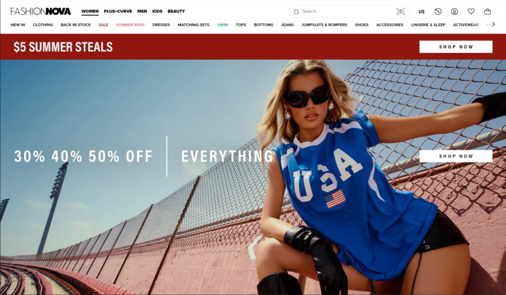
Fashion Nova is a popular online fashion store that started in 2006. Founded by Richard Saghian, the store quickly became famous for its trendy and affordable clothes. It’s especially known for bodycon dresses, jeans, and activewear. The brand works with many influencers and celebrities, keeping it popular on social media.
Visual Design
Fashion Nova’s website looks modern and clean, capturing your attention with bold visuals and an organized layout. The top of the page features striking banners that announce major discounts, immediately drawing you in.
The high-quality, professional images showcase the clothing in the best light, making each product look attractive and desirable.
Using mainly red, white, and blue colors throughout the site ties everything together, giving it a trendy, cohesive look. Fashion Nova’s homepage invites you to explore more with its visually appealing design, making your shopping experience memorable. Adhering to strong brand guidelines ensures their visuals remain consistent across platforms, reinforcing their identity.
Navigation and Interactivity
Fashion Nova’s main menu at the top of the page is clearly laid out, dividing products into major categories such as Women, Men, Plus+Curve, and Kids. This organization helps users quickly locate the section relevant to them.

With the dropdown menu, users can refine their searches by selecting more specific subcategories, saving time and effort.
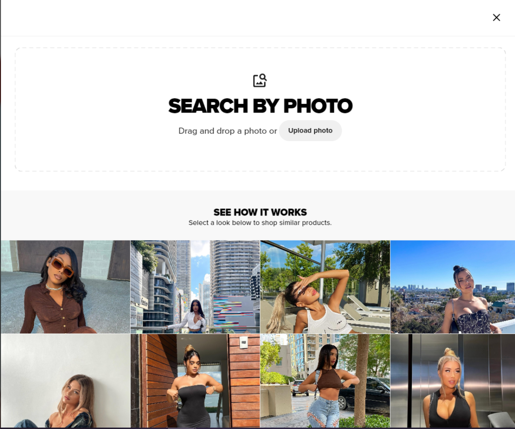
From the search bar, Fashion Nova offers a unique “Search by Photo” feature that helps users upload a photo to find similar items on the site. It simplifies the search process, especially for users inspired by specific looks they see online or in real life.
Collection and Product Pages
On the collection page, you can see a grid layout displaying multiple items at once. Each product shows a clear image, the price, and any discounts available.
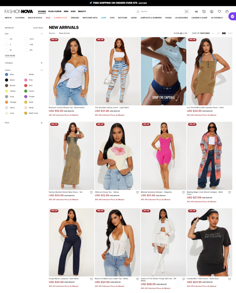
There are filters on the left side that let you refine your search by size, color, and price. This makes it easy to find exactly what you’re looking for without scrolling through endless items. The layout is clean and organized, which helps in quickly scanning through the products.
The product page itself is detailed and user-friendly. You get multiple high-quality images of the item from different angles. The price is prominently displayed, along with size options and a size chart for easy reference.
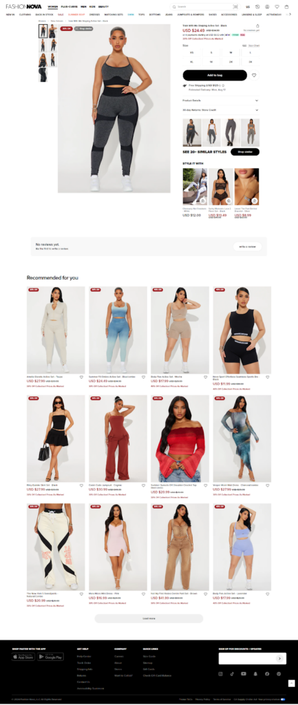
Below the main details, there are recommendations for similar styles, encouraging further browsing.
Cart & Checkout
The checkout process is straightforward and easy to follow. The checkout page screenshot shows a clear layout, making it easy to enter your information. There are various payment options, including credit cards, PayPal, and express options like Shop Pay and Google Pay.
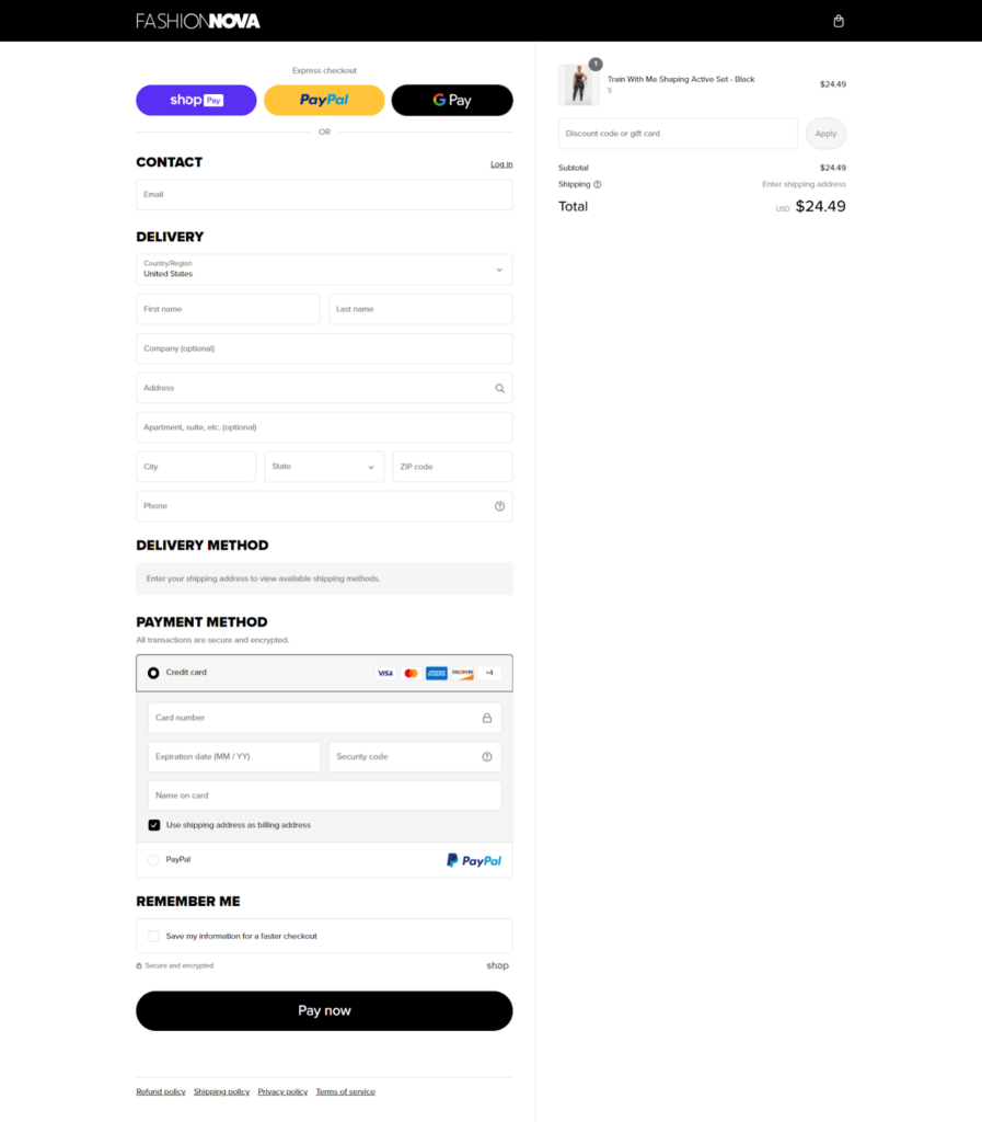
The payment section also shows a lock icon, indicating that your information is secure. Additionally, there’s an option to save your information for future checkouts, making the process faster the next time you shop.
What We Love About It
We really like the mobile-friendly design, prominent display of promotions and new arrivals, and especially the search by photo feature.
2. Black Halo
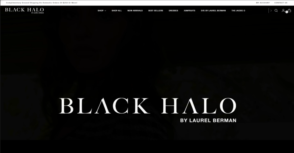
Black Halo is a women’s clothing brand founded by designer Laurel Berman in 2002. The brand is known for its sophisticated, figure-flattering designs, particularly the iconic Jackie O dress, which has been a staple in its collection since 2006. Black Halo’s approach blends aesthetics and art, focusing on creating timeless pieces that empower women through fashion.
Visual Design
Black Halo’s website is clean and minimalist, with mostly black and white colors. This elegant aesthetic is right on point with the brand’s sophisticated image. With its high-quality product photography and dark background, it creates a striking visual contrast that immediately draws attention to the clothing.
The site uses white space effectively, making the products stand out and conveying the brand’s sense of refinement.
Navigation and Interactivity
The horizontal menu at the top of the page lets you have easy access to main categories like “Dresses,” “Eve By Laurel Berman,” and other product lines. With the fixed header, navigation options are always visible as users scroll, which enhances usability.

The homepage features a countdown timer, creating a sense of urgency for special offers or new releases. Interactive elements like a “See What’s New” button and featured product sections encourage exploration of the latest collections.
Collection and Product Pages
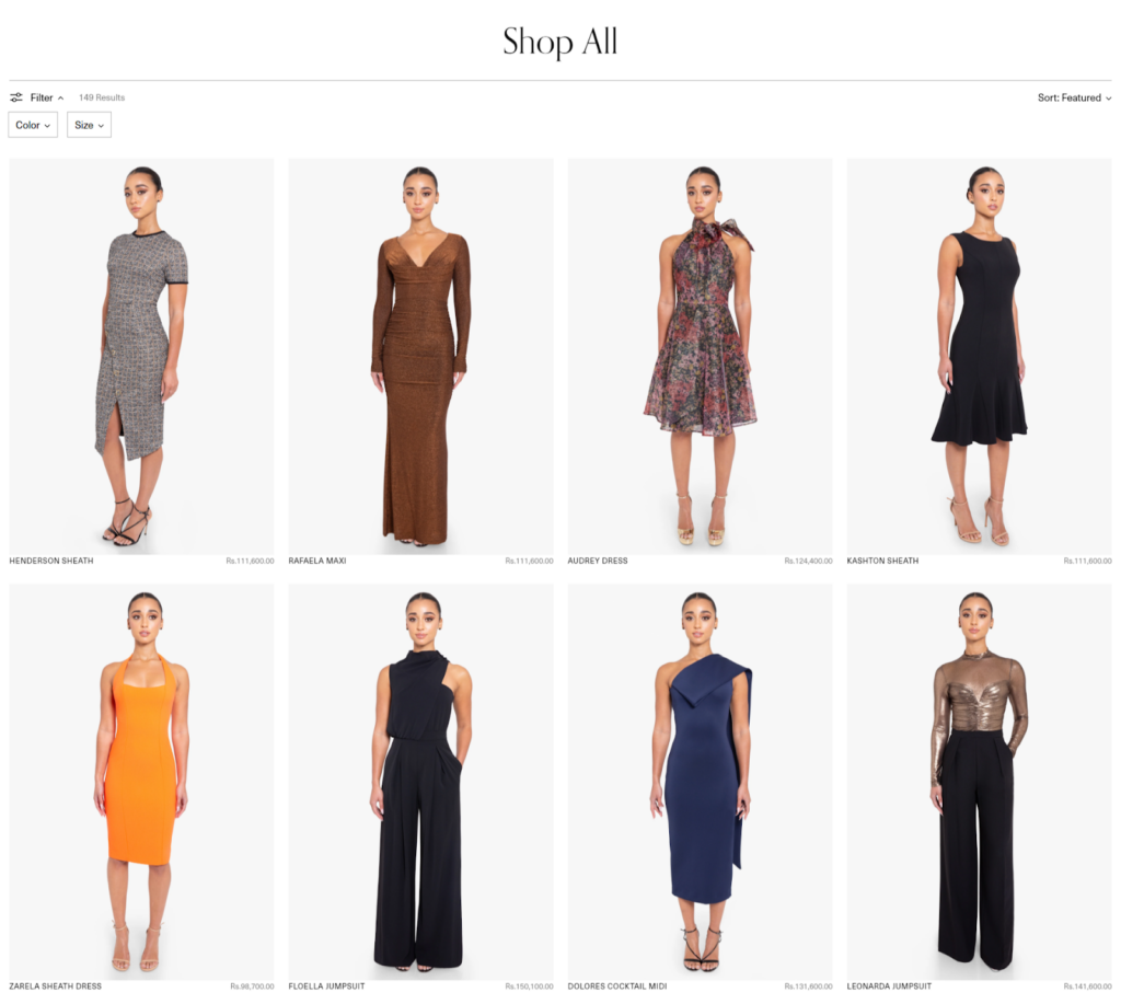
The collection page offers a grid layout of product images with clear pricing and product names. Filtering options for color and size are prominently displayed, allowing for easy product refinement. The “Sort: Featured” dropdown provides additional ways to organize the product display.
Individual product pages display multiple product images, a clear price display, and size selection options.
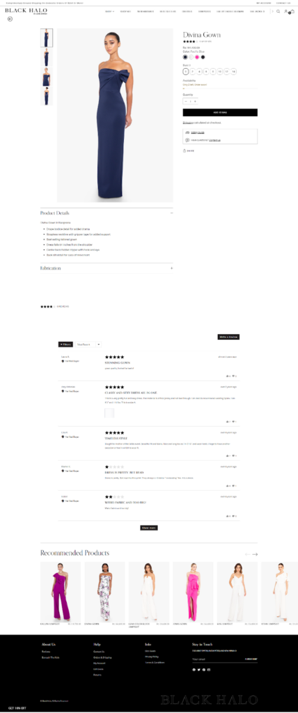
Detailed information about the garment, including fabric composition and care instructions, can be found under “Product Details.”. Each product page also displays customer reviews to help potential buyers decide.
Cart & Checkout
The checkout page is simple, with clear fields for entering shipping and payment information. There is an option for express checkout using Shop Pay or Klarna for interest-free payments, which gives flexibility and convenience to buyers.
What We Love About It
We love the focus on high-quality product photography, which allows customers to appreciate the details and craftsmanship of each garment.
3. Zanerobe
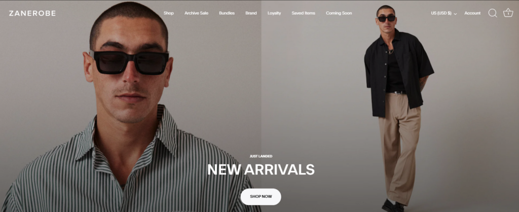
Zanerobe is an Australian men’s apparel brand founded in 2003. They create contemporary, sustainable clothing collections with a focus on signature pieces like the Sureshot Jogger and Flintlock Tee. The brand aims to cater to creative, free-thinking individuals who value style and sustainability.
Visual Design
Zanerobe’s website employs a minimalist yet striking visual design. The clean layout with ample white space ensures that the product images and key information stand out.
The typography is simple and readable, contributing to an overall sleek and professional appearance. The color scheme is mostly neutral, with occasional pops of color to highlight new arrivals and promotions.
Navigation and Interactivity
The top navigation bar includes clear categories like “Shop,” “Archive Sale,” “Bundles,” and “Loyalty,” making it easy for users to find what they are looking for.
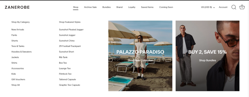
The drop-down menus are organized and display featured deals and collections. You can choose from different categories, such as pants, shorts, tees, and tanks.
Additionally, the website includes interactive elements such as hover effects on product images for quick previews.
Collection and Product Pages
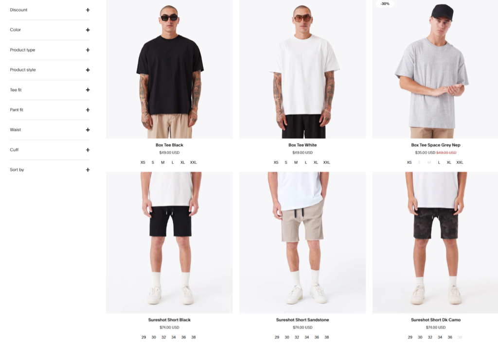
It is easy to scan products on the collection page due to its grid-based layout. Each product includes high-quality images and filter options such as discounts, color, and type.
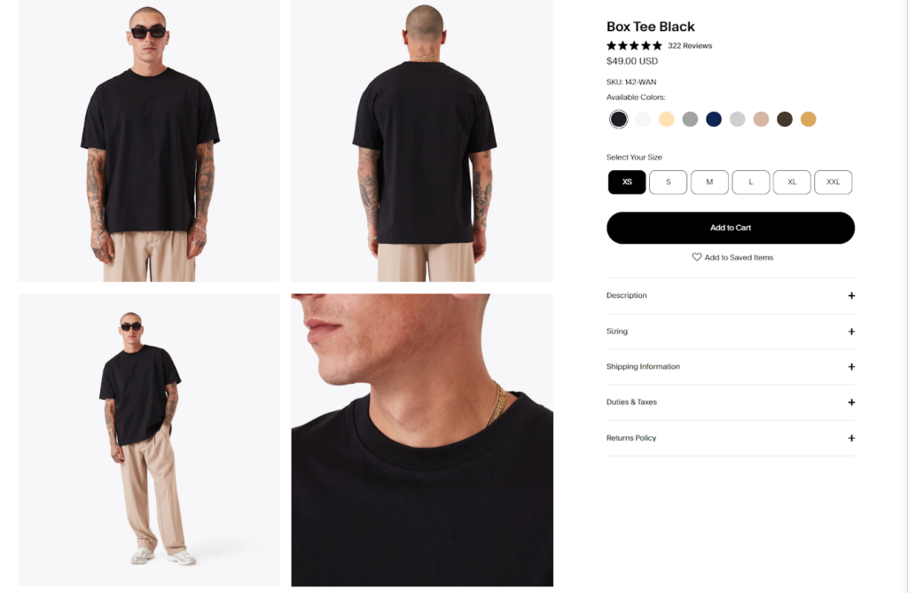
Each product page features multiple images from different angles, a zoom-in option, and a detailed description covering material, fit, care instructions, and the review section.
The site also suggests related products, encouraging users to explore more items that complement their choices.
Cart & Checkout
The Zanerobe website has a smooth and effective checkout procedure. Users can select from a variety of payment methods, such as credit/debit cards and PayPal, and shipping details are submitted simply.
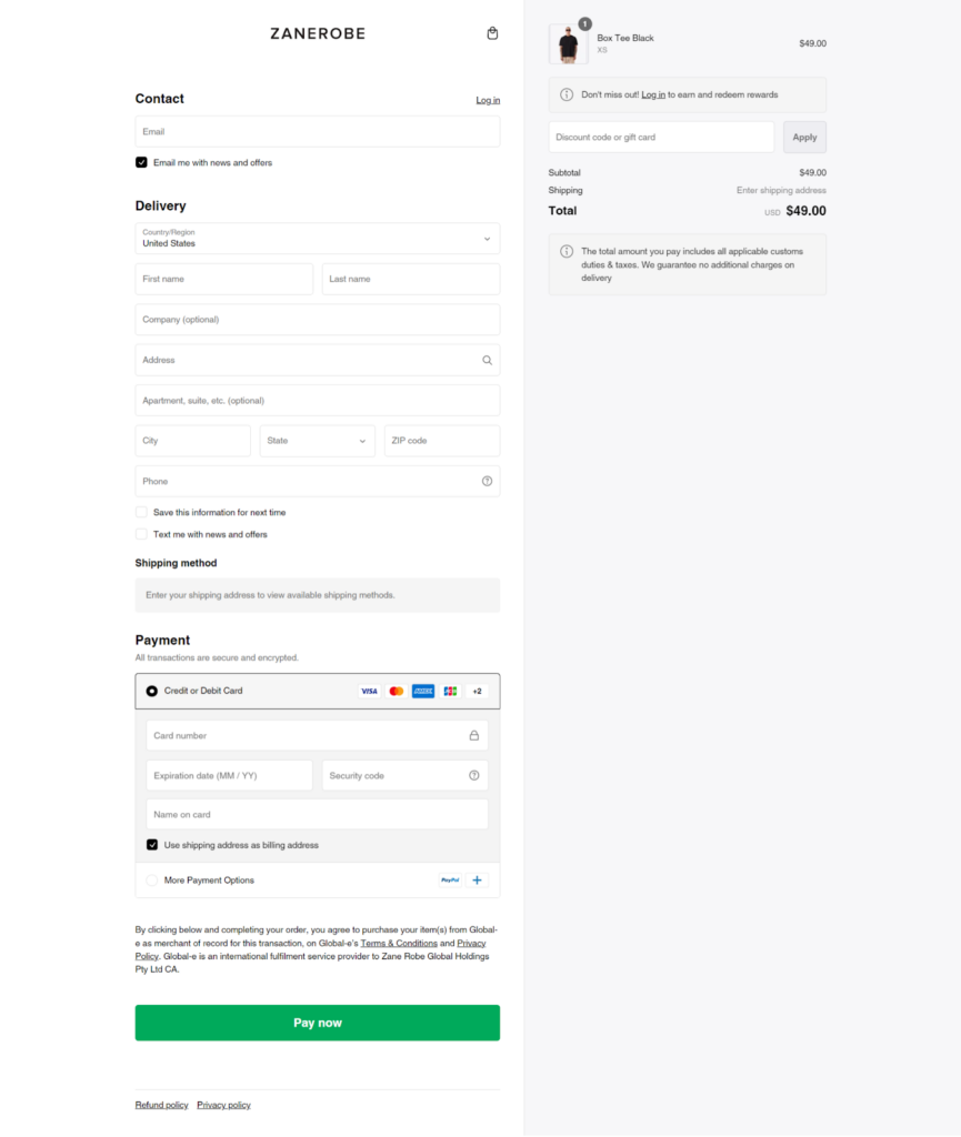
Encrypted transactions throughout the checkout process guarantee the security of consumer information. Features like applying gift cards or discount codes and storing information for future transactions speed up the process even more.
What We Love About It
We love Zanerobe’s loyalty program, which rewards customers with points for every purchase that can be redeemed for discounts.
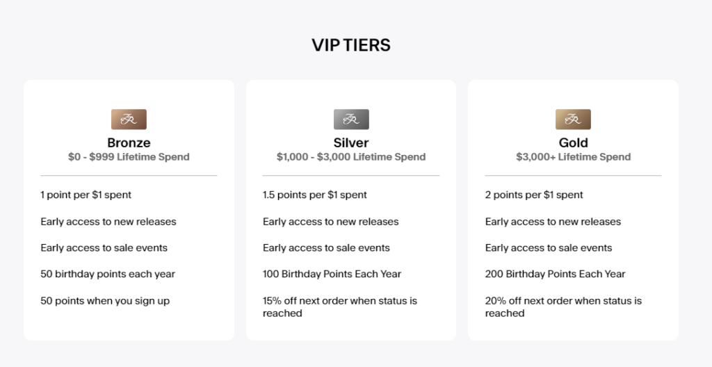
Their bundle deals are fantastic for saving money while getting a complete look. The Archive Sale section is a gem for finding past-season items at great prices.
4. Kith
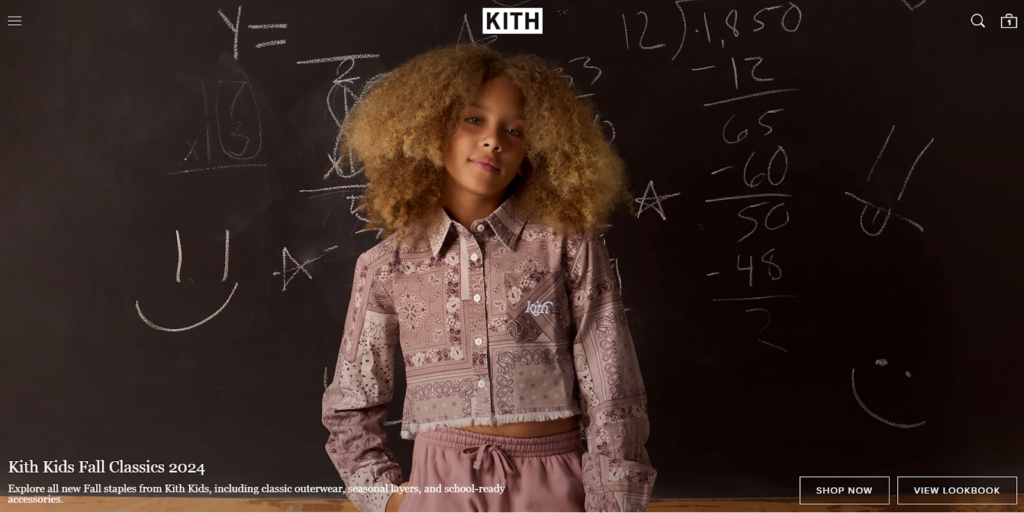
Kith is a New York City-based lifestyle brand and retail concept founded by Ronnie Fieg in 2011. Originally starting as a footwear retailer, Kith has expanded into a multi-faceted fashion and lifestyle brand offering seasonal collections of men’s, women’s, and children’s apparel, accessories, and footwear. The brand is known for its unique collaborations with other leading brands and its focus on storytelling through product design and retail experiences.
Visual Design
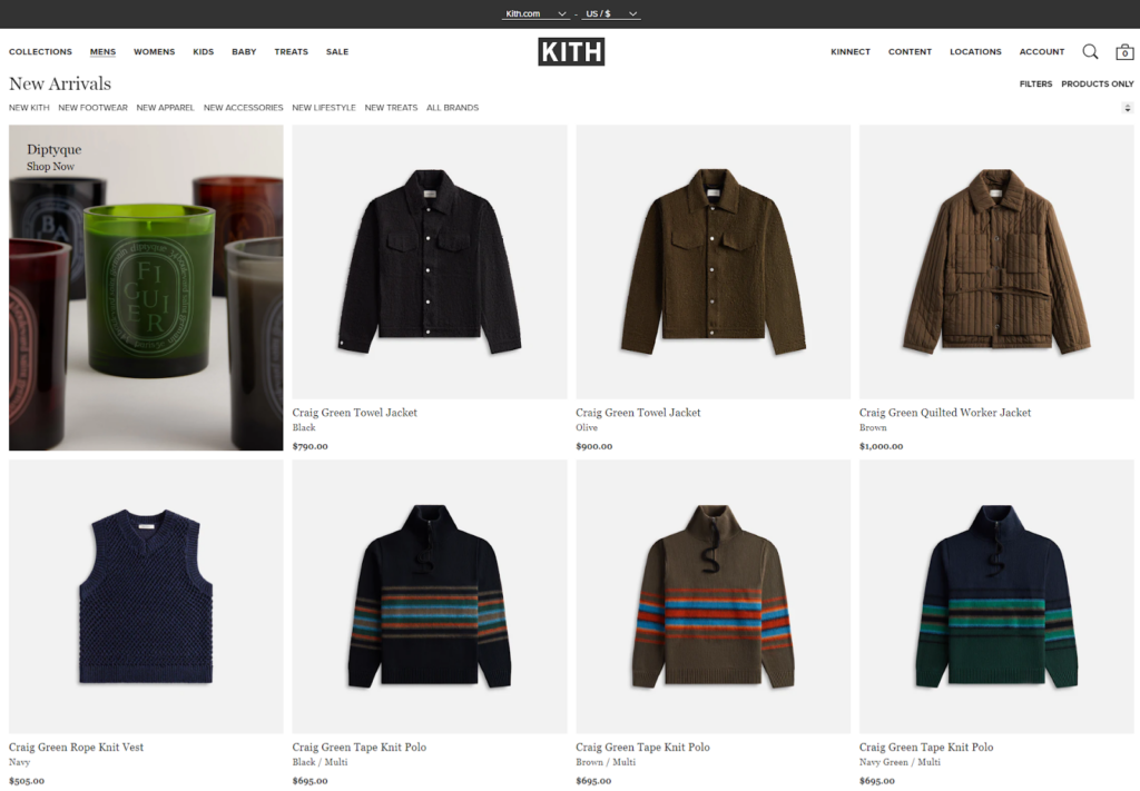
Kith’s website showcases a clean, minimalist aesthetic with a strong focus on product imagery. The design uses a predominantly white background with black text, creating a high-contrast, easy-to-read layout. The product images are large and high-quality, allowing customers to see details clearly.
Navigation and Interactivity
The hamburger menu organizes categories like COLLECTIONS, MENS, WOMENS, KIDS, BABY, TREATS, and SALE. Additional navigation options such as KINNECT, CONTENT, LOCATIONS, and ACCOUNT are placed on the right side of the header.
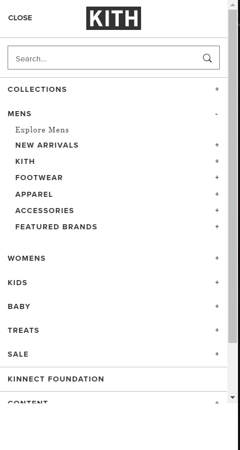
The website includes a search function and a shopping cart icon in the top right corner for easy access.
Collection and Product Pages
On the collection page, there’s a “FILTERS” option and a “PRODUCTS ONLY” toggle, allowing users to refine their browsing experience. Each product tile displays the item name, color (if applicable), and price. As you hover over the product tile, you can see the sizes available for that product and image from a different perspective.
On the product pages, detailed information is provided, including:
- Multiple size options (M, L, XL)
- A “SELECT A SIZE” button
- Detailed product features (e.g., Twill weave, French construction, Button closure on the front)
- Color and material information
- A “SHOP ALL NEW ARRIVALS” link
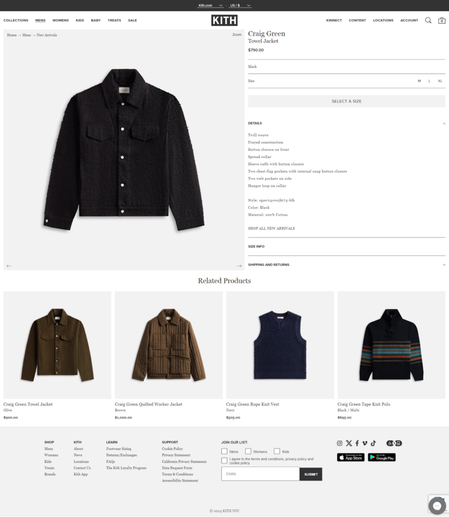
You can find related products at the bottom of each product page, which encourages you to explore more.
Cart & Checkout
Keeping with Kith’s minimalist aesthetic, the checkout process is smooth and efficient. Shop Pay, PayPal, and G Pay express checkout options are prominently displayed to accommodate users who prefer quick checkout.
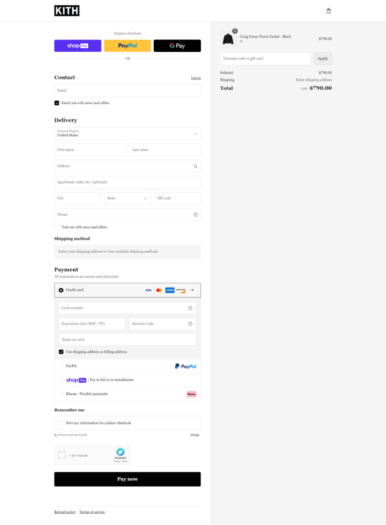
The form fields are logically arranged, guiding customers through contact, delivery, and payment information. Multiple payment methods are available, including installments.
What We Love About It
We love Kith’s omnichannel approach, which is particularly highlighted by their locations page. Through this, they have effectively bridged the gap between online and offline experiences.
5. Alo Yoga
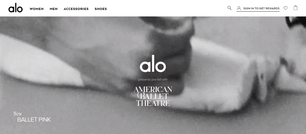
Alo Yoga is a premium athletic apparel brand founded in 2007 in Los Angeles by Danny Harris and Marco DeGeorge. The name “Alo” stands for Air, Land, and Ocean, reflecting the company’s commitment to mindful movement and environmental consciousness.
Alo Yoga has gained popularity among celebrities and yoga enthusiasts alike, offering high-quality, stylish activewear designed for both studio practice and everyday wear.
Visual Design
Alo Yoga’s color scheme is soft and neutral, with whites, grays, and pastel accents that create a clean and modern style. This makes the vivid, high-resolution photographs of the products pop clearly.
The photographs are well-lit and carefully shot, displaying the products in a variety of real-world contexts, including metropolitan surroundings and dancing studios. This allows consumers to see how items might appear in their own life.
Navigation and Interactivity
Users can conveniently navigate Alo Yoga’s website by choosing from categories such as “Featured Shops,” “Clothing,” “Shop by Activity,” “Shop by Color,” “Accessories,” and “Wellness.”
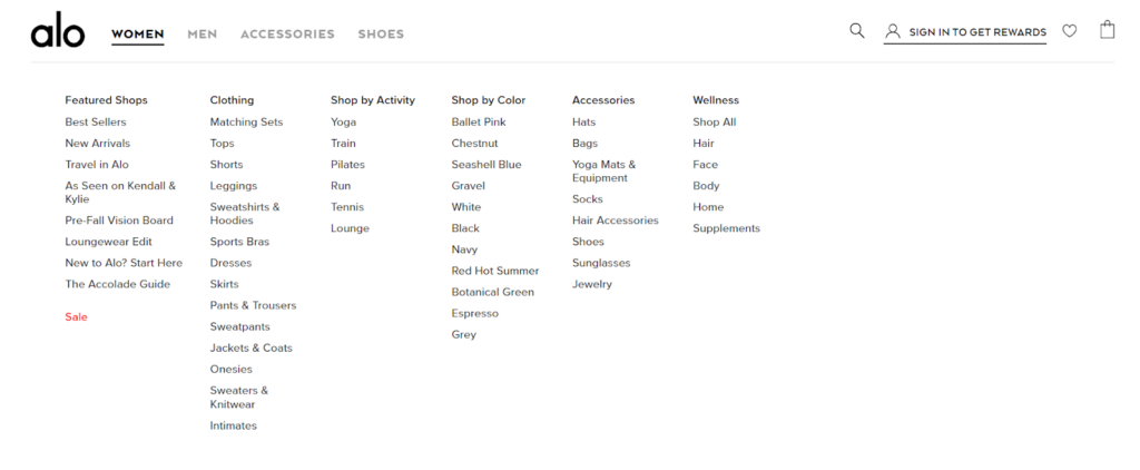
Users can easily browse the site with filters for color, size, and product type. Hover effects and quick view options add a layer of interaction so users can explore products without leaving.
Collection and Product Pages
Each product on the collection page is clearly labeled with clear pricing and color options and can be viewed from different angles by hovering, giving you a complete picture.
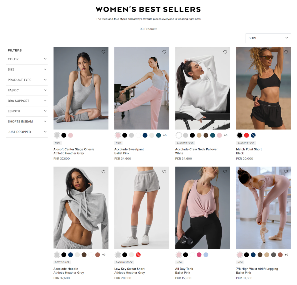
The “SORT” dropdown menu allows users to customize their browsing experience, while the sidebar offers extensive filtering options, including color, size, product type, fabric, and more.
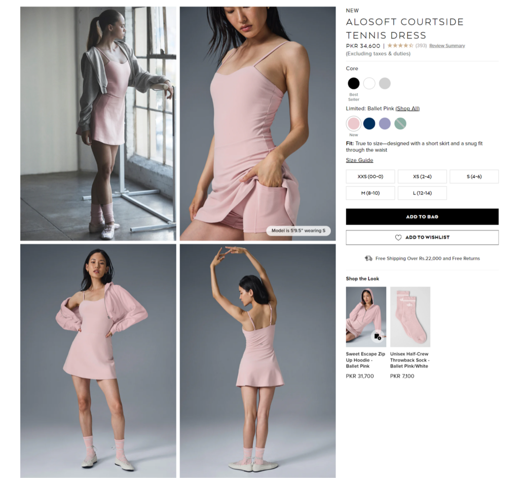
On individual product pages, Alo Yoga provides multiple high-quality images, including close-ups and lifestyle shots. This page also shows fabric details, fit, and features, along with multiple high-resolution images, user reviews, and related products, so customers can decide what to buy.
Cart & Checkout
The cart page clearly displays the selected items, quantities, and subtotal. A prominent “CONTINUE TO SHIPPING” button guides users to the next step.
The checkout form displays clear labels and input fields. Users can create an account or check out as a guest. Mobile phone numbers are included for order updates or other offers so they can get in touch after buying.
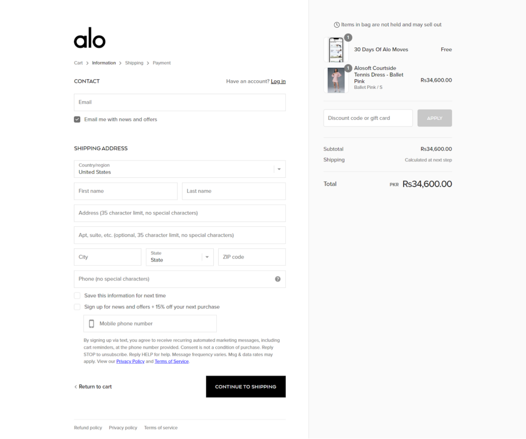
During checkout, Alo Yoga offers multiple payment options, such as major credit cards and PayPal, making it easy for people to pay and reducing the likelihood of cart abandonment.
What We Love About It
We love Alo Yoga’s use of lifestyle content, such as the “Style Inspiration” section, which offers value beyond product listings and highlights Alo Yoga’s position as a lifestyle brand. Its focus on community development through features such as user-generated content and social media connectivity creates a sense of belonging among customers.
Bottom Line
An awesome website experience can make all the difference in turning visitors into happy customers. Take cues from these top Shopify clothing stores to boost your business.
Remember, it’s not just about looking good – your site should be convenient to use too. With some clever tweaks and thoughtful design, your online store can become a favorite among fashionistas.
Get in touch with us today and learn how we can help you build your dream store.


Post a Comment
Got a question? Have a feedback? Please feel free to leave your ideas, opinions, and questions in the comments section of our post! ❤️