5 Best Shopify Toy Stores for UX Inspiration in 2026

For retailers who wish to create outstanding online experiences, Shopify is an excellent choice. If you are looking for inspiration to create an engaging and user-friendly toy store on Shopify, we’ve picked some of the best Shopify toy stores for inspiration. These examples show how you can create a toy shop that looks great, is easy to use, and converts better.
Let’s explore why these stores stand out.
1. Art of Play
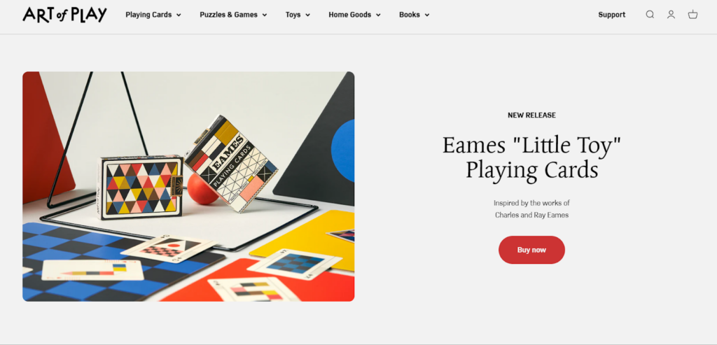
Art of Play is a modern wonder emporium founded by twin brothers Dan and Dave Buck, who are accomplished magicians. The brand specializes in high-end playing cards, puzzles, games, and unique home amusements. Their mission is to inspire curiosity and spread wonder through magical experiences.
Art of Play curates a collection of beautifully designed products that aim to dazzle the eyes and fascinate the mind, appealing to cardists, magicians, puzzle enthusiasts, and collectors alike.
Visual Design
Art of Play’s website boasts a clean, elegant design that perfectly complements its product offerings. The homepage features a striking hero image showcasing their “Little Toy” playing cards, immediately drawing the visitor’s attention. The color palette is sophisticated, with a mix of neutral tones and pops of color that highlight key elements.
The product photography is top-notch, presenting items artistically and appealingly. Each image captures the essence of the product. The overall aesthetic is cohesive and reflects the brand’s focus on curiosity and wonder.
Pro Tip: If you are unsure how to start or which theme suits a toy store best, focus on using a strong concept and cohesive visual design. Professional Shopify design services from Aureate Labs can help turn that vision into a well-structured online store.
Navigation and Interactivity
The navigation on Art of Play’s website is intuitive and user-friendly. The main menu is clearly visible at the top of the page, with dropdown options for easy access to specific product categories like Playing Cards, Puzzles & Games, Toys, Home Goods, and Books. This structure allows visitors to quickly find what they’re looking for.

The homepage features sections such as “Featured Items” and “Spreading Wonder,” which showcase popular products and the brand’s values. Interactive elements like hover effects on product images and smooth scrolling enhance the browsing experience, making it engaging and enjoyable for visitors.
Collection and Product Pages
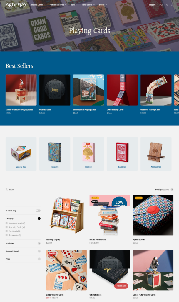
The Art of Play collection pages are well-organized and visually appealing. You’ll find best sellers at the top of a collection page, and all products at the bottom of this section with filter options. Products are shown in a grid layout with clear images, titles, and hover effects.
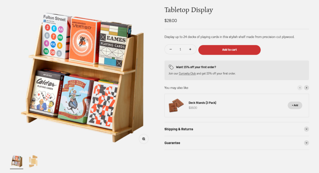
On product pages, you’ll find detailed descriptions and specs of the stuff, plus multiple images that show off how it’s made.
Cart & Checkout
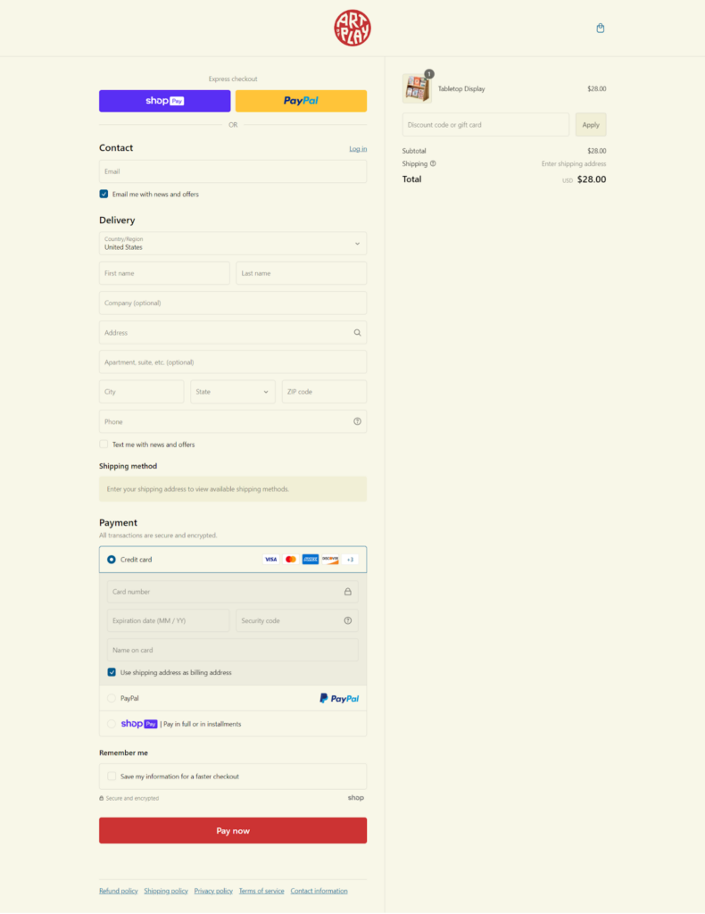
The checkout page shows a simple layout. Users can choose between different payment methods such as credit card, PayPal, ensuring flexibility. The use of express checkout options like Shop Pay and PayPal at the top of the page speeds up the process for returning customers.
What We Love About It
What we love about the site is its ability to evoke a sense of wonder and curiosity from the moment you land on the homepage. The visually stunning design, combined with easy navigation and interactive elements, makes exploring the site a delightful experience. Additionally, the rewards program is a thoughtful touch that creates customer loyalty and encourages repeat visits.
2. Melissa & Doug
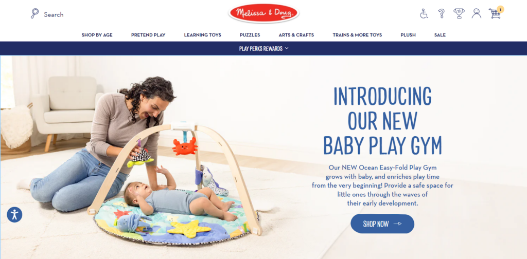
Melissa & Doug is a renowned brand known for its high-quality, imaginative, and educational toys. Founded in 1988 by Melissa and Doug Bernstein, the company has grown into a household name, offering a wide range of products designed to foster creativity and learning in children.
Their mission is to ignite imagination and a sense of wonder in children so they can discover themselves, their passions, and their purpose. The brand is highly regarded for its commitment to safety, durability, and the development of essential skills through play.
Visual Design
The Melissa & Doug website features a clean, colorful design that perfectly captures the brand’s playful essence. The white background is allowing the vibrant product images to stand out, creating a cheerful atmosphere.
With a visually appealing grid layout, the homepage displays a mix of products, featured items, and promotional banners accompanied by whimsical illustrations and icons.
Navigation and Interactivity
A horizontal menu bar at the top of the page offers clear categories like “Shop by Age,” “Pretend Play,” and “Learning Toys,” making it easy for customers to find products suited to their needs. The menu expands on hover, revealing subcategories and popular items and a featured product banner within it.
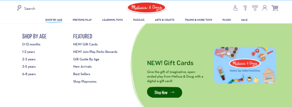
The site also features a “Play Perks Rewards” program prominently displayed in the navigation, encouraging customer loyalty and repeat purchases.
The site strategically places interactive elements, such as product carousels and “Shop Now” buttons, to engage users and guide them toward a purchase.
Collection and Product Pages
The collection pages use a grid layout to showcase product images, names, prices, and ratings, with “add to cart” and “more info” buttons. Filters for age, product type, interests, and price are available, helping customers narrow down their search efficiently.
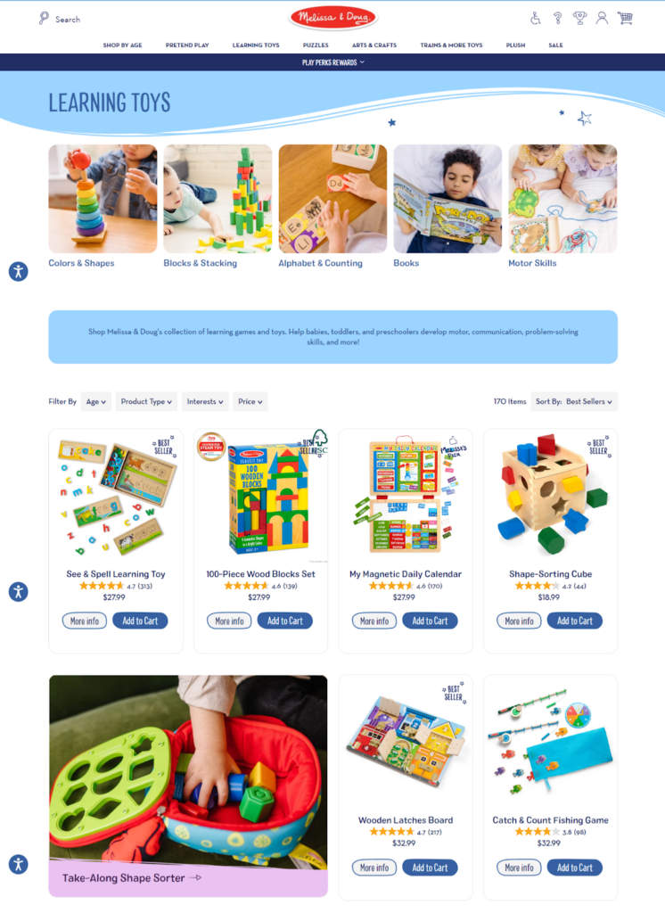
Each product page has multiple high-quality images, a description, and specs, plus the “Add to Cart” button and options for adding quantity and wishlist. Potential buyers can easily see reviews and ratings.
Cart & Checkout
You’ll find the checkout process at Melissa & Doug to be easy and secure. The cart page clearly lists the items, quantities, and prices, and you can apply discounts easily.
With the checkout page, users can choose between different payment methods, including credit cards and PayPal, and the process is made simple so that it requires only a few steps.
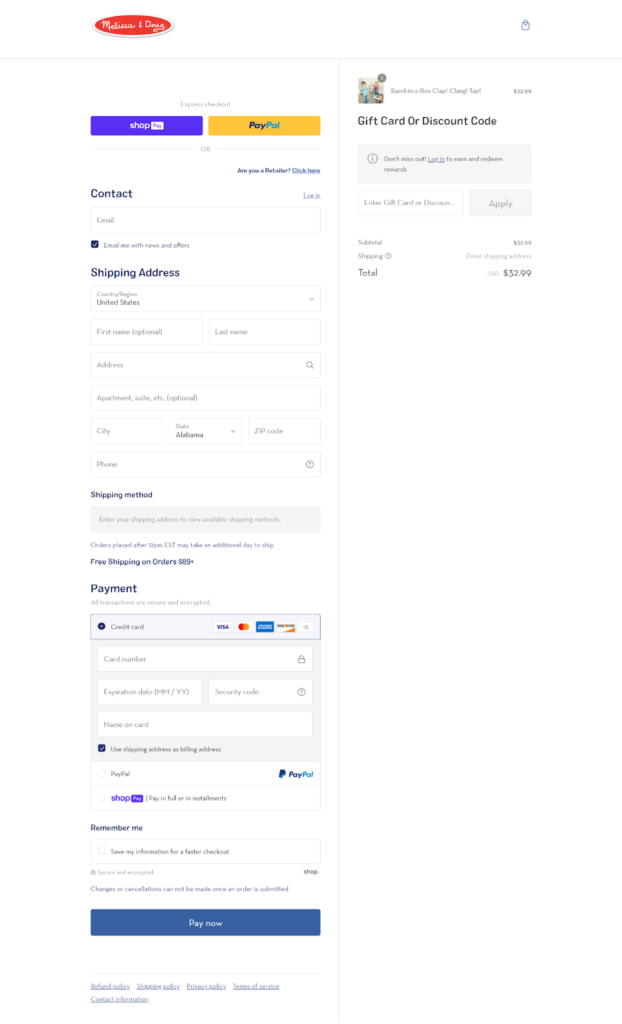
With express checkout options like Shop Pay and PayPal, you can get your stuff done fast and easily.
Pro Tip: Customizing the Shopify Plus checkout can significantly improve user experience and reduce cart abandonment. Explore 25 use cases to customize the Shopify Pulse checkout and improve the checkout flow to your brand and customer needs for better conversions.
What We Love About It
- The “Shop by Age” feature makes it easy for parents to find suitable toys for their children’s developmental stages.
- The “Play Perks Rewards” program encourages repeat customers and builds brand loyalty.
3. Little Wonder & Co
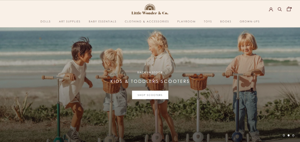
Little Wonder & Co. is an online children’s store specializing in sustainable, organic, and natural products for babies and toddlers. The brand offers a curated selection of toys, clothing, accessories, and nursery items with a focus on inclusive and diverse offerings.
Visual Design
The Little Wonder & Co. website features a soothing, neutral color scheme dominated by beige and white tones. This creates a calm, inviting atmosphere that aligns well with their natural product offerings.
Using high-quality product images and lifestyle photos adds visual appeal and helps showcase their items in real-world settings. The typography is clean and legible, with a mix of serif and sans-serif fonts that contribute to the overall elegant and modern aesthetic.
Navigation and Interactivity
The top menu bar clearly displays the main product categories, making it easy for shoppers to find what they want.

The dropdown menu under “Baby Essentials” is particularly well-organized. It groups items by function (Wear, Sleep, Soothe, Feeding, Essentials) for intuitive browsing. The search, account, and cart icons in the top right corner provide quick access to essential functions.
Collection and Product Pages
The collection pages feature a grid layout with large, clear product images and minimal text. This allows customers to quickly scan through items and get a good sense of the products available.
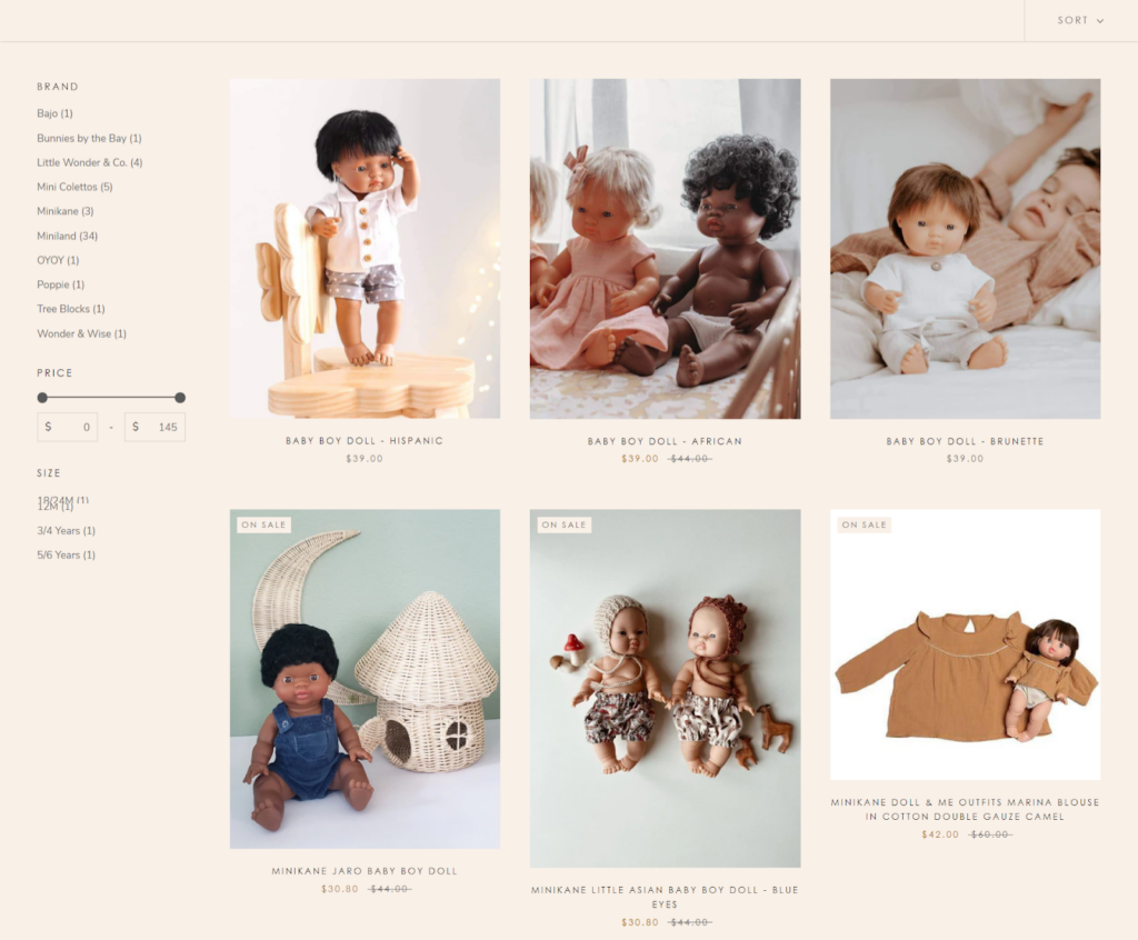
On product pages, multiple images showcase items from different angles, and the “You may also like” section encourages further exploration.
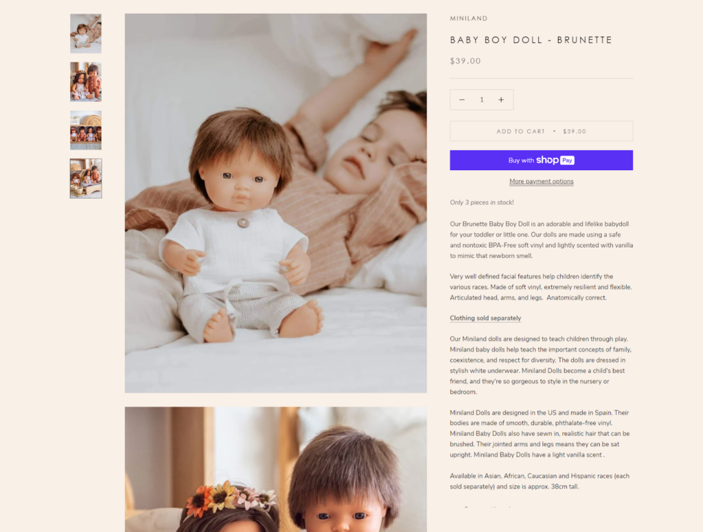
The clean layout and prominent “Add to Cart” and express checkout button “Pay with Shop pay” make the purchasing process quick and simple.
Cart & Checkout
In the cart summary, you’ll see the selected items, quantities, and total price. The checkout page has several payment options, including Shop Pay, PayPal, and Google Pay.
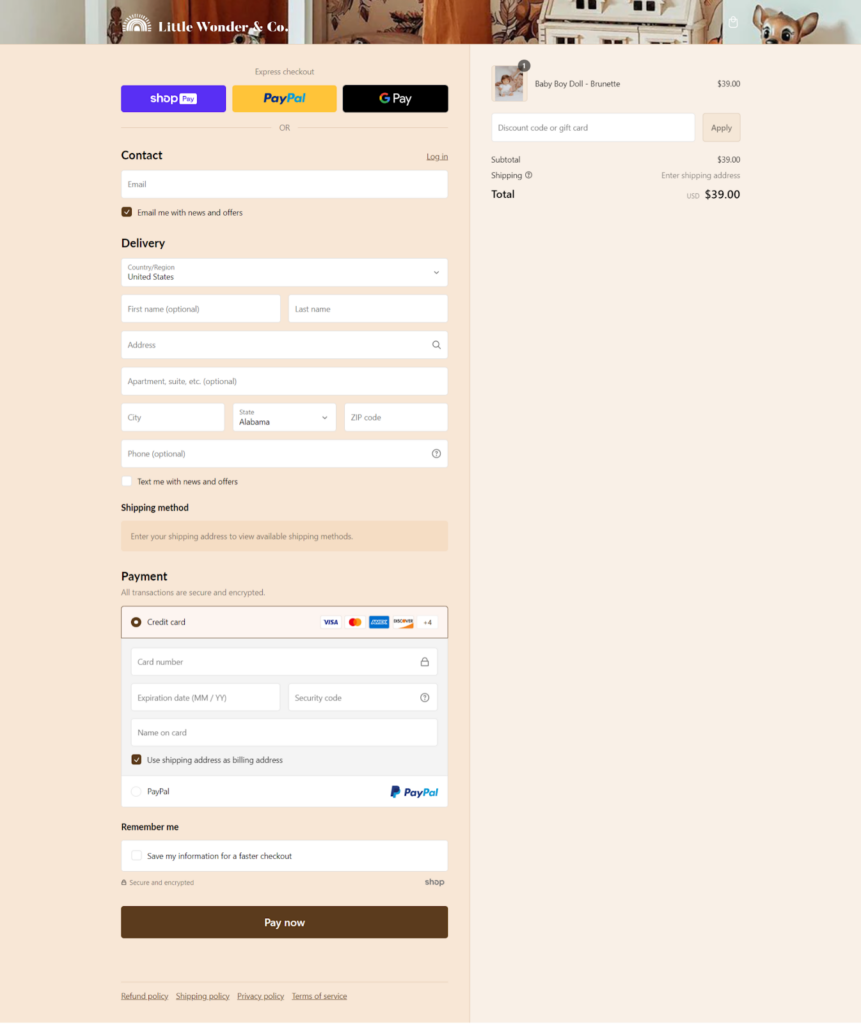
Users will appreciate the well-organized and straightforward form fields for contact, delivery, and payment information. The option to save information for a faster checkout further enhances user convenience.
What We Love About It
Little Wonder & Co. is laudable for its strong focus on sustainability and inclusivity. The soft color palette aligns perfectly with their natural, eco-friendly product range.
4. TOYNK
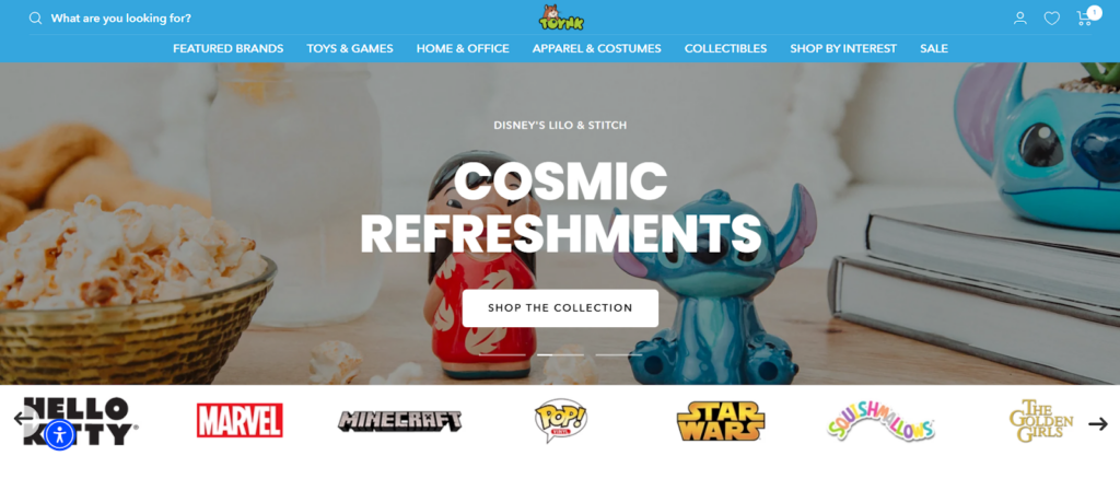
TOYNK is a vibrant and dynamic online toy store specializing in a wide range of toys, games, collectibles, and home and office accessories. Founded in 2001, Toynk has grown to become a go-to destination for fans of various franchises, offering products from popular universes like Star Wars, Marvel, Disney, and more.
The company is known for its wide selection of licensed merchandise and exclusive items, particularly those featured at major conventions like San Diego Comic-Con.
Visual Design
The TOYNK website has a fun and engaging visual design that grabs your attention right away. You’ll love the playful background and toy-themed icons on the homepage. Bright colors make the site look awesome.
Navigation and Interactivity
The main menu is prominently displayed at the top of the homepage, offering quick access to various categories such as Featured Brands, Toys & Games, Home & Office, Apparel & Costumes, and Collectibles.
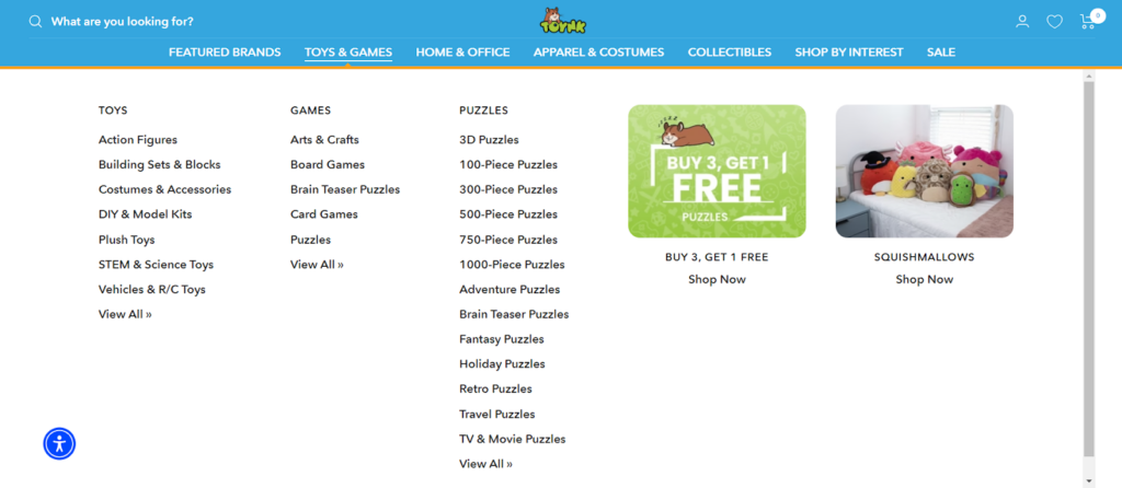
Users can easily find what they are looking for with the drop-down menus. Interactive elements, such as the “Buy 3, Get 1 Free” promotion banner, enhance the site’s engagement by highlighting current offers.
Collection and Product Pages
Each TOYNK product page has multiple high-resolution images, detailed descriptions, and customer reviews. The layout is clean and uncluttered, so users can focus on the products in detail.
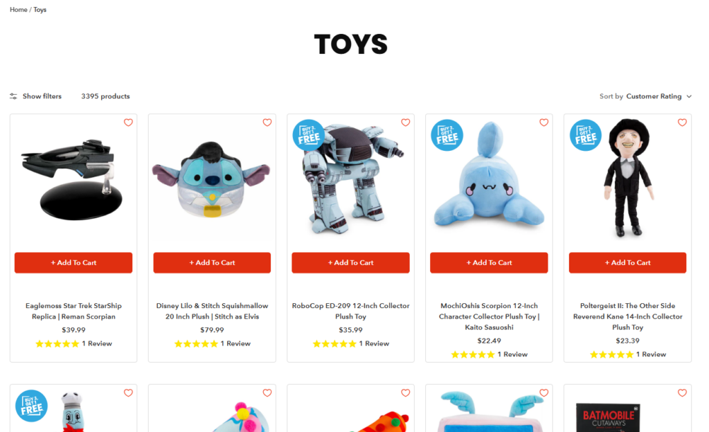
A “Buy with Prime” button and an “Add to Cart” button facilitate the purchasing process. Related products are suggested at the bottom of the page to help users discover more items they might be interested in.
Cart & Checkout
A mini cart appears after an item has been added and provides a quick overview of the selected products as well as a “Buy 3 Get 1 Free” offer.
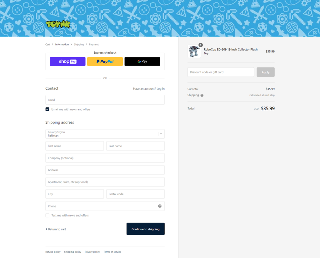
Using Shop Pay, PayPal, and Google Pay allows users to complete the checkout process quickly and easily. Users can enter their shipping information and proceed to payment without complications.
What We Love About It
We love the focus on exclusive and limited-edition items, particularly those tied to major events like San Diego Comic-Con. The “Buy 3, Get 1 Free” promotion for puzzles is a clever way to encourage larger purchases. Additionally, the site’s commitment to customer service is evident through its easily accessible Help Center and secure payment assurances, building trust with shoppers.
5. Milton & Goose
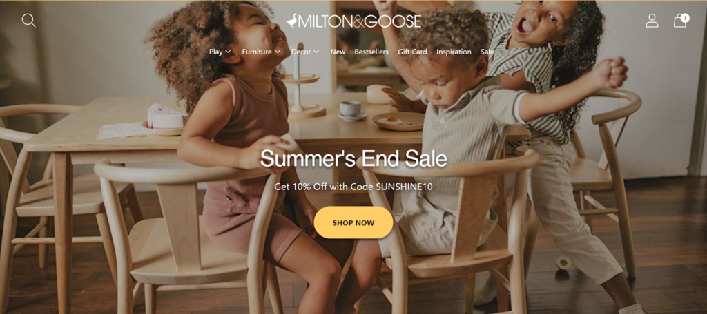
Milton & Goose is a premium toy store specializing in heirloom-quality playthings and furniture for children. Founded in 2017, the brand focuses on craftsmanship, sustainability, and safety, ensuring all products are made in the USA from non-toxic materials. Their offerings include beautifully designed play kitchens, furniture, and toys that inspire imaginative play while fitting seamlessly into modern homes.
With a commitment to quality and aesthetics, Milton & Goose has garnered attention from notable publications and a loyal customer base.
Visual Design
Visually, Milton & Goose is clean, modern, and inviting. Using whites and pastels on the homepage creates a calming and elegant atmosphere. It is easy to navigate the site due to its spacious layout and uncluttered design that complements the brand’s high-end image. The website’s design reinforces the brand’s premium image.
Navigation and Interactivity
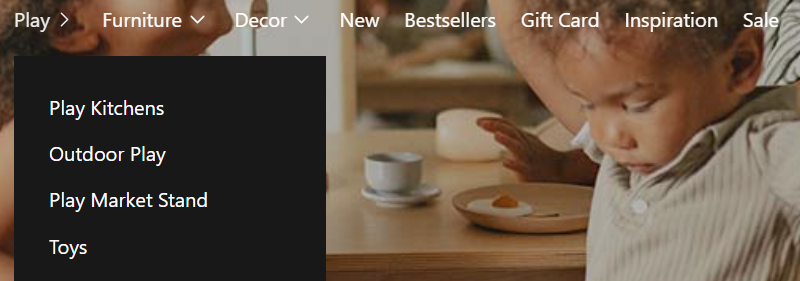
Customers can browse the site quickly using the menus organized into categories like Play, Furniture, Decor, and more. The dropdown menus give quick access to subcategories.
The homepage features a prominent “Shop Now” button, guiding visitors directly to product collections. The overall navigation structure is intuitive and user-friendly, allowing for quick access to different sections of the site.
Collection and Product Pages
Users can easily compare products at a glance on the toys collection page, with products displayed in a grid format, each with a clean image, name, price, and rating.
When users click on a product, they see a detailed and informative product page. The product page displays multiple high-quality images, a detailed description, and customer reviews. This thorough presentation helps customers make better purchasing decisions.
Cart & Checkout
Milton & Goose offers a smooth and efficient cart and checkout process. The cart summary is clear, showing the items, quantities, and total price. The checkout page offers multiple payment options, including Shop Pay, PayPal, and Google Pay, catering to a variety of customer preferences. The form is straightforward, with fields for shipping information and an option to receive news and offers. This simplicity reduces friction, making it easy for customers to complete their purchases.
What We Love About It
The Milton & Goose brand stands out because of their commitment to quality, sustainability, and modern aesthetics. Made in the USA, craftsmanship and non-toxic materials make them appeal to a discerning crowd. The brand prominently highlights Made in USA craftsmanship and non-toxic materials to attract conscious buyers.
Bottom Line
In order to increase conversion rates and create a loyal customer base, your website should be easy to navigate and look great. Using these Shopify toy stores as inspiration, you can make your own store more user-friendly. With some creative design choices, your toy store can be as fun as the products you sell.
Contact us today to learn more about what we can do to help you create your dream store.


Post a Comment
Got a question? Have a feedback? Please feel free to leave your ideas, opinions, and questions in the comments section of our post! ❤️