Decathlon: CRO Inspiration for Sports or Fitness Stores [Shopify Plus]

So, we’re back with our 2nd CRO Inspiration guide for sports and fitness stores.
And, today, we’re turning our attention to a global sporting goods giant: Decathlon!
If you’re looking for some serious inspiration on how to boost your online store’s sales, then you’ve come to the right place. In this blog post, we’re going to break down exactly what Decathlon does right on its website.
Unlike our previous CRO Inspiration guide for Skincare brands, we shall focus here on the conversion-focus design of each page of the Decathlon website. And we’ll show you how you can apply these same strategies to your own Shopify Plus store.
As you go through this guide, you may find many WOW moments 🤩 in between that you may like to note down. So, make sure you scroll down to the end for all the takeaways! (For TL;DR readers, you can just check the WOW moments 🤩).
Before we proceed, let’s countdown all the pages on this eCommerce store.
What are the Must-have Pages for Sports or Fitness Stores?
Here’s the list of pages your online sports or fitness store must have like Decathlon:
- Homepage
- Category Overview
- Category Page
- Product Page
- Cart Slider or Cart Page
- Checkout Page
- Order Confirmation/Thank You Page
- Customer Account Creation & Login
- Customer “My Account” Page
- Order Tracking Page
- Order Returns Page
- Size Guides Page
- About Us Page
- Help/Contact Us
- Policy Pages
- FAQ Page
- Dealership Page
- Ambassadors Page
- Blogs/Press
- Career Page
Now, we’re going to break down Decathlon’s website page by page and learn about their CRO strategies as a prominent sport and fitness brand!
1. Homepage
Homepage — we often call it the main branch of online store. All the other pages, like product listings and information pages, come out of it like the branches of a tree. So, it’s no surprise that the homepage holds the first impression you make on potential customers.
Decathlon absolutely nails their homepage, and it’s a fantastic source of inspiration for any Shopify store in the sports and fitness world. Their homepage does a fantastic job of showcasing the vast variety of sports products that Decathlon offers, all presented in a modern, clean design with a bright color scheme that is easy on the eyes.
Header
Taking the center stage at the top is the header.
Here, you’ll find the prominent Decathlon logo, a search bar for you to find exactly what you’re looking for, and a shopping cart icon to keep track of your purchases. A menu bar, neatly laid out, provides links to various product categories, like “Hike & Camp”, “Bikes & Cycling”, “Women”, and more for easy browsing.
Announcement bar
Let’s not miss the announcement bar at the top which rotates multiple deals.
WOW moment 🤩: When you press the down arrow (v) symbol, it will show you all the offers available currently in the store.
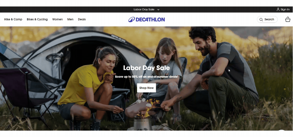
In the same bar, you’ll find the way to register and login to the website.
Search Functionality
Decathlon utilizes a search navigation system that blends browsing and traditional search. The six most important product categories are situated right below the search bar. Clicking on any of these categories incorporates it as a keyword into the search box, initiating a search.
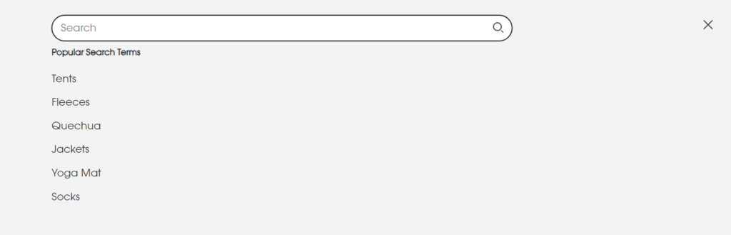
Simultaneously, a menu appears that displays, in a structured way, what the store offers for the term you’ve entered, including relevant categories and popular products.
This innovative method eliminates the need to begin with a search term, as with a typical auto-suggest search, before being prompted to refine your search further using keywords.
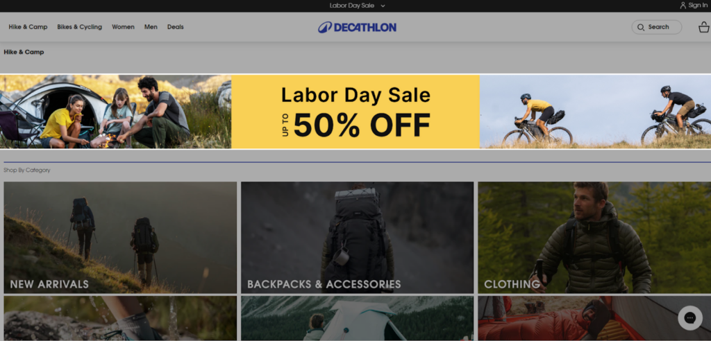
Hero Section
Below the header lies the hero section. This prime spot is reserved to highlight what Decathlon wants you to see first – be it their current promotions or featured products. A large image or video usually grabs your attention here, accompanied by a headline and a call to action button that encourage shoppers to explore further.
Currently it’s promoting their “Labor Day Sale” on the hero banner with a bright CTA button!
This grabs attention and gets users excited to start shopping.
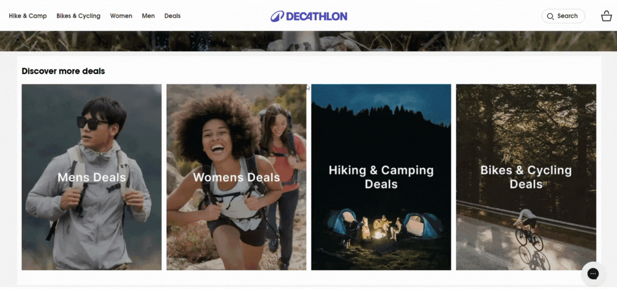
Featured Categories
Next up are the product categories. Decathlon meticulously presents each category with its own dedicated section. You’ll find familiar categories like “Hike & Camp” and “Bikes & Cycling”, alongside others like “Women” and “Men”.
The Deal section showcases products that are currently on sale or discounted. This is important because it attracts customers who are looking for bargains. It can also help to clear out old inventory and make way for new products.
When you explore any of these deal categories, you can find the products with ongoing sales!
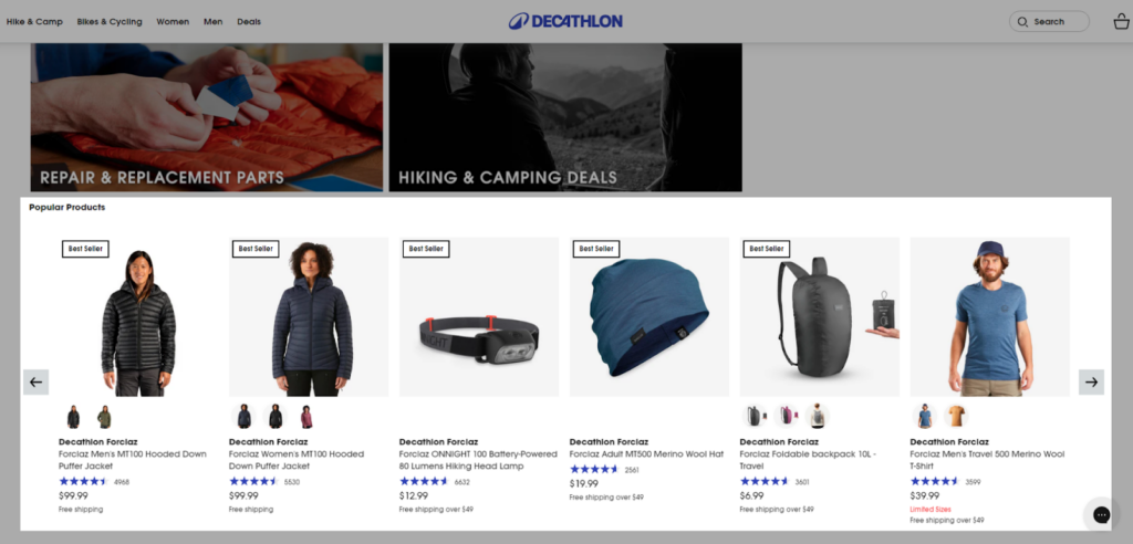
On Sale Products
WOW moment 🤩: The “Labor Day Sale” section on Decathlon’s homepage is another standout element that effectively draws the shopper’s attention.
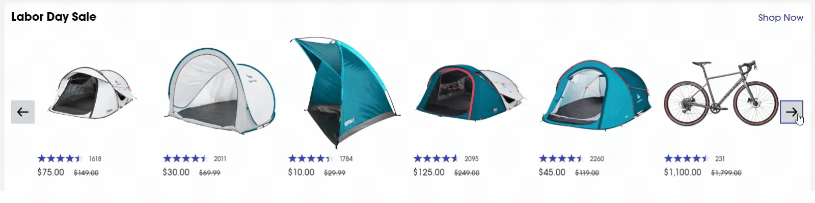
This carousel-style section showcases a curated selection of products that are currently on sale or discounted. The goal of this section is to attract customers looking for deals and to encourage them to explore the wider range of products available.
New Arrivals Section
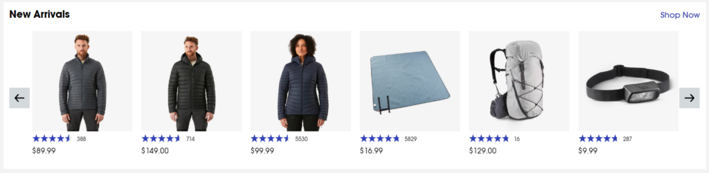
This section highlights the latest products that Decathlon has to offer. This is important because it keeps customers up-to-date on the newest trends and innovations in sporting goods. It can also create a sense of excitement and encourage customers to browse the website for new items they may need or want.
Meet Decathlon
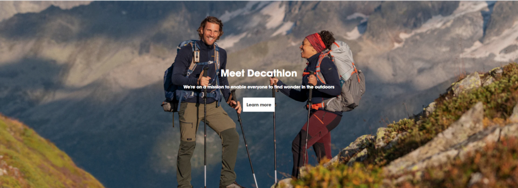
This section provides information about Decathlon’s company values and mission. Customers can learn more about why Decathlon is committed to providing quality and affordable sports and outdoor gear.
Links to Brands and Categories
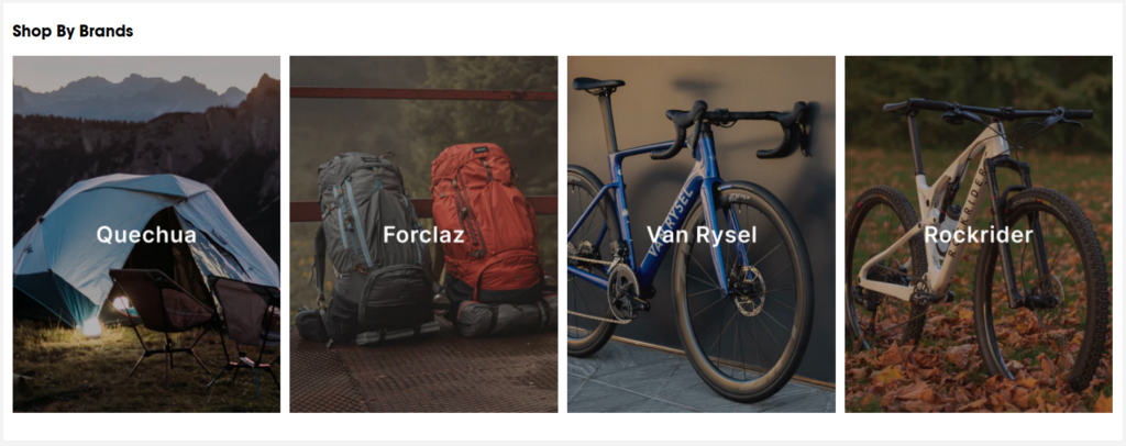
Below the featured products and deals, there are links to different brands and categories of products. This section provides users with more ways to browse and find the products they are interested in.
Overall, your homepage decides how well your store converts visitors into sales, so, it needs to be clear, engaging, and encourage them to explore further.
2. Category Overview
The Decathlon website has a separate page for category overview for their top-level categories.
Having a category overview page is not always necessary. But it’s an important element for large catalog eCommerce stores, as it helps customers understand the range of products that you offer in a particular category. It can also help customers narrow down their search and find the products that they are looking for more quickly.
Here’s what Decathlon has designed their Category overview page:
On-Going Sale Banner
WOW moment 🤩: The page prominently features a banner highlighting the current sales or promotions. This is a strategic move to capture the attention of visitors and encourage them to explore the discounted products.
What to notice here — The banner is visually appealing and includes clear information about the sale, such as the discount percentage or end date.
Multiple-level Category Overviews
The page offers a well-structured hierarchy of category overviews, which allows visitors to easily browse through the wide range of products. The categories are clearly labeled and organized in a logical manner, which makes it simple for users to find the specific items they are looking for.
This multiple-level categorization enhances the user experience by providing a more focused browsing experience.
Featured Products
The “Featured Products” section showcases a curated selection of top-selling or popular items within the category. This section is visually appealing and includes high-quality images of the products. By highlighting popular choices, Decathlon helps visitors discover products that are likely to meet their needs or preferences.
About Category
The “About Category” section provides a concise overview of the category, explaining the types of products available and their intended use cases. This section is valuable for visitors who are new to the category or need more information to make informed decisions.
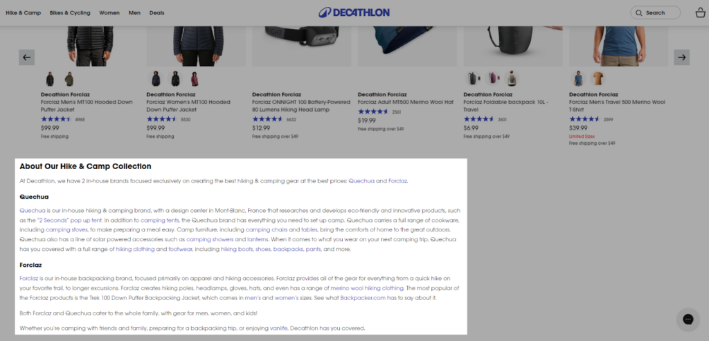
In addition to enhancing the user experience, category overview pages also contribute to improved search engine optimization (SEO). The detailed information about the category and its products helps search engines understand the page’s content and relevance to specific keywords. As a result, shoppers can find these categories at the top of search engine results pages (SERPs). 📈
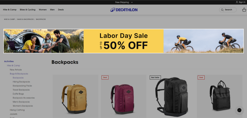
3. Category Page
As the name describes, category pages act as a landing spot for users who are interested in a specific product category but haven’t zeroed in on a particular product yet. Here, users browse through the products offered under a category, compare them, and potentially navigate to the product pages for a detailed view.
Decathlon’s category page serves as a great example of how to design such pages for optimal user experience.
Let’s dissect the category page to understand its key sections and their significance. For better understanding, we are considering the “Backpacks” category here.
Breadcrumbs
The page has breadcrumbs at the top that show the customer their location on the website. This helps customers to understand their location within the website’s hierarchy and allows them to navigate back to previous pages easily.
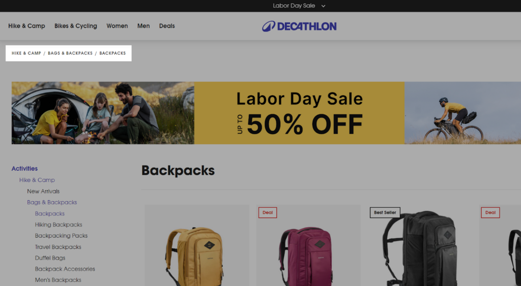
For example, on Decathlon’s Backpacks category page, the Breadcrumbs look like “Hike & Camp / Bags & Backpacks / Backpacks”.
This would indicate that the user is currently on the Backpacks page, which is a subcategory under Bags & Backpacks, which is a subcategory under Hike & Camp being the top-level category.
Hero Banner
Similar to the category overview page, the page greets visitors with a hero banner. Currently, it’s showcasing the ongoing “Labor Day” sale but you can use it to highlight the collection page itself.
This banner might use high-quality images or short videos to visually communicate the value proposition of the product collection — their suitability for various purposes like travel, gym, or everyday use.
Product Listings
Below the hero banner, the page transitions to a grid view of all the lifestyle packs offered by Decathlon. This grid view allows users to quickly scan through the available options and identify packs that acquire their interest.
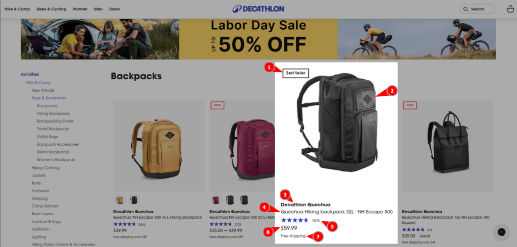
Each product card shares a complete understanding of the product by showing:
- product image
- sale badge
- product variants
- brand name
- product title
- pricing
- star ratings
- free shipping offer
This allows shoppers to easily browse and compare different options at one glance.
Sidebar Navigation
This is what you should admire!
WOW moment 🤩: The sidebar navigation called “Activities” provides additional browsing options within the category. It includes links to all the subcategories (collections) that fall in the same category. This improves the user experience by allowing for a more targeted search.
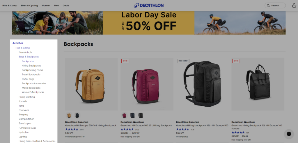
So now, you can directly redirect to the other subcategories (or whatever you want to explore) with one click from the same page itself. You don’t have to check the whole menu all again to find the desired product collection.
Sorting Options
The category page also provides sorting options to help users order the products based on their preferences. Common sorting options include price (low to high or high to low), or popularity (best sellers).
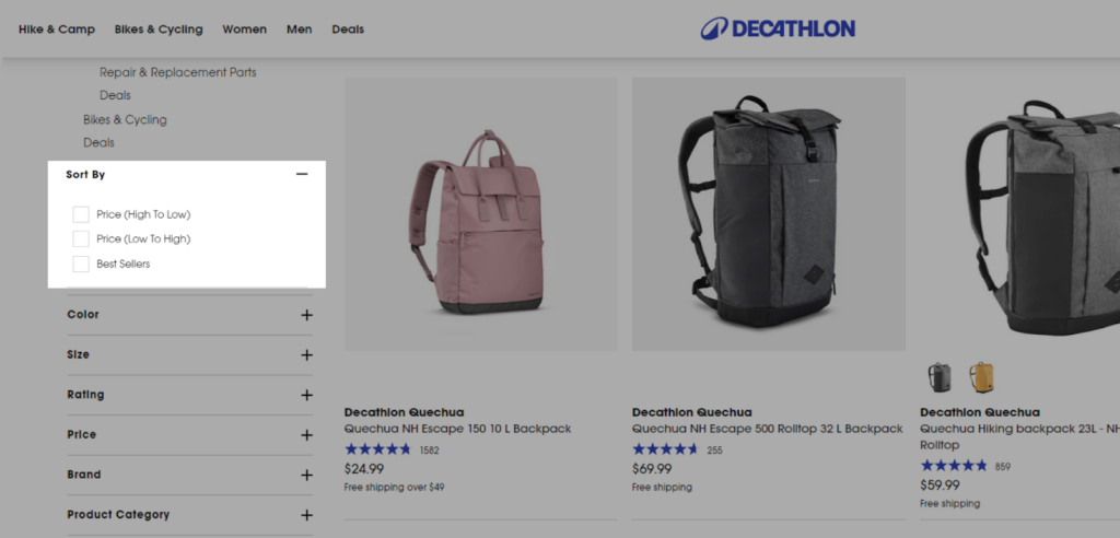
Sub-Categories Filters
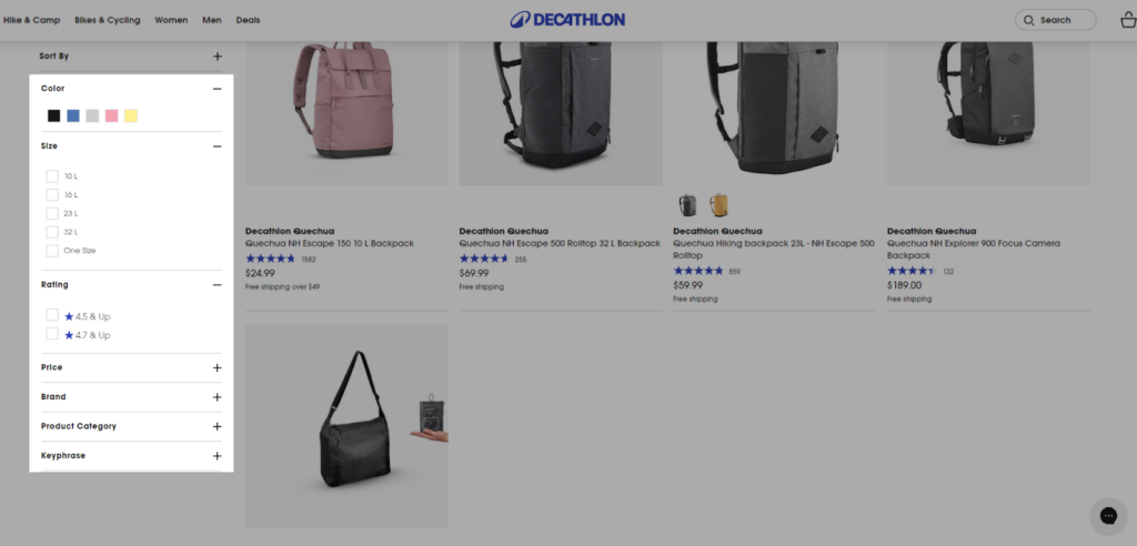
Since the category page offers a wide range of products, Decathlon incorporates filtering options on the left side of the product listing. These filters are smartly curated based on various attributes like:
- price range,
- brand,
- color,
- ratings,
- size,
- product category, and
- keyphrase.
This empowers shoppers to refine their search and find packs that match their specific needs.
You can find the category descriptions at the bottom (after product listings) same as the category overview page which helps each page optimize for SEO as well.
4. Product Page
This is the place where shoppers find A to Z about your product — I mean every detail related to your product.
Decathlon’s product page is very descriptive which easily invokes actions, like adding the product to the cart or making a purchase.
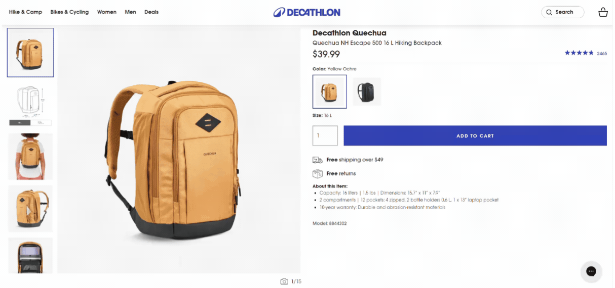
Let’s dissect one of their product page (Quechua NH Escape 500 16 L Hiking Backpack) and understand how it uses various sections to optimize the user experience:
Hero Image and Gallery
High-quality visuals are essential for online shoppers who cannot physically interact with the product.
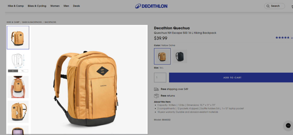
The product page features a prominent hero image showcasing the backpack from multiple angles. There’s also a gallery of additional images that provide a closer look at the product’s details, such as zippers, compartments, and material texture.
Product Details (Above the Fold)
Now, this space is very important in the product page.
WOW moment 🤩: This section sits at the top of the webpage and gives a quick glimpse of the product. As we can see, half of the screen is already allocated to the product gallery, and the remaining half screen is occupied by the most influential elements such as:
- brand name,
- product title,
- price,
- ratings,
- variants,
- quantity selector,
- CTA
- product highlights, etc.
This section is designed to grab the customer’s attention and quickly convey the product’s value proposition.
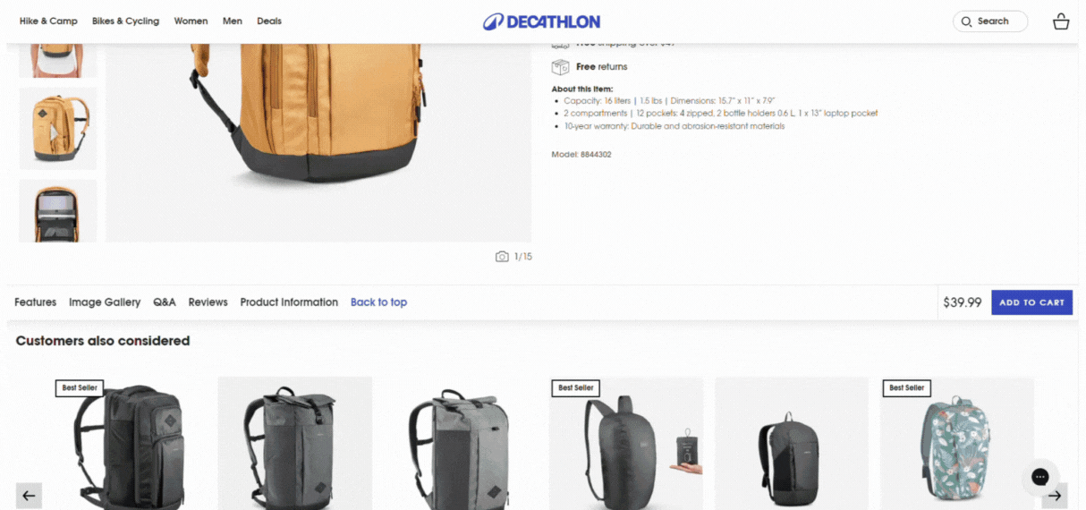
Product Recommendations
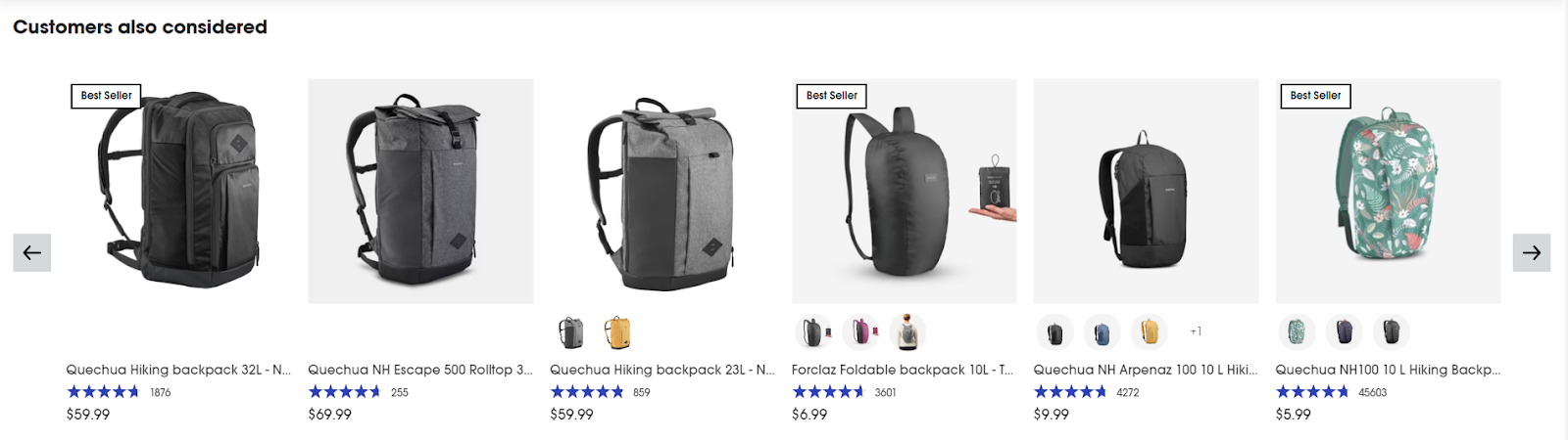
When you scroll a little, you will find a section called “Customers also considered” which shows products that are similar to the one being viewed. This section can help customers discover new products that they may be interested in, and it can also encourage them to purchase additional items.
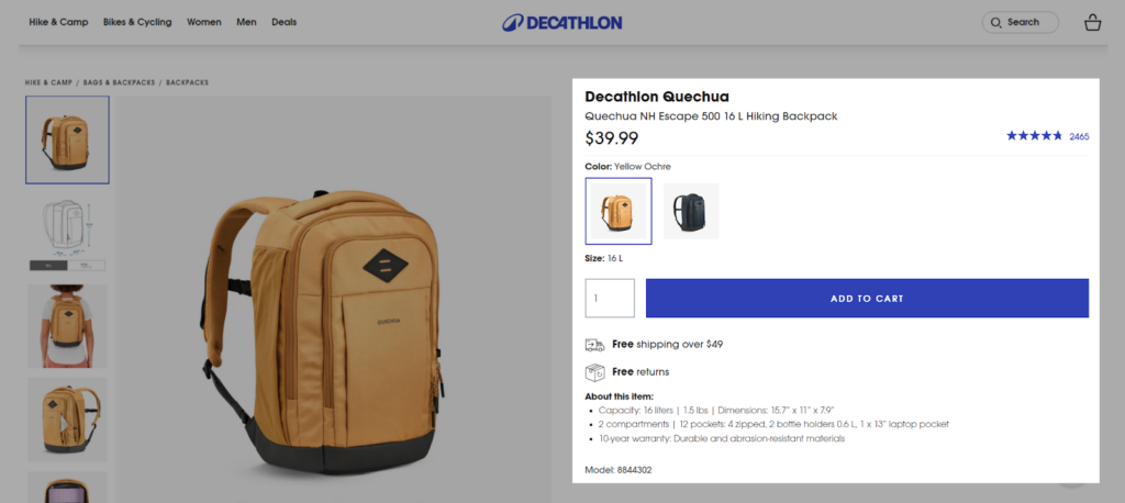
Sticky CTA
WOW moment 🤩: Scroll a little more and you’ll immediately notice the star element of the page — the Sticky “Add to Cart” button!
This prominent button, typically placed at the top of the page, allows users to add the product to their shopping cart with ease (as they don’t have to scroll up and down to find the “add to cart” option).
Other Details (Features, Q&A, Reviews, Instructions, etc.)
This section provides more in-depth information that can be crucial for making a purchase decision. It might include details on product features, FAQs, customer reviews, usage instructions, and warranty information.
It helps customers make an informed purchase decision by providing them with all the information they need to know about the product.
Overall, the Decathlon product page is a great example of how to design a product page that is both informative and user-friendly.
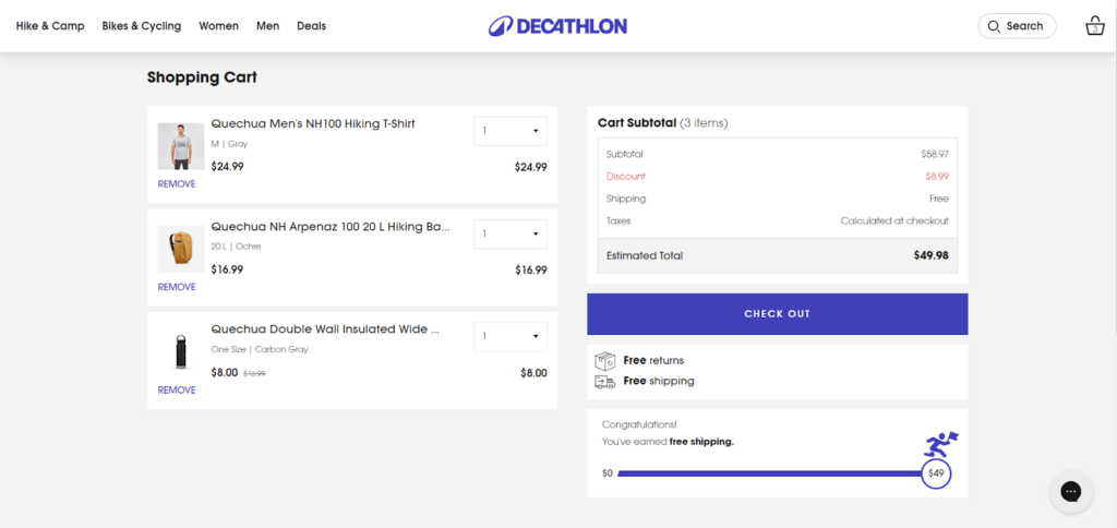
5. Cart Slider or Cart Page
WOW moment 🤩: Now when tap the Add to Cart button on the Decathlon’s product page, a mini cart slider opens on the screen that feels very engaging!
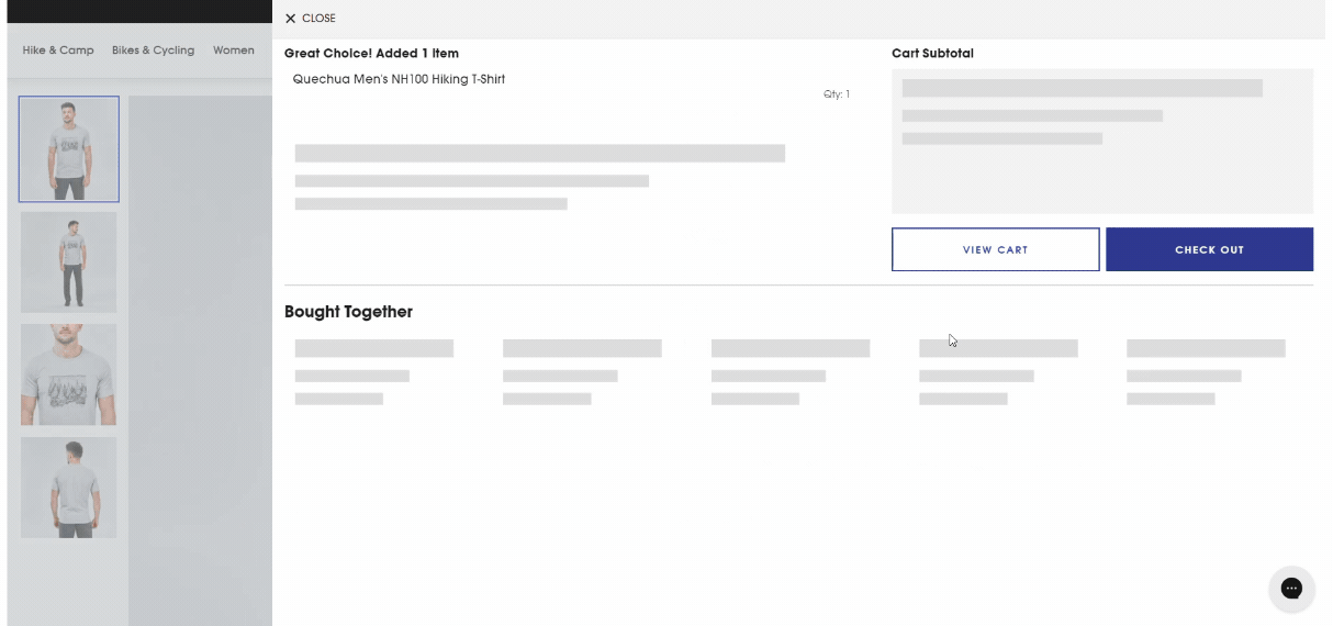
It’s not the cart page but it gives a quick view of your shopping cart without leaving the current page.
This user-friendly element is designed to be expandable and collapsible and enhances the overall shopping experience.
Cart Summary
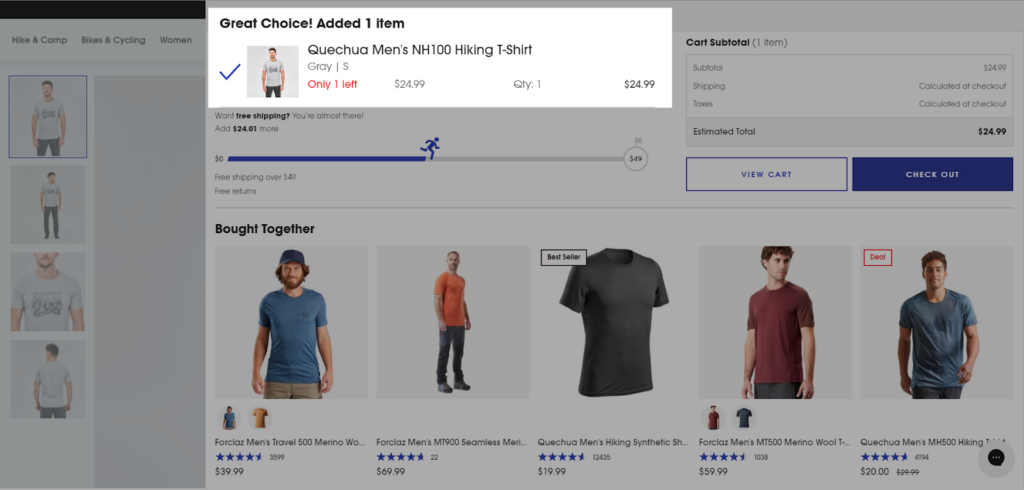
The cart slider displays a concise summary of the items added to the cart. This includes the product image, name, quantity, and price. This allows customers to quickly review their selections (cart items) and make any necessary adjustments before proceeding to the checkout.
Free Shipping Threshold
Can you see that progress bar???
Many e-commerce websites offer free shipping for orders that meet a certain minimum amount.
The Cart Slider displays the free shipping threshold that allows users to see how much more they need to spend to qualify for free shipping.
Here, it asks a few more dollars to reach the threshold………… and yeah!!
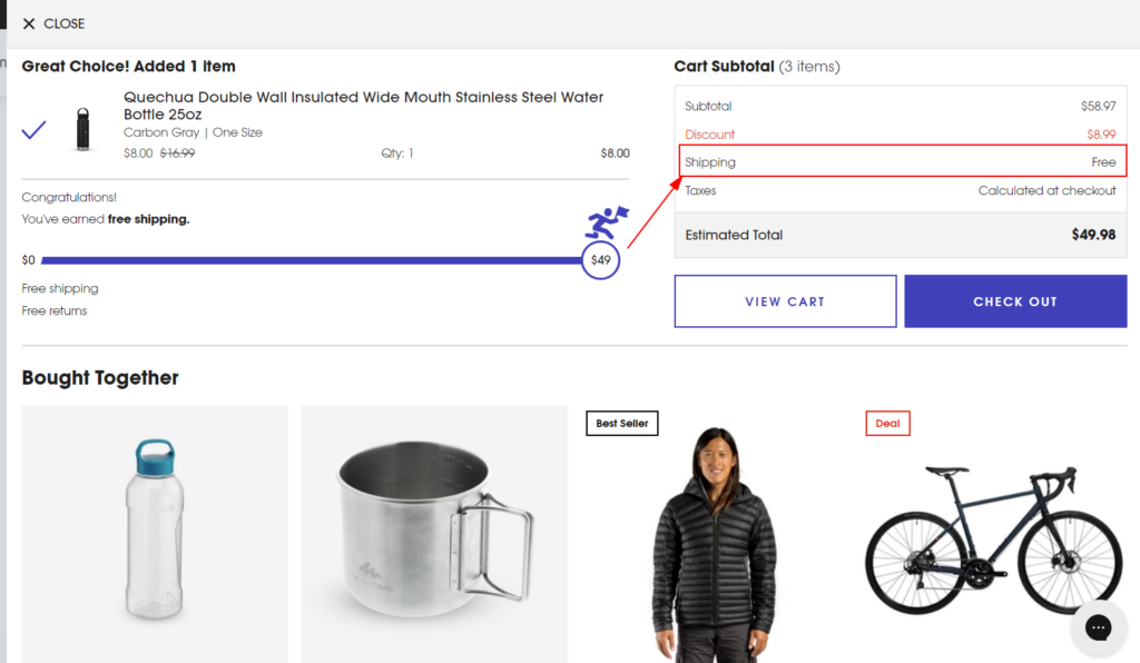
This encourages customers to add more products to their carts and helps you boost the average order value (AOV) effortlessly.
Product Cross-selling
Now, based on the product you added to your shopping cart, the cart slider shows you the product you would also like to add buy!
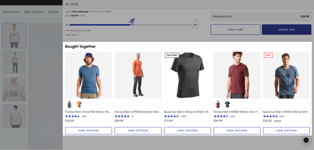
With the combination of the free shipping threshold and recommending complementary products, the Cart Slider can encourage customers to add more items to their cart and increase sales and AOV.
Navigation
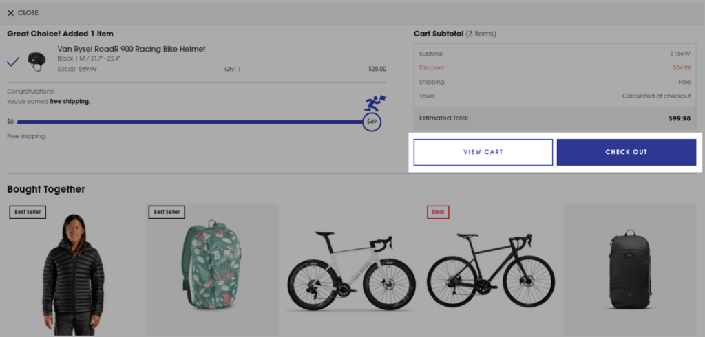
The cart slider typically includes a button or link that allows customers to proceed to the full cart page or even the checkout page. This provides a seamless transition for customers who are ready to complete their purchase.
Well the cart page has the same elements (except product recommendation) but that gives you a full page view as shown below:
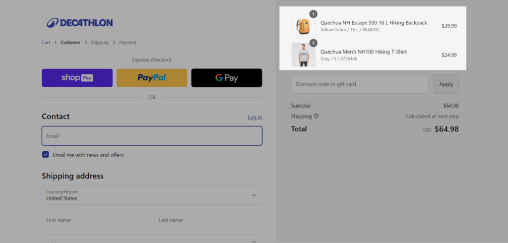
6. Checkout Page
So, Decathlon uses the standard Shopify checkout page and has a similar page layout as given below:
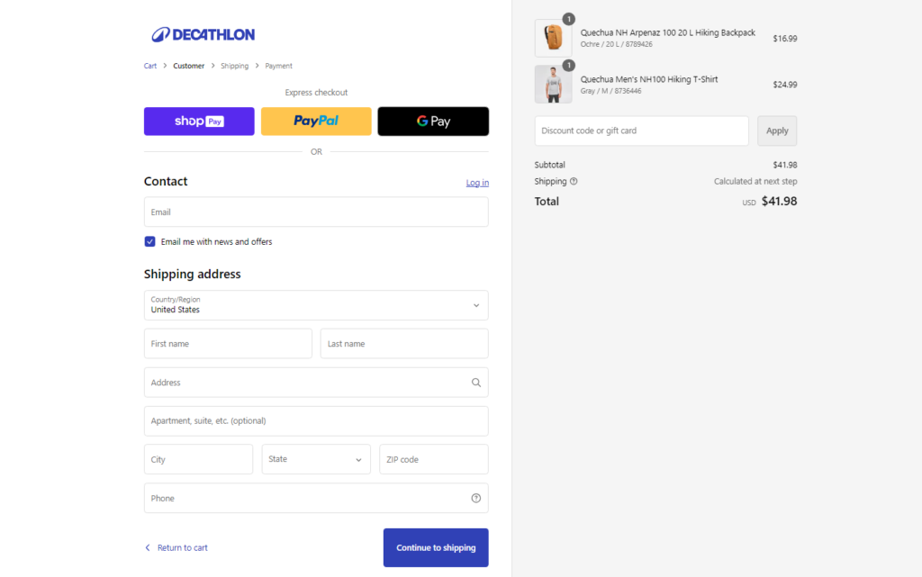
They have kept their checkout page simple with basic customization. However, as a Shopify Plus merchant, you can unlock many advanced features for your checkout page.
Explore 25 Shopify Plus Checkout Page Customization (with examples)!
Order Summary
The first section is a clear overview of the order summary. This includes a detailed list of items, their quantities, and prices. This section also provides a breakdown of shipping costs and any applicable taxes.
Shoppers can also add a coupon code or gift card to avail of the offers and discounts.
Customer Details
The next section requires the customer to enter their shipping details, including address, city, state, and postal code. To expedite the process, the website offers the option to save shipping addresses for future purchases.
Shipping Methods
Once done they are redirected to the second step that lets them select the Shipping option.
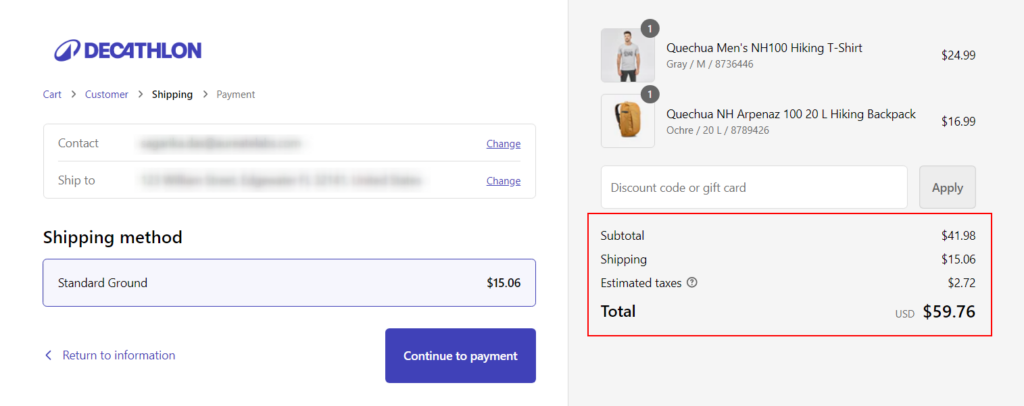
Currently, they have only one shipping method. You can add multiple options like Standard shipping, Express Shipping, etc. with different shipping costs.
Payment
Next and the final step is payment. Decathlon offers credit card and PayPal payment methods.
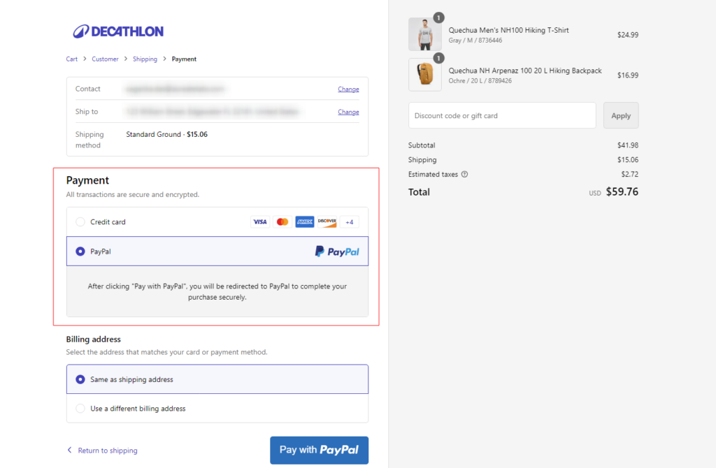
Apart from this, it also offers the express checkout option (such as ShopPay, Google Pay, and PayPal).
Well, you’ve many other payment choices that you should consider based on your target audience. Check out the best payment methods for your Shopify store!
7. Order Confirmation/Thank You Page
So, when the order is successfully placed, the customer is redirected to the order confirmation page (also known as the thank you page).
Well, we currently don’t have access to Decathlon’s Order Confirmation page, but as it’s a Shopify store, we can assume something like this (the default Shopify thank you page):
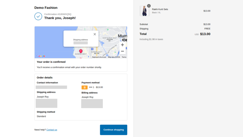
The order confirmation or thank you page generally includes:
- Order Summary: A clear and concise summary of the purchased items, quantities, and total amount.
- Order Number: A unique identifier for the order, which can be used for tracking and customer support.
- Shipping Information: Confirmation of the shipping address and estimated delivery date.
- Payment Confirmation: A message indicating that the payment has been processed successfully.
- Order Tracking: A link to track the shipment’s progress.
- Next Steps: Information on how to track the order, contact customer support, or review the order history.
- Call to Action: A link or button that encourages customers to continue shopping or explore other sections of the website.
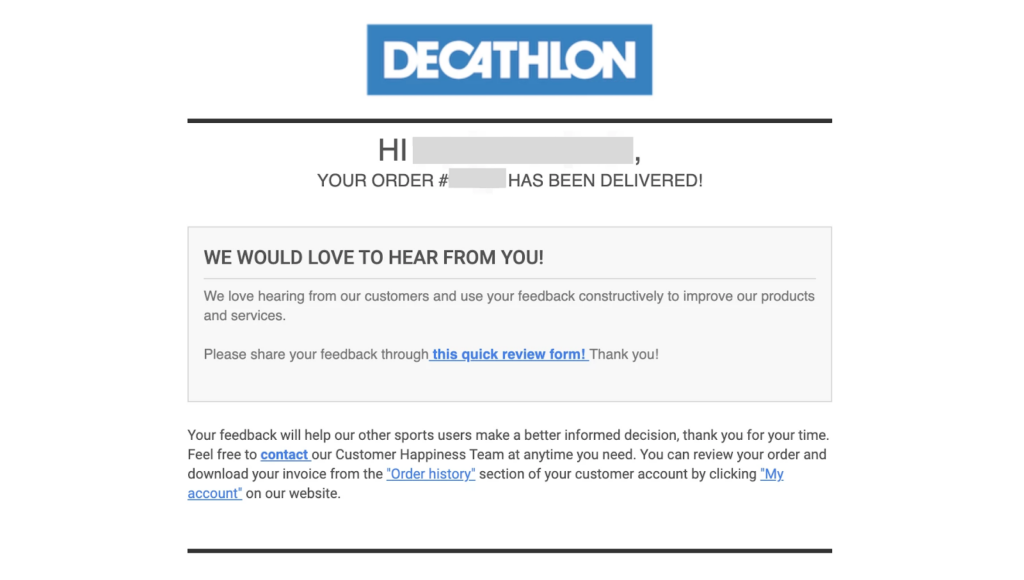
Decathlon’s order confirmation page likely incorporates these elements while maintaining their signature design and branding. We can expect it to be visually appealing, easy to read, and informative similar to their Order confirmation mail (as below):
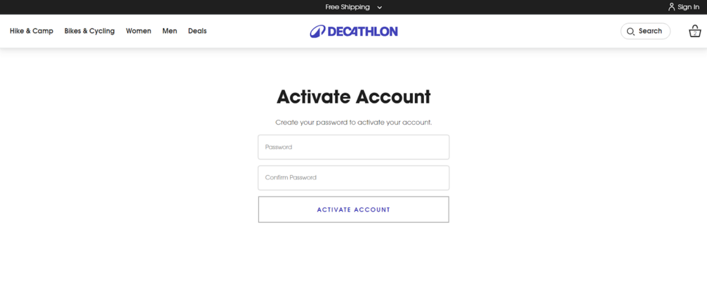
8. Customer Account Creation & Login
Have you seen those lengthy registration forms shoppers are bound to fill out before the checkout process? This is the reason why a big chunk of your potential shoppers run away.
Just look at Decathlon’s Customer Registration page and it’s tiny form!
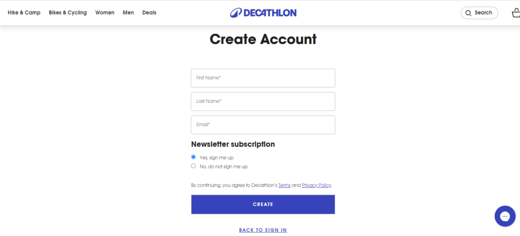
The form is concise, requiring only essential information such as first name, last name, and email address. Once you hit the “Create” button, a verification link will be sent to your email address.
This two-step verification process adds a layer of security without overwhelming the user. After verifying your email address, the user is prompted to create a password.
This way, Decathlon smartly gets user registrations on their website.
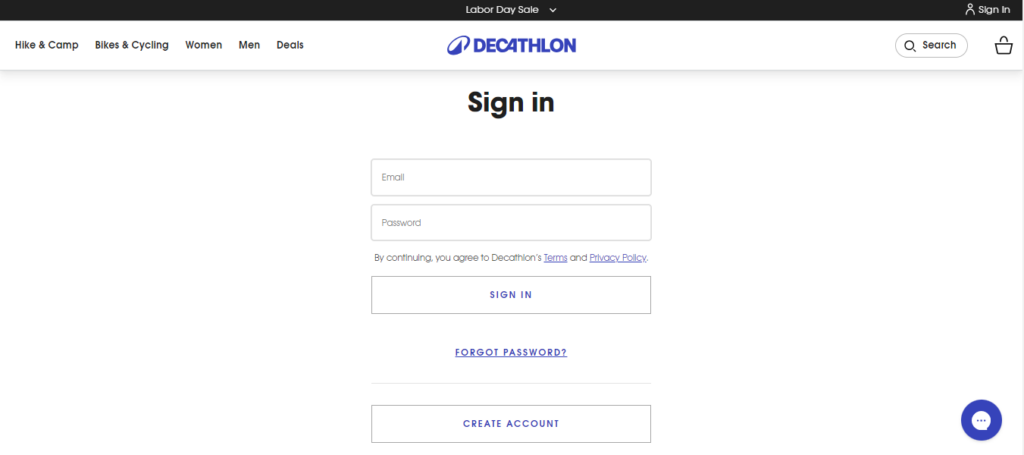
The login page is equally straightforward. Users simply enter their email address and password. Decathlon offers a convenient “Forgot Password” link for those who may need assistance.
9. Customer “My Account” Page
Upon logging in, customers are greeted with a clear Dashboard that’s an overview of their account.
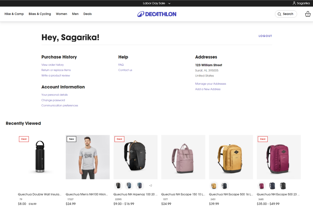
At the top of the page, customers are welcomed with a personalized greeting followed by options to view their purchase history, access help resources, and manage their addresses.
As you can see the page is divided into several sections, each designed to streamline the management of account details and facilitate a seamless shopping experience.
Purchase History
This section offers a comprehensive overview of all past orders. Customers can quickly view order details, track shipments, and initiate returns or replacements. Shoppers also have an option to write a review for their previous order.
Help
The “Help” section provides a valuable resource for customers seeking assistance. It includes links to frequently asked questions (FAQs) and contact information for customer support, to assist customers with any inquiries.
Addresses
This section allows customers to manage their shipping and billing addresses. Customers can add new addresses, edit existing ones, and set default addresses for a smoother checkout process.
Account Information
This gives customers the ability to manage their personal details and account settings. Customers can update their name, email address, phone number, and other personal information. They can create a new password as well as choose whether or not they want to receive email notifications about new products, promotions, and other updates from Decathlon.
Recently Viewed
Here comes the list of products that the customer has recently viewed on the website. This feature can be helpful for customers who are undecided about a purchase or want to compare different options. This can be a convenient way for customers to revisit products they may be interested in.
10. Order Tracking Page
Once you’ve placed an order, the company sends you order details which also include the tracking details. However, Decathlon’s order tracking page offers a convenient way to track your order’s status without having to search through your emails.
The page is simple and straightforward. At the top, it clearly states that there is no tracking number for pickup orders and that a confirmation email will be sent when the order is ready for pickup.
Customers can enter their order number and email address to track their order. The “Track” button initiates the tracking process and provides essential information for customers to monitor the progress of their orders.
11. Order Returns Page
Now, comes the best part where most of the eCommerce brands fail. It’s the after-sales support. This is what mainly associated with customer satisfaction.
Decathlon’s order returns page is designed to make the return process as easy and hassle-free as possible as shown below:
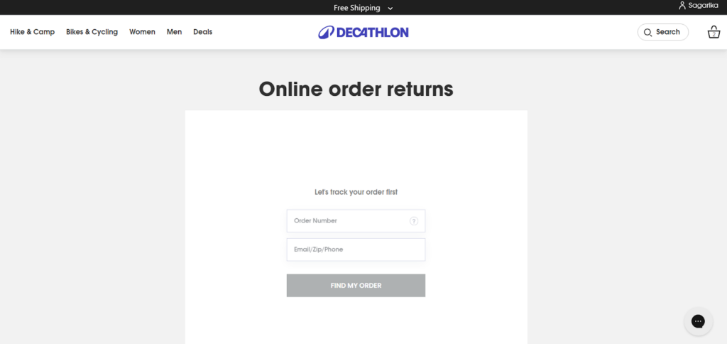
Customers can enter their order number and email address to find their order and initiate the return process.
Once the customer has entered their information and clicked the “FIND MY ORDER” button, they will be guided through the return process. Once the order is located, customers can proceed with the return process.
Decathlon typically provides instructions on how to package the item, obtain a return label, and ship the item back. The company may also offer options for in-store returns or exchanges, depending on the customer’s location and the nature of the product.
12. Size Guides Page
Customers often struggle to find the right-sized products in online shopping.
Decathlon has a dedicated page to resolve the size issue! The size guides page is a comprehensive resource designed to help customers find the perfect fit for their clothing. The page is well-organized and easy to navigate, with separate collapsible sections for
- Men,
- Women,
- Kids,
- Footwear,
- Accessories, and
- Bikes.
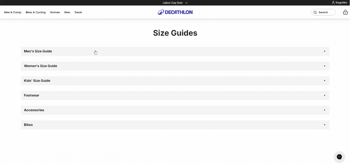
WOW moment 🤩: Each section includes a visual guide with clear instructions on how to measure different body parts, such as the head, chest, waist, hips, and feet. The guides also accommodate a wide range of body types.
The company offers a variety of size options, including regular, plus-size, and petite, to ensure that customers can find clothing that fits them comfortably.
13. About Us Page
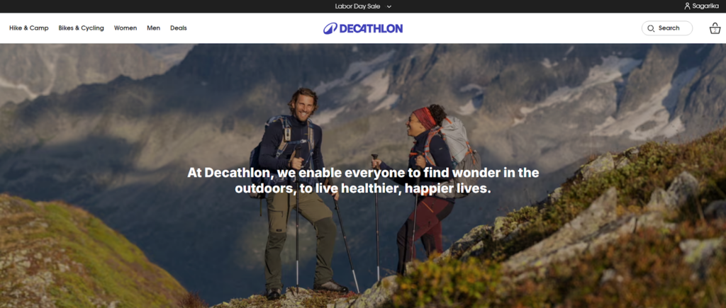
Decathlon’s About Us page is a simple one. It talks about what the company sells and where they are located. The page is well-organized, with different sections that highlight the company’s core values, products, and commitment to the sports community.
If you wondering what you should showcase on your About page, then have a look at the following sections:
Core Values proposition
The page prominently features Decathlon’s core values, which emphasize the company’s mission to make sports accessible to everyone and their dedication to providing high-quality, affordable products.
Some of Our Iconic Products
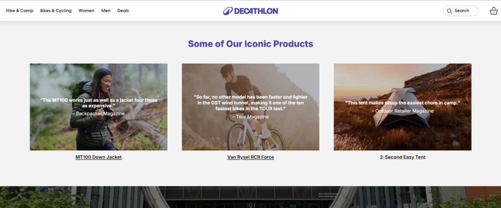
This section showcases a selection of Decathlon’s most popular and well-known products, such as tents and jackets. These products are accompanied by images and brief descriptions, giving visitors a glimpse into Decathlon’s diverse product range.
Headquarters
Decathlon’s headquarters location is mentioned, providing a sense of the company’s global reach and presence.
Quick Facts
It’s the best way to showcase the company’s growth!
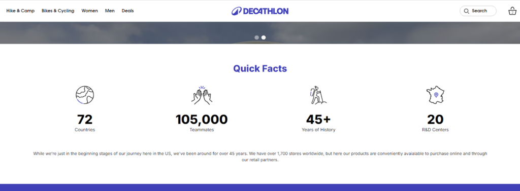
This section presents key facts about Decathlon, such as the number of stores worldwide, the number of employees, and the company’s history. This informs visitors about the company’s scalability and market potential.
Our Brands
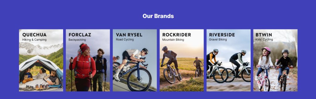
The page features a list of Decathlon’s own brands which can give a better understanding of the brands and their product lines.
Team Partners
Decathlon highlights its partnerships with athletes and teams. It demonstrates their involvement in the sports community and their support for athletes at all levels.
The Latest from Our Newsroom
A link to Decathlon’s newsroom allows visitors to stay updated on the company’s latest announcements, news, and events. This keeps customers informed about the company’s developments and builds confidence in the brand.
Community on Instagram
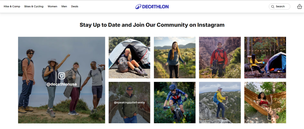
Here’s the best part — a screen full of UGC!
WOW moment 🤩: The Instagram community showcases a variety of user-generated content, such as photos and videos of customers enjoying Decathlon products. This authentic content helps potential customers visualize themselves using the products and builds trust in the brand.
14. Help/Contact Us
The Contact Us page of the Decathlon store is more a Help section where customers can share their queries and product reviews.
Check out the page below:
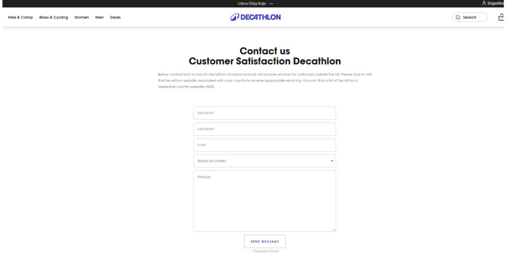
The page is simple and straightforward, with a clear layout that makes it easy to find the necessary information and submit a query.
At the top of the page, there is a prominent “Contact Us” heading, followed by a brief explanation that clarifies that the contact form is only for Decathlon USA customers. This ensures that customers outside the US are directed to the appropriate Decathlon website for their country.
Once customers have filled out the form, they can click the “SEND MESSAGE” button to submit their query. This simple and efficient process makes it easy for customers to get in touch with Decathlon’s customer support team and receive assistance.
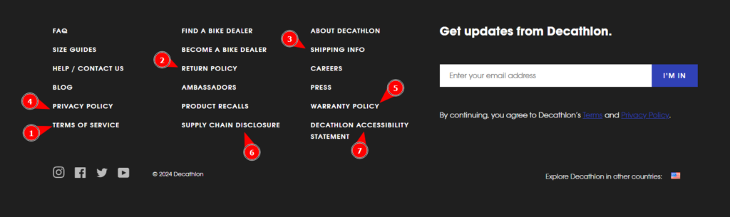
15. Policy Pages
When you are a growing brand, you can’t neglect the legalities and compliances. For that, some necessary pages are required on your online store. Decathlon has a list of these pages as follows:
- Terms & Conditions: This page outlines the rules and regulations governing the use of Decathlon’s website and services. It covers topics such as account creation, order placement, payment, shipping, returns, and intellectual property rights.
- Return Policy: Decathlon’s Return Policy clearly states the conditions under which customers can return or exchange products. It includes information on return windows, eligible items, and refund procedures.
- Shipping Policy: This page details Decathlon’s shipping methods, costs, and delivery times. It may also provide information on tracking orders and handling shipping exceptions.
- Privacy Policy: Decathlon’s Privacy Policy explains how the company collects, uses, and protects customer data. It covers topics such as data collection, data sharing, and data security measures.
- Warranty Policy: This page outlines the warranty terms and conditions for Decathlon products. It may include information on product defects, repair or replacement options, and warranty duration.
- Supply Chain Disclosure: Decathlon’s Supply Chain Disclosure provides transparency into the company’s sourcing practices and ethical standards. It may cover topics such as labor practices, environmental sustainability, and supplier relationships.
- Decathlon Accessibility Statement: This statement outlines Decathlon’s commitment to making its website accessible to people with disabilities. It may include information on accessibility features, compliance with accessibility standards, and contact information for individuals with accessibility concerns.
These policy pages are essential for building trust with customers and ensuring compliance with relevant laws and regulations.
Apart from the availability of these legal pages, you may also want to know how the brand has made these pages accessible to their shoppers. Take a look at their website footer:
16. FAQ Page
Shoppers are mainly concerned about their orders, delivery, cancellations, and many more. And it’s not always necessary to answer these questions personally. The common questions can be bundled and let them assist them by themselves.
Decathlon’s FAQ page is a comprehensive resource designed to address common customer inquiries. The page is organized into clear categories, such as “My Order,” “Return and Warranty,” and “Other commonly asked questions.” This structure allows customers to quickly find the information they need.
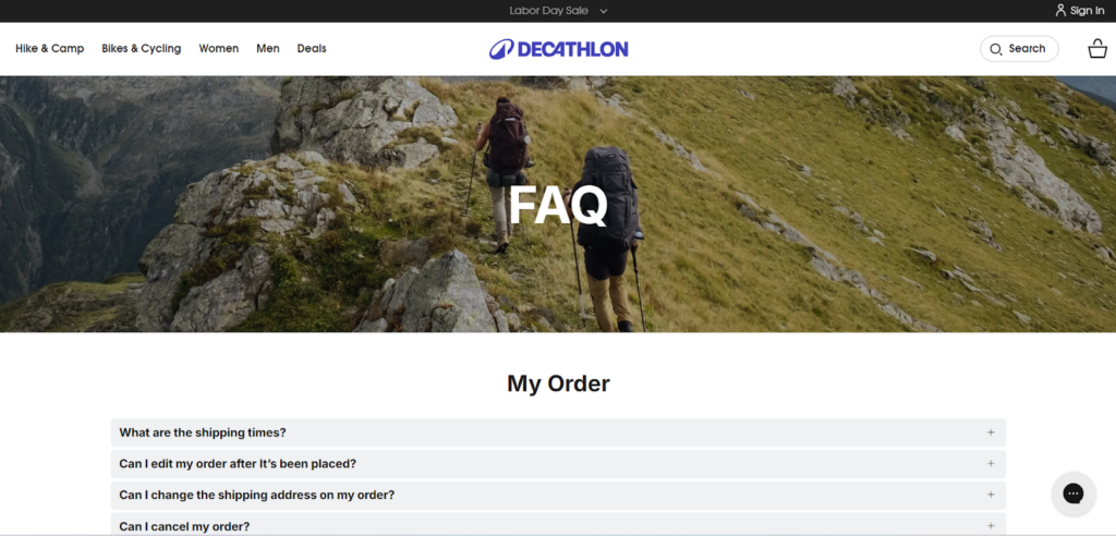
Within each category, Decathlon provides detailed answers to frequently asked questions, covering topics such as order tracking, shipping methods, return policies, refunds, warranties, and more. This helps customers save time and effort by providing them with the information they need without having to contact customer support.
Decathlon’s FAQ page is not only helpful for customers but also for the company’s customer support team. It can reduce the workload of customer support agents and allow them to focus on more complex inquiries.
17. Dealership Page
You belong to a niche where dealerships or partnerships are very common things, right??
Hmm… For that, you should have a dedicated page that attracts and engages potential business partners interested in becoming your dealers.
Decathlon’s dealership page is a prime example of how this can be done effectively.
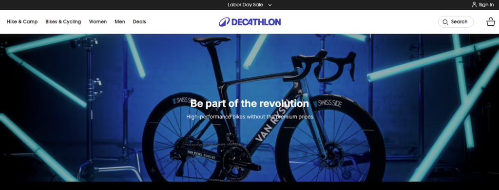
The page is visually appealing, with a modern design that complements the brand’s overall aesthetic. The hero image, featuring a cyclist riding a mountain bike, immediately sets the tone and conveys the adventurous spirit associated with Decathlon. Next, the navigation with sections like “Road Bikes”, “Gravel Bikes”, and “Mountain Bikes” highlights the company’s product range and expertise.
The “Become a Decathlon Bike Dealer” section is the centerpiece of the page.
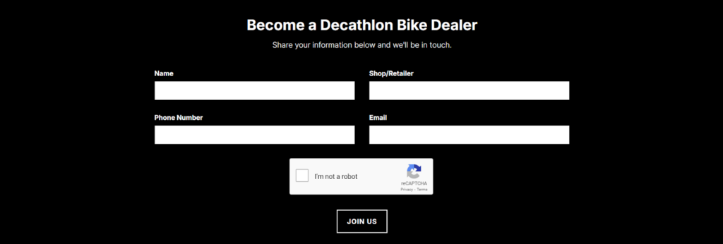
The inclusion of a contact form on the dealership page makes it easy for potential dealers to reach out and express their interest. This streamlined process encourages engagement and simplifies the initial contact.
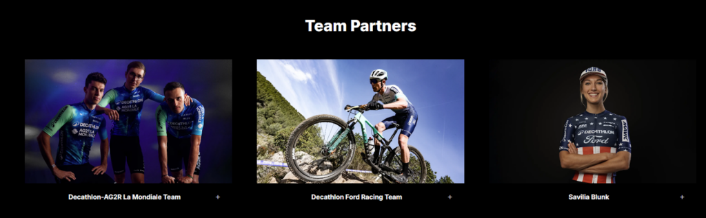
Below the dealer form, Decathlon showcases its “Team Partners”, which features images of professional cyclists associated with the brand. This strengthens Decathlon’s commitment to the cycling community and can be a powerful motivator for potential dealers.
Lastly, the “Discover the world of Van Rysel” section adds another layer of interest, highlighting Decathlon’s own bike brand. This can be a selling point for dealers who are looking to offer a unique and high-quality product line.
18. Ambassadors Page
Need more helping hands to promote your brands and products?
A strong brand ambassador program can significantly enhance a company’s reputation and reach. You can partner with influential individuals who align with the brand’s values, companies can leverage their ambassadors’ social media following and credibility to promote their products and connect with a wider audience.
Decathlon’s Ambassadors Page can be a great inspiration for you.
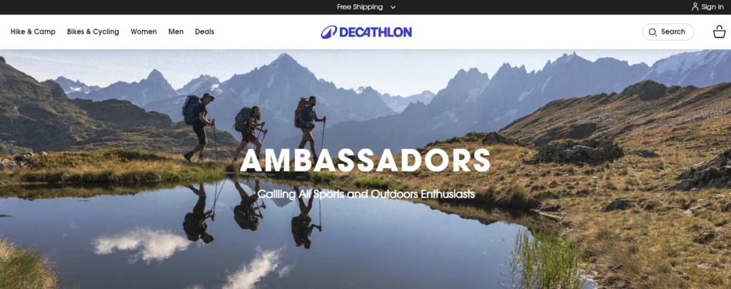
WOW moment 🤩: One of the standout features is the detailed profiles of each ambassador (and emphasizes the importance of being a “FUN-FLUENCER” and a “CONTENT CREATOR”). This helps visitors understand the ambassador’s relevance to the brand and their expertise in the field.
You can also find the eligibility criteria to join the program and become decathlon’s ambassadors.
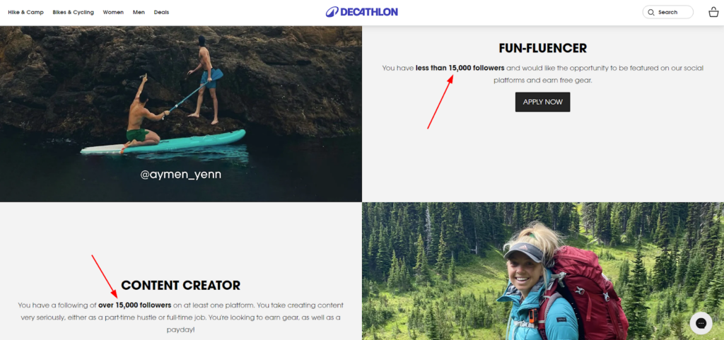
By partnering with individuals who share their passion for sports and active lifestyles, Decathlon creates a network of advocates who can help spread the word about their products and services.
19. Blogs/Press
Being a seller and owner of a sports or fitness store, it’s your responsibility to spread awareness about your products. And the blog page can help you achieve that.
Decathlon’s blog page is a gem of informative and engaging content. It covers a wide range of topics related to sports, fitness, and outdoor activities. From product reviews and how-to guides to industry news and athlete profiles, the content is designed to educate, inspire, and entertain.
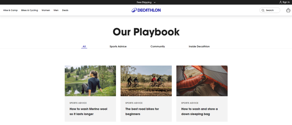
The page’s layout is user-friendly, with clear categories and well-formatted articles. This makes it easy for visitors to find the content they’re interested in.
Similarly, the press page highlights the media coverage received by the brand. This helps to build trust and credibility with their audience. Additionally, Decathlon uses high-quality visuals, such as images and videos, to enhance the overall user experience.
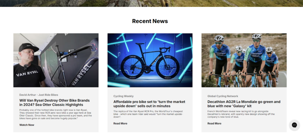
By consistently publishing valuable content, Decathlon positions itself as a thought leader in the sports and fitness industry. This helps to build trust with customers, increase brand awareness, and drive traffic to their website.
Also, the blogs/press page can generate backlinks from other websites, which can improve the site’s search engine ranking.
20. Career Page
An eCommerce website can play various roles!
It can also serve as a platform to attract and recruit talented individuals who align with the company’s values and mission.
Decathlon’s career page is well-designed and effectively conveys the company’s culture and values.
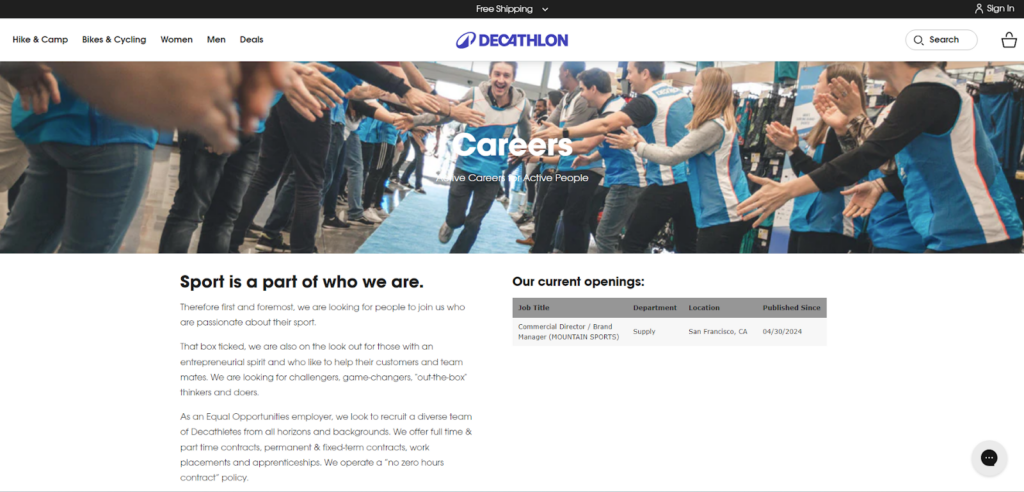
The page highlights Decathlon’s passion for sports, commitment to diversity and inclusion, and focus on employee development. This helps to attract candidates who align with the company’s mission and values.
The page also includes a section showcasing current job openings. The inclusion of location and publication date makes it easy for candidates to find relevant opportunities.
Final Thoughts!
So, we reached the end of this guide.
Hope you learned something from this page-by-page breakdown.
Now, it’s time to take action! Experiment with Decathlon’s strategies and see how they can benefit your Shopify Plus store. Remember, a holistic approach to CRO is key. Don’t just focus on individual elements; consider how they work together to create a seamless customer journey.
We call this CRO-focused UI/UX design, where exceptional customer experiences meet conversion-boosting design. By combining personalized audits and deep insights into your customer’s behavior, you can create a truly optimized online store.
If you’re unsure where to start, don’t hesitate to consult with CRO experts. With a personalized CRO audit of your eCommerce store, we’ll provide tailored recommendations to help you maximize your online sales.


Post a Comment
Got a question? Have a feedback? Please feel free to leave your ideas, opinions, and questions in the comments section of our post! ❤️