The Role of UI/UX in Customer Retention [for eCommerce Industry] – A Detailed Guide

Introduction:
Imagine you’ve come to a new city in a new country and you are visiting it only the second time. This time, you want to enjoy it even better than last time but you see there are no clear signs for directions, the sidewalks are cracked, and the transportation is totally messed up.
How would you feel? Frustrated, right?
The same happens with your existing customers when they land on your eCommerce site to buy something new. This all happens because of poor UI/UX design.
And when their experience with your website is not smooth, they will stop buying from you again and again – hampering your customer retention period.
When your customer retention period is low, it’s obvious that you will find it hard to make profits in the long run.
To avoid this dead end, you need to make sure that your storefront is compelling and engaging so that your customers can’t stop but keep buying from you for a longer period of time.
Wondering how you can do that? We’ve got you covered!
This guide will walk through the UI/UX strategies you can use to retain your customers. Plus, we will also share the designing strategies you can use to boost your customer retention.
So, let’s get started with the understanding of how UI/UX impacts customer retention.
How UI/UX Impacts Customer Retention?
Before I tell you how UI/UX helps in customer retention, I recall this memory of a restaurant that I often visit. So whenever I visit there, the attendant places the my preferred water bottle without me asking for it. They also place the QR code for me to browse the menu.
And while leaving the restaurant, he brings the QR code without me asking for it as he knows that’s how I pay every time.
The best part? This smooth experience makes me visit the restaurant even more!
Now if you have to translate this same experience for your eCommerce store customers, you need to make an impact with great UI/UX.
Let’s see how having effective UI/UX impacts your customer retention rate.
Tailored Experience for Returning Customers
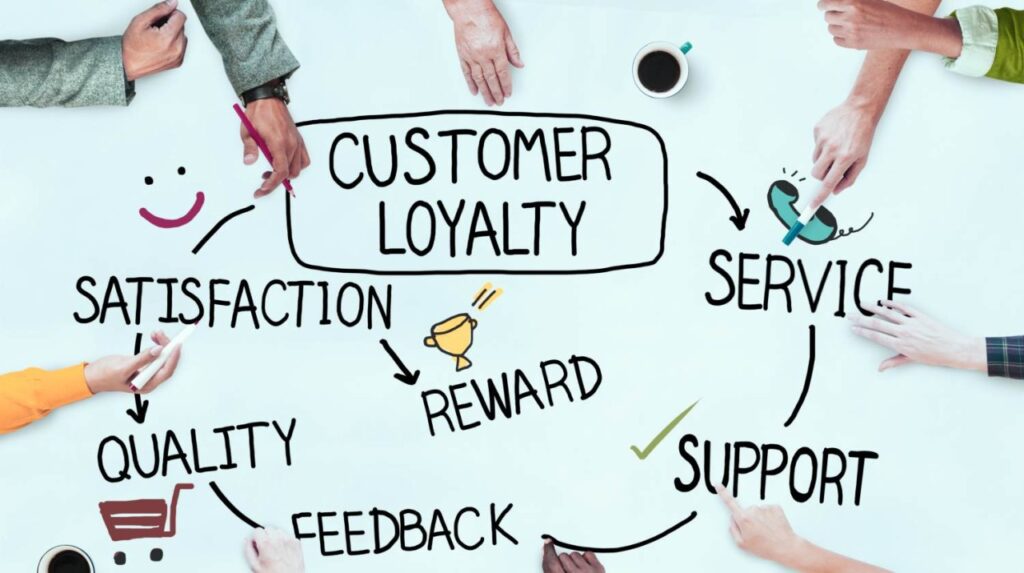
I’m sure when you visit an eCommerce store the second time (and as you keep visiting), you see the home page is designed in a way that encourages you to keep browsing the store.
These dynamic sections of product recommendations based on past purchases, viewed items, and the option to continue shopping for items in the cart make it easier for returning customers to find what they are looking for without any hassle – impacting the customer retention rate significantly.
Plus, providing discounts for this dynamic content is a great way to retain a customer almost 93% of customers feel encouraged to buy again when offered discounts – boosting the customer retention rate.
Loyalty Program Integration for Higher Sales
Other than tailored experiences, UI/UX design also influences the amount of customers who join your loyalty program.
Having a UI/UX that lets more and more customers know about your loyalty programs through subtle designs (attractive banners) and experience strategies (fewer clicks to access) can help you achieve your retention goals faster.
When people can easily know about your loyalty programs and reward points, it becomes easier for you to get them in your funnel to sell more in the future – improving customer retention rate.
Moreover, how easy you make it for customers to redeem their points with a simple process during the checkout also determines if they will buy from you next time, impacting their association with your brand.
Post-Purchase Engagement
The role of UI/UX doesn’t end once the customer has made a purchase but it becomes even more crucial after that.
The way you make it easier for your customers to track their orders, check their past purchases, and download invoices decides how likely they are to buy from you again.
If these elements are hidden under a trap of a lot many clicks and complex paths – they might never buy from your store ever again – impacting your customer retention rate in a bad way.
Customer Service Accessibility
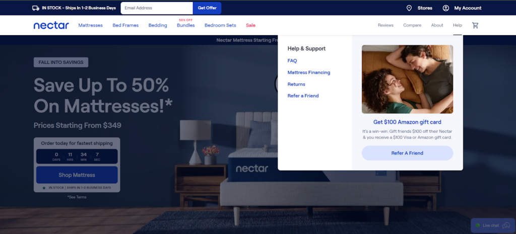
Last but not least, having a design flow that ensures great customer support in your store also impacts their association with your brand.
While evaluating the effectiveness of UI/UX on your eCommerce store, ask yourself these questions –
- Is it easy for customers to contact your support team?
- Can your customers access Live Chat to solve their queries throughout their journey?
- Can your customers easily find FAQs about the products and services with one click?
- Can your customers access their past chat with your support team for their reference?
When your store is designed to help your customers, it’s definitely going to create a ripple effect of satisfied customer experiences, thus improving the customer retention ratio to a great extent.
So now that you know the importance of UI/UX in customer retention, the question arises: how do you ensure that you have implemented the best strategies in your store?
It’s easier said than done but to give you a quick idea, we have listed some of the key UI/UX strategies to optimize customer retention rate.
Let’s have a quick look at each of these strategies.
How to Design UI/UX to Boost Customer Retention?
To improve your customer retention rate, multiple things need to be aligned correctly. When it comes to UI/UX, you need to have functionalities like re-ordering with one click, dynamic content blocks, and gamifying the customer experience.
Let’s walk through the process of how you can implement these strategies on your site.
1. Enhanced Account Features
If we refer back to the example of the restaurant mentioned above, it was the attendant who remembered all the details of what I liked and what not. It was that convenience that made me go back to them again and again.
To give the same experience to your eCommerce customers, you need to have advanced machine-learning algorithms that smoothen the shopping experience. Think of designing a dashboard that saves customers’ preferences such as size, colors, or favorite categories.
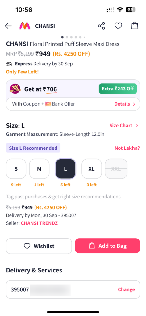
As you can see in the above example, Myntra, a popular fashion brand, has this functionality in its store. Whenever I’ve to buy something, it picks the size automatically based on my past orders.
With this saved preferences feature, customers can reduce the time it takes to re-enter their details again and again, making their shopping experience better.
Moreover, you can also let people set their preferences of receiving notifications about the sales and discounts for their wishlist items and restocking of sold-out products.
Here’s how ASOS – a popular fashion brand, is making it possible for customers to choose their contact preferences for smooth shopping experiences.
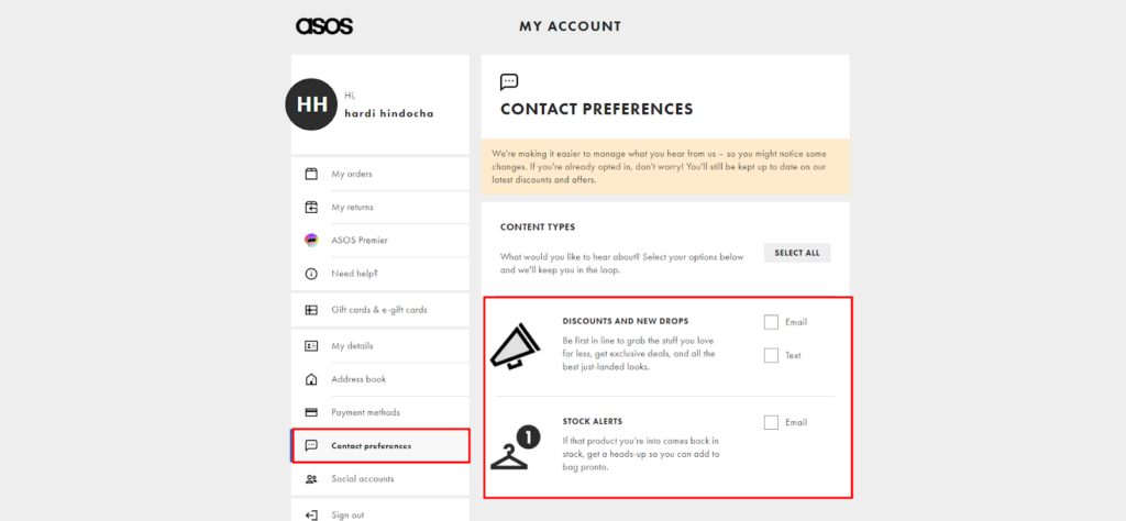
When you implement these UI/UX features on your eCommerce website, it helps customers buy their favorite items before they go out of stock again while helping you improve your customer retention ratio over a period of time.
💡Additional Note:
While designing these experiences, make sure customers don’t have to juggle much to find and set their preferences. It may backfire on your retention rate.
2. One-Click Reordering
Now let’s say you don’t often visit offline restaurants like me but order food online – I’m sure you have seen the functionality of “reordering” your dishes.
This is another way to retain your customers for longer. This strategy works wonders especially if you have a grocery or food store as customers need it more often.
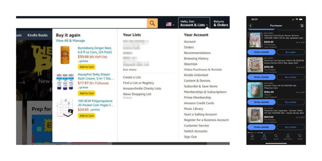
Amazon and eBay have implemented this feature nicely in their store. So whenever an existing customer visits the site, they can see their past orders and re-order them with just one click.
It’s like visiting an offline store and getting what you want in just one minute. This ease of customer interaction encourages customers to stay longer with your brand – improving your customer retention rate.
And when your UI/UX designs inspire customers to buy again and again, you get one more chance to design an experience that further enhances customer retention rate.
Can you make a guess? It’s about giving rewards for staying with a brand for longer.
Let’s explore that in the next section.
3. Loyalty Program Integration
Rewards !! Customers love it when they receive additional discounts and benefits when they buy products from you. And to give your customers constant rewards without burning your pockets – it’s a good idea to make them a part of loyalty programs.
As many studies prove the impact of loyalty programs on customer retention in the retail industry [1], you need to make sure that your UI/UX encourages customers to join loyalty programs.
To effectively highlight loyalty programs for repeat customers in your UI/UX, it’s important that you clearly display how the loyalty program works and its different tiers. For example, 1 point for each dollar spent, points for following the brand on social media platforms and sharing UGC content.
Plus, have a progress bar where customers can see how many points they have earned and what are the next milestones for them. This visual representation and gamification (more on this later) excite users to keep purchasing from you again – improving customer retention rate.
Dange Dover has nicely designed the UI/UX of their loyalty program page where it checks off all the important elements required to lure customers to opt for the program.
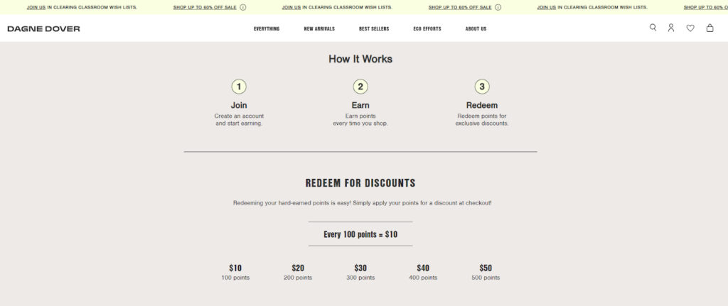
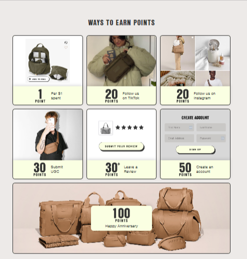
These different tires of earning points by connecting to the brand in different ways is quite an impressive strategy to improve customer retention rate to a great extent.
Not sure how you should design the user path for the loyalty programs? Take inspiration from the below example –
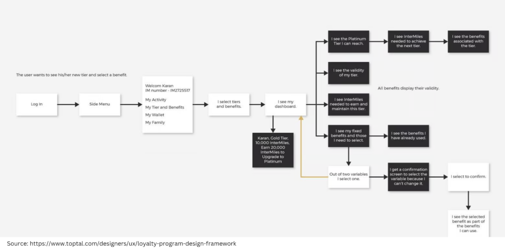
As you can see, the path includes a mixture of different tires, validity, spending needed to upgrade the tire, and fixed benefits – all of these ways target a variety of triggers that encourage customers to stay connected with your brand for longer.
Moreover, ensure your UI is designed in a way where customers can easily redeem their points and rewards in multiple ways like discounts, cashback, and additional benefits like express deliveries.
Other than highlighting loyalty programs in your UI/UX designs, you can also encourage users to opt for subscription and auto-replenishment options through intuitive UI/UX to increase customer retention rate.
Let’s explore it in the next section.
4. Subscription and Auto-Replenishment Options
If you sell products that customers need to buy regularly or on a particular interval, you can design the UI/UX of your store in a way that encourages subscription and auto-replenishment more naturally – improving customer retention of your store.
Think of products like hair care, skincare, beauty products, food & beverages, and grocery products.
Here are some tips to keep in mind for designing a store that promotes subscription and auto-replenishment options –
- Place a clear “subscribe & save” button – just next to the “add to cart” button or have a sticky widget on the product page for the subscription model.
- Add a dropdown or radio button selector for customers to choose how often they want the product to get delivered (e.g., weekly, bi-weekly, monthly, or bi-monthly).
- Clearly highlight the benefits of a subscription with persuasive copywriting.
- During checkout, include an option to set up auto-refill for consumable products (e.g., “Replenish every X weeks”)
- Make it easy to manage subscriptions in the account overview for a positive brand experience.
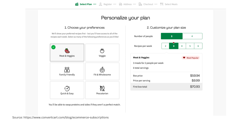
HelloFresh’s UI/UX for the subscription model perfectly fits all the aspects mentioned above – the option to choose the type of food, the number of people, and the frequency per week. All these minute details ensure a great customer experience and thus higher customer retention rate.
5. Dynamic Content for Returning Users
Moving next, to improve your customer retention rate with UI/UX, you can design your store in a way that promotes dynamic content for returning users, as it keeps users engaged for a longer period of time.
Now the question arises, how do you design a store that focuses on dynamic content for returning customers? Follow the given below tips –
- Think of placing sections where customers will see product recommendations based on their browsing history.
- Have a section of “continue shopping” where customers can revisit the products in their cart.
- For customers who frequently reorder, dynamically suggest setting up a subscription or auto-replenishment plan. (Refer to the subscription UI/UX model we just talked about in the previous section)
- Offer dynamic and progressive offers and discounts to encourage repeat visits and purchases.
- Display dynamic products and promotions based on the customer’s location. Think of showing regional-specific best-sellers or seasonal products.
- Design the review section in a way that dynamically shows product reviews from users with similar demographics or preferences, making the reviews more relatable and increasing trust.
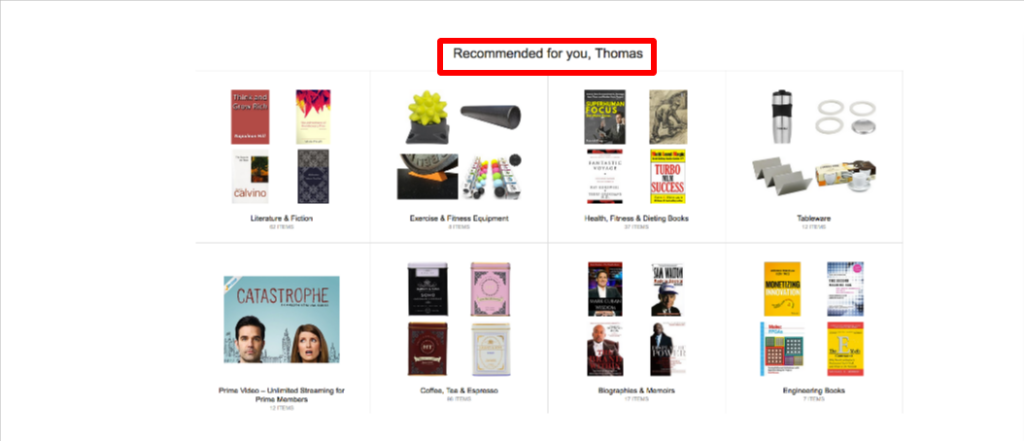
Amazon is a great example of showing dynamic content to their customers for a higher retention rate! Here are some examples of how the brand is utilizing dynamic content in their favor –


6. Gamify the customer experience
Other than dynamic content, you can make it fun for your customers to buy from you again and again to increase customer retention rate.
In simple words, it’s called gamification.
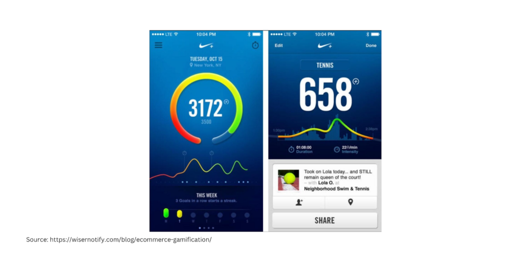
Gamification has become so popular nowadays that even big brands like Nike are leveraging reward points, badges, levels, and leaderboards to engage customers for longer.
As you can see in the below example, Nike encouraged their customers to be physically active and earn rewards in exchange. As people need to use the Nike+ App to get their rewards, the brand recall got stronger and stronger – helping Nike improve its customer retention rate.
Plus, this has also helped the brand increase app usage by 55% while getting a 30% rise in the product sales linked to the app.
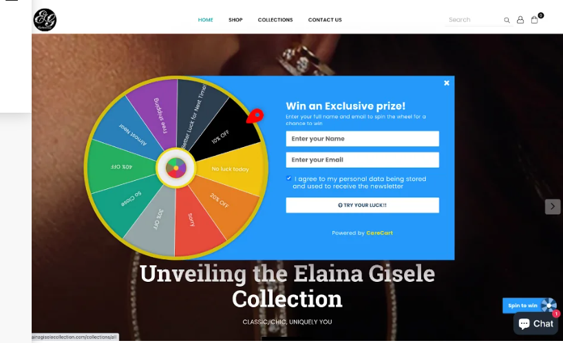
Other than the dashboard, you can also have “spin the wheel” where customers can win an exclusive prize every time they visit the tour website.
Or if you want to level up your gamification game, you can literally make people play on your website and get rewards for it – like how Lacoste did.
As you can see in the video, customers need to find five crocodiles in the store to get rewards. This game strategically engages users to be more connected with the brand (the crocodile in the logo and finding crocodiles in the game too) – which helps in improving brand recall as well as customer retention rate.
So let’s say, you have almost every aspect of UI/UX design in place for better customer retention and still you aren’t super satisfied with the numbers that you see – it’s time to focus on the post-purchase engagement.
7. Right Product Information Display
Unlike other things, the customer retention game actually starts when a customer has already made a purchase and now it’s time for you to make sure they buy from you again.
But if their product experience isn’t great with the first or previous order, they might not buy from you ever again – hampering your customer retention rate.
To address this issue with UI/UX, it’s recommended to have a user guide and detailed instructions mentioned on the product pages so that the customer makes the correct choice while buying.
One quick example I can recall is of a sports brand for women that has designed its UI/UX in a way that clearly mentions the product details along with a size guide.
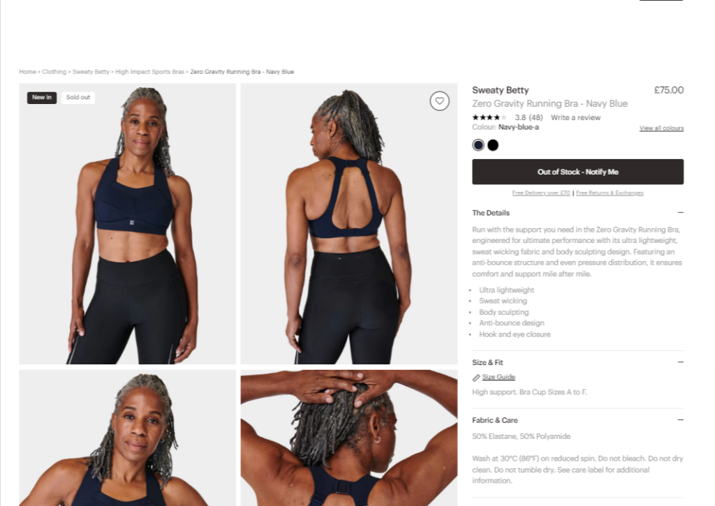
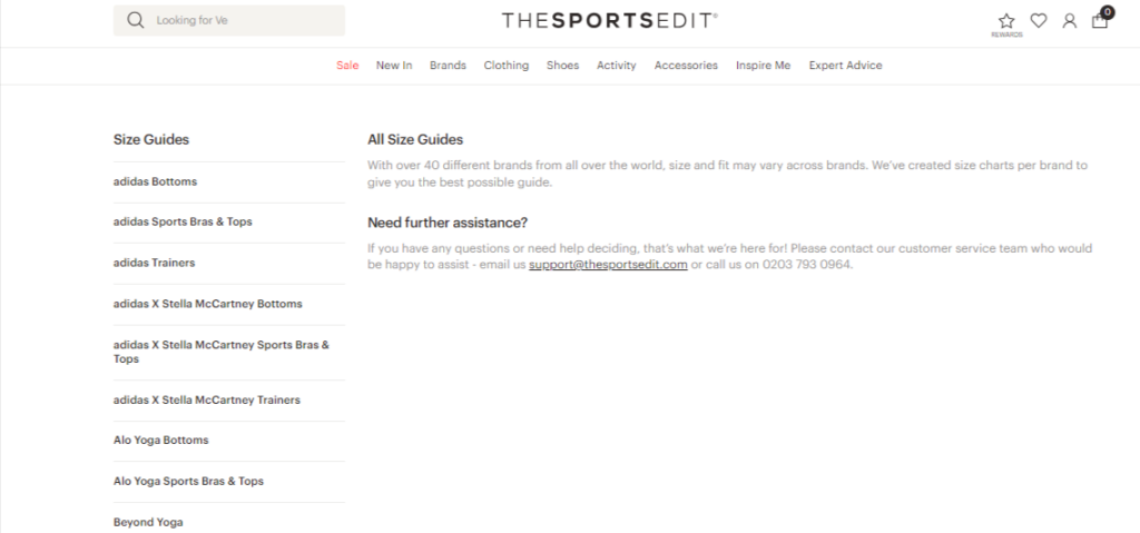
Plus, they have an extensive size guide for multiple brands to make sure people buy the right product.
Not only that, they also designed a huge library of educational content that customers can access for post-purchase journeys.
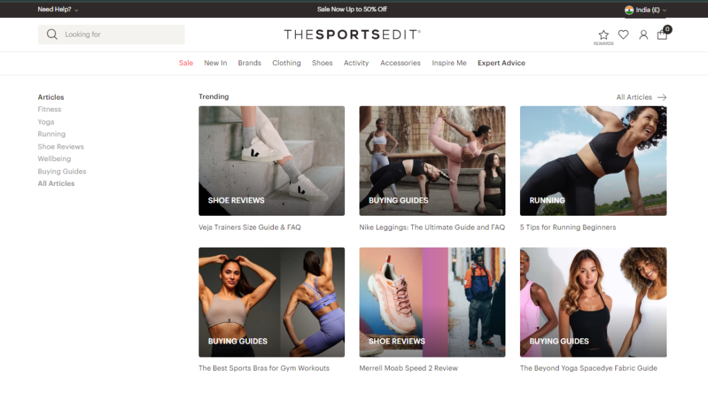
This combination of having educational and authoritative content design makes sure that the customer sees your brand as a leader – helping you improve the customer retention ratio.
8. Customer Feedback and Surveys
Lastly, the key to improving customer retention with UI/UX is knowing what your customers want.
And the best way to know what your customer wants can be achieved by regularly collecting feedback and conducting surveys from your customers.
Think of including conducting “five-second” and “one-click” tests to measure the effectiveness of your designs.
Plus, for the customers who never buy from you after the first order, you can request them to be a part of a survey and give inputs for improvement in exchange for rewards.
Follow this checklist to make sure your surveys are according to the best industry standards and are effective –
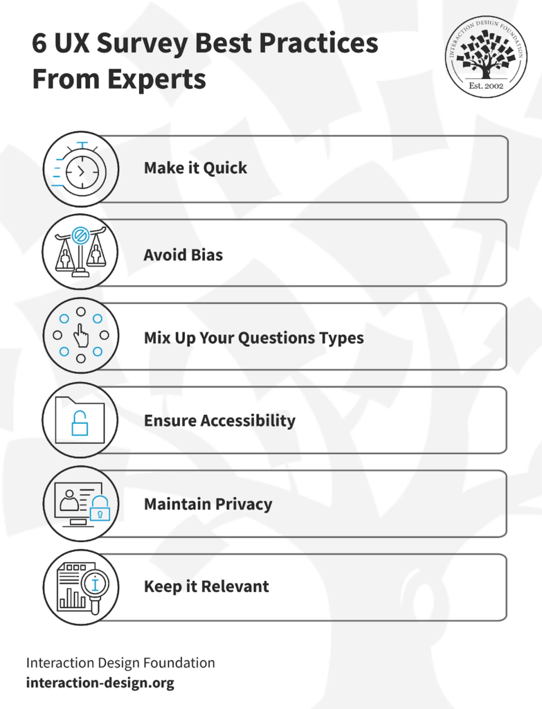
Let’s say, you have implemented all the UI/UX strategies mentioned above in the guide and now want to see if those strategies are working – how would you do that?
By looking at the metrics that are related to the customer retention rate. Let’s have a look at them.
How to Measure the Impact of UI/UX on Customer Retention?
When your customer retention improves, there are many other things and aspects that get improved automatically. To check if your UI/UX customer retention strategies are giving you fruitful results, see the performance of the below-mentioned metrics.
Better Brand Perception
As humans are visual creatures, the placement of elements on your website and the flow it creates directly influence how customers perceive your brand.
Having a great UI/UX is like packaging a gift with a nice wrapper so the receiver feels more special about the gift they are getting.
Moreover, a good UI/UX helps you gain the trust of your customers much faster.
You can measure the improvement in your brand perception by evaluating the Net Promoter Score (NPS) and customer feedback.
User Engagement
Other than customer retention, a good UI/UX is directly related to user engagement on your website.
It’s obvious that when your customers enjoy spending time on your website with effortless navigation, it improves user engagement metrics like session duration, page per session, and bounce rate.
You can check if your UI/UX changes have improved user engagement by either looking at Google Analytics metrics or by seeing the heatmaps.
Repeat Purchase Rate
What can be the biggest indicator of good UI/UX for customer retention than a higher repeat purchase rate, right?
If more and more customers are buying from you repeatedly, it clearly means that your UI/UX designs are correctly aligned with your goals.
And the more a customer buys again and again from you, it automatically improves customer lifetime value – bringing us to our next point.
Customer Lifetime Value (CLV)
When your customers don’t have to juggle a lot on your site to find what they want, it encourages them to stick with your brand for longer – improving customer lifetime value.
But if your UI/UX is not up to the mark, no matter what you do, you won’t be able to get the desired results.
Design Delightful Experiences to Improve Customer Retention
There’s no doubt that UI/UX plays a major role in how customers engage with your business – including the decision to buy again from you.
However, knowing what works well is not enough, you also need to get things done in order to see the results.
If you don’t have an internal team or enough experience required to make an effective UI/UX design, it’s always a good idea to hire a conversion-focused UI/UX designer to work with you.
FAQs Related to the Role of UI/UX in Customer Retention
What is customer retention in eCommerce?
Customer retention in eCommerce refers to the strategies and efforts aimed at keeping existing customers engaged and encouraging them to make repeat purchases.
How to measure retention in eCommerce?
Retention in eCommerce is typically measured by metrics like repeat purchase rate, customer lifetime value (CLV), and churn rate, which track how often customers return and how long they stay with your brand.
What is the retention rate in eCommerce?
The average retention rate in eCommerce is about 30%. That means 3 out of 10 customers order again from the same store.
What are the 3 R’s of customer retention?
The 3 R’s of customer retention are Retention, Revenue, and Referrals. These focus on keeping customers, generating revenue through them, and encouraging them to refer others to your brand.


Post a Comment
Got a question? Have a feedback? Please feel free to leave your ideas, opinions, and questions in the comments section of our post! ❤️