In the series on building an eCommerce website from scratch, we covered how to find an eCommerce niche for online businesses last time. We’re on step 2 now. The current chapter will include everything related to website templates & why many entrepreneurs and small business owners choose a website template.
A good template can cut the development time in half and expedite the website launch time.
However, due to the lack of technical knowledge and expertise in website building best practices, many people end up with poorly made templates that do more harm than good.
That’s why we decided to discuss what makes a good website template and how to choose one. You’ll learn about website-making best practices, how to look for and verify essential features of a template, and lots of other things.
But first of all, what is a website template?
What is a Website Template?
A website template is a pre-made design used to build a website. A template typically comes with the whole design for each page of the entire website. It can contain a single or multiple pages and the complete layout, including headers and footers, text boxes and images, and sometimes extra tools and apps.
You can search templates online and filter them based on factors like features and benefits, technology, business type, or compatibility with CMS platforms like WordPress, Shopify, and Webflow.
Working with templates is relatively easy and doesn’t require in-depth web development or design experience. You can modify small details like the colour or font and add new elements without too much technical understanding. But there are areas where some technical know-how is appreciated.
Why do people choose website templates over building one from scratch?
Because templates save time and are easy to implement, they also require low to no coding experience and are cost-effective. Templates can help build and publish a site in a few days.
Why Does Choosing an Appropriate Website Template Matter?
How your website looks and works can control a lot of things. Not only does it represent your brand, but it also works as a portal for driving revenue.
A good website can help build trust, generate awareness, capture demand, and help you sell more.
That’s why you need a template that truly represents your brand and helps you reach your goals. One that creates a positive user experience delivers your message, helps drive traffic to your business, and converts them.
But not all templates are suitable for every business. The next section tells you about the best practices for choosing a template.
- What are the Things You Should Consider Before Choosing a Website Template?
- Tip #1: Determine Your Business Type and Goal
- Tip #2: Finalize Your Layout & Design
- Tip #3: Responsiveness
- Tip #4: Budget
- Tip #5: Plugins, Extensions, Apps Integration
- Tip 6#: Speed
- Tip #7: Check if it’s SEO-Friendly
- Tip #8: Support and Security
- Tip #9: Run a Competitive Analysis
- Point #10 Ease of Use
- Point #11: Involve Your Marketing Team
- Tip #1: Determine Your Business Type and Goal
- Choose the Right Website Template
What are the Things You Should Consider Before Choosing a Website Template?
The process of finding a good template starts with good research. It involves multiple steps and stages of evaluation that are both non-technical and (a bit!) technical in nature.
We’ll try to make it as simple as possible, so you’re more aware and empowered as a customer.
Here are some essential factors to consider before choosing a website template:
Tip #1: Determine Your Business Type and Goal
Are you an eCommerce or SaaS? Or are you a creative person looking to showcase your talent? What type of business or industry are you in?
Next, what’s your goal? Is it publishing blogs or selling products online? Or is that you want to display artwork and attract potential clients?
There are various types of templates designed for different industries fulfilling different goals.
Going with one that matches your niche business requires minimal work because it will come with necessary features and tools. This means, you can build and launch your site faster, and won’t have to spend time customizing too much.
For example, an eCommerce template will likely have product pages, add to cart, and product swatches as built-in features. Now, if you choose a landscaping business template because you liked the design, you’ll be spending a lot of time customizing and adding features to it.
Similarly, if you are a UX designer or photographer, you’d like to showcase your creative power to attract potential clients, and need a suitable template that allows you to do so. An eCommerce template won’t be of any use in this case.
Now let’s look at some templates based on the type of business to get a better idea. Pay attention to the fundamental differences in design, looks, and feel as you observe the examples:
Portfolio
A portfolio website design showcases work in a way that’s visually appealing. These themes have minimal text and instead, focus on striking layouts and design. An appropriate portfolio template allows adding individual projects, organizing them, and comes with simple navigation.
Who can use this template?
Anyone can create a portfolio site, from designers to artists, professional photographers to illustrators.
Examples:
- Here’s a simple portfolio template for creative designers:
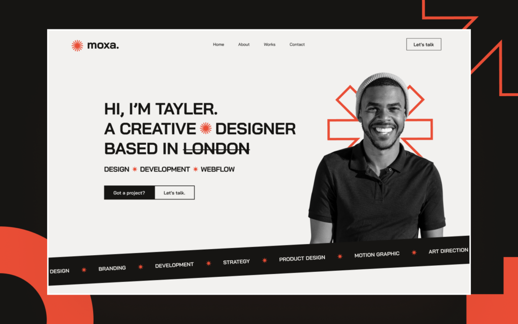
Image Source: Webflow
- Another portfolio template for photographers:
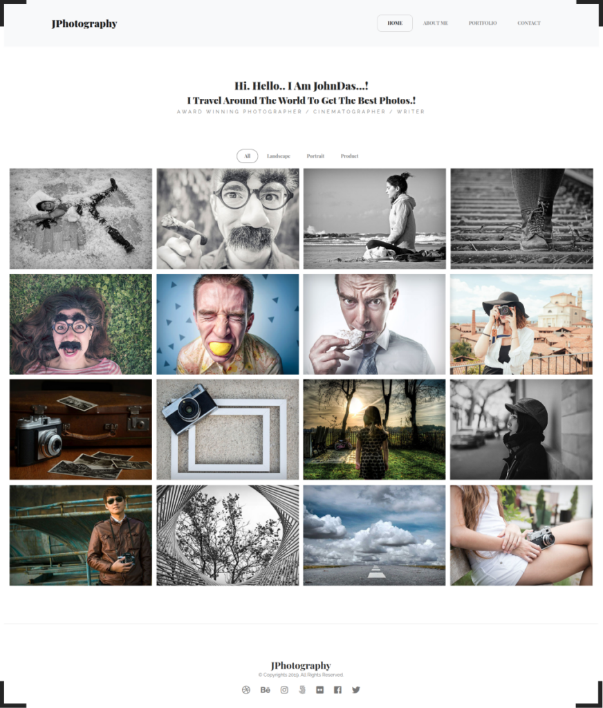
Image Source: Envato Elements
- And finally, a portfolio template for copywriters:
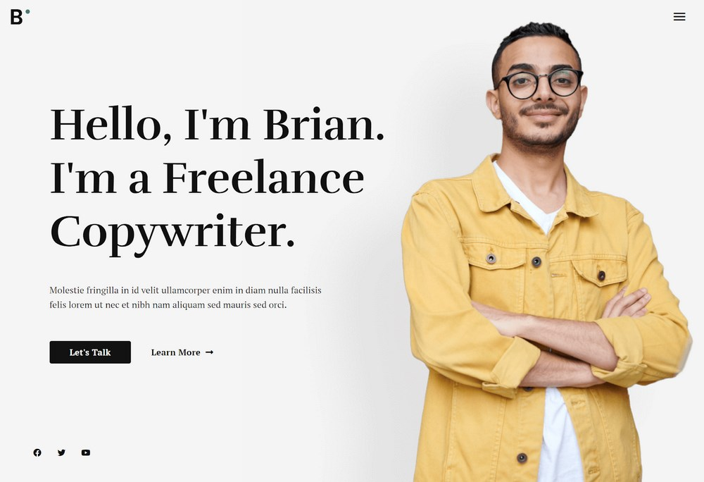
Image Source: Astra
eCommerce
Fashion, makeup, retailers, and merchandise sellers must choose eCommerce templates for building a website.
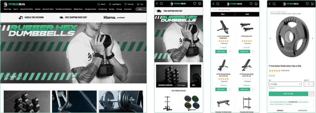
eCommerce templates have multiple layouts for different kinds of web pages like the homepage, product catalogs and product pages, add to cart and payment pages.
A good eCommerce template is optimized for speed, has ease of navigation and attractive design, and helps you sell more and make money.
We can’t stress enough how important it is to select the right eCommerce template. Do it wrong, and your page will load slowly, your products won’t be visible to customers, and your customers will abandon their cart!
So it’s advisable that you talk to an eCommerce expert or consult our team. As highly experienced Shopify and Magento eCommerce developers, we’ve helped over 350+ global brands like Lancer, Miko 3, and Fitness Bug. We’d love to help you decide what type of template suits you best after considering your requirements and budget.
Who can use this template?
B2C and D2C brands sell retail products, including clothes, accessories, jewelry, grocery, vegetables, and electronic items.
Live examples:
- Look at these stunning images from Fitness Bug’s eCommerce website, proudly created by Aureate Labs:
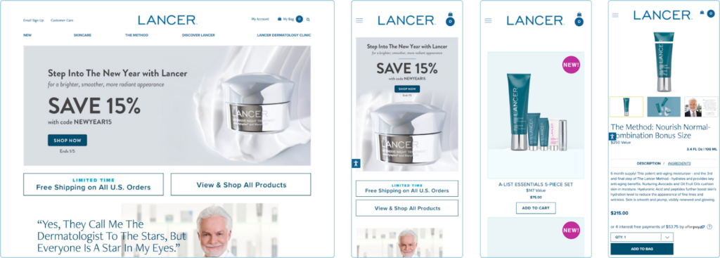
- The next example is from Lancer’s e-commerce site, of course, created by none other than us!
Blog
Website templates make it easier to express your ideas to a global audience. Blog templates include marketing and SEO features that help you run campaigns to broaden your audience by drawing in new readers.
These types of templates provide you the power to control your narration, organize and edit the articles, track engagement with Google Analytics, and even generate leads and email subscribers.
Who can use this template?
Individual creators to professionals and businesses, anyone who wants to prioritize blogging can choose blog templates.
Examples:
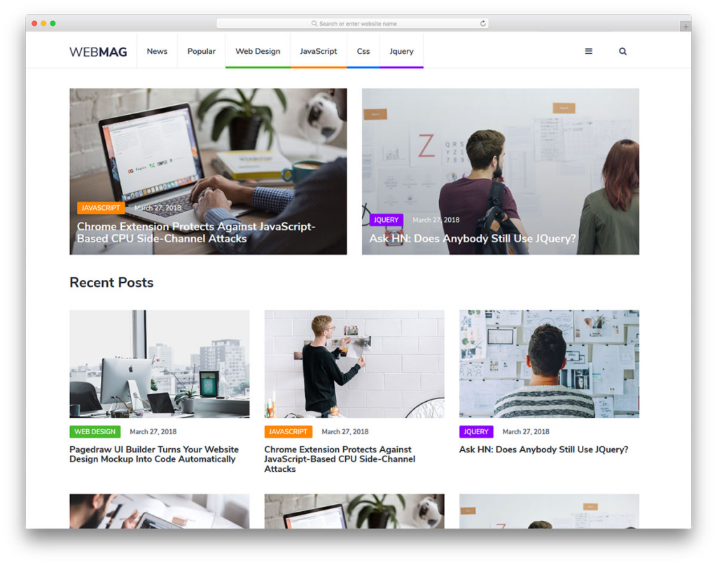
- Here’s an example of a blog template from Colorlib.
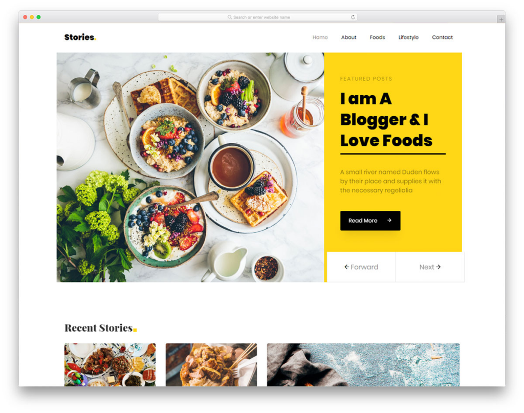
- Another website template from Colorlib for food bloggers:
Software and SaaS
If you’re into software or SaaS business, a few things to look for when choosing your website template are:
- Clean and attractive design.
- Features and pricing pages.
- Payment page.
- Demo page and CTA buttons.
- Built-in blog, case studies, and knowledge base pages.
- Lightning fast speed.
- A place to showcase social proof and testimonials.
- Sign-up and login pages.
Who can use this template?
Software, SaaS, and cloud-based tech companies.
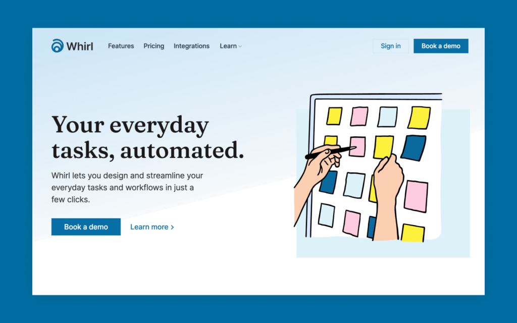
The example below from Webflow has most of the features mentioned above that make it an ideal software/SaaS business template:
Small Business
Small business templates provide the essential components to allow small businesses to work more effectively and efficiently.
These templates are known for their flexibility, style, and functionality. They come with simple yet powerful UI and design elements that help to establish a strong brand identity.
In addition to the common features, certain small business templates allow adding a location on the map and hours of operation which can be extremely helpful for local businesses.
Some of these templates may also come with built-in eCommerce functions like add to cart and payment pages that allow merchants to sell services or products directly on the website.
Who can use this template?
Small businesses, service-based companies, boutique agencies, coffee shops, marketing companies, restaurants, clinics, gyms, pet grooming, plumbing, notary etc.
Examples:
There are hundreds of small business website templates to choose from. Here’s a beautiful template for landscaping and lawn maintenance companies:
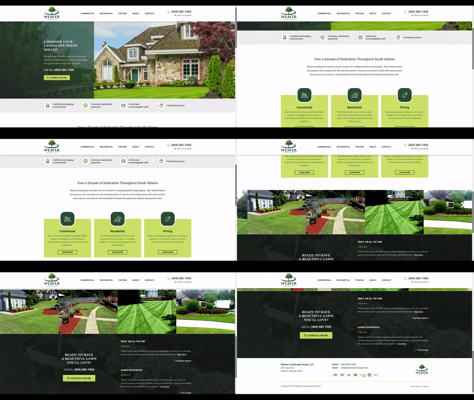
Image Source: Cemah
- The second one is for wedding planner companies.
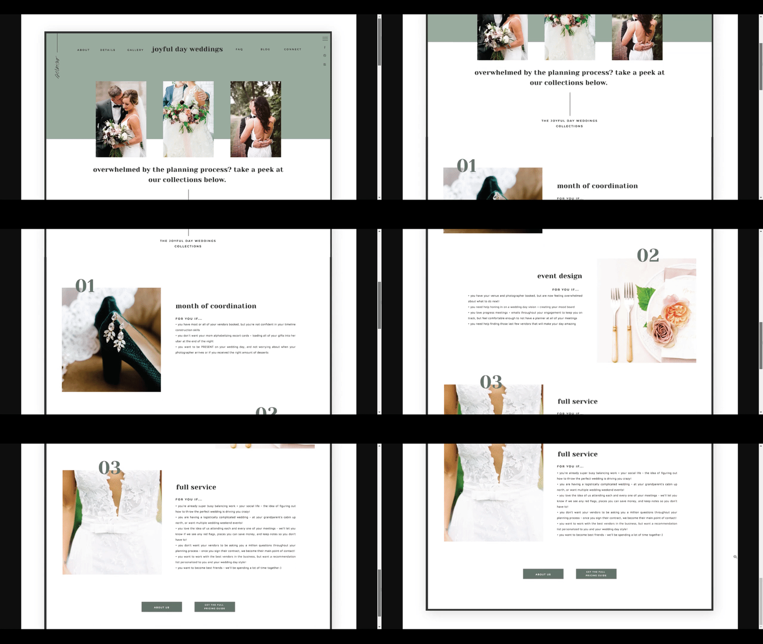
Image Source: Saffron Avenue
- Here’s another small business website template for restaurant and food businesses:
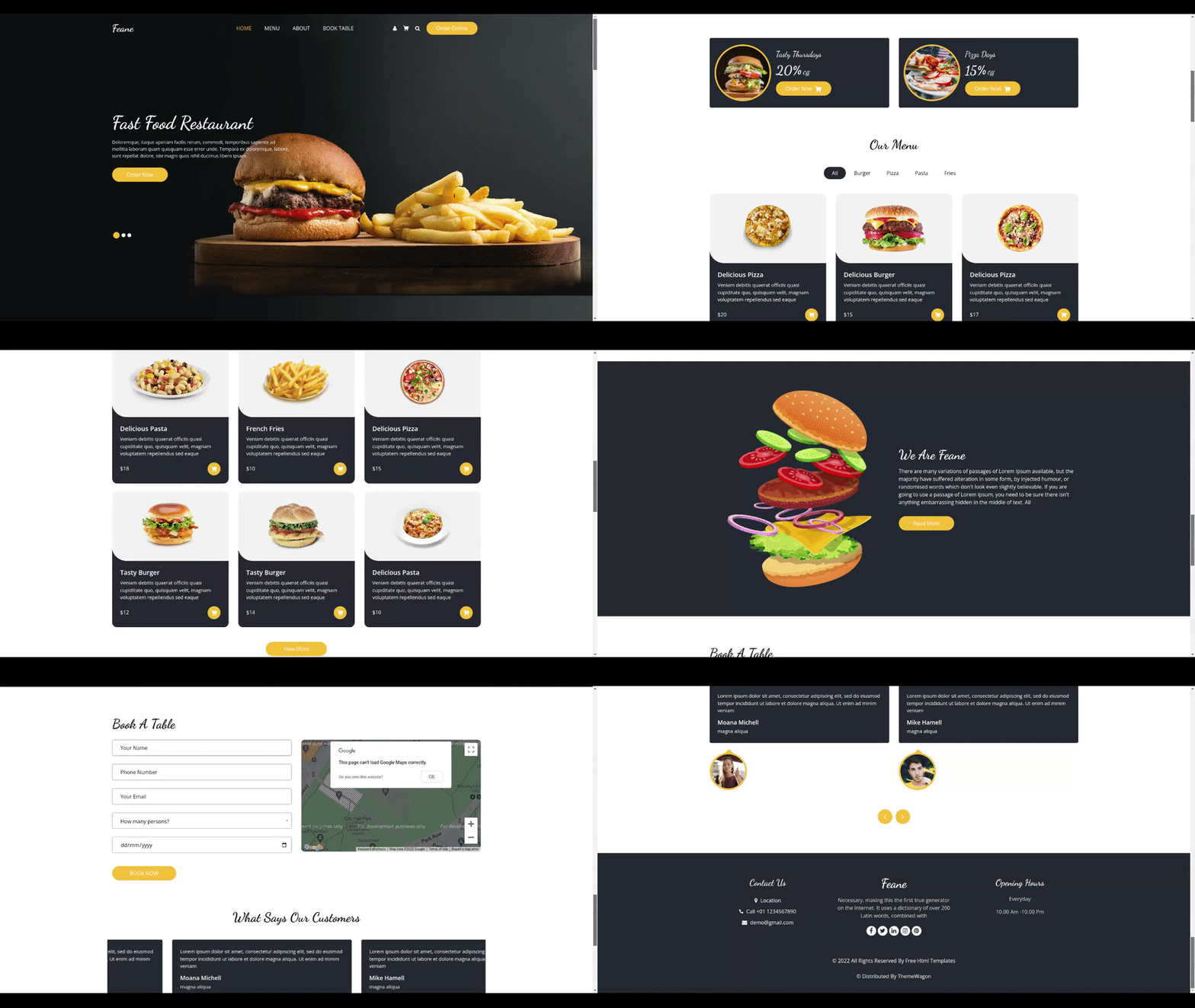
Image Source: Theme Wagon
- The last example under the small business category is dedicated to marketing agencies.
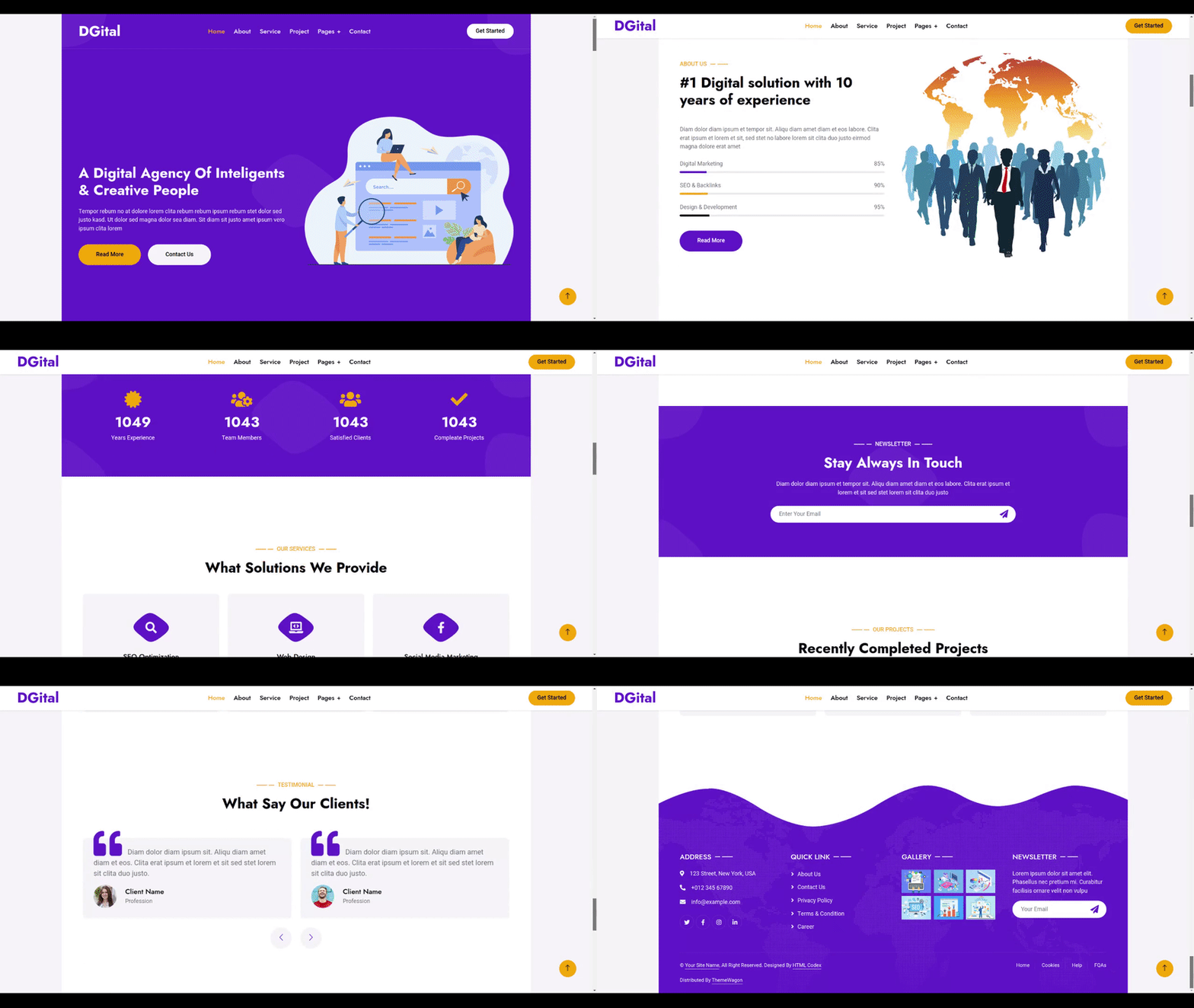
Image Source: Theme Wagon
Tip #2: Finalize Your Layout & Design
In the previous section, we saw multiple types of templates for different businesses fulfilling different goals. Now talking from a design perspective, you need to know a few things. Don’t worry if they sound a bit technical because we’ll explain it in simple words.
Header Layout
Header design is extremely important because it’s the first thing your visitors will notice when they land your website.
Remember that your main objective here is to attract your audience and pique their interest so they keep exploring your site. Therefore, you need to choose a header that helps you accomplish that goal.
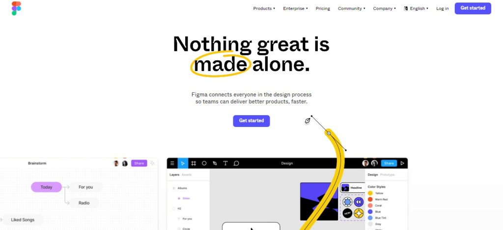
Most header designs combine an interesting header image or video with the brand’s slogan and logo. For some templates, it’s possible to choose between a static image or a slideshow header.
Headers also contain text slots to give a brief overview of the business and call to action buttons.
Example:
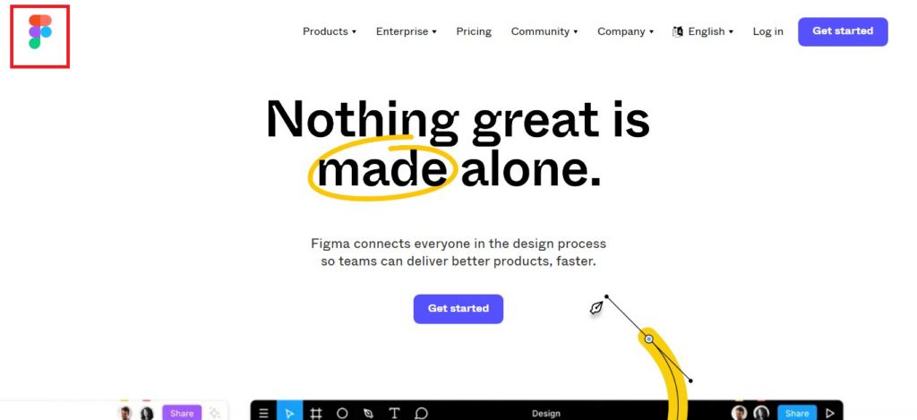
We love Figma’s header, supported by the strong yet simple design and content that convey just the right message:
Content Width
There are primarily two types of content width: full-width and boxed-width.
Full-Width
When the background image fills the entire width of your screen, this is known as a full-width design. Full-width layouts are fairly common and are ideal for websites, and they’re often responsive and known for being mobile-friendly.
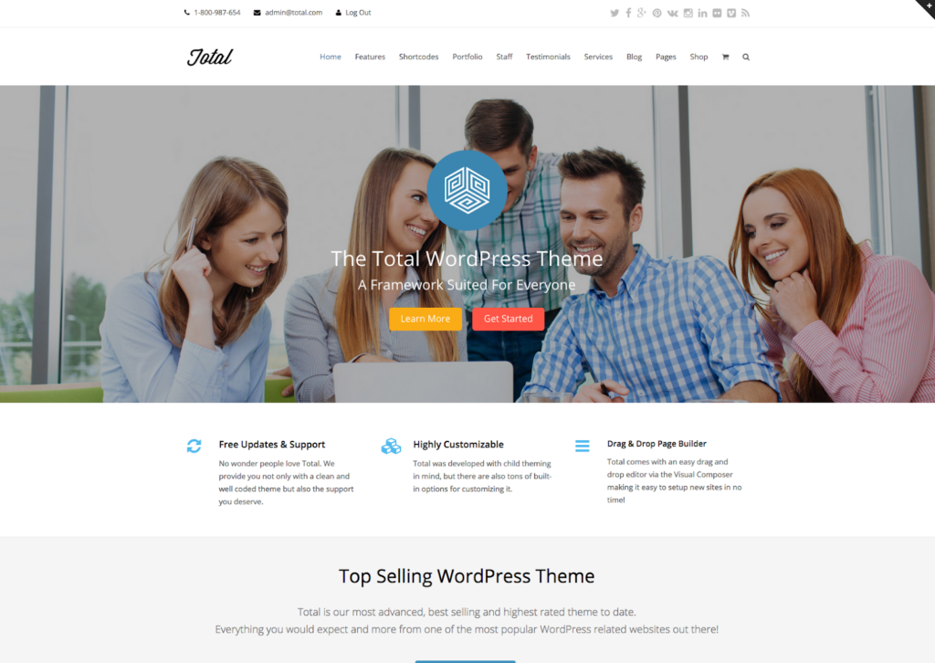
Image: Full-width website template design. Source: Total WordPress Theme
Boxed-Width
When your content is boxed-width, a visible frame can be seen on the left and right margins of the screen. As a result, the content appears to be “boxed” within a specific area.
This is more common in traditional websites but some new-generation website designs also appear to be boxed-width.
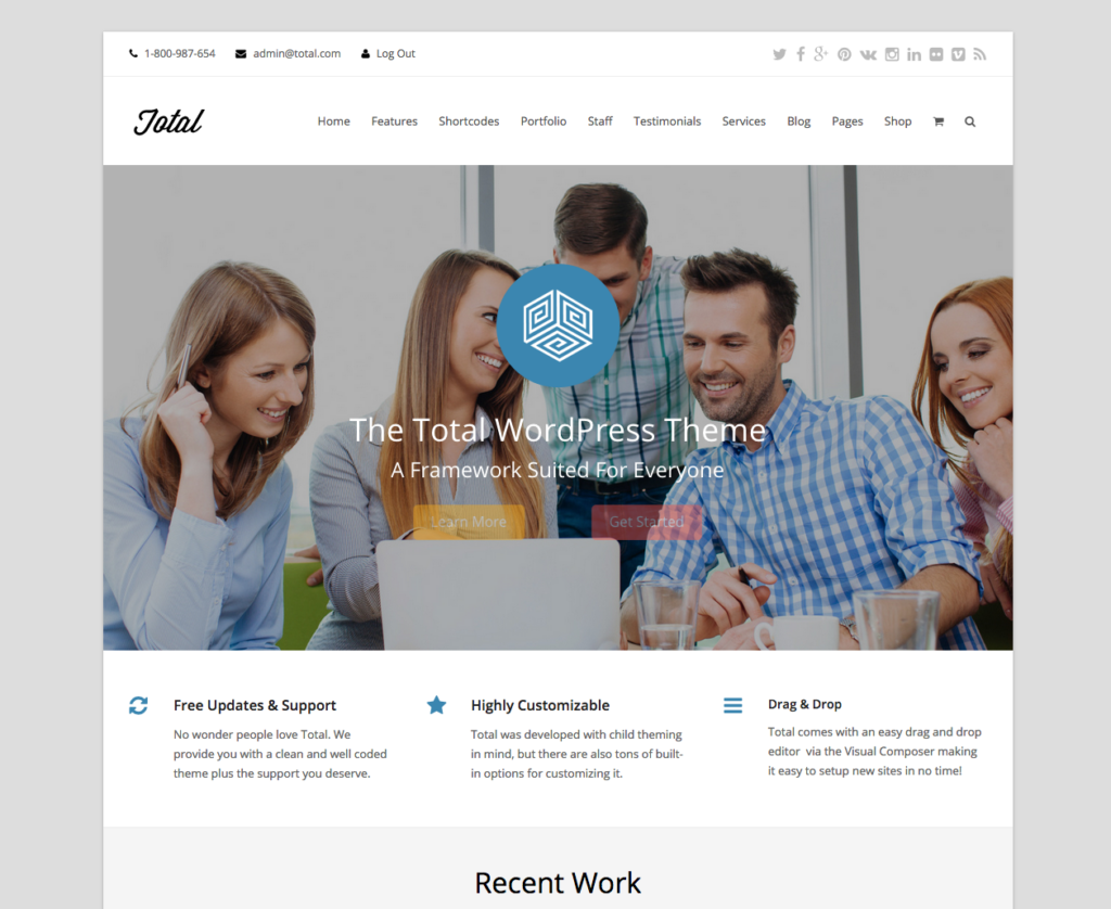
Image: Boxed-width. Source: Total WordPress Theme
Navigation and Menu Bar Design
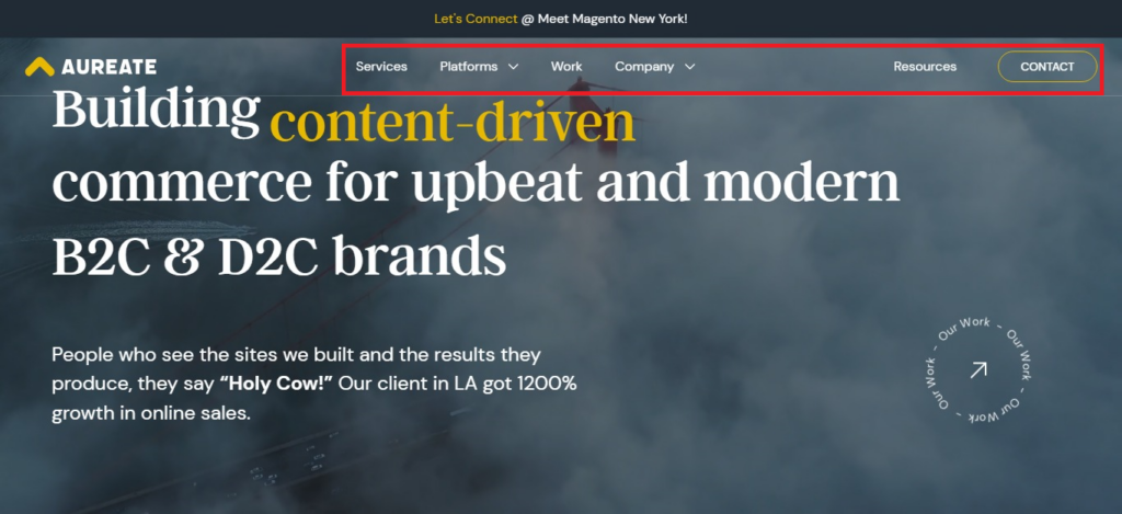
Your website navigation bar is super important because it allows your customers and prospects to browse through the site. Choose a navigation bar that’s uncluttered and uncomplicated, and has contrasting but pleasing colors so viewers can notice it.
Where your navigation bar is placed is also crucial for your business. Most businesses go with a horizontal top navigation menu. But you can also choose a vertical menu if it matches the overall layout.
Menu items in the navigation should be arranged based on significance, typically from left to right. Make sure to remove unnecessary items from the main menu and instead, add them as drop-downs or at the footer of your website.
Example:
Here’s an example from our website. We added the most important menu buttons with drop-downs and kept the navigation bar clean and simple.
Logo Design and Placement
Logo plays an important role in generating brand awareness. Your business logo should be placed where it’s visible to everyone.
Some experts say that a logo placed in the same line as the navigation bar generally means the business puts less emphasis on branding. But in our opinion, that’s not always true.
Take Figma for example. Their logo is in line with the navigation bar but we all know who Figma is!
However, in the case of Ogilvy, their logo is placed at the center of the screen when you first open the site. As you interact with the page and scroll down, the logo becomes smaller and takes the top, center position.


How you want the logo to appear is also important. You can choose either text-based or image-based, or combine both types when you design it.
Footer
What doesn’t go in the navigation menu, goes in the footer. A great footer should offer useful information that makes it easy for users to navigate the website and informs and educates them.
Some important elements in the footer area:
- Sitemap.
- Careers page.
- Customer support.
- Privacy policy.
- Terms of use.
- Address and contact information.
- Important site pages.
- Social media icons.
- Copyright information.
- Affiliate disclosure, if necessary.
Examples:
There are various ways to design your website footer. But you can draw inspiration from the following sites and then customize them according to your needs:
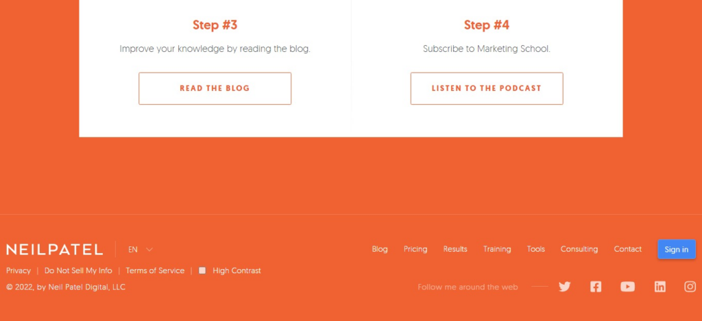
- Neil Patel’s website footer is simple. It has a language menu, social media links, copyright information and other elements.
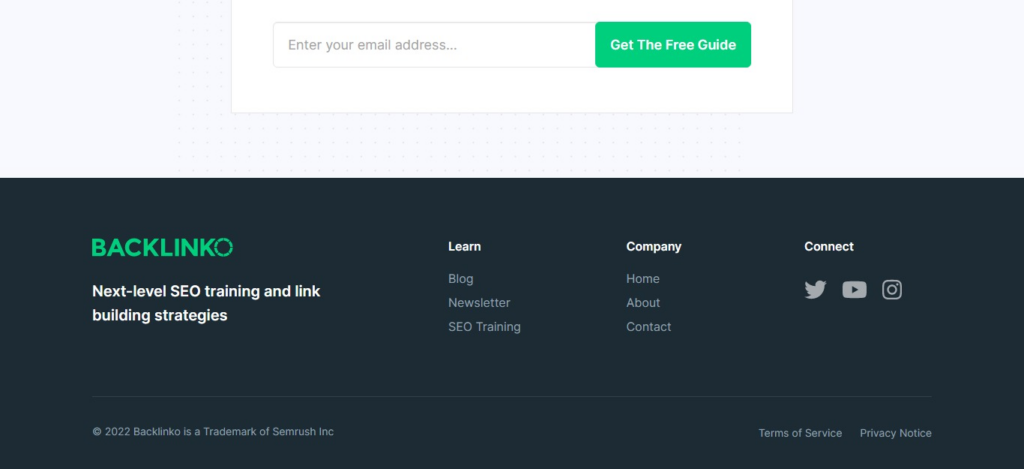
- Brian Dean’s site Backlinko has its footer arranged slightly differently.
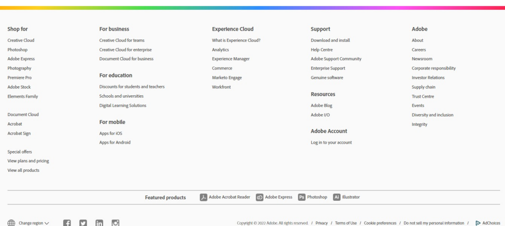
- Now look at Adobe’s feature-rich footer. They’ve several pages organized under the menu.
Tip #3: Responsiveness
As of August 2022, mobile devices account for the largest traffic with 65.87% share, whereas desktop accounts for 31.98%, and tablet for 2.15% of global traffic.
As mobile traffic is becoming more and more, it makes sense for businesses to create a responsive design. Because it allows the site to function properly and load fully, irrespective of the device type and size.
Responsiveness is a web design method that helps website content automatically adjust itself and fit to the screen of a device.
While most websites have adapted to a responsive design already, several websites haven’t switched to it yet. As a result, the content is not shown properly across all devices, especially on mobile devices.
According to a GoodFirms survey, 73.1% of web design companies and designers believe non-responsiveness is one of the prime reasons causing visitors to leave a site. We bet you don’t want your visitors to poorly perceive your brand and quit your website because of that. So always choose a template that is responsive and mobile-friendly.
How to Check Website Responsiveness?
There are several ways to find out if your template is responsive:
i. Open the theme’s demo page and toggle previews on different devices.
Here’s a Wix template that shows how a template will look and load on different devices. This gives an idea of whether the template is mobile-friendly.
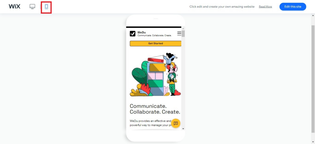
Image: Wix template in mobile preview
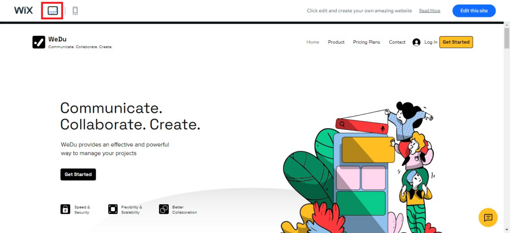
Image: The same Wix template on desktop browser
Additionally, you can open the template on your desktop and mobile devices, and tablet if you have one and see if the content fits the screen.
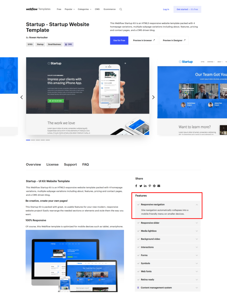
ii. Check details provided by the template developer.
Typically, theme developers mention if a template is responsive in the description. So read the description and features carefully.
Below is a screenshot of a Webflow template. Pay attention to the “Features” section (boxed in red) where you’ll also notice the mention of responsiveness.
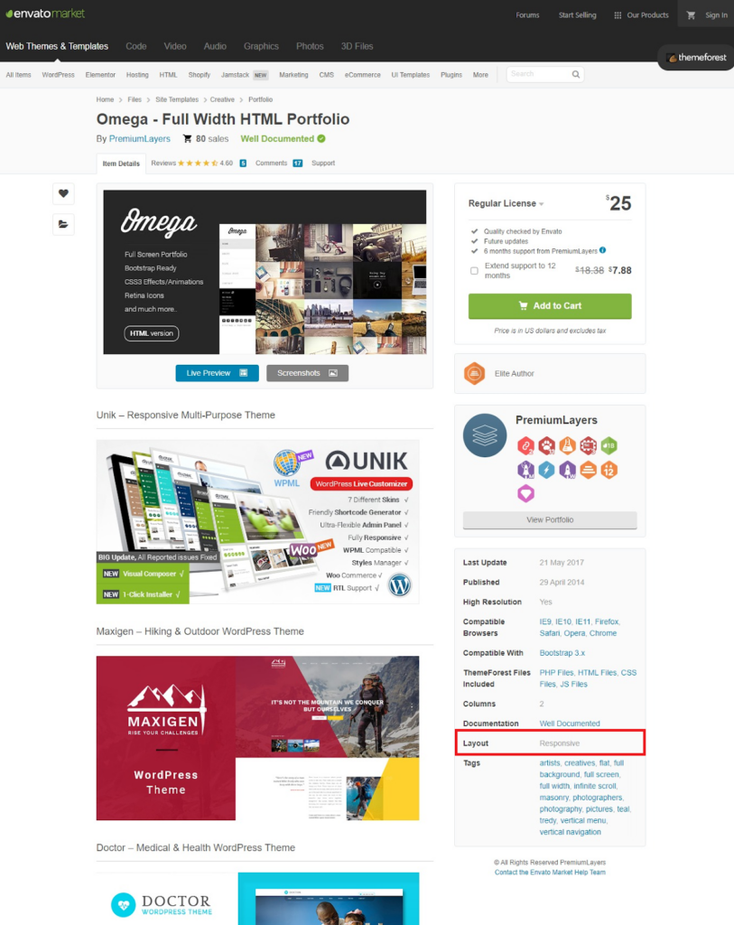
You’ll find similar descriptions on other template marketplaces as well. Check details of individual templates and try to locate where it’s mentioned. If you’re on ThemeForest/Envato Market, you’ll most likely find it under “Layout” (see below).
iii. Open the template on a desktop browser and slowly resize it. Carefully observe if the design shrinks or expands automatically as you resize.
iv. Another way to know if a theme is responsive or not, you need to go to inspect elements.
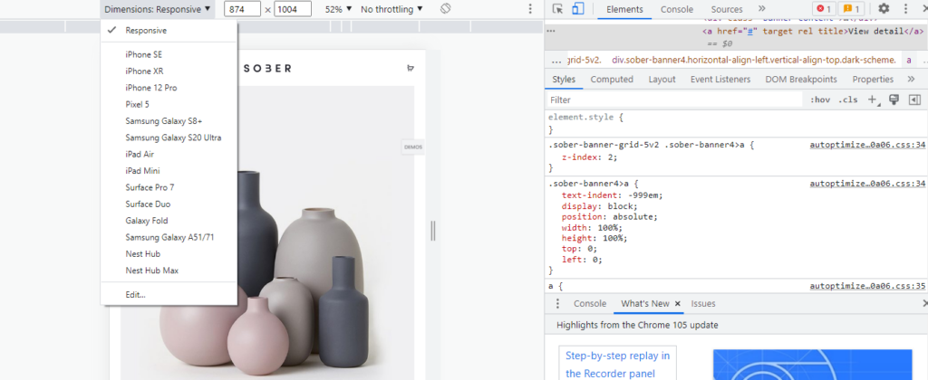
Here’s how to do it: Open the theme on the Chrome browser. Click the three vertical dots at the top, and go to More Tools → Developer Tools.
Now at the top, you’ll notice the toggle device toolbar (Ctrl + Shift + M). As you click on it, you can preview the theme’s responsiveness. You can also choose different devices from the drop-down, as shown in the picture and see how it loads.
Tip #4: Budget
There are many factors to consider when choosing a website template, and money is certainly a top priority.
But is it just money that you’re investing? No. You’re also investing your resources, time, and effort.
A free template might seem like the most obvious choice but think about how much time you need to invest in customizing it. Or if it’s poorly coded, how will that affect your site?
So make a wise choice here or talk to an expert for guidance.
We’ll suggest that unless you can check individual code and elements of a free template, it’s better to go with a premium theme.
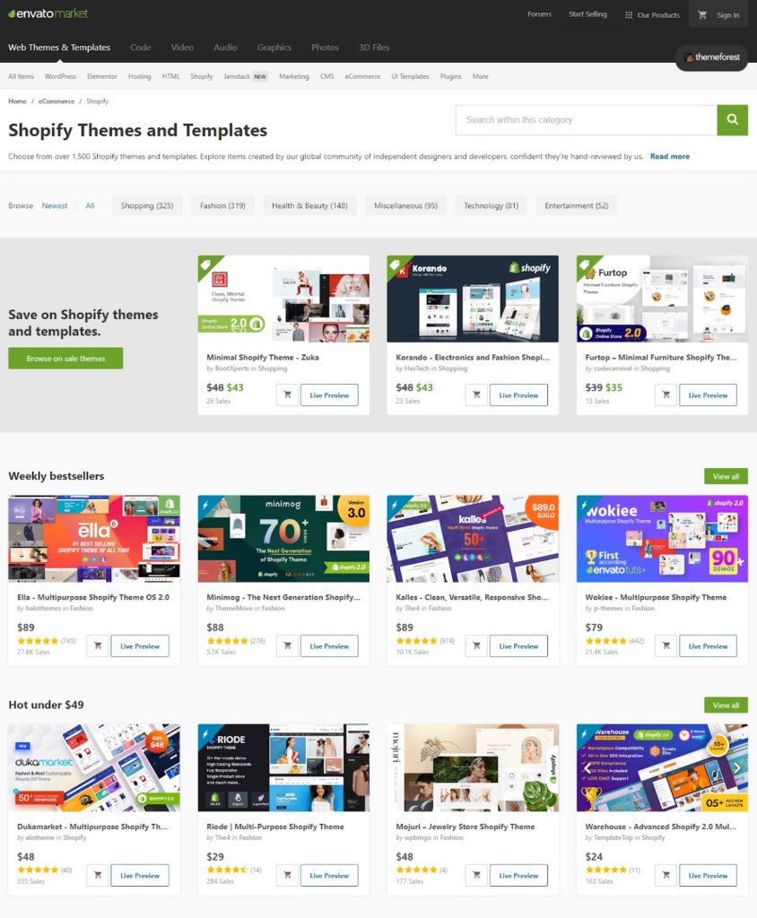
Premium templates come with a price tag and can cost anywhere between $40 to $200. The more sleek, attractive, and feature-rich template you choose, the higher the price.
Every premium template will have the price mentioned somewhere near it.
Note that you may have to pay your developer to install and integrate the theme. You can learn to do it yourself with the help of online research and a bit of technical knowledge, but there are several adjustments that are best to let a developer handle for you.
Tip #5: Plugins, Extensions, Apps Integration
Tools, apps, and extensions are helpful to automate tasks and manage work. Sometimes they’re essential to operate an online business.
Therefore, choose a template that gives you the ability to add different tools or apps you need anytime you want.
For example, if you’re a designer, you may want to go for a template that supports the integration of tools like Adobe Lightroom.
For eCommerce, you may need email marketing tools and extensions for running email campaigns.
Some templates already come with access to various tools, apps, and extensions. But there are times when you need to add them separately. So it’s wise to check the compatibility of the template with different tools before you buy.
You’ll get the necessary information about this in the description of the theme. If you don’t find it there, check the discussion and previous Q&A. If you still couldn’t find what you want to know, ask the developer and wait for a response.
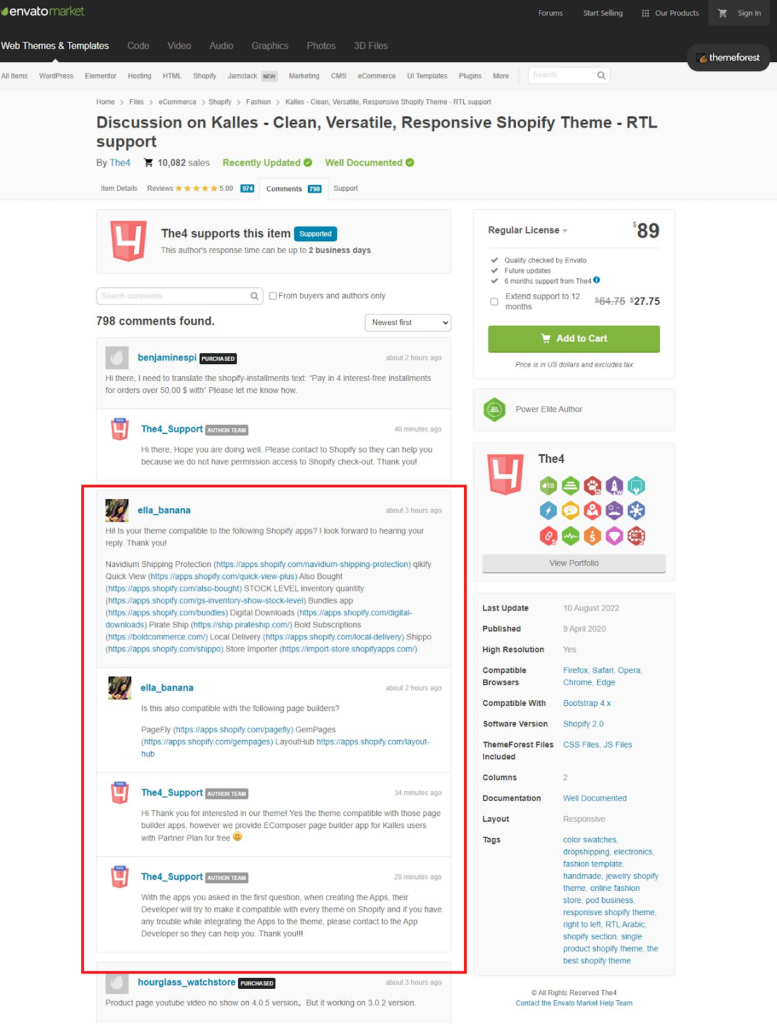
Image: A conversation between customer and developer about compatibility of apps.
Tip 6#: Speed
Website speed is important because it directly or indirectly affects the conversion rate.
If your website template is poorly made or created by an ameteur designer with no experience, chances are the template might be code-heavy and slow to load. Now when you upload videos, images and content, it can become even slower.
Customers don’t like slow websites, so as a result, sales slump.
For every few seconds of delay, the conversion rate takes a hit. If your site takes more than 5.7 seconds to load, chances are your conversion rate will be lower than 0.06%.
Source: Cloudflare
How to Check Theme Speed?
Open your template on Chrome desktop browser. Next, click the three vertical dots at the top right corner of the browser.
Now follow the next steps:
More tools
↓
Developer tools
↓
Customize and control DevTools. (Click the three vertical dots next to the gear/Settings button)
↓
More tools
↓
Performance insights
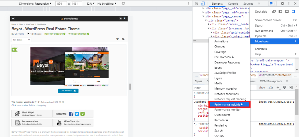
Now when you get there, you’ll see an option that says Measure page load.
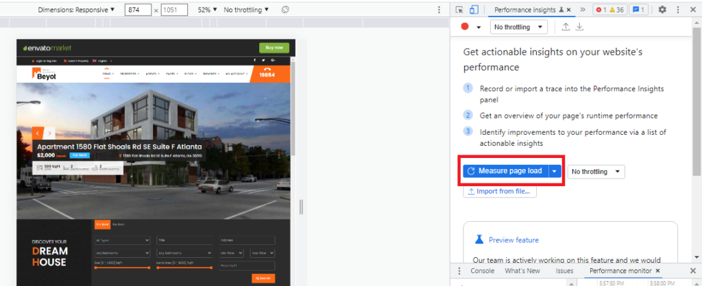
Click that and run the test.
The test will finish automatically as it collects necessary data and shows the result in the right panel.
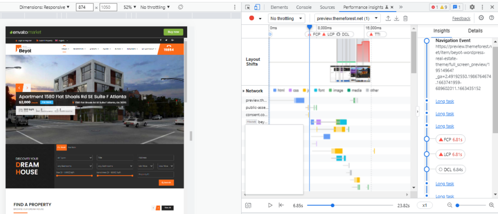
Now go through the Navigation Events and Details to learn more about the theme speed.
Tip #7: Check if it’s SEO-Friendly
Who doesn’t want online visibility? If you’re a small business owner, you’d want to put your business at the front of your target audience. And SEO (search engine optimization) helps you achieve this goal.
However, certain theme templates don’t come with the flexibility to optimize for search engines making it difficult to rank or appear in SERPs.
If a template is SEO-friendly, the developer would mention it in the description:
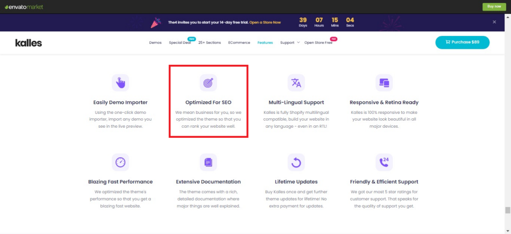
Additionally, you can check a few other things to ensure that your template is indeed SEO-friendly:
- Browser Compatibility
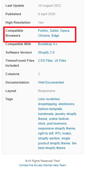
You customers can use any of the major browsers to visit your website. That’s why browser compatibility plays an important role. It ensures your website can load and fully function on multiple browsers like Chrome, Firefox, Safari, and Opera without causing any trouble.
You’ll find this information on the template description like you see here on Envato Market’s website:
- Speed
Website speed is one of the ranking factors on Google. And it’s been the case since 2010 when Google confirmed that its search algorithm would start considering speed into account when ranking pages:
“Like us, our users place a lot of value in speed – that’s why we’ve decided to take site speed into account in our search rankings.”
Refer to our previous point that discusses how to check speed.
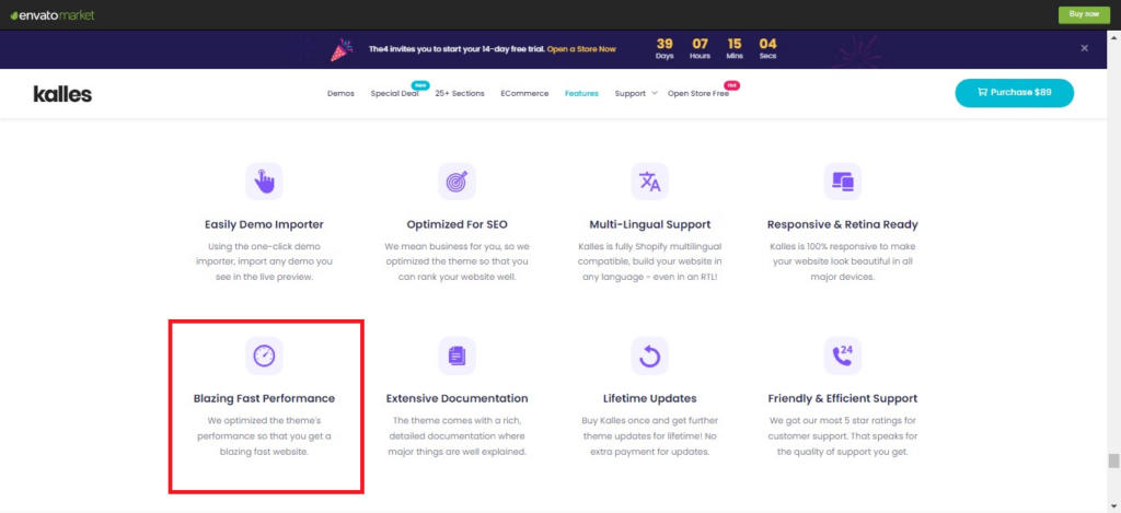
You’d also find speed-related information on a template page; the developer would mention if the theme is fast-loading:
- Mobile-Friendliness
90% of the global audience uses mobile devices to browse the internet. Your site needs to be optimized for mobile users, which includes responsiveness, speed, and other factors. You can visit Google’s Mobile-Friendly Test page and enter the code or URL to check this.
Tip #8: Support and Security
A website template usually requires theme updates and maintenance. This is to keep your website functional and cut down on errors as they arise.
Sometimes theme updates can cause problems in CMS systems. Hence knowing that you’ll get support from theme developers can save you much trouble.
Check if you need to pay anything extra for support and for how long it remains valid. Some developers offer limited-time support and updates while others do it for lifetime.
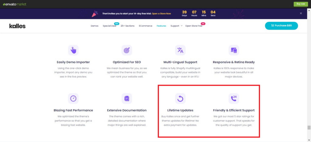
Image: Assurance from template developer regarding customer support and lifetime update. Source: Envato Market
Before purchasing a theme, check when it was first published and last updated. It’s best to go with templates that are updated in recent times.
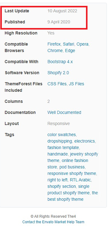
Image: Last update information for a website template. Source: The4, Envato Market
Hearing from previous customers about their experience can be really helpful. By reading the reviews and feedback, you’ll easily find out if the template is good, if the developers are helpful, what kind of support they provide, and everything else.
It may sound too obvious, but try to choose a template that has received positive reviews and feedback from customers.
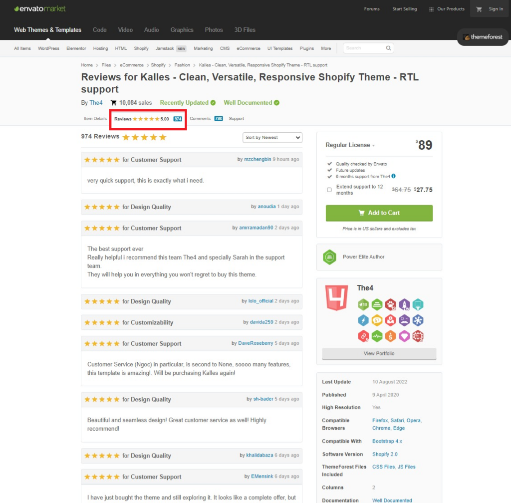
Also, it’s in your best interest to buy a template for your website from a reputable site.
Tip #9: Run a Competitive Analysis
A competitive study of websites allows you to collect information from and analyze the elements of your competitors’ web pages. Keeping an eye on your competition can help you gain quick insights into winning strategies and apply them to your business.
Checking your competitors’ themes and websites can help you minimize cost, educate you on the already existing helpful features, cut time on researching themes, and save you the trouble of excessive customization and development cost.
For example, you may want to take a look at their homepage and product pages, and absorb some ideas.
It could be the arrangement of graphic elements, design, and text layout, UI and UX, product categories, display, and galleries, and their presentation.
If you’re eCommerce, you may also want to compare or check some of these excellent features like:
- Arrangement of the menu.
- Product swatches.
- Quickview
- Zoom view.
- Banner sliders.
- Wishlisting.
- Bestseller and new arrivals sliders.
- Related products sliders.
- Advanced filters.
- Add to cart.
- Payment pages.
- Numerous custom pages like 404, FAQ, Contact.
- Multiple languages and currency.
- Major fonts.
- Stunning layout and stock images.
- Multiple layouts, headers and footers.
Make a note of features you’ve found and liked on your competitor’s website and when browsing templates for yourself, look for similar features that come built-in.
Point #10 Ease of Use
Small business owners usually like templates that are easy to use and don’t require too much time. Oftentimes, they’re not designers or developers. So it makes sense to go for something that can be set up using minimal time and effort, a template that comes with all the necessary features. The most common aspects of an easy-to-use template are:
It’s Design-Ready
A good and easy template comes with ready-to-use, pre-built page layouts. Since most parts of the template are already designed, you don’t have to start from scratch or worry about individual elements. You can save a lot of time from tweaking it because you’ve got a basic layout and features to start working immediately.
Has Multiple Layouts
Most template designers and developers offer a variety of layout choices. Multiple layouts for the website including homepage, product pages, or allow you to choose from them.
If you don’t like the basic layout, browse the variations until you find one you like. Multiple layouts can cut your design time in half so you can quickly change the default design and replace it with another one you want.
Where to find this information?
Most theme developers provide clear and necessary information about basic information and features on the theme page. To know if your template has multiple layouts, you need to look for and read the description.
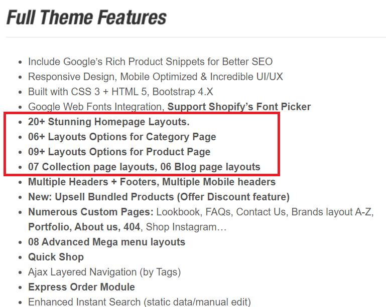
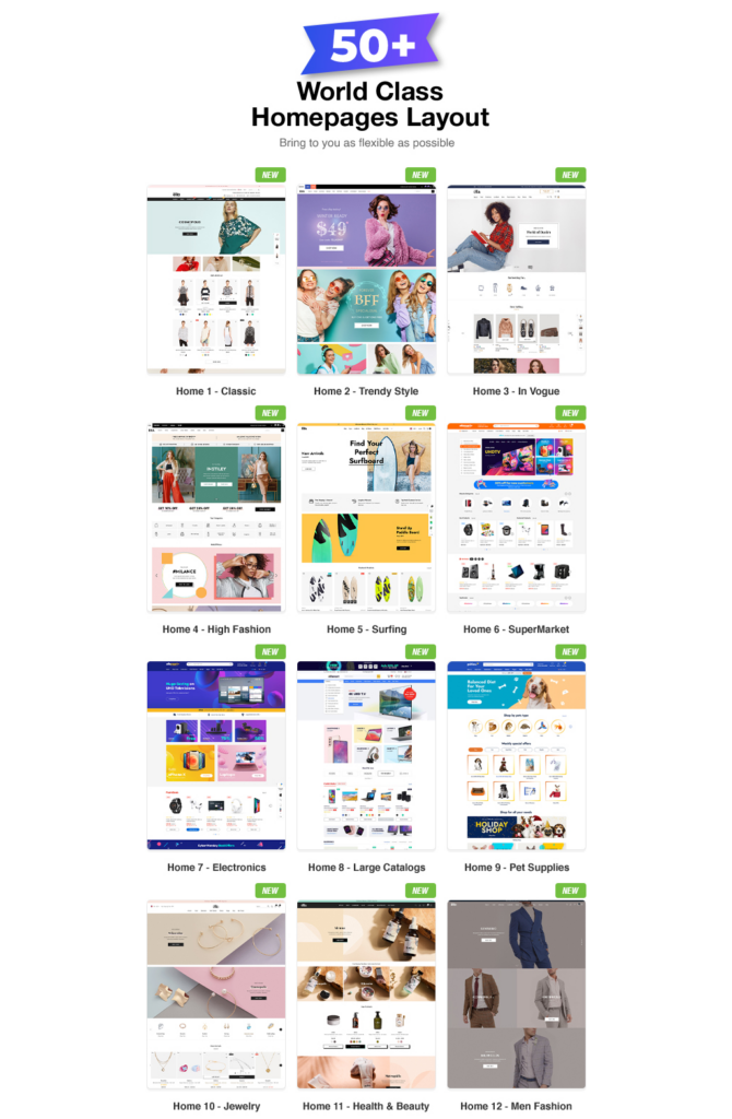
Image Source: ThemeForest
Make sure to always check the demo and preview it live in addition to reading the description. This way you’ll get the most important information before deciding on a template.
Comes With Image Library
Templates are readymade designs that come with stock images matching the primary theme colors based on business type. If you’re a small service-based industry, you can start using the stock images until you’re ready to hire a designer.
Let’s look at this pleasing, ready-to-work landscaping business homepage template design that has excellent stock images:
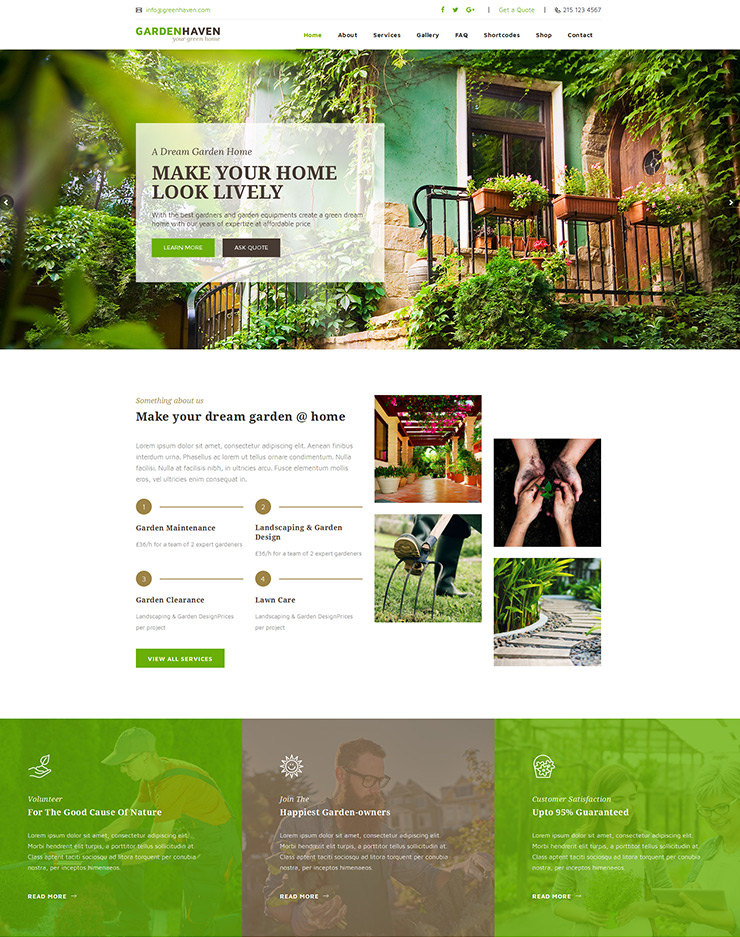
Image Source: ThemeForest
Drag and Drop
Want to quickly add a new block of text? Drag and drop can work.
This feature can make your work of customizing a page or the design so easy that you can do it on the fly. You can add sections anywhere on the page. This means a lot of room for customization anytime you want.
It’s one of the features you might need to make your work easy. So check if it’s available or supported.
Allows Customization and Flexibility
A good template comes with the flexibility to scale and customize, so it can adapt to meet the evolving business goals.
You may want to adjust the text boxes or customize the design before publishing it. Or you may choose to update your website in future, and decide to add or remove tools, apps, plugins, extensions. Now if your template isn’t flexible, you may have a difficult time working on it.
Any standard template allows customization and gives the ability to personalize it. So check the description, read all of it, or ask questions to make sure you have the freedom to optimize, should you choose to do so.
Point #11: Involve Your Marketing Team
It might seem obvious, but your website is one of the doorways for your marketing team. They use it to drive traffic, generate leads, or close deals, and might be running special campaigns. Your duty is to help your marketing team meet its goals faster and more efficiently.
For example, your marketing team might need a newsletter sign-up popup to collect email leads and drive conversions through email marketing.
Involve them to seek their inputs early on for building or rebuilding your website. Brainstorm ideas with them and you’ll be surprised to come across brilliant inputs for choosing a website template.
Choose the Right Website Template
Your website is a gateway to your business and face of your brand. That’s why choosing a proper template is crucial for your success because it’s the first thing your customers will notice when they come to your site.
An ideal template will help you capture their attention and keep them on the site, and even encourage them to take the action you expect.
A template that checks all the boxes is rare to find but aim for maximum features we discussed in this blog and ask yourself these questions,
- Does this template have all or most of the features I need?
- Can I set it up quickly?
- Are my customers going to like it? Is it user friendly?
- Does it help in sales and marketing?
After reading this guide, we’re hopeful that you’re better positioned to decide how to select a website template. Next in the step is filtering out the best eCommerce platform for small businesses.


