Fenty Beauty: CRO Inspiration for Skincare Brands [Shopify Plus]

Are you here for inspiration…?? Ofcourse yes, we all are here for inspiration only.
But what kind of inspiration are you looking for?? – That’s what matters.
Well, let me guess… you are looking for the “CRO strategies” behind Fenty Beauty’s success as a Beauty and skincare brand, aren’t you?
If this is the case, you’re at the right place! In this blog, we’ll be unfolding how they are able to offer the best user experience that’s:
- boost their conversion rates,
- lower their CAC (Customer Acquisition Cost), and also
- increase their AOV (Average Order Value).
As we all know, Fenty Beauty, the brainchild of Rihanna, has revolutionized the beauty industry with its diverse shade ranges and inclusive approach. Their Shopify Plus store offers a wealth of inspiration for skincare brands looking to upgrade their customer experience (CX) as well as conversions.
What makes ‘Fenty Beauty’ stand out in Cosmetics?
Fenty Beauty has built a loyal following and impressive sales figures through a combination of smart strategies.
Here’s a closer look at what makes them stand out:
Laser focus on their niche
Success is often measured by how focused you are!
From the start, they focused on offering a wide range of shades for all skin tones, something the beauty industry hadn’t quite grasped yet.
This wasn’t a small market segment – it was a massive, underserved population. By launching 40 foundation shades (later expanded to 57!), unheard of at the time, showed a deep understanding of their target market’s needs.
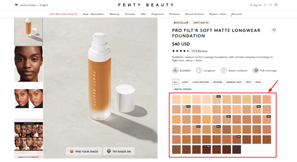
Look at Fenty Beauty’s website. Their product images showcase a diverse range of models with various skin tones. They don’t shy away from showcasing darker skin tones, which is something many brands still struggle with.
This way, Fenty Beauty sent a clear message: they saw everyone’s beauty. This laser focus on inclusivity resonated with a huge audience and helped them carve out a unique space in the cosmetics industry.
Conversion-focused store design
The second reason behind their uniqueness is the CRO-focused UI/UX design of their online store.
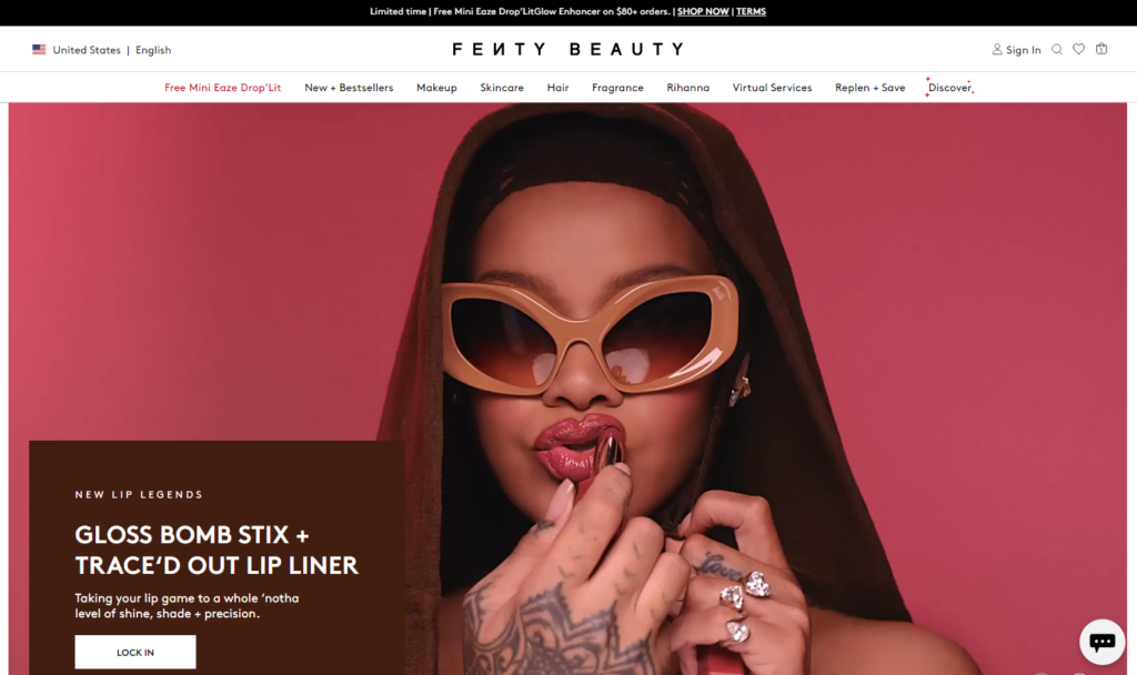
Fenty Beauty’s storefront isn’t just visually appealing; it’s designed to convert visitors into buyers. The layout is clean and clutter-free, with high-quality product images that take center stage.
Products are grouped logically in the header menu which makes it easy for customers to find what they’re looking for. They’ve incorporated so many CRO elements (we will be discussing them later) in different areas of their website.
For example, when you click on a Fenty Beauty highlighter, you’re not bombarded with text. Instead, you see a gorgeous model with the product beautifully applied. The image gallery shows different skin tones using the product, along with close-ups of the texture. The short videos play, showing the product’s texture and how it catches the light.
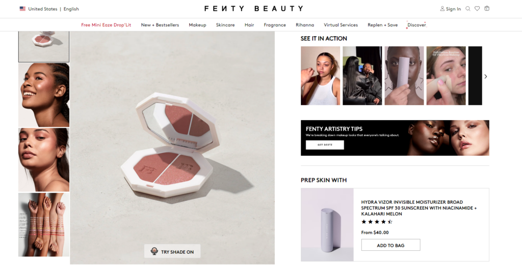
It’s easy to imagine yourself using the product and achieving that same flawless glow. This detailing makes it easy for visitors to decide if the product is right for them, increasing the chances of a purchase.
Also, the checkout process is streamlined and user-friendly, minimizing any roadblocks that might prevent someone from completing their purchase. In short, Fenty Beauty has excelled at creating a customer-centric experience that results in – increased Conversion Rate Optimization (CRO)!
Early adoption of eCommerce trends or market trends
When you start a race, you can’t wait for your competitors to jump the hurdles first for your inspiration, right??
Same way, Fenty Beauty never procrastinated when it came to adopting new trends to stand out as a cosmetics or skincare brand.
They were there early on, offering a seamless way for customers to test shades and products virtually before buying. This taps into the growing trend of Augmented Reality (AR) and Virtual Reality (VR) experiences in eCommerce. As a result, beauty lovers have a more interactive and engaging way to shop.
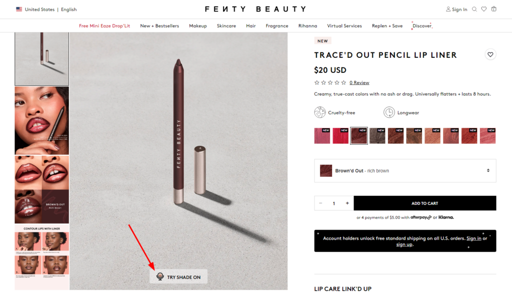
Now, instead of guessing between shades or relying on reviews, customers can confidently choose the perfect product, which reduces purchase hesitation and returns. This means more people who visit their site end up buying something.
All these points majorly contribute to a positive UX that makes shoppers feel comfortable and confident in their purchase decisions. When they find the information they need easily and feel like the brand understands their needs, they’re more likely to convert (i.e. add products to their cart and buy!).
Well, I know this is just an overview, you are looking for the exact things that you can directly implement in your skincare or beauty store. Don’t worry, you’ll love the next section.
What CRO Elements your Skincare Brand Must Have (like Fenty Beauty)?
Fenty Beauty isn’t just a celebrity brand with a catchy name. It’s a leader in the cosmetics industry, and a big part of that success comes down to how they approach customer experience (CX) and conversion rate optimization (CRO).
Here are some key CRO elements your Skincare brand should have, inspired by Fenty Beauty:
1. Test Before Buy
Shoppers mostly struggle with finding the right makeup shade when shopping online. This directly impacts your Customer Acquisition Cost (CAC) – the money spent to acquire each customer.
If they order the wrong shades, there will be lots of returns, no doubt!! Fenty Beauty has resolved this with a “Shade Try On” feature.
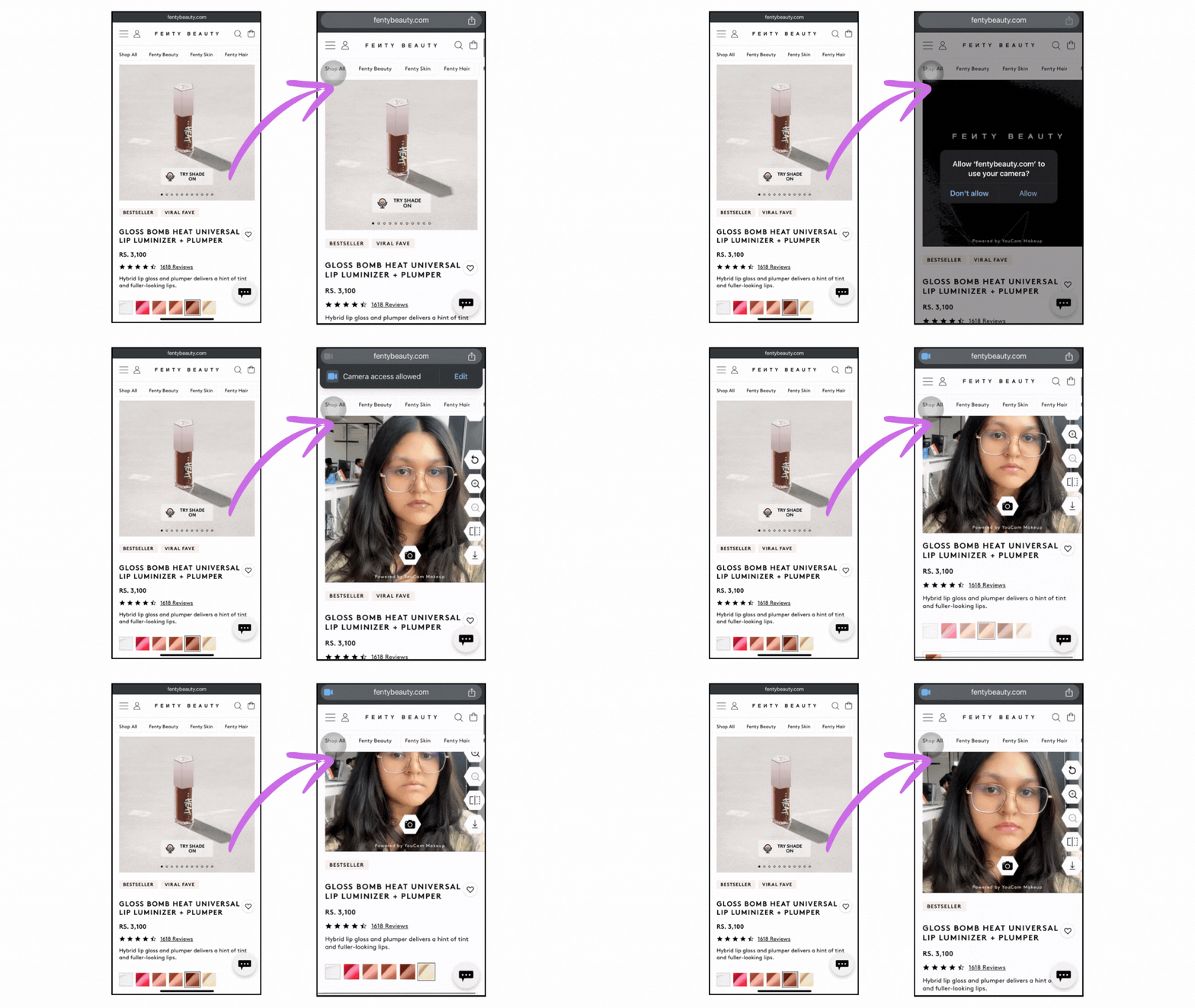
When you click on “Try Shade on”, it automatically activates your camera and shows the application virtually on your face. As you browse different shades on the product page, the virtual try-on adjusts instantly, letting you see exactly how each one would look.
2. Before & After Photos
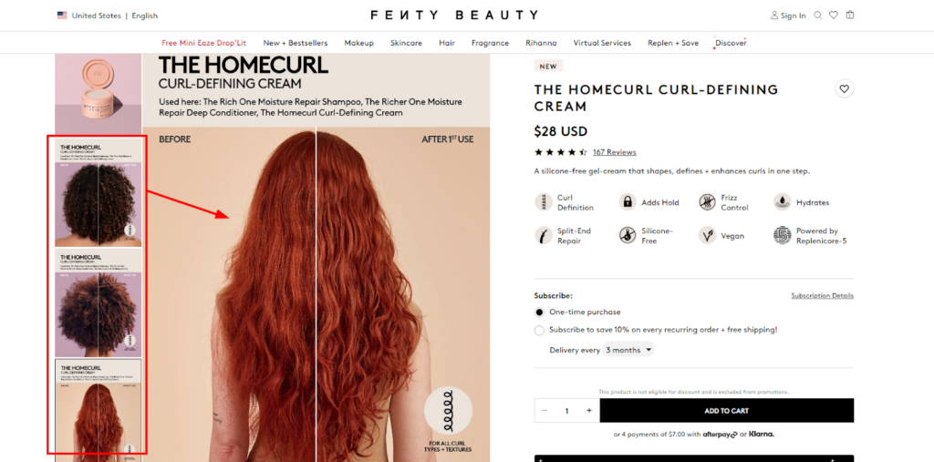
Would you be more likely to buy a product with a detailed description or one where you see the stunning results for yourself?
Sure, you can talk all day about how amazing your products are, but a picture (or in this case, a series of pictures) is worth a thousand words.
Fenty Beauty understands this and utilizes high-quality before and after photos to showcase the transformative power of their products. This proves to be very effective and encourages them to take the plunge on your products.
3. Complimentary Virtual Consultation
While the “Shade Try On” feature is a great first step, some customers may still require more assistance.
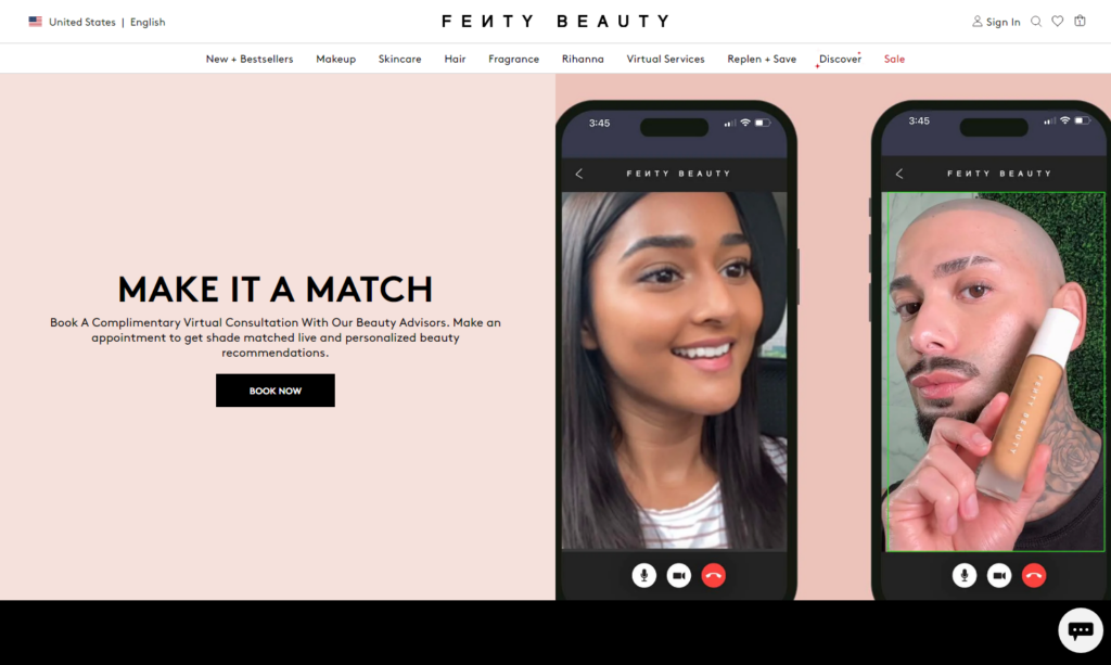
Fenty Beauty offers complimentary virtual consultations with beauty experts. These consultations allow customers to chat one-on-one with a makeup pro who can answer questions, recommend products based on their specific needs, and even offer personalized skincare or beauty advice.
This level of personalized service builds customer loyalty and trust which mostly convert them into paying customers and even brand advocates.
4. Product Bundles
We all know that there can’t be an all-in-one product in the makeup or skincare niche. So, shoppers need to purchase the products separately. For more ease and convenience, Fenty Beauty offers product bundles that help shoppers buy a kit without browsing multiple products.
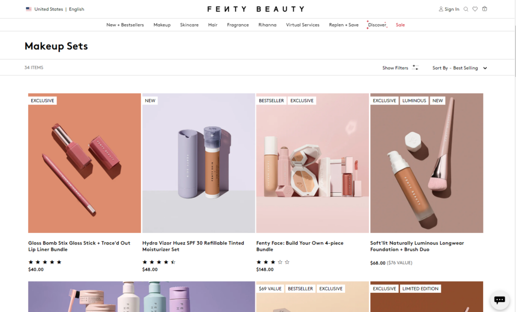
These bundles not only incentivize purchases but also help educate customers about how different products work together to create a complete look. This can be especially helpful for new makeup users who might not be sure where to start.
By offering these bundles, you make it easier for customers to find the products they need and create a cohesive makeup routine, all while getting a little extra value.
5. Specialized Product Filters
I’ve seen most of the eCommerce stores have the generic product filters that go with every product line. This way they make their brand lost in the huge crowd.
Fenty Beauty combats this by offering specialized product filters on their website. See what unique filters they have for their “Concealer + Corrector” product collection.

These filters allow customers to narrow down their search based on specific criteria like skin types, benefits, shade range, finish (matte, dewy, etc.), and even concerns (dryness, oiliness, etc.).
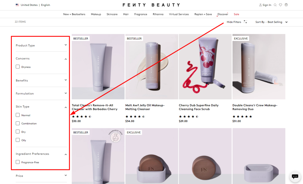
This makes it a breeze for shoppers to find the products that are a perfect fit for their needs.
When you make it easier for customers to find the products they’re looking for, you can significantly improve their shopping experience and increase the chances of conversions.
6. CTAs Everywhere
When you hover over any product on the collection page, the homepage, or anywhere on the website, you’ll find a CTA button. It directly gives you a way to add it to your shopping cart.
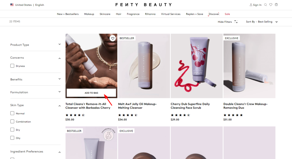
I know this is a basic thing, but it really matters a lot when you have a loyal customer base. They won’t like to explore the product page all over again to add a single item to the cart.
Thus, strategic placement of CTA guides customers through the buying journey smoothly and minimizes the chance they’ll get lost or abandon their cart.
7. Sales Labels over Products
The sales labels are the mini highlights that answer “Why they should buy the product”. As a shopper, I look for great products and these sales labels really help me identify those products.
Look at the picture below of how Fenty Beauty has incorporated text-based labels into their product cards.
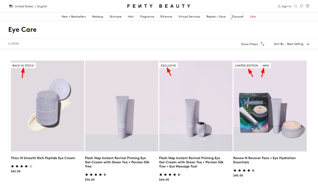
Every badge has a meaning. For example, “Back in Stock” represents the product as a best seller product that is sold very quickly. So, it’s better to grab it fast before it’s sold out again.
Same way, you can brainstorm unique perspectives and highlight them with the help of sales labels just like Fenty Beauty!
8. Subscription Services
The skincare and cosmetics industry is blooming because this has become a routine for Millennials and Gen-Z. So, just like grocery and dairy products, shoppers need these products frequently.
So, many beauty brands are now offering subscription services, and Fenty Beauty is no exception. Subscription boxes deliver a curated selection of products to customers on a regular basis.
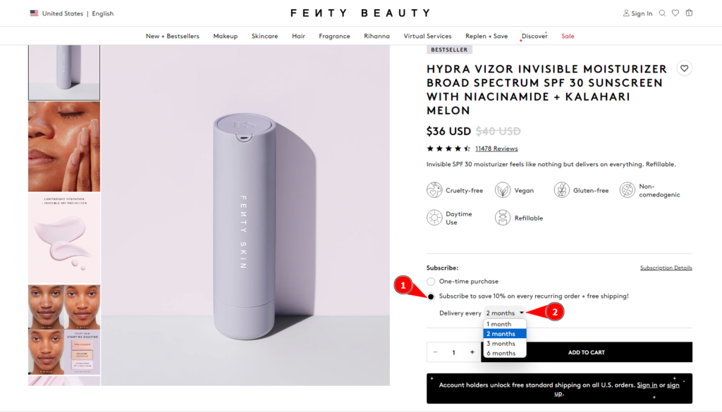
Subscriptions encourage repeat business and provide a predictable revenue stream, which can be helpful for financial planning and forecasting. As shown in the picture above, you can also add the subscription model for your shoppers and make repeat purchases effortlessly.
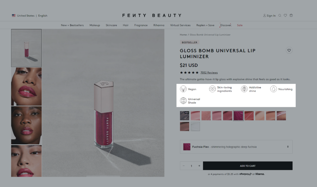
9. Key Feature Highlights
When it comes to product pages, sometimes basic descriptions just don’t cut it. Fenty Beauty excels at highlighting the key features of their products in a way that grabs attention and informs purchase decisions.
Instead of long paragraphs, Fenty Beauty uses bullet points to showcase the key benefits of each product such as “long-wearing”, “lightweight”, “buildable coverage”, etc. This makes it easy for shoppers to scan and understand what makes the product special.
You should focus on how each feature solves a customer’s problem or enhances their beauty experience. Here’s the best example of how you can highlight the key features of your product.
10. Ingredients section
This is a fascinating section for me – because it says what I’m actually using and how it is beneficial for my skin!
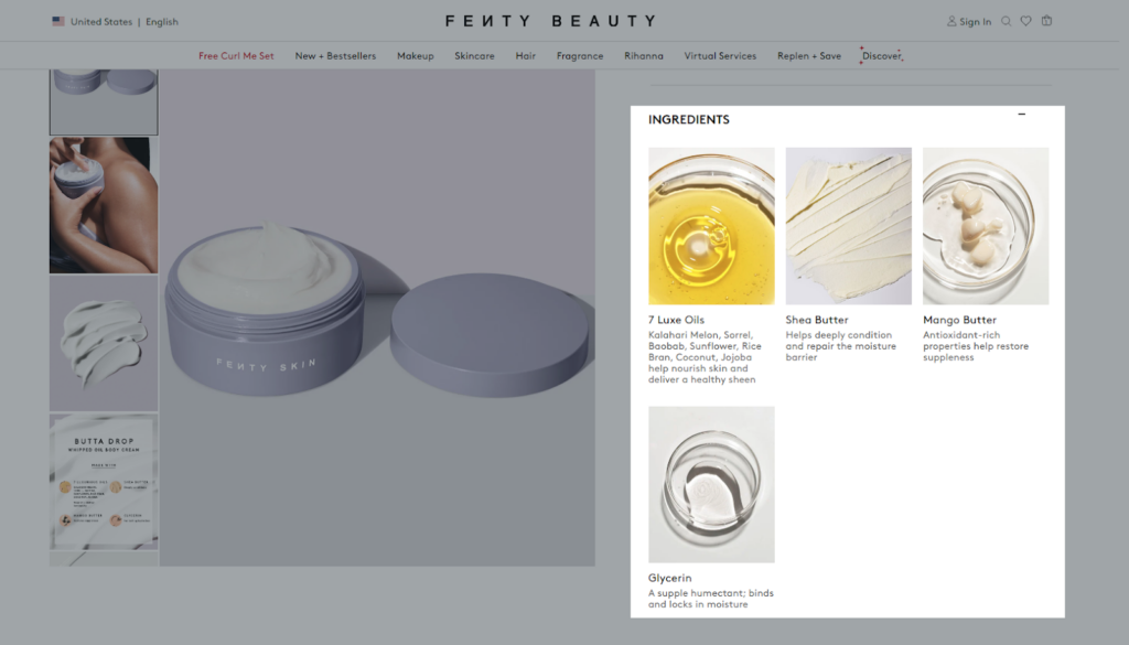
By being transparent about what’s in your products, you build trust with your customers. They appreciate knowing exactly what they’re putting on their skin.
Again, some customers might have allergies or preferences for certain ingredients (e.g., vegan, cruelty-free). A clear ingredients list allows them to make informed choices about what works best for them.
Fenty Beauty understands this and provides a comprehensive ingredients section on each product page. They also explain certain ingredients or highlight key components that contribute to the product’s benefits. This extra level of transparency positions them as a trustworthy and customer-centric brand.
11. “How to” Tutorials
Even the most amazing makeup product needs to be used correctly to achieve its full potential. Fenty Beauty offers tutorials in a variety of formats, including text instructions, short video clips, and even live Q&A sessions with makeup artists.
For some products, you can find a dedicated section that guides the shoppers through the right application process.
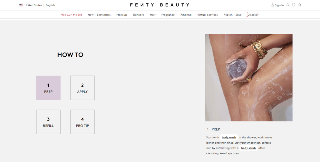
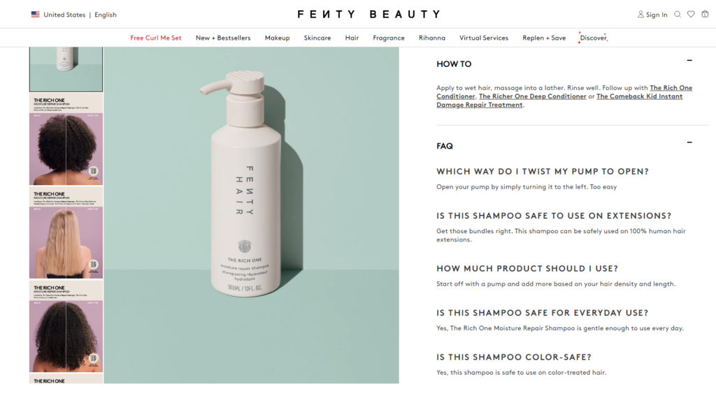
And for most products, you’ll find this “How to” and “FAQs” to answer the dozens of questions as shown below:
12. Easy Installment Option
What better can be done than making premium products affordable???
Fenty Beauty identifies that financial accessibility can be a hurdle for some shoppers. That’s why they offer easy installment options through services like Klarna or Afterpay as shown in the picture below:
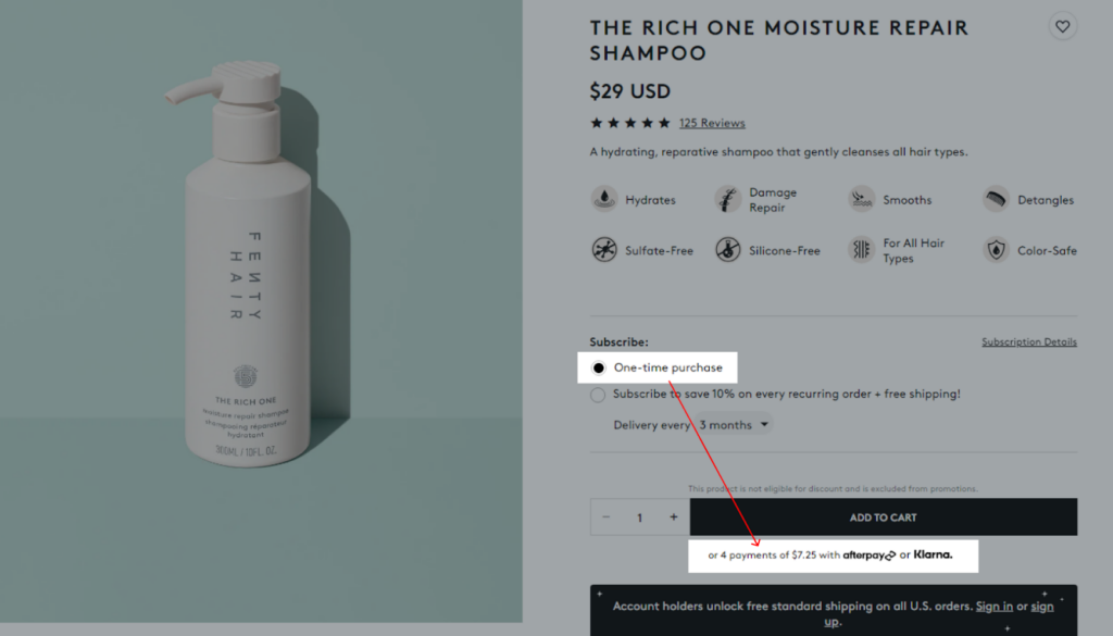
This allows customers to spread the cost of their purchases over time and makes high-quality makeup more accessible to a wider audience.
Sometimes, cart abandonment happens because the total cost feels overwhelming. Installment options can help customers overcome that hurdle and complete their purchase.
13. High-quality visuals
In the world of online shopping, high-quality visuals are non-negotiable. You’re trying to convince someone to buy a product they can’t physically touch or try on in person.
Fenty Beauty uses stunning product photography and video content to showcase their products.
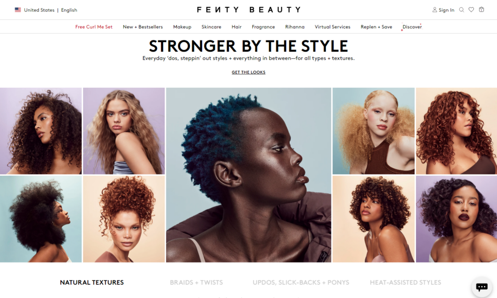
They feature diverse models with different skin tones and features, that encourage customers to see how the makeup will look on someone who resembles them.
14. Clear Navigation or Mega menu
Yes, as you can see, Fenty Beauty uses the Mega menu to showcase all the smartly curated categories. This is a large, expandable menu that categorizes all their products in a clear and organized way.
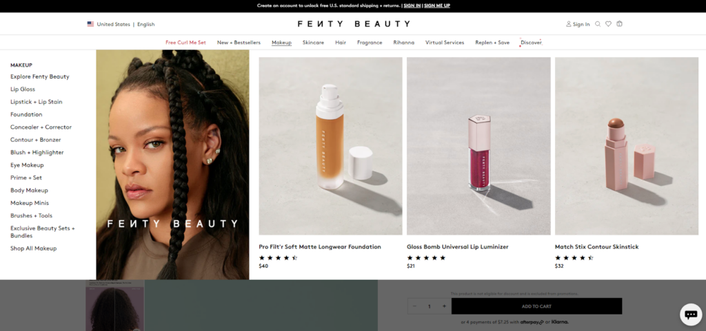
So based on your category size, you can select from different types of navigation menus. But the Mega menu is my personal favorite because it allows you to add products and images to the menu. This makes it more attractive and leads the shoppers straight to the products they want to buy.
15. Product Comparison
All I want to say is – Fenty Beauty has tried its best to help shoppers with product selection. From shade finder to free consultation to product comparison, they have covered everything that a beauty brand should.
See how they offer a product comparison tool that allows customers to see how different products stack up side-by-side.
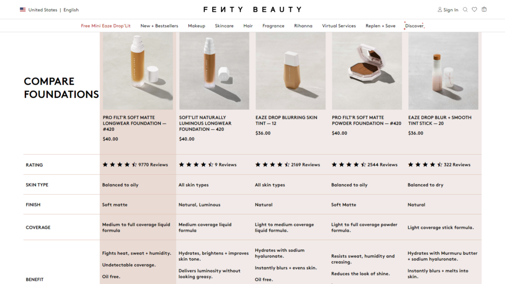
Now shoppers can find the product based on their skin type, coverage, benefits, etc.
16. Free Samples or Gift on Purchase
Sometimes, shoppers just need a little push to take the next step.
Fenty Beauty understands the power of a little something extra. They often offer free samples or free gifts with purchase, encouraging customers to try new products and boost overall order value.

Offering “free samples” helps you introduce customers to new beauty or skincare products and encourages them to step outside their comfort zone. It’s also a low-risk way for them to experience the quality of your brand firsthand.
17. Guest Checkout
A lengthy and complicated checkout process can be a major turnoff for customers. Fenty Beauty removes unnecessary hurdles by offering express checkout and guest checkout options. This lets customers purchase quickly without creating an account.
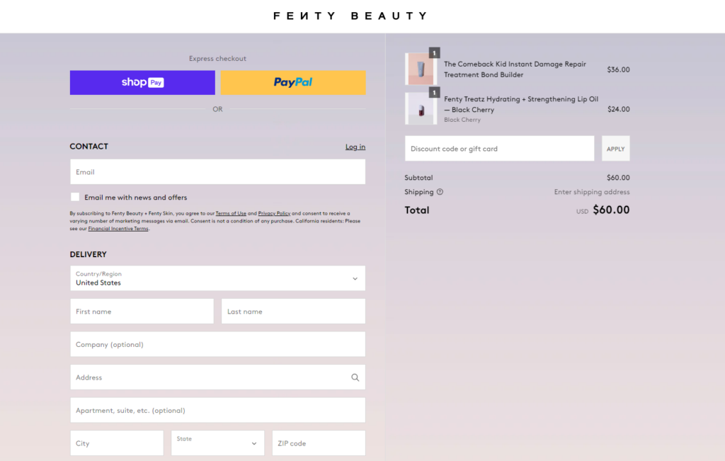
It’s perfect for impulse buyers or those who simply prefer a faster experience. And with the Shopify Plus plan, merchants have more power to customize their checkout process to a great extent.
18. Live Chat and Customer Support
Sometimes you just need a friendly face (or voice) to answer a question.
Fenty Beauty offers a live chat feature where shoppers can connect with a customer service representative in real-time. They can answer detailed questions about product ingredients, address concerns about allergies, or even offer personalized recommendations based on the customer’s needs.
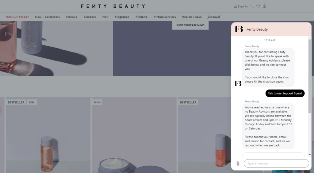
Well, you can update this live chat support with an AI chat assistant to reduce the customer support workload and answer frequently asked questions 24/7, freeing up your human team for more complex inquiries.
For example, the AI assistant can answer questions about finish (matte or glossy?), recommend shades for specific skin tones, or even suggest similar colors from other brands the shopper loves.
So, here we come to the end of the section that lists the major CRO elements your online cosmetics or skincare store should have. Don’t forget to check other conversion boosters we have discussed in our guide on Ecommerce CRO Audit!
Next, we’ll explore the latest eCommerce trends that Fenty Beauty follows and that you might be interested in.
What eCommerce Trends Does Fenty Beauty Follow for Higher Conversions?
Trends come and go… that’s true! But some trends can turn you into a superstar!
So, it’s important to adopt those trends at the right time to reap the benefits, like Fenty Beauty. Here are the latest eCommerce trends they leverage to boost conversions:
AR/VR Integrations
Remember the days of swatching makeup in a physical store to find the perfect shade? While online shopping offers convenience, it can be tricky to visualize how a product will look on your skin tone.
Fenty Beauty tackles this with AR (Augmented Reality) and VR (Virtual Reality) integrations. AR/VR bridges the gap between online shopping and the in-store experience.
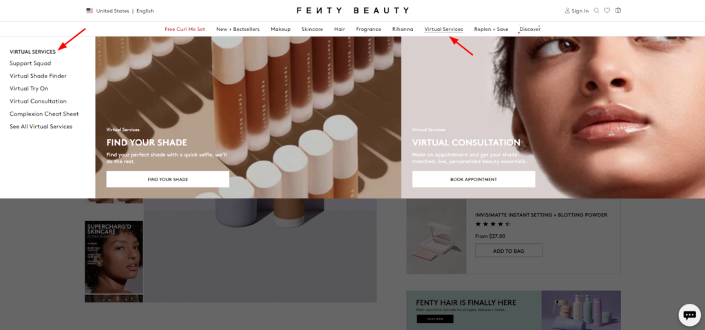
Here’s how it works: Imagine a customer browsing lipsticks on the Fenty Beauty website. With AR integration, they can use their webcam or phone camera to virtually “try on” different shades. This lets them see how the lipstick will look on their own skin tone and under different lighting conditions. It’s like having a magic mirror at home!
So, it builds trust by letting customers experiment and find the perfect shade, thus reducing the fear of buying a product that doesn’t suit them.
You can find many AR/VR solutions that you can integrate into your online store and upgrade the shopping experience for your customers.
Personalization
Personalization makes customers feel special. It shows you understand their needs and are there to help them find the perfect products.
Fenty Beauty uses this key trend that allows you to cater to each customer’s unique needs and preferences.
Here are some ways Fenty Beauty personalizes the shopping journey:
- Skin shade quizzes: These quizzes help customers find the perfect foundation shade based on their skin tone and undertones.
- Recommended product lists: Based on a customer’s browsing history and past purchases, Fenty Beauty suggests complementary products they might be interested in.
- Beauty Consultations: Fenty Beauty offers live chat options or virtual consultations with beauty experts who can answer questions and provide personalized recommendations.
- Pricing: The website shows the product price in the local currency based on the user’s location.
- Loyalty Programs and Rewards: Fenty Beauty has a loyalty program that provides personalized benefits and offers customers rewards for their purchases.
In short, personalization isn’t just a fancy word. It’s about building relationships with your customers and creating a shopping experience that feels tailored just for them. By using data strategically, you can make product recommendations that resonate with your customers.
Read more: Personalization vs. Customization in Ecommerce: How Do They Differ?
User Generated Content (UGC)
Yes, you heard it right – UGC is an effective trend that evolves with time.
Seeing real people using and loving your products builds trust with potential customers. It’s more believable than perfectly staged model photos.
Fenty Beauty encourages customers to share photos and videos of themselves using their products on social media with a specific hashtag. They then curate the best content and display it on their website.
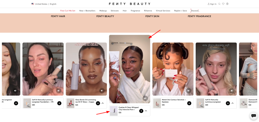
This UGC section is placed on the homepage where shoppers can explore their most popular products (promoted by the beauty influencers as well as the customers). You can also find an option to check on the product page or directly add it to your cart with ease.
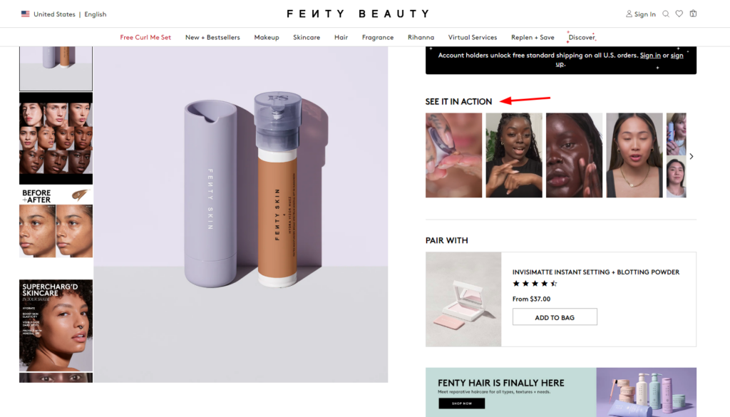
Also, each product page (PDP) has this section which contains the user-generated videos using the products. Not only this, but you can also find the UGC sections on many other pages, such as Fenty Artistry Tips, As Seen On TikTok, Fenty Mini, Videos, and so on.
This way you can also find ways to showcase your UGC and add value to your products. For more inspiration, check out the best UGC Examples!
Wrapping Up!
Shopify Plus store owners in the skincare or beauty niche can learn valuable lessons from Fenty Beauty’s success story. It’s a brand that understands the importance of a seamless customer experience.
In this blog, we’ve thoroughly explored their website to understand what makes them an outstanding brand in makeup and skincare. Of course, we’ve also highlighted several CRO boosters that you can implement in your online store for better conversions.
Now, it’s your turn to experiment with these strategies and see what works best for you. To ensure maximum returns, you would require a holistic approach to CRO optimization (where most of the brands fail).
We call it CRO-focused UI/UX designing, where Customer Experience (CX) is improved with a conversion-boosting design backed with insights derived from personalized audits and your customer’s behavior on your website.
If you’re not sure, you can Consult CRO experts and get suggestions from them based on a personalized CRO audit of your eCommerce store!


Post a Comment
Got a question? Have a feedback? Please feel free to leave your ideas, opinions, and questions in the comments section of our post! ❤️