Ecommerce CRO Audit: Check for These 21 Conversion Boosters

Internet is loaded with detailed CRO audit processes. And, I know you are looking for an expressway!
❌ So, we are not going to explain how you should conduct the eCommerce CRO audit.
✅ Rather, we will give you the exact roadmap that you should follow for ecommerce success (some top brands are already using it).
This blog consists of a curated list of CRO boosters which you need to check whether your website has or not. So, no more guessing or struggling with the CRO auditing. The upfront list of conversion-focused elements will directly give you an idea of how you can optimize your eCommerce conversion rate.
Additionally, we will show you the impact of those elements with real-world examples. So, you can easily implement or ask your developers for the same. A bonus section is waiting for you as you scroll down to the end.
Now, let’s start your eCommerce CRO audit with the conversion boosters test! 👇
What Are the Must-Have Ecommerce CRO Boosters?
As promised, here are all the elements behind the higher conversion rate for most of the successful eCommerce stores. Now it’s your turn to check where your online store is missing or failing in converting site visitors.
Here are the best Ecommerce CRO elements your Ecommerce store must have!
- Discount Progress Bar
- Quick Buy Option
- Dynamic Checkout
- Product Ratings & Reviews
- Predictive search
- Recently Bought Notifications
- HP Featured Product
- Facebook Messenger/WhatsApp Chat
- Promotion Timer
- Few Items Left
- Currency Converter
- Product Bundles
- Subscription Model
- Frequently Bought Together
- Estimate Delivery Date
- UGC Section
- Product Quiz
- Sales Badges
- Trust Badges
- One-click Checkout
- Exit Pop-up
Let’s learn about them in detail!
1. Discount Progress Bar
You may know this feature with some other names like Volume Discounts, Free Shipping Progress Bar, Tiered Progress Bar, or simply AOV Progress Bar!
This basically allows you to put multiple offers/discounts for shoppers that they can enable by increasing their cart value or total order amount. So, the discount bars are majorly located at
- Shopping cart
- Top in the website header
- Stick on the bottom of the screen
Here are some stores using the discount progress bar in different locations.
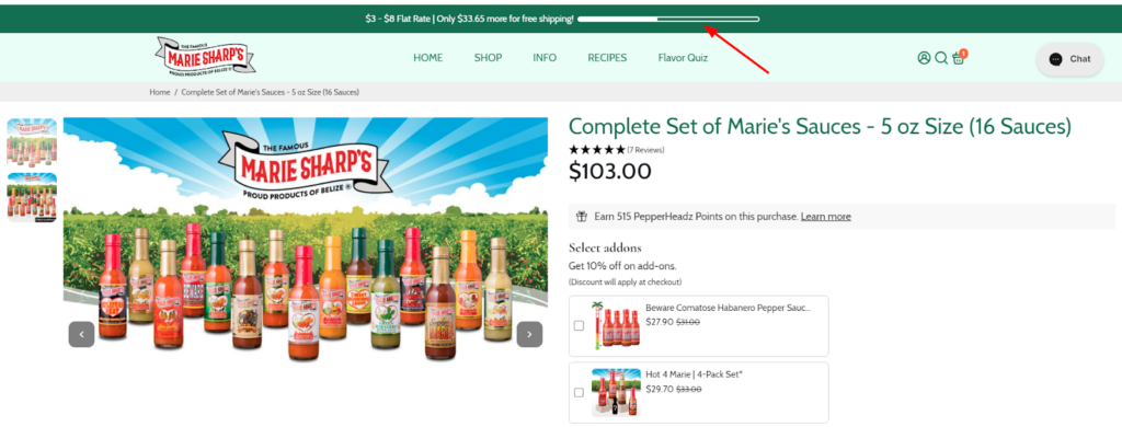
- Example 1: Marie Sharp’s store uses a progress bar that displays progress towards free shipping with a clear dollar amount needed to reach the threshold.
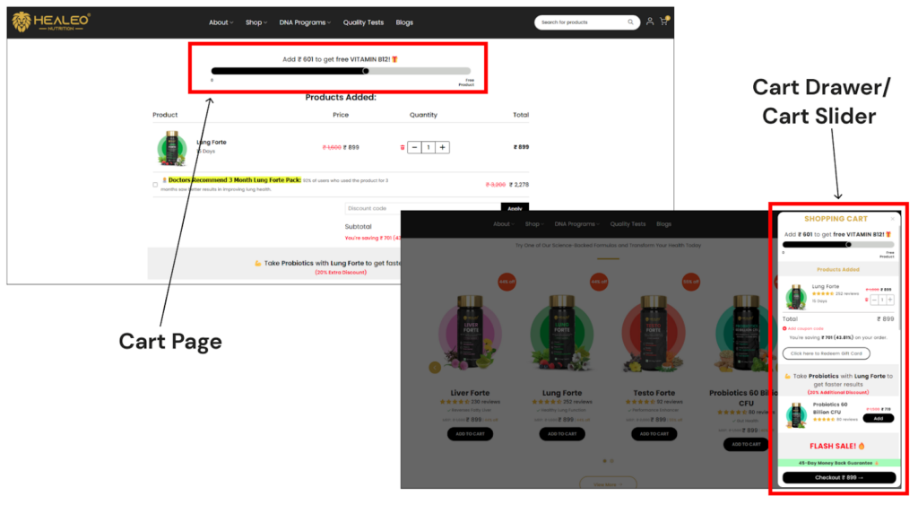
- Example 2: Healeo Nutrition has placed the Free gift progress bar in the shopping cart.
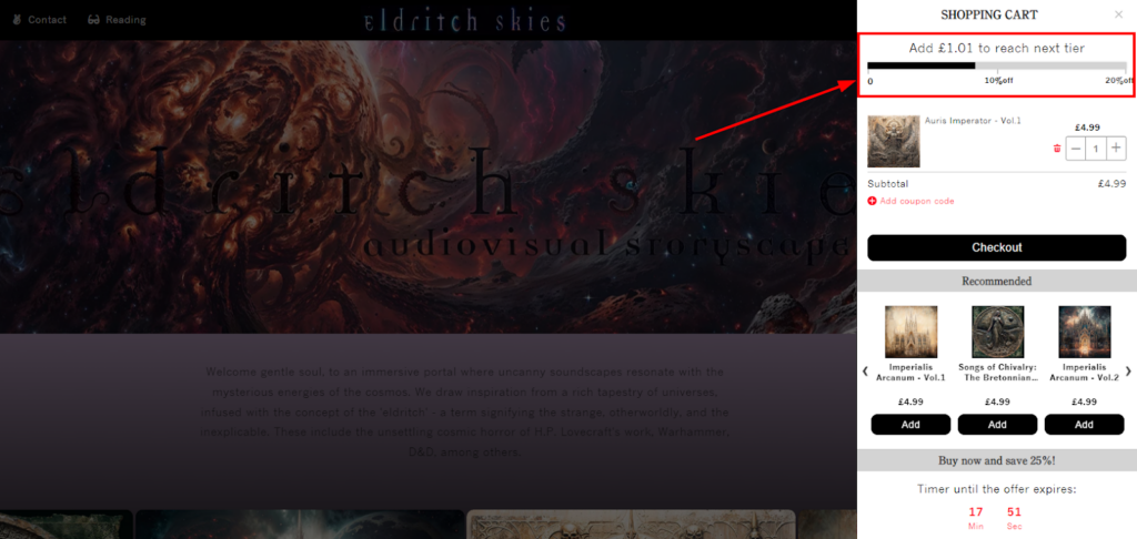
- Example 3: Eldritch Skies employs a tiered progress bar showcasing different discount levels achieved with increasing cart value.
Customers actively engage with these progress bars, tracking their progress and strategically adding items to reach the desired threshold. This interactivity keeps them on your site longer and encourages a more positive shopping experience.
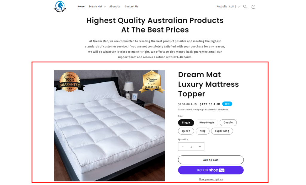
2. Quick Buy Option
Shoppers usually like a shortcut when buying a known product very often. For example, a female shopper would not go for a product investigation every time she buys her regular skincare products.
She would need a straightforward checkout for the same. The quick buy option allows your customers to bypass the traditional checkout flow and complete their purchase with just a click (or two). It’s the ultimate in convenience and speed, perfect for impulse buyers or returning customers with pre-filled information.
This option can be found on the product grids or the product detail pages. Here are the examples!
3. Dynamic Checkout
You must have noticed the payment buttons (like Amazon Pay, Google Pay, etc.) when browsing the products online. They are known as dynamic checkout buttons that cater perfectly to mobile users by enabling one-click purchases using pre-filled payment information stored in digital wallets.
These alternative payment options eliminate the need to enter card details in the traditional checkout process. This offers a significant improvement in mobile conversion rates.
Dynamic checkout is a feature that lets you offer a convenient checkout experience for your customers.
You can usually find these buttons on the product page or checkout page as below:
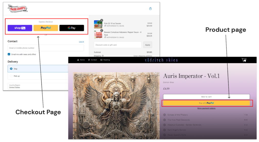
Here, customers can choose their preferred payment method and reduce their final checkout steps.
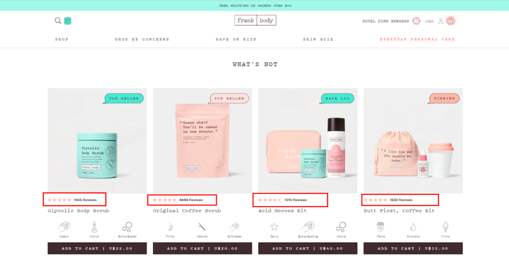
4. Product Ratings & Reviews
We all know this… right?? And we also know its importance – influencing purchase decisions and building trust with potential customers.
You may already have the product reviews on your product page. But what about other places?
I believe product reviews and ratings are as important as product price. So, it’s ideal to have them everywhere you showcase your products, whether it’s the homepage, collection page or even the product recommendation section.
In short, every product listing or product grid must have the product star ratings with other product details (title, price, variants, image, etc.).
Here’s an example for better understanding!
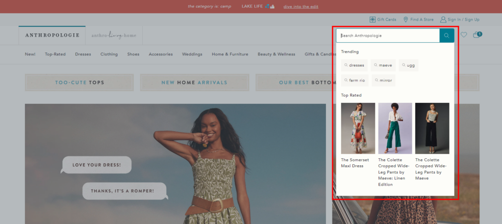
5. Predictive search
Predictive search, also known as autocomplete is a powerful feature that streamlines product discovery and boosts conversions. When the customer starts to type their search query, relevant suggestions appear instantly. This helps them quickly find the product they desire.
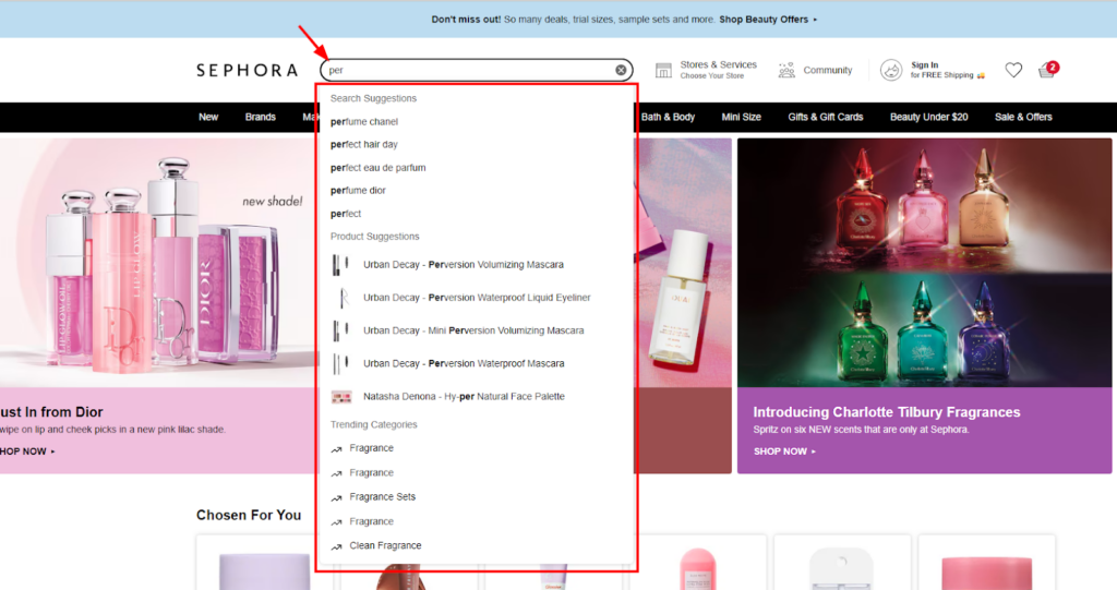
By suggesting relevant options, it eliminates the need for extensive browsing or multiple search attempts. This leads to a more efficient shopping experience and increased customer satisfaction.
No matter which platform you have, you can find the best eCommerce search engines available for site search or product discovery. Some of the robust features these tools provide are:
- Relevance: Understands synonyms, typos, and prioritizes relevant products.
- Filtering & Sorting: Refine searches by price, brand, color, size, etc.
- Faceted Navigation: Filter by multiple criteria simultaneously (e.g., brand, screen size, RAM for laptops).
- Predictive Search: Suggests products before users finish typing their query.
- Search Analytics: Analyzes searches, clicks, and conversions to optimize product listings.
- Personalization: Tailors results to browsing history, past purchases, and wishlists.
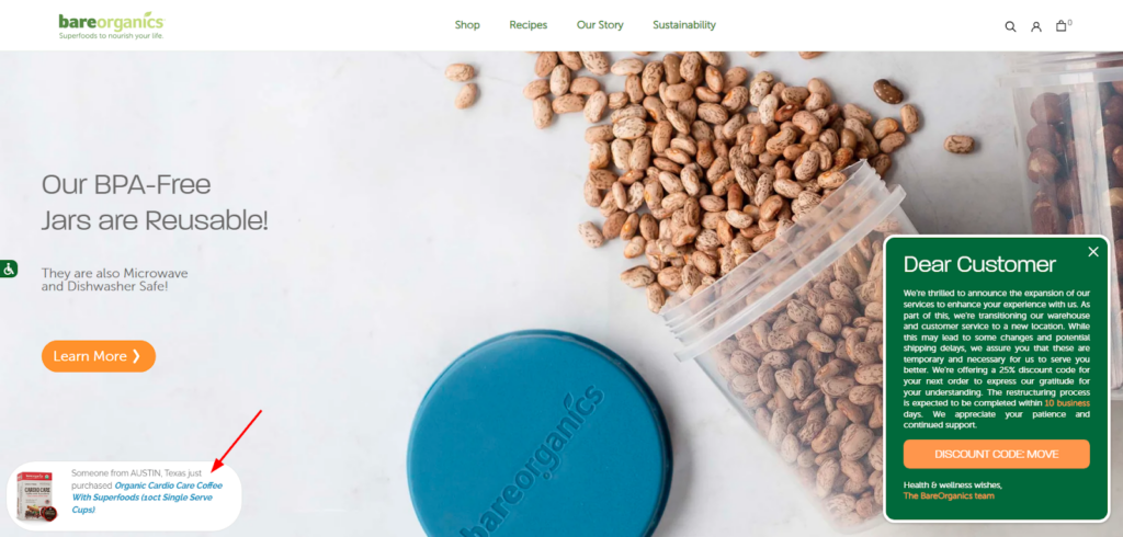
6. Recently Bought Notifications
Browsing a product page and seeing a subtle notification that “3 people just bought this item!”.
This simple message can trigger a sense of urgency and social validation, encouraging them to add the product to their cart and complete the purchase. Some stores also display “X people are looking at this item right now” notifications.
Product pages are the prime location for recently bought notifications. Or some of the stores show it on the bottom of the screen (that’s visible on the entire website) as below:
7. HP Featured Product
Many shoppers, when landing on the homepage, are confused about what they should buy. From which product they should try your brand? What’s the top-selling product on your website?
This HP Featured Product section is the ultimate answer. Here HP represents the “homepage”, so this element is specially designed for the homepage. Stores with small and exclusive catalogs often use this section to showcase their OG products.
Highlighting specific products on your homepage instantly grabs customer attention and raises awareness of your key offerings. This is particularly effective for promoting new arrivals, seasonal items, or products you want to push for higher sales.
8. Facebook Messenger/WhatsApp Chat
Believe it or not, but our minds are fully loaded with questions when we browse an unfamiliar product. And, a confused shopper will never buy a product.
To resolve this, you can place a cute little chat button where your shoppers can post their questions and get instant answers. The social media chat options are the best, as you can seamlessly connect with your visitors there and resolve their issues.
With a simple click on the Facebook Messenger or WhatsApp icon, they can initiate a real-time chat with a customer service representative.
Here’s how it looks:
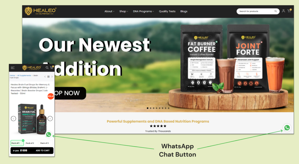
The integrations are available in the form of third-party applications specific to your ecommerce platform.
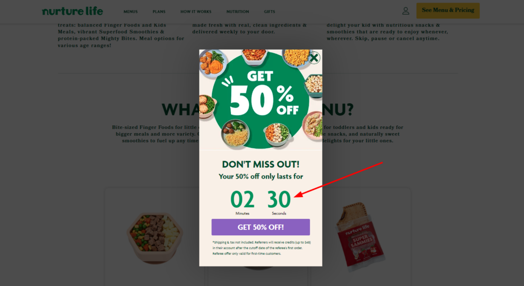
9. Promotion Timer
Mostly used for upcoming sales or ongoing sales on your online store, the countdown timers are the best way to encourage shoppers for purchase.
But some smart merchants place these timers in the shopping cart to convert the visitors into customers as shown below:
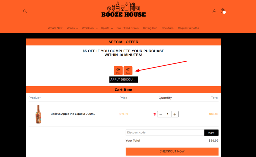
Yes, the promotional times are used in different ways to influence the conversion rate including:
- Highlighting flash sales, limited-quantity items, or special promotions with an expiration date.
- Timers can be used in abandoned cart emails to remind customers about the items left in their carts.
- Timers can tick down towards unlocking early shipping (as shown below).
- Using a countdown timer for early access to a new product launch or exclusive sale.
- For an upcoming sale display a countdown timer before the official launch date.
- Using a timer that displays the cut-off time for same-day delivery or next-day delivery options.
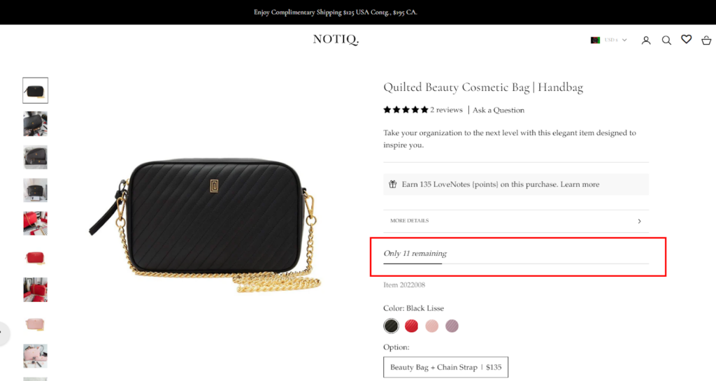
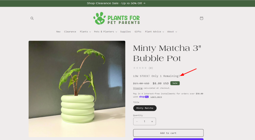
10. Few Items Left
Quick, quick… Only 1 item left!!
When customers see the limited stock message, they perceive the product as more valuable and desirable. It’s because the “Few Items Left” indicator taps into this psychology and subtly influences customer behavior.
The prime place to display the indicator is on product pages, especially on the first fold. This captures attention at the most crucial decision-making point and inspires customers to secure the item before it’s gone.
Here, I have one more example to show. The CRO booster is placed at the right place but shoppers can easily miss the message. It could be more effective if the text color would kept “red” and highlighted well.
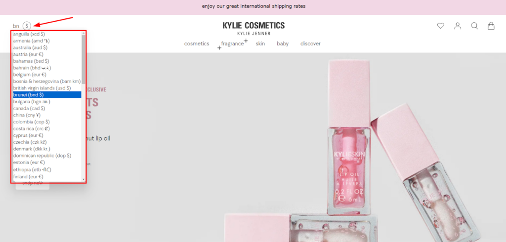
11. Currency Converter
If you’re selling internationally, a currency converter can be a game-changer for your conversion rates. Without a currency converter, your shoppers might struggle to understand the true cost of your products and ultimately abandon their shopping cart.
The currency converter eliminates this barrier and offers a smoother shopping experience for your global audience.
A prominent location like the header or top navigation bar ensures easy access for the customers. They can quickly switch currencies without navigating through the entire website. Here’s the best example of a currency converter.
12. Product Bundles
Do you have products that aren’t selling as well as others? Bundling them with popular items can help move that excess inventory. Easy…right??
Product bundles offer a curated selection of complementary items grouped together at a discounted price. This strategic approach can significantly boost conversions and customer satisfaction.
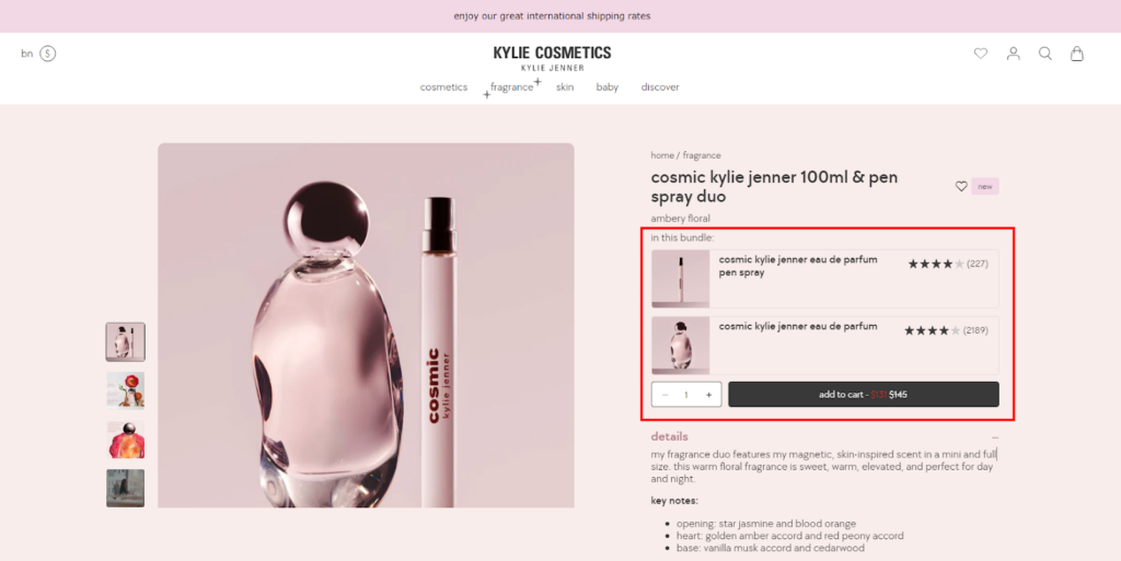
For example, offering sample or trial-sized product bundles, allows customers to experiment with new items at a lower price point.
One more way to add product bundles is by allowing the shoppers to pick a specific number of products to make a customized bundle for bulk purchases. Here’s a real example!
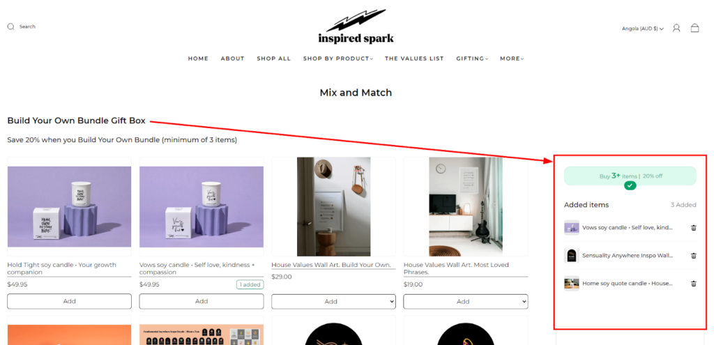
I have seen these product bundles on product pages, shopping cart, and even on the thank you page. So, there’s no harm in using this CRO booster! 👍
13. Subscription Model
The traditional one-time purchase model might not always be the best fit for your ecommerce store. In recent years, the subscription model has emerged as a powerful CRO booster,
- fostering customer loyalty,
- predictable revenue streams, and
- increased customer lifetime value.
The best example is “Skincare companies offer monthly or quarterly subscription boxes with a selection of personalized products based on individual preferences”.
You can also introduce the subscription model to your customers if your products are frequently consumable. The best place where this element resides is the product page. See how Dollar Shave Club disrupted the industry with its convenient and affordable razor blade subscription service.

Numerous third-party integrations are available for various ecommerce platforms. These solutions streamline subscription management, handling order fulfillment, automatic renewals, and customer communication. Once the customer purchases a subscription the rest will be managed by the tool.
Wondering how to encourage customers for subscription purchases? This feature also allows you to offer a discount for buying the subscription. Let’s see the example below.
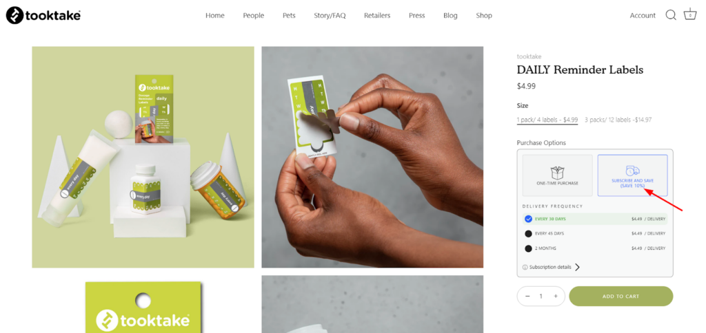
This allows customers to easily choose between a one-time purchase or the convenience of a subscription.
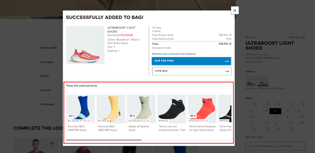
14. Frequently Bought Together
This CRO booster falls in cross-selling strategies popular for influencing customer behavior and boosting average order value (AOV). You may find this section on every eCommerce store at various places like the product page, cart page, or even on the checkout page.
By presenting relevant and complementary products alongside individual items, you encourage customers to spend more. For example, recommending a screen protector alongside a phone case demonstrates a thoughtful approach to their purchase.
After the product page, the card page is another prime location for “frequently brought together” suggestions. As customers review their cart contents, they might be enticed to add complementary items to reach a free shipping threshold or simply enhance their purchase.
Here’s an example of Adidas!
Product page
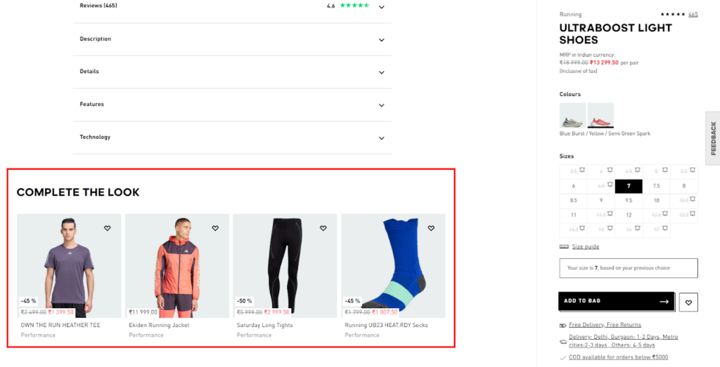
Cart pop-up
15. Estimate Delivery Date
An estimated delivery date (EDD) is a piece of information that directly impacts customer experience and conversion rates.
“When will my order arrive?” is one of the major concerns in online shopping. So, when you answer this question on the product page itself, you can secure some customers in seconds.
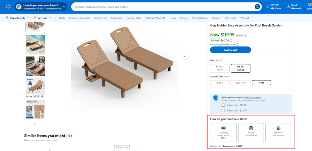
Walmart excels at displaying estimated delivery dates. On product pages and during checkout, customers can see the estimated timeframe for their order based on their chosen shipping option.
For that, the online store asks for the PIN code to provide an accurate delivery date. You can either develop this functionality or integrate third-party extensions into your website.
16. UGC Section
User-Generated Content (UGC) is the real-life photos and videos showcase products in action, which helps customers visualize how they might use and benefit from them. It provides a well-rounded perspective on your products to visitors.
UGC acts as social proof and demonstrates to potential customers that other shoppers have purchased and enjoyed the products. This authenticity builds trust and encourages visitors to feel confident about making a purchase.
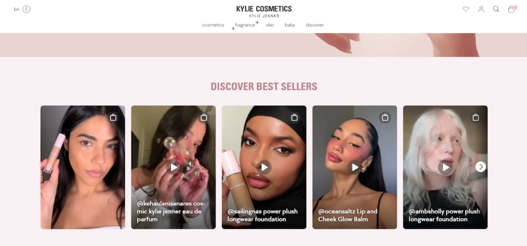
The placement of UGC sections can be based on your needs. You can place a UGC gallery on the home page, and product pages, or even have a dedicated landing page for success stories.
Explore more about the top UGC examples!
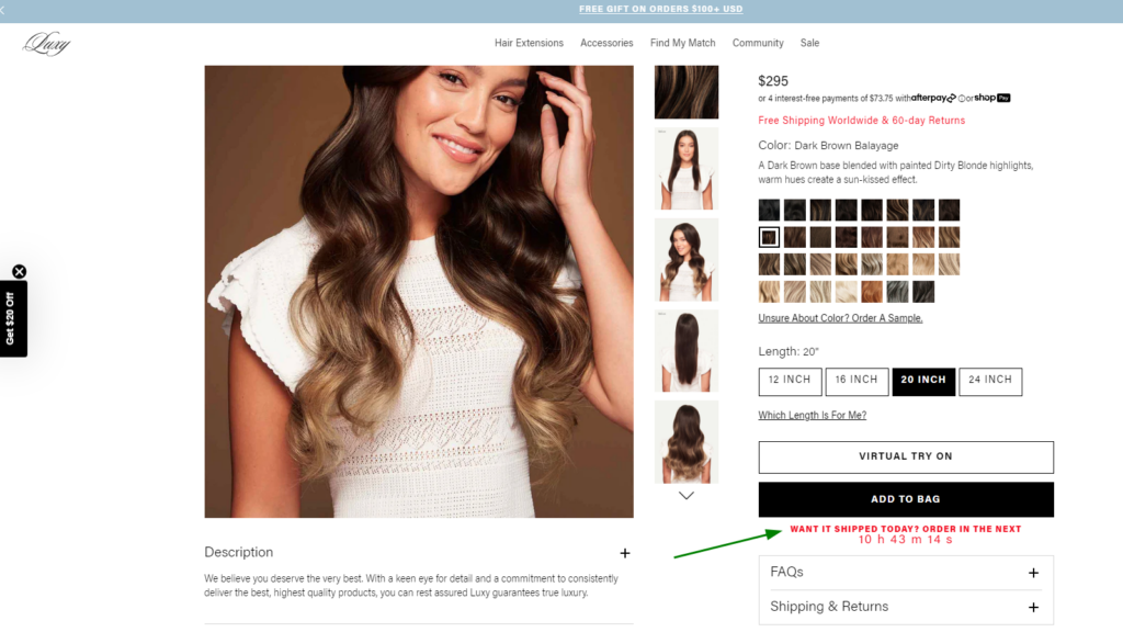
17. Product Quiz
Here’s the best way to convert visitors into your customers by helping them decide which product they actually need.
Once I was looking for a hair extension, but confused about which one to choose as I never used it before. I visited Luxy Hair’s website and found a way (product quiz) to get the perfect hair extension for me. They asked me very precise questions and suggested me the best fit for my hair.
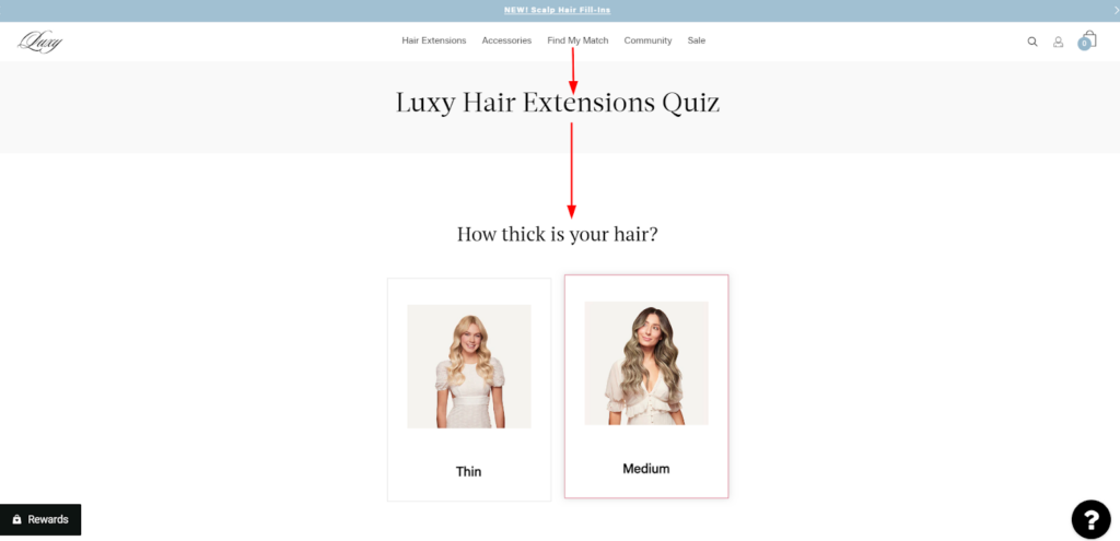
This way you can employ this CRO booster and help your confused shoppers to pick the right product by identifying their needs. A prominent product quiz on your homepage or landing page can immediately engage visitors and guide them towards relevant products.
The data collected through product quizzes provides valuable insights into customer preferences, needs, and buying behavior. This information can be used to
- improve product offerings,
- personalize marketing campaigns, and
- optimize your overall ecommerce strategy.
Product quizzes make shopping a more interactive and engaging experience. Customers feel like they’re receiving personalized guidance which boosts trust and satisfaction.
18. Sales Badges
I call them visual magnets!! 🤑
Sales badges are the tiny stickers or labels (on the product images or product grids) that effectively attract customer attention and communicate the value proposition of an offer. It helps you highlight specific products in the wide collection like:
- Highlight percentage discounts (e.g., “20% Off!”)
- Advertise free shipping (e.g., “Free Shipping!”)
- Create urgency with limited-time offers (e.g., “Flash Sale”)
- Generate excitement for new arrivals (e.g., “New Arrival”)
- Influence behavior with top-selling products (e.g., “Top Seller!”)
- Promote bundle deals (e.g., “Buy 2, Get 1 Free!”)
- Showcase limited-quantity items (e.g., “Only 5 Left!”)
- Emphasize eco-friendly products (e.g., “Sustainable”)
- Flag award-winning products (e.g., “Best of 2024”)
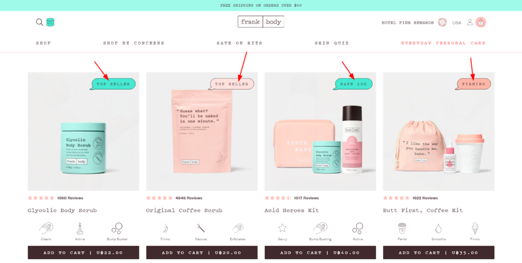
Prominently placed badges can help customers identify discounted or sale items more easily, streamlining their product discovery process and potentially leading them towards unexpected purchases.
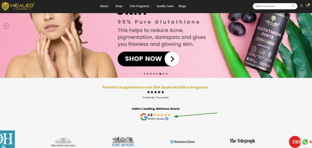
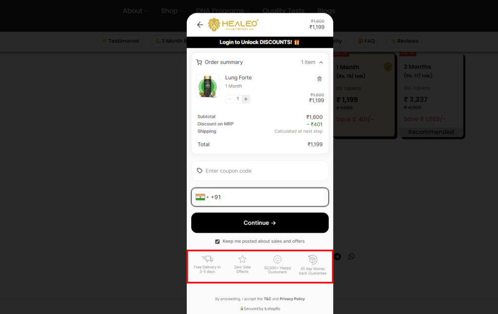
19. Trust Badges
Similar to sales badges, trust badges help you boost your conversions.
Trust badges alleviate customer concerns about online security, particularly for first-time buyers. By displaying these badges, you demonstrate your commitment to data protection and secure transactions, encouraging customers to feel confident about sharing their financial information.
Wondering which trust badges you can add?? Here you go!
- Display badges from trusted payment processors like Visa, Mastercard, or PayPal to assure customers that their financial information is protected during transactions.
- Utilize badges indicating a valid SSL certificate, which encrypts data transmission and safeguards customer information.
- Showcase badges highlighting positive customer reviews or industry ratings.
- If your business holds security certifications related to data privacy or online transactions, display badges representing those certifications to reinforce your commitment to security.
- Promote trust by featuring badges that advertise your money-back guarantee policy.
… and many more. The placement can be anywhere, on the homepage, product page, cart page, checkout page, or all of them.
Here are some examples!
Homepage
Checkout Page
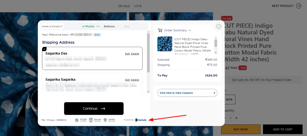
20. One-click Checkout
Do you know, the major reason behind cart abandonment is the lengthy checkout process??
So, the ultimate solution is the one-click checkout! Or we can also call it “single page checkout”. It removes extra steps from the traditional checkout process and allows customers to complete their purchases quickly and effortlessly.
Even for returning customers with pre-saved billing and shipping information, one-click checkout is ideal.
If your platform doesn’t offer a native one-click checkout solution, explore its app marketplace. You’ll likely find various third-party apps specializing in one-click checkout functionality. These apps can be integrated with your store to provide the desired functionality.
For example, the GoKwik checkout solution streamlines the checkout process with smart address autofill, discount configuration, and multiple payment options.
Guess what, If you are a merchant of a Magento store or Shopify store, we can help you integrate GoKwik checkout into your online store (just like we help our client – Fabric Pandit).
21. Exit Pop-up
It gives you a last chance to hold your shoppers with an exciting offer or special giveaway!
Exit pop-ups, also known as exit-intent pop-ups are a strategic way to recapture the attention of abandoning visitors and potentially convert them into customers. These pop-ups appear just as a visitor is about to navigate away from your website, offering a last-minute incentive or reminder to encourage them to stay and complete a desired action.
For example, if a customer’s cart has products, you can use an exit pop-up to offer a Free Gift for completing the purchase.
Or you can offer a discount on the next purchase in exchange for their email address as shown below.
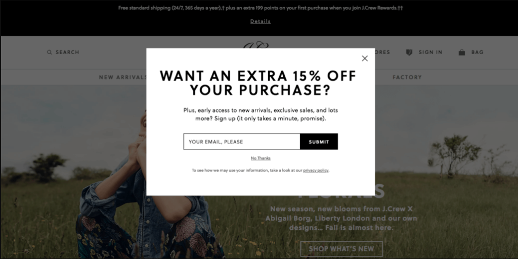
Don’t forget to personalize your exit pop-ups with abandoned cart reminders or product recommendations to make them more effective.
So, here ends our CRO booster list. I’m expecting that your eCommerce store has most of them. If not, it’s time to add them based on your business niche or model. You can also consult CRO experts to optimize your store without harming the existing store functionality.
So, let’s move further.
What are CRO Metrics to Track Ecommerce Conversions?
CRO is all about optimizing the proportion of visitors who take desired actions on your eCommerce store.
Let’s understand this with the picture below.
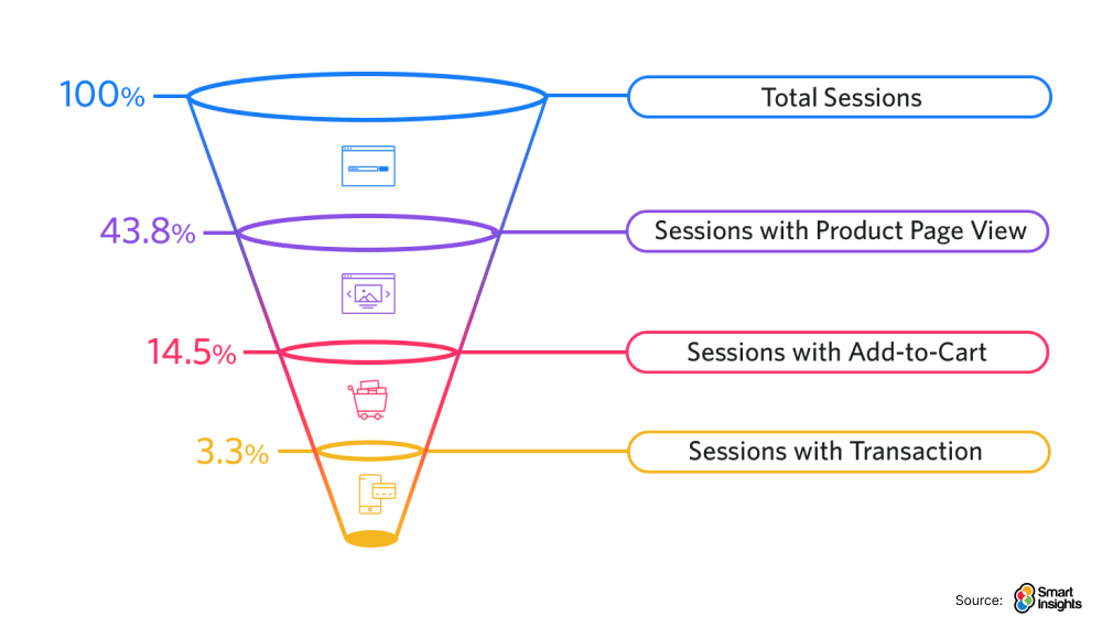
It shows that the total traffic (total sessions) is much higher than the sessions with product page view, add-to-cart, and transactions. Here “conversion rate” is the cornerstone metric for measuring the effectiveness of your CRO efforts.
But in this section, we will also learn about other metrics that can help analyze your store conversion.
1. Conversion Rate
The conversion rate represents the percentage of visitors who complete a purchase on your eCommerce website. This metric provides a clear picture of how effective your website is in converting visitors into paying customers.
Here’s the formula to calculate your conversion rate:
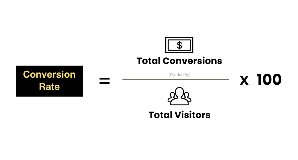
Let’s say a product page on your ecommerce store received 1,000 visitors last month and resulted in 25 sales. Following the formula:
Conversion Rate (%) = (25 Sales / 1,000 Visitors) x 100 = 2.5%
So, the conversion rate is 3%, which falls within the typical eCommerce industry benchmark range of 2% to 5%. A healthy conversion rate indicates that your eCommerce website is effectively guiding visitors toward completing the purchase. However, a low conversion rate suggests areas for improvement.
2. Abandonment Rate
While the conversion rate focuses on successful purchases, the abandonment rate looks at the flip side – the percentage of visitors who add items to their cart but fail to complete the checkout process.
A high abandonment rate indicates roadblocks within your checkout process or other areas of your website that might be discouraging customers from completing their purchases.
Here’s the formula to calculate your abandonment rate:
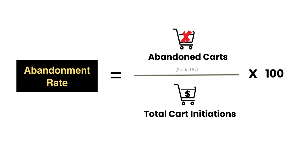
- Abandoned Carts: This refers to the total number of shopping carts created on your website that were not followed through to completion.
- Total Cart Initiations: This is the total number of times visitors added one or more items to their cart during a specific timeframe.
Example:
Let’s say your ecommerce store had 100 visitors initiate carts last month, but only 25 of those carts resulted in completed purchases. Here’s how to calculate the abandonment rate:
Abandonment Rate = ((100 carts – 25 purchases) / 100 carts) x 100 = 75%
In this scenario, the abandonment rate is 75%, indicating that a significant portion of visitors who added items to their carts didn’t complete the purchase.
The average shopping cart abandonment rate across various industries falls around 69.99%, with a range of 56% to 81% depending on the specific industry.
So, if your site’s abandonment rate is above 70% you should consider identifying the reasons why customers might be abandoning carts. Then, you can implement CRO strategies to streamline the checkout process, address customer concerns, and ultimately reduce cart abandonment.
Read more: 4 Retargeting Strategies for Abandoned Cart Recovery
3. Bounce rate
The bounce rate measures the percentage of visitors who leave your website after viewing only one page. In simpler words, it indicates how many visitors landed on your site but didn’t explore further or take any action.
This metric provides insight into how engaging your website is and whether visitors are finding the information they need.
Here’s the formula to calculate your bounce rate:
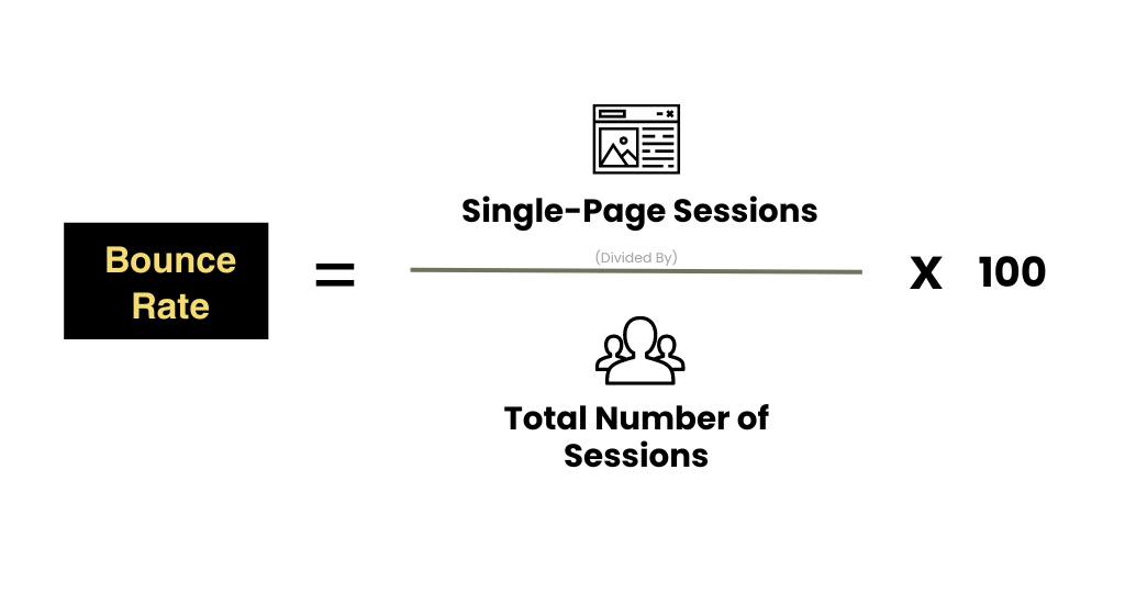
For example, imagine your ecommerce website received 5,000 sessions last month, and out of those, 2,000 visitors only viewed a single page before leaving. Let’s calculate the bounce rate:
Bounce Rate = (2,000 Single-page sessions / 5,000 Total sessions) x 100 = 40%
In this scenario, the bounce rate is 40%.
What is the “good” bounce rate for eCommerce stores?
The “good” bounce rate for ecommerce stores can vary depending on the niche, but a range between 20% and 45% is generally considered a positive benchmark. A high bounce rate indicates issues with your website’s content, design, or user experience that prompt visitors to leave quickly.
So here, you should aim to have a low bounce rate which reflects your website is effectively capturing visitor attention and encouraging them to explore further.
4. Click-Through Rate (CTR)
Now this metric is related to your marketing campaigns and website SEO.
Click-Through Rate (CTR) specifically tracks the percentage of viewers who see your ad (or any other call to action) and click on it.
The CTR calculation is straightforward:
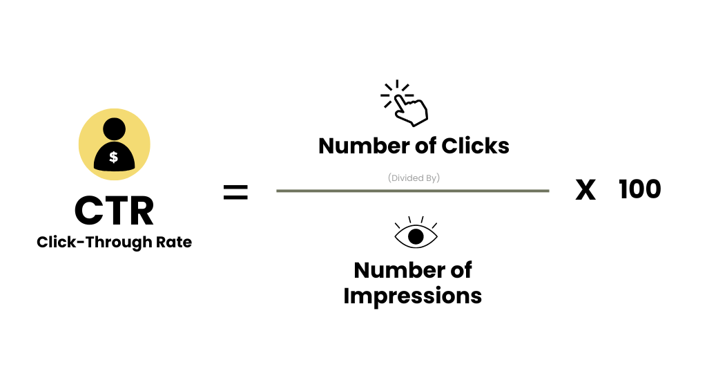
An impression occurs each time your ad or link is displayed. For example, your Google ad received 10,000 impressions and resulted in 150 clicks.
Let’s calculate the CTR:
CTR = (150 Clicks / 10,000 Impressions) x 100 = 1.5%
In this scenario, the CTR is 1.5%. While a “good” CTR can vary depending on factors like industry, campaign goals, and device type, a CTR above 2% is generally considered positive for eCommerce businesses.
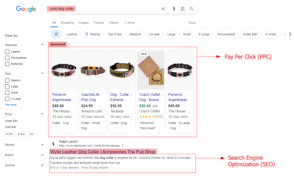
CTR can be applied to both Pay-Per-Click (PPC) ads and Search Engine Optimization (SEO). For example, when you search for “polo dog collar”, the Sponsored links (in the box) refer to the PPC marketing, and the results below belong to SEO.
If your CTR is lower, you should understand the factors influencing click-through rates, and optimize your website as well as your marketing campaigns. This will lead to a higher CTR, increased website traffic, and ultimately, more conversions and sales for your ecommerce store.
5. Customer Lifetime Value (CLV)
While conversion rate and CTR focus on immediate actions, Customer Lifetime Value (CLV) takes a broader perspective. CLV is a metric that estimates the total revenue a single customer brings to your business throughout their entire relationship with your eCommerce brand.
Understanding CLV helps you prioritize customer retention strategies. High-value customers who purchase frequently and spend more contribute significantly to your overall revenue.
There are various methods to calculate CLV, which can overwhelm you.
Here’s the simplified formula:
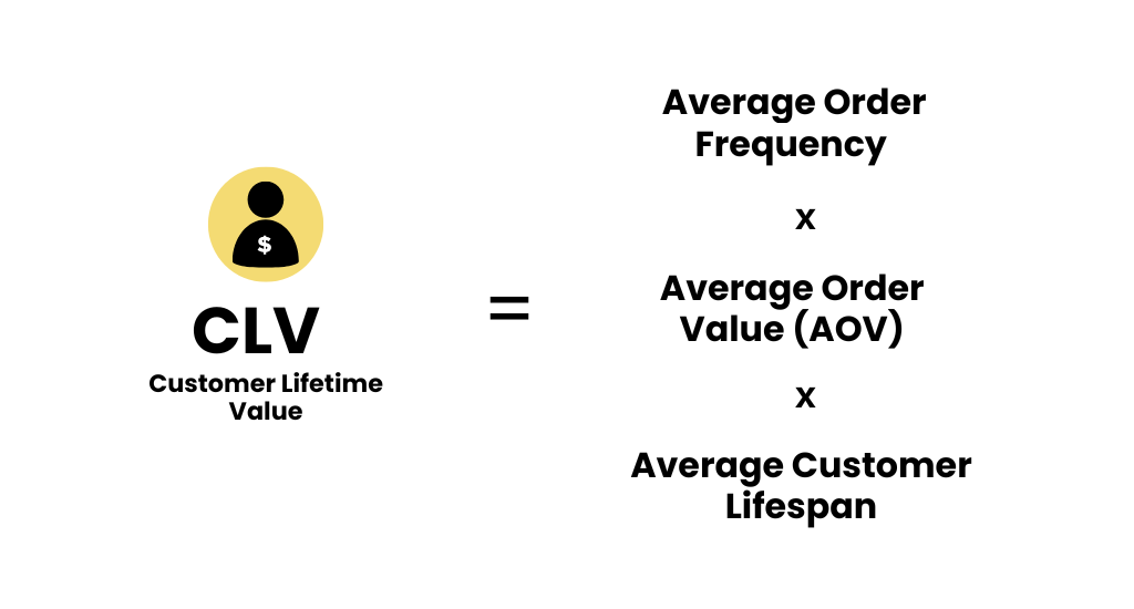
Let’s break down the formula:
- Average Order Value (AOV): This is the average amount a customer spends per order. You can calculate it by dividing your total revenue by the number of orders in a specific period.
- Average Order Frequency: This represents how often a customer makes a purchase within a given timeframe.
- Average Customer Lifespan: This is the average duration a customer remains engaged with your brand (e.g., calculated using historical purchase data).
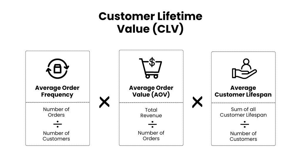
Example:
Let’s say the average customer at your pet store spends $50 per purchase and makes two purchases a year (average customer value = $100 annually). Additionally, based on your data, the average customer stays loyal to your store for 3 years (average customer lifespan).
Following the formula:
CLV = $50 (AOV) x 2 (Purchases/Year) x 3 (Years) = $300
In this example, the CLV is $300. This indicates that, on average, a customer brings $300 in revenue to your store over their lifetime relationship.
Since acquiring new customers can be expensive, focusing on retaining existing high-value customers becomes more strategic. That’s why understanding CLV allows you to prioritize customer retention which automatically improves the conversion rates.
This way, by analyzing your conversion funnel, identifying drop-off points, and implementing CRO strategies, you can work towards optimizing your conversion rate and maximizing your ecommerce store’s success.
Let’s understand the complete process below!
How to Perform a Successful eCommerce CRO Audit?
Conducting a regular CRO (Conversion Rate Optimization) audit helps you identify areas where your website can be improved to convert more visitors into customers.
Here are the step-by-step instructions for performing CRO audits of your ecommerce store:
Step 1: Define Your Conversion Goals
The first step is to define your conversion goals. As a merchant, you likely have various aspirations for your store. Start by identifying your primary CRO goals like:
- Do you want to increase overall sales?
- Boost add-to-cart rates?
- Reduce cart abandonment?
- Maybe a combination?
Once you pinpoint your main objectives, translate them into specific measurable CRO metrics (discussed in the previous section).
For example, if your primary goal is to increase sales, a metric could be a targeted conversion rate increase of 10% within the next quarter. This provides a benchmark to track progress and ensures your CRO efforts are laser-focused on driving sales.
Having clear goals will guide your audit and ensure you’re focusing on the areas with the biggest impact on your bottom line. Once you know your goals, you can start to identify the pages and elements that are most important for conversion.
Step 2: Identify Priority Pages for Optimization
Now, it’s time to pinpoint the areas on your website that require the most attention. Not all pages hold equal weight in the conversion process.
No doubt, the homepage, product page, cart, and checkout pages are the impactful pages. But not all of these need conversion optimization.
Here’s how to identify high-impact pages for optimization:
- Traffic Volume: Web analytics tools will reveal which pages on your store receive the most visitors. Prioritize pages with high traffic, as even small improvements in conversion rates on these pages can significantly boost overall sales.
- Conversion Rates: Pages with lower conversion rates compared to the store average are prime candidates for optimization. Identify what’s hindering conversions on these pages – confusing product descriptions, a complex checkout process, or lack of clear calls to action.
- Bounce Rates: Pages with high bounce rates indicate visitors aren’t finding what they need. Investigate the reasons behind high bounce rates – is the page loading slowly, or is the navigation unclear?
For example:
- Home pages and others bringing the most traffic;
- Pages with the highest bounce/exit rate;
- Pages with the worst conversions.
Simply make a list of those pages and move to the next step.
Step 3: Analyze User Behavior
Once you’ve identified your priority pages, it’s time to start analyzing how users are interacting with them. There are a number of tools that you can use to do this, such as heatmaps, session recordings, Google Analytics, Clickstream, and many more.
Here’s what you can do:
- Analyze where users click on your pages to identify areas of confusion or missed opportunities (e.g., unclear CTAs, hidden product information).
- Observe how users navigate your site to pinpoint hesitation points or clunky checkout processes.
- Look for patterns in abandoned forms to identify complex sections (e.g., too many form fields).
- Conduct sessions where real users navigate your priority pages and provide feedback on usability issues you might have missed.
- Track the sequence of pages users visit to understand their browsing behavior and identify potential roadblocks.
- See how far down users scroll on a page to understand if they’re engaging with all your content.
In addition to this, it’s also important to gather feedback from your customers. You can do this through surveys, interviews, and customer reviews. By analyzing user behavior, you can identify areas where users are getting stuck or confused.
Step 4: Jot Down the Issues and Fixes
With valuable insights gleaned from user behavior analysis, it’s time to translate them into actionable steps. This stage involves identifying conversion roadblocks and brainstorming solutions, with a particular focus on quick wins.
Here’s how to do that:
- Look for opportunities to address low-hanging fruit – issues that can be resolved quickly and yield significant improvements. Examples might include fixing broken links, clarifying unclear CTAs, or optimizing product page information for better readability.
- For each issue, categorize its severity (high, medium, low) and potential impact on conversions.
- For each identified issue, brainstorm potential solutions.
There are likely a number of quick wins that you can implement to improve your conversion rate. These are small changes that can be made relatively easily and that can have a big impact.
Here are a few examples of quick wins:
- Improve your product descriptions
- Make your calls to action attracting
- Simplify your checkout process
- Offer free shipping
- Implementing the CRO booster (discussed above)
The quick CRO optimization allows you to experience early progress and build momentum for tackling more complicated challenges.
Step 5: Form a Conversion Hypothesis
Once you’ve identified some areas for improvement, it’s time to start forming some conversion hypotheses.
What is a Conversion Hypothesis?
A conversion hypothesis is a formalized prediction about how a specific change to your website will impact conversion rates. It follows a clear structure:
- Problem… (Introduce the problem)
- Solution… (State the specific change you plan to make)
- Expected outcome… (Describe the expected impact or outcome)
- Reason… (Explain the reasoning behind your prediction)
Here’s an example of an effective Hypothesis!
- Problem: The user spends time on product pages but leaves the site without purchase.
- Solution: Add a demonstration video to our product pages.
- Expected outcome: This will lead to a 15% increase in add-to-cart rates.
- Reason: Product videos can showcase features and benefits more effectively than static images.
Follow this for all the issues you’ve on the list.
Step 6: Run A/B Tests
The best way to test your conversion hypotheses is to run A/B tests. A/B testing is a powerful CRO technique that allows you to compare two variations of a webpage element and see which one performs better in driving conversions.
Here is the A/B Testing Process:
- Choose the Element to Test: Select the specific element on your webpage that aligns with your hypothesis. (e.g. a product image, a call to action button, or even the overall layout of your product page).
- Create Variations: Develop two variations of the chosen element. One variation will be the control (the existing version) and the other will be the challenger (the version based on your hypothesis).
- Split Traffic: Now split your website traffic between the two versions with the help of A/B testing tools like Optimizely, VWO, Crazy Egg, etc.
- Track and Analyze Results: Once your test has run for a sufficient timeframe, gather and analyze the data. Look for significant differences in conversion rates between the variations.
- Implement the Winner: Based on the test results, determine which variation performed better. If the challenger variation outperformed the control, consider implementing it permanently on your website.
Once you’ve run your A/B tests, it’s time to put your learnings into practice. Implement the changes that were found to improve the conversion rate by CRO-focused UX design and development!
This way you can ensure that the changes you make to your website are actually going to improve your conversion rate.
BONUS: Ecommerce CRO Audit Checklist
As promised, here is the section you were looking for. The eCommerce conversion optimization audit involves the following steps:
1. Preparation
- Define conversion goals (purchases, sign-ups, etc.)
- Identify high-traffic pages (homepage, product pages, checkout)
- Gather baseline data from analytics (conversion rates, traffic sources)
2. Customer Journey
- Understand customer pain points and buying behavior
- Analyze customer journey flow and identify any drop-off points
- Gather user feedback through surveys and customer interviews
- Review the checkout process for simplicity and ease of use
3. Website Content
- Ensure content quality and relevance with your marketing campaigns
- Assess product descriptions, titles, and CTAs (calls to action)
- Ensure complete information, high-quality images, and videos
- Review trust factors like customer reviews, security badges, and return policies
- Ensure clear value propositions and benefit-driven content
4. User Experience & Interface
- Evaluate website layout, navigation, and visual design
- Check for mobile responsiveness and website speed
- Analyze user behavior with heatmaps and session recordings (if available)
5. A/B Testing & Optimization
- Identify quick wins and prioritize improvements
- Develop A/B testing hypotheses to validate changes
- Continuously monitor results and implement winning changes
- Develop a long-term CRO strategy based on your findings
6. Regular Audits & Monitoring
- Schedule regular CRO audits to track progress and identify new opportunities
- Track results and iterate based on data
Want more sales? Give your customers a great user experience! 86% of online shoppers are willing to pay more for it.
Additional Resource: Ecommerce UX Audit Checklist: Finding and Fixing UX Issues!
A customer-centric CRO audit helps you understand their needs, identify what works on your website, and test ways to improve.
If you think conducting the eCommerce CRO audit is difficult, Aureate Labs can make it easy for you!
Our team of CRO experts possesses the right tools and expertise to guide you through the entire process. We’ll help you uncover hidden conversion opportunities, craft winning A/B tests, and translate insights into actionable strategies.
Connect with us at hello@aureatelabs.com to learn more about our CRO services and schedule a free consultation.


Post a Comment
Got a question? Have a feedback? Please feel free to leave your ideas, opinions, and questions in the comments section of our post! ❤️