
Continuing our journey through the eCommerce UX Audit Checklist, we now shift our focus to the Product pages of your online store. In the previous chapter, we explored the category page best practices for enhancing key areas of your eCommerce website. Building on that foundation, this chapter will help you optimize your Product Detail Page (PDP) and create a superior user experience using Product Detail Page Best Practices.
Raise your hands who don’t know the importance of the product detail page. I am sure no one will do that. As online merchants, all of you understand the worth of conversion-ready eCommerce product pages.
But do you know whether the product pages of your eCommerce store are conversion-ready or not? Have you checked whether your product detail page offers the best customer experience or not? To answer these questions, we have come up with this guide that focuses on improving the user experience for the online shoppers on your product pages.
So, let’s begin!
Why is UX Optimization Necessary for the Product Page?
Customers can bypass the homepage and product listing page (product category page) when arriving at your online store through ads. They can even make purchases without using key elements like search bars, menus, or filters. But the same cannot be said for the product pages.
This is why eCommerce UX experts widely consider the product page as the cornerstone of the user experience in eCommerce sites. UX optimization focuses on enhancing the usability, accessibility, and overall satisfaction of shoppers when they interact with your product page.
With UX optimized product page, you can unlock the major benefits which are as follows:
- Potential customers can quickly evaluate the product (because of the clear presentation of the product).
- Better clarity of the product leads to higher conversion rates.
- Reduced bounce rates positively impact your website’s overall performance.
- Encourage repeat purchases and foster long-term relationships with your customers.
- Reduce cart abandonment rates and increase completed purchases.
On the other hand, UX optimization goes hand in hand with Search Engine Optimization (SEO) practices. By creating a user-friendly Product Page with relevant content and optimized elements, you can increase the chances of ranking higher in search engines, driving organic traffic to your site.
So, if you want to make sure your eCommerce product detail page generates more sales, UX optimization is necessary for that. Now let’s see the most suitable product page layout for your eCommerce website.
Ideal Product Page Layout for Better User Experience
I saw many merchants complaining “Why do the potential buyers leave the site on the product detail page?”. And after studying the customer shopping journey, I’ve discovered numerous reasons for users abandoning the online store.
One of them is the inappropriate product detail page design. Before you create your product pages you should understand how the customers visualize and interact with your product details pages.
Here is the ideal structure to follow for creating a visually appealing product detail page:
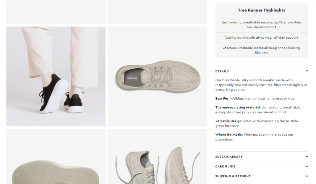
Product Images
Believe me, your product images can sell better than anything else on your product detail page. Because it is the most important deciding factor that helps the shoppers know what they will get.
You should add 8-10 high-quality product images or product videos that show how the product looks from different angles. Also, include zoom functionality and allow users to view and investigate the product in detail.
Product Title
Everything has a name, and when comes to your products, I’m sure you must have the best names for them. Just make sure the product title accurately describes the product.
Here I’ve listed 3 examples of product titles. See how different eCommerce stores have added the same product with different names.
EXAMPLE 1: NOW Solutions
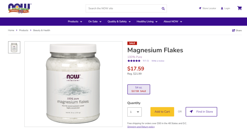
Here the eCommerce brand “NOW Foods” is showing a short and easy-to-remember name of its own product.
EXAMPLE 2: Walmart
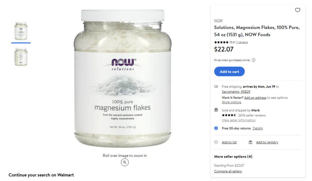
The same product is available at Walmart. Here the product title is a little descriptive.
EXAMPLE 3: Amazon
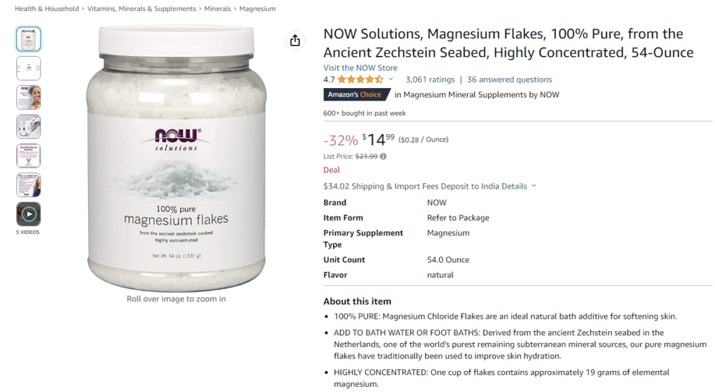
The same product on Amazon has a very descriptive product title that includes important details such as brand, key features, or product attributes.
Can you see the difference? Did you understand why these online stores have added different product names for the same product?
When selling products that are manufactured by different brands, you should show the brand name in the product title. Showing key features in the title is good but make sure lengthy titles don’t spoil the overall look.
Star ratings
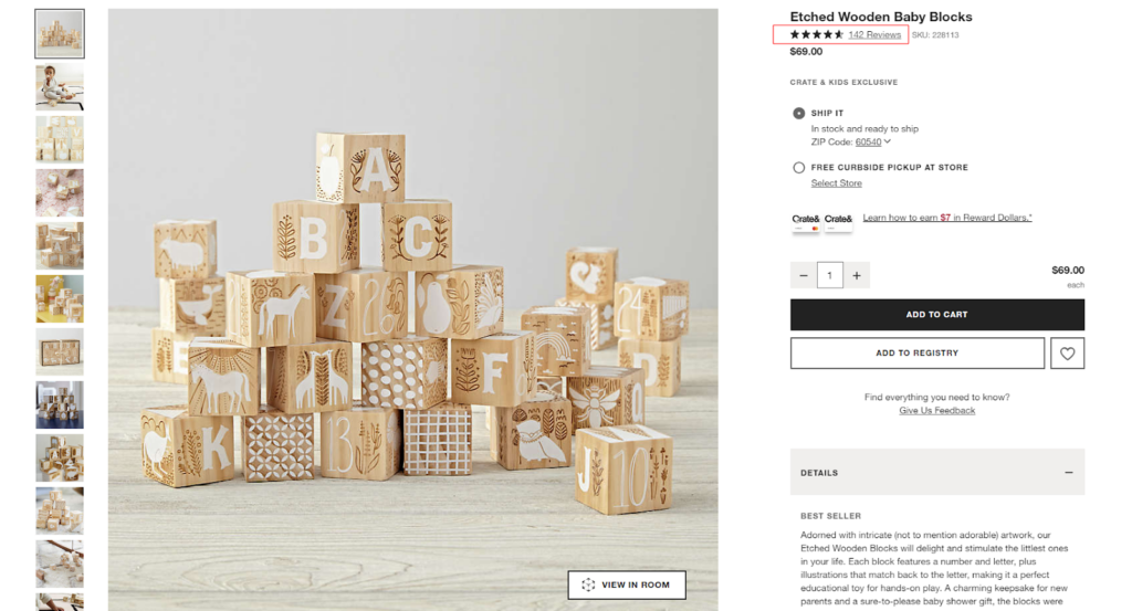
Online shoppers often have limited time or patience to go through extensive product descriptions or read through numerous reviews. The star ratings offer a quick and precise summary of the product’s overall quality and performance. These star ratings are typically based on customer reviews and feedback.
When customers see high ratings next to a product, they are more likely to try it. The high ratings indicates that past customers have had positive experiences with it. This helps build trust in the product and the brand, making customers more likely to make a purchase.
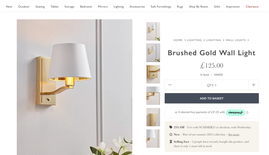
Pricing and Promotions
After seeing the product image, shoppers usually seek the selling price of the product. They want to know the price of a product upfront. Placing the pricing after the product title and star rating offers transparency and enable customers to quickly assess whether the product fits within their budget.
If the product is part of a limited-time offer or has any special deal, you should always highlight it to encourage conversions.
Product Variations
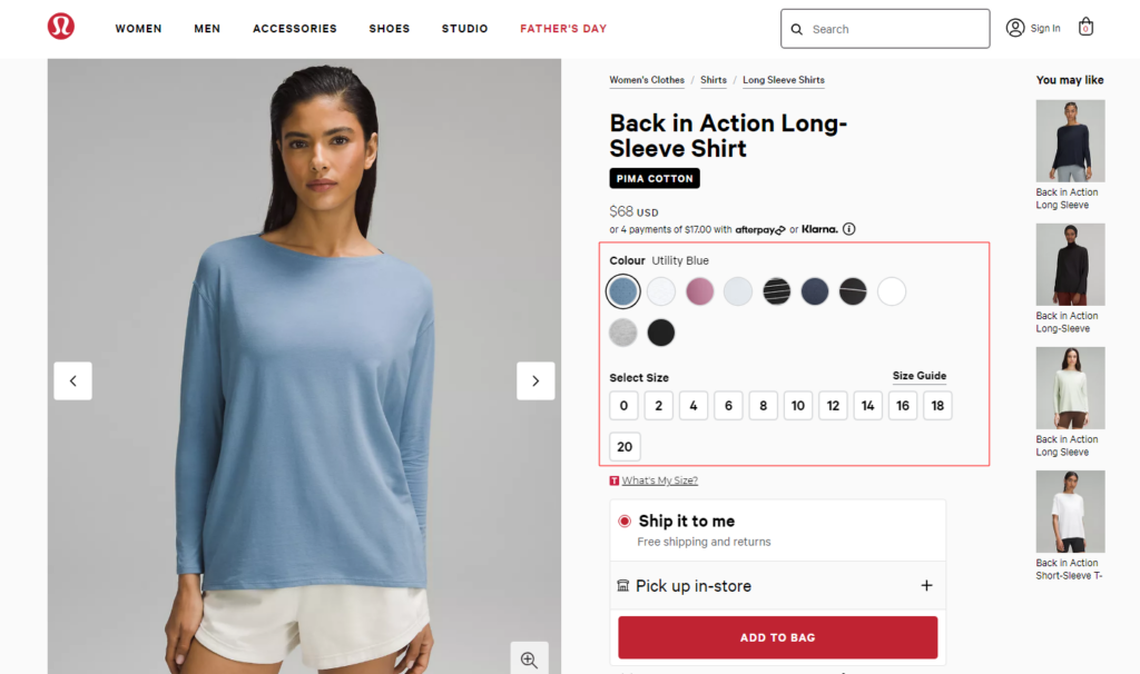
Customers have various tastes and requirements, and the product variants ensure that there’s something for everyone. Instead of presenting customers with a one-size-fits-all approach, it presents them with a curated set of choices.
If the product comes in different variations such as size, color, or style, include dropdown menus or swatches for customers to select their preferred option. In addition, you can update the product image and price based on the selected variation.
Wherever there comes different sizes, you must add a size chart to help your customers to choose the correct size. This will minimize the number of returns and exchanges due to the wrong size selection.
Product Description And Key Features
After scanning the product visually, shoppers need more clarity about the product. Now it’s time to describe your products!
The product description goes beyond the brief overview and dives into the specifics. It paints a picture, using persuasive language to charm shoppers and create a strong desire to own the product. It communicates the benefits, practical applications, and potential impact it can have on the customer’s life.
Like shown in the above picture, you can add a comprehensive yet brief description of the product. Highlight its key features, specifications, and benefits.
Product Subscription
Optional. This is an option that you can offer to your recurring customers.
For customers, it provides convenience by eliminating the need to remember to reorder regularly. It saves time and effort while ensuring a steady supply of the product they love. Additionally, customers may enjoy discounted pricing, exclusive perks, or special offers as part of their subscriptions.
It’s important to make the subscription setup process user-friendly so that customers can easily manage their subscriptions and make adjustments as needed.
Call To Action Buttons
Want your shoppers to take some action???
It’s the right time to place the primary CTA, often labeled as “Add to Cart” which encourages customers to take the next step and make a purchase. Ensure the Add to Cart button is eye-catchy enough to guide the potential customers toward the checkout page.
Many online stores also have secondary CTA buttons that provide alternative actions for customers. These could be “Add to Wishlist” or “Compare” which serve different customer preferences and create additional pathways for engagement and conversion.
Shipping and Delivery Information
Once the shoppers are happy with the product information, they next enquire about when they will get it. Sometimes it is the only deciding factor for them about whether they should buy it or not.
I can explain this in a better way with a real-life example.
This year, I found an amazing black dress to gift myself on my 29th birthday, but the expected delivery date was 2 days back. So, I purchased another dress that was delivered before my birthday.
That’s why you must show the delivery and shipping details on the product detail page along with the associated costs so the shoppers can avoid after-purchase hassles.
Product Recommendations
As humans, we cannot control our desire to explore new things!
Using personalized recommendations on the product pages, you can present relevant product suggestions and create opportunities for upselling and cross-selling. This can also complement their original purchase or offers alternatives that might better suit their requirements.
Product recommendation not only increases the average order value but also exposes customers to a wider range of products they may not have discovered otherwise.
More Product Information
I usually study the product thoroughly when buying it for the first time. Your shoppers may do the same.
So, it would be best if you had this section that covers a wide range of product details that go beyond the surface-level descriptions. This will dive into technical product specifications, usage instructions, care guidelines, warranty information, store policies, and any other relevant facts.
This section is often presented in a tabbed or expandable format, allowing customers to navigate through different sections of information effortlessly.
Customer Reviews and Rating
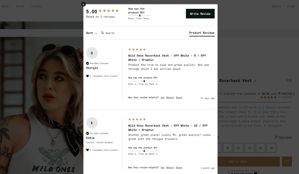
Some keen online shoppers like me actually read the reviews to be sure about the products they want to buy. They check every detail of the product and after-sale services before they hit the “Add to cart” button. Relax, convincing them is not that hard!
You can convince them easily if you’ve genuine product reviews on your product detail pages.
This section showcases feedback and ratings from customers who have previously purchased the product. It helps build trust, provides social proof, and assists potential buyers in making decisions based on the experiences of others.
FAQs
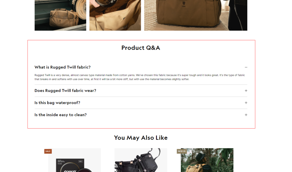
Optional. No matter how well you describe your products, something will be missing for sure. And humans are curious beings. So, you will always get questions about various aspects of the product, such as its features, functionality, compatibility, sizing, or any other relevant details.
It’s better to have a Product Q&A section that allows potential buyers to address specific concerns or inquiries they may have about your product before making a purchase.
So, here are the key sections you need to add to your product detail page. Now let’s check out the product detail page best practices to improve these sections for a better user experience.
Product Detail Page Best Practices To Consider
Unlike brick-and-mortar stores, shoppers cannot physically touch, try, or test the products before making a purchase in online shopping. The product detail page is the only medium to know about the product.
So, it is necessary to make the best shopping journey for your online shoppers. Here are best practices to create high-converting PDPs and provide a satisfying shopping experience:
1. Product Page Layout
The layout of your product detail page decides whether the online shopper will stay or leave your eCommerce website. If the visitors find it difficult to study your product, they won’t a single second on your online store.
We have already seen the standard product detail page flow in the above section. Now let’s learn how to make optimize the product detail page design.
Consistent Page Design
Many times while online shopping, when I open any product detail page, I feel like I’ve landed on a different planet. Have you ever felt this?
This happens when you try to design unique product pages from scratch and totally forget about the consistency with other web pages on your site. So, make sure all your product detail pages have the same visual elements like colors, typography, and spacing.
Consistent navigation, button styles, icons, graphics, and imagery should be employed. Also, pay attention to alignment, and responsiveness to ensure consistency across different devices.
Minimize Distractions
A page layout with less distraction helps visitors to draw attention to the product. With more distractions, your target customers will be unable to focus on the product benefits to make a purchase.
So, you should avoid cluttered layouts, excessive ads, or pop-ups that may distract your target audience from their main purpose. Keep the focus on the product and the purchasing process.
Mobile-Responsive Design
It’s okay if you don’t have dedicated mobile apps for your mobile shoppers. But if your eCommerce product detail page is not mobile-friendly, that’s not okay!
For a better user experience for mobile users, optimize your product page layout for mobile devices. Make sure it’s responsive and provides a seamless experience across different screen sizes. Also, consider mobile-specific features like swipeable image galleries.
Remember, every business and target audience is unique, so it’s essential to fine-tune your product detail page layout for maximum conversion.
2. Product Title and Gallery
This is what I notice first on the product pages and I’m sure every online shopper does the same!
It doesn’t mean you don’t have to pay attention to the product title and images. Here are some best practices specifically focused on optimizing the product title and gallery:
SEO Optimized Product Title
Whether you want to add short titles or long titles for your product, make sure it contains relevant keywords. It will help your target audience to easily find your product on search engines.
And to make it more effective, you can choose a product title that accurately describes the product and its key features. Also, ensure the title is easy to understand and stands out on the page.
High-Quality Product Images
No matter how good is your product, if it’s not looking good on your product detail page, no one would like to buy it.
Your product gallery should have high-quality images that showcase the product from different angles. Ensure that the images are well-lit, visually appealing, and accurately represent the product features.
Show different color variations, close-up shots of important details, and lifestyle images if applicable. Allow customers to zoom in on the images for better inspection.
Dedicated Images For Product Variants
When shopping online, there are more chances of getting confused. For example, someone may call it “blue”, but someone may call it “navy blue”, “royal blue”, or “sky blue”. In such cases, it’s necessary to show dedicated images for each variant.
This will minimize the confusion and ensure that customers accurately visualize and understand the specific options available to them.
Product Usage
When selling unique products, it’s your responsibility to educate the shoppers on how to use them. You can include images and videos that demonstrate the product being used or provide a sense of scale. This helps customers envision themselves using the product and understand its practicality.
Also, focus on implementing thumbnail navigation below the main product image to allow users to quickly navigate through the gallery without scrolling excessively.
Make sure you improve the usability of your eCommerce product pages by focusing more on the product title and image gallery optimization. Now let’s move to the next elements.
3. Price and Availability
After getting impressed with the product images, shoppers immediately check how much it would cost them. This is also the right time to show if the product is available or not.
So, the price of the product, any discounts or promotions, and the current availability status (in stock, out of stock, pre-order, etc.) should be clearly mentioned next to the product title. And here’s how to optimize this part:
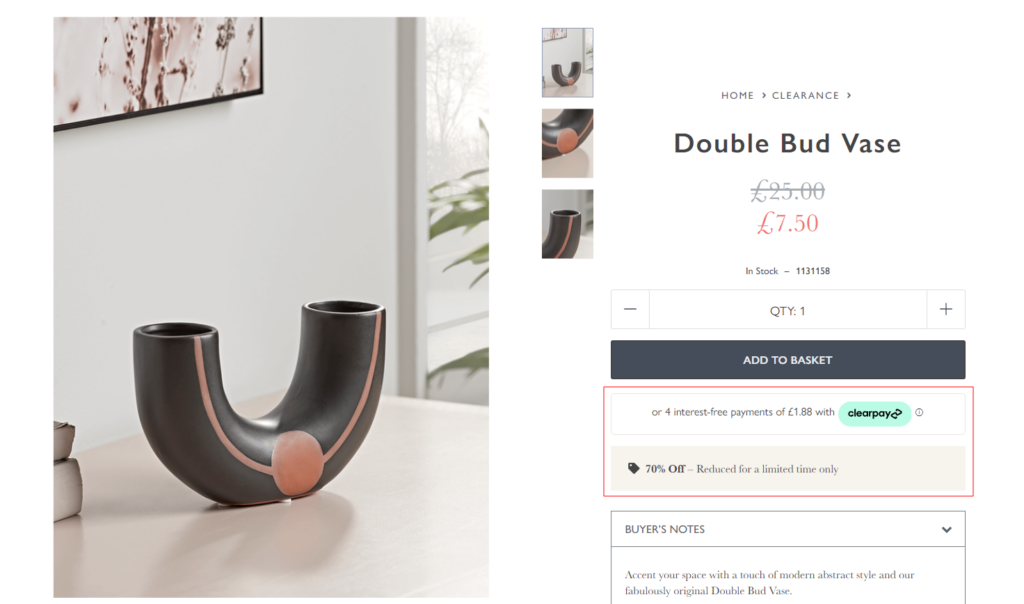
Discount or Special Offers
Discounts are always an effective tool for attracting customers and driving sales. If you’re running any discounts, promotions, or special offers on the product, you should highlight them on the product page.
Clearly communicate the amount or percentage of savings customers will receive. For example, you can display the original price alongside the discounted price to highlight the price difference. This will boost the perceived value of the offer.
Don’t forget to show the urgency triggers like “Limited Time Offer”, “Sale Ends Soon”, or “Limited Stock Available” below or beside the offer to encourage customers.
Detailed Pricing Information
When you want your shoppers to trust your brand and become loyal customers, transparency is key!
That’s why you should provide comprehensive pricing information, including any applicable taxes, shipping fees, or additional charges. Highlight the total cost to the user upfront, so there are no surprises during the checkout process.
Also, make sure that the pricing is presented in the customer’s preferred currency. If you cater to an international audience, consider providing currency conversion tools to help customers understand the prices in their local currency.
Product Availability
Why waste the shopper’s time when they cannot buy the product? Instead, you can suggest similar products that are available.
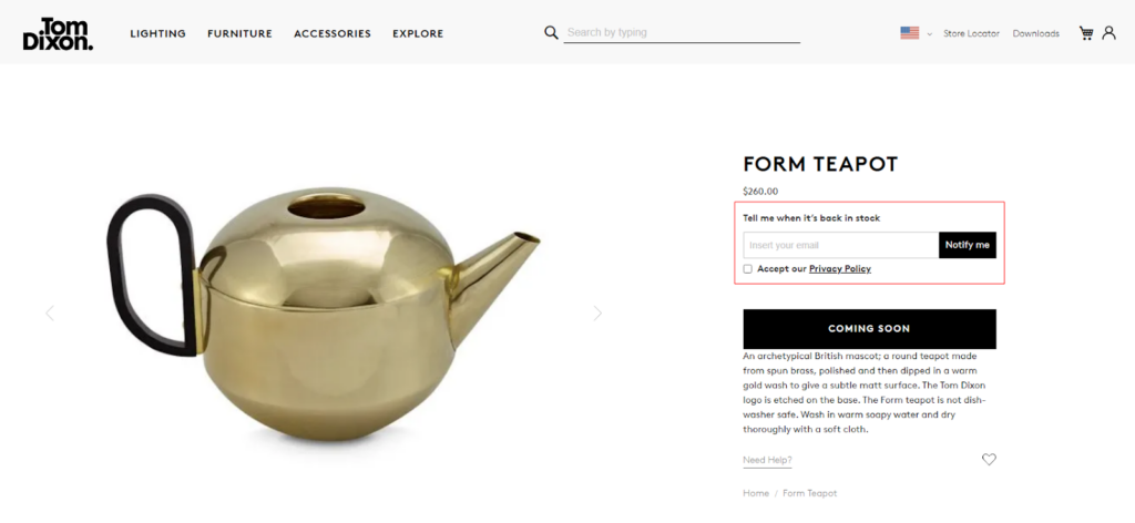
First, you should indicate the availability of the product, like whether it is in stock or out of stock. If the product is out of stock, you can also provide options for customers to sign up for notifications when it becomes available again.
Additionally, consider displaying the available quantity. The stock update can create a sense of urgency or scarcity which enables customers to make a purchase decision faster if they see limited stock remaining. For example, showing messages like “Only 3 Left” can motivate customers to act quickly.
Now let’s see the next key element of the product detail page.
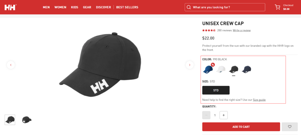
4. Product Variants
When the shoppers are interacting with the product variants means they are one step closer to buying the product.
So why not make their product selection seamless with better usability of the product variants? Here are some best practices to make sure the product variants are optimized:
Variant Presentation
Every element should be aligned properly to offer a professional look and feel. So, you should maintain consistency in how variants are presented across the product detail page. You can use intuitive dropdown menus, radio buttons, or interactive selectors to enable users to choose their desired variant easily.
If each variant has unique features, specifications, or descriptions, you should provide variant-specific information on the product detail page. This helps customers understand the differences between options and choose the one that best suits their needs.
Pricing for Each Variant
Different product variants may have different prices. So, your product detail page should show the associated price for each product variant when the shopper selects it. This will help the customers understand any price differences between variants and make purchasing decisions without any confusion.
Variant-specific Availability

It’s possible that the black color dress get sold out faster than other colors, as it can be the first preference for black lovers like me. So, the shoppers must be able to see whether the specific product variant is available or not.
For that, you should disable the variants if they are unavailable or display the scarcity message for variants having limited stock. Communicating the availability status for each variant will help shoppers understand which options are currently in stock and prevents disappointments during the purchase process.
This is how you can make product selections effortless for the shoppers. Now, it’s time for the next important component of the product detail page.
5. Product Description
We can also call it the “sales speech” that describes the products as well as motivates the shopper to hit the “Add to cart” button.
Before you add the product descriptions in your own way, check if it is optimized for better conversion. Here are some best practices to follow:
Short & Long Description
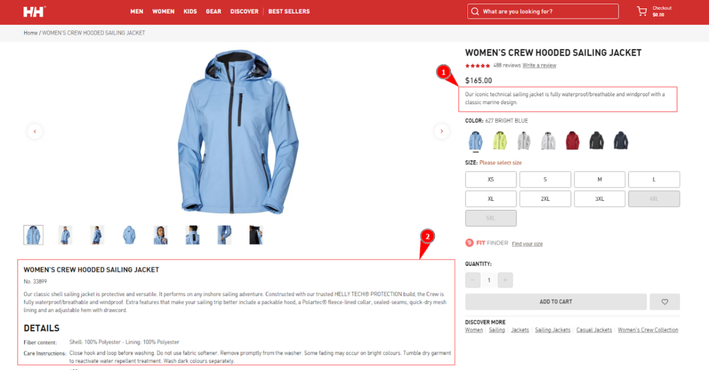
No shopper would like to read a long essay in the product description. At the same time, it’s necessary to add all the product details for more investigation. So, basically, you need two different product descriptions:
- Short one: a persuasive description to place on the first fold of the product pages (above the primary CTA).
- Long one: the detailed description that includes product specifications and technical details that you can place on the second fold of the product pages (below the primary CTA). You may also add shipping information and FAQs about your product.
You can keep both or also skip the short description, but be careful with the placement.
Focus on Benefits
There’s nothing wrong when we say “You’re not selling products, you’re selling benefits”. Customer only cares about what they get, and how much they get.
Try to answer the questions like:
- What sets it apart from competitors?
- How does it deliver more value or solve the customer’s problem better?
So, while introducing the products to your shoppers, make sure to highlight the benefits and unique selling points of the product. Focus on how it can improve their life, save time, enhance their productivity, or provide enjoyment.
SEO Optimized
The product pages not only help the shoppers understand your product, but it also helps the search engines. And the product description is a helping hand to make your product page SEO-friendly.
So, you can optimize the product description for search engines by incorporating relevant keywords that customers are likely to use when searching for similar products. However, also ensure that the content remains natural and user-friendly. Avoid keyword stuffing, as it can negatively impact the readability and user experience.
This is how to effectively communicate the product’s value, engage customers, and drive conversions by improving your product descriptions.
6. Primary CTA Button
Here come the “Add to cart” or “Buy now” (or you may have other labels) buttons which take your shoppers ahead in the sales funnel.
Can the CTAs affect the conversion rates?? The answer is YES! So, let’s learn how to optimize the primary CTA in your product pages to boost conversions and revenue.
Prominent Placement of CTA
The CTAs are very important and so are their placement on the product pages. Make sure that the primary CTA button is prominently displayed and easily visible on the product detail page.
It should be placed above the fold, where shoppers don’t have to scroll to find it. Place the button in a way that naturally draws attention, such as near the product price or below the product images.
Contrasting CTA Button Color
A visually striking button can increase its visibility and clickability. That’s why you should use a color that stands out from the rest of the page’s design to make the CTA button visually distinct.
Choose a color that complements your brand’s color scheme but contrasts well with the background to catch the user’s attention.
Sense of Urgency
Sometimes, only the CTA is not enough for getting orders. You can support your primary CTA button with visual cues to create a sense of urgency. For example, you can include phrases like “Limited Time Offer”, “2 days shipping!”, or “Only 3 Left in Stock”.
Such messaging encourages shoppers to take immediate action to avoid missing out on a time-sensitive offer or limited availability product.
Now, let’s move ahead with the next component that will help you increase the Average Order Value (AOV).
7. Product Recommendations
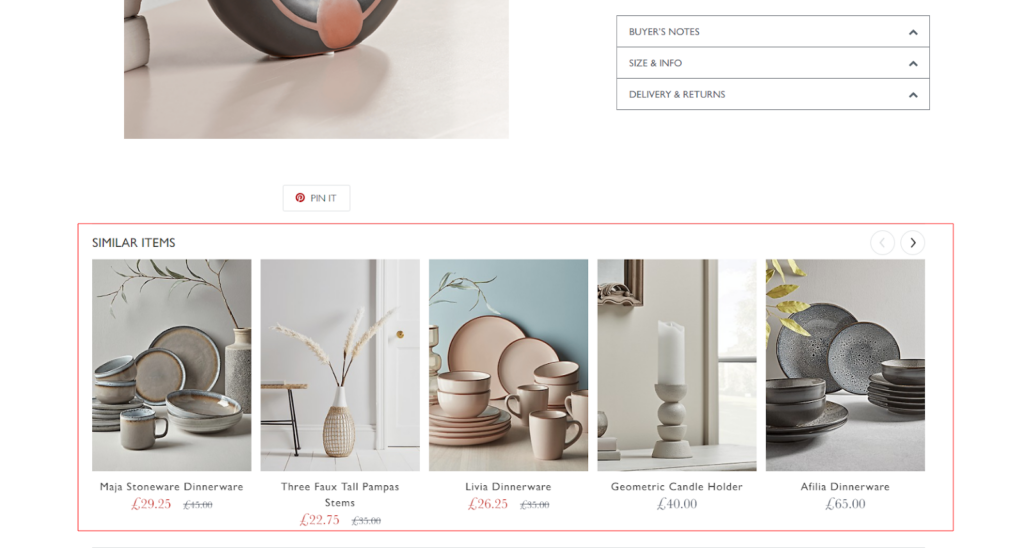
As a shopper, I like checking on recommended products as it helps me find out the product that I was really looking for. Again, it saves my efforts in finding compatible products with my chosen products.
And for merchants, as I stated above, it helps you generate sales and boost the AOV. But if you haven’t optimized this section, you may not see good results.
So, here are the best practices for optimizing product recommendations:
Relevant Recommendations
When the shopper is on a product page, it means he/she is interested in similar products or categories. Here, you cannot put any products randomly. Ensure that the recommended products are relevant to the current product being viewed.
For that, eCommerce merchants mainly use algorithms or manual curation to present items that complement or enhance the customer’s potential purchase. You can also consider some common factors like the product category, customer preferences, popular choices, and frequently bought-together items.
Limited Number of Recommendations
Too many recommendations can confuse your shoppers. And the confused shoppers can lose their purchasing desire as they cannot reach a decision. So, show limited suggestions that allow customers to evaluate their options without feeling overwhelmed.
Depending on the page layout and design, featuring 3 to 6 recommended products is generally effective. Position them strategically near the main product image, below the product description, or in a dedicated “You May Also Like” section.
By considering these points you can offer better recommendations and encourage your shoppers to buy more from your online store.
8. Customer Reviews and Ratings
Want to sell without social proof?? That’s only possible in the imagination.
To make sure your shoppers shop confidently in your store, you need to showcase the product reviews efficiently. Here are some best practices to follow to optimize the user experience:
Including the Bad Reviews
Everything in this world has got good and bad reviews.
When you only show good feedback about your products, it may look fake. Customers appreciate businesses that are open about both positive and negative experiences.
When customers see a mix of positive and negative reviews, they consider the review section as more credible and trustworthy. It shows that your product has been reviewed by real customers with varying opinions and experiences.
Review Filtering
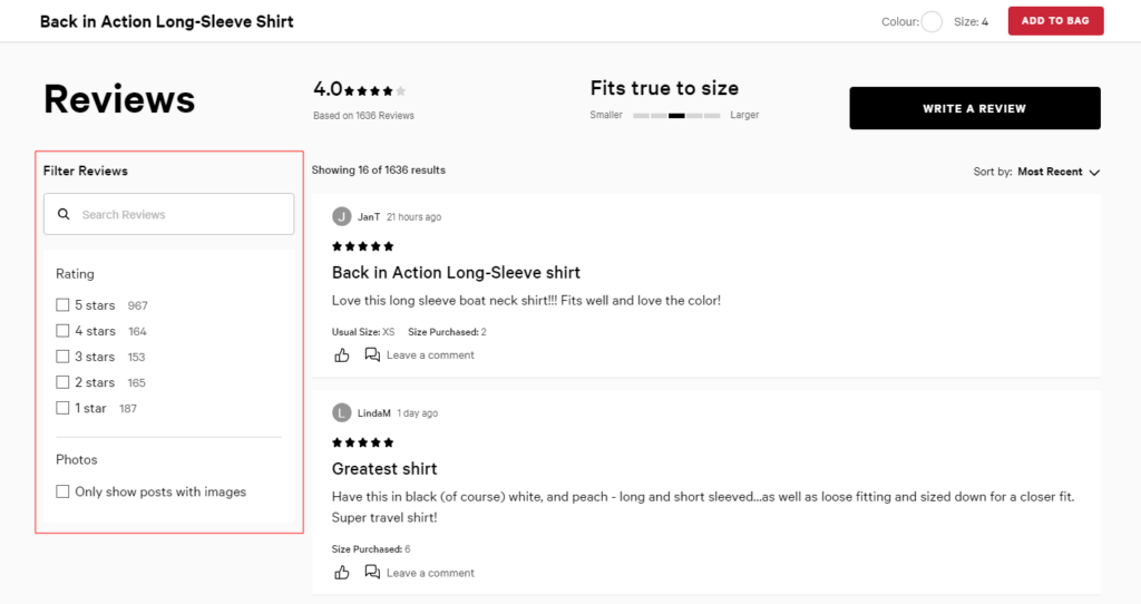
Save your shoppers from getting lost in thousands of customer reviews!
Depending on the nature of your product and target audience, you may consider providing filters. You can also provide sorting options for reviews to allow customers to view them based on dates or ratings. This will help customers to find the most relevant and informative reviews that align with their specific needs and concerns.
Verified Purchase Badges
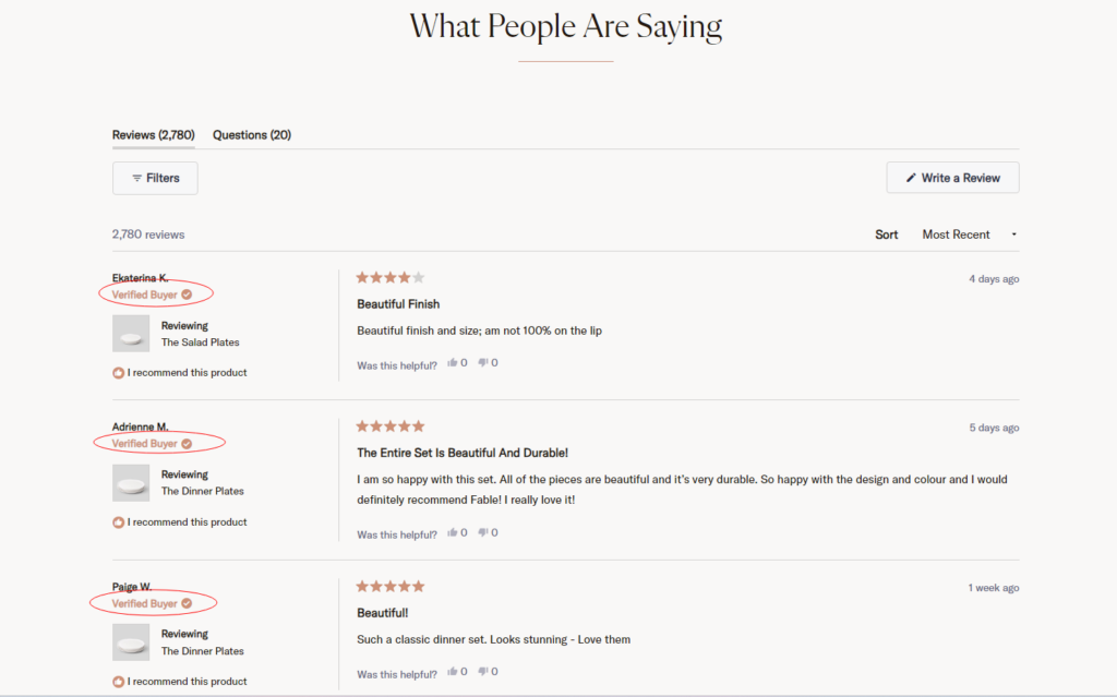
Want your shoppers to trust you more? Here’s what you need. If possible, highlight reviews from verified purchasers with a badge or indicator.
Verified badges add credibility to the reviews, as they indicate that the reviewer has actually bought and used the product. Potential customers are more likely to trust and value reviews from verified purchasers, as they know the feedback is based on real experiences with the product.
Responding to Reviews
Responding to both positive and negative reviews demonstrates that you value customer feedback and are committed to addressing any concerns or issues. It shows potential customers that you actively engage with your customers and strive for their satisfaction.
So, you should respond to reviews promptly. Aim to address customer feedback within 24-48 hours to demonstrate your attentiveness and commitment to customer satisfaction. Also, try to personalize your responses by addressing the customer by name whenever possible. This adds a human touch to your interactions and makes the customer feel valued and acknowledged.
Here were the best practices you should follow to improve your product pages for a better user experience. Now, it’s time to check out some interesting eCommerce product pages that are popular and offer a great shopping experience to online shoppers.
Examples of Best eCommerce Product Detail Page
I know learning sometimes becomes boring. That’s why we are now going to explore some of the best product page examples to get a better idea.
Here are the 10 examples of the best eCommerce product detail page:
1. Bite
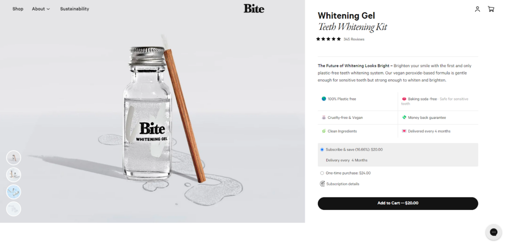
Bite’s product detail pages offer a clean and minimalist design that showcases their range of eco-friendly oral care and personal care products. The pages include high-resolution images, detailed product descriptions, and ingredient lists.
Shoppers can also find additional information such as sustainability initiatives and user reviews, creating a comprehensive and informative shopping experience.
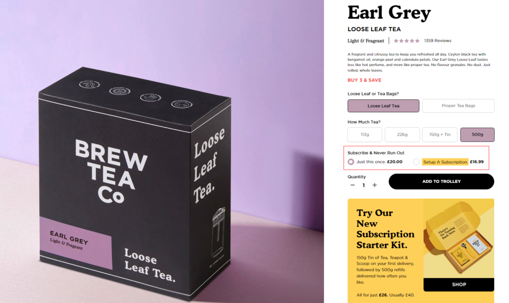
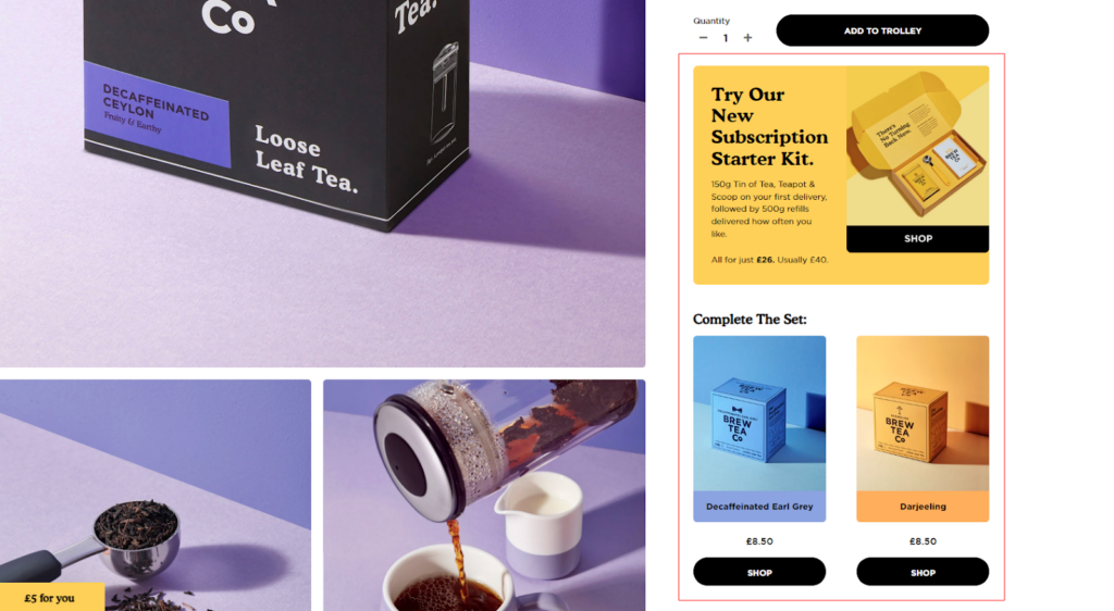
2. Brew Tea Co.
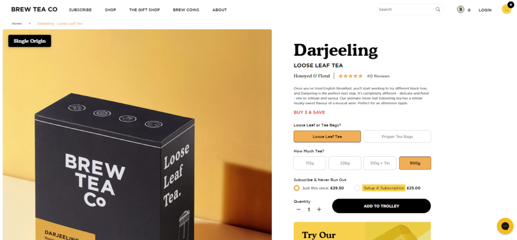
Brew Tea Co.’s product detail pages offer a delightful tea shopping experience.
The product pages feature vibrant visuals, detailed descriptions of tea flavors and brewing instructions, and customer reviews in the form of user-generated content. Customers can also easily select the desired tea quantity and explore related products to customize their tea orders.
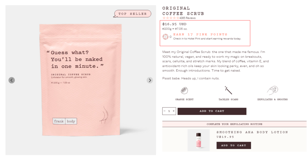
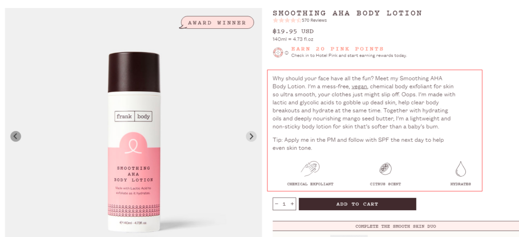
3. Frank Body
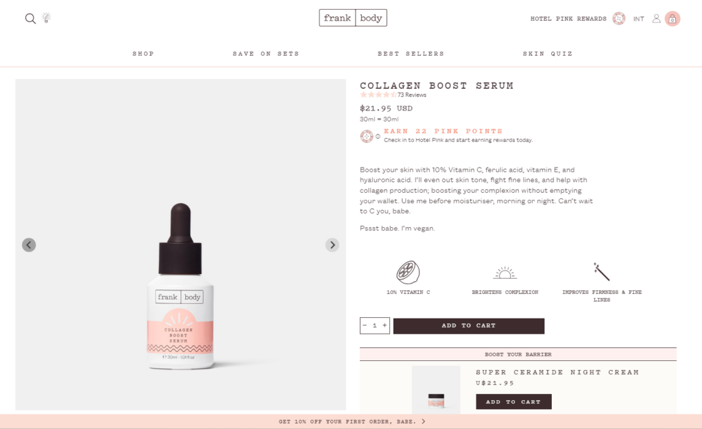
Frank Body’s product detail pages stand out with their playful and vibrant design that matches their brand identity. They showcase their skincare products with engaging visuals, clear descriptions, and key product features. The inclusion of customer reviews and before/after photos adds social proof and builds trust among potential buyers.
4. Zulu Longines
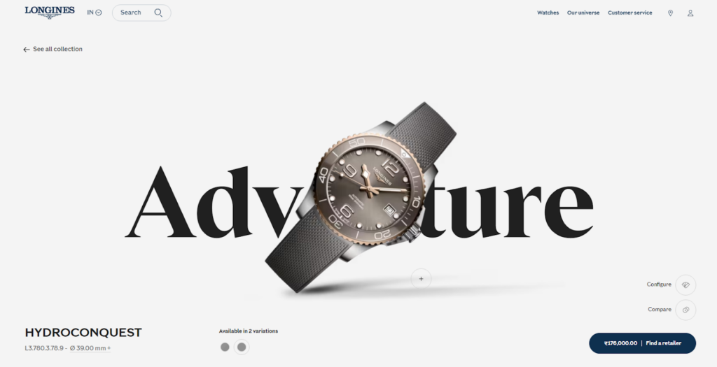
Zulu Longines’ product pages showcase their luxury watches with elegance and sophistication. The pages feature high-resolution images, detailed specifications, and comprehensive product descriptions that highlight the craftsmanship and unique features of each timepiece.
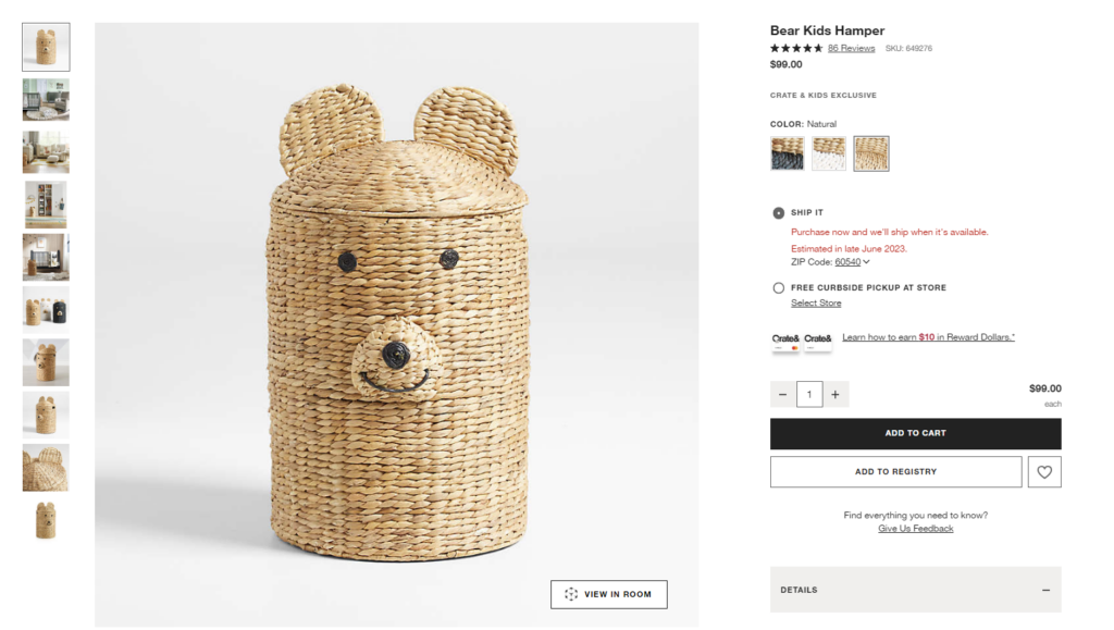
5. Crate and Barrel
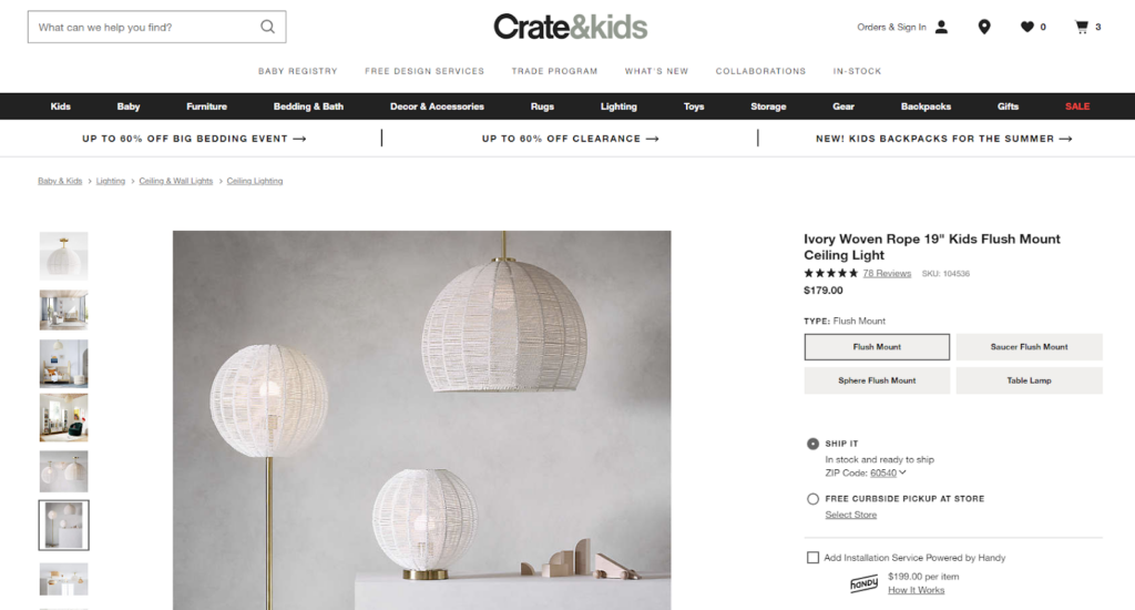
Crate and Barrel’s product detail pages excel in their clean and organized layout. They provide multiple product images from different angles, detailed descriptions, and specifications. What unique you can get here is the virtual product representation with the help of augmented reality!
The pages also include various shipping options, customer reviews, and related product recommendations, enhancing the user’s understanding and offering additional options.
6. Susanne Kaufmann

Susanne Kaufmann’s product pages for their luxury skincare products offer a visually stunning user experience. The high-quality product images and videos highlight the luxurious packaging and natural ingredients.
You can also find detailed product descriptions that provide information about the product’s benefits, usage instructions, and key ingredients.
7. Soylent
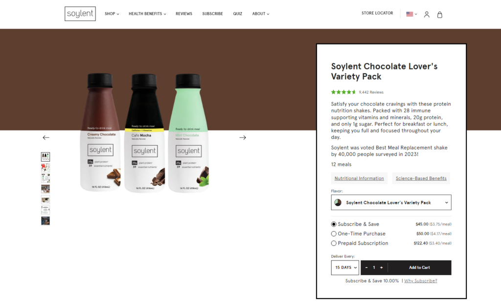
Soylent focuses on its meal replacement products, emphasizing their nutritional value and convenience. The product pages include product images, detailed descriptions, and key nutritional information such as calorie count, macronutrient breakdown, and dietary specifications.
The shoppers can select different product variations, view bundle options, and read customer reviews to make informed decisions. Subscription options are also prominently featured, making it easy for customers to sign up for recurring deliveries.
8. Luxy Hair Co.
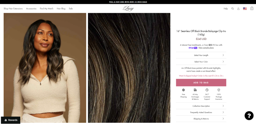
Luxy Hair Co.’s product pages for their hair extensions and accessories offer a comprehensive and user-friendly experience. The pages include multiple product images showcasing different hair shades, lengths, and styles.
Detailed descriptions provide information about the hair type, weight, and application methods. You can also find styling tips, video tutorials, and customer reviews on the product pages. This will help the shoppers choose the right product and ensure a confident purchase.
9. Native Union
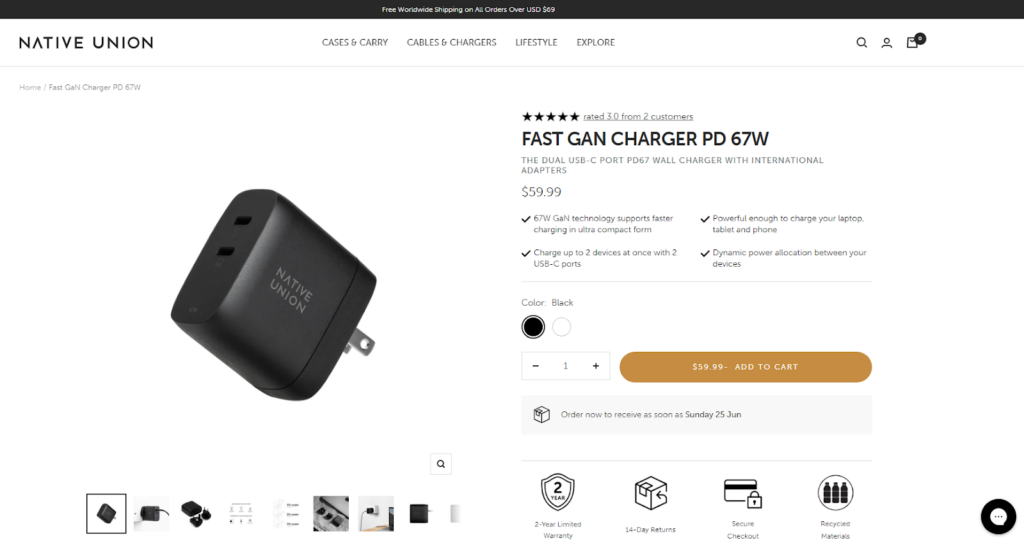
Native Union’s product pages feature a sleek and modern design. The pages display high-quality product images from various angles, allowing customers to see the product’s design and features.
It also provides information about the product’s functionality, materials used, and compatibility with different devices. Customers can also explore related products, read customer reviews, and access additional resources such as user manuals and warranty information.
10. BURGA
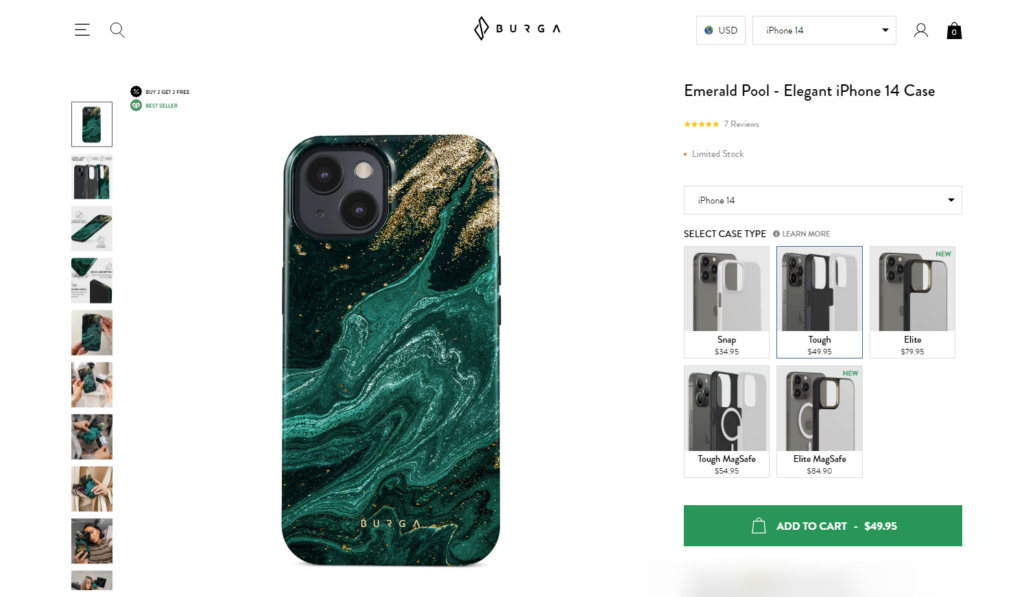
BURGA’s product detail pages for their smartphone cases are visually striking and provide essential product information. The pages showcase the product’s design with high-quality images and close-up shots.
The detailed product description highlights the materials used, protective features, and design elements. You can also find information on compatibility with specific phone models, customer reviews, and related designs. The pages include an easy-to-use interface for selecting the desired case style and color options.
Final Words!
Here we come to the end of the chapter 4!
We all know that a user-centric product detail page can make a significant impact on conversion rates, customer satisfaction, and overall business success. To make your product page conversion-ready, it’s necessary to optimize the page for a better user experience.
And that’s what you have learned in this entire guide. Now, it’s time to implement the best practices and track the progress of PDP conversion optimization.
Wait… our journey doesn’t end here! In the upcoming chapters of our eCommerce UX audit series, we will continue to explore the key components of an eCommerce UX design.
So, stay tuned for the upcoming chapters!
