
Here comes the fifth chapter of our ultimate guide on the eCommerce UX audit checklist! Have you checked our previous chapter, i.e. “Product Detail Page Best Practices“? If you’re not sure whether your product pages are optimized or not, I would recommend you take a look.
After optimizing your product page, now it’s time to focus on your shopping cart UX (user experience). Optimizing your eCommerce cart page with the “Best Practices for Shopping Cart” will give you three major benefits:
- Offer a seamless shopping experience to your customers
- Minimize cart abandonment rate
- Boost the average order value (AOV)
So, if you want to optimize the cart experience, this guide is all you need now.
Let’s begin the read!
Type of Shopping Carts in Online Store
As a shopper, I love to see different types of shopping carts implemented in eCommerce websites.
These shopping carts serve as virtual containers for online shoppers to add and manage their selected items before proceeding to checkout.
The four types of shopping carts are commonly used:
1. Mini Shopping Cart
Meet the compact version of the shopping cart!
The mini shopping cart is usually displayed as a drop-down box when clicking on the icon or widget on the website. It provides a summary of the items in the cart like the number of items and the total price.
You can also find two CTA buttons: 1) View Cart and 2) Checkout which takes the shoppers to the respective pages to view the cart in more detail or proceed to checkout.
The mini cart is visible to the user navigating through the website, allowing them to quickly access their cart without leaving the current page.
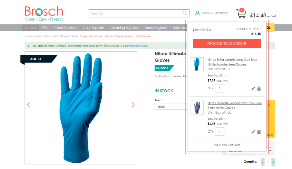
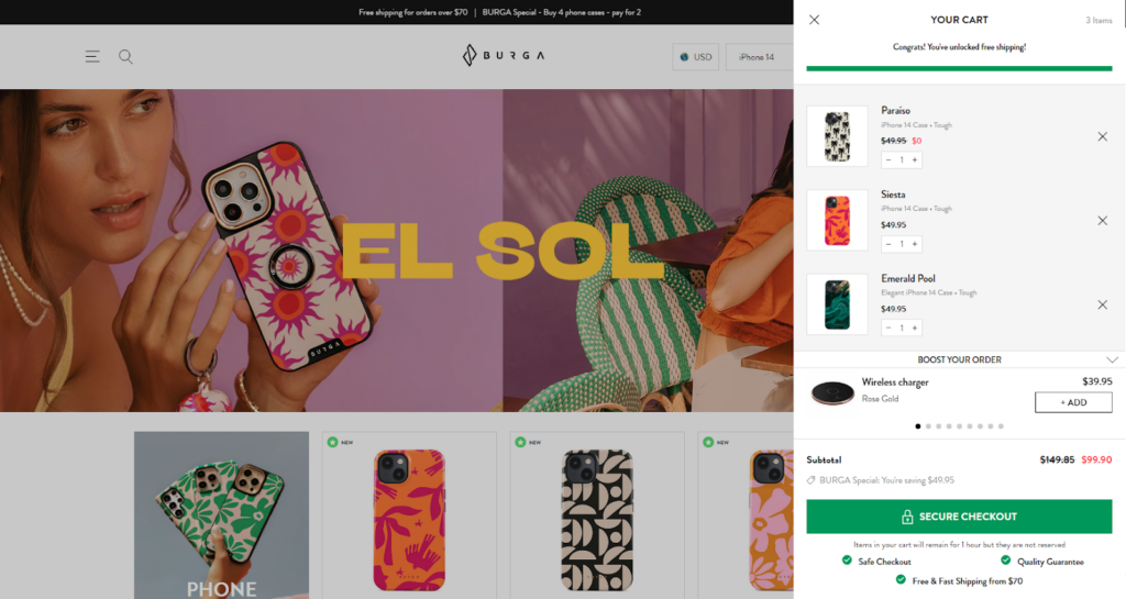
2. Pop-Up Cart
Here comes the elder sibling of a mini shopping cart!
Instead of expanding within the webpage, the small pop-up cart opens as a separate window or overlay, displaying a larger preview of the cart items.
Pop-up carts often show information like product images, names, quantities, prices, and an option to remove items. This type of cart is useful for customers who want a quick overview without leaving the current page.
3. Cart Slider/Drawer
This is the modern shopping cart, or you can also call it the best alternative to the traditional full-page shopping cart.
A cart slider/drawer is a panel that slides out usually from the right side of the screen when a user interacts with the cart icon or button. Shoppers can see the cart slider/drawer to check the full contents of the cart or perform actions like editing quantities or removing items.
The key advantage of a slider/drawer is that it maximizes screen space and can be easily hidden when not in use. It allows shoppers to view and manage their cart without navigating to a separate page.
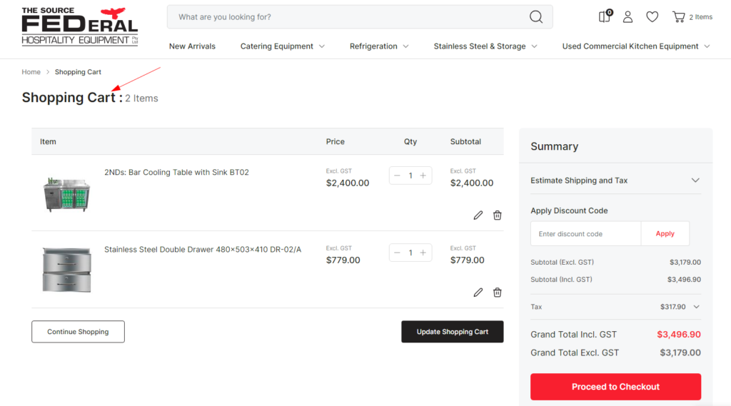
4. Full Page Cart
For the shoppers who are done with shopping and now want a final glance at their cart items and pricing, nothing better than the full cart page. It’s because it offers a complete and detailed view of their next purchase.
When users click the cart icon or a “View Cart” button, they are redirected to a new page dedicated to the cart. The full-page cart provides a comprehensive view of the items, and options that allow customers to
- modify product quantities,
- add notes for the seller,
- enter coupon codes, and
- proceed to checkout.
This type of cart offers more space for detailed product descriptions and additional options.
These different types of shopping carts serve various purposes and can be chosen based on the design and functionality preferences of an online store.
Ultimately, the choice of shopping cart type depends on the specific needs and preferences of your online store and the target audience. Some eCommerce merchants might use a combination of these cart styles to balance user experience and convenience effectively.
Why is UX Optimization necessary for the Cart Page?
Adding products to the cart doesn’t always end with a purchase.
Statistics show, in eCommerce, the average cart abandonment rate is around 70%. So, the risk of cart abandonment is very common. Would you believe it if I say, you can reduce this figure to an extent by improving your shopping cart UX?
Yes, it’s true! There could be many reasons behind shoppers abandoning their carts such as:
- Unexpected additional costs (hidden shipping costs, taxes, and other fees)
- Forcing users to create an account or register for purchase
- Complex and time-consuming checkout process
- Confusing pricing
- Unable to apply promo codes
- Longer than expected delivery times
- Unavailability of desirable payment options
- Payment security concerns
- Currency doesn’t match
- Website hiccups and glitches
and so on…… But a better cart page experience can magically encourage them to hit the Checkout button and complete their purchase at your site. Thus, minimizing the chances of cart abandonment.
Apart from this, an optimized cart page can offer many other benefits that include:
- Enhanced page usability
- Reduced bounce rate
- Customer satisfaction and loyalty
- Higher average order value
- More sales and improved conversion rate
In a nutshell, shopping cart UX optimization is necessary to create a seamless, trustworthy, and user-friendly experience.
Now let’s move further and learn what makes an ideal eCommerce shopping cart.
Ideal Structure of eCommerce Shopping Cart Page
Ready to revamp your cart page? Before you proceed with the new shopping cart UX design, let’s check out the most suitable cart page content flow for your eCommerce site.
Here are the key elements, your shopping cart page must-have whether it’s a full cart page, cart slider, or other dedicated cart page:
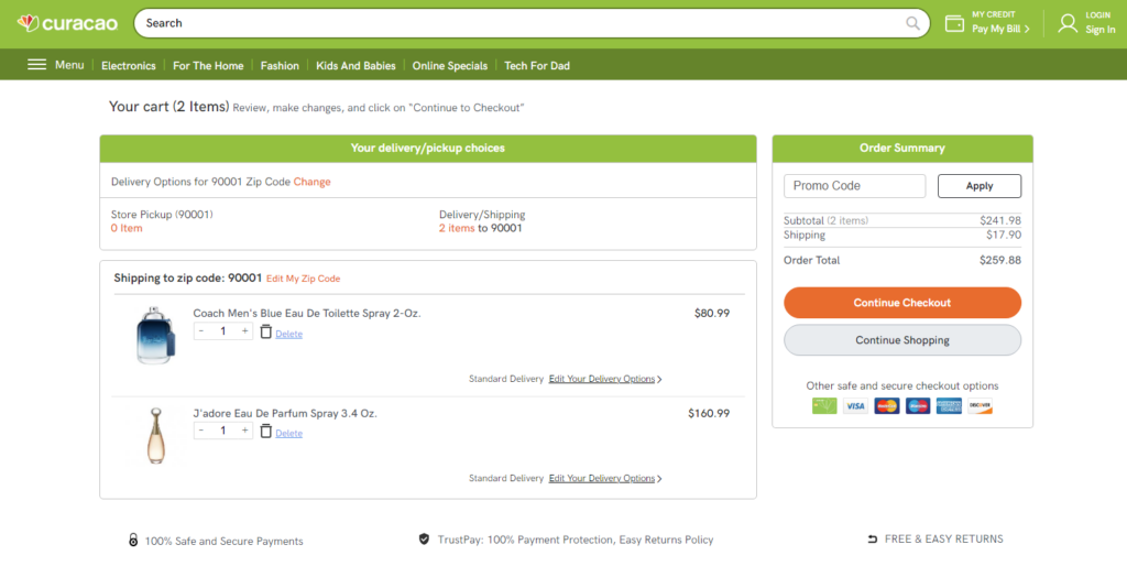
Page Title
We all know the page begins with a heading (“Shopping Cart” or “Your Bag”) that indicates it is the cart page. After the title, the page divides into 2 sections in the full cart page:
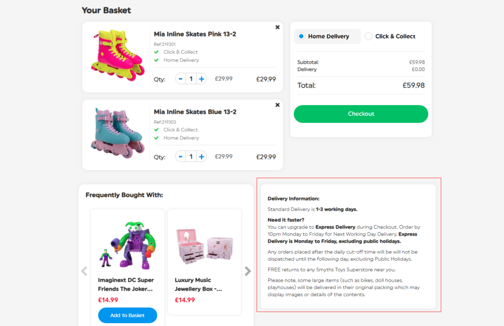
- Cart items: contains a list of products added to the cart page and in-cart upsells & cross-sells (left side).
- Order summary & checkout: contains price breakdown, shipping details, offers, and checkout CTA (right side).
Let’s take a look at the other components one-by-one.
Products List
Next comes the list of items shoppers added to their cart.
It shows essential product details such as name, thumbnail image, SKU, quantity added, price, and any applicable variations (size, color, etc.). Here, the shoppers can modify the product quantity and also remove the product from their shopping cart.
Cross-sell or Upsell Opportunities
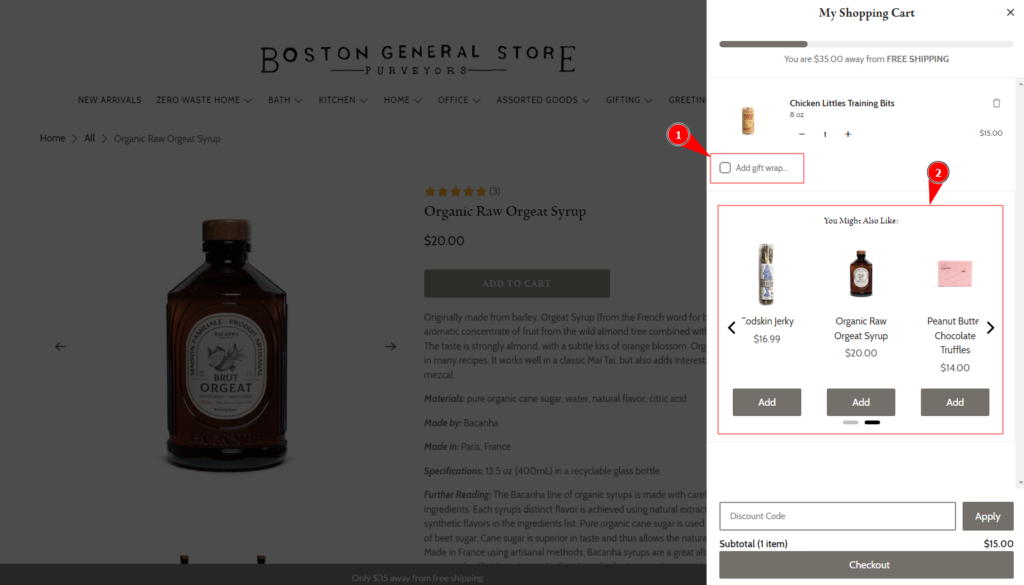
Now it’s time for the elements that give a boost to the order value.
This can be done by suggesting related products, offering bundle deals, or highlighting items frequently bought together. You can also offer gift wrapping or other gift options to upsell your services.
These suggestions should be relevant to the items on the cart otherwise you won’t find the expected conversion.
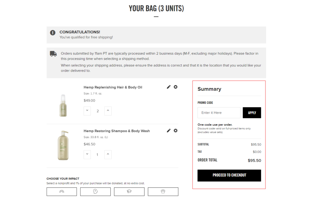
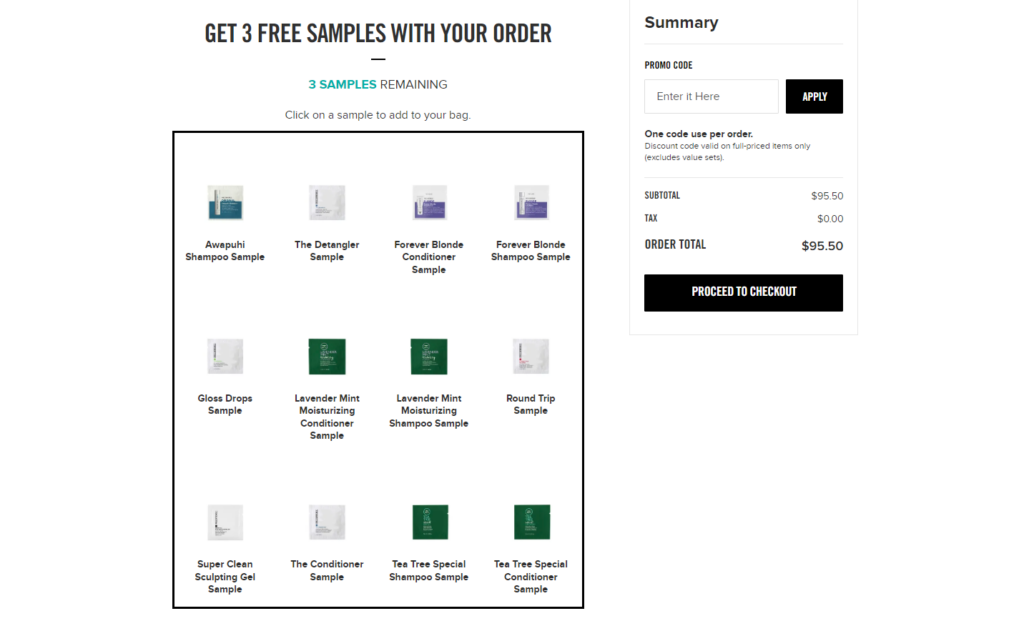
Discount Offers & Rewards
Here comes the star element that can be seen on the top of the cart page (upper right corner).
Why at the top? Because it’s always a best practice to highlight the “benefits” to the shoppers. It will boost their interest in your brand and products.
Well, here you can give them the option to apply coupon codes and also show them the offers that are already applied to their cart.
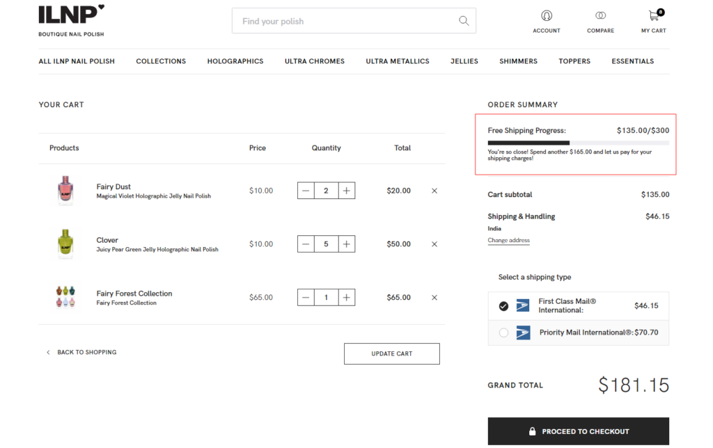
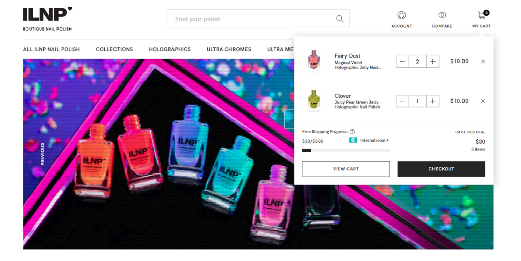
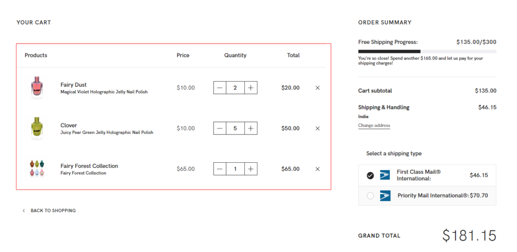
One of our clients, ILNP Cosmetics, has shown an amazing progress bar to motivate the shoppers to increase cart value to avail of the offer, i.e. “free shipping”. You can also try out something playful like this.
If you want the same feature on your cart page, contact us! We can help you add custom functionalities to your online store.
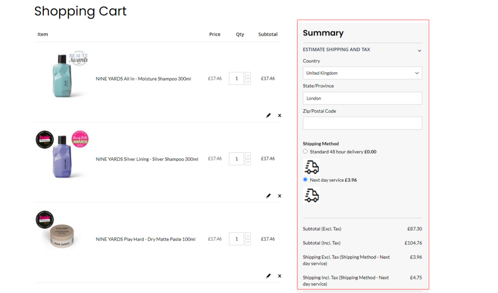
Order Summary & Pricing
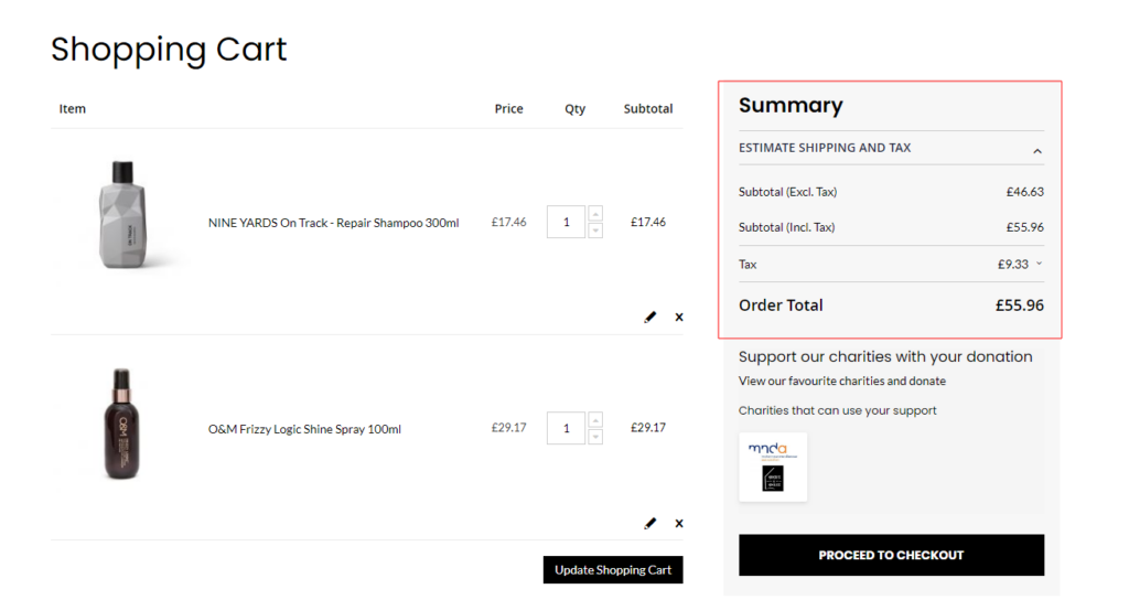
Here’s the section where you can display the cart’s subtotal with a detailed price breakdown. Mainly it includes applicable taxes, shipping costs, or additional fees that may affect the final total.
The goal is to provide a transparent calculation that helps users understand how much they have saved and how much they have to pay to purchase the items.
Shipping & Delivery Information
When the shoppers are actually looking to purchase your products (in the purchasing funnel), they will definitely take an interest in the shipping and delivery process.
Here you can provide a section where users can view or update their shipping and delivery details. This may include options to select shipping methods, enter addresses, estimated delivery dates, or specify delivery preferences.
Proceed to Checkout
“No more gazing, now it’s checkout time”—Want to say this to your shoppers?
Let’s place a prominent and visually appealing “Checkout” or “Proceed to Checkout” button on the page. Keeping this call-to-action easily accessible and visible will encourage your visitors to move forward with the purchase process.
Trust and Security Indicators
Want to make your checkout button more powerful?
Try displaying trust badges, security seals, and accepted payment options to assure users of the security and legitimacy of their transactions. Once they are assured of secure checkout, they will move to the checkout page with confidence.
I hope these elements helped you to define the flow of your shopping cart page. Now let’s learn to make these elements work more efficiently to convert your store visitors into your customers.
Best Practices for Shopping Cart User Experience
Are you worried about low conversions due to the weak shopping cart pages? Poor user experience can be responsible for your non-performing shopping cart.
Here are the best practices to optimize your shopping cart page and see more shoppers hitting the Checkout button.
1. Cart Items
The first thing users notice on the shopping cart is the items they’ve added to the shopping cart. So, optimizing this section is important for enhancing the user experience and driving conversions.
Here are some best practices to optimize the cart items in the shopping cart:
Visual Representation
I have seen many stores keeping the product details in boxes (in a table) on the cart page which looks a little inappropriate. Instead, you should display cart items in a clear and organized manner, providing key details such as product image, name color, size, and quantity.
Also, try to keep the information concise to avoid overwhelming the user with excessive text.
Cart Modification Options
Shoppers often modify their cart items before moving to the checkout page. So, for a better online shopping experience, you should include options to easily adjust quantities, update variations, or remove items altogether.
Use relevant icons or buttons to represent these actions, making it effortless for shoppers to make changes.
Product Check
When returning after an interval, shoppers may find it difficult to recall the products they had added to their shopping cart.
You can implement a quick view or hover preview feature that allows users to see a larger product image or additional details without leaving the cart page. Also, include a direct link to the product page allowing users to review the product details, specifications, or customer reviews.
Continue Shopping
Visiting the shopping cart is not always the end of shopping. Your shoppers may like to hunt for more products in your store.
So, there should be a convenient way to go back and continue the product discovery. For that, you can add a “Continue Shopping” CTA button that takes users back to the last page they visited before accessing the shopping cart. This will enhance the user experience by saving them from retracing their earlier steps.
This is how you can optimize the cart items for a better user experience. Let’s move to the next important area on the eCommerce shopping cart.
2. Order Summary
This section shows the calculation of the shopper’s purchase. They can check the total cost here and decide whether to move ahead or not. So it’s necessary to make sure it works efficiently for your online shoppers.
Here are some best practices to optimize the order summary in the shopping cart:
Transparent Pricing
Statistics say 64% of online shoppers abandon the cart due to cost-related issues:
- 48% of your potential customers leave because they find the extra costs too high (shipping cost, tax, fees).
- 16% of shoppers back off just because they couldn’t calculate the order cost upfront.
Provide a breakdown of the total cost to show customers exactly what they are paying for. This transparency will help users make informed decisions and reduce cart abandonment due to unexpected costs.
Hidden charges may surprise users during the checkout process. So, clearly display all the additional fees, taxes, or shipping costs in the order summary. Your shoppers should have a full understanding of the total cost before proceeding to checkout.
Dynamic Update
If your order summary is not updating automatically, your shoppers may consider it a system error. It’s because almost all the good eCommerce websites use a dynamic update feature that automatically adjusts the pricing when users make changes to their cart.
So, make sure the order summary is dynamically updated. For example, if users tend to add or remove items, update the order total, taxes, and shipping costs in real-time.
This eliminates the need for manual page refresh to see the updated information and creates a more interactive and seamless shopping experience.
Promo Code and Discounts
Imagine shoppers struggling hard to apply a promo code. How frustrating!
Have you checked whether your site offers disappointment in place of offering free shipping or other discounts? If your online store offers promo codes or discounts, make sure it works well:
- Display an input field in the order summary where customers can enter their codes.
- Validate the codes instantly and apply the relevant discount to the order total.
- Indicate the applied discounts and their respective values to ensure transparency.
Avoid making the promo code field too prominent to prevent potential cart abandonment from users searching for codes outside your website.
Shipping & Delivery Details
You may not have noticed but improper or incomplete shipping information can also be the potential reason why customers abandon their carts.
Providing accurate and transparent shipping information fulfills customer expectations and reduces the chances of cart abandonment at the last step of the checkout process.
Make sure to add shipping details in the order summary, such as the selected shipping method, estimated delivery time, and any associated costs. Be upfront about shipping fees and any conditions that may affect shipping costs, such as order value thresholds for free shipping.
So, that’s it for the order summary! Now we shall focus on the next key area to improve the user shopping experience.
3. Product Recommendations
Not every shopper buys additional products from the upselling or cross-selling products. But even if half of your customers consider it, you win. For that, you need to make sure it works efficiently and inspires the shoppers to purchase more!
Here are some best practices to optimize the product recommendations in the shopping cart:
Promote Complementary Products
The success of product recommendations relies on which products you display on the shopping cart.
Recommend products that complement the items in the shopping cart. For example, if a customer has added a camera to their cart, suggest compatible lenses, camera bags, or other accessories. These recommendations can increase the average order value and enhance the overall shopping experience.
You can use data from the customer’s browsing history, past purchases, and preferences to personalize the recommendations. The more personalized the recommendations, the higher the chances of users finding products they are genuinely interested in.
Limited Product Suggestions
Displaying related products in the recommendations can make your cart page layout messy. A cluttered cart page can distract customers and make it difficult for them to complete the checkout process.
So, avoid overwhelming your shoppers with too many product recommendations. Limit the number of items shown to a few high-quality and relevant suggestions.
Product Star Ratings
Want your shoppers to quickly add the recommended product to the cart item? Star ratings can make the action fast.
It’s good practice to display the star ratings when you place any product. Decent star ratings can build trust and confidence in the suggested items, making customers tend to add them to their cart.
Now it’s time for the last section of our shopping cart UX best practices.
4. Empty Shopping Cart
Every corner of your store matters, even the empty shopping cart. We can’t keep it blank and boring for shoppers who unintentionally come to the shopping cart without adding any products.
Let’s learn how to optimize the empty shopping cart UX in your eCommerce site.
Compelling Message
- “Your cart is empty!”
- “Looks like you need to fill your cart. Let’s find something you’ll love!”
Can you see the difference?
Avoid generic messages and instead, use personalized messages that encourage users to explore products, continue shopping, or discover new items.
Popular or Featured Products
Why not fill the empty page and mind with some useful shopping ideas?
If applicable, consider displaying a section with popular or featured products on the empty cart page. This allows users to quickly access products that are currently in demand or have received positive reviews. Such recommendations can entice users to add items to their carts.
By following these best practices, you can optimize the empty shopping cart experience, turning it into an opportunity to engage users, drive more conversions, and enhance the overall user experience on your eCommerce website.
Now let’s make our theory session more interesting with some real-life examples.
Examples of the Best eCommerce Cart Pages
Looking for some inspiration before you start customizing your shopping cart in your eCommerce site? Here are some best shopping cart page examples that will help you with unique ideas to optimize your shopping cart UX design.
1. Disney
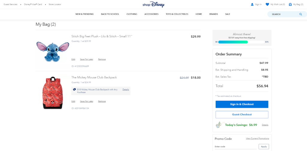
The cart page is thoughtfully designed, displaying a clear and itemized list of your chosen goodies, complete with vibrant product images that evoke a sense of nostalgia. Disney’s cart page goes the extra mile with the volume deals presented through the progress bar.
The cart summary cleverly reminds you how much money you’re saving on the purchase.
2. ASOS
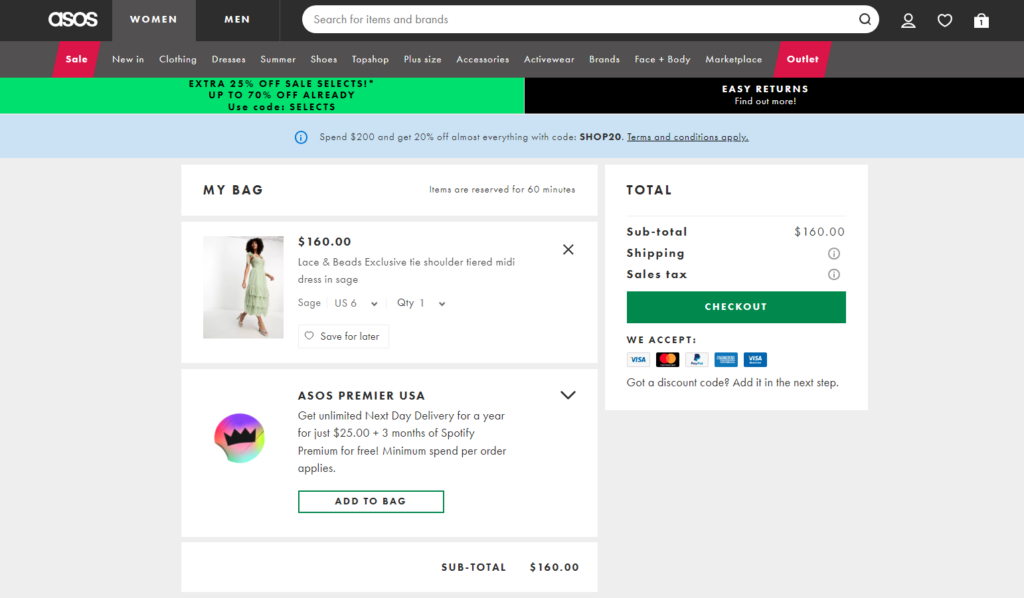
Fashion-forward and user-friendly, ASOS’ cart page is a runway of simplicity and style. With a sleek and intuitive layout, the cart elegantly displays your selected items in a grid-like fashion, making it easy to review your choices at a glance.
ASOS pays attention to the little details, allowing you to appreciate the finer features before making a final decision. The cart page also provides smart product recommendations based on your browsing history, ensuring you never miss out on a trendy gem.
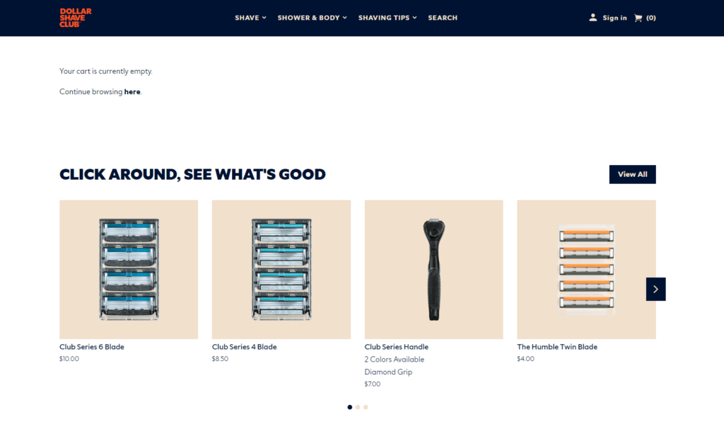
3. Dollar Shave Club
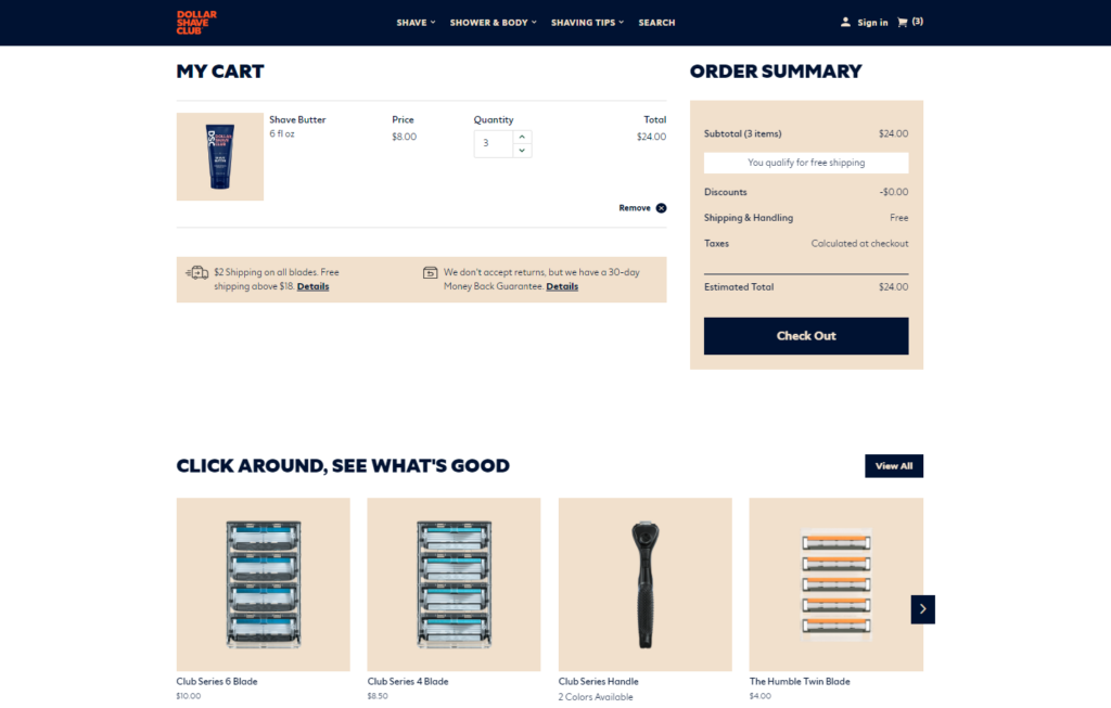
Dollar Shave Club’s cart page is all about smart functionality with a playful twist. The minimalist design perfectly aligns with the brand’s commitment to hassle-free grooming.
Adding products to your cart is a breeze, and the cart page offers helpful product recommendations based on your previous selections, ensuring you never miss out on essential grooming supplies.
4. Crazy Cups
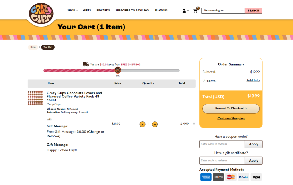
Crazy Cups understands the power of customization, allowing you to mix and match your coffee flavors directly from the cart. Their cart page is like stepping into a coffee wonderland, where every sip is an adventure to savor.
Each coffee pod or tea bag you add to your cart is like a delightful surprise, enticing you to explore their diverse range of flavors.
5. Sephora
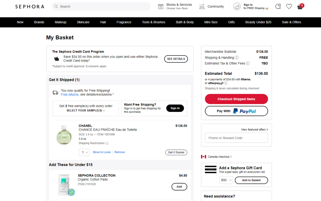
Sephora’s cart page celebrates diversity by offering an extensive range of products suitable for all skin tones and types. The user-friendly interface allows you to easily compare products and make informed decisions, ensuring you walk away with a shopping bag full of confidence and radiance.
Final Words!
This chapter has taken us on a journey through the essential aspects of optimizing the shopping cart user experience (UX) for e-commerce websites. We’ve explored various best practices that not only enhance the overall shopping journey but also contribute to higher conversions and customer satisfaction.
As we wrap up this chapter, let’s recap some of the key takeaways that can significantly impact the success of any online business.
- Building trust is essential in online shopping.
- Optimizing for mobile users is no longer a choice; it’s a necessity in today’s M-commerce world.
- Avoiding last-minute surprises related to pricing, taxes, and shipping costs is crucial.
- The significance of trust and security cannot be overstated.
- Personalization emerges as a powerful tool for e-commerce businesses.
Each click, each interaction, and each customer journey through the shopping cart will shape the success of your online business. So, regularly review and update your shopping cart to adapt to changing user needs and market trends.
