
The chapter prior to this was about eCommerce Homepage best practices. Now, with this chapter, we want to add a new point to our eCommerce UX Audit Checklist! Here, we will learn the eCommerce Category Page Best Practices for improving the user experience of your category page and subcategory pages.
While shopping for years, one thing I’ve noticed is that every page in an eCommerce store has a purpose. As a merchant, you must ensure every page of your site fulfills its purpose and offers a better shopping experience to online shoppers. And like our other guides, this guide is dedicated to the “category pages”.
Here, you will learn together how to grease your category pages so that your shoppers can find the products easily with just a few clicks. So, let’s get started!
Why is UX Optimization necessary for the Category Page?
The category page doesn’t need an introduction, as it’s one of the most commonly visited pages on any eCommerce site. It redirects the store visitors from the homepage to the product pages. But sadly, most online store owners ignore optimizing category and subcategory pages for better user experience.
UX optimization = Conversion optimization
The more time the shoppers spend on the category pages means, it is difficult to find the product they are looking for. The reason can be one or more of these:
- insufficient or irrelevant filter and sorting options
- the category page is incomplete, unclear, or lacking crucial details
- improper visual presentation of the products
- products on the category page are not appropriately tagged or labeled
- category page has a complex navigation system
- longer buffer time as too many product loading at once
With UX optimization of category pages, you can improve product discovery logically. This can also improve your site’s visibility on the search engines, driving more organic traffic to your category pages.
Well-structured category pages with descriptive titles, relevant images, and product summaries make it easier for shoppers to identify the products that meet their needs. When visitors can quickly find relevant products, feel confident in their choices, and navigate seamlessly, they are more likely to convert into potential customers.
So, it’s very necessary to optimize category pages and offer a seamless user experience on your eCommerce website. And having a well-optimized category page is difficult without a well-designed structure. That’s why we have included an ideal sequence of sections that helps you build high-converting category pages.
Ideal Structure of eCommerce Category Page
Before you go ahead with optimizing category pages in your eCommerce site, make sure your category pages follow the right page structure.
Here is a suggested structure for an impactful eCommerce category page:
Featured or Promotional Banner
Optional. Do you have anything to offer to your shoppers (e.g. 20% OFF, Free shipping, or other offers on a specific category)? If yes, this is the right place to promote your store offers, events, or new product launches. Or if you have nothing to show off, at least a hero banner suits on the header that reflects your product category page.
You can capture shoppers’ attention with an eye-catchy banner showcasing featured products, discounts, or promotions related to the category.
Category Page Title & Breadcrumbs
After the banner comes the category page title. Let’s give your category page a catchy and relevant title that screams, “Come and explore the wonders within!”. It should be bold, clear, and instantly grab shoppers’ attention.
And breadcrumbs? Breadcrumbs are a navigational aid that shows the user’s current location within the website hierarchy. It helps users understand the category’s position and allows them to navigate back easily if needed.
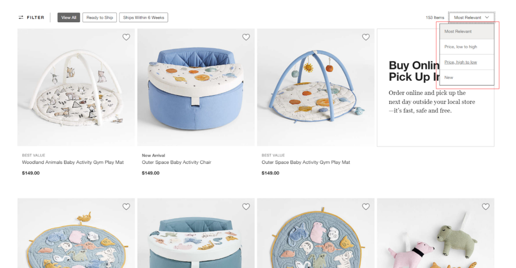
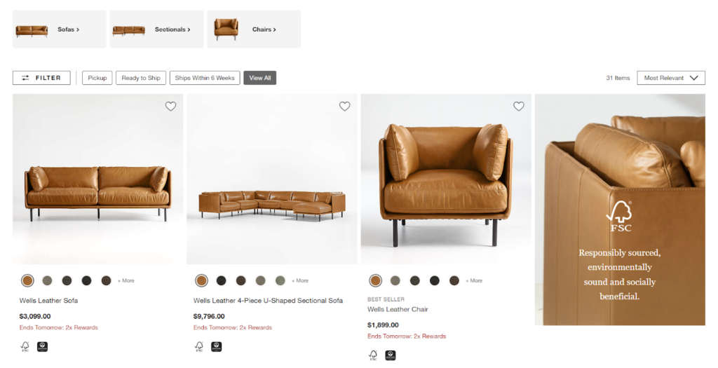
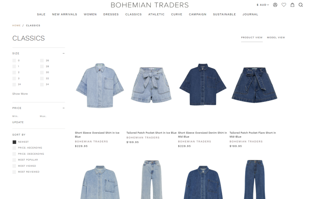
Category Filters
Category filters work as your shoppers’ personal shopping assistants, helping them find their perfect match. These super little filters let customers refine their search based on their preferences – be it price, size, color, brand, or anything else they desire.
Most successful eCommerce store owners place the filtering options on the left or top side of the page. It’s all about making the shopping experience super smooth and satisfying.
Sorting Options
It’s okay if your shoppers want to see the popular products first!
With the sorting options, shoppers can play and decide how they want products to be organized. You can provide sorting functionality near the top or above the product listing. This enables shoppers to customize the order of displayed products based on parameters like price, popularity, customer ratings, and more.
Product Listings
Next comes the product listing – the most important element on the category pages! Product listings are the visual representation of the products available within a category. You can present the products in a grid or list format, showcasing clear product images, titles, prices, and relevant information.
Display multiple products per row or column to optimize space. Each product card should give key product details along with offers, helping customers make informed purchase decisions.
Pagination or Infinite Scroll
Want your shoppers to keep scrolling or jumping between pages?
Pagination gives shoppers a sense of control as they flip through pages like a bookworm on a mission. Infinite scroll, on the other hand, takes them on a never-ending journey of product discovery. The choice is yours, but remember, it’s all about keeping the shopping experience smooth and entertaining.
Related Categories or Subcategories
Optional. Looking to expand your shoppers’ horizons by showcasing related categories or subcategories?
Displaying popular categories or subcategories provides additional navigation options for shoppers. It will help them explore related product ranges, enabling cross-category browsing.
Featured Brands or Featured Products
Optional. Featuring well-known brands or specific products with unique selling points attracts shoppers’ attention and encourages them to explore further.
Highlight specific brands or products within the category that may be popular or have a special focus. It can help build trust and influence purchase decisions.
About the Product Category
Providing an informative section about the product category offers valuable insights to shoppers. It can include a concise category description that highlights the key characteristics, benefits, or special attributes of the products within the category.
By sharing relevant information, you educate and engage customers and optimize your category page content for search engines.
This is how you can organize your existing category pages in your eCommerce store. Now you can move ahead to optimize your product category pages for a seamless user experience.
Best Practices for Product Category Page Optimization
Now it’s time for the section for which you are actually here—best practices to optimize the Product Category Page in your online store!
1. Product Category Page Design
When it comes to optimizing product category pages for better performance and user experience, there are several best practices you can follow.
Here are some recommendations for product category page layout optimization:
Consistent Branding
Consistency in navigation, design elements, and interactions creates a seamless experience for users. This reinforces your brand’s professionalism and reliability.
So, first of all, build a category page that is compatible with your website theme and follows your brand style guidelines. This will offer a consistent user experience across your entire eCommerce website, including the product category pages.
Placement of Subcategories
Some online stores may have only main categories, and some stores include both parent categories and subcategories. In the second scenario, the parent category pages show a collection of subcategories that redirect the visitors to the intermediary category pages.
If your eCommerce website has parent category and subcategory pages, ensure that your parent category page has a clear internal linking to the subcategory pages. You should use breadcrumbs or a hierarchical menu to show the user’s current location within your website.
SEO-optimized Page Content
Who said category pages cannot get visibility on the top search engine results pages (SERP)? For that, some SEO efforts are compulsory!
The category title not only helps shoppers understand your category but also helps the search engines understand whether it’s the exact page people are searching for. The same goes for the category page description.
Each category page should have a title and description that accurately represents the products within it. Also, it’s important to use relevant keywords in the page content, title tag, meta description, and page URL to improve search engine optimization (SEO). Do proper keyword research to find the target keyword for all the pages that belong to product categories.
Mobile-Friendly Design
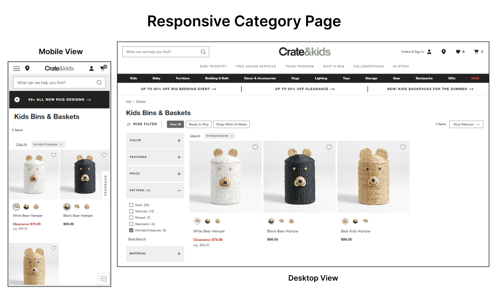
I’m not sure whether all your shoppers would have computers, but I’m sure they would surely have mobile phones. And I know you understand the importance of having a responsive mobile site structure.
As an increasing number of users browse and shop on smartphones and tablets, your category page layout should be optimized for mobile devices. Whenever you add a new section or functionality to your category pages, ensure that your page provides a seamless experience across different screen sizes.
Performance Optimization
A good user experience is impossible without good site performance. This is what you need to focus on. No one would like to wait unnecessarily while the product cards are loading on the category pages.
That’s why, ensure that your category page loads quickly to prevent user frustration and bounce rates. For that, optimize images, minimize server requests, and leverage caching techniques to improve overall page speed.
These best practices will help you in category page optimization to meet the unique needs of your customers.
2. Product Filtering and Sorting
The category page is not just about listing similar products. It also helps shoppers find products that meet their needs. For that, we have (1) Filter options and (2) Sorting options. And here we’ll learn how to optimize the product filtering and sorting options.
Follow the best practices to follow to make product filtering and sorting a better experience:
Relevant and Useful Filter Options
Agree that you have well-functioning filters on your category pages. But do they actually help your customers?
Without relevant filter options, you make your shoppers find a needle in a haystack. That’s why you must include product-specific attributes in your category filters that align with customer preferences.
Common filter options include price range, size, color, brand, rating, and other attributes of your products. Conduct research and analyze user behavior to identify the most valuable filter options for your target audience.
Filter Functionality
Slow or delayed filtering can lead to frustration and abandonment. Always remember, that your goal should be to make product discovery quick and easy for your shoppers. For that, make sure using the category filters is effortless.
This is how your product category filters should function to meet user expectations:
- Clearly display the applied filters at the top or side of the category page.
- Show the number of products available for each filter option, indicating how many products match that specific attribute.
- Maintain the selected filters when users navigate between pages or return from product detail pages.
- Allow users to select multiple filter options simultaneously.
- Include an option to reset or clear all filters.
Apart from the guidelines, ensure that the filtering process is fast, responsive, and provides real-time results as soon as users make filter selections.
Relevant Default Sorting
The product sorting will arrange the products in an appropriate order. It could be based on popularity, ratings, pricing, and so on. And the best way is to show the products based on user behavior or preferences. Common options for the default sorting are “Best Sellers”, “New Arrivals”, or “Price: Low to High”.
Analyze your user data to determine which sorting option is most commonly used or which one leads to higher conversion rates. You can also consider implementing a personalized default sorting that is most relevant to your target audience.
Persistent Sorting
The basic expectation of the shoppers is: when they select any sorting option, the products should be visible in the same order. What else can improve the user experience is: keeping their preferences consistent until they modify it!
Maintain the selected sorting option as users navigate through different pages or interact with filters. This ensures a consistent experience and saves users from reselecting the sorting option repeatedly.
By implementing these best practices, you can enhance the usability and functionality of your product category pages.
3. Product Listing
Now comes the most important section on the product category page!
Product listing refers to the display and organization of products on a website or platform, typically in an e-commerce context. It involves presenting a collection of products within a specific category or search results, allowing users to browse and explore various options.
Here are some key aspects of product listing that need improvements:
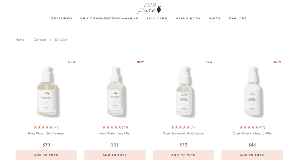
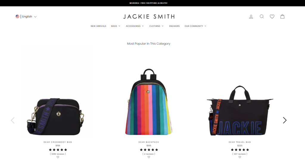
Grid or List View
Product listings can be presented in a grid or list view, depending on the website design and user preferences. The grid view displays product cards in a visually appealing grid layout, while the list view presents them in a vertical list format. Grid view is my favorite and also the most preferred style!
Some eCommerce stores allow shoppers to switch between views based on their preferences. This boosts user engagement as they find it fun while toggling between the options.
Engaging and Informative Product Thumbnails
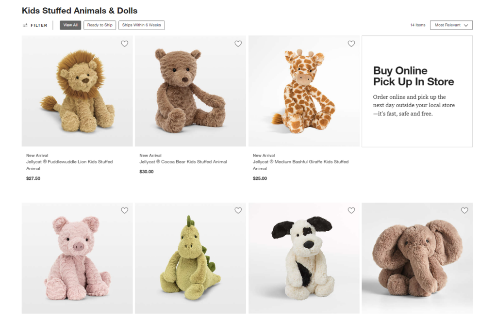
What the shoppers actually notice on the category pages are the product thumbnails. If the product thumbnails are not compelling, they might not look at your product again. That’s why you should display visually appealing product thumbnails that have high-quality images and are consistent in size.
You may have seen some eCommerce websites that include sales badges (e.g. “Fast delivery”, “Best-seller”, “New”, “Top choice”, and “Trending”) on the product thumbnail to attract their visitors. For more ease, don’t forget to make the thumbnails clickable and lead to individual product pages.
Key Product Information
The product cards show relevant product details that users would consider when making a purchase decision. This may contain product name, price, applicable discount, ratings, variants, availability, and more.
Apart from the key details, you can also include product features, specifications, and unique selling points. However, avoid overwhelming users with excessive text; focus on highlighting the most important information.
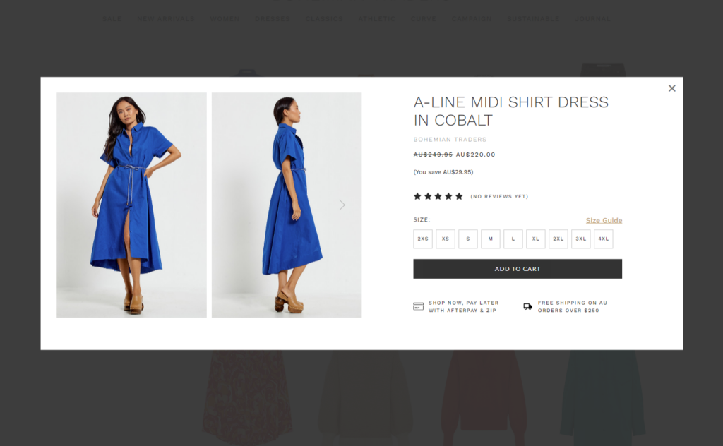
Call-to-Action (CTA) Buttons
Have you ever thought about why Amazon uses “yellow CTAs”? There are so many colors that can suit their website theme, but why yellow? Is there any reason behind the yellow color?
Yes, Amazon is very cautious about their UI and eCommerce optimization. After lots of research, they decided to place these CTAs to boost their sales.
Well, this shows your CTA also decides whether a shopper will click on the product or not. So, ensure that they stand out visually and are easily clickable. Consistent placement of these buttons throughout the category page improves user experience and encourages conversions.
Quick View or Preview
Some product listings offer a quick view or preview feature that allows users to get more information about a product without leaving the listing page. Quick-view pop-ups provide additional details like product descriptions, ratings, and an option to add the item to the cart, enabling users to make informed decisions more efficiently.
Consider offering a quick view option that allows shoppers to get a closer look at the product details, without leaving the category page.
Consistent Card Layout
A little disorder in the product listing can make the category page look messy. That’s why, you should maintain a consistent layout and design for all the product cards within the category page. This consistency helps users navigate and compare products more easily.
Align the product images, titles, prices, and CTAs to create a visually pleasing and organized appearance.
Dynamic Loading Or Pagination
Now the question comes which option to use: dynamic loading or pagination? Well, both have their own benefits.
If you have a large number of products in a category, consider implementing pagination to prevent slow loading times. This will help you avoid excessively long scrolling on the category page. Display a limited number of product cards per page to prevent overwhelming users with too many options at once.
And for small-sized category pages, you can use dynamic loading. Here you can load a certain number of product cards initially and provide a “Load More” to fetch additional products as the user scrolls or clicks.
This is how you can improvize the product listing on your eCommerce category pages. Now let’s move to the next point!
4. Relevant Cross-Sells
I have seen many eCommerce brands, including Amazon, highlight the best-selling products in-between the product listings on the category pages. These products are look-wise differentiated from other products or sometimes marked with special tags.
This practice, commonly referred to as “cross-selling” can greatly enhance the user experience and boost sales. Are you looking to optimize your product category pages and incorporate cross-sells effectively?
Here are some best practices to consider:
Prioritize Relevance
Yes, you can promote or cross-sell your best products on your category page. But irrelevant or random cross-sells won’t help it. It may confuse users and reduce their overall shopping experience.
When selecting cross-sell products to display on your category pages, ensure they are genuinely relevant to the products being viewed. Consider factors such as compatibility, complementary use cases, or popular pairings.
Optimize Visual Placement
The right placement of cross-selling products is important for attracting attention and encouraging clicks. Typically, displaying relevant cross-sells between product listings or within a sidebar is effective.
However, you should also test different positions to find the optimal placement that suits your website layout and maximizes visibility without being too intrusive.
Keep It Limited
While cross-selling can be powerful, you should avoid overwhelming your users with excessive recommendations.
Displaying too many cross-sell products on a category page may lead to decision paralysis or distract users from their primary shopping goal. Instead, aim for a concise selection of highly relevant cross-sells to maintain focus and facilitate decision-making.
That’s it for the cross-selling products. Now, let’s move to the next key element of the category page that usually the online store owners miss.
5. Category Description
Sometimes you can find it at the top or bottom of the category page, or most of the time it won’t be visible.
When it comes to optimizing product category pages, one important element to focus on is the category description. The category description provides valuable information to users about the products within that category and also helps in SEO.
Here are some best practices for optimizing category descriptions:
Align with User Intent
Users appreciate clear and concise information. So, you should keep your category description to the point and avoid lengthy paragraphs that may overwhelm users. Customize the description to address their intent and provide the necessary information to assist them in their decision-making process.
Identify and highlight the category’s unique selling points, such as exclusive products, special features, or exceptional quality. This helps users understand the value of exploring the products within that category and sets your category apart from competitors.

If applicable, include links within the category description to relevant subcategories or specific products. This helps users easily navigate and find what they’re looking for. It also improves internal linking, enhancing the overall site structure and user experience.
Optimize for Search Engine
While writing category descriptions for users, don’t forget to optimize them for search engines. For that, conduct keyword research to identify relevant keywords and incorporate them naturally into the description.
Also, review and update your category descriptions in certain intervals to ensure they remain accurate, relevant, and aligned with your product offerings. This can improve your category page’s visibility in search engine results, attracting more organic traffic to your website
So, here are the best practices that can help you optimize category pages in your eCommerce sites. Now it’s time to work on the key elements on the category pages and ensure your shoppers visit the product detail page as much as possible.
After the category page best practices, now we’ll explore some best eCommerce category pages that will inspire you.
Examples of Best eCommerce Category Pages
Let’s not miss checking some appealing category pages to get ideas for optimizing your product category page.
Here are 10 examples of the best eCommerce category pages:
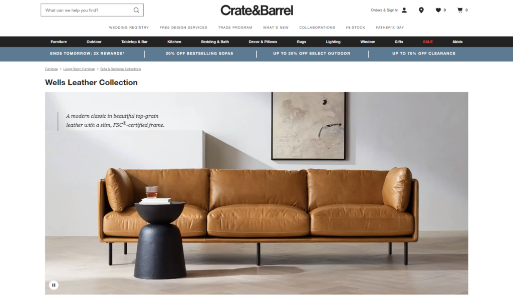
1. Crate and Barrel
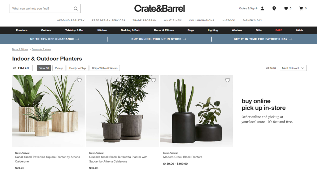
Crate and Barrel’s category pages are well-organized and visually appealing. They feature high-quality product images, clear categorization, and helpful filters to narrow down options. The pages also provide category briefs and additional product details when clicked upon, ensuring users have all the information they need.
2. Frank Body
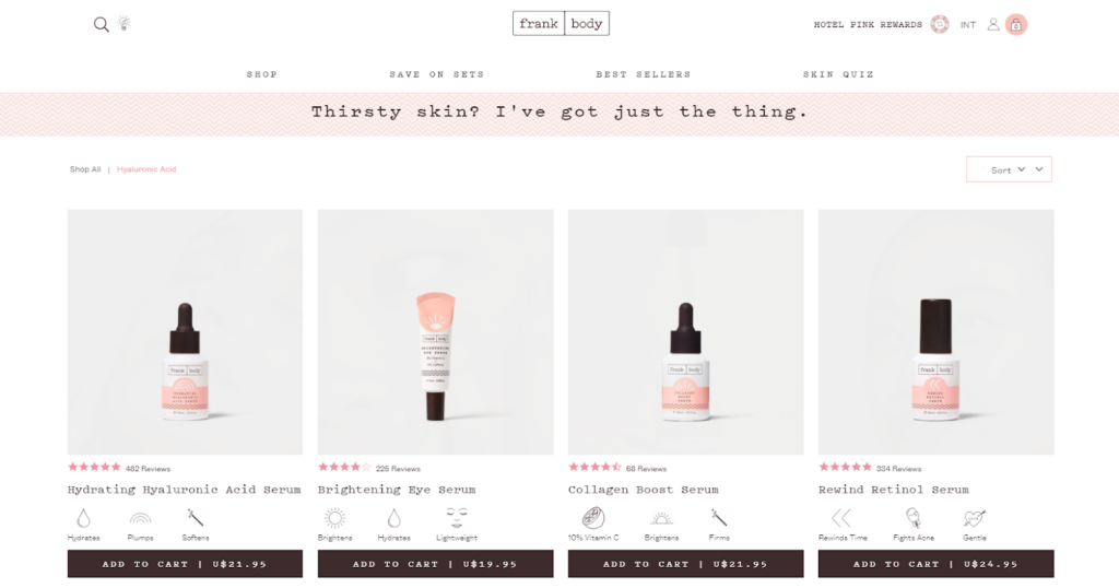
Frank Body’s category pages stand out with their unique and playful design. They actually capture the brand’s personality through vibrant visuals and engaging copywriting.
The category pages offer a seamless shopping experience, with product descriptions that are both informative and entertaining. The UI boosts the shoppers to explore different product lines and make assured purchasing decisions.
3. Allbirds

The category pages in Allbirds personify simplicity and user-friendliness. The design is clean and minimalist, highlighting the brand’s commitment to sustainable footwear.
The pages feature clear product images, short descriptions, and product variants that satisfy the customer hunt. The navigation is straightforward, allowing users to quickly find the specific category or product they’re looking for.
4. P&Co
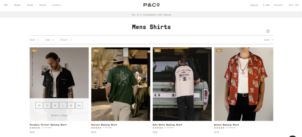
P&Co’s category pages showcase a strong visual aesthetic and brand identity. The pages effectively combine stunning product imagery with customer reviews and pricing information.
The smart filtering options enable users to refine their search based on size, color, and other relevant attributes. The category pages offer a seamless shopping experience that aligns with the brand’s edgy and modern style.
5. Simply Chocolate
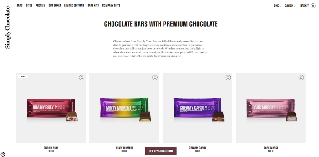
The category pages create an immersive chocolate shopping experience in Simply Chocolate. They use beautiful imagery, detailed descriptions, and customer reviews to entice users to explore their wide range of chocolates.
The pages offer a unique “Add to cart icon” on the product thumbnail to assist shoppers in finding the perfect treat.
6. GREATS
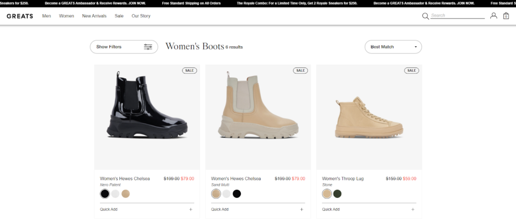
GREATS’ category pages are sleek and modern, reflecting the brand’s emphasis on minimalist design. The pages display their collection of sneakers in a visually appealing manner, with detailed product information and sizing options. The intuitive navigation allows users to seamlessly browse different styles.
7. Kettle & Fire
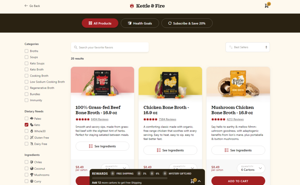
Kettle & Fire’s category pages prioritize providing valuable information to their customers. They feature product descriptions, nutritional information, and customer reviews to help shoppers choose the right product as per their needs.
The pages also offer helpful filters to narrow down the selection based on dietary preferences or specific ingredients.
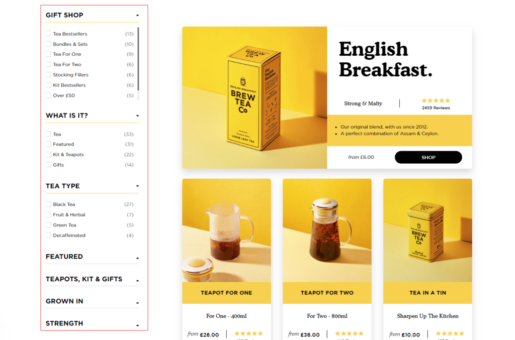
8. Brew Tea Co
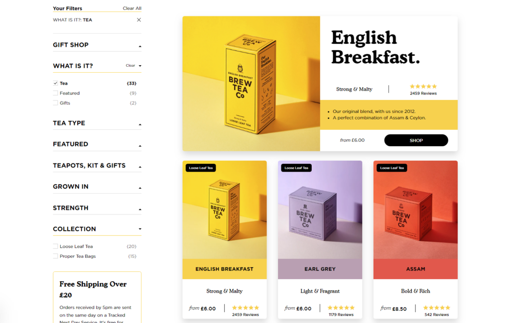
The category pages in Brew Tea Co offer a delightful tea shopping experience. They use enticing visuals and informative descriptions to showcase their wide variety of teas. The pages also provide suggestions for tea pairings and brewing tips to enhance the user’s tea-drinking journey.
9. Wild
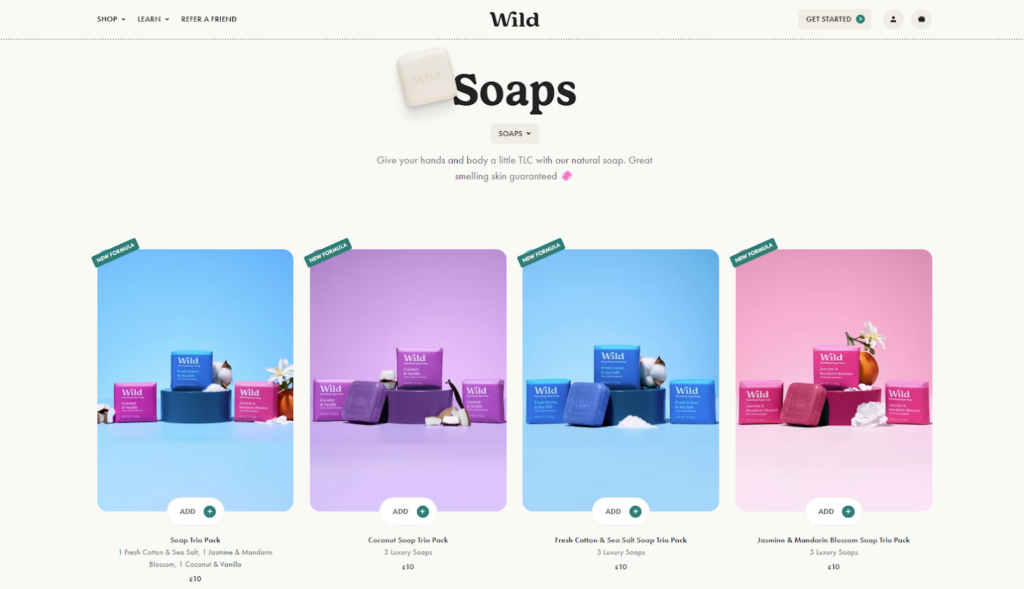
Wild’s category pages are clean and minimalist, reflecting their focus on natural products. The pages highlight the brand’s key selling points, such as cruelty-free ingredients and customizable product options.
The product thumbnails, sale badges, and CTA are really appealing. The shoppers also get an option to easily navigate through different categories and view detailed product information.
10. Bremont
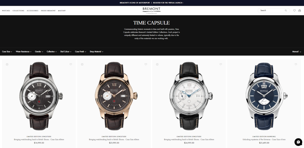
Bremont’s category pages promote luxury and craftsmanship. These important pages feature stunning product imagery and 3D views that showcase the brand’s high-end watches. The pages also provide helpful filters at the top for shoppers to refine their search based on features, collections, or price ranges.
The overall design and user-friendly interface make it a pleasure to explore and discover Bremont’s range of exquisite watches.
These examples demonstrate how eCommerce brands can optimize their category pages to create a visually appealing, user-friendly, and engaging shopping experience.
Final Words!
In Chapter 3 of our series on the eCommerce UX audit checklist, we explored the best practices for optimizing eCommerce category pages. Executing these best practices will not only improve the performance of category pages but also contribute to the success of the entire eCommerce website.
Now it’s time to take leave! Hope the purpose of reading this guide has been fulfilled. If there is anything that I couldn’t add or make easy to understand, please mention that below in the comment box!
You can also visit the previous chapters (if you haven’t yet) for complete eCommerce optimization. Stay tuned for the upcoming chapters!
