
In the previous chapter of our eCommerce UX Audit Checklist, we’ve seen the general best practices for improving the primary areas of the eCommerce website. Now, this chapter will help you to optimize the Homepage of your eCommerce store for a better user experience.
I know you’re here to make sure your eCommerce homepage is good enough to attract more shoppers. Also, you may have many questions about your current homepage like:
- Whether your homepage is confusing or overwhelming?
- What’s lacking in your homepage that can affect the user experience?
- Are all the elements set in the right place?
- What are the areas to focus on to improve its usability?
- How to avoid common mistakes while designing a new homepage?
Don’t worry! This guide has everything you need.
So let’s get ahead and learn how to improve the usability of your eCommerce homepage.
Why is UX Optimization necessary for your Homepage?
The homepage may not be the first page your shoppers visit on your eCommerce site, but still, it holds the first place in your online store. I’m sure, you’ve put a lot of effort into making your homepage attractive and fully functional. But even if your conversion rate is low or stable for a long time, there’s room for improvement!
Neglecting UX optimization on your homepage can have some severe consequences. Imagine potential customers landing on your homepage and being greeted with slow loading times, confusing navigation, or overwhelming information.
What do you think they’ll do? Most likely, they’ll quit your site faster than you can say “lost sale”.
So, what does this homepage UX optimization really mean? Well, it means:
- making your homepage a smooth and seamless journey for your shoppers.
- removing any roadblocks or diversions that might distract or frustrate them.
- creating a delightful experience that makes them stay, click, and buy!
To truly stand out in the crowded eCommerce world, you need to go beyond the external beauty of your homepage and dig deep into the grace of eCommerce UX design.
That’s what we are focusing on today! The next section will help you check whether your homepage is well-structured or not.
Ideal eCommerce Homepage Structure
The homepage is the main entrance to your eCommerce store. Imagine if that entrance is untidy, confusing, or lacks relevant information, no shoppers would like to visit other rooms of the store.
So the first step in optimizing the usability of your own homepage is to have a well-structured layout.
Here is a suggested structure for an impactful eCommerce homepage:
Hero section
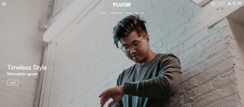
The first and most important section after the header is the “hero banner” section. It features a visually appealing image or a series of high-quality images that highlight your brand, and key products. It should be accompanied by a clear headline and a compelling call to action (CTA).
You can also highlight any ongoing promotions, discounts, or special offers to encourage users to explore and make purchases.
The USPs
It’s a section on an e-commerce website designed to highlight the store’s unique selling proposition (USP). This USP is essentially what makes the store stand out from its competitors and entices customers to choose them.
Mono-brand stores can focus on the unique qualities of their product, while multi-brand stores should emphasize their exceptional service. If you specialize in a particular niche (like cruelty-free beauty products), highlight that in the USP bar.
Featured categories or products
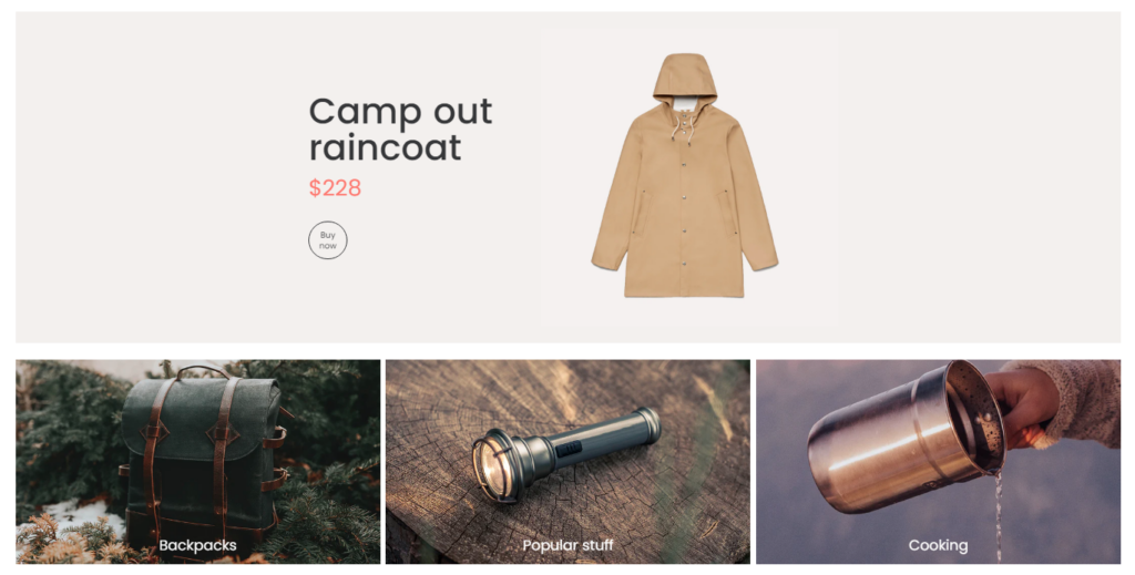
Next, in the hero section comes the best-selling products and categories! Here, you can showcase a selection of your popular product categories or featured products, making it easy for visitors to browse and discover items of interest.
Personalized recommendations
Optional. You may have seen the “Recently viewed products” section on the homepage of many eCommerce sites. This basically helps shoppers to quickly and easily access the products that they find interesting.
The secret is to track the user’s browsing history or user data to provide personalized product recommendations or deals.
Promotional banners
Optional. What I really like about online shopping is that eCommerce websites always have some ongoing pocket-saving offers, discounts, or seasonal sales for the shoppers. If your store has offers too, you should highlight them using eye-catchy promotional banners.
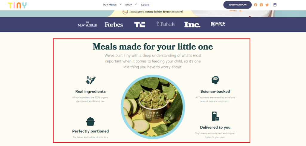
About Us
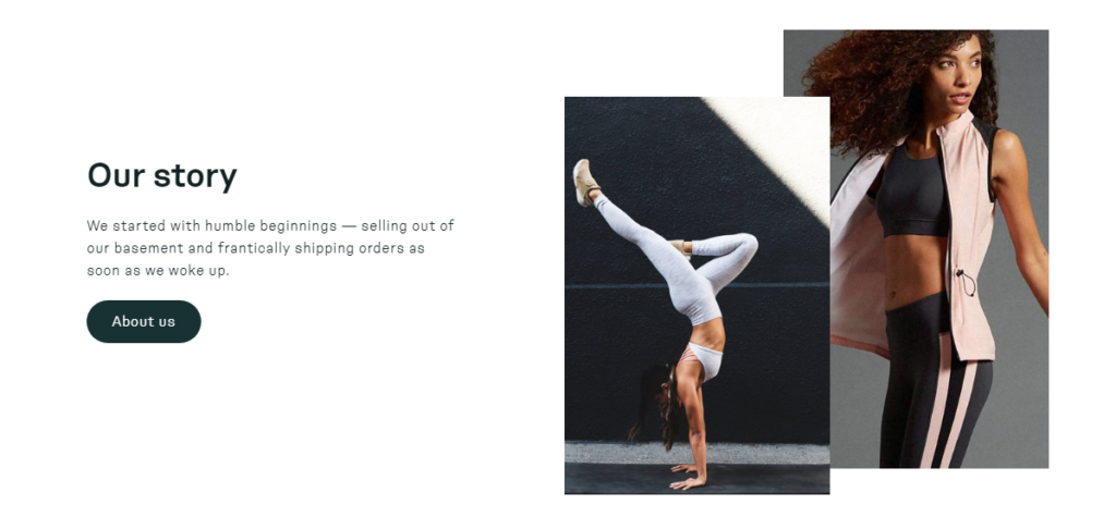
The homepage is the abstract of your eCommerce website. So, don’t be afraid to inject your brand story into it! You can add a brief introduction or a section that shares your brand story, mission, and values to connect with your audience on a personal level.
Also, include some points about what makes your brand unique, and why they should choose you over the competition.
Social proof & UGC
We all know the importance of social proof. It influences the buying decisions of the shoppers. So, it’s necessary to include customer reviews, ratings, and trust badges to build credibility and trust with your audience.
If applicable, showcase the user-generated content where the customer has mentioned your brand or products. This can attract shoppers who want a little assurance whether the buyers are satisfied with your product or not.
Recent blog posts or news
What else do you have to show to your store visitors? Well, it’s a great idea to show the latest updates about your store or eCommerce niche.
If you produce blogs or helpful content related to your products, feature a section that showcases your latest blog posts or informative articles to provide value to visitors.
So, this is how all the sections can be visible from top to bottom on your eCommerce homepage. I’ve listed all the possible sections that you can place on the homepage. But it’s not necessary to add all of them present here. Choose the sections wisely based on your needs or that are suitable to your product line.
Now it’s time to check all the key areas that will help you to optimize your homepage user experience.
Best Practices for Your eCommerce Homepage
The user experience is what keeps your customers engaged, encourages them to explore your products, and ultimately convinces them to make a purchase.
Here are eCommerce homepage design best practices you need to follow:
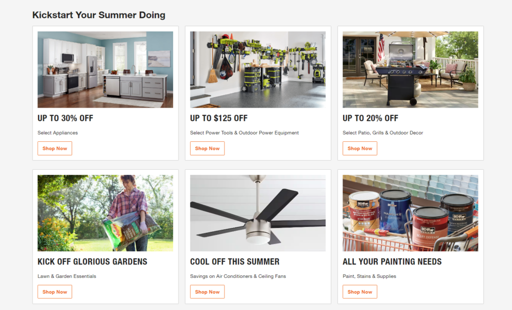
1. Hero Banner
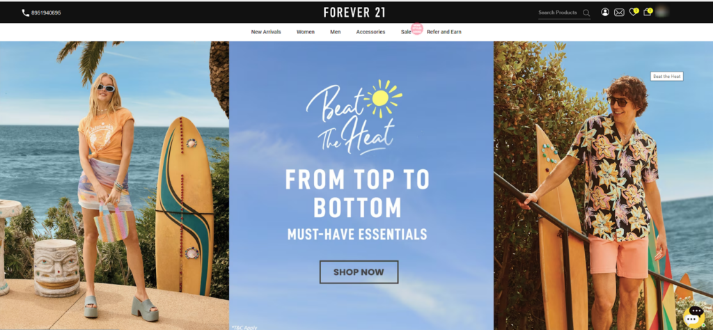
You may have visited thousands of websites and almost every website greets you with some exciting new product arrival, blockbuster deals, or some best-selling product collections (with a hero banner).
Have you ever noticed why they show these specific things only??
It’s because the hero section comes in the first fold and grabs your shopper’s attention very well. So, it’s the best place for conveying important messages, promoting products or offers, and motivating users for the desired action.
Here’s what you can feature using your Hero banners:
- On-going sale highlights
(e.g. Summer Steals! Up to 50% Off Everything) - Upcoming sale with a countdown
(e.g. Black Friday Sale Starts Soon! 2 Days Left!) - Best products announcement
(e.g. Our Customer Favorites Are Back!) - New products launching
(e.g. Introducing the All-New Smartwatch) - Seasonal best-selling products
(e.g. Fall Fashion Must-Haves! Limited stocks.) - Custom product bundles
(e.g. The Ultimate Skincare Routine: Bundle & Save!) - Pocket saving collections
(e.g. Amazing Finds Under $10)
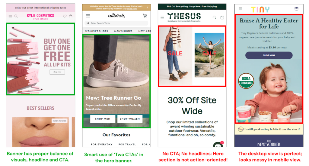
Creating these banners includes visuals, headlines, sub-headings, and one or two CTAs. You don’t have to limit yourself to just one highlight. You can combine these elements to create a truly impactful hero banner. Also, it’s fine to create multiple banners and rotate them using the slideshow.
Let’s learn how we can make a more effective hero section for your homepage.
- The banner image size should be 1440px x 500px.
- You should avoid using videos if your website already loads slowly.
- CTAs should be prominent and easy to understand.
- Text and buttons should be easily readable and clickable on smaller screens.
- Use fonts, colors, and imagery that reflect your brand personality.
- Regularly update your hero section with new content to keep visitors engaged.
- When using a slideshow/carousel, show the navigation
By incorporating these best practices, you can create a visually appealing hero banner that boosts user engagement and conversions in your eCommerce store.
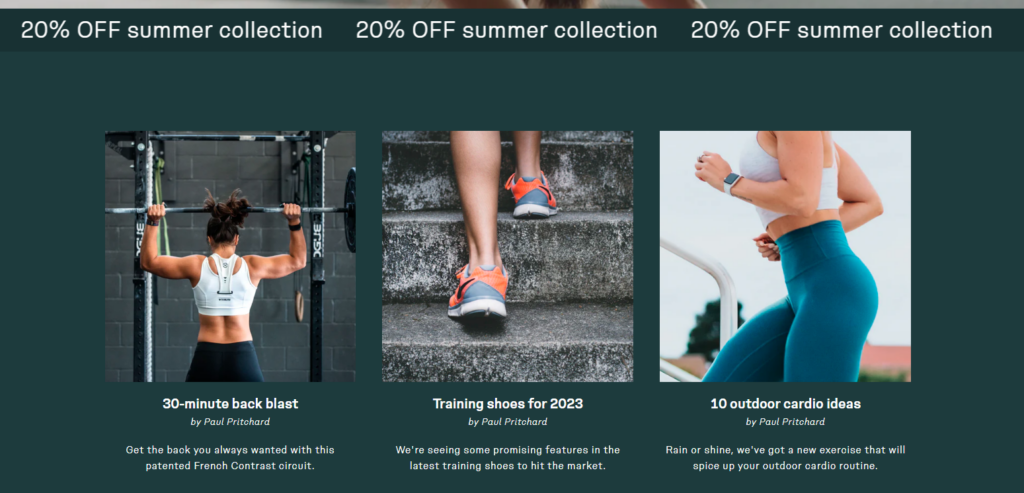
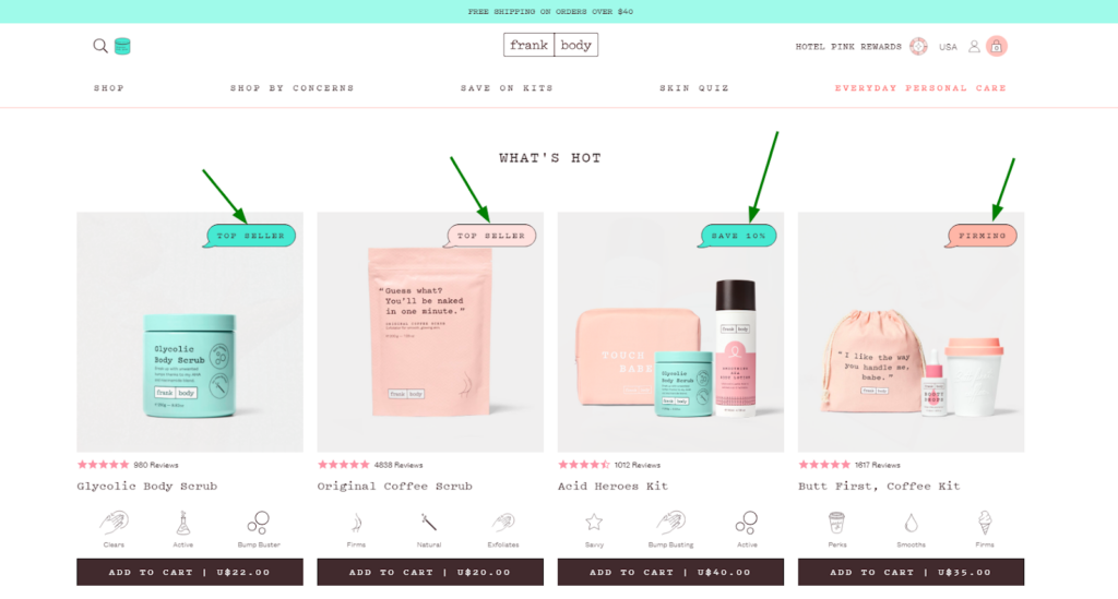
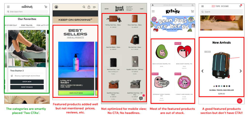
2. Featured Products & Categories
When you enter a brick-and-mortar clothing store, you can find some dummies wearing the best outfits of the collection. Let me give you one more example: have you seen a masterpiece to be highlighted in the jewelry showroom?
This section is a highly visible and influential area that can significantly impact your customers’ shopping experience and boost sales.
Strategic Product Selection
How should I choose the featured products or categories? Well, it’s complicated. But don’t worry, we are here to help you!
Here you need to carefully curate a selection of featured products that represent the best of what your store offers. You can consider listing:
- Popular or bestselling products
- Categories by users or usage
- New product arrivals
- Categories by discounts
- Categories by brands (for multi-vendor stores)
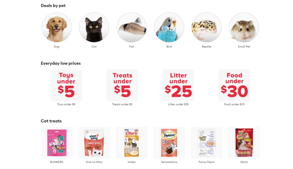
Also, avoid overwhelming customers with too many featured products. Showcase a small, curated selection to maintain focus and interest. Or if you still want to add more products, you can use the carousel or slider row as shown below:
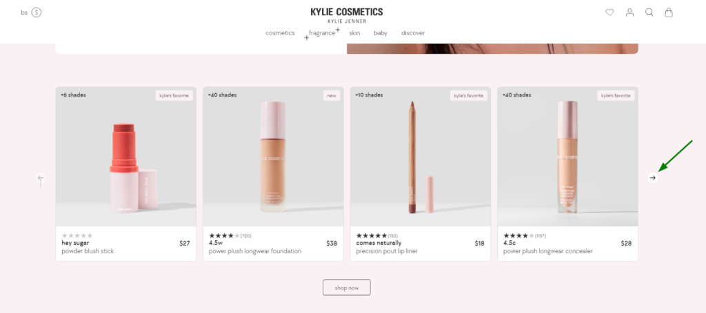
Make sure to show the indicators that guide the shoppers to explore the hidden products.
Seasonal and Trendy Products
Trends change with time and with every new trend, it’s no surprise that people’s interests will also change. So, it’s necessary to update your featured products regularly to stay relevant and capitalize on seasonal or trendy items.
Highlight the products that are currently in demand or aligned with specific themes or events.
If any of your featured products have discounts, promotions, or special offers, clearly display the savings alongside the product. This can attract customers and create a sense of urgency.
Here’s what else you need to consider for improving this section:
- Don’t add out-of-stock products here. Give a chance to other products and use the limited space wisely.
- Use well-lit images and a consistent grid layout for featured products or collections.
- When the user hovers the mouse over the product, it shows the second product image (optional).
- The featured product card must have reviews, an option for variant selection, and an Add-to-Cart button.
- Consider personalizing the featured products based on user behavior (past purchases, browsing history) or demographics (location, purchase history).
- You should also place a “View All” button below the product list that shows all the products in the same collection.
- If you’re showcasing multiple categories, prioritize them based on popularity, seasonality, or promotions.
- Make sure this section is mobile-friendly.
Regularly analyze user behavior and adapt your approach based on the data you gather to continually optimize your “Featured Products & Categories” section.
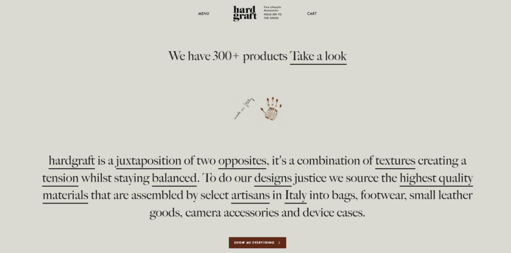
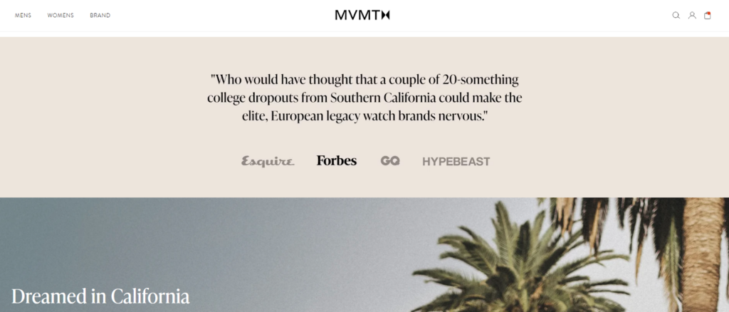
3. Brand Story & USPs
People connect with stories. And, your brand story sets you apart from competitors by highlighting what makes your eCommerce store unique. This section will help you with that.
Your brand story is the “why” behind your products. It’s what makes you different, what resonates with your target audience on an emotional level.
In the “About Us” section, you should share your brand’s history, mission, and values that drive your eCommerce business. Yes, you can also incorporate the USPs in this section.
USPs: Spotlight Your “Why Choose Us” Factors
What sets you apart from the competition? Do you offer sustainable, ethically sourced products? Do you have a lightning-fast shipping process? Shout these advantages on your homepage.
When you weave your brand story and USPs together, you create a powerful narrative that speaks directly to your ideal customer.
Focus on customer benefits
Customers are primarily interested in how your products or services can improve their lives. While sharing your story, highlight how your products or services will benefit your customers.
Address their pain points and explain how your offerings can solve their problems or meet their needs. This establishes the value proposition of your brand and encourages potential customers to engage further.
Of course, you cannot add everything about your brand on the homepage. So, you can simply add a link to the section that redirects your curious shoppers to your “About us” page.
Here’s what you can’t miss to optimize the About Us section on the homepage:
- Avoid overwhelming visitors with lengthy paragraphs.
- Adding relevant images, videos, or infographics captures attention, enhances the user experience, and helps communicate your brand’s personality more effectively.
- While sharing your history is valuable, emphasize your current offerings and future aspirations to showcase your dynamism and relevance.
- Include relevant keywords throughout the content to improve search engine visibility.
- Keep the description short and make sure that the entire section/block fits on a desktop screen or mobile screen.
Remember, the “About Us” section is an opportunity to make a strong first impression and establish a connection with your audience. By following these best practices, you can easily connect your store visitors to your eCommerce brand.
4. Social Proof and Trust Indicators
Trust and credibility are essential ingredients for any successful e-commerce business. Imagine stepping into a store and seeing people buzzing with excitement over a product. That’s the power of social proof.
So, what should you add to your Homepage to build trust?? Just product reviews? Nope!
Product ratings or reviews look appropriate on the product page, not on the homepage. Here’s what you can include in the homepage:
- Video success stories
- Written testimonials
- User-generated content – UGC
- Trust badges
- Certificates or licenses
- Awards or achievements
Video Success Stories (Best)
Short, impactful videos featuring real customers who have benefited from your product or service. They share their positive experiences and the positive outcomes they achieved.
This works best for single-product stores or online stores having limited and exclusive products or services.
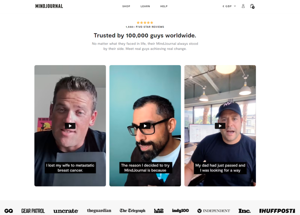
They are highly engaging and relatable. Viewers can see real people using your product and the positive impact it has.
Written Testimonials
Quotes or short paragraphs from satisfied customers praising your product or service. Testimonials provide a written record of customer satisfaction and build trust through third-party validation.
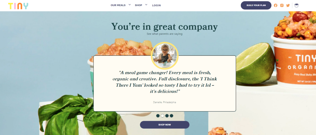
Testimonials are easy to integrate, showcase multiple perspectives, and highlight specific features or benefits customers appreciate.
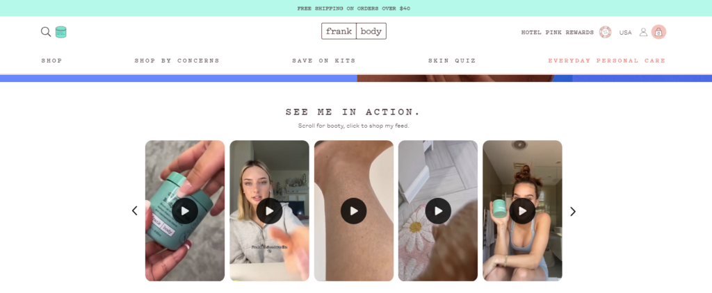
User-generated Content (UGC)
This refers to content created by your customers, like social media posts, photos, or videos showcasing your product in everyday use. UGC is considered highly trustworthy because it’s authentic and comes from real people, not your marketing team.
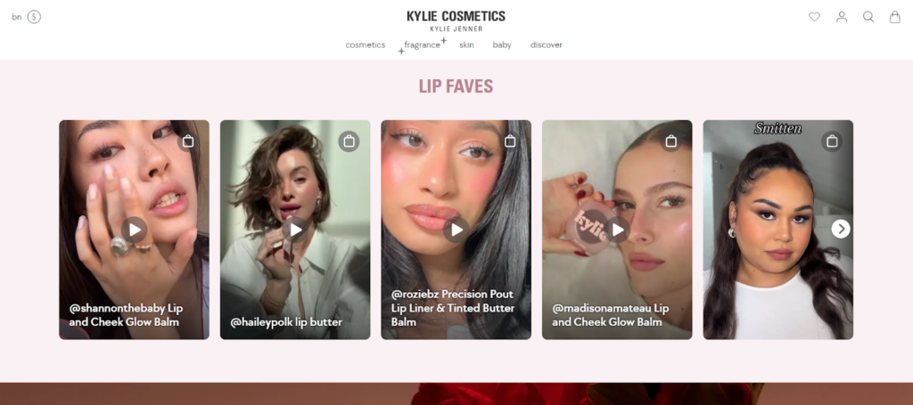
Look for content that’s visually appealing and showcases real people using and loving your products. Many stores embed a live feed from your social media platforms displaying positive customer mentions and reviews.
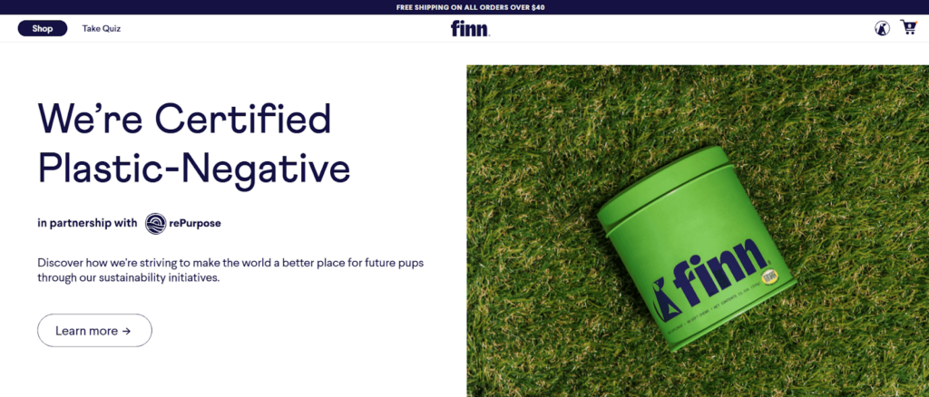
Trust Badges
Logos or icons from security companies, payment processors, or review platforms that verify your legitimacy and trustworthiness.
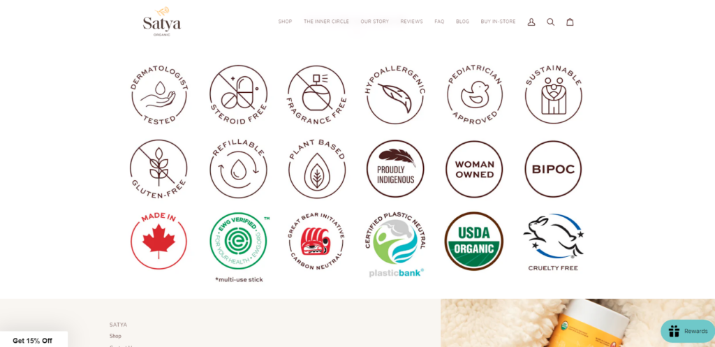
Displaying security seals, and partner logos on your homepage infuses confidence and peace of mind for the shoppers. They feel more secure knowing you’ve been vetted by reputable organizations.
Consider creating a visually appealing gallery of trust badges to reassure customers of your eCommerce brand’s credibility.
Certificates or licenses
If your business requires specific industry certifications or operates under relevant licenses, displaying them on your homepage demonstrates legitimacy and compliance with regulations. However, this may not be relevant to all businesses.
Awards or achievements
Industry recognitions, awards, or positive press mentions can add prestige to your brand and build trust with potential customers.
By incorporating these trust indicators strategically, you can build credibility, increase customer confidence, and ultimately drive more sales. You can use a mix of these social proof elements to keep your homepage visually interesting and cater to different visitor preferences.
Here are some points to remember when adding social proofs to your homepage:
- Blurry photos or unprofessional videos undermine the credibility of your social proof.
- For video testimonials, include captions and calls to action. Consider linking written testimonials to relevant product pages.
- Too much social proof can overwhelm visitors. Aim for a curated selection of high-impact testimonials and UGC.
- While you shouldn’t display negative reviews prominently, addressing them professionally can build trust and demonstrate your commitment to customer satisfaction.
- When featuring user-generated content, consider linking back to the original social media post.
- You can partner with relevant influencers in your niche to create video testimonials or user-generated content.
5. Customer Support Options (optional)
Have you ever spent ages hunting for a support email ID on a website? Buried contact details create a negative user experience (UX).
Creating an exceptional customer support experience is crucial for any eCommerce store’s success. And one effective way to achieve this is by optimizing the customer support elements on your homepage.
Not everyone prefers the same communication style. Some might prefer a quick chat conversation, while others might have more complex inquiries requiring email or phone support.
Let’s explore the various options!
Contact Information
I agree that you want your shoppers to reach you to resolve their queries. But what if their biggest query would be “How to reach your customer support team?”
It’s important to prominently display contact information on your homepage, so customers can easily get in touch with your customer support team. This could include an email address, phone number, or live chat option.
Make sure this information is easy to find and stands out from the rest of your homepage content.
FAQ section
Do you get the same queries again and again? You can post those common questions and answers in the FAQ section.
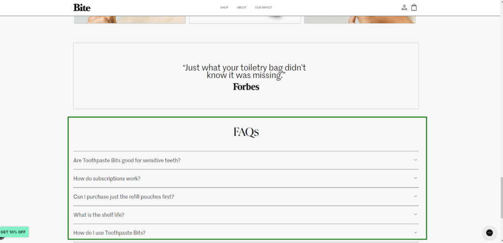
Again many shoppers prefer to solve problems on their own, rather than contacting customer support. A well-crafted FAQ section serves a similar purpose. By including answers to frequently asked questions (FAQs) about returns, shipping, product features, or troubleshooting steps, you can empower customers to find solutions independently.
This reduces strain on your support team and allows them to focus on more complex inquiries. Instead of the typical question-and-answer format, add some creativity by using eye-catching visuals and witty copy to address common customer concerns.
Live Chat
Immediate replies and instant support make your brand more trustworthy! With a Live Chat feature, you can say goodbye to long response times and hello to instant gratification.
Imagine a friendly chat bubble that pops up, inviting customers to ask anything from style advice to product inquiries. This interactive approach encourages a sense of connection and makes customers feel valued and attended to.
Test different layouts and presentations of your support options to see what resonates best with your audience. By optimizing your “Customer Support” sections, you can build trust, improve user experience, and empower your online shoppers to get the help they need effortlessly.
6. Homepage Layout
As we have already seen the ideal layout structure for the eCommerce homepage in the previous section, I don’t want to repeat them here. You just need to design your homepage according to the structure given above and a few UX designing tips given below:
Visual Hierarchy
I hope most of you haven’t heard about the visual hierarchy of the website. So what is visual hierarchy?
Visual hierarchy refers to the arrangement and presentation of design elements in a way that guides the viewer’s attention to the most important elements first. It helps to create a clear structure and balance in the design, making it easier for the viewer to understand and navigate the content.
See the example below that shows how the user sees the page.
Source: Pinterest
How to achieve it:
- Size: Larger elements naturally grab attention first. Feature your hero product or current promotion with a prominent image or banner.
- Contrast: Use color strategically. Vivid elements against a neutral background will stand out. Highlight a limited-time offer with a bold button contrasting the background.
- Positioning: Elements placed higher in the viewport are seen first. Showcase your top product categories or best-selling items above the fold (the area visible without scrolling).
Limited Distractions
Want your store visitors to focus on the flow you created on your eCommerce site?
If yes, then you need to identify the elements that can distract your visitors. Remove unnecessary pop-ups, flashy banners, or irrelevant content that can divert visitors’ attention from your main offerings.
By minimizing distracting elements and visual noise, you create a clear and uncluttered browsing experience that directs attention to what matters most—your products and offers.
Seamless Personalization
Personalized user experience is the winning secret nowadays!
It includes offering relevant product recommendations, personalized promotions, and a customized browsing experience. This level of personalization enhances customer satisfaction, builds loyalty, and increases conversions and repeat purchases.
So, you can customize the content based on user data, demographics, or browsing behavior to see the after-effects of personalization.
- Targeted Promotions: Use browsing behavior to recommend products relevant to past searches. A customer who viewed hiking boots might see a personalized banner for outdoor apparel.
- Dynamic Content: Greet returning customers by name and showcase their recently viewed items. This creates a sense of familiarity and encourages further exploration.
- Product Recommendations: Based on purchase history, suggest complementary products. Someone who buys a phone case might be interested in a screen protector.
Minimal Load Times
Every second counts! Do you know the user experience starts prior to shoppers fully entering your homepage? The time it takes to load the homepage is valuable as it creates the first impression.
Slow-loading pages can be frustrating for visitors and may lead to high bounce rates. Optimize your homepage by minimizing image sizes, leveraging caching techniques, and utilizing efficient coding practices to ensure a lightning-fast homepage.
To make sure your homepage is conversion-ready, hire a professional eCommerce design team that can help you inject the best UI/UX in your homepage design.
So, here are the eCommerce homepage best practices to optimize the homepage UX for your shoppers.
10 Best eCommerce Homepage Examples
So far you have learned how to optimize your eCommerce homepage. Now let’s get some inspiration from some eCommerce homepages that offer the best user experience.
Here are the best eCommerce homepage examples:
1. Bite
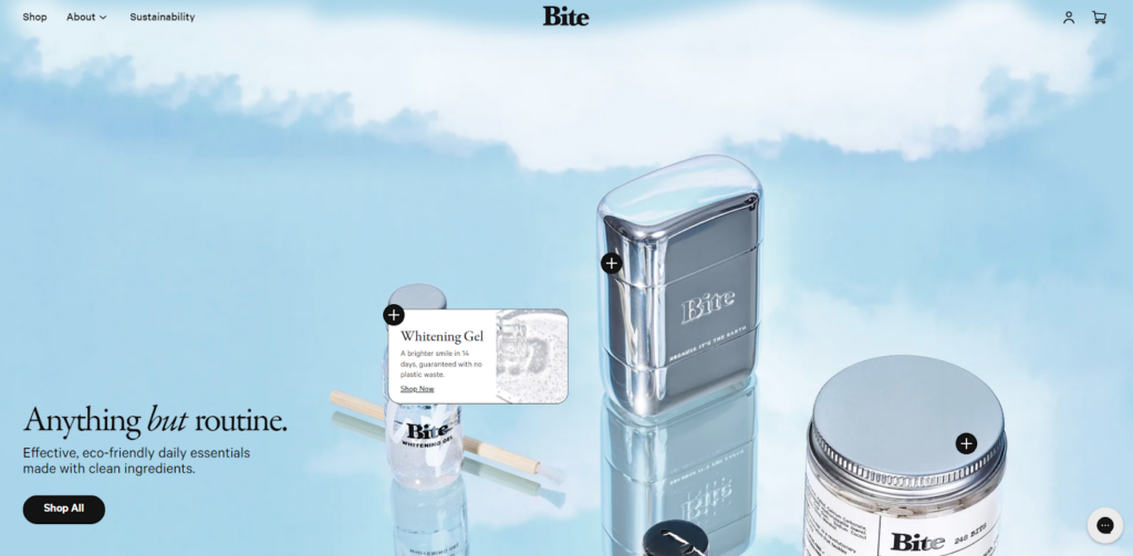
The homepage of Bite embraces simplicity with a touch of elegance. It welcomes you with a clean and minimalistic design that immediately grabs your attention. The clever use of white space creates a sense of calmness and allows the vibrant product images to pop.
As you scroll down, the homepage showcases their eco-friendly mission, making you feel good about your purchase. Bite’s homepage is like a breath of fresh air, reminding you that sometimes, less is truly more.
2. Zeuss
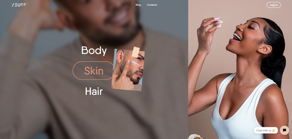
You can see a world of luxury and sophistication when you land on Zeuss’ homepage. It reflects luxury through its sleek and polished design. The carefully curated product images are beautifully presented, capturing the essence of elegance.
As you explore further, the homepage attracts shoppers with exclusive offers and personalized recommendations, leaving them feeling like a VIP. Zeuss’ homepage is a masterclass in creating a captivating shopping experience that makes you feel like it.
3. Zulu Longines
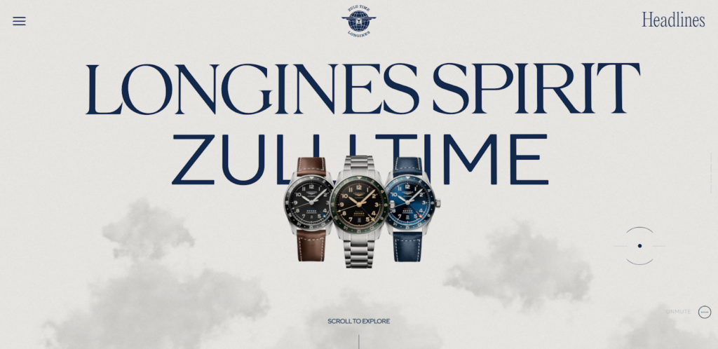
The homepage of Zulu Longines takes you on a horological journey, combining style and functionality in perfect harmony. The moment you arrive, you’re greeted by a stunning carousel of timepieces that showcase the brand’s stunning craftsmanship.
The clever use of interactive elements allows you to explore each watch’s complex details as if you were holding it in your hands. Zulu Longines’ homepage is a testament to their passion for horology, which leaves you yearning for that perfect timepiece to adorn your wrist.
4. Crate and Barrel
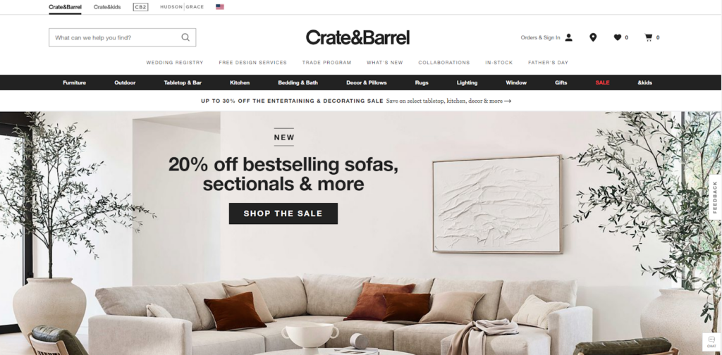
Crate and Barrel’s homepage is like a virtual interior design studio, offering a glimpse into a world of endless possibilities for creating your perfect living space.
The clean and contemporary design invites you to discover their extensive collection of furniture and home essentials. As you scroll down, you’re greeted with beautifully styled room settings that spark your imagination and make you envision your dream home.
5. Allbirds
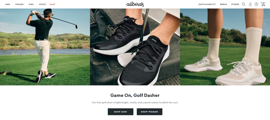
Embrace the simplicity and sustainability of Allbirds’ eCommerce homepage. Like a serene forest, it invites you to discover the wonders of nature-inspired footwear. The earthy color palette and nature-inspired imagery immediately convey their commitment to eco-friendly practices.
The homepage showcases their range of stylish and sustainable footwear, making you feel good about your fashion choices. Through clever storytelling and compelling visuals, Allbirds’ homepage invites you to join their mission of creating a greener future, one step at a time.
6. Nike
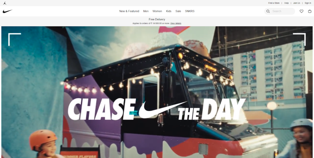
The iconic Nike homepage represents the spirit of determination and athleticism. It’s a powerhouse of energy and inspiration, featuring powerful images of athletes in action. The dynamic design and bold typography reflect Nike’s bold and relentless pursuit of excellence.
As you explore further, the homepage offers personalized product recommendations based on your interests and activities, making you feel like part of the Nike family.
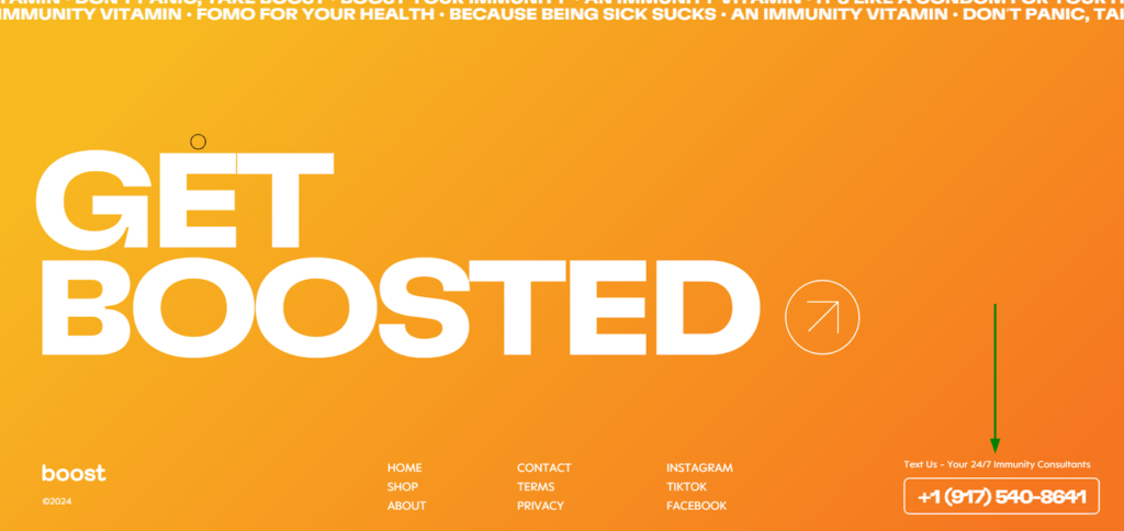
7. Boost
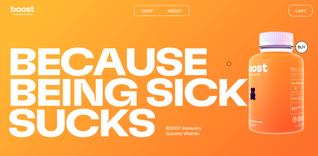
Get ready for an electrifying experience with Boost’s eCommerce homepage. The playful and colorful design instantly uplifts your mood and brings a sense of joy. The homepage showcases a wide range of health-focused products and nutrition tips, making you feel motivated to take charge of your well-being.
With interactive quizzes and engaging content, Boost’s homepage feels like your personal wellness coach, cheering you on as you strive for a healthier and happier lifestyle.
8. MindJournal
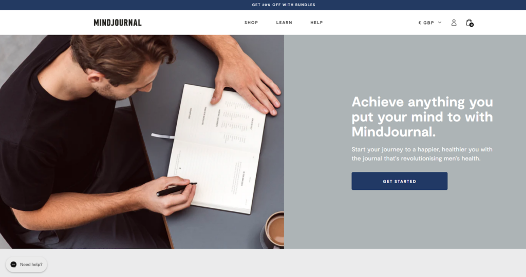
MindJournal’s homepage dives into the kingdom of mindfulness and personal growth. The serene and tranquil design sets the tone for self-reflection and inner exploration. The homepage offers a range of guided journals and resources that empower you to embark on a journey of self-discovery.
Through inspiring testimonials and thought-provoking quotes, MindJournal’s homepage invites you to prioritize your mental well-being and embrace a more mindful way of living.
9. Simply Chocolate
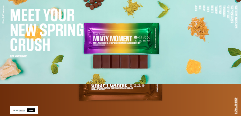
The rich and luxurious design instantly entices you with the mouth-watering imagery of artisanal chocolates. The homepage offers a curated selection of chocolate gifts and treats, perfect for any occasion.
With tempting descriptions and offers, Simply Chocolate’s homepage is a haven for chocolate lovers, allowing you to savor the sweetness and elevate your gifting game.
10. Vegan Essentials
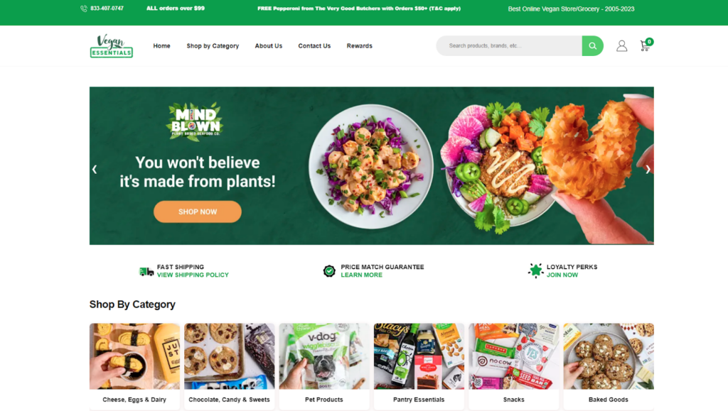
The vibrant and verdant design reflects their commitment to cruelty-free and sustainable living. The homepage showcases a wide range of vegan products, from food and cosmetics to clothing and home goods.
Through informative articles and recipes, Vegan Essentials’ homepage empowers you to embrace a compassionate lifestyle while satisfying all your needs. It’s a welcoming haven for vegans and anyone interested in ethical consumer choices.
Wrapping Up!
Thank you for reading! So, we’ve journeyed through the eCommerce homepage best practices for a seamless and exciting user experience. By following the best practices outlined in this chapter, you’ll be on your way to creating a visually appealing, user-friendly, and conversion-focused homepage.
From designing a captivating hero banner to telling your brand story and showcasing featured products, every element plays a role in engaging your visitors and driving them toward making a purchase.
Don’t forget to keep an eye on the latest trends and continuously optimize your homepage based on user behavior and feedback. The eCommerce world is ever-evolving, and staying ahead of the curve will help you stand out from the competition.
Now that you have all the knowledge and tools to enhance your eCommerce homepage, it’s time to put them into action. Go ahead, make those tweaks, and create a homepage that leaves a lasting impression on your visitors.
Good luck and stay tuned for the upcoming chapters!
