7 Ways To Impress Visitors Through Your Homepage

The window to impress visitors on your page is way too small. You have to give them at least one reason to stay on your page.
It’s only a matter of seconds when they will hit the search bar to look for your competitor or tap the back button and get out of the daunting experience.
So, you’ve got a small window of opportunity to showcase your product and make them aware of your services.
You may ask how small is big enough to grab their attention, and you’d be surprised to know that visitors deviate off from the pages in less than 2 seconds.
Since you’ve only got 1-3 seconds to prove that you are different from billions of web spaces, it’s apparently going to be a very tough ask.
And as the homepage is the most critical page since it constitutes 50% of the pageview— it automatically is worth your attention— the most.
Creating the homepage which matters.
You need to add certain elements in specific ways to make your homepage catchy, skimmable, and informative.
It begins by focusing on a concise copy.
1. To the point copy
Copy content creates the first impression of your brand, what you do, and what you have to offer your customers.
And it should be readable and shouldn’t deflect or distract users.
You want vital points to be skimmed, and there’s a possibility that your readers may miss them.
Different product or service require different explanations.
If you are targeting an audience which is well-updated with the gist of your product or service, you don’t have to scrabble unnecessary copies for spinning their minds.
Note: Your users only convert when you give them the clarity of thought. With mindless copies placed on your homepage, you will puzzle them more often than not.
If your service or good is less common, you need a bit more of an explanation than others; however, it’s essential that you don’t overdo it.
For example, take a look at Airtable— the collaboration platform— which explains the purpose of the service with a brief copy.
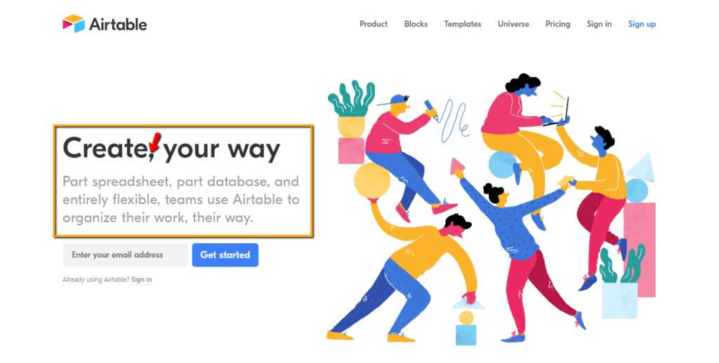
The page wants everyone to create their path.
Focus on the coma “,” in “create, your path.” It sounds like an emphasizing tone.
It neatly motivates the users for easing up the workflow with a cloud-based spreadsheet and database.
Similarly, Pandora— the exclusive jewelry makers— concisely catches users’ attention.
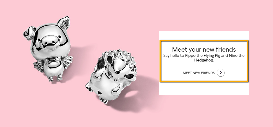
It’s nearly impossible for the visitors to bounce off because the message of the page is relatively understandable.
So, your dilemma should be clear while picking what suits the best for your homepage.
2. Invoke action by compelling elements.
You should confirm whether you want your website to generate leads and sales or if you are happy with the token of appreciation.
Ultimately, the motive of embellishing your homepage is to convert the users, and I don’t find any good reason to work on it only to get a positive reaction from the users.
No user comes to your page only to go back— the frame of opportunity lies entirely in your control.
Instead of turning them clueless on the page, intimate them their next step and what they will be doing in the next moment.
This brings call-to-action element in action as it’s the most significant component in your homepage, and compels them to act.
Take a look at how Slack accommodates call to action on their home page.
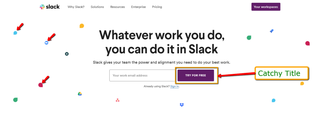
The purple color action button is in the different vibe of the white page, which easily let the users know: “something happens here.”
Furthermore, the wavy animation all around the page arranges a good-site view for the users.
Now take a look at how Google Doc introduces call to action buttons in their homepage.
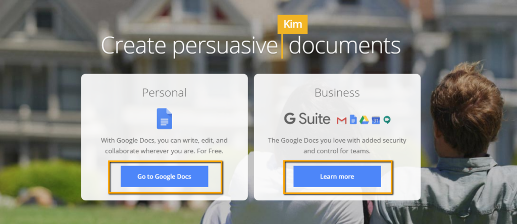
It has two call-to-action buttons, and both serve different purposes— one talks about entering into the Google Docs project, whereas the others speak about other business services from Google.
They have made clear that they don’t want to confuse the web visitors.
Hence, they give them the limited options to drive an action.
So, ensure that you aren’t giving a lot of CTA options to the users.
Our objective is to simplify user-experience and not complicate it.
On the other hand, you can be creative with multiple CTAs like Busuu as it offers the myriad of language courses to the users.
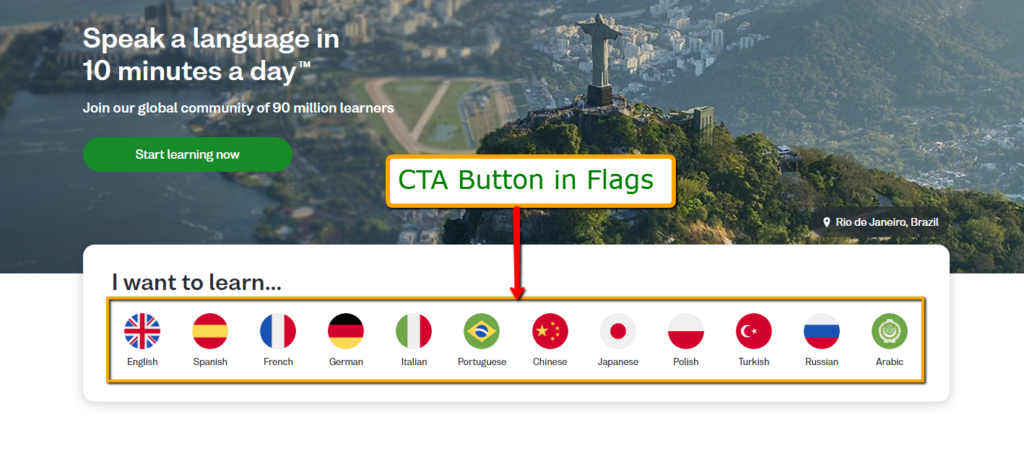
Since the homepage promises to deliver multilingual tutorials, it uses multiple buttons by draping them in official flags of the country.
These types of CTA techniques in Busuu defy all the rules of CTA presentation because offering multiple buttons meet the purpose of different people with different language orientation.
3. The placement of your headline.
Your headline deserves a placement which should easily bisect the reader’s vision.
It depends on the way we have been reading books throughout our lives.
Demography of the place plays a pivotal role in the placement of the headline.
If your target audience speaks English or any other language which is scripted from left to right, their brains develop a habit of reading the headline at either left or centered aligned.
It is why we probably roll our eyes from left to center on the computer or mobile screens.
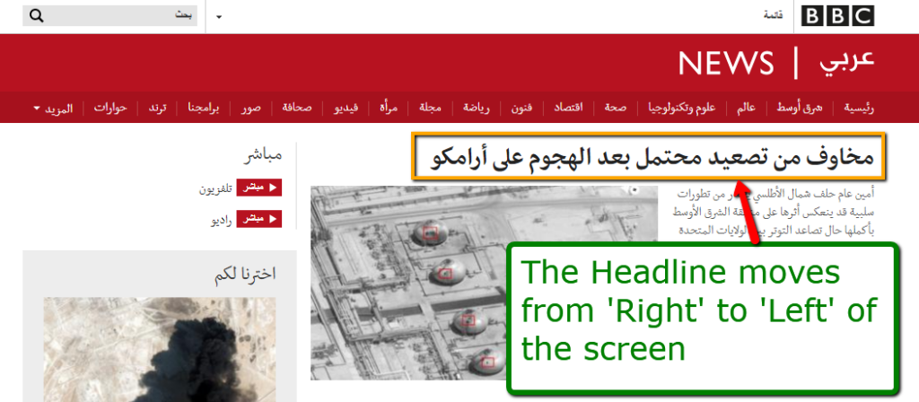
But in the countries of the Middle-East and African continent, the headlines are placed close to the left corner.
That’s because the native language users are programmed to read books which run texts and images from the left to the center.
Take a quick glance at how the Arabic BBC places its headline.
When it comes to headlines, Dropbox proves to us that we are in a time loop.
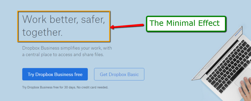
With the minimal aesthetic, bold headline, and contrasting background color; the cloud giant teaches us that simplicity drives conversion— pretty much the same ideology we had two decades ago.
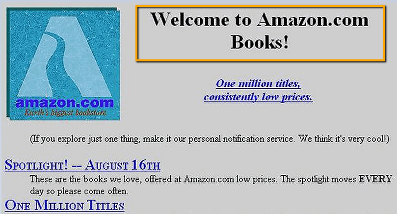
Here’s the simplistic approach from Amazon which has come up a full circle.
The simplicity effect theory also explains that balancing the headline with the minimal colorful graphics can reap the maximum returns.
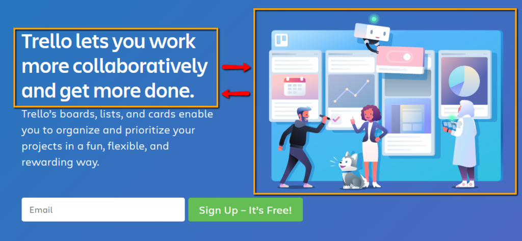
See how Trello amalgamates headline with the graphics— both compliment each other and one doesn’t dominate the second.
4. Stay great above the fold.
If you don’t know what is above the fold, hold your newspaper and watch the first page above the folding crease.
That’s content above the fold— and more importantly, that has the most prominent news of the day.
Similarly, the page above the fold is the area on the homepage before the user scrolls down.
It’s what they see when they first get into the page.
Hence, the onus falls on above the folded page to display the essence of your work, and what you offer to your customers.
It’s imperative for you to add the most compelling element on the top of the landing page because that’s the only way to drive readers to scroll down and learn more about your brand.
Pink Floyd’s official website is as classy and sassy as their music.
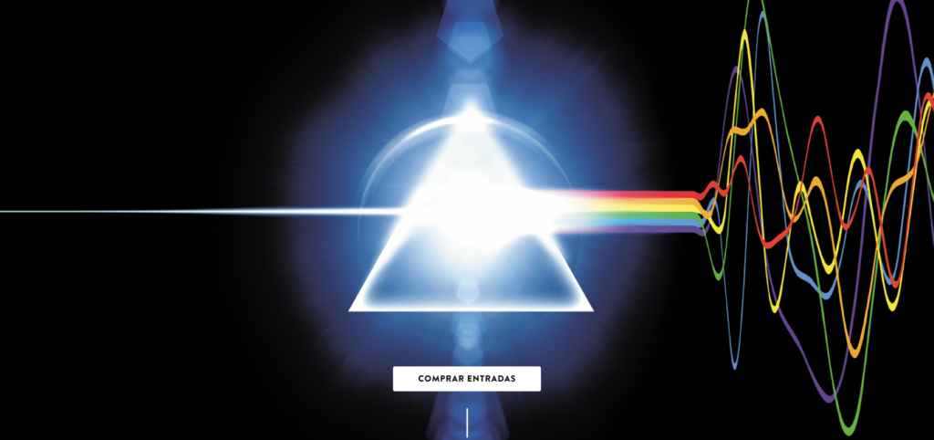
The landing portion displays the symbolic spectrum logo of the band which immediately creates homeliness among the fanbase, and then ushers them to the next official page through CTA.
Some above the page fold require more explanation than others; however, your fundamental profession should be reflected exactly on this portion.
Fitting the most compelling data doesn’t mean that you have to hotchpotch all your offerings in the fold.
Here’s a classic example of one of the translation companies which tries to accommodate maximum data in the minimum page space.
This is what users FEEL when they see an over-crowded above the fold page.
The small font-size challenges the visibility capabilities, and staves off the readers at the first go.
You may be inquisitive about how to fit multiple services above the fold— since all the services are essential.
In that case, you can put the ratings against all the services, and decide which should come above.
The online payment company such as PayTm neatly describes all the primary services with the graphics and captions without putting a lot of copy in the upper fold.
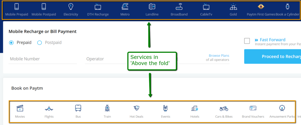
It’s a specimen which indicates that your homepage can run well without copy content.
Another way to fit multiple services on your homepage is by not fitting them at all.
Here’s how Palantir— a digital strategy provider offers various services and doesn’t mention any of them in the page.
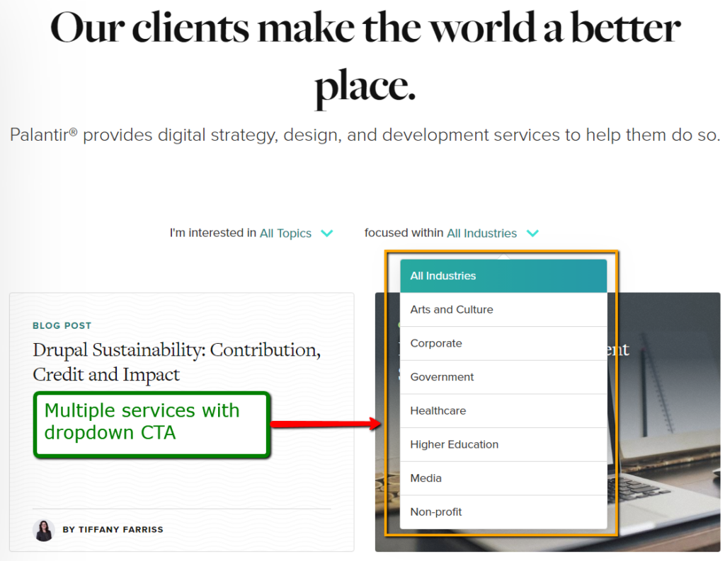
Instead, it uses quick drop-down CTA menus for filtering its services for the customers above the fold, and it’s doing relatively well in appeasing clients with a minimal but effective approach.
5. The unusual homepage.
While it takes a lot of courage to go for unusual homepage designs; the results may indeed come out to be very fruitful.
Usually, you’d see unusual home pages in the creative fields, and that’s why these pages have higher pageview time than the rest.
We shoot the bottles is one such photography company which dares to go for unusual homepage designing by adding horizontal scrolling components.
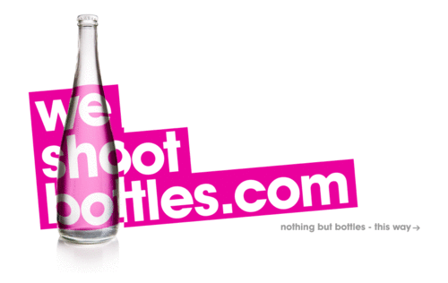
This way, it always stays above the fold, and readers feel that they are experiencing the seamless transition from left to right— more like a panoramic view.
Since desktop and laptop screens are rectangular; the users can grab more information while gliding from left to right without being felt discontinued or broken.
Your profession will demand a different set of creativity altogether on your homepage; hence, your designing team should have trailblazing ideas.
6. The graphics which catch eyes.
Until now, we have talked about copying and call to action because they are the two most essential components of any homepage.
And homepages can do tremendously well without graphics because creative copy and CTA can engage readers.
For example, The Minimalist— the graphic designing company— shows a short, crisp copy of their work and justifies itself for the namesake.
It works for these companies because their goal is to produce high-end results with optimal resources on the homepage.
But that doesn’t make graphics or videos less of an important component in attracting readers.
In fact, in some cases, graphics and videos work as effective as copy and CTA.
The eye-candy graphics can prove as a backup if your copy fails in creating the impression.
Akin to copy and CTA, graphics should clear the purpose of the readers.
It should be catchy and let the users know why are they here.
Moreover, the graphics and images of the picture should incite tangibility and the immersive environment if your brand sells palpable products— the products which your customers want to touch and feel before purchasing them.
Neverbland uses the wavy graphic which feels enthralling and immersive, and as soon as you enter into the service page, the graphical text blasts into the smokey air.
Although the brand is not selling tangible objects, the 3-D effect produces a novelty-effect.
By adding a dark yellow cup on the shaded 1 to 100 yellow background, MCD brings life into the cup, thereby giving a perfect graphical representation of their product.
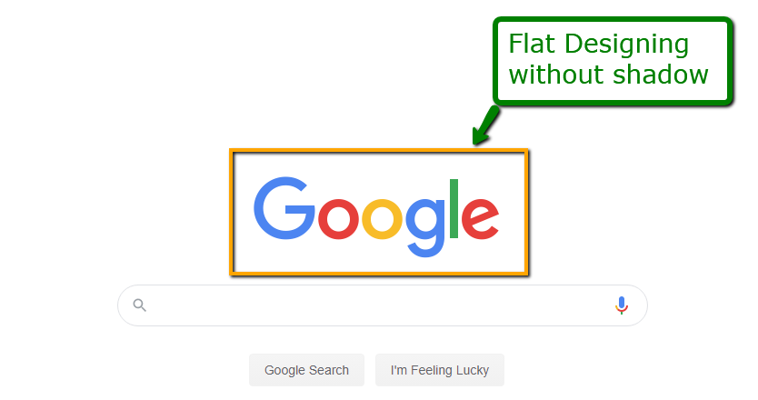
Take another close look at the page which almost every one of us sees— Google.
Although the brand is not selling tangible objects, the 3-D effect produces a novelty-effect.
The giant food-chain McDonald’s uses three-dimensional look-alike effect with the 2-D image.
By adding a dark yellow cup on the shaded 1 to 100 yellow background, MCD brings life into the cup, thereby giving a perfect graphical representation of their product.
Take another close look at the page which almost every one of us sees— Google.
Understanding the demand for minimal and utilitarian design, it uses flat designing technique rather than Skeuomorphic designs, which also amplifies the page performance.
This ends up creating rational conviction with a very little graphic on the homepage, and that’s probably because the big-set-ups don’t have to spend time explaining themselves.
7. Arrange all the elements with sufficient blank spaces.
Our brains work on the power-saving mode.
It wants to see and read the easily interpretable patterns.
As a kid, we all begin our learning with nicely-spaced graphics, alphabets, and numbers.
The reason is simple— we want our brain to focus on one thing at a time.
The blank or whitespaces in the page help the brain focus for a longer time.
Segregating graphics, copy, and other elements invoke a tidy feeling, which eventually leads to higher time spent on the page.
The truth with crowded content is that the more you add, the less the users comprehend.
Since blank spaces separate all the elements in the homepage, the users have a better chance of understanding the context of your page.
Adding whitespaces to your content also means that you will have less space to project your idea; however, whatever space you have, you should make the most of it.
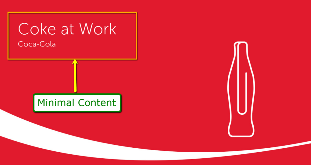
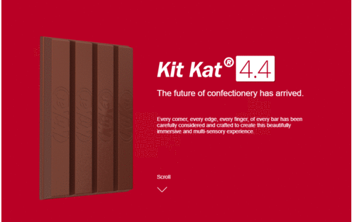
Here’s how Nestle KitKat uses spaces around all the elements to present their idea and manifests the complete eatery experience through the scrollable pages.
Other brands like Apple know that it’s about restricting the users to view the minimal aesthetic.
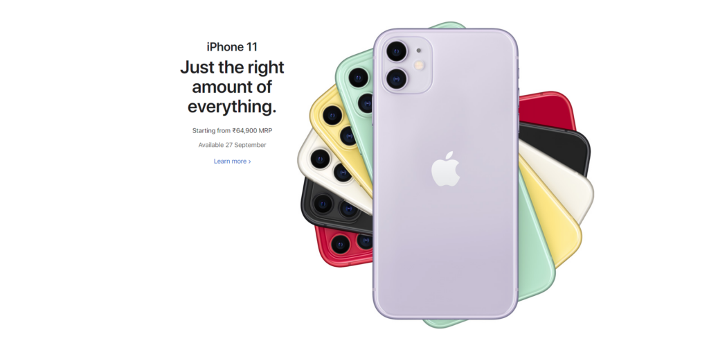
It wants readers to look through the latest iPhone inventions; hence, it understands that hiding other products are worth the risk.
The restriction stops the users from getting deflected because they’ve no option to diverge, more like serving a banana platter instead of mixed-fruit.
There has to be a change in thought school.
Instead of clinging to the idea that “content is king,” update it with “the limited content is king,” and add plenty of blank spaces in your homepage.
Conclusion
The elements in your homepage are the walls between a reader getting into your site or bouncing back by knocking your competitor’s door.
You have a very little time to prove your credibility, smartness, and uniqueness; and convince that your website deserves their attention.
Fortunately, with a little logical content and placement; you can grab user-attention on the homepage.
At this point in time, you can say to yourself— “alright, I have got their attention. Let’s pitch.” And if it’s still rocket science for you, we can assure it’s not that difficult. Our conversion-focused eCommerce designs are proof.


Post a Comment
Got a question? Have a feedback? Please feel free to leave your ideas, opinions, and questions in the comments section of our post! ❤️