
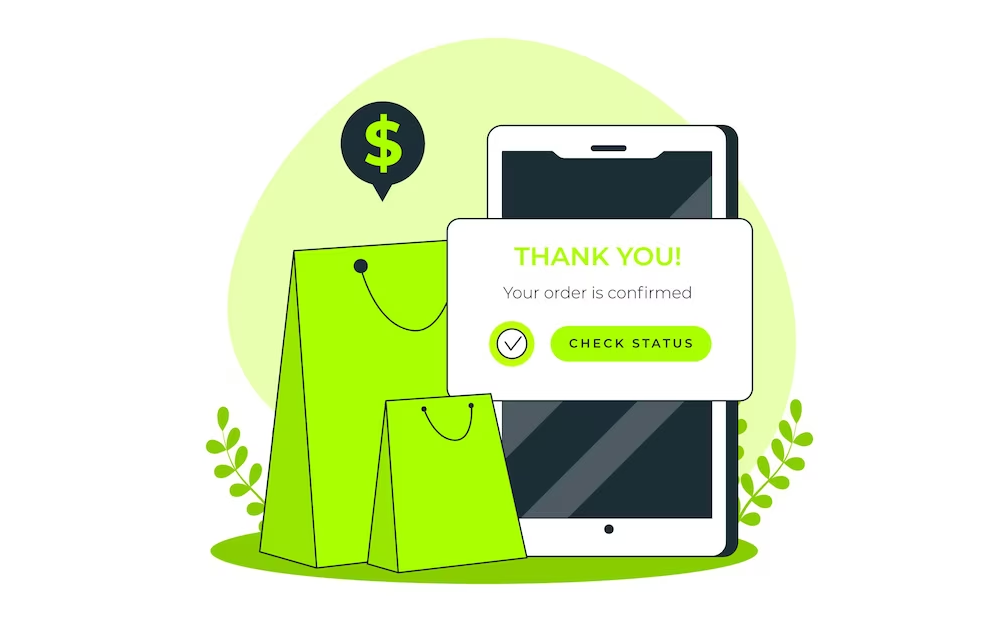
Congratulations, you’ve made a purchase!
I hope you get the hint. Yes, the final chapter of our eCommerce UX audit checklist guide is about thank you page UX optimization. In the previous chapter, we learned how to improve the checkout conversion process by optimizing the checkout page user experience.
Now, it’s time for the last step of the eCommerce shopping customer journey: — Thank you page or order confirmation page! The customer shopping journey may end here but not the customer shopping experience.
So, you need to optimize your thank you page to ensure a better user experience for your customers. And this article has everything you need to improve your thank you page.
Let’s begin then!
Why is UX Optimization necessary for Thank You Page?
What comes to your mind when you hear “Thank You Page”? Politeness, gratitude, or maybe just another generic page on the internet? Well, it’s much more than that.
In eCommerce, a Thank You Page is a page that appears after an online shopper completes a purchase. Its purpose is to express gratitude and give order confirmation.
Wait… there’s more. They can boost customer satisfaction, improve user experience, and provide opportunities for future sales.
Do you think, a 90% blank page with 2 lines of appreciation can do the same? No, it can’t.
That’s why you must have a well-optimized thank you page to see off to your incredibly valuable customers in a better way.
The next section will guide you on designing a great thank you page with all the key components.
What Makes a Good Thank You Page in eCommerce?
A great thank-you page not only expresses gratitude to your customer for choosing your store but this particular page also serves as a crucial opportunity to further engage and retain them.
Before you start optimizing the thank you page in your online store, you may want to know which components are important to build an effective thank you page.
Here are the key elements that make a good eCommerce thank you page:
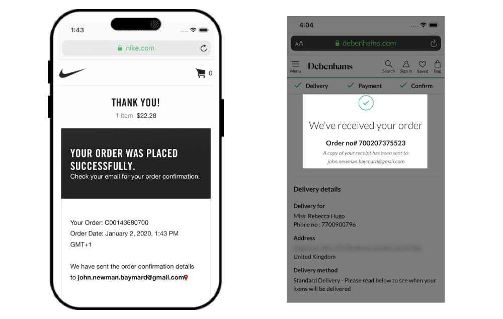
1. Order Confirmation with Appreciation
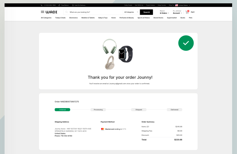
Source: Dribble
When clicking on the “Place order” button, the shoppers first want to see the order confirmation. It’s the virtual receipt that confirms their successful transaction and offers a sense of closure.
A well-crafted order confirmation section provides customers with a complete summary of their purchase, including order details such as:
- Order ID
- Product details
- Transaction ID
- Expected delivery date
- Order tracking option
So, place the order confirmation section at the top so that shoppers can find it immediately after the thank you page loads.
2. Feedback or Survey
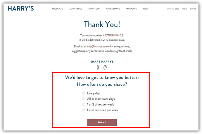
Source: Cloudways
Some shoppers actually seek to share more value of their shopping experience with the merchant —
- how was the checkout flow and the payment process?
- did they face any difficulty during their online shopping?
- how was the overall experience with the online store?
You can add a feedback or survey section on the thank you page to allow the customer to review the shopping experience – the good, the bad, and the ugly. It shows that you actually value their opinion and are looking to improve for a better user experience.
3. Email Subscription
Do you offer regular deals, new product launches, or price drop updates through newsletters or email marketing??
If yes, you can add the email subscription section here — on the website thank you page! This will help you gain new subscribers who can be convinced easily for a second purchase and many more.
4. Personalized Recommendation
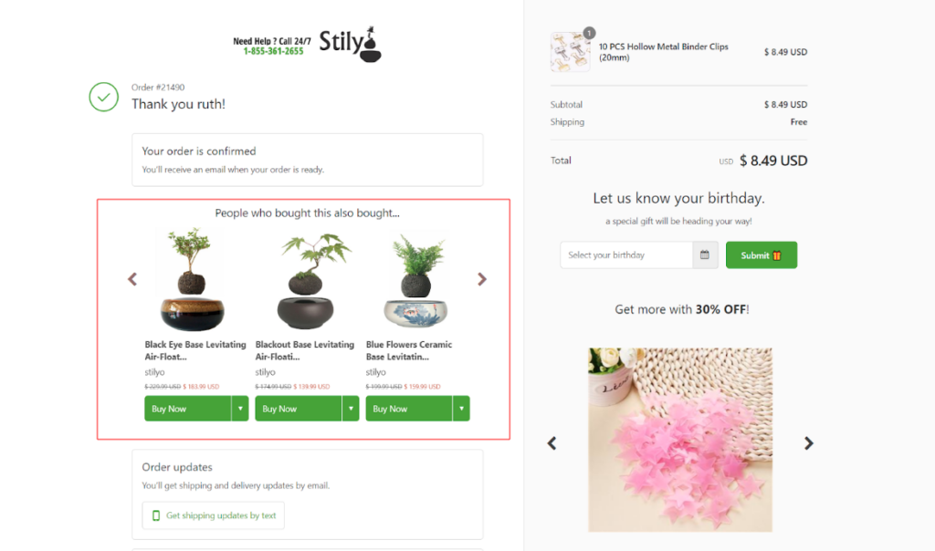
Source: Updimes
You might be thinking: what’s the point in upselling or cross-selling after a sale?
Some successful eCommerce merchants and experts believe: “It’s not always about the sales, it’s about the user experience!”
Imagine the shoppers land on the thank you page after just completing their purchase and find a curated selection of products that perfectly complement their recent buy. It’s like having a personal shopper who knows their taste inside out.
And what they will do with these recommendations?
Simple! If your shoppers really like the suggested products, they can either buy them immediately or save them on their wishlist for their next purchase. This will save lots of time and effort in finding these products next time they come to your store for purchase.
5. Exclusive Offers for Future Purchases
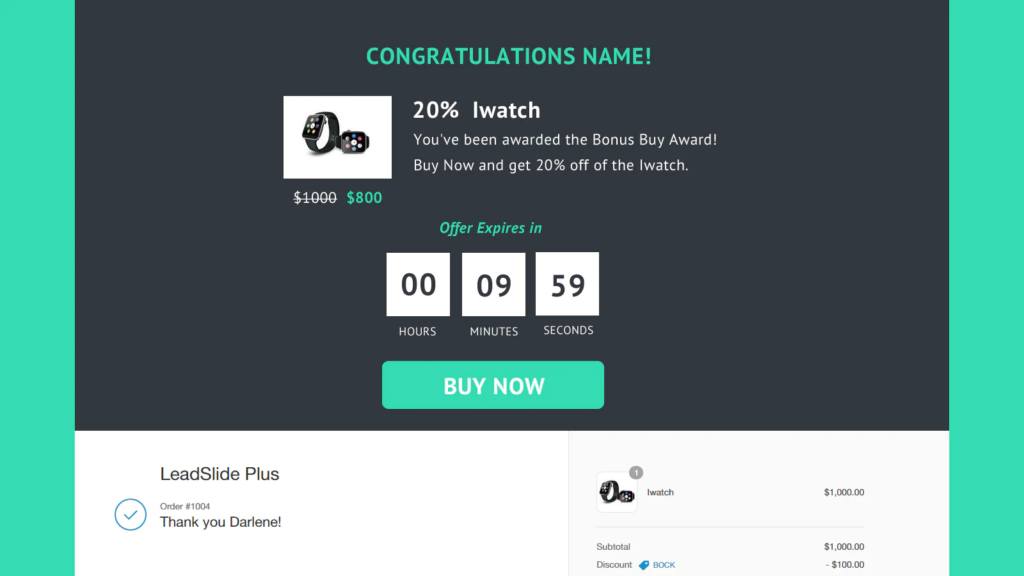
Source: Spotted
Want your shoppers to come back again and again?? That’s very easy.
Well, there’s always a reason behind every purchase. It can be anything like:
- Your shopper found your store trustworthy
- They got better deals on their purchase
- They want to try your products for a change
- They found your products cheaper than other brands, etc.
You just need to make sure your shoppers have a strong reason to come to your online store and purchase your products. And the after-purchase coupon codes can help you in conversion rate optimization!
You can place a coupon code on the thank you page for your shoppers that can tempt them to repeat purchases.
6. Return, Refund, and Exchange Policy
Do you think hiding the policy pages can prevent order returns or exchanges? No, it won’t. After every purchase, there are equal chances of:
- The order is delivered and “accepted” by the customers
- The order is delivered and “returned” by the customers
So, you have to be ready for both situations. Not every shopper is going to return your products. But they must be aware of your policies in case they genuinely don’t have any other choice left except it.
Placing the policy links straight on the thank you page will help them check out your policies and learn about the return or exchange process.
So, remember that the Thank You Page isn’t just a farewell. It’s an opportunity to leave a lasting impression, and to make your customers feel valued and cherished. And you just have learned how to craft a good thank you page.
The next section is equally important for you. Let’s move ahead!
Best Practices for Your eCommerce Thank You Page

Kudos! You’ve successfully navigated your customer to the checkout page. But, don’t stop yet.
A great post-purchase experience is crucial for customer satisfaction and retention. That’s why an optimized thank you page is just as important as the checkout process.
Here are the thank you page best practices that will help you improve the user experience:
Customize your Thank You Page Design
Customizing the thank you page design might be your last priority. But it’s the first thing your customers see after purchase that defines their post-purchase experience.
Does your existing thank you page design complements its purpose – thanking your customers and celebrating their purchase? It’s not just about aesthetics; it’s about functionality too.
Here’s what to make sure:
- Keep things elegantly simple
- Stick to your brand’s color scheme and typography
- Keep the design clutter-free and organized
- Incorporate whitespace for visual breathing room
The page design should be an extension of your brand’s identity, incorporating your logo, color scheme, and design elements. A well-structured page not only soothes the eye but also helps customers navigate effortlessly.
Make it Responsive for Mobile Shoppers
Source: Pagefly
Did you forget the mobile shoppers when designing the thank you page??
That’s not fair!
Mobile responsiveness ensures that your page looks and functions smoothly across devices. With a significant chunk of shoppers using smartphones, your page must adapt effortlessly to varying screen sizes.
Test the page thoroughly on different mobile devices to ensure that:
- page layout adapts seamlessly to various screen sizes
- menus transform into user-friendly icons
- buttons are easily tappable
- text remains readable without zooming
- images are appropriately sized and much more…
Preview your Thank You page on various devices – iPhones, Androids, tablets. Thus, prioritize a seamless experience for mobile users to prevent frustration and encourage repeat purchases.
Include Order Summary and Tracking Details
No doubt your customers will receive an order confirmation mail with all the relevant content. But it doesn’t mean your thank you page cannot contain the order details.
So what you can do is –
- Order confirmation with the order number.
- Display the items purchased, quantities, prices, and any discounts applied.
- Option to download or print the payment receipt.
- Offer an order tracking link that takes them to a tracking page.
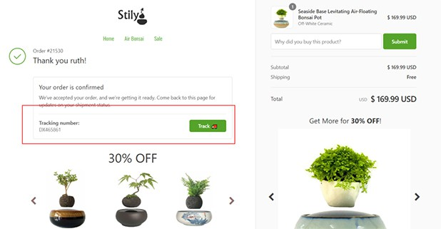
Source: Prisync
The post-purchase anxiety (to get the order delivered) is real, and order summary and tracking details can soothe those nerves.
Add Personalized Message
Don’t forget – Thank You page transforms from a static confirmation to an engaging experience that keeps customers invested in their purchase.
And to foster great experiences, personalization is a necessary element. A personalized message adds a human touch that can turn a routine interaction into a memorable experience.
Your thank you page may have something common like this:
- “Thank you for the order!”
- “Thanks for choosing us!”
Instead, you can add a little personalization by adding customer names or order details.
Want some examples of personalized order confirmation?? Look below:
- “Hey [Customer’s Name], your [Your Brand] order (#23456) is like a shooting star – heading your way!”
- “Cheers, [Customer’s Name]! Your goodies, including [Product Name], are in motion. We’re as excited as you are!”
- “Thanks, [Customer’s Name]! We’ve packed your order of [Quantity] x [Product Name] with extra care and enthusiasm. It’s on its way to you, creating smiles every step of the journey.”
Keep Call to Action (CTA) “Above the Fold”
Do you want your shoppers to take the next step??
For that, you must have the action ready on the first fold of the screen (that visible screen area before scrolling). Placing CTA above the fold will optimize its visibility and ensure that customers can’t miss the desired action.
By the way, there are various CTAs you can use on the Thank You page to guide your customers toward valuable actions.
Here are some examples:
- Account creation – Encourage customers to sign up who used guest checkout for their purchases.
- Continue Shopping – Encourage customers to explore more by inviting them to continue browsing your products.
- Share Your Purchase – Invite customers to share their recent purchases on social media.
- Join Our Loyalty Program – Encourage customers to join your loyalty program to unlock exclusive benefits, rewards, and discounts for future purchases.
- Refer a Friend – Invite customers to refer their friends to your store and offer them rewards or discounts in return.
- Subscribe to Newsletter – Encourage customers to subscribe to your weekly newsletter to receive updates on new products, promotions, and more.
- Write a Review – Ask customers to leave a review for the product they purchased.
- Follow Us on Social Media – Invite customers to follow your social media accounts to stay updated on your brand and share social proof.
- Contact Customer Support – Invite customers to contact your customer support team in case they have any questions or issues.
- Explore Similar Products – Suggest related or complementary products based on the customer’s purchase.
Whichever CTA you are adding to your Thank you page, your CTA should stand out visually. Use contrasting colors, bold fonts, or buttons to draw attention to it.
Your Thank You page is the final impression your customers have after a transaction. Follow the best practices to make it an experience that leaves them not just satisfied but excited to engage with your brand again.
5 Best eCommerce Thank You Page Examples
Here are five examples of well-designed eCommerce Thank You pages that effectively enhance user experience and engagement:
1. Crate and Barrel
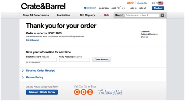
Source: StableWP
Crate and Barrel is known for its sophisticated and stylish home goods. Their eCommerce thank you page reflects these qualities through a combination of design and functionality.
Not only do they express gratitude for the purchase, but they also provide tools for:
- customers to manage their orders,
- learn about their return options,
- share feedback, explore related sites, and
- get in touch with customer support if necessary.
By including these features in their Thank You Page, Crate and Barrel is creating a comprehensive post-purchase experience.
2. Book Depository
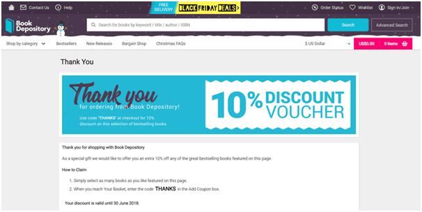
Source: StableWP
Book Depository’s Thank You Page focuses on building customer loyalty through exclusive offers.
By featuring the post-purchase offers and guiding customers on how to claim them on their next purchase, the brand is effectively nurturing repeat business. This approach is combined with a thank you message and possibly an opt-in to order summary, ensuring customers have relevant details readily available.
3. Best Buy
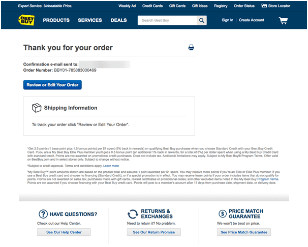
Source: StableWP
Best Buy’s Thank You Page is designed to provide customers with essential information and resources related to their purchase.
The placement of order details and shipping information ensures clarity. And the links to the Help Center, return and exchange policies, and price match guarantee demonstrate the brand’s dedication to customer satisfaction.
4. Hello Matcha
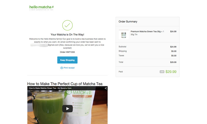
Source: CXL
Hello Matcha’s Thank You Page likely mirrors the brand’s identity, using vibrant green colors related to matcha products.
In addition to expressing gratitude, Hello Matcha includes recipe tutorials involving their matcha products on the thank you page. This guides matcha beginners and encourages customers to experiment with new recipes.
5. Glossier
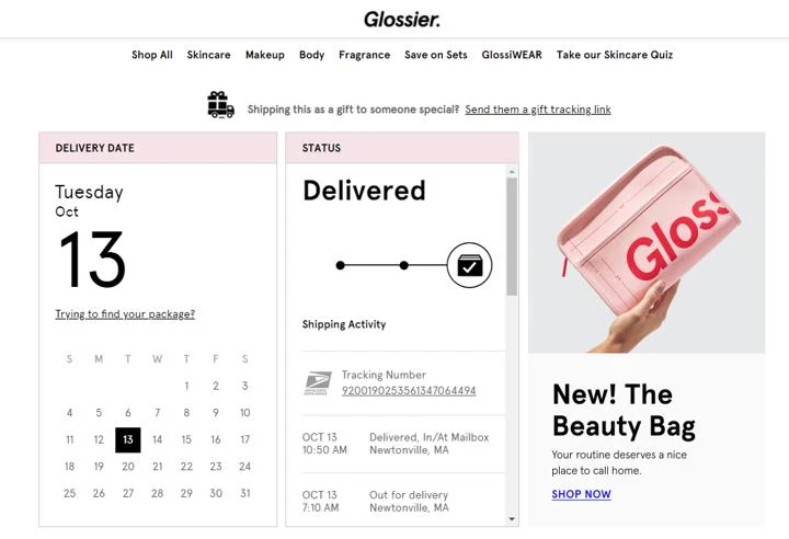
Source: Wonderment
Glossier has a well-thought-out Thank You Page that goes beyond the basic acknowledgment of purchase.
The tracking graphics add visual interest and excitement to the order-tracking process. The recommended products not only encourage continued shopping but also showcase the brand’s understanding of individual preferences.
Offering a link to a shipping FAQ page is a brilliant idea. It demonstrates Glossier’s commitment to transparency and customer support.
Wrapping Up!
In the end, I would like to say…
Don’t underestimate your thank you page! It’s your bridge to lasting customer relationships and continued success in e-commerce. Crafting a Thank You page that aligns with your brand’s voice can create a positive experience.
Make your Thank You page a conversion-driving, satisfaction-boosting machine by applying the best practices outlined in this chapter.
So, this is the end of our eCommerce UX audit guide!
One of the things you might have noticed about eCommerce is that this field is constantly evolving; what works today might be entirely irrelevant tomorrow. And that’s why it’s essential to keep up with the latest eCommerce trends and practices.
Hope this series helped you understand the importance of eCommerce UX design. In case you have any questions, please feel free to contact our eCommerce experts with decades of experience!
