
As we all know, after the shopping cart comes the checkout page!
In the same way, we are here with a new chapter of our eCommerce UX audit checklist guide—Checkout page UX optimization!
Did you miss the previous chapter? It was regarding how to optimize the shopping cart UX. Now, in this chapter, we will concentrate on checkout page UX optimization.
If you’re not sure about your existing checkout page, spare a few minutes to dig into it. At the end of this guide, you will be able to clear some major doubts like:
- Why are online shoppers leaving your checkout page?
- Whether your checkout is confusing or overwhelming?
- What’s affecting the user experience of your checkout page?
- What are the areas to focus on to improve its usability?
- How exactly your checkout flow should be?
So, let’s get ahead and learn how to improve the checkout experience for your online shoppers.
Why is Checkout Page UX Optimization Important?
Do you think prevention from shopping cart abandonment will get you 100% conversion? Sadly, NO! As an eCommerce merchant, you don’t have such control.
After reaching so close to the purchase, you may not want your shoppers to back off from the checkout process. But do you know what exactly causes this?
The reason behind checkout abandonment could be any of the following:
- lengthy checkout process
- too many data entries
- high shipping costs or other hidden costs
- payment insecurities
- mandatory account creation
- confusing checkout flow
- slow loading checkout page
and many more… So, to overcome these shopping challenges (or you may also call “poor experiences”), you must have a well-optimized checkout process.
Wondering what makes a good checkout page with a streamlined process? Let’s go ahead and uncover this!
Ideal eCommerce Checkout Process
Hitting the “Proceed to Checkout” button will take the shoppers to your checkout page. Now it’s totally up to your checkout process to take them to the order confirmation page (also known as thank you page).
Is your current checkout page failing the same???
Don’t worry! We will learn the complete checkout flow here which will help you optimize the user experience.
So, let’s start then!
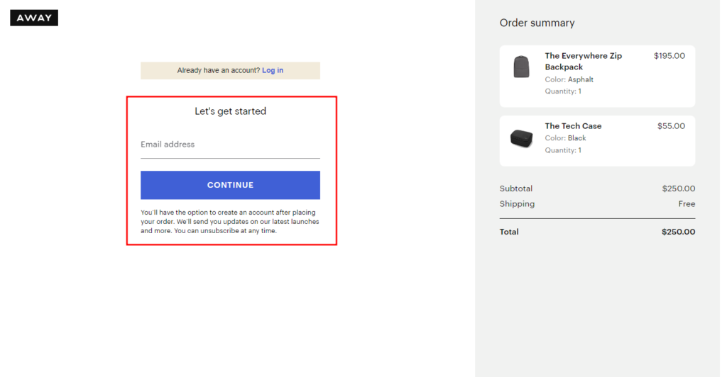
Step 1: Login/Register or Guest Checkout
Well, the very first step after landing on the checkout page should be offering the account creation, login, or guest checkout option.
The shoppers already registered at your eCommerce website can log in to their account to proceed with a faster checkout experience.
For new visitors or those who prefer not to create an account, you can offer a guest checkout option in your eCommerce store.
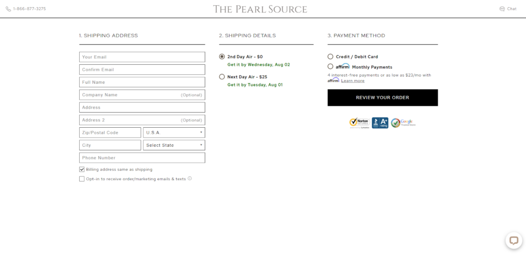
Step 2: Shipping Information
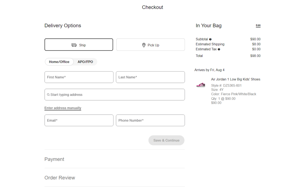
Next, you can ask your shoppers where they want their orders to be delivered.
Here’s how it should be:
- For guest checkout, first-time customers will enter their shipping address and contact details.
- For logged-in users, offer their saved addresses (if available) to choose from or let them add a new shipping address.
- Offer a checkbox to use the billing address as the shipping address.
- Allow them to select their preferred shipping method (e.g., standard, express).
Finally, you can show up the shipping details (estimated delivery times and costs) based on the selected shipping options.
Step 3: Payment Information
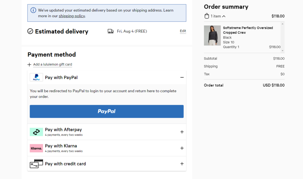
Now, time to get the payment details from the shoppers. You should offer commonly used and trustworthy payment options (PayPal, Google Pay, Apple Pay, etc.) to your checkout page so that they can find it secure and convenient for their transactions.
The shoppers will choose the suitable payment option and enter the payment details to place the orders. It’s important to show the
Step 4: Order Review
You should always ask for confirmation before they take the final step! It will make your customers feel more valued and protected.
I mean you can display an order summary with product details, quantities, prices, shipping costs, and total order amount to review and edit their order details before the purchase.
Step 5: Final Purchase
Once they’ve done the final check, they can click the “Place Order” or “Complete Purchase” button to finalize the transaction.
A loading or processing indicator should be there to assure the shoppers that the order is being processed. Then, you can redirect them to the thank you page and give them order confirmation.
Isn’t it simple? This way you can set up a well-structured checkout process for your customers. But that’s not enough. There are more areas that you need to optimize for better usability of your checkout page.
Let’s check ‘em out in more detail, shall we?
Checkout Page Best Practices for Better User Experience
Better checkout = better conversion
As experts in eCommerce web design, development, and UX (user experience), we know exactly how to optimize a checkout page design in order to maximize sales.
Here are 10 actionable tips for your checkout page UX optimization:
1. Enable Guest Checkout
Suppose a customer walks into your store, picks up some cool items, and just as going to pay, you ask him to fill out a lengthy registration form. Who needs that kind of commitment at checkout?
Same way eCommerce merchants should not keep forced account creation for purchasing online. To make our customers feel like VIP guests, you need to offer them the freedom of guest checkout.
When designing our checkout page, display the “Guest Checkout” option. Make it a breeze for visitors to complete their purchases without the hassle of creating an account.
2. Maintain a Single Page Checkout Process
When your customers are just one step away from their purchases, and then they’re thrown into a never-ending maze of pages. Is it enough to disappoint them???
Research says 17% of shoppers leave the site because they find the checkout process too long and confusing. So, try to keep it swift and smooth with a one-page checkout.
Also, add a progress bar, steps, or stages to guide them with the checkout progress, and they’ll be cheering as they cross the finish line as soon as possible.
Remember, keeping it all in one place is the secret to ‘checkout success’!
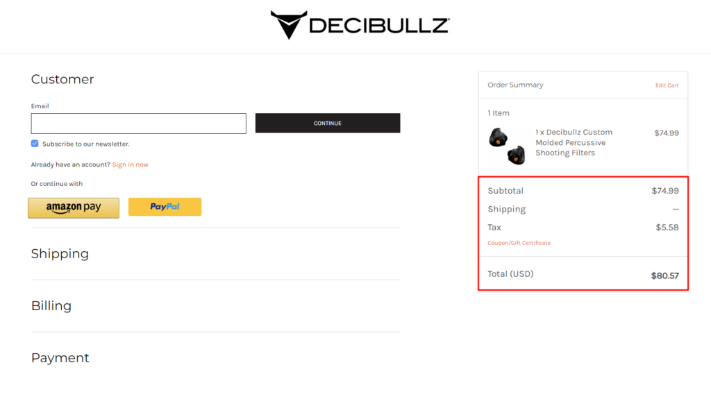
3. Display the Order Summary
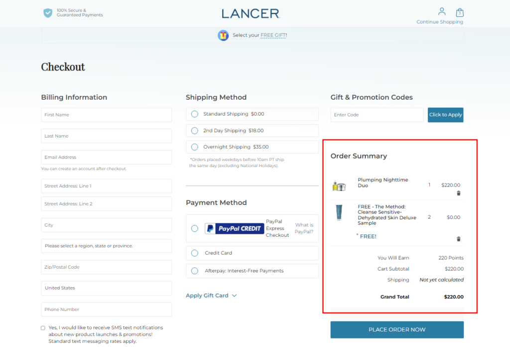
Transparency is the key to any great relationship – even with our customers! Your customers need a little reminder of the amazing choices they’ve made.
A dash of order summary at the checkout page makes them informed and attentive to the products they are going to purchase.
Design an eye-catching order summary section with details like product names, quantities, prices, and any discounts applied so they can double-check and feel the excitement!
4. Avoid Unexpected Costs
Surprise expenses may work for birthdays, but not during checkout! You may not believe but hidden costs can lead to cart abandonment.
So if you don’t want to lose your shoppers, make sure you show all the costs – taxes, shipping fees, any extras. Make it crystal clear from the start, so there are no surprises.
Happy customers are those who know what they’re paying for!
5. Streamlined Checkout Form
Filling out long forms can be a mood spoiler for your shoppers and kill their shopping excitement. So, what’s the solution? Here it is…
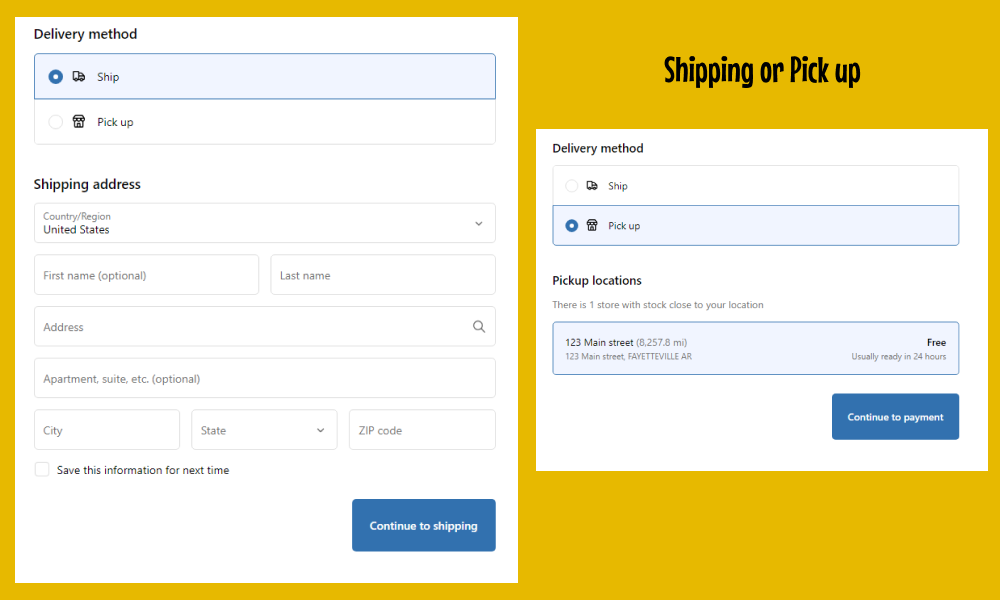
Simplify the checkout form and ask only for the essentials like:
- Contact details (Email or mobile number)
- Delivery Method (Shipping or pick up)
- Shipping address (Name, address line, city, state, country, and ZIP code) if the “shipping” option selected
For the pick-up option, you need to offer them the locations from where they can get their package.
You can also implement the smart auto-fill feature for speedy data entry.
6. Support Multiple Currencies and Payment Options
Can you afford to lose your customers just because they have different payment choices?
No, right? Offering multiple currencies and payment options is like opening doors to a shopping world without borders and inviting shoppers from all corners of the world!
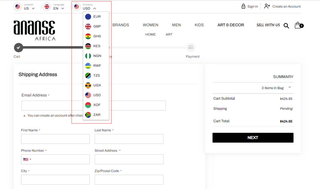
You can utilize a currency convertor, just like one of our clients, Ananse implemented in their eCommerce store. If you want to add exact or similar functionality without affecting your website performance, we can help you with that. Get in touch with our eCommerce experts!
Don’t forget to offer multiple payment methods to your shoppers for more conversions.
7. Optimize for Mobile Shoppers
Don’t forget, it’s the age of M-commerce—shopping with thumb-scrolling!
So now it’s time to optimize for those tiny screens with responsive design, big buttons, and easy navigation.
Utilize responsive design elements to ensure a seamless checkout experience on mobile devices. Enlarge those buttons and streamline the process, so your thumb-tapping shoppers can checkout within seconds.
Also, check the speed and performance of the mobile checkout page and optimize them if required.
8. Incorporate Trust Seals
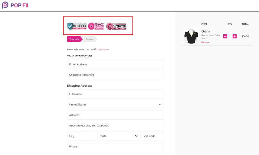
Can you believe, 18% of potential customers back off from the purchase process because they don’t trust ecommerce stores with their payment details?
No doubt, you have excellent products and great discount offers for your shoppers. But all of these will get wasted if they don’t trust you.
Place recognizable trust seals and security icons prominently on your checkout page. Your shoppers need to know they can trust your online store with their hard-earned money.
9. Ensure Easy Access to Customer Support
“Being there for your customers when they need help” can surely turn them into your loyal customers.
How about a friendly “Need Help?” bubble appears on our checkout page? You can offer various ways to reach out — from a quick chat with our support team to contact info for all the queries.
Also, you can offer a link to your help desk or knowledge base for all the common queries your shoppers can have regarding orders, policies, and more.
10. Utilize Exit Popups
Do you think, even after all the optimization, the shoppers may abandon the checkout process?
Don’t worry! A perfect offer can help you change their mind. And that, you can show them using ‘exit popups’ exactly when they are about to leave your online store.
It could be a limited-time discount, free shipping, or a surprise gift just for them by saying, “Wait, there’s more!” These exit popups are like little invitations trying to bring them back for completing the shopping.
These eCommerce checkout best practices help you can convert your non-performing checkout page to a high-converting checkout page.
Now let’s witness some of the best e-commerce checkout examples to get real-time inspiration.
10 Best eCommerce Checkout Page Examples
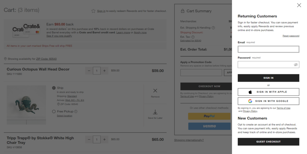
1. Crate and Barrel
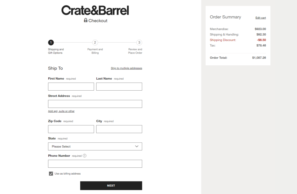
Crate and Barrel is a well-known furniture and home decor retailer, and their eCommerce checkout page sets a great example for a smooth and user-friendly experience. The checkout process is kept simple, with a clean design that guides the user through each step.
They offer a guest checkout option, allowing customers to complete their purchases without the need to create an account. This reduces friction and encourages more conversions.
The single-page checkout layout ensures that customers can view all the necessary information in one place, including shipping details, payment options, and order summary. They provide a clear outline of the checkout process, informing users about the steps they need to take to finalize their purchase.
2. Jollyes
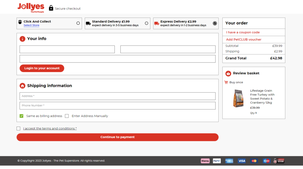
Jollyes, a popular pet supplies retailer, excels in providing a seamless checkout process for its customers. Their checkout page is designed with pet owners in mind, ensuring that the experience is convenient and efficient.
The checkout process is optimized for mobile shoppers, allowing shoppers to make purchases on the go with ease. Jollyes supports multiple shipping options along with pricing and expected delivery dates at the top of the page.
To reassure customers, Jollyes integrates trust seals and secure payment logos on their checkout page. These seals indicate that the website is secure and that customer data is protected during the transaction process.
3. Vegan Essentials
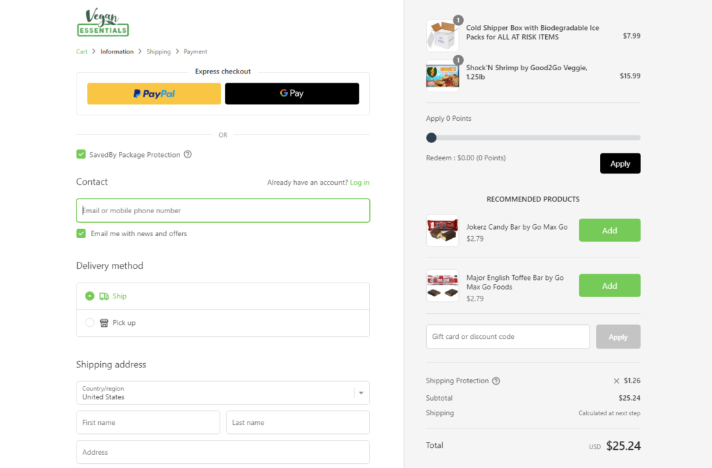
Vegan Essentials, an online vegan store, focuses on providing a hassle-free buying process for conscious shoppers. They enable smart form filling, where essential information is automatically populated for returning customers, speeding up the checkout process significantly.
Vegan Essentials also offers product recommendations on the checkout page to add the products effortlessly without going back to the category pages.
4. Marmot
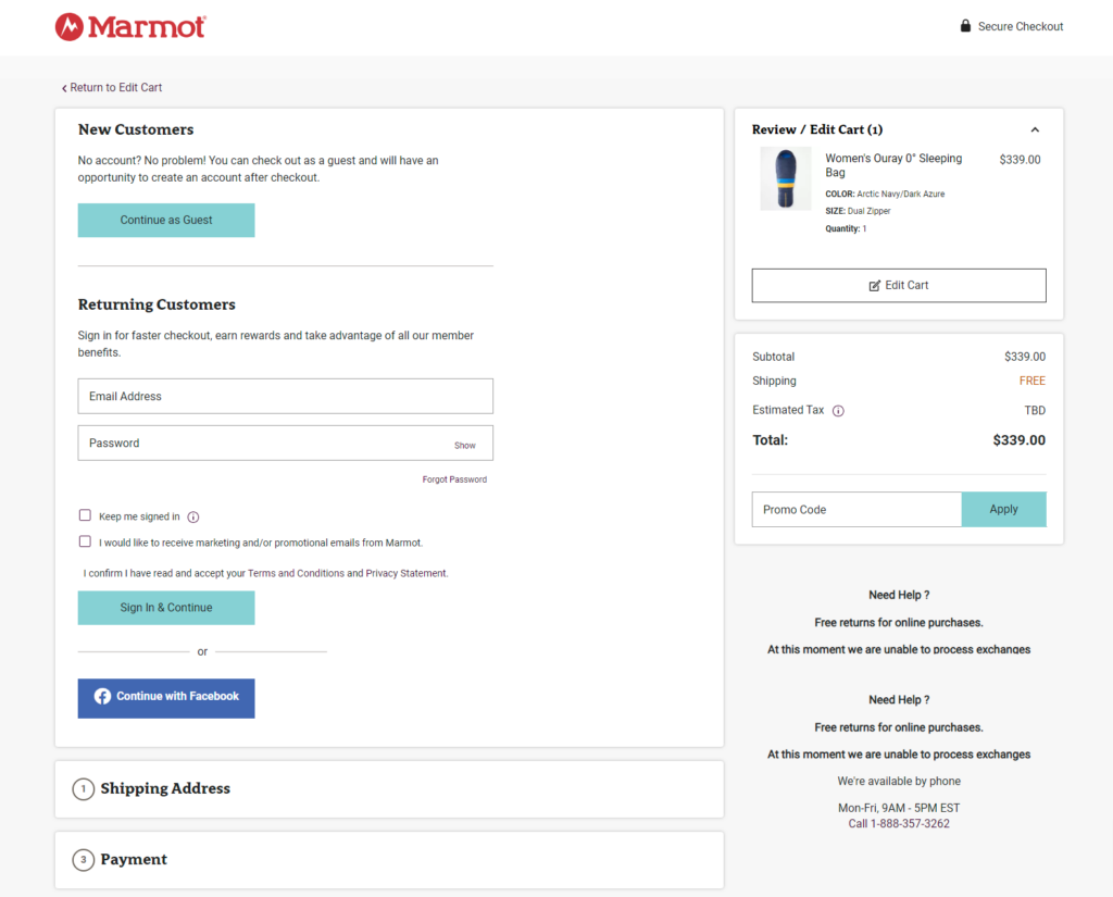
Marmot, a well-known outdoor apparel and equipment brand, showcases an exemplary mobile-optimized checkout page. Given that many outdoor enthusiasts may be shopping from their smartphones while on the go, Marmot ensures that the checkout experience is smooth and easy to navigate on small screens.
Marmot also makes customer support easily accessible during the checkout process. They provide a quick customer support contact number and ensure that shoppers can seek assistance whenever needed.
5. Ritual
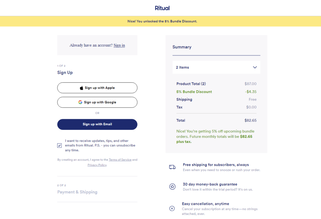
Ritual, a popular health supplement brand, sets an example of a visually appealing and user-friendly checkout page. Their design is sleek and minimalist, with a focus on guiding the customer through the checkout process effortlessly.
Ritual offers a guest checkout option, making it convenient for first-time customers to make a purchase without having to create an account. However, they also provide an option for potential customers to create an account or log in for a faster checkout experience in the future.
6. MeUndies Inc.
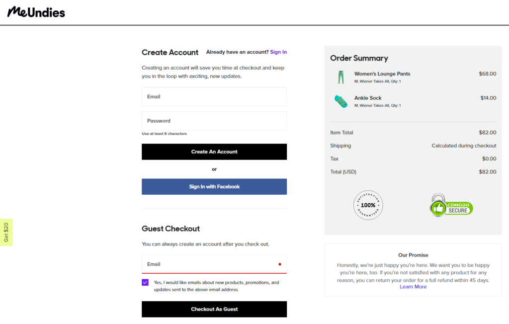
MeUndies offers a guest checkout option, allowing shoppers to complete their purchases quickly without the need to create an account. However, they also provide the option to create an account or sign in for a more personalized experience in the future.
The checkout process is designed to be simple and intuitive, with a single-page layout that displays all the necessary information in a concise manner. Customers can easily review their order details, shipping information, and payment options before finalizing their purchase.
To build trust with their customers, MeUndies includes trust badges and security icons prominently on their checkout page.
7. Casper
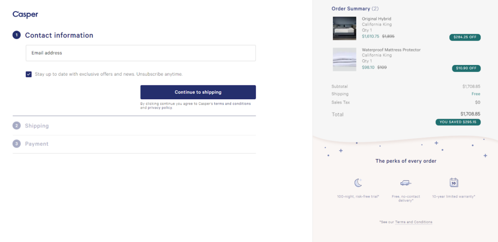
Casper is a renowned mattress and sleep products company that prioritizes a seamless and pleasant checkout experience for its customers.
Casper boasts an accordion-style checkout design with a clean and minimalistic layout. Casper’s checkout process is also optimized for mobile shoppers, ensuring a smooth and responsive experience for customers using smartphones or tablets.
In addition to clear pricing and shipping information, Casper’s checkout page emphasizes transparent store policies.
8. Lululemon
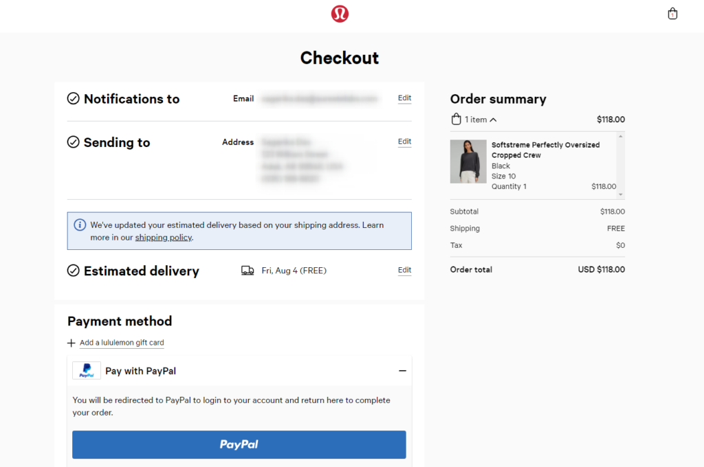
Lululemon offers a seamless checkout experience for fitness enthusiasts and fashion-forward shoppers alike. Their checkout page reflects the brand’s aesthetic, emphasizing a clean and modern design.
Customers can easily complete their online shopping from their smartphones while on the move, enhancing convenience and accessibility.
Lululemon showcases an order summary on their checkout page, giving customers a clear overview of their selected items, prices, and any applicable discounts. This allows customers to review their choices before making the final payment.
9. Bellroy
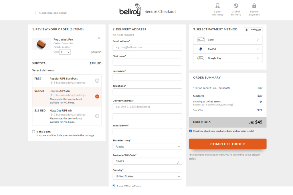
Bellroy, a renowned brand specializing in premium wallets and accessories, showcases an exceptional eCommerce checkout page that prioritizes customer convenience and trust.
By presenting all the necessary checkout elements on a single page, Bellroy eliminates any friction that might arise from multi-page checkout.
In addition to its user-friendly layout, Bellroy strategically displays unique selling points (USPs) during the checkout process. These USPs serve as persuasive elements to encourage customers to finalize their purchases without hesitation.
10. Black Star Pastry
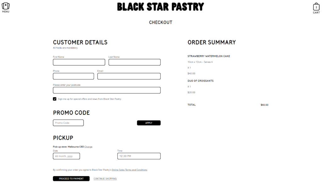
The checkout page of Black Star Pastry is a seamless extension of the bakery’s overall brand aesthetic and values. The design elements and color scheme align perfectly with the rest of the website which creates a great shopping experience for customers.
The detailed order summary displays all the items they have chosen, along with their individual prices and quantities. This breakdown allows customers to review their selections, ensuring that they have everything they desire before finalizing their purchase.
Quick Recap!
This chapter uncovers the secrets of crafting a seamless and pleasant checkout experience for eCommerce websites. We’ve shared some best practices that are aimed at optimizing the user experience on your checkout pages and ensuring customer satisfaction.
So, we are about to end this chapter. Before that, let’s take a quick look over what we’ve learned in this chapter:
- Keep the checkout process simple and efficient, with all essential information on one page.
- Offering multiple payment options and supporting different currencies will widen your sales horizons.
- Assure customers that their sensitive information is safe during transactions.
- Provide easy access to customer support options, such as FAQs and contact information, to assist customers during checkout.
- Ensure transparency with clear order summaries and pricing to create a positive checkout experience.
Hope this guide helped you transform your checkout process and improve your conversion rate. Couldn’t get any answer? Feel free to share your doubts with us in the comment box.
