
Welcome to the first and most important step of the eCommerce UX audit checklist—the “General best practices” to conduct a preliminary eCommerce UX audit to improve the overall user experience of your online store. Here we will focus on all the areas that come first in the interactions of your store visitors.
Before we start, note that the “General UX audit” is a part of the “Complete eCommerce UX audit” which covers all the primary elements of the site that builds the user’s trust in your brand.
People who regularly keep purchasing online are PRO Shoppers! And, I’m one of them. They can analyze at first glance whether the site they’ve landed on for shopping is trustworthy or not.
What does help them analyze the site too fast? Yes, it’s “user experience”! So, to make your eCommerce website appropriate for these shoppers, you have to work on the key areas that help you create their first impression.
The purpose of this guide is to give you the answers to the questions given below:
Which key areas can make or break your site’s first impression for visitors?
How to analyze whether any important elements are missing or not?
What improvements are required to ensure your site survives in the first-sight evaluation?
Shall we begin the guide??? Let’s go!!
Preliminary eCommerce UX Audit – Why it is necessary?
The overall performance of an eCommerce website can have a significant impact on the success of your online business. Performing a preliminary or basic eCommerce UX audit is important for several reasons:
First things first
Identifying the UX issues for your entire site can take days but resolving them can take months—depending on your store size!
No, I don’t want to demotivate you by saying “A complete eCommerce UX audit can be time-consuming”. It is compulsory for every website. But can you afford to lose your visitors and brand credibility for months (until your website is fully optimized)?
I know your answer is NO! So, the solution is to undertake the quick eCommerce UX audit in agile methodology. Here, the preliminary UX audit will only focus on the key areas in your site that are most important to catch the user’s eyeballs or build trust in your brand.
Identify the website’s usability issues

Do you know what frustrates your shoppers when they visit your eCommerce site? It’s difficult to say until you browse your website from your shoes and identify them on your own.
The UX audit detects usability issues such as confusing navigation, unclear calls to action, or slow page load times that may be negatively impacting the user experience on your eCommerce website. It can also identify design problems, such as poor color choices, inconsistent typography, or lack of visual hierarchy.
Resolving these usability issues will ultimately lead to a more seamless and enjoyable shopping experience for your customers. As a result, you can expect happy customers, more sales, and higher revenue for your business.
Meet user’s expectations
Shoppers nowadays are too quick to scan your online store within seconds and decide whether to stay or leave. They will leave your site if they don’t find anything that they expected from your site. Or sometimes it happens that your store has exactly what they are looking for but they couldn’t see it due to poor user experience at your site.
On what grounds do they make their calls?
Well, some specific criteria help them to evaluate your site’s credibility. The basic eCommerce UX audit checks for those key areas on your website and helps you improve the user experience at first glance!
When your website meets user expectations, they will always choose to stay and explore more in your online store.
Keep up with the latest trend
Trends come and go!
As more and more businesses move online, customers expect a certain level of quality and convenience when shopping online. If your website falls short of these expectations, customers are likely to take their business elsewhere.
The eCommerce UX audit can help you identify areas where your website may not be meeting industry standards or best practices with the latest trends.
By regularly auditing and updating your eCommerce UX design, you can ensure that you stay up-to-date with the latest trends and best practices, and provide customers with a seamless shopping experience that keeps them coming back.
Now that you know why your online store needs a basic UX audit, it’s time to check out the best practices for optimizing your eCommerce website for a seamless user experience.
General eCommerce UX Best Practices
Finally, we are about to learn about the key areas (as I promised) that can make or break the first impression of your visitors about your eCommerce store.
Let me reveal these key areas before we learn more about them in detail:
- Branding
- Navigation
- Search Bar
- Header Shopping Cart
- Login/Register
- Footer
- Other areas
Hope you are very much familiar with all of them. Let’s see the best practices for these key areas and analyze which improvements you need to make in your eCommerce store.
1. Branding

First up is branding—the visual identity that sets your online store apart from the rest.
Just like a shopkeeper would hang a sign outside their brick-and-mortar store, you need to display your logo and color scheme throughout the site. This builds your brand recognition and establishes trust with your customers.
Follow the below best practices for branding in your eCommerce store:
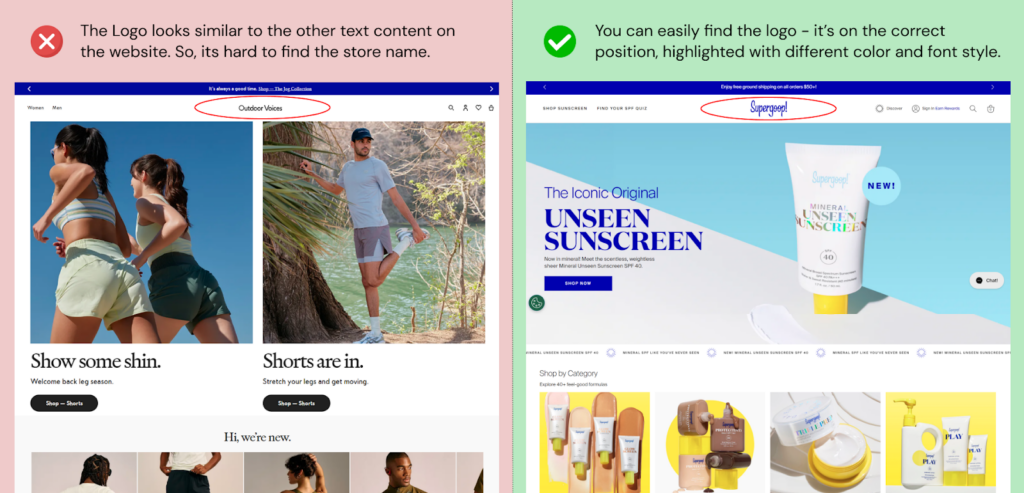
Logo
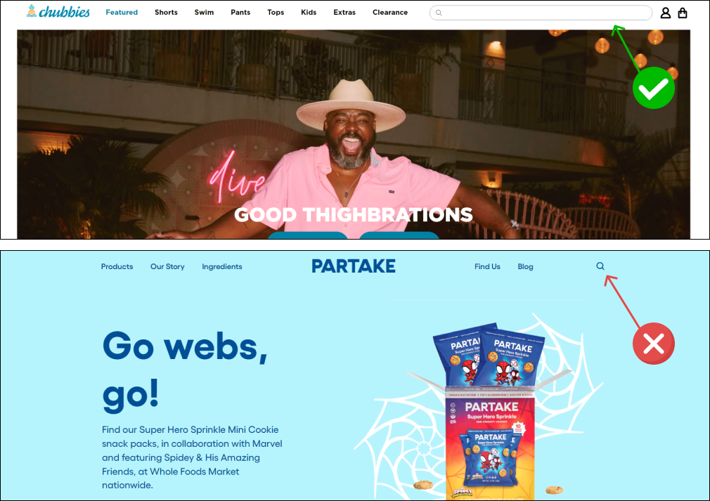
Your logo is your brand ambassador. Most people may forget your store name but they will easily recognize your store with your logo. It’s because human remembers graphics more easily than text.
- Your logo can be at the left or the center of your website header.
- The logo is always clickable which redirects shoppers to the homepage.
- Your logo image must be clear (and not the blurry one!).
- The recommended logo width is 512 pixels minimum.
- Your logo should be easily distinguishable from other content.
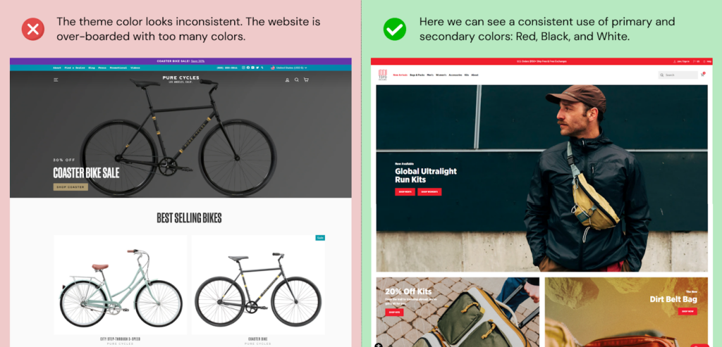
Color scheme
Colors have a powerful influence on how people perceive your brand. Different colors evoke different emotions. For example, red is associated with excitement and urgency (“Sale alert! 50% off everything!”), while blue conveys trust and security (“We’ve got your back with our secure payment system”).
That’s why you should choose them wisely.
- Choose a primary color for your brand identity, then select complementary shades to create a unified look.
- Your color palette should align with your brand or niche (Green for organic food stores).
- The colors should provide enough contrast for the text to be easily readable against the background.
- Avoid using too many colors, as this can overwhelm your visitors.
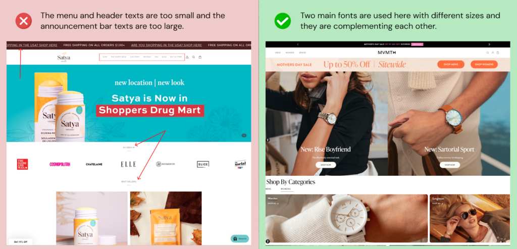
Fonts or Typography
Just like you, fonts have personalities. Choosing a font that reflects that personality will instantly connect with your audience.
A playful script font conveys a fun and casual vibe, while a sharp, modern font exudes professionalism. The right font can make your brand feel friendly and approachable, sophisticated and luxurious, or anything in between.
- Make sure your chosen font is easy to read on both desktops and mobile devices.
- Use of System fonts is recommended over web fonts for faster page loading.
- Stick to a maximum of two or three fonts – a primary one for headlines and a secondary for body text that works well together.
- Try using a unique display font for your logo or a quirky typeface for a specific call to action button.
- Follow the hierarchy of font sizes to guide users through your content. Headings should be larger and bolder, while body text should be slightly smaller and easier on the eyes.
- Don’t crowd your website with text. Give your fonts breathing room with ample white space to improve readability and create a visually clean layout.
Let’s move to the next section!
2. Navigation
One day I was looking for the “leggings” category but I couldn’t find it in the navigation menu. After using the search box, I finally found it as a “Pants” category.
So, the moral of the story is that just like a map in the forest, your site navigation will help your visitors reach their destination with less effort. The more precise it is, the more quickly the shoppers find their desired products.
Follow the below best practices for your site navigation:
Header Menus
As a shopper, I don’t like long navigation or the need for 4-5 clicks to reach the target page. Your shoppers may have the same preferences. So, it’s necessary to identify the most visited pages or important pages on your website, such as your product pages or checkout page, and prioritize them in your navigation.
The first thing you should focus on is the Menu Type! What works for desktop will not work for mobile shoppers. So, let’s find the best menu types for both.
| Desktop Menu | |
| 1. Mega menu | ✅ |
| 2. Drop-down menu | 🆗 |
| 3. Vertical menu | ❌ |
| Mobile Menu | |
| 1. Hamburger menu | ✅ |
| 2. Tab bar or Navbar | 🆗 |
Desktop Menu
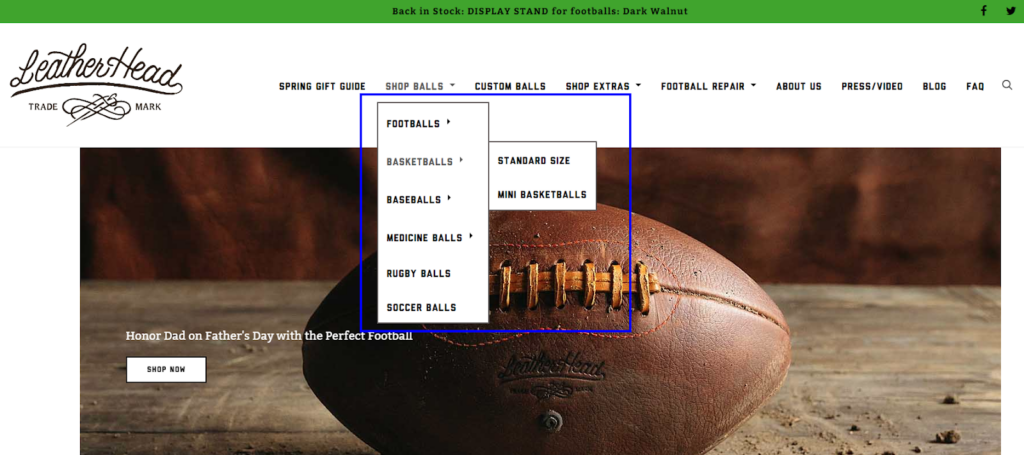
The Mega Menu gives visitors an exhaustive overview of categories, subcategories, and even sub-subsections. It’s a great way to showcase a wide range of products without overwhelming users. The vertical menu looks like the filters section in the category pages and offers less visibility compared to the mega menu. See example!
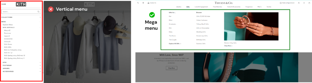
The Drop-Down Menu showcases a limited selection of top-level categories. Subcategories appear when you hover over the main category.
Mobile Menu
Most mobile sites have one of these two menu forms:
1) The Hamburger Menu: This familiar icon (three horizontal lines) hides the menu options until clicked. It’s a space-saving solution that hides the main navigation options until a user taps it. While widely recognized, it requires an extra step for users to access navigation. It’s mostly used by D2C eCommerce brands.
2) The Tab Bar (Navbar or Bottom Menu): This menu sits conveniently at the bottom of the screen, right under the user’s thumb. It offers quick access to essential sections and is becoming increasingly popular for mobile browsing. It’s a popular choice in native apps, but top multi-vendor eCommerce brands use this menu for user convenience.

Here are some tips to make your site menu user-friendly and accessible:
- Logically organize categories, with broader categories at the top and more specific subcategories below.
- Add the policy page links (T&Cs, privacy policy, return policy, etc.) to the footer menu and not to the main menu (header).
- The menu items should have descriptive labels.
- Keep the number of categories to a minimum, ideally at most 7-8 main categories.
- Group the related menu items together to help users navigate your website more easily (optional).
- Ensure that your site navigation is mobile-friendly. Avoid using too many menu items that may be difficult to tap on a small screen.
- Make sure the navigation menu is easily accessible from all pages of the website.
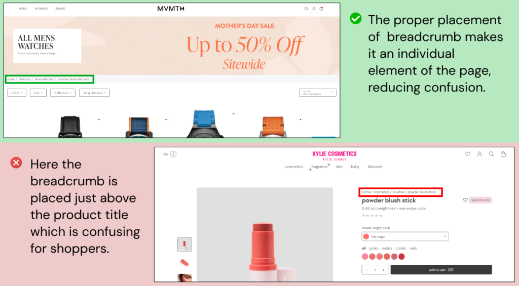
Site Breadcrumbs
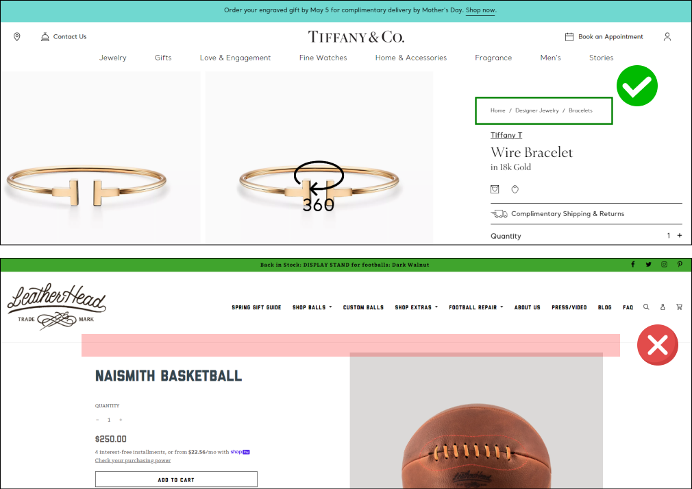
Some websites have it and some don’t. But it’s necessary for better user experience and SEO.
Breadcrumbs show the actual path of your website, from the home page to where the user is currently positioned. Suppose, the user is on the product page, the path will look like this:
- Home / Category
- Home / Main Category / Sub-category
And the path keeps changing as they visit different pages. Here are some do’s and don’ts for placing Breadcrumb Navigation on an e-commerce website:
- Separate breadcrumbs with the arrow ( > ) or forward slash ( / ).
- You can include the current page name (but don’t link it).
- Breadcrumb labels should be easy for users to understand. Avoid using jargon or overly technical terms.
- Avoid placing long breadcrumbs. You can show the previous 2-3 sections from the current page if the path is too long (eg. “…. / WATCHES /
- MEN / CHRONO”).
- We recommend: that the best place for breadcrumbs is the “Top Left” side.
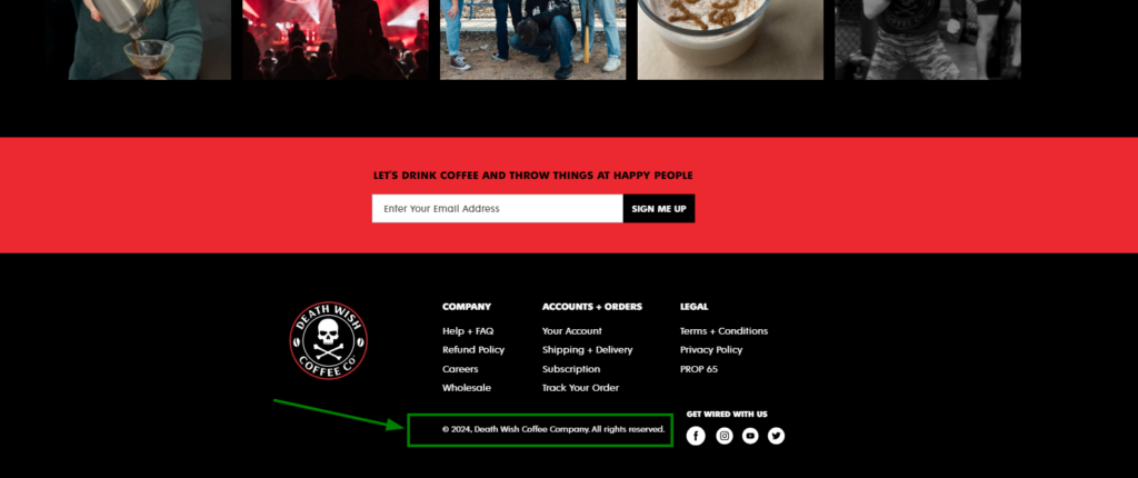
Footer Menu
Footer—that holds all the additional information of your store like social media links, customer service information, store policies, and more.
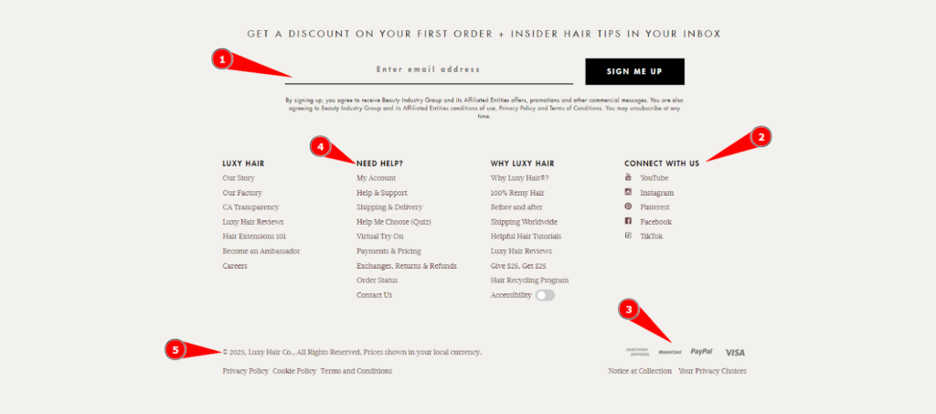
See how the footer can be a friendly guide by showing your customers all the best spots to visit on your website. For that, you need to include:
- About Us
- Contact Us
- Policy pages
- Newsletter sign-up
- Trust badges and security information
- Payment methods
- Social media links
You can also add contact details (such as phone number, email address, and physical address) in the footer. This makes it easy for customers to get in touch with you if they have any questions or concerns.
A nicely designed footer can help customers to access important resources easily.
These best practices can help you offer outstanding navigation to your shoppers. Test the navigation menu with the above points to identify any usability issues or areas for improvement.
3. Search Bar
When the shoppers know exactly what they want, they’ll head straight for the search bar. It functions similarly to Google for your eCommerce website, i.e. giving the most relevant results for shoppers for a specific phrase or query!
However, some websites place a little search icon over a text box and reduce the chances of shoppers using it to find the desired product.
Here are the best practices to follow to make sure that the search bar works as expected by the user:
- Make the search bar long enough to accommodate commonly used search terms.
- Use a clear label and placeholder such as “Search” or “Search for products” respectively to ensure that users understand what the search bar does.
- Make sure that the search box is mobile-friendly.
- Put a search button or icon to start the search and a clear “✘” button to clear the search bar.
- Use contrasting colors or shading to ensure that the search bar is easily visible and distinguishable from other page elements.
- Implementing autocomplete or predictive search can save time for users and provide relevant suggestions as they type. It can also prevent typos or spelling errors.
- Utilize natural language processing (NLP) to help users find what they’re looking for, even if they don’t know the exact terminology. For example, if a user searches for “running shoes”, the search should return results for “sneakers” or “athletic shoes”.
- Ensure that the “search results page” loads quickly with the most relevant results.
- Show an appropriate message when there is no result to show for the searched term or query.
- Give product recommendations along with the search outcomes on the search result page.
The Goal: Displaying relevant results
Once the shoppers have searched for a query or a term, now it’s your turn to show them what they are looking for. When they don’t find it, they can feel disappointed. So, you should make sure they find exactly what they are expecting to see, i.e. specific products or categories in your online store.
Make sure that the search results are relevant to the user’s query. Use machine learning algorithms or search engine technologies to refine the search results based on the user’s search history, location, and other relevant factors. You can also provide an option to search within specific categories of the website.
The only objective of the above best practices is to make sure the search bar is effective and user-friendly.
4. Header Shopping Cart
The shopping cart is meant to act exactly like the shopping trolly we have while shopping at the supermarket. We don’t have to do extra hassle to view what we added to the shopping trolly while exploring other sections or departments in the market. So, online shoppers deserve the same effortless shopping experience.
Of course, no eCommerce site is complete without a shopping cart. It’s the bridge between the customer’s desire and the final purchase where they review the shortlisted products and finalize their orders.
Here we are talking about the cart icon or button that appears in the header section of your eCommerce website. Let’s see how to improve the usability of this important element.
Follow the below best practices for the shopping cart in the header of your website:
- Ensure that the customer can easily see what they’ve added to their cart and how much they’ll be paying.
- Notify shoppers every time the cart updates, i.e. adding an item to the cart or removing the item from the cart using a badge or a notification.
- Make sure the shoppers can view the cart contents (along with product information such as the product name, image, price, and any other relevant details) without leaving the current page by clicking on the cart icon that opens a mini cart such as a cart slider (mostly preferred), or a pop-up or a drop-down.
- They should also be able to edit or remove items from their cart easily, without having to start the shopping process over again.
- Let them use the shopping cart as a shopping list—you can help them to save their cart for future reference or send it to themselves via email.
- Make sure you have the necessary CTAs (“View cart” and “Checkout” buttons) in the mini cart to encourage shoppers to complete their purchases.
- For empty carts, add the “Continue shopping” button that is visible upon hovering on the cart icon.
A perfect shopping cart makes the checkout process more convenient for your customers. And the above points will make sure your header cart works as per your user’s expectations.
5. Login/Register
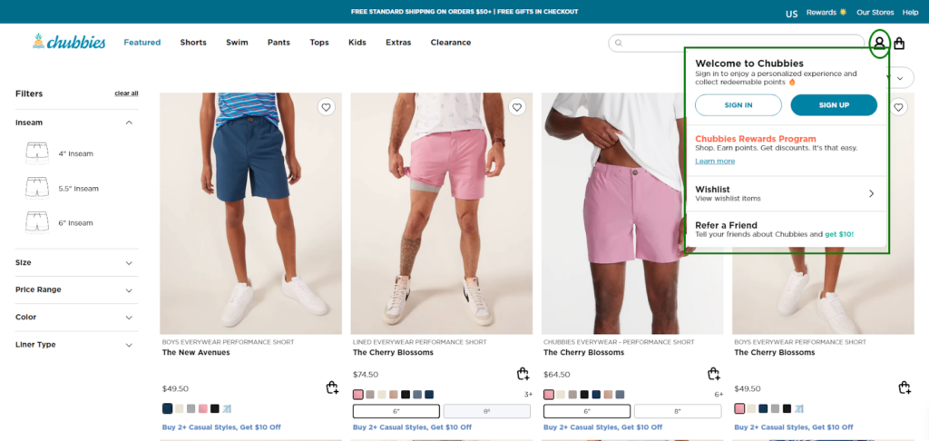
Customers who fall in love with your eCommerce store will definitely like to come back again and again. That’s why you should focus on optimizing the login/registration feature for your potential customers.
The only thing I hate in the registration process is filling out the long tedious form. Similarly, your shoppers may not like it either. So, keep the login/register process simple and straightforward.
Don’t ask for too much information or make the process too complicated. Just ask for the essentials to make it easy for them to get started.
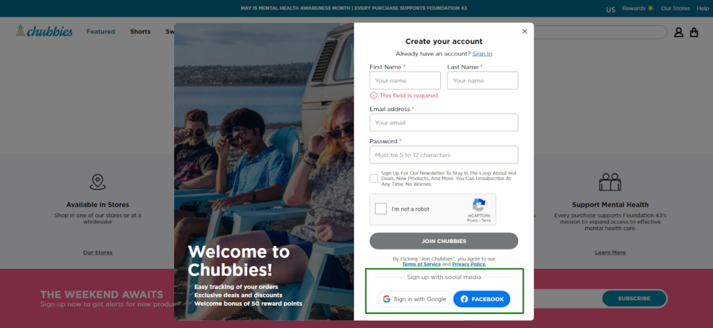
The best solution is to single-click login via their social media accounts. Make sure you offer social login options like Facebook, Twitter, or Google. This can save users time and reduce the friction of creating a new account.
Password recovery options
We all forget things sometimes, including our passwords! You don’t want your customers to get locked out of their accounts! At the same time, you want to protect your customer’s data from cyber attacks.
So, make sure you provide a password recovery option along with SSL encryption to protect user data. This could be an email with a link to reset the password, or a security question that the user needs to answer. You can also secure the login process by implementing two-factor authentication, CAPTCHA, or other security measures.
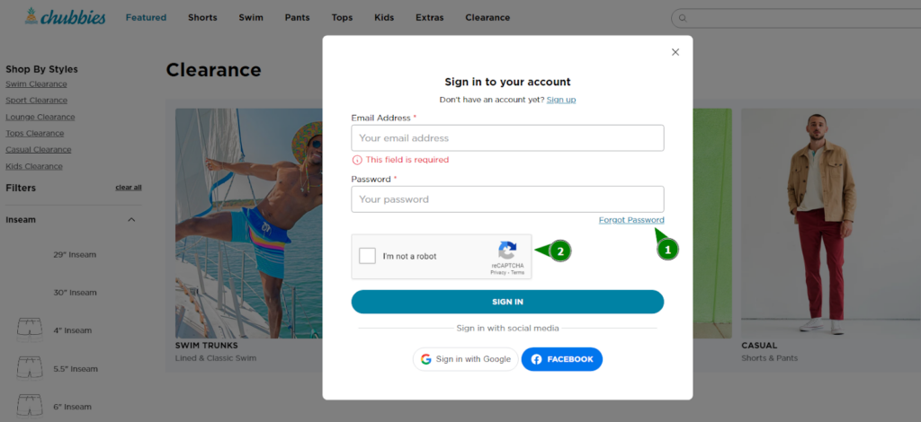
Let’s see some more ways to optimize the login and registration options on your eCommerce website:
- Highlight the Login/Register button by using contrasting colors for the element. Include a hover effect or animation to indicate that the button is clickable.
- Consider using a modal or lightbox to display the login or registration form instead of redirecting users to a separate page.
- Use a consistent design for the login and registration forms.
- Offer auto-fill and auto-complete features when filling out the form fields.
- Show error messages for login failure that clearly explain the reason and also offer actionable steps to resolve the issue.
- Optimize the button placement and size for mobile devices by using responsive design elements.
- Display relevant information such as the user’s name and account status after successful login.
With these best practices listed above, you can improve the signup and login experience for your customers.
6. Other Essentials
Finally, we are on the last section where you will find the improvement areas that impact the overall user experience of your website.
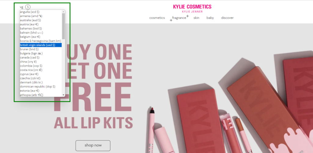
Language & Currency Selector: Placing language and currency selectors in the header allows users to easily switch between their preferred options. It removes any confusion about pricing and product information. Thus, you can offer more personalized experience and caters to a global audience.
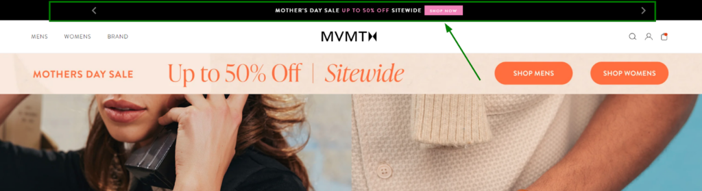
Announcement Bar: It’s a narrow stripe at the very top containing the ongoing promotions, new product arrivals, or important updates. You can highlight your main offerings here and grab user attention.
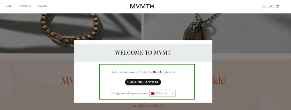
Geo-targeting: It tailors the shopping experience based on the customer’s location. This can involve showcasing products relevant to their region, displaying local currency by default, or highlighting local delivery options. For businesses managing multiple regions or conducting competitor analysis across different markets, tools like cheap proxy services can simulate user behavior from different geolocations. Whether you’re verifying ad placements, tracking SERP performance, running localized pricing experiments, or ensuring compliance in international markets, rotating or residential IP proxies help you browse as if you’re a customer from that specific area.
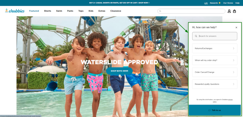
Customer Support Chatbox: Integrating chatbots or virtual assistants provide instant customer support, answer frequently asked questions (FAQs), and guide users through the buying process. This allows for 24/7 assistance and reduces wait times.
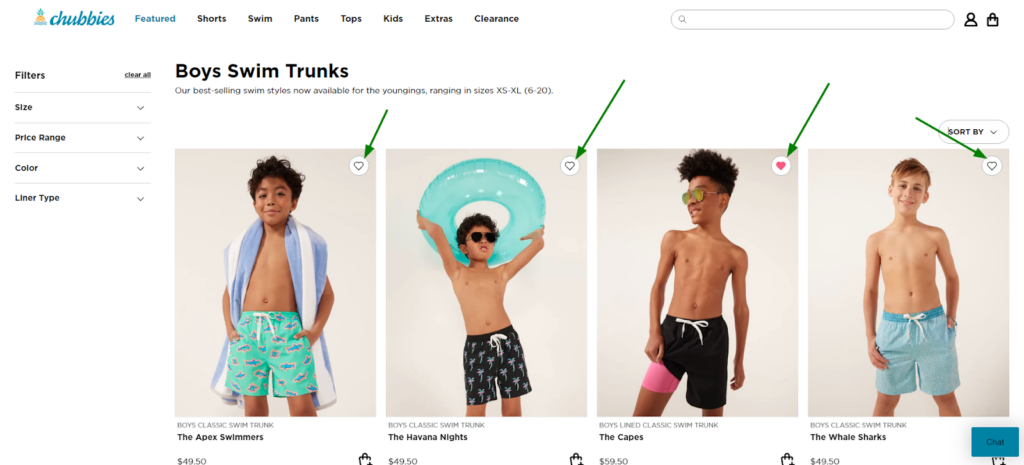
Wish List: A wishlist allows users to save products they’re interested in for later purchase or sharing with others. This helps with decision-making and facilitates future purchases.
Exit-Intent Popups: As a user shows signs of leaving the website, an exit-intent popup can offer discounts or special promotions, potentially enticing them to stay and complete a purchase.
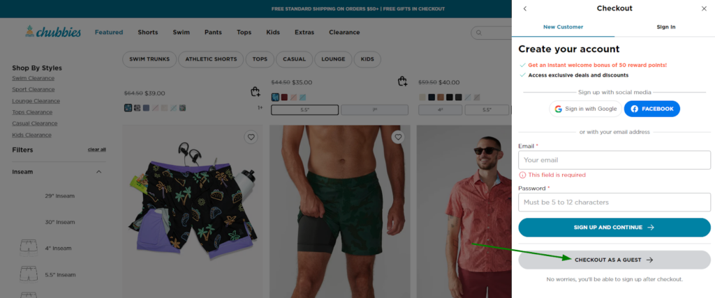
Guest Checkout: Users trying for one-time purchase should have a quick way. Guest Checkout streamlines the checkout process for customers who don’t want to create an account.
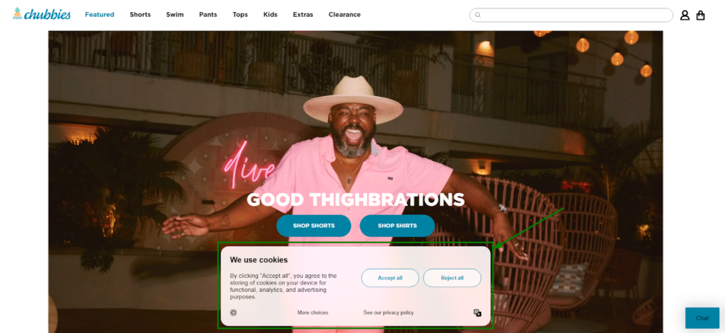
Cookie Permissions: Respects user privacy and use cookie permission bar that informs users about cookies used on the website and obtains their consent. It should disappear immediately after a user interacts with the site, avoiding being an annoyance.
Powered by: Adding “Powered by Brand_name” in the footer acknowledges the platform behind the website and subtly reinforces credibility and professionalism, especially for new businesses.
With these essential eCommerce UX best practices, you’ll be well-prepared to create an online store that stands out from the competition and provides your customers with a seamless and enjoyable shopping experience.
Wrapping Up!
The user experience starts with the “first impression” of your store visitors. Online merchants spend lots of time and money just to save their first and last opportunity to impress their shoppers when they come for the first time.
You’ll definitely learn how to improve your entire website one-by-one in the upcoming chapters of our eCommerce UX audit checklist. But before you go for the detailed audit for each page of your website, consider optimizing your online store as shown in this guide.
Hope you understand the importance of continually optimizing and updating your eCommerce site to create an unforgettable user experience to influence potential customers and foster brand loyalty. By implementing these general best practices, you can offer a positive experience that survives the first-sight evaluation.
Now, it’s time to move to the next chapter—eCommerce Homepage Best Practices for UX Audit!
