How to Develop Effective & Potential Business Plan with Conversion Rate Optimization

Okay, 90% of website owners think traffic is their silver lining! Hah! Nothing triggers me more than improve business plan!
Then I ask, “What are they going to do with the traffic?”
They would say, “We love counting monthly visitors,” taking immense pride in their traffic.
And I go blank, thinking if it was the only business goal they could ever come up with?
Counting traffic doesn’t give you a penny…
And then I feel bad bursting their bubbles…
Conversion >> Traffic and Traffic!
You can have millions of visitors hitting the page…
You can have thousands of them reading the posts…
But if:
- There’s no action from the user
- You haven’t got them interested
Then they will come and window shop with you.
And finally, they’ll disappear.
If you aren’t getting an order from these users, or
If you don’t compel them enough to share their email IDs with you…
You are missing out on a big-time conversion opportunity.
What do you need from them? Not traffic, I tell you!
You need:
- Sign-ups,
- Purchase,
- Clicks on CTA,
- Orders,
- Newsletters subscriptions
- And anything that shows substantial action from them
And to have all this working for you, you need to master the art of conversion optimization.
If you’re done with traffic romanticization, we’ll move on to conversion optimization now. Ready?
Conversion Optimization Tip #1: Try A/B testing, it is the heart of conversion
The only thing we perfectly know about marketing is that there’s no “perfect technique” for a higher conversion rate.
Whether you write a catchy headline or a fluffy SEO title, or you put trending designs or the classic ones… everything is a piece of hit and trial.
A/B or split testing lets you test different versions of your pages.
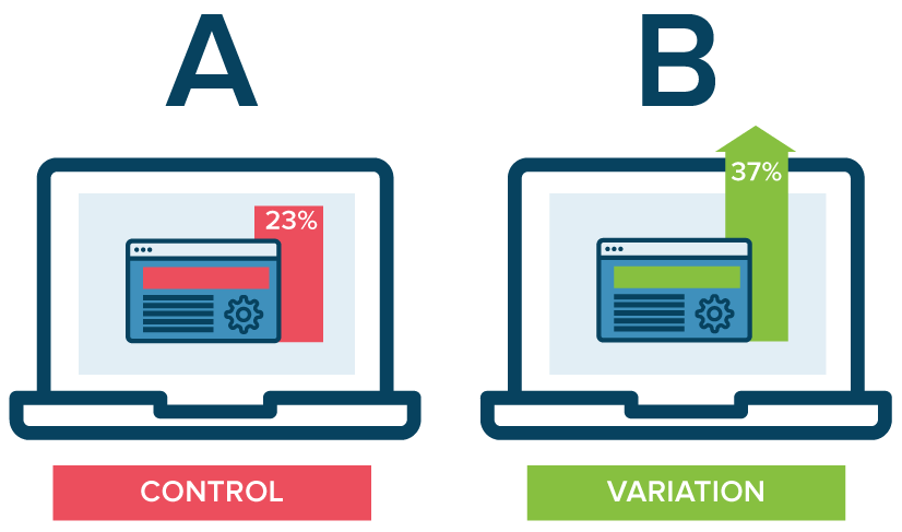
Here’s how it works:
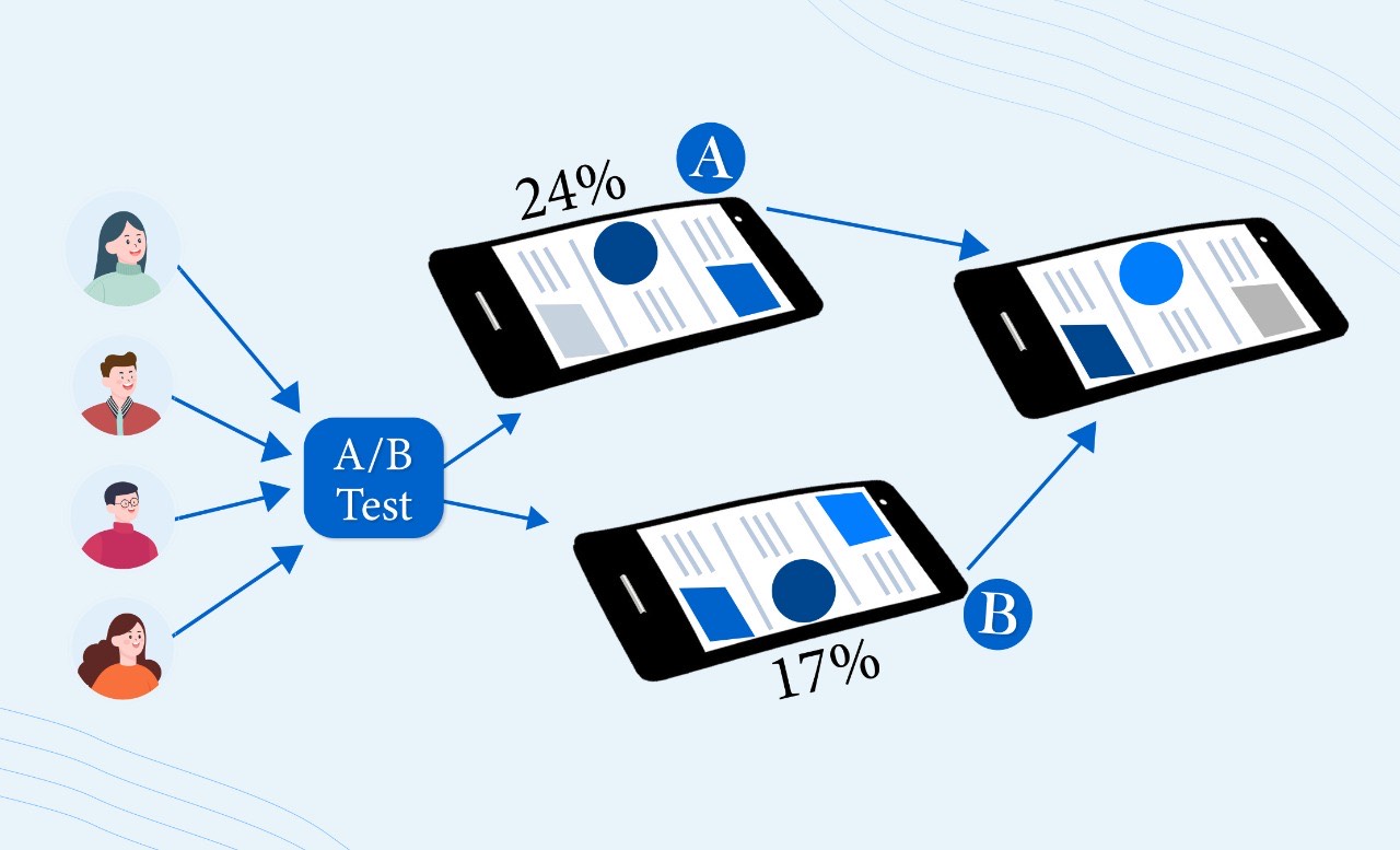
Let’s say you have two different featured images for a blog!
Now you don’t have to “guesstimate” and pick one of the two.
Instead, take a look at these steps
Steps for AB testing
- Run the A/B split test
- Create two different pages (A and B)
- Add one featured image each
- Put CTA (call to action) on both pages
- A/B testing software will split 50% of visitors between the two pages
- The software will count the total people taking action on both pages
- And then you have a clear winner
Examples
1) Navigation menu testing
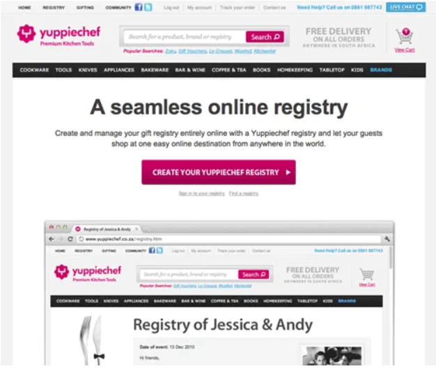
Low conversion rate with cluttered navigation menu
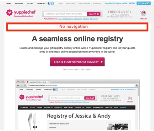
100% increase in conversion with a slight navigation variation
2) Landing page testing
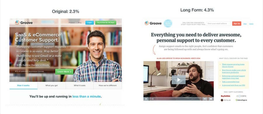
Groove nearly doubled its conversion rate with an A/B test. The first page is a short landing page that focuses more on design, and the second page is a long landing page that focuses on copy than design.
3) 5 A/B testing
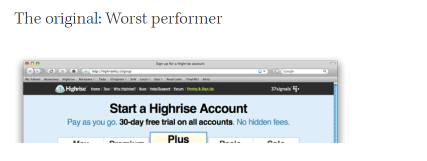
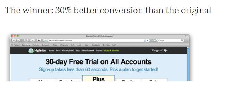
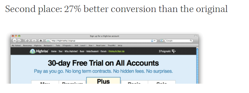
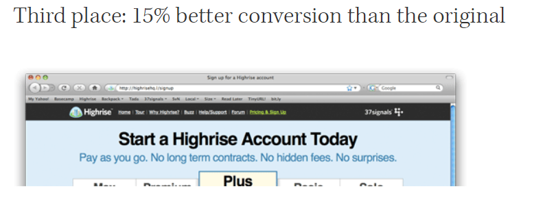
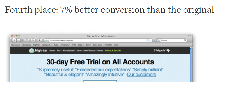
Five different headlines and subheadlines were tested with Google Website Optimizer.
What you should A/B test
- The headline. Headline Studio is my favorite tool to optimize headlines, eliminate guesswork, and outperform competition. You can write strong and compelling headlines and copy with it. Give it a shot because your headline is the key to conversion rate, and test it with split pages.
- Page navigation and layout. Chances are high that your website menu is costing you conversions. Keep the menu simple, organized, and concisely described before A/B testing.
- The discounts and offer. This is where psychology chips in the most! You have to apply different marketing techniques to lay out your message to the readers and then test them with A/B.
- Media test. Be it images or videos, you can test if they’re pushing visitors into taking actions.
- Any radical change. Don’t go new without having two totally different prototypes. A/B testing ensures radical changes don’t bring risk with them.
The purposeful brand optimizing tool that delivers the count value.
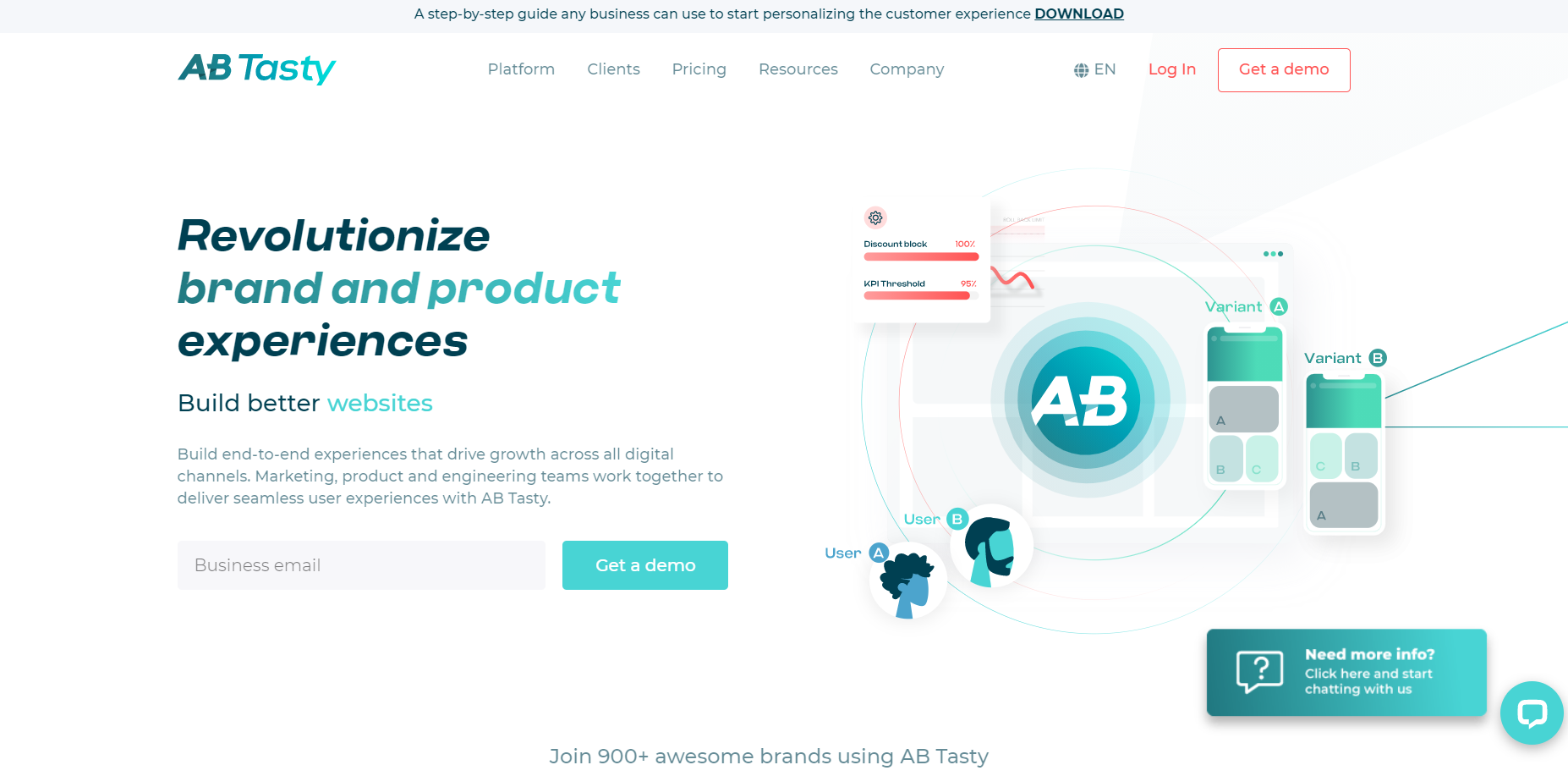
AB tasty conversion optimization tool
Conversion Optimization Tip #2: Show your value proposition, clearly
Every customer asks, “What’s in it for them?”
If they’re visiting your website, what do you want to show them?
- The welcome banner?
- The list of the companies you’ve worked with?
- Or your budget-friendly pricing model?
That’s it? You have nothing else to offer?
Well, you do!
You show them what value you can add to their lives.
And you do it by proposing and sharing optimized yet attractive values with them.
- If you’re saving them 70%… say it loud.
- If they’ve earned discounts for being the first few visitors of the day… let them know clearly.
You don’t miss a chance to promote your values.
How do you propose values?
- Step 1: You identify and learn the benefits and features of your products.
- Step 2: You describe the means-end benefits. It means… describe these benefits in a way they sound valuable.
- Step 3: Identify your customer’s pain point. All the customers have some pain points. See if you can connect your benefits with their problems.
- Step 4: Link benefit values with the customer’s problem. You want to be sending the message loud and clear that your benefits solve their problems.
- Step 5: Market yourself as a leading provider of these benefits. You have to differentiate yourself in a manner you stand out from your competitors.
Examples
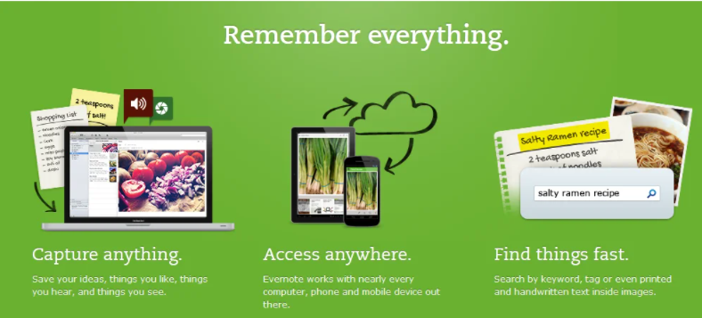
Crisp value proposition by Evernote

Neat value proposition by Herman Miller. Endorses a well-designed product that will solve all the design problems.

Value proposition by Poo-Pourri: No more bathroom odor

Tuft & Needle nail their value proposition with benefits and a fair price
Tools for value proposition
- Value Proposition Canvas by Strategyzer
- Roojoom
- Visual presentations with Emaze
- Infographics with Canva, Piktochart, or Illustrator
- Test landing page value proposition with Unbounce, PageWiz, or Leadpages
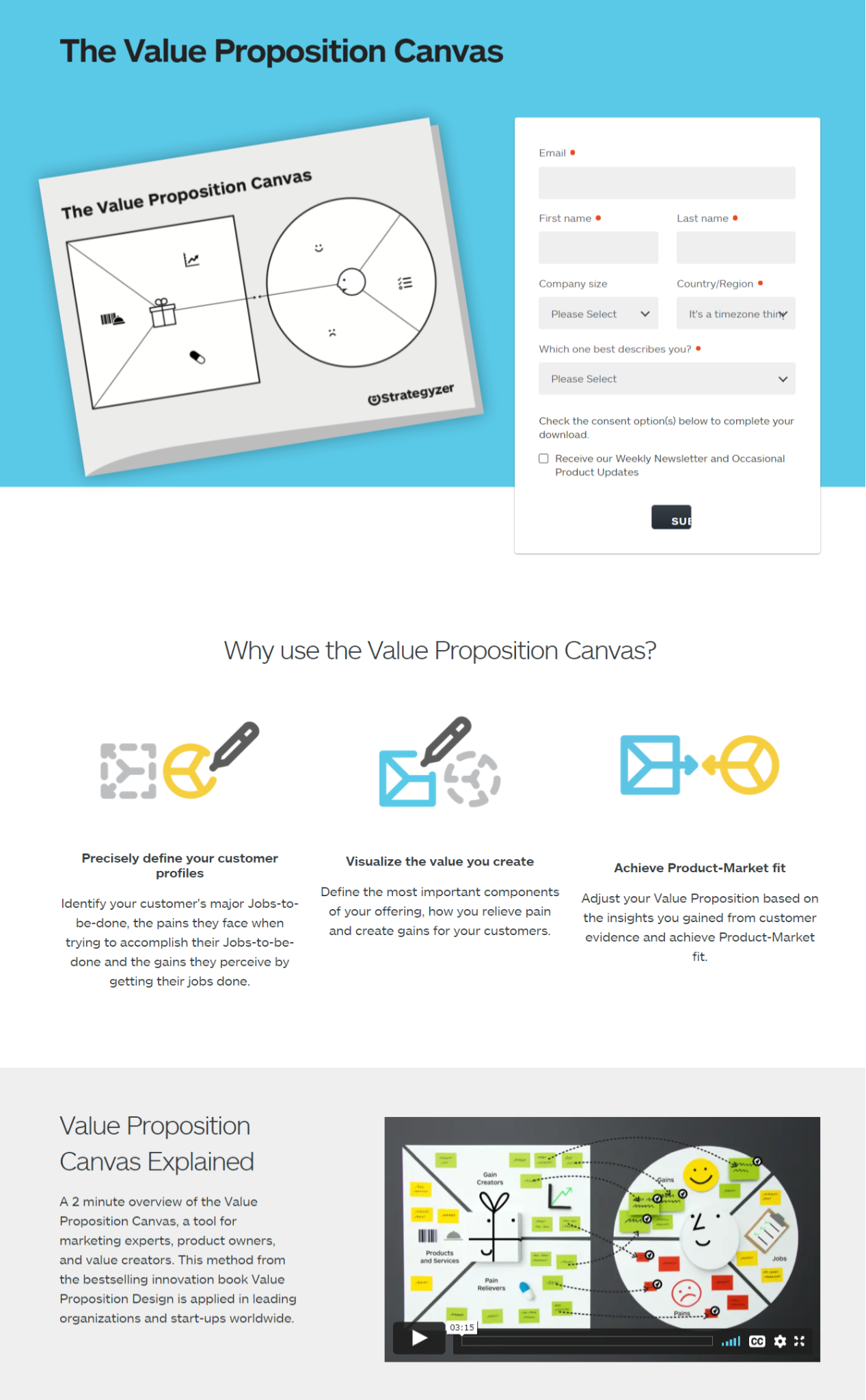
Value proposition canvas tool— Strategyzer
Conversion Optimization Tip #3: Optimize your sales funnel
Sometimes, you and your visitors are not on the same page.
No, I don’t mean the webpage.
But the stages of the eCommerce sales funnel.
How often does it happen that they sign up with you and you start a blitz of sales messages instead of content promotions?
They’ve literally signed up with you, JUST NOW!
Getting too salesy without knowing their stage of the sales funnel can be too risky a ballgame. If you’re preparing to pitch your products or business ideas to investors, try using a pitch deck maker to craft a professional presentation.
They’re not psychologically ready to buy anything from you.
You can’t be too pushy.
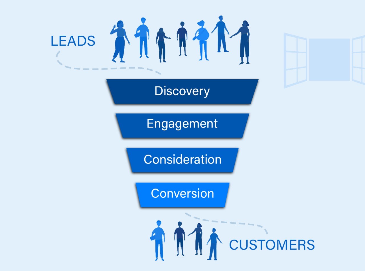
How to make funnel optimization?
- Create Google Analytics goals to discover when and where your users are leaving you.
- Then check your landing page. Copy, headlines, color, font style, and purchase path. These all should fall into your first round of testing. You’re basically testing why users are leaving your page.
- Evaluate your sign-up form. Maybe headlines or textbox placements are not optimized. Or maybe your CAPTCHA is too confusing. You’re optimizing every point where a user can leave you.
- Run online funnel optimization tests. You can run your website on FiveSecondTest to know the simplicity of your sales funnel. It doesn’t take much time. Only five seconds. It tells you what users were watching during the visit. If they were watching what you were catering, your goal is accomplished.
Examples
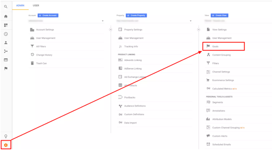
Creating goals on Google
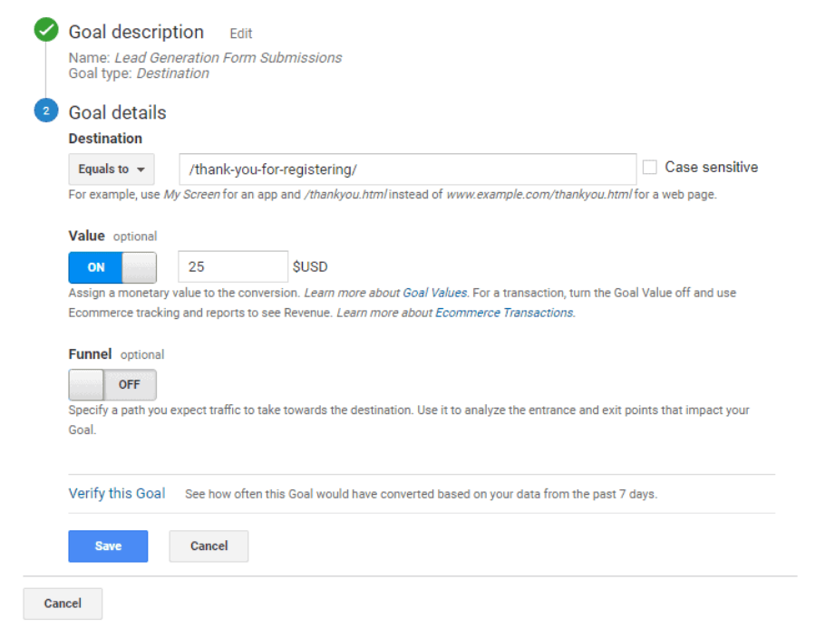
Lead form submission goal
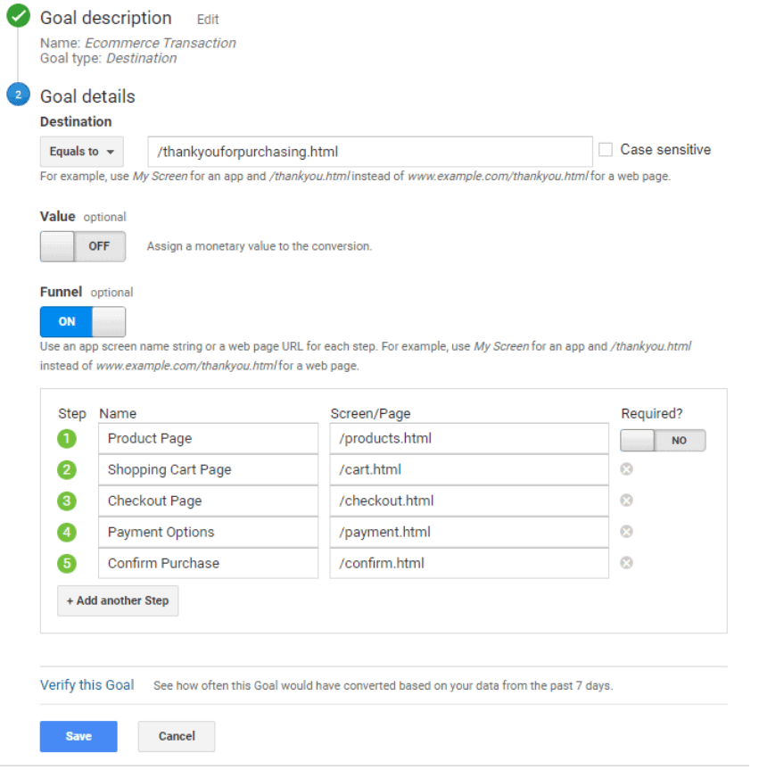
E-commerce goal funnel
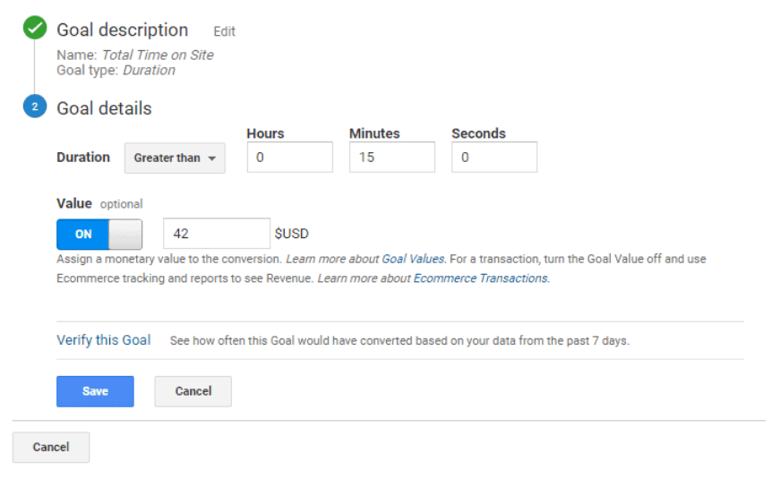
Duration of time on-site goal
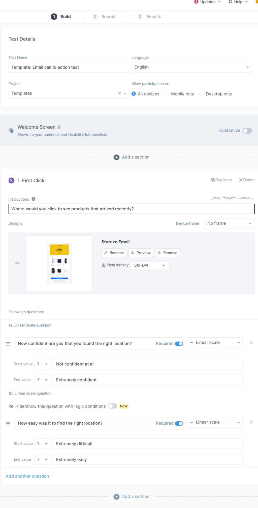
Run a 5-second sales funnel test
How to sound less salesy when they’re new with you?
You must have noticed how IT services give free trials before asking to sign up.
Well, they have an advantage when it comes to conversion rate.
But let’s say you’re selling products.
You can’t really have them signed up for free trials.
This is where you have to go slow in the sales funnel and not look too salesy.
Here’s how you do it:
- Offer free information on blogs, social media channels, videos, etc.
- Turn into a trusted advisor. If you’re selling an EMF-mitigating device, give them information on a healthy lifestyle. If you’re selling them a cooling mattress, advise them to sleep relaxed.
- Promise them free guides on problem-solving tips. This way, they’ll give their emails for good info.
- Send more informative content via email.
- Get salesy with optimized sales copy and retain them over and over again.
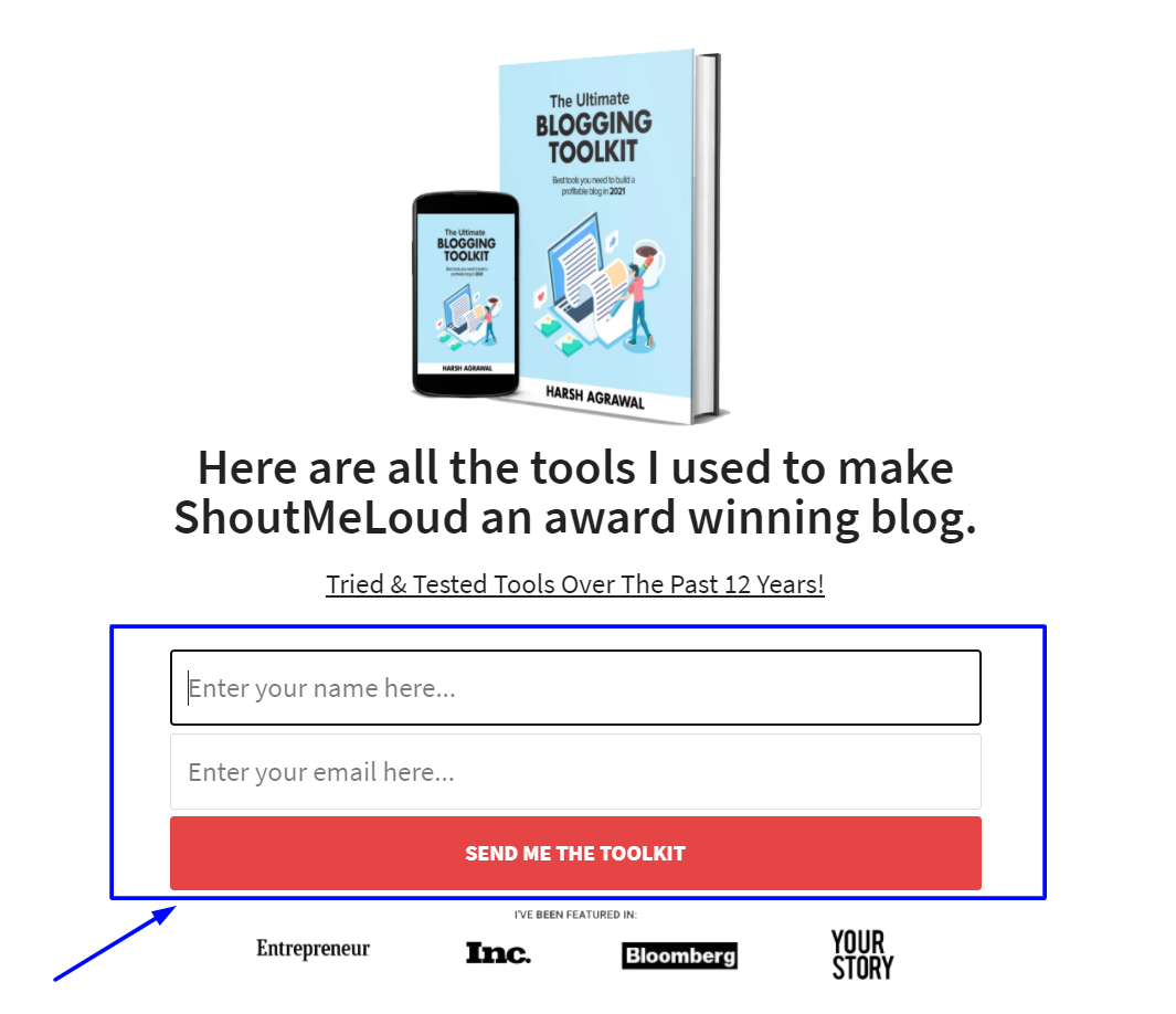
Shoutmeloud mails a personalised guide for driving traffic after handing the email handle
Conversion Optimization Tip #4: Clarity trumps fancy jargon and designs
I have seen people writing gibberish as “avant-garde, state-of-the-art services at pocket-friendly cost for everyone.”
Read that again!
It takes me seven seconds to understand this jargon.
Look! Visitors won’t spend much time on your website.
You don’t want to put them into a puddle of confusing and muddy sales copy.
What you want is to send
- a clear and concise message
- a bold value proposition
In fact, if you look deeply, conversion is persuasion at each stage of your sales funnel.
Whether you’re writing or designing, or putting a media, clarity trumps fancy stuff!
How to optimize writing?
- Know your audience. The first step towards writing an optimized sales copy is building a persona. This is where you bridge the gap between your customers and services.
- Use psychological triggers. Your copy should be emotionally compelling. Add persuasion techniques like
- Reciprocity
- The BandWagon Effect,
- Inoculation technique
- Trigger psychological responses with 8 life desires.
- Means-end benefit strategy
- Write for grandma, not for a literary festival. Write as you talk. No fancy jargon, no word meandering. Plain language for plain people who don’t carry a dictionary.
- Short sentences. Like this one. They’re easily readable and don’t put strain on the eye. You can use anything between 3 to 8 words in a sentence.
- Follow inverted triangle format. Write the most important information at the top and the least at the bottom.
- Don’t write the words you wouldn’t use in real life. I don’t speak “however” in real life. So I don’t use them in my writing.
- Power words. Optimize headlines and copy with words like Secrets, Tricks, Unknown, Smart, Powerful, Free, etc.
Examples
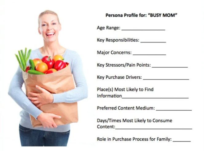
Building audience personas for busy moms
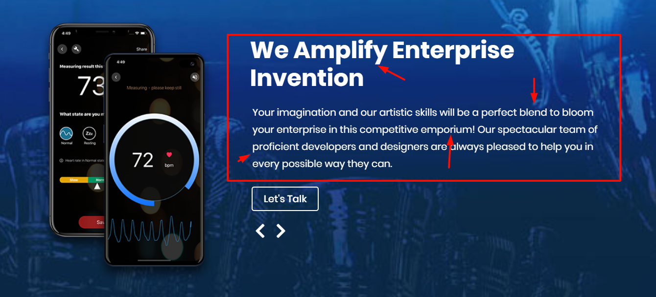
Hard language is a weed of writing.
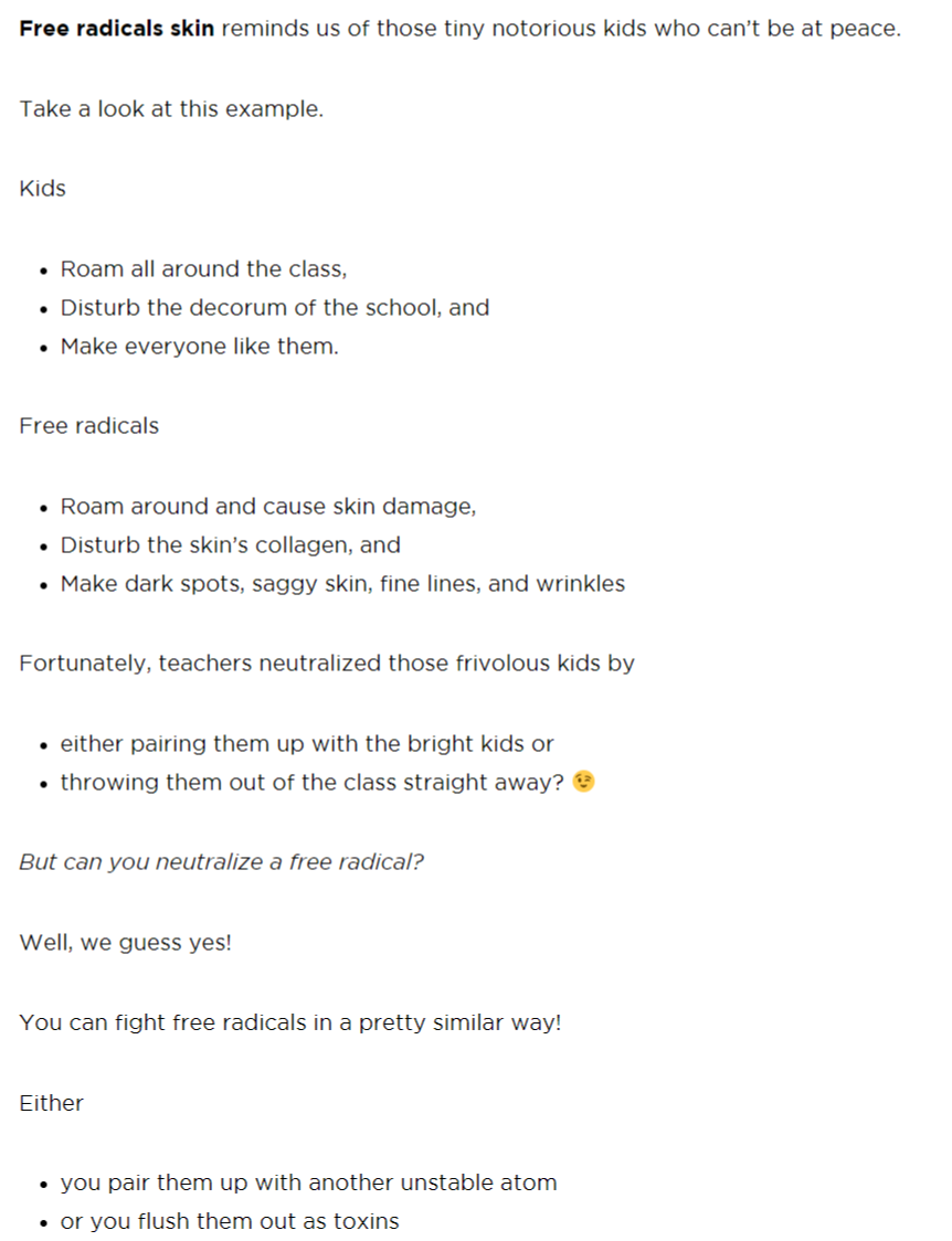
Ageless Body Blog writes short sentences and paragraphs for a better Flesch readability score
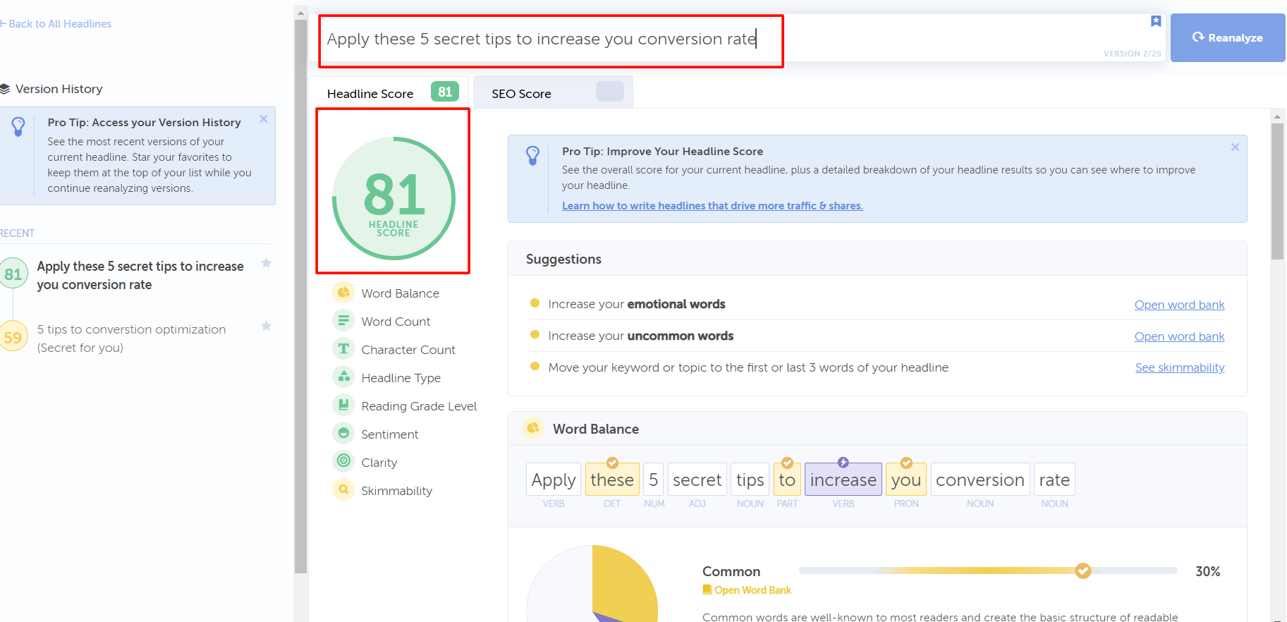
Headline score checker, test 1 scores 82 with power words.
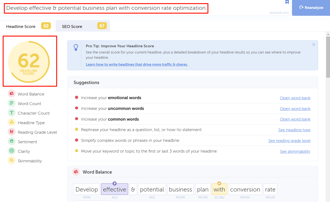
Headline score checker, test 2 scores 62 without power words
The modern content needs a modern optimizer.
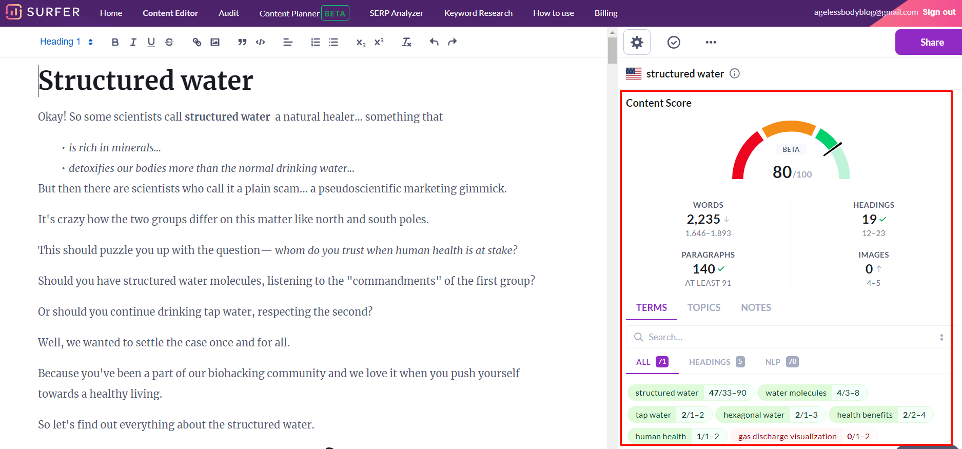
SurferSEO helps with optimized content scores.
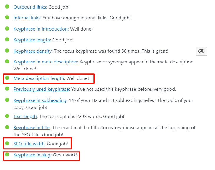
Yoast optimizes SEO titles and meta descriptions texts
Design principles for a better conversion rate
- Put a clear Call-to-Action inside a container
- Don’t clutter the designs; use a minimal approach
- Apply color theory and contrast psychology
- Direct to you, CTA with direction cues
- Use more whitespaces for clarity
- Build a clear visual hierarchy for visitors
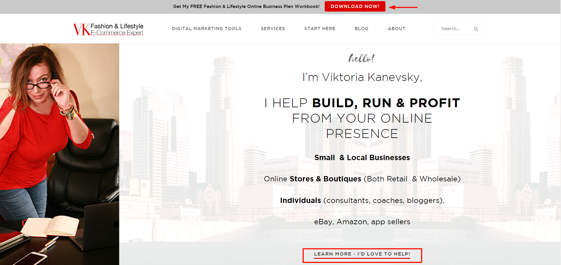
Vkecom.com uses visually clear CTAs on the home page
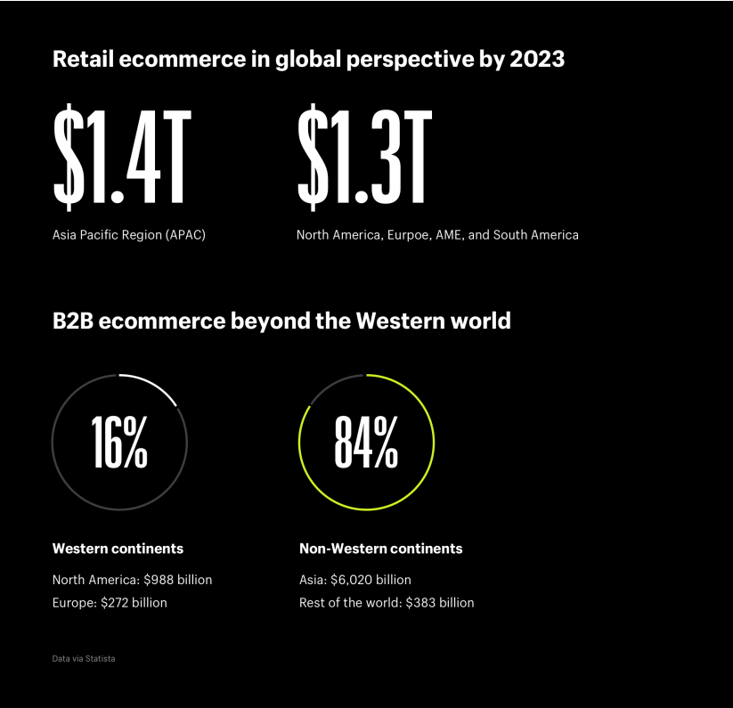
Shopify uses a minimal design for effective readability
Conversion Optimization Tip #5: Become a trustworthy authority
Now, what has trust got to do with conversion rate?
Well, everything!
Think of it like this: why aren’t they signing up or purchasing with you?
Don’t they have time or money?
No!! They don’t trust you.
Would you buy a MacBook if someone came to you randomly and gave the best offer?
You won’t!
Similarly, your visitors don’t trust you yet!
They won’t put their email ids or credit credentials if you haven’t gotten them in your trust court— because if you’re unknown, you’re unsafe!
So how do you become safe for your customers?
Well check out these factors.
How to build trust?
- Whatever info you put, make an outbound link to the trusted website and third-party supports. Online authority comes with linking yourself to the authorized websites already.
- Show your human side on social media and websites. No one likes to talk with the robots. One way to do this is to put NAP (Name, address, and place) in all the webpages. Finally, set up your presence on Google and Bing My Business to build credibility among local customers.
- Reveal your team members. Show their faces in the front-end! Boast how your business functions in the back-end. Put the pictures and the videos of your organization. Talk about their families, hobbies, and interests! Anything that adds a human element to your organization should be live on your website.
- Make yourself easily available on the Contact pages. Avoid contact forms and hiding in the rut. Phone number, address, or email, everything that reaches you should be clear.
- Post the reviews of your customers. Visitors trust other visitors more than you. You can’t really do much about it. Customer testimony is the free pass to more credibility.
- Don’t try to get into their eyes. You’re not looking to annoy your visitors. You’re looking to solve their problems. It’s possible they don’t need your help at the moment. Don’t poke them too much with message blitz. The less salesy you get, the more they trust your value.
- Try not to place too many ads on your website. Though visitors have evolved with learned behavior of ignoring the ad banners, you don’t want to spam them with tons of clickable items. Keep it simple. Keep it real.
- Put trust seals if you have a transactional website. GoDaddy site seal or Web of Trust are good ways to show yourself as a secure platform. Flaunt your SSL-certified badges as well.
- Get reviewed by influencers. They not only pass on authority juices, but also get new customers from their audience group.
- Look to perfection. Whether you avoid content, news, media, services, or products, try to avoid mistakes (no matter how small they look). You’re also fixing all the broken links so the visitors can navigate around freely. Not doing it would make your business look shady.
Examples
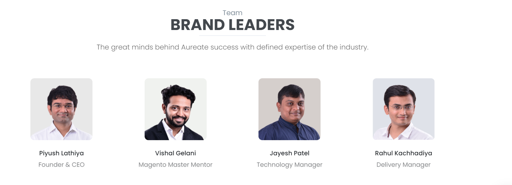
Aureate Labs puts forward their leaders for adding human elements on the website.

Trust certificates on websites
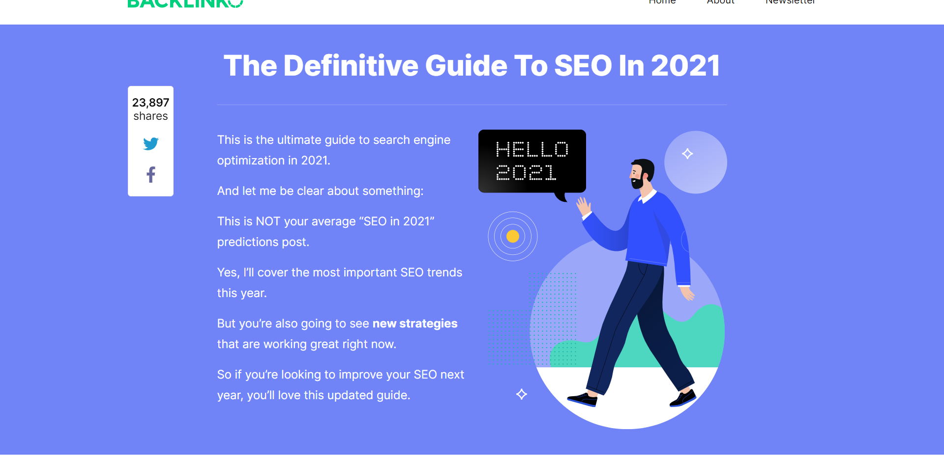
Backlinko doesn’t use any ads on its page. Dean Brain believes user experience is the most important thing a website can deliver.
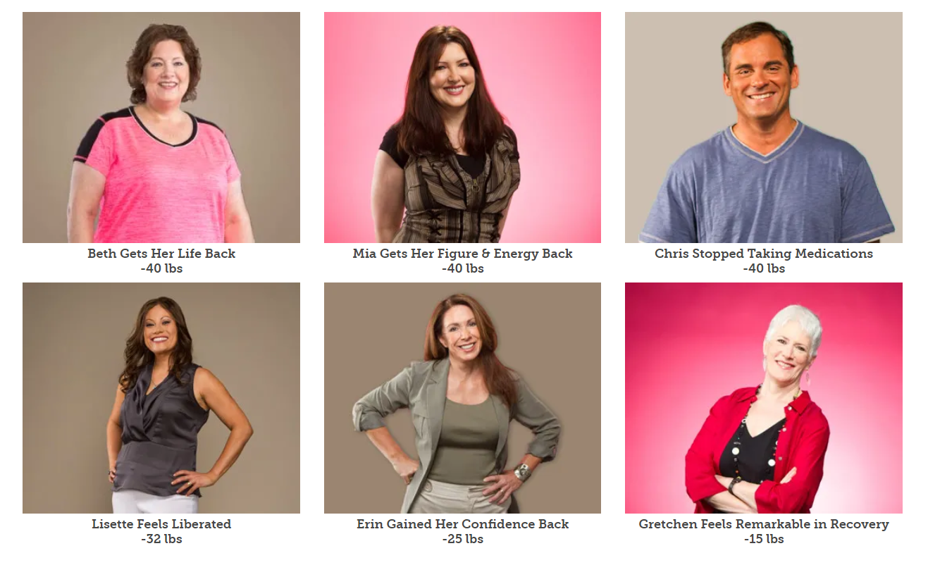
Upfront customer reviews by BistroMD for trust building.
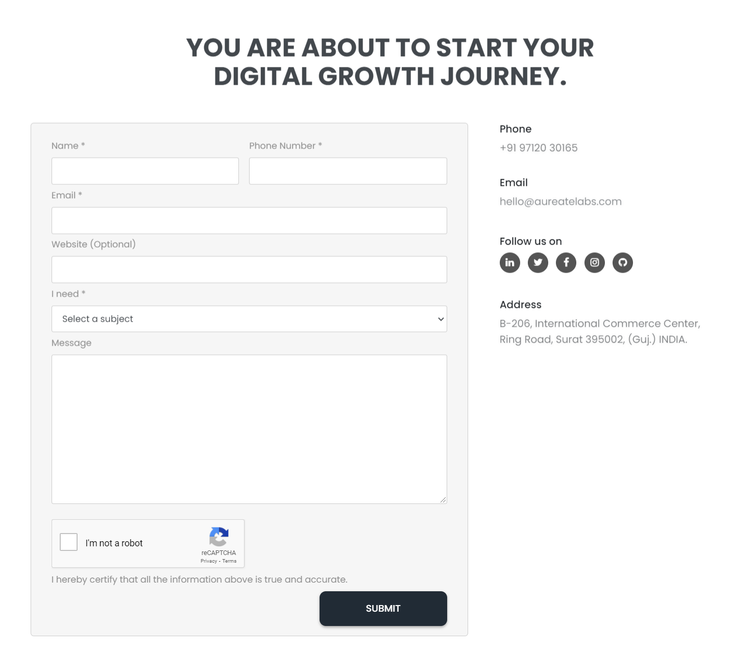
Clean contact us page by AureateLabs
What you learned…
I have covered a fair bit of ways to optimize your conversion rate.
Let’s recall them.
Now you learned… conversion is more important than traffic.
You learned… there’s no point in guesswork when you’re in doubt. Apple A/B testing (split testing) and see who’s the winner.
Have you learned… the worst sin you could do is getting too salesy when your visitors are in the wrong sales funnel stage. You want to go slow about pushing your product.
You learned… there’s no match for clarity. You’re not persuading your clients. You’re adding value to their lives with compelling sales copies and visually appealing designs. Jargon is a big no-no!
You learned… there’s no control over customers’ needs, money, and time. You only have control over trust. Start building it for a higher conversion rate.
Image Credit: Web


Post a Comment
Got a question? Have a feedback? Please feel free to leave your ideas, opinions, and questions in the comments section of our post! ❤️