How to Get Sales on Shopify: 15 Proven Strategies!

“My website looks great, and I get tons of visitors, but my cart remains empty. What am I doing wrong?!” — This is what most Shopify store owners complain about.
Some of you may be wondering the exact reasons why that happens. And some of you could be finding the solutions. Guess what??
We have addressed both the concerns here.
In this blog, we’ll not only diagnose the reasons behind high traffic and low sales but also equip you with actionable strategies to turn those website visitors into paying customers.
Ready, steady, go!!
Getting High Traffic But No Sales? What’s Wrong?
Don’t worry, here we will discuss some of the major reasons why people might not be buying from you. By looking at how visitors behave on your site, you can make some good guesses about what’s going on.
You might have access to some important eCommerce metrics that reflect your store’s performance. Let’s understand how analyzing these metrics can answer the frustrating question: “Why am I getting high traffic but no sales?”.
1. High bounce rate
If people come to your site and leave right away, it could be a few things. Maybe your visitors aren’t interested in what you’re selling, or maybe your Shopify site takes too long to load (check your site speed here).
2. No Add to Cart
If none of your visitors added products to their cart, it might be a product-audience mismatch. Your marketing might be attracting the wrong crowd, or your products might not be what they’re looking for.
It could also mean people don’t trust your store enough yet. Are you clearly displaying secure payment options to reassure shoppers?
3. Cart abandonments
If people add things to their cart but then abandon it before checkout, maybe your shipping costs are scaring them away. Take a look at your shipping options and see if there’s room for improvement.
4. Low Mobile Conversions
If a lot of visitors come from mobile but don’t buy anything, your site might not be working well on mobile devices. Make sure your site is easy to use on all kinds of screens.
5. Low Repeat Visitors
If you mostly get new visitors who never come back, it means you might not be building brand loyalty. Maybe there’s no reason for people to return to your site. Do you have something to offer to existing customers?
6. Low Average Order Value (AOV)
Customers might be converting, but if their average purchase amount is low, it could be due to missed upselling or cross-selling opportunities during checkout. Upselling encourages buying a more expensive version of a product, while cross-selling suggests complementary items that enhance the main purchase.
So, we’ve discussed some cases (with the help of eCommerce metrics) why you’re not getting sales.
Next, we will explore many actionable strategies that help you convert your visitors into customers.
How to Get Sales on Shopify?
The previous section addressed the first concern: identifying the reasons for no conversion. Now, based on those reasons we will learn how to get sales on your website.
Here are the 15 effective strategies that can help you get sales on your Shopify store.
Get more Shopify sales with these proven strategies:
- Make your store mobile-friendly
- Improve your website speed
- Simplify the site navigation
- Focus on features over product description
- Feature high-quality product images and videos
- Highlight social proof and reviews
- Highlight scarcity (limited-time offers)
- Don’t miss the important pages
- Add trust signals to your store
- Implement upsells and cross-sells
- Offer guest checkout
- Utilize pre-filled forms at checkout
- Offer multiple payment methods
- Run abandoned cart email campaigns
- Create a customer loyalty program
1. Make your Store Mobile-friendly
The major portion of your website traffic would be mobile shoppers, I know. And, when your website does not look perfect on their devices, they will definitely not going to purchase.
So, you have to optimize your Shopify store for mobile shoppers. This includes
- responsive pages like homepage, product page, and more
- dynamic design elements that work differently on mobile devices (e.g. navigation menu)
- text, image, CTA resizing based on devices
Overall, offering an app-like feel to the shoppers…
I’m not saying that Shopify themes are not mobile-friendly! They are best optimized for all types of devices. But, sometimes when you customize your theme, you might have missed turning ON the in-built features to make the elements work better for mobiles.
The theme editor offers many such features for optimizing the Shopify sections and blocks for mobile layout as follows:
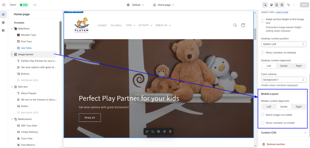
You can utilize these options to offer an app-like look and feel to your mobile shoppers.
Also, when you’re tweaking the theme or adding an extra piece of code, the page structure gets disturbed. As a result, your Shopify theme will no longer remain responsive.
Here’s an example of unoptimized customization that affects the store design in mobile view.
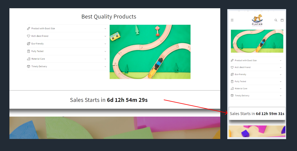
For this, I would suggest you take expert help who can customize your Shopify theme without affecting your store performance and user experience.
2. Improve your Website Speed
As discussed above, if your website loads slowly, the store visitors will immediately leave your site and the bounce rate will be high. They don’t even get the chance to explore your products.
This way the poor performing website has a great impact on your conversion rate. Optimizing your website speed is easy if you identify the reasons why your store is slow.
Here are the common Shopify mistakes that can slow down your online store. Also, find the solutions in the table.
| No. | Problems | Solutions |
| 1 | Using an unoptimized theme | Use an up-to-date, optimized Online Store 2.0 theme |
| 2 | Having too many tracking pixels | Minimize the number of tracking pixels you use |
| 3 | Adding large images or gifs | Optimize your images for size and quality |
| 4 | Bulky animations and video files | Use compressed videos and consider video hosting |
| 5 | Installing too many apps | Keep the number of apps you use to a minimum and remove any unused apps |
| 6 | Poor theme customization | Be mindful of your theme customizations and avoid using excessive code |
| 7 | Using fancy fonts | Use system fonts whenever possible to avoid adding extra HTTP requests |
| 8 | Too many redirects | Minimize redirects and use tools to identify and remove redirect chains and loops |
| 9 | Using excessive popups | Use popups sparingly and keep them lightweight |
| 10 | Avoiding website maintenance for long | Perform regular maintenance on your Shopify store to keep it clean and optimized |
The basic optimizations can be done by non-technical people like you and me, but what about the advanced speed optimization??
For that, you may need to hire Shopify developers or performance specialists. They can easily resolve the performance issues and speed up your website.
3. Simplify the Site Navigation
As a shopper, I don’t like long navigation or the need for 4-5 clicks to reach the target page. Your shoppers may have the same preferences. So, it’s necessary to identify the most visited pages or important pages on your website, such as your product pages or checkout page, and prioritize them in your navigation.
It’s true that when you have complex navigation, shoppers will be able to find what they are looking for. And they simply leave your site without purchasing anything.
On the other hand, well-structured site navigation assists shoppers with seamless product discovery and motivates them to spend more time on your website.
Here are some tips to make your site menu user-friendly and accessible:
- Logically organize categories, with broader categories at the top and more specific subcategories below.
- Add the policy page links (T&Cs, privacy policy, return policy, etc.) to the footer menu and not to the main menu (header).
- The menu items should have descriptive labels.
- Keep the number of categories to a minimum, ideally at most 7-8 main categories.
- Group the related menu items together to help users navigate your website more easily (optional).
- Ensure that your site navigation is mobile-friendly. Avoid using too many menu items that may be difficult to tap on a small screen.
- Make sure the navigation menu is easily accessible from all pages of the website.
Read more: How to Add Nested Drop-down Menu in Shopify [No Coding]
4. Focus on Features over Product Description
Customers care more about benefits: how your product will improve their lives or solve their problems.
And, merchants mostly show the product description and forget about the key features that are comparatively more readable and effective. It could be small information but it can really impact the buying decisions.
Let’s understand this with a perfect example!
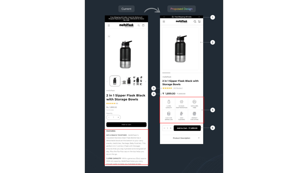
Can you see the difference between both designs???
Current Design:
This design relies on a text-heavy approach, which can be overwhelming for shoppers. While it might mention technical specifications, it doesn’t immediately grab the reader’s attention and explain why they should care.
Proposed Design:
This design uses bullet points to highlight the key features of the product in a clear and concise way. This allows shoppers to quickly scan the benefits and understand the value proposition.
Here’s why the second design is more effective:
- Scannable: Busy shoppers don’t have time to read lengthy paragraphs. Bullet points allow for quick and easy digestion of product information.
- Benefit-Oriented: The features are presented in a way that emphasizes the benefits to the customer. For example, “2 in 1 Sipper Flask” clearly communicates functionality and versatility.
- Increased Engagement: The clear layout is more engaging and keeps shoppers interested in learning more about the product.
This is how you can improve the product page and make it impressive.
5. Feature High-quality Product Images and Videos
In online shopping, visuals are the only way for shoppers to examine the product’s quality and design. And it’s also your only chance to convince them by offering a great look and feel of the product virtually.
Frankly speaking, blurry photos and low-quality videos are a red flag for customers. They can instantly create a negative impression and raise doubts about the legitimacy and quality of your products.
Would you trust a business that doesn’t take the time to present its products well?
Professional visuals showcase your products in all their glory. Customers can zoom in on details, see the product from different angles, and even get a sense of how it might look or function in their own lives.
6. Highlight Social Proof and Reviews
People trust the opinions of others, especially when it comes to trying new products. That’s why highlighting positive reviews and customer testimonials can be a powerful sales strategy for your Shopify store.
User-Generated Content (UGC) feels more authentic than traditional marketing and allows customers to see how others are using and enjoying your products. This includes photos and videos shared by real customers featuring your products.
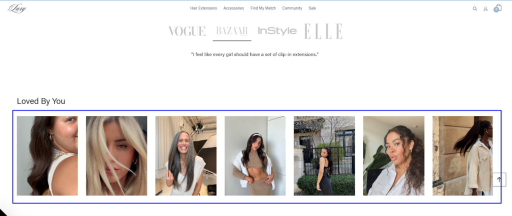
See how Luxy Hair showcases UGC on its home page. This is a great example!
Check out the top UGC examples to learn how some brands are leveraging user-generated content to impact their shoppers. Consider implementing a similar strategy to use the power of social proof on your own Shopify store.
7. Highlight Scarcity (Limited-time Offers)
People are naturally drawn to limited-time offers and products with perceived scarcity.
Scarcity marketing taps into the fear of missing out (FOMO) psychology. Customers don’t want to regret missing a limited-time offer, so they’re more likely to buy now.
When a product is perceived as scarce, it automatically seems more valuable and desirable. So, customers are more likely to buy before they miss out on a great deal. By highlighting limited-time offers or limited-quantity products, you can create a sense of urgency that encourages customers to act fast.
Here are some ways to highlight scarcity in your Shopify store:
- Limited-Time Sales and Discounts: Offer flash sales, limited-time discounts, or special promotions that expire after a set period. Use countdowns or timers to create a sense of urgency.
- Limited-Quantity Products: Highlight products that have limited stock or are part of a limited-edition collection. Indicate the remaining quantity to create a sense of scarcity.
- Pre-Order Exclusives: Offer exclusive pre-order benefits or limited-edition bundles for products that are not yet available. This generates excitement and encourages early purchases.
Also note that, if every product seems to be in limited supply, it can lose its effectiveness. Use scarcity strategically for specific products or promotions to maximize its impact.
8. Don’t Miss the Important Pages
Some hidden pages like About Us, policy pages, etc. may not get good attention on your website but are strong supporters and build trust for new buyers. Some merchants don’t even care to add these pages to their stores.
Customers want to know who they’re buying from, and a well-crafted About Us page can help you connect with them on a personal level. According to Shopify’s research, customers visit the About Us page to learn more about the brand and the people behind the products.
Pages like your Return Policy, Privacy Policy, and Shipping Policy might not seem exciting, but they’re essential for building trust with customers. These pages show that you’re a legitimate business and that you’re transparent about your practices. They also give customers peace of mind by knowing what to expect in terms of returns, shipping, and data privacy.
If you don’t have these pages then you must add them immediately. Here are the detailed guides to help you create them:
- How to Create an Effective Shopify About Us Page?
- How to Add Store Policies using Shopify Policy Generator?
9. Add Trust Signals to your Store
Online shoppers remain extra careful when shopping with new brands. Trust signals alleviate these concerns and make customers feel comfortable completing their purchases.
Display logos of trusted security providers like SSL certificates or payment processors like PayPal and Visa. These badges visually communicate that your store is secure and protect customer information.
See one more example of trust badges on the product page that are enough to boost the user’s trust or confidence in the brand.
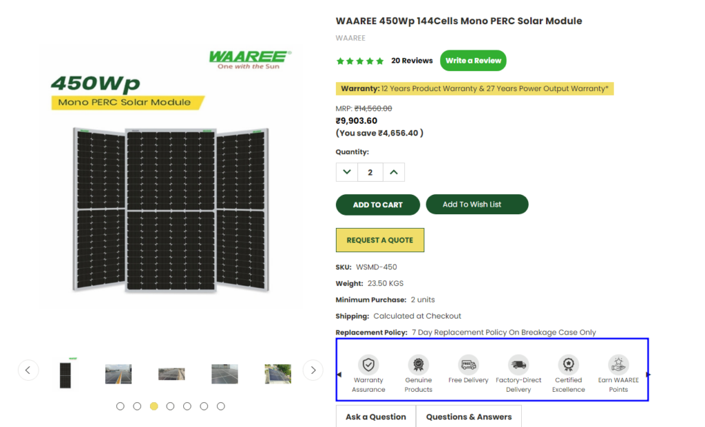
Here are the main types of trust signals you place on your website:
- Product Pages: Industry-specific trust badges (e.g., organic certification for food products)
- Checkout Page: Payment processor logos, security compliance badges specific to financial transactions (e.g., 3D Secure)
- Throughout the Website:
- SSL certificates, Secure Sockets Layer (icons representing a padlock or checkmark)
- Customer review badges (e.g., Trustpilot, Yotpo)
- Logos of trusted payment processors (e.g., PayPal, Visa, Mastercard)
- Security compliance badges (e.g., PCI DSS)
- Logos of Industry association memberships
When customers feel confident about the security and legitimacy of your store, they’re more likely to convert and make a purchase.
10. Implement Upsells and Cross-sells
Customers don’t always land on the perfect product right away. Studies show that 63% of customers expect online stores to understand their needs and expectations.
How upselling and cross-selling are relevant here? Let me explain to you.
Upselling means offering Premium options: When a customer is viewing a product, suggest a higher-end version with additional features or benefits. For example, if they’re looking at a standard phone case, recommend a more durable case with drop protection at a slightly higher price point.
Cross-selling means recommending Complementary Products: Use product recommendations to suggest items that complement what a customer is already considering. For example, if someone adds a t-shirt to their cart, suggest a pair of jeans or shoes that would go well with it. This can create a more complete shopping experience and encourage them to spend more.
When you offer relevant product suggestions, you can help customers find exactly what they need. This adds more convenience to their shopping experience and encourages them to purchase more items.
Shopify offers built-in features to add product recommendations to your online store, but you can also use third-party solutions (which are more customizable). Check out the best Shopify upsell apps for your store.
This way you can increase your sales while helping customers find the products they need to complete their purchase
11. Offer Guest Checkout
Many customers, especially first-time buyers, prefer the convenience of skipping account creation during checkout. Guest checkout allows them to purchase without registering, streamlining the buying process.
The main benefit of guest checkout is increased conversions, especially for first-time buyers, as there are fewer barriers to completing the purchase.
Additionally, it can build trust with wary first-time buyers who are hesitant to share their data. However, this convenience comes at a cost for businesses.
Guest checkout means no customer data is collected! This can make it difficult for you to personalize marketing campaigns, track purchase history, or recover abandoned carts. Ultimately, the decision depends on whether the benefits of faster checkouts outweigh the drawbacks of limited customer data.
See the best example of guest checkout:
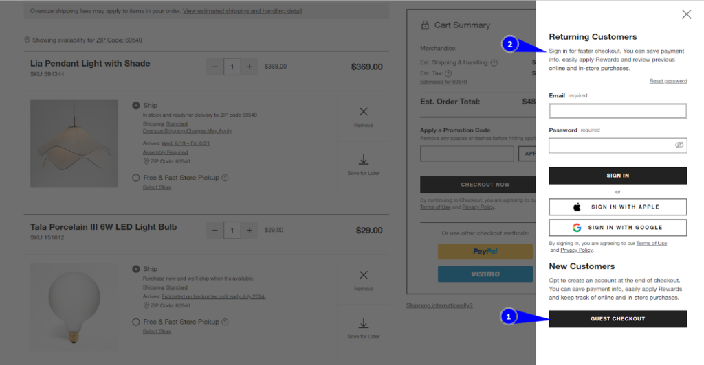
To optimize guest checkout, you should:
- offer it prominently alongside account login,
- explain the benefits of each option,
- streamline the checkout process, and
- implement security measures to build trust.
This way, you can provide a convenient experience for guest buyers while mitigating some of the downsides for your business.
12. Utilize Pre-filled Forms at Checkout
According to Google, auto prefills save 30% of users time – resulting in more success at checkout pages.
You can either store customer accounts or use cookies to remember past data such as name, shipping address, and email address to enable auto prefill. This way, you not only save them more time but also improve your Shopify store’s conversion rate.
There’s another way where you can offer checkout forms prefill more efficiently. Yes, you heard that right.
With GoKwik’s one-click checkout solution, you can make the checkout process faster and easier. They offer the largest pool of 100 million+ shoppers, so up to 85% of the addresses are prefilled.
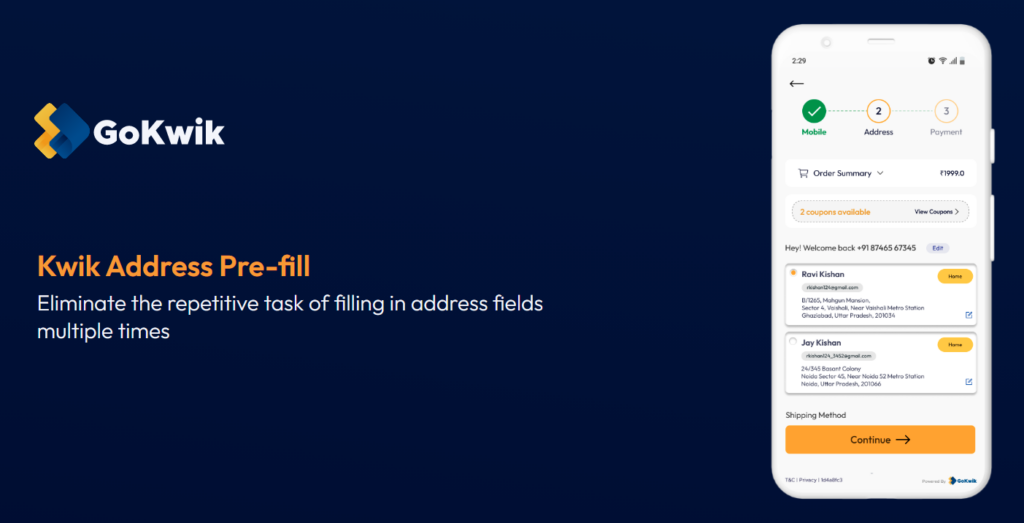
Plus, it suggests the top two addresses for a faster checkout. This eliminates tedious typing and reduces errors, which offers a smoother experience.
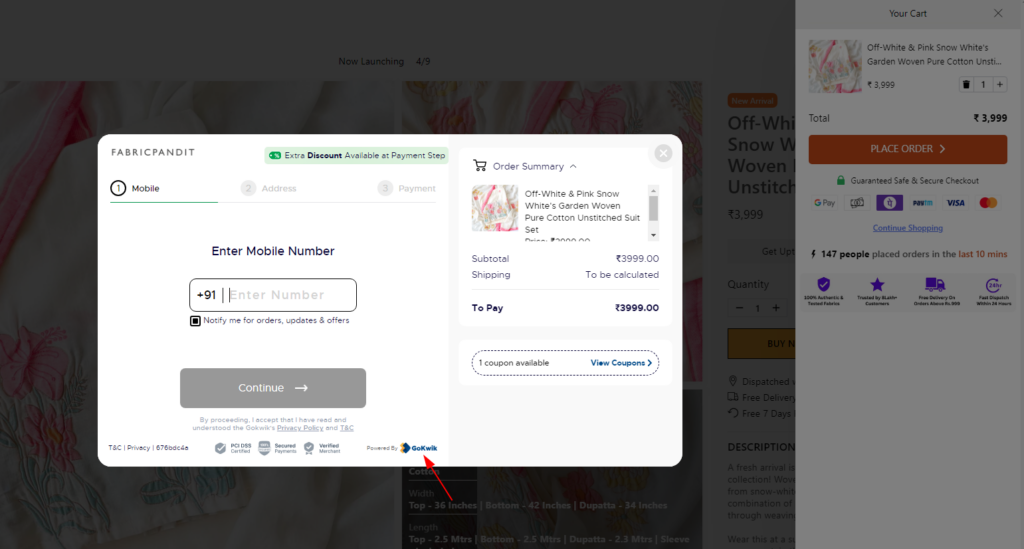
If you want to integrate this solution into your Shopify store, let us know! We, Aureate Labs has partnered with GoKwik which enables us to help eCommerce businesses streamline their checkout processes and ensure reduced cart abandonment.
See how we have integrated KwikCheckout for one of our Shopify clients: Fabric Pandit!
13. Offer Multiple Payment Methods
Every shopper is different and so are their preferences. So, what may work for one, may not work for other shoppers.
Those who prefer a specific payment method (like digital wallets or buy-now-pay-later options) are more likely to complete their purchase if it’s available; otherwise, they might abandon their cart altogether.
You can offer multiple choices like credit cards, debit cards, digital wallets, and even alternative payment solutions like buy-now-pay-later services.
In case you’re wondering, here are the best payment methods for Shopify stores!
- Shopify Payments
- PayPal payments
- Google Pay
- Stripe
- Apple Pay
- Amazon Pay
If you target specific locations only, then you should research the most preferred payment option for online transactions in that location.
For example, in the US, the survey shows that users mostly prefer credit cards and mobile wallets over other payment options, likely due to the popularity and user experience with mobile payment apps such as PayPal.
Whereas, Indian Gen Z shoppers mostly prefer digital wallets or UPI (Unified Payments Interface) payment options (source)!
By providing payment convenience to your shoppers, you make it easier for them to complete their purchases.
14. Run Abandoned Cart Email Campaigns
Have you ever added items to your online shopping cart only to get sidetracked and forget about them? It happens to most of us and your shoppers too!
But the good news is, that you can win back those lost sales with strategic abandoned cart email campaigns.
These automated emails are sent to customers who have added items to their cart but haven’t completed the purchase. This reminds customers about the items they left behind, reignites their interest, and prompts them to complete their purchase.
Abandoned cart emails typically have higher open rates than regular marketing emails, as they’re relevant to the customer’s recent browsing activity.
One more good news — Shopify allows merchants to automatically send an email to customers after they have abandoned their checkout. You can edit the email template by adding a logo or changing the color scheme.
Here are the steps to set up automatic recovery emails sent on Shopify:
- From your Shopify admin, go to Settings > Checkout.
- In the Abandoned checkouts section, check Automatically send abandoned checkout emails.
- Under Send to, choose who you want to send a checkout recovery email to:
- Anyone who abandons a checkout
- Email subscribers who abandon a checkout
- Under Send after, select the number of hours that Shopify should wait before sending the abandoned checkout email:
- Never.
- 1 hour later
- 6 hours later
- 10 hours later (default)
- 24 hours later
- Click Save.
Here’s how you can manually send an abandoned checkout email to customers.
15. Create a Customer Loyalty Program
Last, but not least—Customer loyalty programs are a fantastic way to turn one-time buyers into repeat customers who become brand advocates.
By offering rewards and incentives, you can encourage them to keep coming back for more.
Here are some popular ways to reward customers in a loyalty program:
- Points System: Award points for purchases, reviews, social media engagement, and other actions. Customers can then redeem points for discounts, free products, or exclusive rewards.
- Tiered Programs: Offer different reward levels based on purchase history. Higher tiers can unlock exclusive benefits like early access to sales, free shipping, or personalized birthday gifts.
- Exclusive Offers: Provide loyalty program members with exclusive discounts, early access to new products, or special events. This creates a sense of privilege and keeps them engaged.
- Referral Programs: Reward customers for referring friends and family, encouraging new customer acquisition.
Here’s a perfect example!
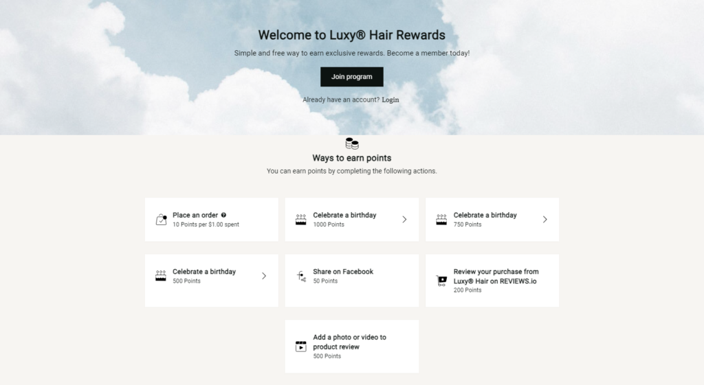
Luxy® Hair uses a customer loyalty program to encourage repeat purchases. Their program offers exclusive “club-only” merchandise, creating a sense of exclusivity and motivating customers to join.
Final Thoughts!
Congratulations! You’ve explored 15 powerful strategies to boost sales on your Shopify store.
Now it’s action time. See what resonates with your audience and adapt your approach accordingly. Start by identifying the areas you can improve on most.
Remember, building a successful ecommerce business takes dedication and continuous improvement. Take it one step at a time, and soon you’ll be well on your way to achieving your sales goals!Need Shopify experts can help you improve your website user experience? — Let’s Talk!


Post a Comment
Got a question? Have a feedback? Please feel free to leave your ideas, opinions, and questions in the comments section of our post! ❤️