16 Guaranteed Ways to Increase Mobile eCommerce Conversion (With Examples)

If you belong to a time when eCommerce was a new thing, you would remember how we used to buy things on a big screen with lots of excitement and a sense of pride. But today, the times and technology have changed.
According to multiple studies and online resources, it’s evident that despite a significant increase in mobile usage, conversion rates aren’t that great [1]. It’s actually lower compared to desktop and tablet devices.
So what’s the solution? Optimizing your eCommerce website to increase mobile conversion rate.
As we have worked with a range of eCommerce clients, we have figured out the best strategies that can help you increase your mobile conversion rates to great levels.
In this guide, we have covered everything about mobile conversion optimization starting with –
- Definition of mobile conversion rate,
- What a good mobile conversion rate is,
- Facts and statistics of mobile conversions,
- Why mobile conversion matters for an eCommerce Business, and
- How you can increase mobile eCommerce conversion rate to make the most out of your marketing efforts.
Let’s get started without any further delay!
What is the Mobile Conversion Rate?
The mobile conversion rate is the percentage of users who complete desired actions on your website through mobile devices.
These actions can include buying a product, signing up for a newsletter, filling out a form, or any other action that helps you achieve your pre-defined business goals.
If you wish to calculate the mobile conversion rate, you can simply do it by dividing the total number of visits by the number of mobile conversions and multiplying it by 100.
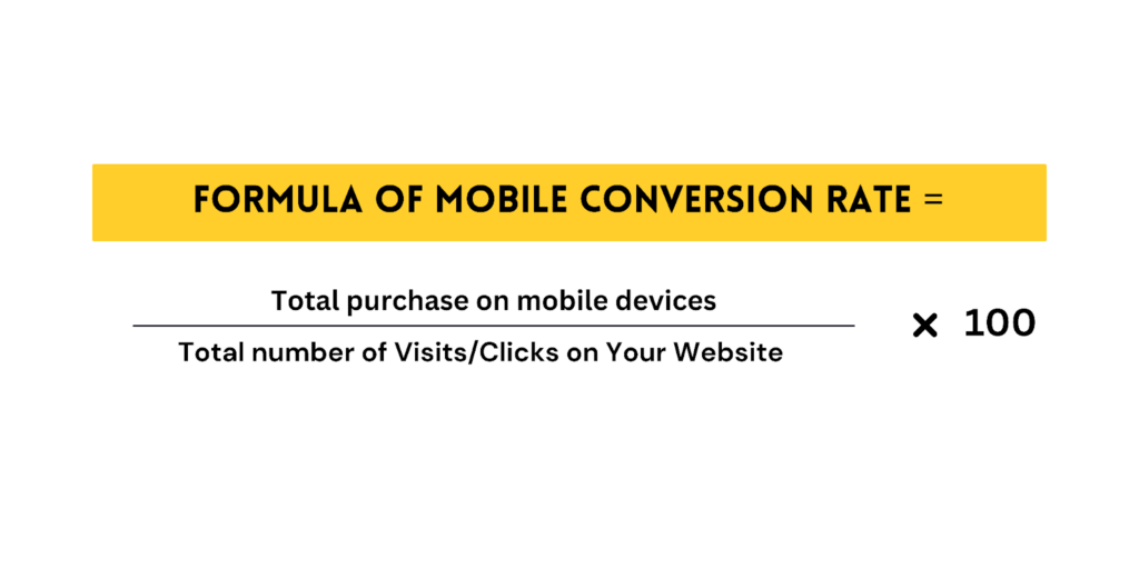
Now that you know what is mobile conversion rate, let’s find out what’s the benchmark for a good conversion rate.
What is a Good Mobile Conversion Rate?
The definition of good mobile conversion rates depends on the industry to industry and specific KRAs you may have set.
The best way to judge if your mobile conversion rate is good or not, you can check your industry benchmark and evaluate accordingly.
However, for a good quick reference, we have listed some key facts and statistics that you should know about.
Key Facts and Statistics about Mobile Conversions
Other than the industrial mobile conversion rate benchmark, here are some more statistics that you should keep in mind to improve mobile conversion rates accordingly.
➡️The mobile e-commerce sales worldwide went over $4 trillion in 2023, making up more than 72% of all online shopping.
➡️Around 65% of people use their phones to shop online at least once a month, and for 25%, it’s their main way of shopping.
➡️80% of what people buy in stores is influenced by research they did on their phones first.
➡️At least 79% of smartphone users have made a purchase online using their mobile device in the last 6 months.
➡️Mcommerce experiences steady growth, with sales projected to exceed $710 billion in 2025 and 187 million active mobile shoppers by 2025 in the US alone.
➡️Smartphones (73%) are the most common devices used for online shopping in the U.S.
➡️The worldwide 29.9% of consumers buy something online each week via a mobile phone.
➡️Mobile commerce spending makes up 38% of overall digital spending in the US.
➡️More than half of all online sales during Cyber Week come on mobile.
➡️As many as 67% of mobile users state that “pages and links being too small to click on” is a barrier to mobile shopping.
Why is Mobile Conversion Rate Optimization Important?
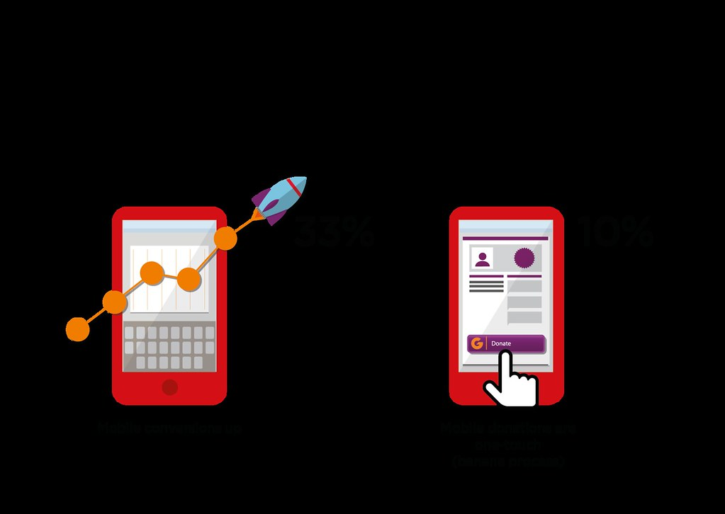
From the above data, you can clearly see that there’s definitely a growing market for eCommerce. However, the data when it comes to mobile conversions, is not so great!
And thus, when you overlook the mobile CRO for your store, you miss out on a lot of opportunities that can get you quick revenue for your online store.
Here are some immediate benefits you can get by optimizing your store for mobile –
1. Higher Engagement From Users
Do you know where users struggle the most?
Interacting smoothly with your store on a smaller screen. So as soon as you optimize your store, your users can experience –
- Faster loading website,
- Easily tap-able buttons,
- Mobile-first content that’s easy on the eyes
- Functionality to search with voice assistance
- Less scroll and intuitive navigation
When your website has all of these factors present, it naturally improves engagement from mobile device users.
2. Low-Hanging Opportunities from Mobile Devices
Have you heard the phrase “low-hanging fruits”?
They are the opportunities or tasks that you can achieve with the least effort – making it super easy.
Many studies prove that despite mobile getting the highest traffic, they have the lowest conversion rate.
It’s like letting the opportunity go in front of you!
And, the moment you make it smooth for mobile users to access your store, you improve the mobile eCommerce conversion rates and unlock higher revenue.
3. Improved Omnichannel Experience

I’m sure you or someone you know who checks the product on mobile but buy it offline or maybe from their desktop the next day.
The shoppers in an offline store may visit your online store to compare the product in terms of pricing and discounts. They may also visit your mobile store to read the product description, see the application of the product, and see product reviews.
Checking the products online and buying offline and vice versa makes it important for you to design an experience that aligns with the bigger picture of an omnichannel experience.
So when your mobile experience is smooth for the customers, it influences their buying decisions for the better. Collaborating with a dot net development company like Clickysoft can also enhance your eCommerce platform’s performance. By leveraging the .NET framework, you can ensure faster load times, seamless cross-platform functionality, and an overall improved user experience—resulting in higher mobile conversion rates.
4. Cost-Effective Business Growth
Finally, when you fit all the missing pieces of the mobile experience puzzles, you solve the problems that cost you high like –
- Spending big dollars to bring customers to your store only to find out they are bouncing back,
- People add products to their carts but a majority of them abandon the cart
- High cost of customer acquisition and very little returns on investments
And as soon as these problems are solved, you can grow your eCommerce business in a cost-effective way – justifying all the investments that you have made to make your store mobile-conversion friendly.
So the question now becomes what strategies to implement that constantly give you better mobile conversions? Let’s find out!
How to Increase Mobile eCommerce Conversions?
Before you read these mobile eCommerce conversion strategies, decide which strategies will be the most effective for you, you need to look at your eCommerce store metrics.
Metrics such as where users are dropping off the most, which pages they visit the most, how their journey looks like on your website (Customer Journey Maps), exit rate, click-through rate, average session duration, and scroll depth.
This data will give you a lot of insights about how you can design your mobile store that facilitates user journeys and gets more conversions.
Here are sixteen strategies that increase mobile eCommerce conversions to a great extent:
- The rule of thumb
- Strategic visual hierarchy
- Mobile friendly popups
- Excellent speed and performance
- Push notifications
- Mobile friendly fonts
- Mobile SEO
- Digital wallets
- Dynamic keyboard
- Responsive design
- Sticky CTA
- Voice search functionality
- Mobile search functionality
- AR/VR experiences
- Location-based targeting
- PWA for native-like experience
1. Remember the rule of thumb
We know that there are some thumb rules in every business but do you know that “thumb” is the biggest rule in mobile eCommerce?
As users need to scroll more and it takes more effort to type on mobile devices, it can become a tiring experience for them if the store is not optimized for smaller screens.
Plus, the attention span for mobile screens is extremely tiny, and a highly unstable internet connection makes it even tougher to engage users on the mobile.
This doesn’t mean you have lost it all! The artistry lies in how you place elements in your store so that it becomes smooth for users’ eyes.
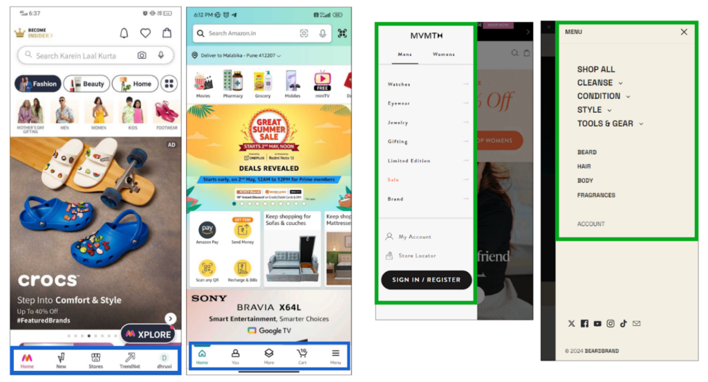
You can do this in multiple ways so, let’s first start with the importance of different menus on phones and websites:
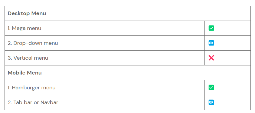
As shown in the table, there are two popular types of menus that help in better mobile conversion rates: the hamburger menu and the tab bar.
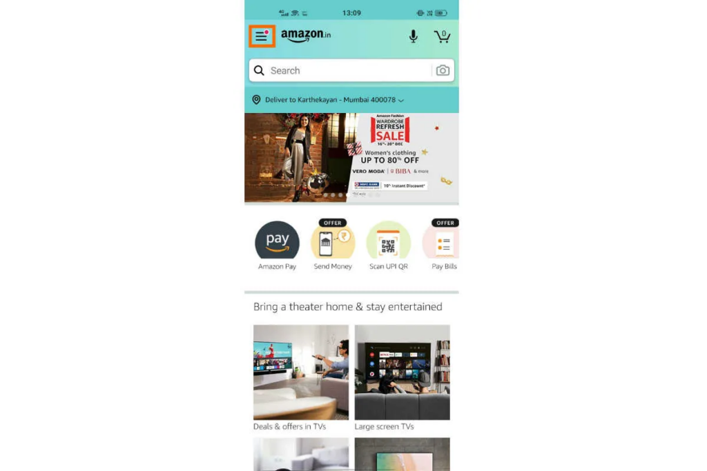
- The Hamburger Menu
In the Hamburger menu (three horizontal lines), the menu doesn’t appear on the screen unless a user clicks on it. This helps you save space on mobile devices to improve user experience.
- The Tab Bar (Navbar or Bottom Menu)
The tab bar menu, specially designed for mobile phones, is placed conveniently at the bottom of the screen – almost where a user’s thumb can reach easily.
With the tab bar, users can quickly access the essential categories and products within a few clicks – improving mobile conversion rates.
Not only menu, but you also need to design your product pages in a way where shoppers can –
- See product photos and videos
- Read product descriptions
- See multiple variants
- Access and edit cart and
- Make payments
with a single scroll and minimum movements of their hand/fingers!
This reminds me of a proposed design that we recently did that you can see below –
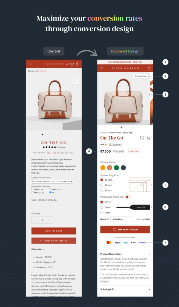
The above image is a perfect example of how you can redesign your product pages in a way that makes it seamless for users to take desired actions.
However, the “thumb” rule is not enough to increase mobile eCommerce conversion rates, you also need to be strategic with your visuals!
2. Be strategic with visual hierarchy for better UI/UX
Our actions and decisions are heavily influenced by what and how we see – and it applies to mobile stores too.
But is it simply about placing images and videos in your store? No!
Visual hierarchy is about designing a structure that’s so intuitive that your users don’t even have to think twice before tapping the next button.
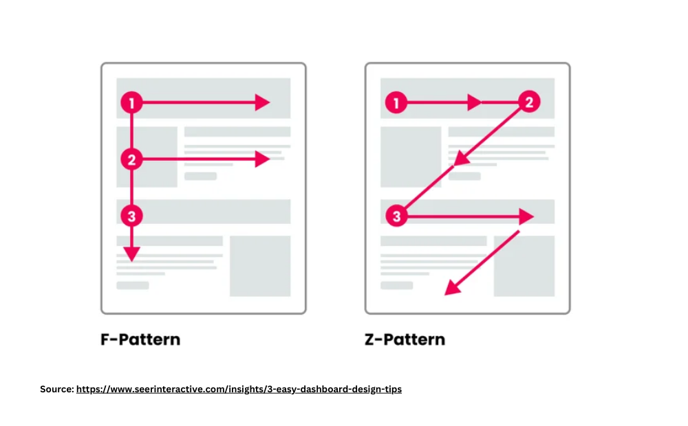
Think of following the Z or F pattern of design to guide users’ eyes in a logical flow without any hassle.
If you look at any big and popular brand, you will observe the same pattern in their website design.
Here’s how the Z and F pattern looks in the designs!
Other than that, keep all the prominent elements in a way that captures the user’s attention in one go!
Check out, one of our clients, Fabric Pandit’s store design in mobile view!
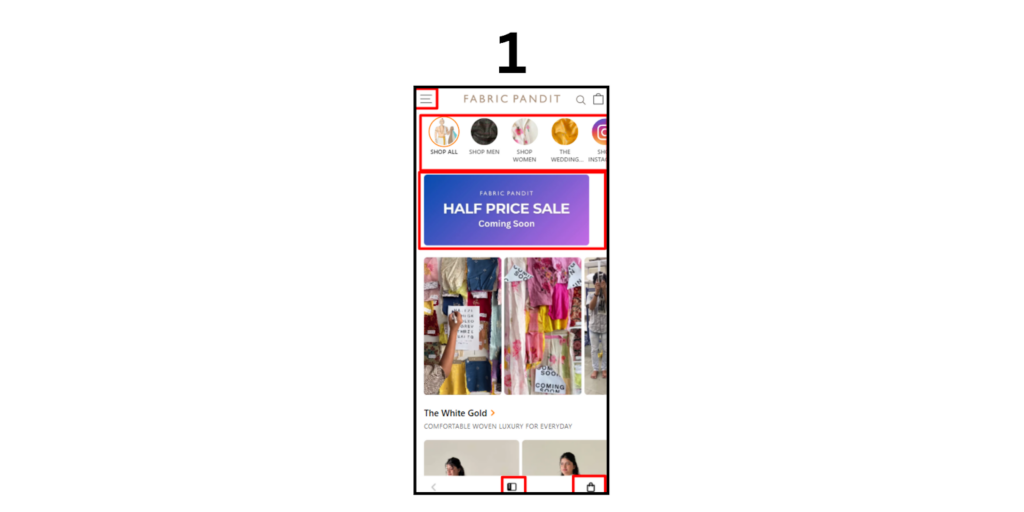
This is a very good example of store design that incorporates visual hierarchy.
All the red blocks that you see are the ways that guide users to take their next step of action.
- The menu that shows the categories to the users
- The promo banner encourages users to make quick purchases
- Another menu button near the thumb to see relevant products
- Shopping cart to see what they have added and make quick payments.
Other than the home page, there are some design concepts that you should keep in mind to drive more mobile conversions –
- Identify the elements that drive the business like CTA buttons, product images, and headlines, and make them stand out.
- Leverage the concepts of contrast in terms of colors and size to naturally draw attention to the important aspects of the store and product pages.
- Use whitespace to separate different sections while avoiding the clutterness on the site.
After you have sorted your visual hierarchy, the next thing you should focus on is popups!
But we are not talking about any random popups, we are talking about mobile-specific popups!
Let’s see how you can make your popups mobile-friendly for improved mobile conversions.
3. Have Mobile-friendly Popups
Did you know that in 2017 Google rolled out an update where if you have intrusive pop-ups on your site, it may get affected heavily in terms of ranking?
And when your ranking gets affected, it’s obvious that fewer people will find your website and thus fewer people make purchases from it!
So what’s the solution?
Having a popup especially designed for mobiles.
Keep these points in mind while designing and implementing popups on mobile –
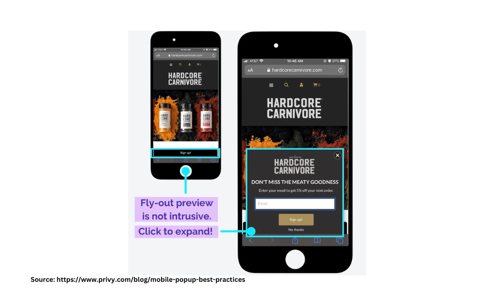
- Occupy lesser space so that the popup doesn’t become unavoidable for a user
- Optimize the resolution of popups to make them visible on mobile sizes
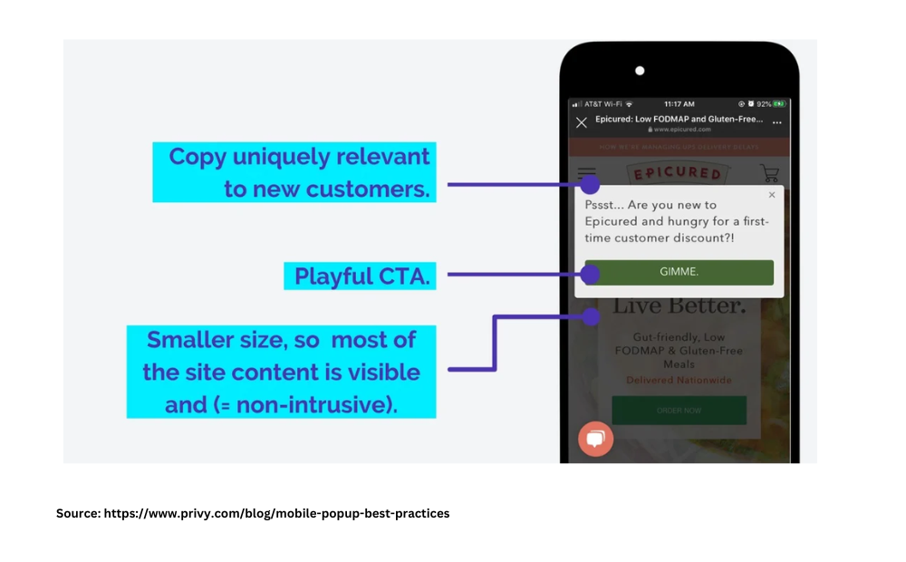
- Be crisp and fun in your popup copies for better conversions
- Don’t trigger popups too often as it may hamper the user experience
Here are a few examples of mobile-friendly popups as per Google standards. As you can see, they don’t cover the full mobile screen and it’s easy to dismiss them.
While you optimize your mobile store for the above-stated strategies, there’s one more thing that you can’t ignore!
Do you know what it is? Speed and performance!
But why? Let’s find out.
4. Ensure Excellent Speed and Performance
According to Google, your conversions can fall by up to 20% for each second of delay in loading.
Take one more second and your customers will not think twice before leaving your site and jumping onto the competitors.
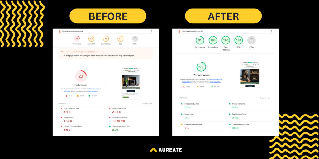
This reminds me of our recent client, Imaginfires, who wanted to improve their website performance and make the store mobile conversion ready before their peak business season arrives in winter.
Our team took the challenge and rolled up their sleeves and we made it possible for them to achieve their business goals.
Based on our experience, here are some common tips you can follow to improve the speed and performance of your website,
Use AMP pages
Implement Accelerated Mobile Pages (AMP) as they make your website load faster on mobile devices – helping you get more traction from mobile devices and thus improving chances of conversion from there.
Load Above-the-Fold Content First
Compared to laptops and desktops, mobile devices generally have low internet speed and for that reason, it becomes important for you to load above-the-fold content first so the user can start accessing your website as soon as they land on the page. This leads to a better user experience, resulting in better impacts on your mobile conversion rates.
Use CDN Tool + Browser Caching
Let’s say you have an international eCommerce brand. Users are coming to your site from multiple locations. Now, in this case, you need to have more hosting bandwidth to serve multiple caches. And if not done properly, this can lead to higher latency rates.
To solve this problem, you need to use a Content Delivery Network (CDN), which improves your site response time across nations, helping your multinational customers access your site without any delays – improving the chances of mobile conversion rates.
Plus, we recommend you enable browser caching as it stores all web pages on the device for some time – loading the page faster when a user visits it the second time. This will help them see content faster which supports better mobile conversion rates.
When you ensure both of these factors, it helps your site to have better performance.
So what’s next after improving your website speed and performance to increase mobile eCommerce conversions?
Push notifications! It’s a super weapon that you can use only on mobile phones!
5. Use Push Notifications
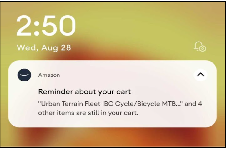
When it comes to mobile eCommerce conversions, push notifications hold a major influence as they can boost engagement rates by up to 88%.
Think of using push notifications to
- Show exciting deals and offers
- Highlight newly arrived products
- Location-specific updates for customers
- Give updates about the orders and other transactions
However, to make these push notifications conversion-centric, here are some tips that you should keep in mind:
- Personalise notifications based on user preferences, and demographics.
- Send notifications when users are most active and likely to engage with your app. You can decide these timings by checking the user engagement insights of your app.
- Send behavior-triggered notifications such as reminders after a user abandons their cart.
- Leverage deep links in your notifications to redirect users to specific pages to reduce friction and increase conversion.
6. Incorporate Mobile-Friendly Fonts
If you have to visit the same store from your desktop and mobile device, you will see a significant difference in how the fonts and visuals look and there’s a reason for it!
The ideal font on desktop devices is 24px whereas it’s 16px for mobile screens. If you keep these fonts too small or too big, it hampers the user experience and thus mobile conversions too. Also, make sure the spacing between the two lines is adequate enough for a user to skim your product pages easily.
Other than mobile-friendly fonts and size, it’s also recommended to limit the use of font families you use across the store and brand elements as it may confuse eyes and hamper the psychological ease of reading.
Think of designing an orchestra of headings, sub-headings, bullet points, and white space that gives an amazing scrolling experience to your users.
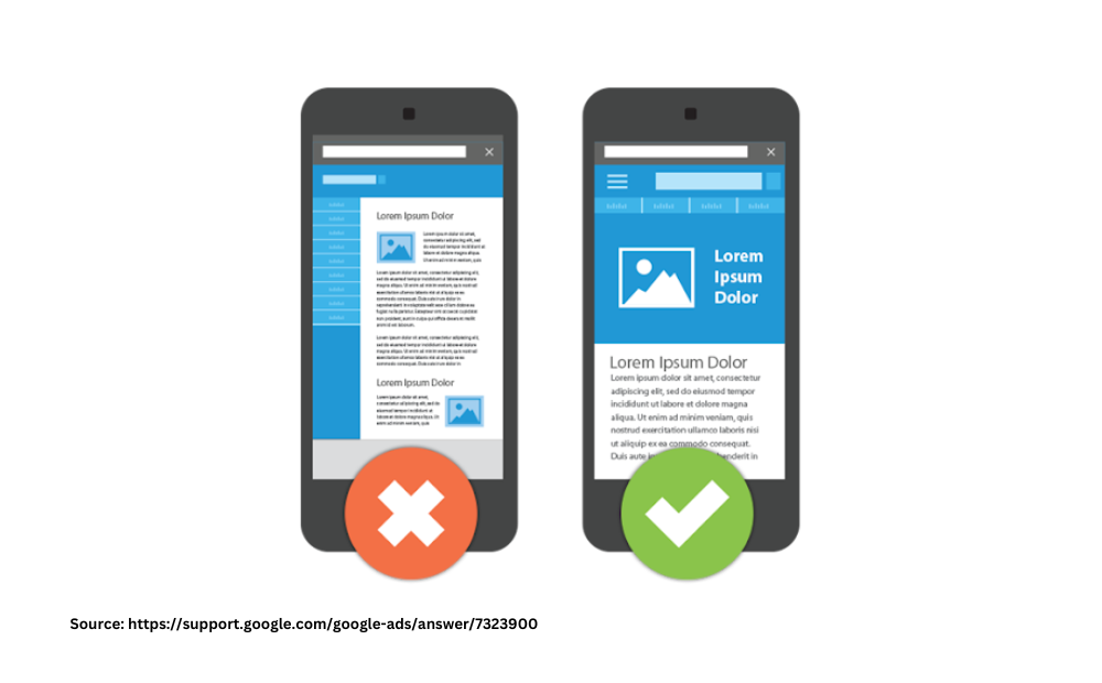
If you look at the image above, you will see subtle design strategies, including font size that make a huge difference to how a page looks.
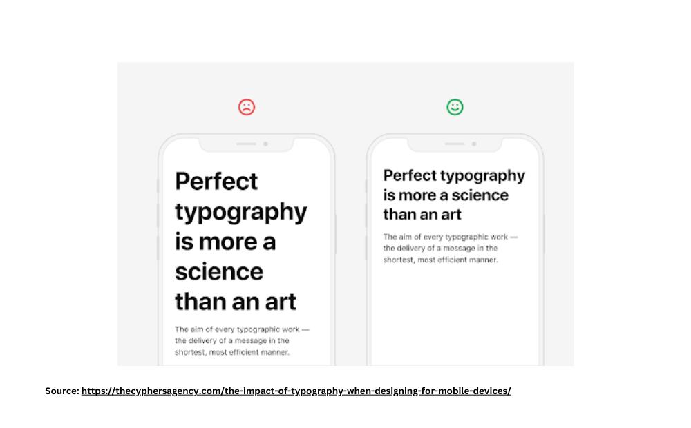
Here’s another example of how too big font size can make it very uncomfortable to read the sentences in one go but a perfect size makes it smooth like butter!

This example nicely demonstrates the importance of keeping adequate space between the lines for better user experiences.

And lastly, this image very well explains the importance of having a limited font family in your page designs to maintain brand consistency and experience.
When you make sure your website has enough readability, you will definitely see an improvement in your conversion rates too.
Other than humans, even search engines need to find your website easy to read and understand and that’s why it’s important to make your store SEO friendly!
Let’s find out how you can do it to convert more customers to your store.
7. Incorporate Mobile SEO
Do you think mobile SEO is all about page speed? Think about it again! Sure, website speed for eCommerce matters but mobile SEO is not limited to that!
If you want to optimize mobile SEO, keep these points in mind:
- Make sure your website is easy to navigate on different and small screen sizes – maintaining a consistent user experience. When the user experience is consistent, it gives a positive signal to both search engines and users to trust your website, translating into better mobile conversion rates.
- Make it easier for users to checkout with just a few clicks. On a desktop, a lengthy checkout may not feel overwhelming but with a small screen size, it may feel like a LOT – increasing cart abandonment rate. And when there’s high cart abandonment, it definitely affects your mobile conversions heavily.
- Implement product, review, and pricing schema markups to help search engines understand your content better. With schema markups, you can secure featured snippets, bringing you more clicks and thus better conversions. Moreover, when users see what they want to see quickly, it encourages them to buy from your website.
- If you have local stores, you can leverage local SEO to attract customers who are searching for your products on mobile devices. You can create location-specific pages to further improve conversion rates.
- Keep your content bite-sized with shorter paragraphs, bullet points, and headers to improve readability on smaller screen sizes. When a buyer can skim your page faster, it minimizes their struggle to understand your products and offerings thus improving mobile conversion rates.
- Have a mobile-friendly URL structure – short and clear – so the readers can get them in a second, improving your click-through rate as well as conversion rates.
When you incorporate all of these things in your website, it improves your visibility on mobile devices and thus higher chances of mobile conversions.
You know what’s one more user behaviour change that has changed the way mobile eCommerce works? Online payments!
You look around yourself and you will see even the local vendors have UPI QR codes with them. And this brings us to our next point of integrating digital wallets into your eCommerce store.
8. Integrate Digital Wallets
According to statistics, in 2023, mobile wallets accounted for roughly half of global e-commerce payment transactions, making the digital wallet by far the most popular online payment method worldwide. And this is to increase with a CAGR of 14.9 percent between 2023 and 2027.
So if your store doesn’t have digital wallets, you are giving a clear opportunity to users for not completing their purchase.
Provide all the popular digital wallets like ApplePay, GooglePay, PayPal, and credit card options so the users can pay easily and increase the chances of a successful order.
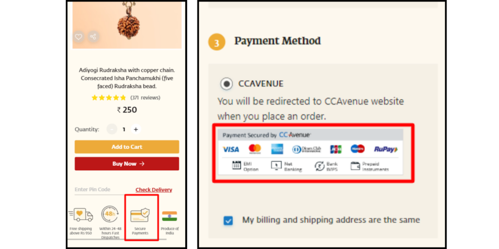
Taking the example of the same project, you can see how they have indicated the factor of “secured payments” (left-hand image) and shown all the accepted payment methods on the checkout page (right-hand image).
Now think, the user decided to make the payment, they entered their details and they got an OTP on their phone.
But on the input page, they see a full keyboard mixed up of alphabetic and numerics. This might create confusion and they may leave the store without making the purchase.
So what’s the solution? Dynamic keyboard!
9. Add Dynamic Keyboard Functionality
As we are discussing mobile eCommerce conversion specifically, we can’t ignore the functionality of dynamic keyboards as they are specifically designed for mobile devices.
Simply put, dynamic keyboards are a functionality where the keyboard switches based on the intended input purpose.
For example, if you want your users to provide an email, the keyboard would have some pre-filled email formats so your users can fill in data quickly.
Same way, if they need to enter a password, it will have a different keyboard, and so on!
You can see a few examples of dynamic keyboards in the image below.
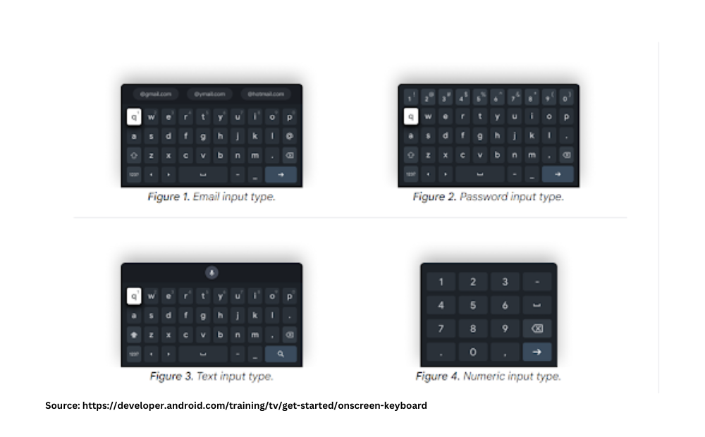
Now, let’s go back to the instance where we were talking about a user needing to enter an OTP. In such situations, if you have enabled the functionality of a dynamic keyboard, it will automatically show the numeric input type keyboard.
Not just that, think of a situation, where they have to enter a phone number or a zip code – there a numeric input type keyboard would be highly effective.
Based on the type of data you need from your users, you can enable those keyboards for your website/store.
There’s no doubt that when you implement this strategy, you will see better mobile conversion rates.
💡Additional Tip:
Enable auto-fill functionality to save the time of users and make their shopping journey even smoother!
Now, as you have many factors in place that make your store ready for mobile conversions – the next thing you need to ensure is a responsive and adaptive design of your store.
I’m sure, we all expect a good structure and design of a store but how does it actually affect the mobile conversion rates? Let’s find out!
10. Have Responsive (Rather Adaptive) Designs
37%. Yes, 37%. This represents the group of consumers who are more likely to make a purchase from a mobile-responsive website.
And there’s no big logic why!
When your store is responsive, it becomes convenient for your users to navigate your store regardless of their screen size.
However, the times have changed and responsive design is not the next best thing you can have. Why?
Responsive designs are auto-generated and they may look cluttered and messy sometimes.
So what’s the solution then?
Adaptive designs!
In adaptive designs, you design multiple fixed sizes for each element, and then based on the available screen of the user, the website selects the layout that matches the best ratios.
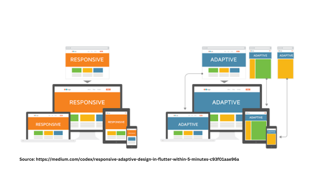
If you look at the image above, you will see how a responsive design has the same website element structure that tries to fit into all the screen devices.
On the other hand, adaptive design has a different structure for each device screen with a unique element structure strategy.
These subtle changes in the design make your website more easy to access and surf through – helping you increase conversion rates.
Moving forward, another factor you should keep in mind to optimize your store for mobile conversion is placing a sticky CTA as it makes buying actions easier for users.
11. Use a sticky CTA
Imagine, after analyzing everything in your store, a user finally decides to make a purchase. Or they are already sure of buying the product – but they can’t find the “buy now” button! Wouldn’t it feel frustrating scrolling on product pages up and down just to find that tiny block?
To avoid such situations, don’t let your customers waste even a second of their time finding the most important elements of the page. Plus, place a sticky CTA near the hand and thumb region so that they can click on the button without any effort and complete their purchase.
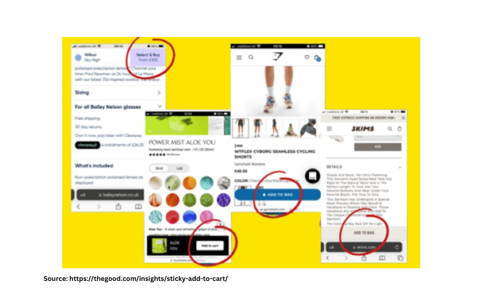
There are many ways you can place the sticky CTA button as shown above in the image. You can experiment with the placements and track the mobile conversion rates to see which one is working the best for your website and user preferences. However, keep only one main CTA. Don’t have multiple CTAs that may create decision fatigue.
12. Offer Voice Search Functionality
For a second, assume that you are outside and your hands are dirty – you can’t type. But you want to search for your desired products – what will you do?
Look for voice assistance, right?
That’s the first thing that comes to any user’s mind.
To maximize the usage of voice search assistance, design and write content on your eCommerce store in a way that facilitates your natural language processing capabilities.
This reminds us of one of our clients who has beautifully incorporated a voice search function to improve user experience.
Here’s how it works in the store!
You know what’s one more thing that you can do to increase mobile eCommerce conversions? Optimizing for mobile search.
13. Optimize for Mobile Search
As mobile screens are smaller than laptops, there are higher chances that users would misspell the words. And if they have to auto-correct their words again and again – it would frustrate your users.
By simply giving voice search (just discussed above) or an auto-fill option, you can show them the right products and improve the conversion rates.
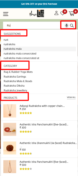
This reminds us of our recent project where we implemented the same strategies of enabling voice search and displaying relevant suggestions, categories, and products to facilitate user experience for improved conversion rates.
💡Additional Tip:
You can keep the search bar as a sticky header so users can find products without any hassle!
Can you guess what will appeal even more to human psychology and trigger them to buy your products immediately? When they get a quick trial of it.
And you can do it with the latest technology of Augmented Reality and Virtual Reality!
14. Provide an Option to Experience the Product with AR/VR
If you have a cosmetic brand then you may know that it can get tricky for users to find how a product would feel like on them!
And due to this concern and the double-mind of users, the store was not able to reach its best potential.
What did we do?
Suggested product trails through the functionality of AR/VR!
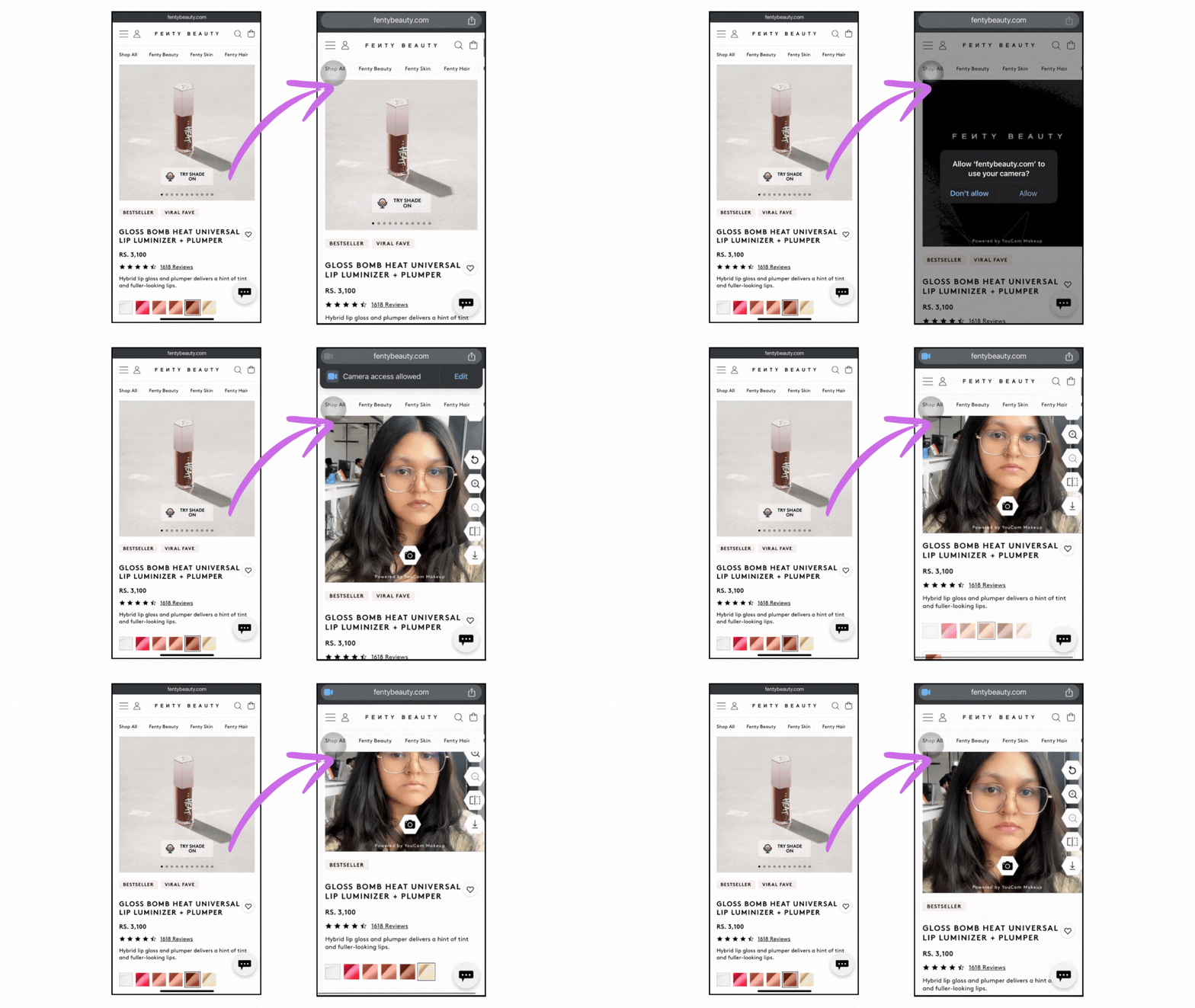
As you can see in the video, users can try the available shades of lipstick and see which one looks good on them.
This feature is especially useful when the majority of your users are visiting your store from mobile devices.
And when they integrated AR/VR along with some other CRO-focused strategies, they saw immense growth in their sales and revenue!
Learn how fenty beauty’s CRO is inspiring the whole skincare industry.
Other than AR/VR, as people take their mobile phones with them everywhere they go, using their location details for improved conversion is a great idea you can execute.
15. Enable Location-based Targeting
Do you provide your products or services in multiple locations?
If yes, location-based targeting is the best strategy you can use to increase mobile conversion.
Here are some strategies that you can use to increase mobile conversion through location targeting:
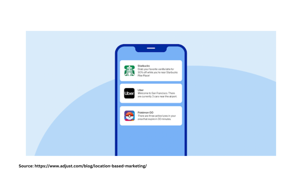
- Leverage Geofencing. You can use this feature and set virtual boundaries to users’ locations. So when they enter the targeted location with their mobile phone, you can send them specific notifications to increase conversions.
For example, If your business has a physical presence, you can use geofencing to drive both offline and online sales. For example, when a user enters a mall where your products are available, you can send them location-based push notifications.
These notifications could encourage users to explore your products in-store and offer time-sensitive or location-specific coupon codes to incentivize online purchases.
Look at these push notifications. They all are location-specific and need the user to take an action that generates revenue.
But what if you don’t have a mobile app? How can you have similar features of a mobile app without spending over your budget?
PWA is your answer to increase mobile conversions.
16. Implement PWA for Native App Experience
Progressive Web App (PWA) is a type of application that gives a mobile-like experience without having a mobile app!
It is an ultimate combination of web and native-like apps. It runs on the web with the experience of an app.
There are many reasons you should consider PWA for increased mobile conversion because –
They have faster loading times so even when your users are in poor network areas, they don’t bounce. This increases user engagement leading to better conversion rates.
They can work offline too so the users can check your product pages even when they are not connected to the internet. This is the best time for them to browse your store and they can place an order when they are back online!
Unlike traditional apps that users need to download from the app store, PWA can be accessed through a browser on the home screen. This makes the user journey hassle-free and converts those users too who don’t prefer installing an app.
We recently developed a PWA for our client and as you can see in the video, the website almost looks like a store without building the actual store.
You can engage users with personalized and customized push notifications that land them on targeted product pages. Think of psychological triggers like flash sales, FOMO updates about restocked items and behaviour-driven offers.
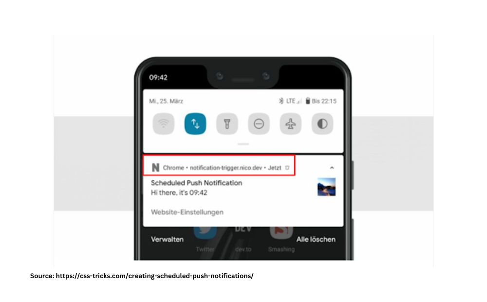
The push notifications would look the same, the only difference is that they will have a display of “Chrome” followed by your website URL.
As PWA is indexable by Google, your store can have better visibility from Google – bringing new users to your site and ultimately contributing to an increased potential of better conversion rate.
PWA works the same way across all the devices, improving the brand trust factor and conversion rate.
Now, with all the strategies you have learned for increasing mobile eCommerce conversions with this guide, we are sure you are more empowered to make better choices.
However, this is just the beginning of the journey! There’s a lot of work that needs to get done to get the desired results.
Design Your Mobile eCommerce Store for Improved Conversion
The good part is, you know what works the best for mobile conversions.
Not so good part? You don’t have time (and perhaps the expertise) to strategize and implement these changes on your own!
And rather than seeing mobile conversion as a pain, look at it as an opportunity to grow your business.
At Aureate Labs, we have helped many online stores increase their mobile conversions with our conversion-focused design services and your store can be the next!
Have a look at the results we have brought for our clients and contact us today to discuss your project requirements.
FAQs:
What’s a good mobile eCommerce rate in 2025?
As of January 2025, the average mobile eCommerce conversion rate was 1.2%. 3% is considered satisfactory and above 5% is exceptional.
How to increase mobile eCommerce conversion?
To improve mobile eCommerce, design a smooth user journey on the phone, be strategic with visual hierarchy, have mobile-friendly popups, leverage push notifications, integrate digital wallets, have voice assistance, AR/VR functionality, location-based targeting, and PWA of your website.
What are the key challenges in mobile eCommerce conversion?
The major roadblocks for mobile conversion are limited screen space and attention span, unstable internet connection, slow page speed, poor visual hierarchy, and payment security concerns.
Why focusing on mobile eCommerce is important for businesses?
Focusing on mobile eCommerce helps you get better customer reach, an opportunity to engage users for longer periods of time, and give them better convenience. All of these help you fulfill your business goals.


Post a Comment
Got a question? Have a feedback? Please feel free to leave your ideas, opinions, and questions in the comments section of our post! ❤️