Shopify Product Page: 7 Best Customization Tips With Examples

Are you sure your Shopify product page is adding value to your brand or well-designed to attract your shoppers? For most eCommerce stores, the product page is the only page that brings sales.
This means that if you’re not careful with your design and copy of your product page, you could be losing out on a lot of potential buyers.
That’s why we’ve put together this guide on how to make a customized and personalized Shopify Product Page. By following the tips and best practices in this article, you can be sure that your pages are optimized for your shoppers as well as search engines.
First, let’s start with the basics.
What is a Product Page in Shopify?
A Shopify product page is a page that showcases a single product in your Shopify store. This is where customers will learn more about a specific product and make a purchase decision.
The default Shopify product page consists of different elements such as product title, description, price, product image gallery, product variants, and add to cart button.
If you are using [Shopify 2.0 themes], then you can find many more customization options such as product recommendations, collapsible tabs, multi-column sections, and so on.
Product pages are the most important pages on your Shopify store, as they are responsible for converting visitors into customers. That’s why it’s so important to have catchy, informative, and visually appealing product pages that accurately reflect your brand and help you close sales.
What makes a Good Product Page?
For better conversion, it’s not just about having a beautiful page, although that’s important. It’s also crucial to have a good, compelling product description that tells shoppers why they need your product in their lives.
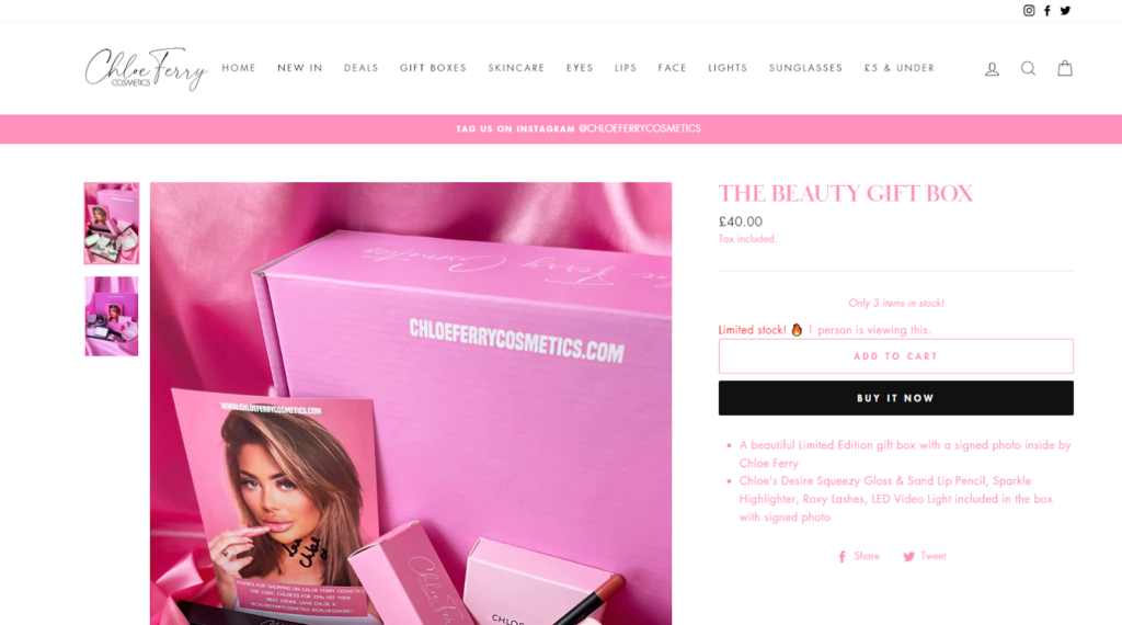
Think about it this way: if you were selling a new type of toothbrush that was designed to clean your teeth better than any other brush on the market, your product page would be the perfect place to explain why this is the case.
Let’s take a look at some of the key elements of a good Shopify product page.
A good product page must have the following elements
- A catchy product title
- A well-written description
- High-quality product pictures
- Compelling product videos (if applicable)
- Detailed product specifications
- Benefits and features
- Shipping and return information
- Customer reviews and testimonials
- A strong call to action (CTA)
- A FAQ section
You should try to add all the elements to your product page to make sure it’s as effective as possible. If you’re not sure how to get started, we’ve put together a list of tips and best practices to optimize your Shopify product page in the upcoming sections.
Keep reading!
7 PRO Tips to Optimize Your Shopify Product Pages
Now that you understand the importance of having a great product page for your shoppers, let’s know how to make one.
Here are the tips to optimize your Shopify product page:
1. Showcase all the aspects of your product
A high-quality product photo can make a big difference in whether or not a customer decides to buy from you. Make sure your photos are clear and showcase your products from all angles.
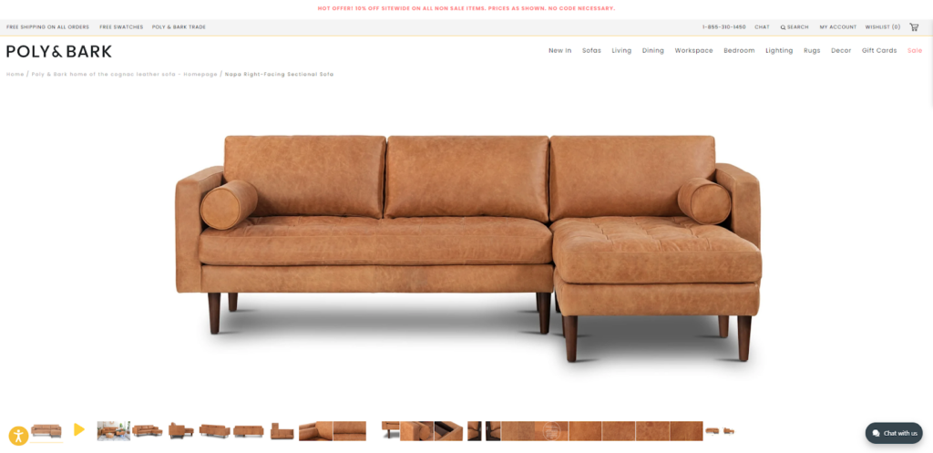
Videos can help shoppers understand how to use your products and see them in action. If you have any product video, make sure it’s prominently displayed on your product page. For brands looking to enhance their product images further, using a product retouching service can refine colors, adjust lighting, and create a more professional appearance that enhances conversions
2. Write clear and concise product descriptions
When shoppers visit your Shopify product page, they should be able to quickly understand what your product is and what it can do for them. This means creating clear and concise product descriptions that explain both the features and benefits of your product.
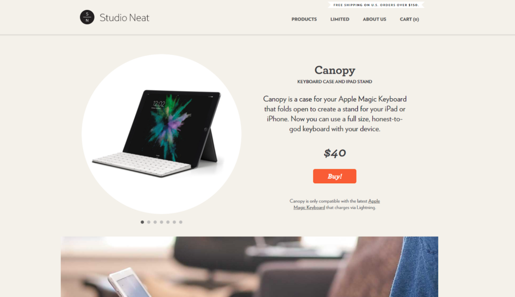
Keep in mind that most buyers will only skim your product description, so make sure to highlight the most important information at the beginning. You can also use bullet points to list key features or specifications to show how your product has helped others.
By taking the time to craft good product descriptions, you can ensure that your shoppers have all the information they need to make a purchase. But what if you don’t have robust writing expertise or time to write perfect descriptions? In any of these cases, a product description generator can serve you the best. It will quickly craft sweet, unique, and engaging product descriptions according to the given details.
3. Never miss the Shipping and return information
When buyers are looking to purchase a product online, they want to know all of the relevant information upfront. This includes shipping information and returns policy. Shoppers want to know how much it will cost to have the product shipped to them, and whether they can return the product if they’re not satisfied.
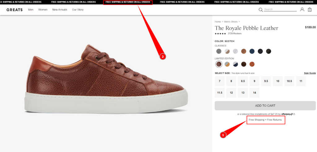
This information should be clearly displayed on your product pages. By providing this information upfront, you’ll help to build customer trust and confidence in your brand. In turn, this can lead to increased sales and customer loyalty. So don’t overlook the importance of shipping policy and return information – make sure it’s prominently featured on your product pages!
4. Instill trust in potential buyers with badges and reviews
Any business owner knows that building trust with potential buyers is essential to success. After all, no one wants to buy from a company that they don’t feel confident about.
One way to build trust is by featuring customer reviews and testimonials on your product pages. This helps potential buyers to see that other people have had positive experiences with your products or services.
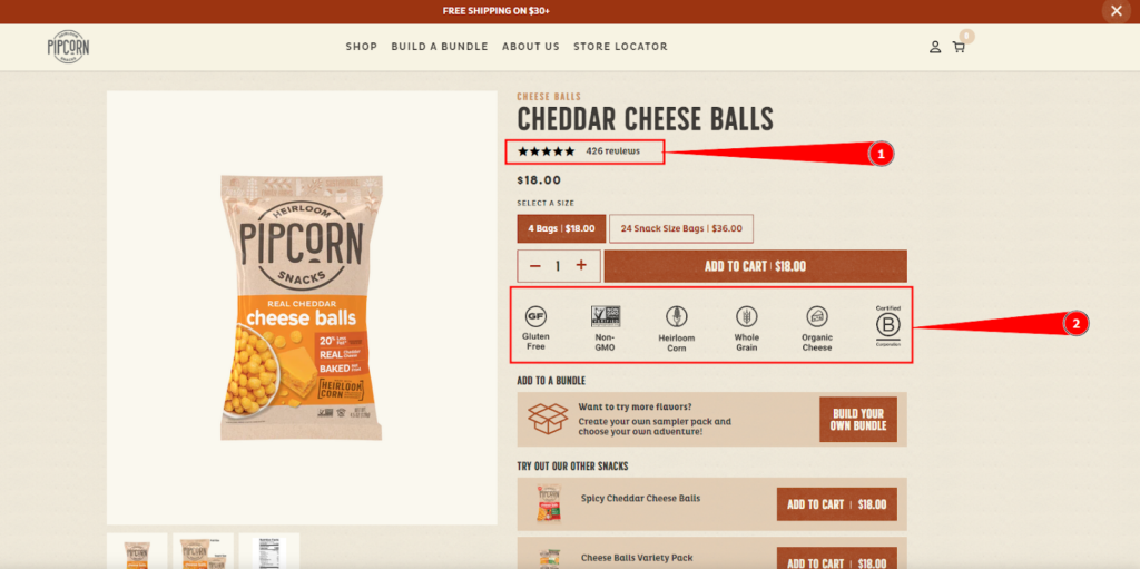
If you don’t have any reviews or testimonials yet, consider reaching out to some of your past consumers and asking them to write a few words about their experiences. Just a few positive reviews can make a big difference in the way potential buyers view your business.
You can also place some trust badges on your product page to show that your website is safe and secure. These badges let potential buyers know that their personal information will be protected when they make a purchase from you.
5. Show estimated delivery dates to reduce buyer anxiety
When it comes to online shopping, anxiety is often triggered by the fear of the unknown. Will my package arrive on time? Will it be what I expected? These are just some of the questions that can cause buyer anxiety.
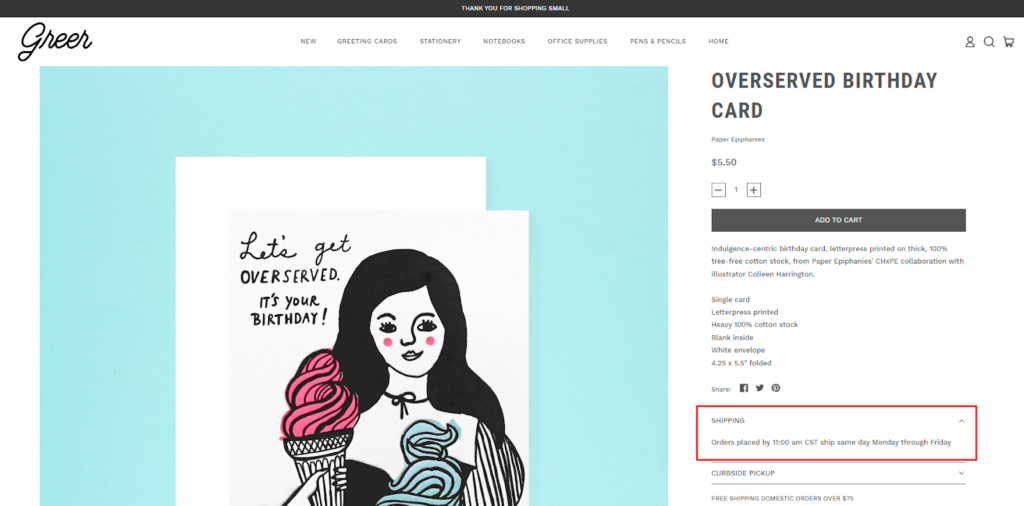
One way to reduce buyer anxiety is to show delivery information like estimated delivery dates on your product page. This way, shoppers know exactly when to expect their package and can plan accordingly. For example, if they need an item for a specific event, they can ensure that it will arrive in time. And if they need to have the item shipped to a different address, they can arrange for that in advance.
By providing this information upfront, you can help reduce buyer anxiety and make the shopping experience more pleasant for everyone involved.
6. Write copy that reflects your unique brand story
Your product pages are like your shop window – they’re one of the first places potential buyers will look to get an idea of what you’re all about. So it’s important that your product page reflects your unique brand story.
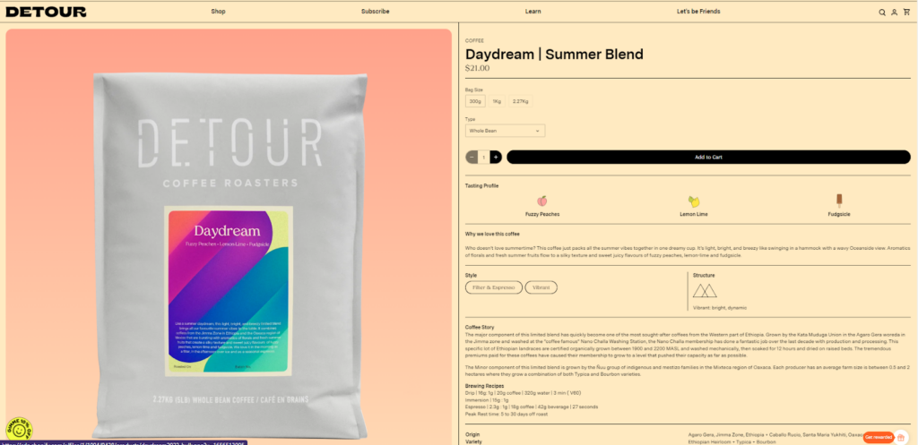
By creating a bond with your shoppers through your words, you can encourage them to see your products as more than just items to purchase – but as part of a larger history that they can be a part of. So tell your story on your product pages, and watch your sales grow.
7. Use persuasive language on your Shopify product page
The language you use on your Shopify product pages can have a big impact on whether or not customers decide to buy from you. Make sure to use persuasive language that will encourage customers to take the next step and add your product to their cart.
Some examples of persuasive language you can use include:
- Shop Now
- Add to Cart
- Get it Now
- Buy Now
- Shop Today
By using persuasive language, you can give shoppers the push they need to make a purchase. Just make sure not to overdo it – too much persuasive language can come across as pushy and turn customers away.
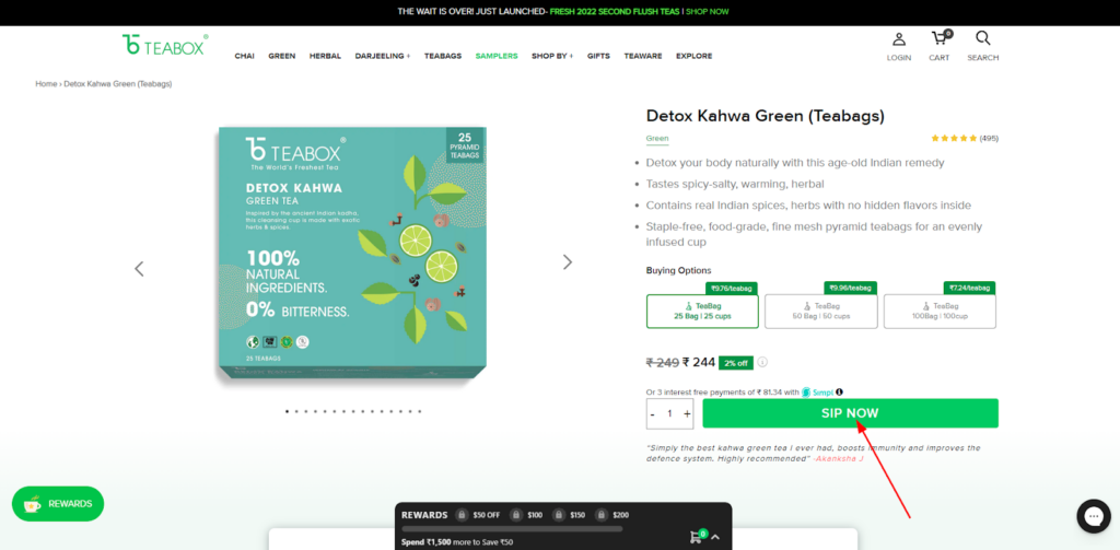
Now that we’ve gone over the basics of the Shopify product page and how to optimize it for conversion, it’s time to get into the nitty-gritty of designing your Shopify product page.
So, are you ready to start optimizing your Shopify product page?
Let’s jump to the next section…
Building a Perfect Shopify Product Page
Your Shopify product page is a key to generating sales and converting customers. But if they’re not up to par, you could be losing out on valuable business.
That’s why it’s important to optimize your Shopify product pages for conversion. By making sure your pages are well-designed and packed with the right information, you can encourage more customers to buy from you.
PART 1: Create a Custom Shopify Product Page Template
The first step to creating a perfect product page is to create a custom Shopify product page template. This will allow you to have full control over the design and layout of your pages, and ensure that they’re consistent with the rest of your site.
It’s better to have different page layouts for representing different types of products. For example, you might want a different layout for physical products (Green Tea bags) than you do for digital products (ebooks for recipes).
Shopify’s theme editor can be called a page builder makes it easy to create a custom product page layout with the drag and drop features.
Here are the steps to create a custom Shopify product page template:
- From the Shopify Admin, go to Online Store > Themes and click the Customize button. This will take you to the theme editing page.
- Select the “Product” template from the drop-down list.
- Click on Create Template.
- Name your new product page template.
- Select the product template type from the given options in the dropdown menu.
- Click Save!
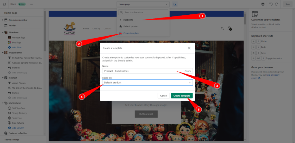
By creating a custom Shopify product page template, you can also upsell and cross-sell your products. You can add related products to the bottom of your product pages to encourage shoppers to buy more from you.
This you can achieve by customizing your Shopify product page template. Let’s see how to do that in the next section.
PART 2: Customize product pages in your Online Store
Once you’ve created your custom Shopify product page template, now it’s time to start customizing them to attract new buyers and build their trust in your brand.
You can use Shopify’s drag-and-drop editor to change the layout of your pages and add or remove sections as needed. You can also customize the colors and fonts to match your brand’s style guide.
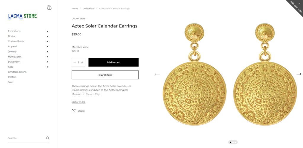
Here are some common elements that you might want to include on your default Shopify product page:
- Product Review
- Trust Badges
- Estimated delivery date
- Payment in installments
- Storytelling section
And many more…
Use ‘Shopify Sections‘ to customize the product page templates
Shopify offers a number of different sections that you can add to your product pages. These sections allow you to show off product images, videos, and descriptions in a way that’s eye-catching and easy to navigate. Know more about [Shopify sections and blocks]!
Use Shopify Apps to add custom features to your product page
One way to impress your shoppers is to add unique features to your product pages using the Shopify Apps. There are a number of apps available in the Shopify app store that can help you add extra functionality to your pages, such as customer reviews, social media integration, and more.
By taking advantage of these third-party apps, you can ensure that your product pages are more attractive and engaging, which can lead to more sales.
To add advanced customization to your Shopify product page template, you need to edit the code of your template theme files.
But if it is done by someone who is non-technical or inexperienced with Shopify theme editing, then the changes may affect the product page design as well as responsiveness. Therefore, we recommend hiring Shopify experts to customize product pages without harming the existing layout.
PART 3: Add Metafields to Shopify Product Pages
Metafields are small pieces of information that you can add to products, customers, and orders in Shopify. They help you keep track of additional details about your products so that you can create a personalized shopping experience for your customers.
For example, let’s say you are selling shoes and want to add the color of your shoelaces as an important attribute. With metafields, you can simply create a custom field named ‘Shoe Lace Color’ and map it with your product. This way, when users search for products with specific attributes, they will be able to narrow down their searches according to the shoelace color.
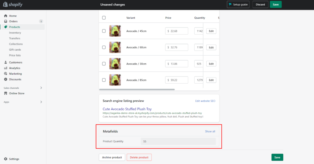
In other words, metafields give you the power to customize and personalize your product page. So if you want to build exceptional product pages and take your Shopify store sales to the next level, start using metafields today!
Here’s [how to use Metafields in Shopify].
PART 4: Make your Shopify Product Page SEO-optimized
You’ve been running your online store for a few years now, but have you considered Shopify’s built-in SEO features to get your products in front of shoppers? Without SEO, it’s difficult to drive traffic to your website and get the most out of your product page.
Finding the right keywords that optimize your product page for the search engine can be tricky – but it’s worth it if you want to see a boost in website traffic. You should spend some time tweaking your product titles, descriptions, and keywords.
By using the right keywords, and meta description, and adding some extra detail to your product page, you’ll see a surge in traffic from Google!
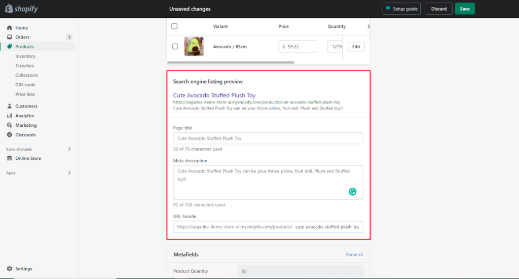
If it’s difficult for you to find the right keywords or optimize the SEO of your Shopify website, you can hire our Shopify experts to help you!
You may want to add more customization options to your Shopify product page, but don’t know how or where to start. It can be tough to find the right Shopify experts who can help you add the level of customization you need for your business.
Oftentimes, you have to spend hours researching different agencies and sifting through reviews before finding the right one.
Mint Your Store is here to help! We are a team of experienced Shopify experts with years of experience in helping eCommerce businesses just like yours add more customization options to their product pages.
Contact us today for a free consultation and see how we can help you take your business to the next level.
Let’s explore some outstanding product pages to take inspiration from.
10 Best Shopify Product Page Examples
1. Flower Beauty
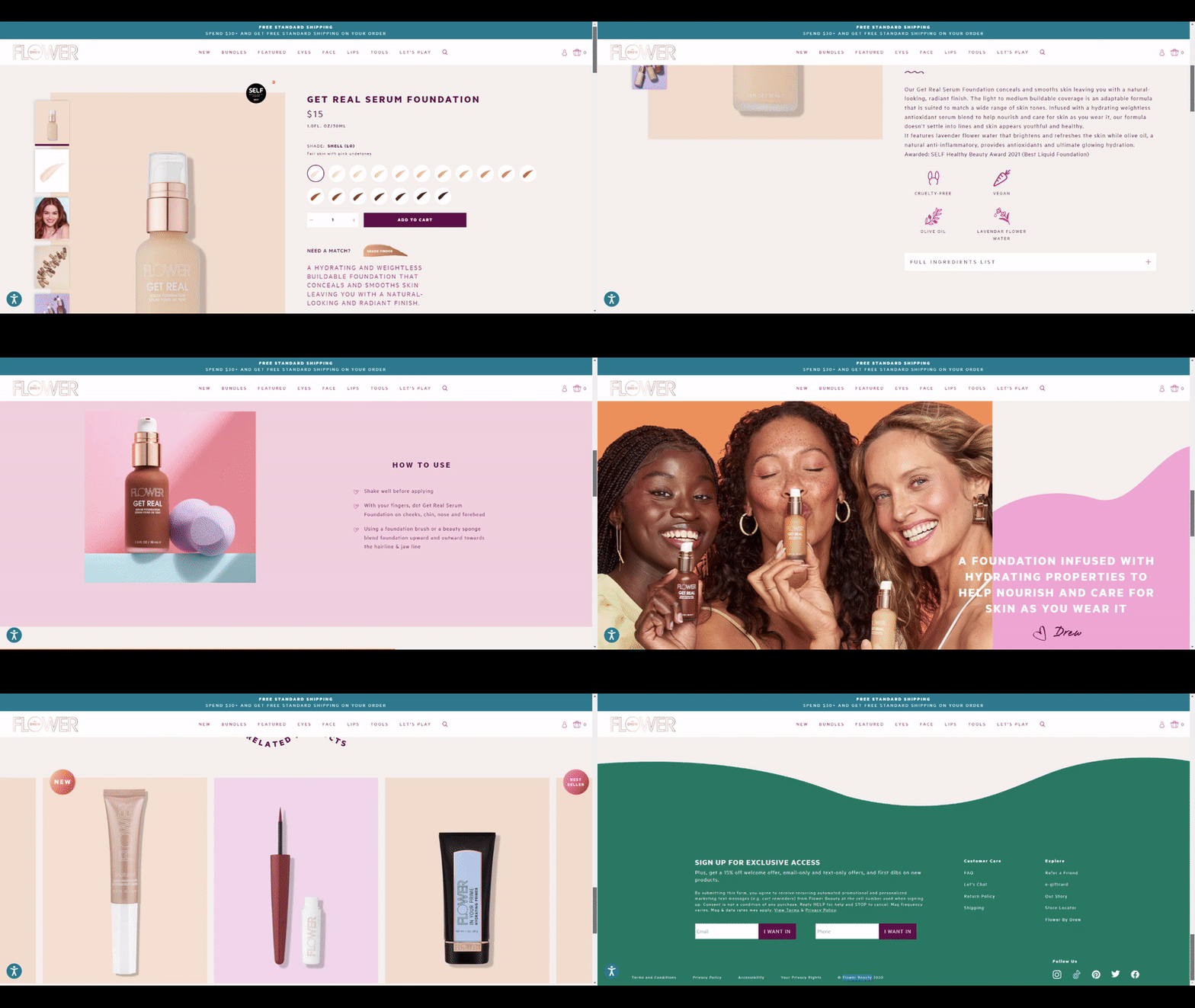
The product page of Flower Beauty is a great example of how to write persuasive product descriptions. The copy is short, sweet, and to the point—but it still managed to pack in a lot of information.
The first sentence tells you what the product is, while the second sentence jumps into the benefits. And notice how they use “you” throughout the copy to make it more relatable.
They also include some key ingredients, which is always a good idea. Buyers want to know what they’re putting on their skin, and this helps to build trust.
2. The Citizenry
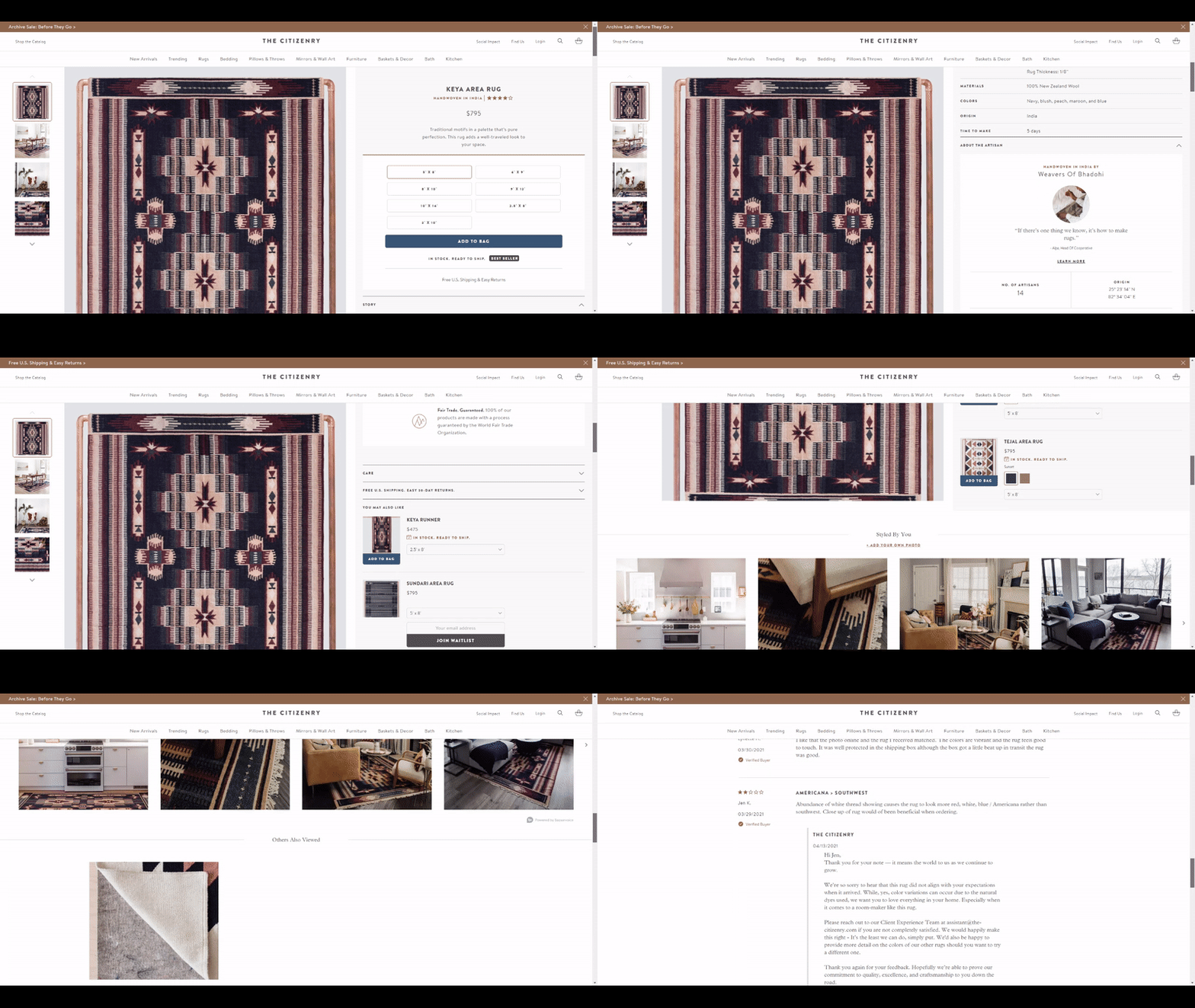
The Citizenry is a home decor brand that does an excellent job of customizing its product page.
They also use high-quality images to show off their products in use. This helps potential shoppers visualize how the product would look in their own homes.
They also include a short description of the product, as well as the materials and dimensions. This is all important information that potential customers will want to know.
But what really sets The Citizenry apart is their “About the Artisan” section. This is a great way to tell the story behind the product and make it more personal.
3. HORNE
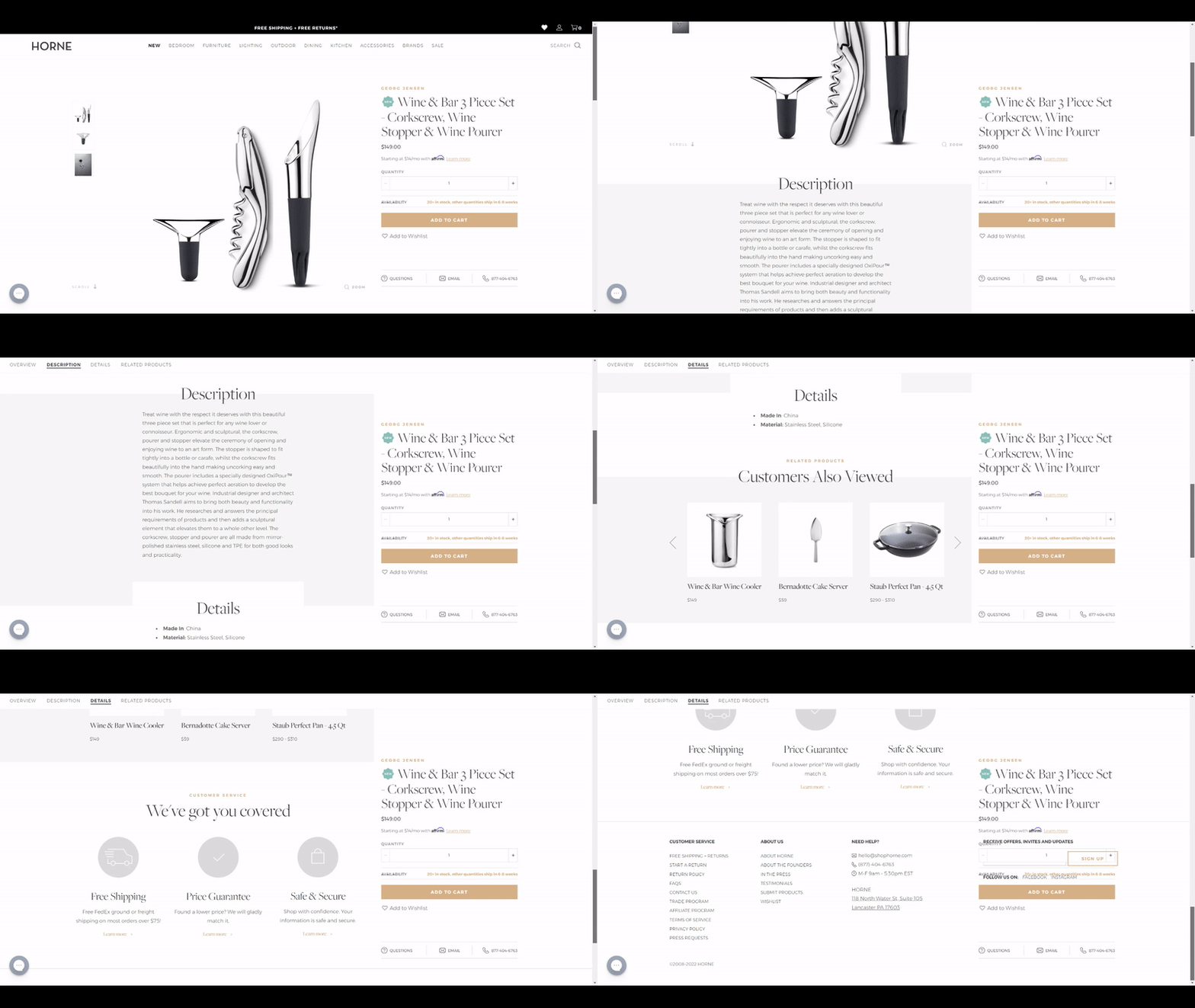
HORNE is a furniture brand that understands the importance of a great product page. Their product pages are clean and concise, with all the important information front and center.
The first thing you’ll notice is the beautiful product image. It immediately sets the tone for the page and tells you what kind of product you’re looking at.
4. LEIF
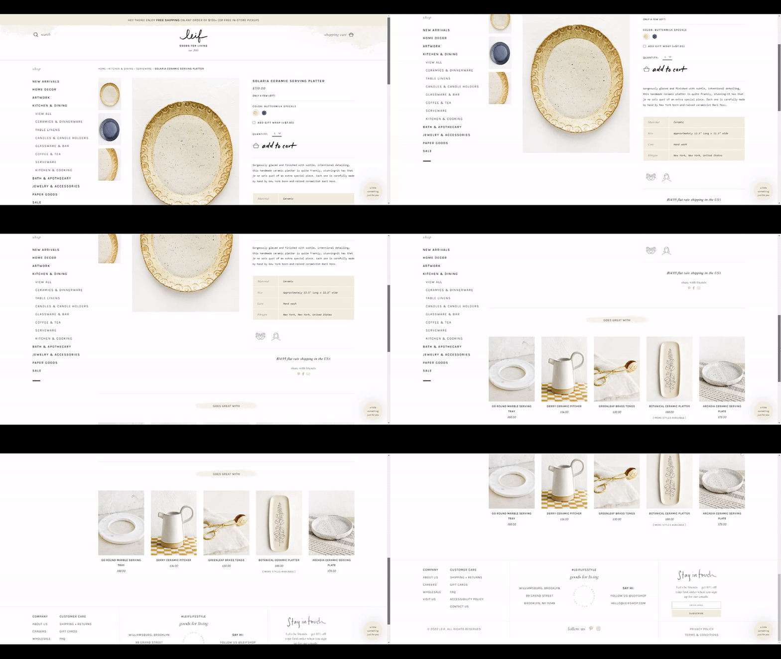
LEIF is another great example of a Shopify store doing product pages right. Similar to HORNE, they use enticing product images and a clean design to showcase their products.
They also include a unique “Add to cart” and a helpful “product details” section that tells you everything you need to know about the product. This is especially important for furniture, where customers need to know things like dimensions and materials.
They have smartly used the cross-selling section to show multiple products as dynamic recommendations.
5. NONA
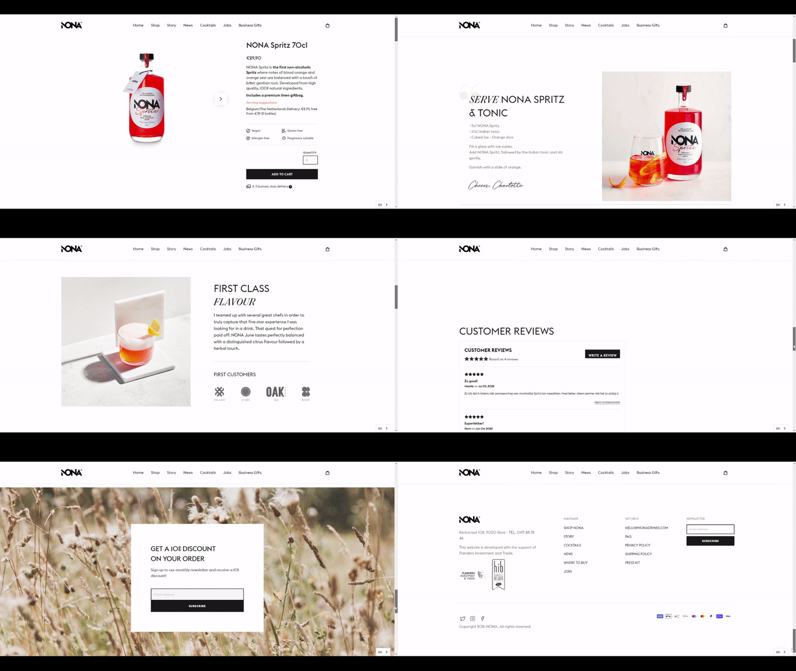
NONA Drinks is a Shopify store that sells non-alcoholic craft cocktails. Their product page does a great job of selling the experience of the product, rather than just the product itself.
The first thing you’ll see is a beautiful image of the product being enjoyed. This immediately gives you a sense of what the product is and how it’s meant to be enjoyed. The copy on the page is also very well done. It’s short, to the point, and uses persuasive language to convince you to try the product.
Overall, NONA has created a product page that is both visually appealing and informative. This page is sure to convert visitors into customers.
6. LINDSAY LETTERS
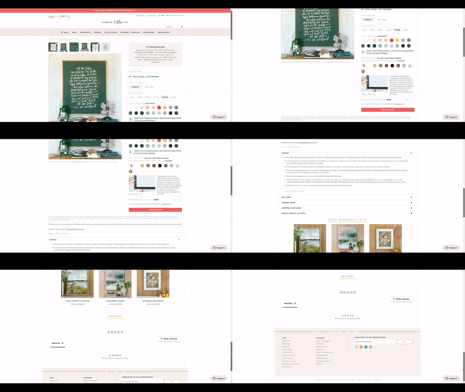
Lindsay Letters is a Shopify store that sells prints, posters, and other wall art. Their product pages are simple but effective. The product image is the first thing you see, and it does a great job of showing off the product.
The copy is also well done. They managed to pack in a lot of information about the product on a single page. They also use persuasive language to convince you to buy the product.
7. MVMT
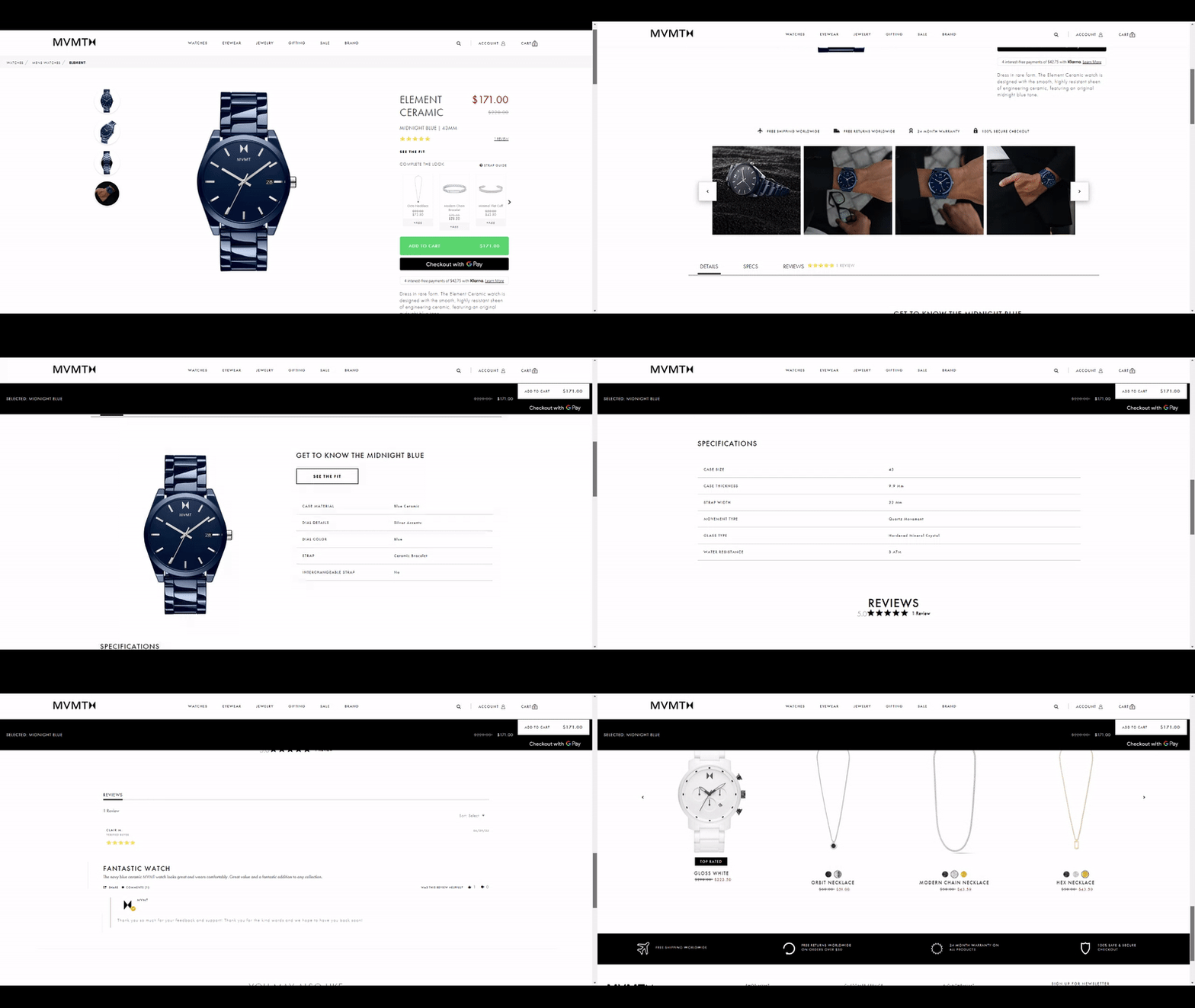
MVMT is a Shopify store that sells watches. Their product pages are clean and modern, with a focus on the product images and the overall design is pleasing to the eye.
The copy on the page is also brief and to the point. They managed to include all the vital information without overwhelming the reader.
What’s more, MVMT does a great job of highlighting the important features of their products and cross-selling products smartly. Overall, the product page is well-optimized for conversion.
8. HARDGRAFT
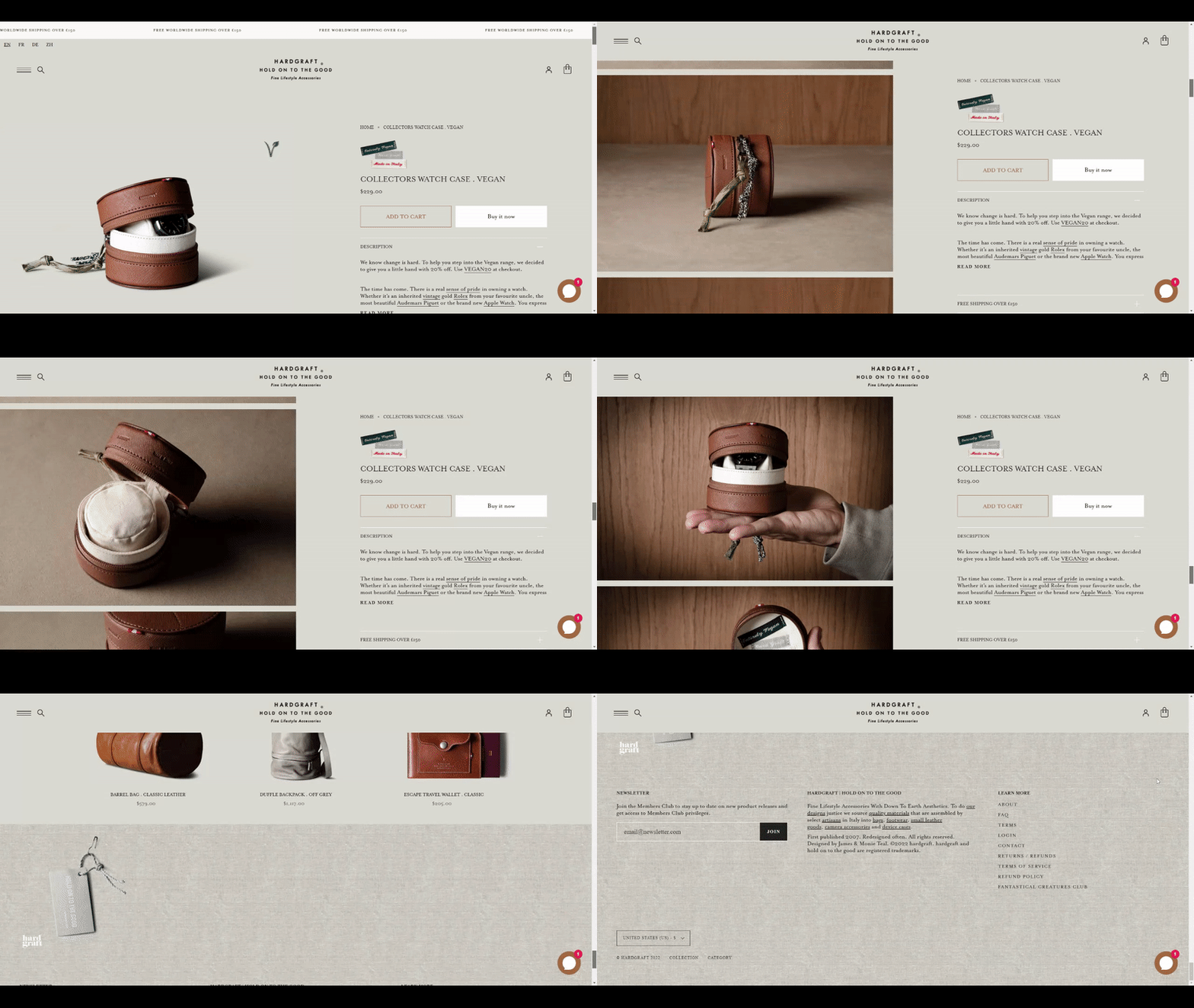
Hardgraft sells leather goods and accessories. Their product pages are simple but well-designed. The focus is on product photography to showcase a high-quality image gallery and give shoppers a good sense of what the products look like in real life.
The copy is short and to the point and highlights the important features and benefits of the products. Hardgraft also does a good job of using customer reviews to build social proof and increase conversion rates.
9. Grovemade
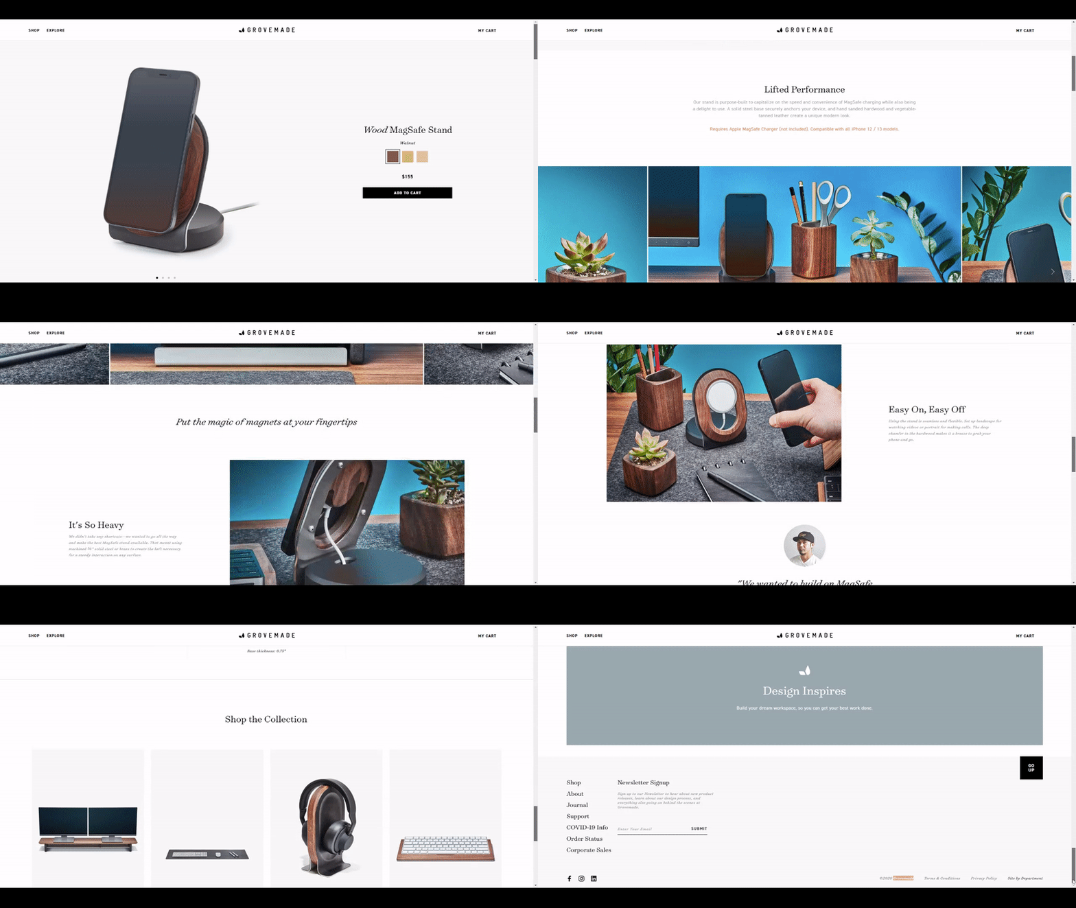
Grovemade makes wooden iPhone cases, desk accessories, and other home goods. Their product pages are beautiful and minimalist. The pricing is displayed prominently and is easy to find. The Add to Cart button is also easy to spot.
Grovemade uses high-quality, close-up photos of its products. This gives your potential customer a clear idea of what the product looks and feels like. They also use lifestyle photos to show how their products can be used in everyday life.
The product page offers a unique and professional experience by providing only the relevant information, leaving everything else out. Overall, the page is designed to make it easy for potential customers to learn about the product and make a purchase.
10. JOHN JACOBS
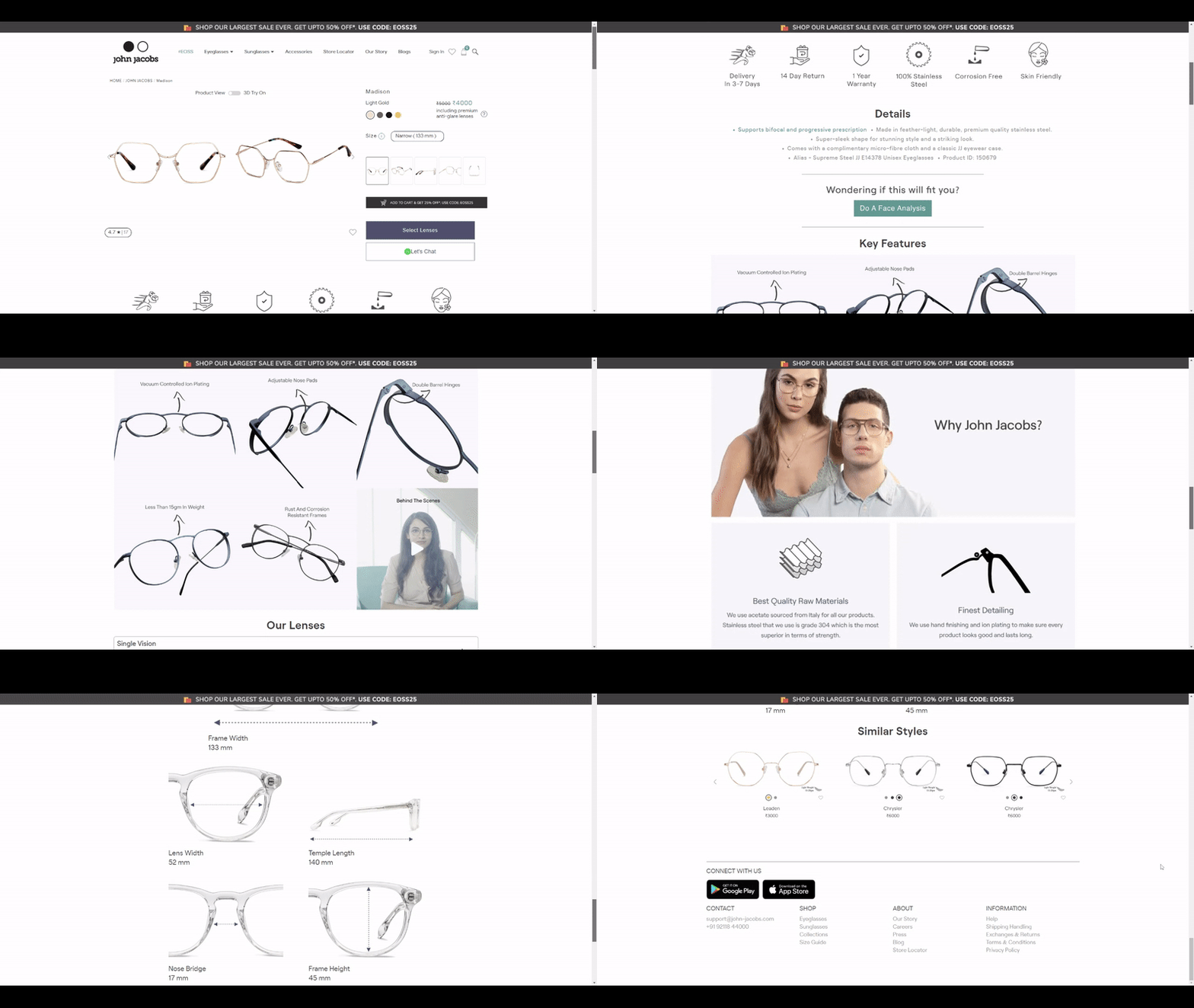
JOHN JACOBS’s product page is sleek and modern. The photos are high-resolution, and great product descriptions are well-written.
The product descriptions are clear and concise. They give customers an idea of what the product is, without going into too much detail. The descriptions focus on the features and benefits of the product, rather than the specs.
The page is also easy to navigate, and the CTA buttons are placed strategically. Overall, it’s an excellent product page that’s sure to convert visitors into customers.
Quick Recap!
Making a customized and personalized product page is essential when you’re running an eCommerce website. Not only does it help to optimize your pages for shoppers, but search engines will love the extra information too!
This article provides tips on what makes up a great design as well as how best practices can be followed so everyone wins in this game of Shopify product page optimization.
Here you have learned:
- How to make your Shopify product pages more attractive and engaging.
- How to create a custom Shopify product page template.
- How to add Metafields to your Shopify product page.
- How to make your Shopify product pages SEO-optimized.
If you’re not sure where to start, don’t worry. Our Shopify store developers can help you build high-converting product pages for your online store.


Post a Comment
Got a question? Have a feedback? Please feel free to leave your ideas, opinions, and questions in the comments section of our post! ❤️