In the last chapter of the series on how to start an eCommerce website from scratch, we covered DIY ways to choose an eCommerce domain name. Now it’s time for the next step, choosing a must-have eCommerce website pages list.
If you’re confused about what makes a perfect e-Commerce, we’d say 31 pages. We like to call them the “Bare-Minimum Pages” because it’s the least you should eye for. These 31 eCom pages cover everything your store needs to run and start minting money for you. Anything above that is a bonus. In the chapter, we’ll cover these eCommerce website pages list, some industry examples, and the must-have elements on the pages. So let’s start!
- Must have eCom page #1: Homepage
- Must have ecom page #2: Category Overview
- Must have ecom page #3: Category Page
- Must have ecom page #4: Product Page
- Must have ecom page #5: Search Functionality and Result Pages
- Must have ecom page #6: Customer Account Login
- Must have ecom page #7: User Account Page
- Must have ecom page #8: Mini Cart
- Must have ecom page #9: Cart Page
- Must have ecom page #10: Checkout Information Page
- Must have ecom page #11: Shipping
- Must have ecom page #12: Payment Methods Page
- Must have ecom page #13: Payment Failed Page
- Must have ecom page #14:Order Confirmed Page
- Must have ecom page #15: Orders/Order History
- Must have ecom page #17: Profile Settings
- Must have ecom page #18: Payment Settings
- Must have ecom page #19: Addresses
- Must have ecom page #20: SMS & Email Sign Up
- Must have ecom page #21: Return Policy & Center
- Must have ecom page #22: Shipping details
- Must have ecom page #23: Order Track
- Must have ecom page #24: Help/Contact Us/FAQ
- Must have ecom page #25: Store Locator
- Must have ecom page #26: About Us/Who We Are Page
- Must have ecom page #27: Terms & Conditions
- Must have ecom page #28: Privacy Policy
- Must have ecom page #29: FAQs
- Must have ecom page #30: Feedback/Customer Reviews
- Must have ecom page #31: Thank You Page
- Conclusion
- Frequently Asked Questions
Must have eCom page #1: Homepage
The homepage is the daddy of all the pages on your store. Most pages on your site will branch out of it.

Visually, it’s also the page on which every other website page wants a bit of space. Promotion, featured products, categories, blogs, etc., are some pages the homepage promotes.
But merely having a homepage is not enough. You must have all the elements on the eCommerce homepage that make it a homepage. We’ll tell you some of them.
Trust Symbols

Appealing First Fold

The Value Customers Can Take

Actionable CTAs
Visible Site Search
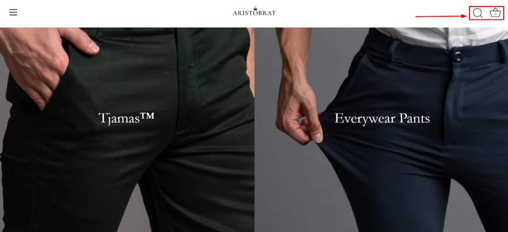
Product category view

Lucrative Offers

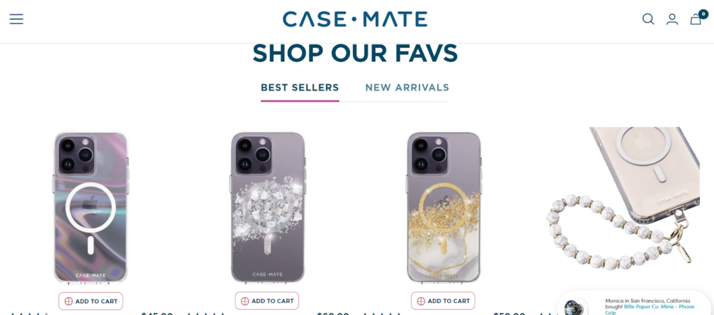
Featured Collections

Trending Designs

Quick Reviews For Purchase Action
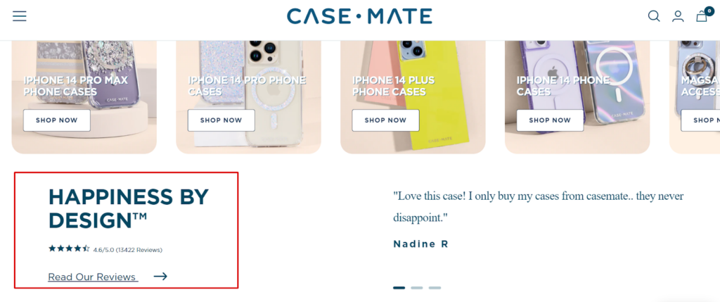
Ready-Filters To Reduce Analysis Paralysis
Email Subscription For Marketing & Communication

Social Proof

Clean Navigation

Must have ecom page #2: Category Overview
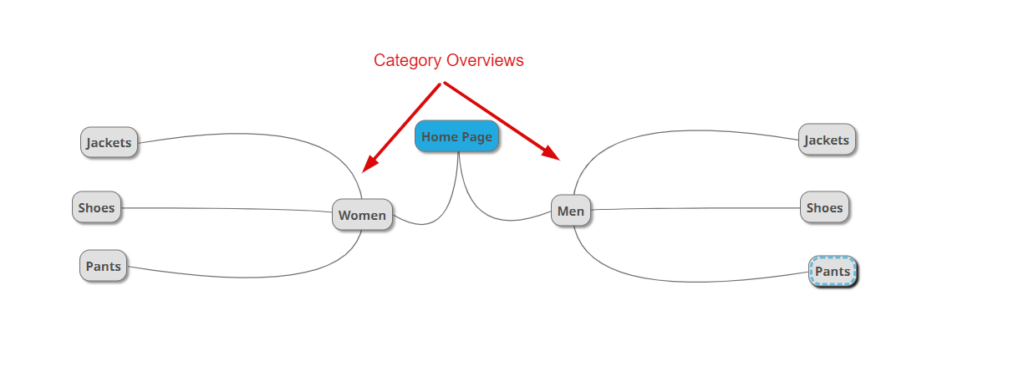
The Category overview may not necessarily have a separate page. But it’s one of the essential elements of categorizing the products you’re selling.
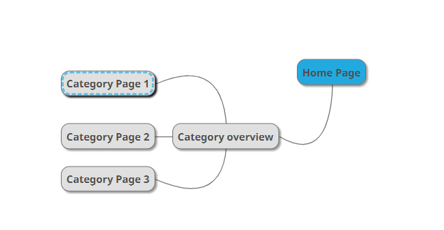
You can have top-level category overviews.
And you can also have multiple-level category overviews if you have a massive product line.
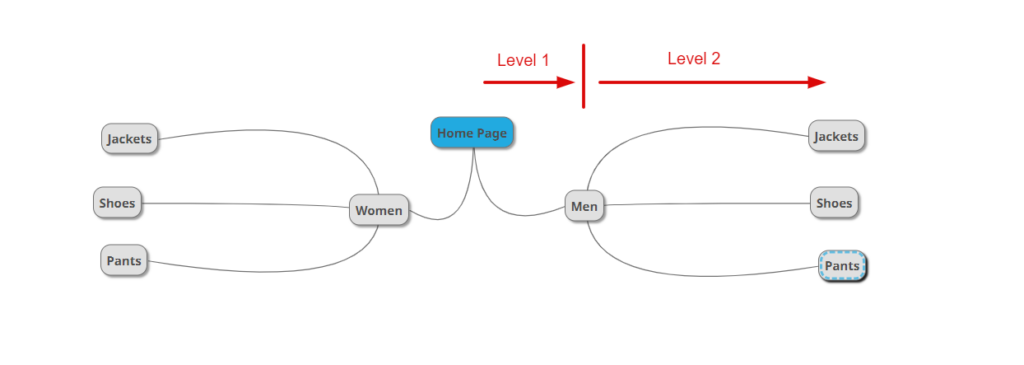
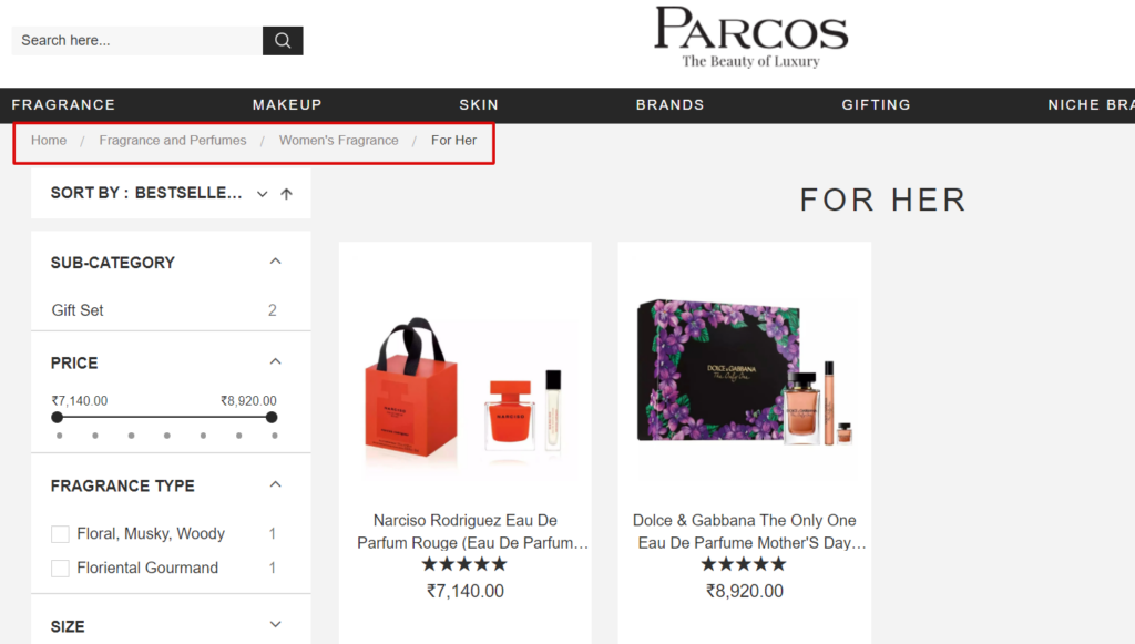
Category overview element/page is not mandatory. You can skip it if you only have one level of categories. However, we like to keep the first-level overview to set up the expectations straight for the visitors.
Here are the examples:

Must have ecom page #3: Category Page
The category page is the listing page of all the products in one particular category. Not all users jump to the product page directly.

Visitors like to have
- a grid view of the products
- browse through the products you have
- compare products at one go
- navigate to the sections they want
Don’t confuse category pages with category overviews. The main difference between category overview and category pages is the category overview is like a wayfinding element. Category pages, on the other hand, are the grid arrangement of the products.
Now let’s find out the necessary elements needed on category pages.
Relevant Keyword-Based Categories
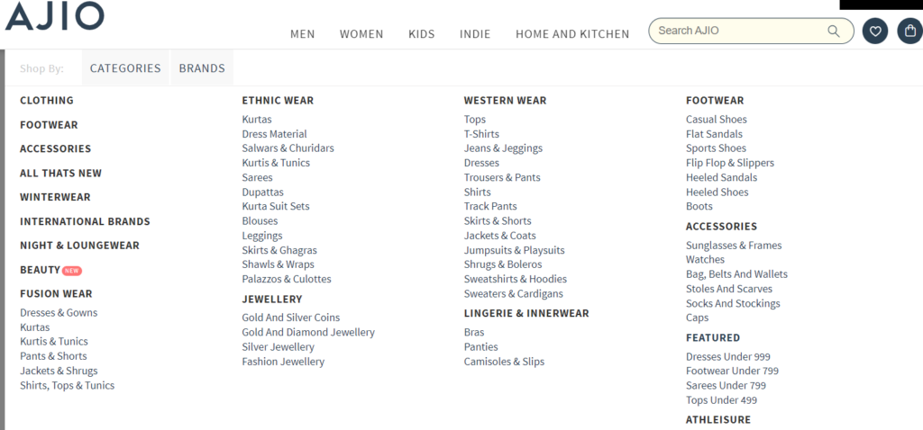
Sub-Categories Filters
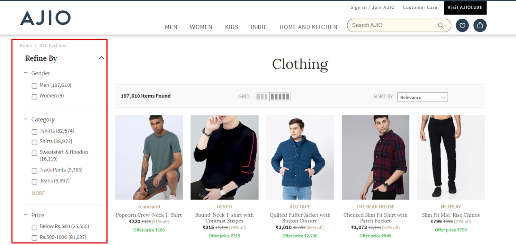
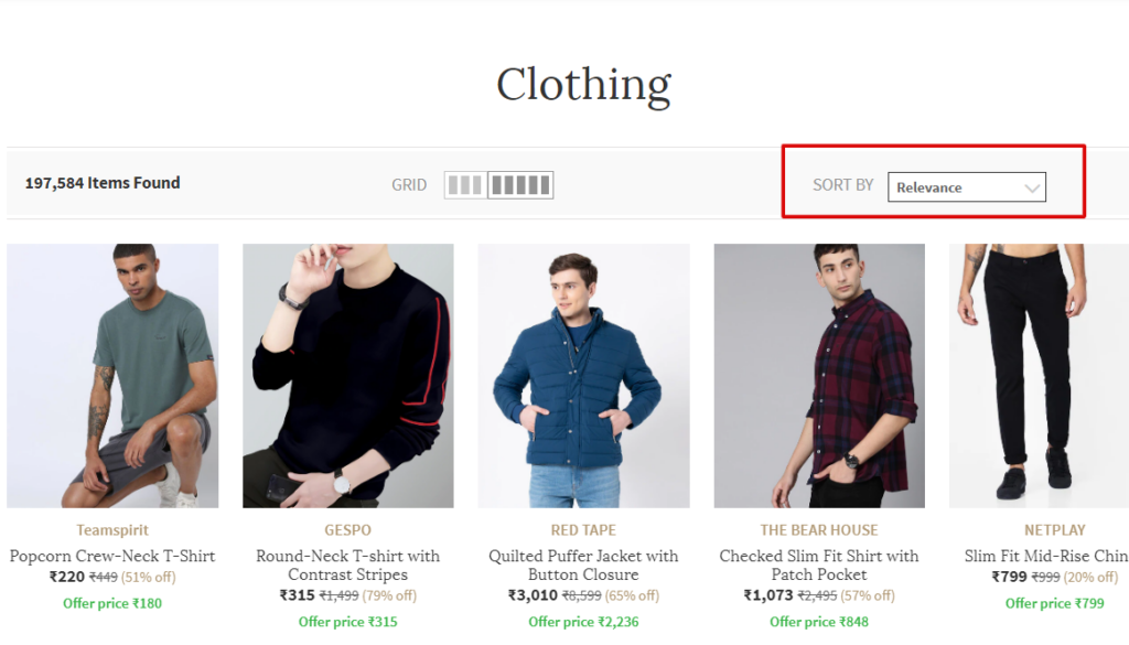
Sort By Feature
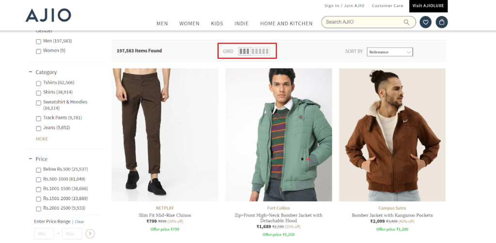
Grid Control
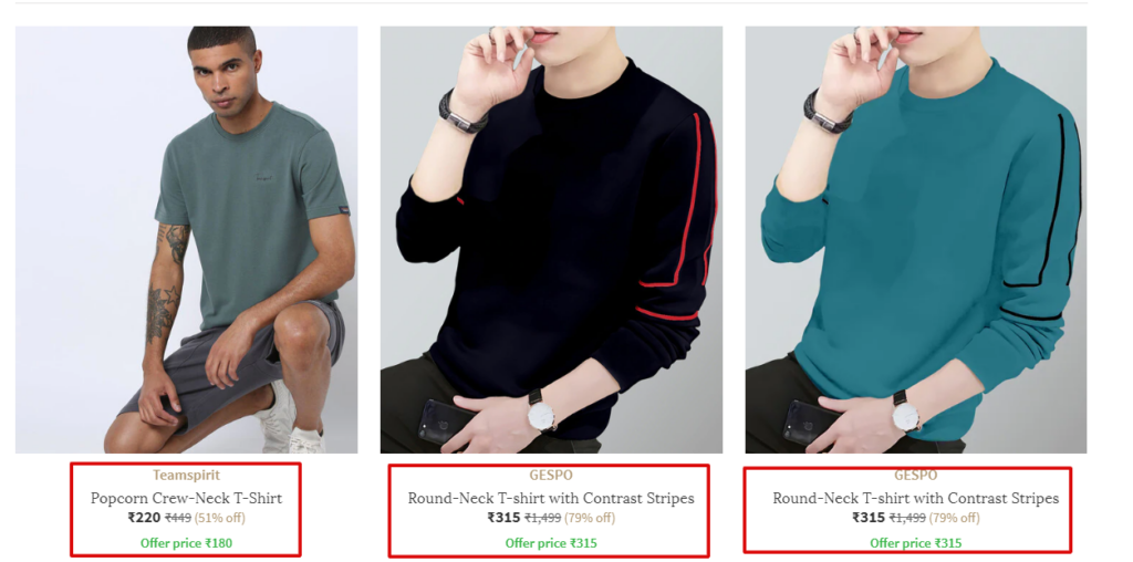
Product Blurbs
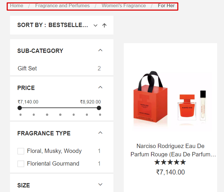
Breadcrumbs
Must have ecom page #4: Product Page
The product page is where you want to describe the A to Z of the product. Here’s what they usually have
- Specification
- FAQs
- Benefits
- Reviews
- Buy now CTAs
- Instruction guides
- Size guides
- Images
- Videos
And many more. This is where you have to be most creative and descriptive to invoke actions. Users should land on the product page when clicking on any product from the Category page list.
Here’re some necessary elements on product pages for user experience, no matter what you sell.
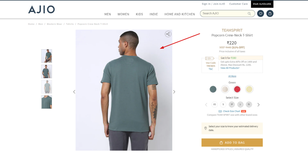
Images With White Backdrop
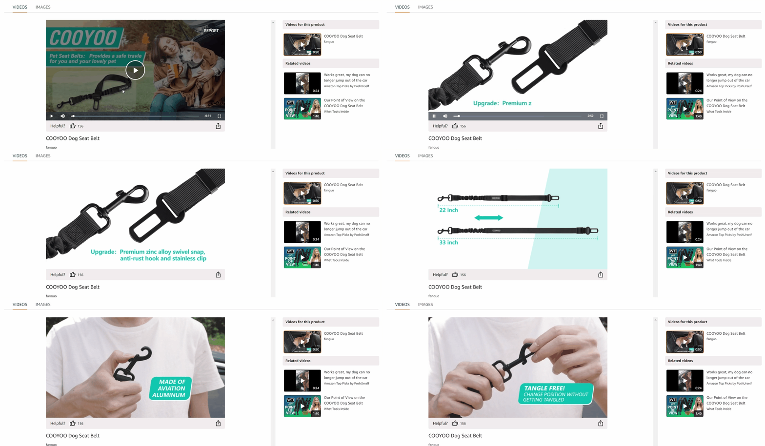
Functional Aspect Videos
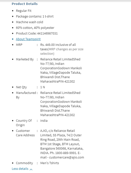
Descriptive Product Description
Product Reviews
Relevant Name
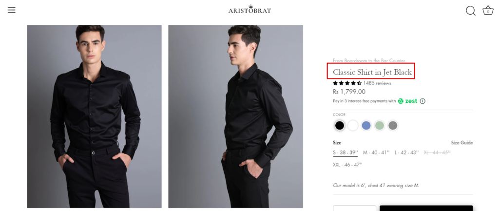
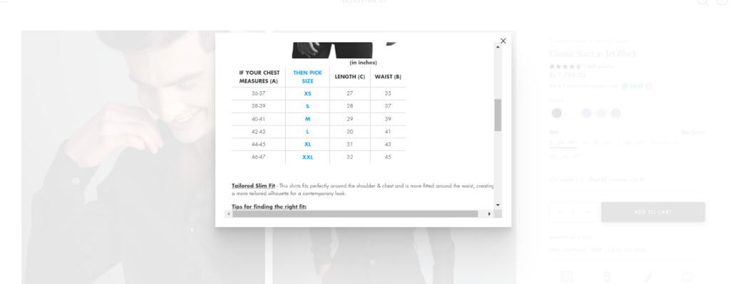
Size Guide
Call To Action
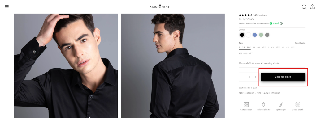
Products’ Benefits

Related Products

Must have ecom page #5: Search Functionality and Result Pages
Search functionality is usually kept on all the page’s navigation menus. But you can also create a separate page for it.
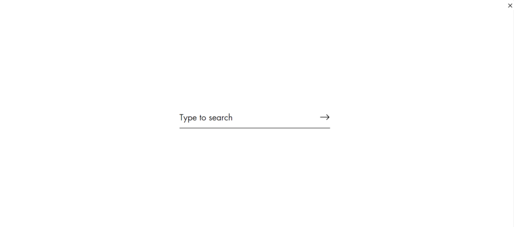
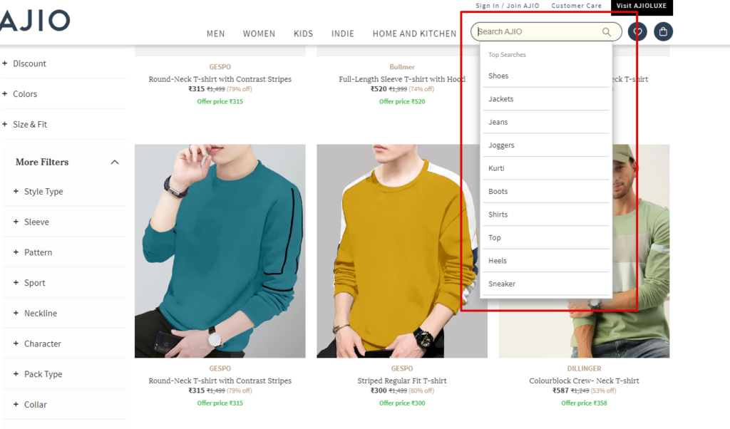
You will also have to create a result page that pulls out the products after the user has searched on the search bar.

Many eCommerce stores follow the category page template in their search results. Here’s what you may add to the category page template to make it search results.
Items Found
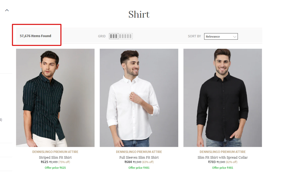
Name & Price

Must have ecom page #6: Customer Account Login
The customer account login may not necessarily be a separate page.
It’s the element you’d want the most but also the element you can’t force on the users. Keep it optional. Forcing users to fill in these details in barter to purchase may affect your conversion rate. This is also the reason why many eCommerce stores allow guest checkouts.
After the users create their accounts through the login, the user behavior data will get saved on the user account page, which we will discuss next.
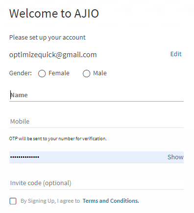
So coming back to not having a separate page. You can use a pop-up without changing the URL slug. Think of it like any regular login page allowing users to create their accounts with your business.
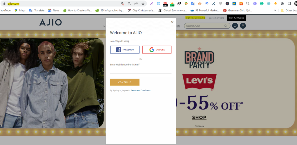
You can observe the highlighted URL didn’t change despite clicking on the “Join Ajio” button. It means you don’t have to have a separate page for account login.
Here are a few other things to take care of for your precious account users.
Simple Login
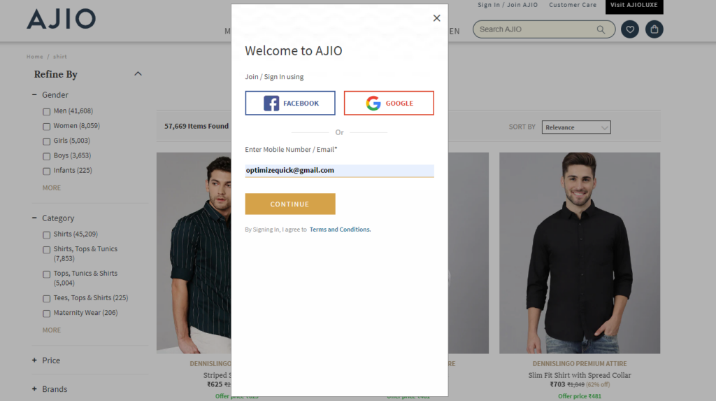
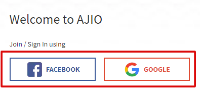
Social Logins For Quick Logins
Hassle-Free Forms
Must have ecom page #7: User Account Page
The user account page is the page that saves users’ data.
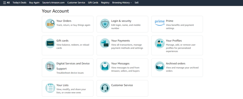
It may save
- customer details
- purchase history
- billing information
- browsed products for recommendation
And many other fields. Here are a few elements you should consider while designing a customer account page.
Related Items

Browsing History

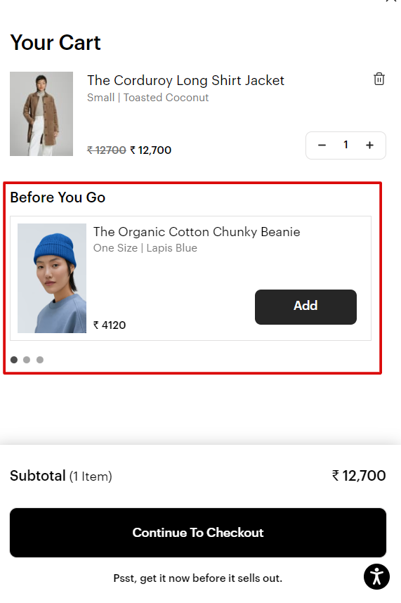
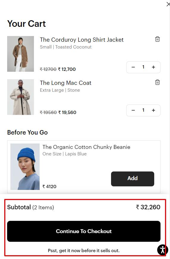
Must have ecom page #8: Mini Cart
Like the user account login, the mini-cart is not a page but an essential element of the store. It gives users a direct view of what they have added to the cart without going to the cart page.
Benefit? Users won’t leave the category page to check if the product has been added to the cart. This way, they will keep browsing more products seamlessly.
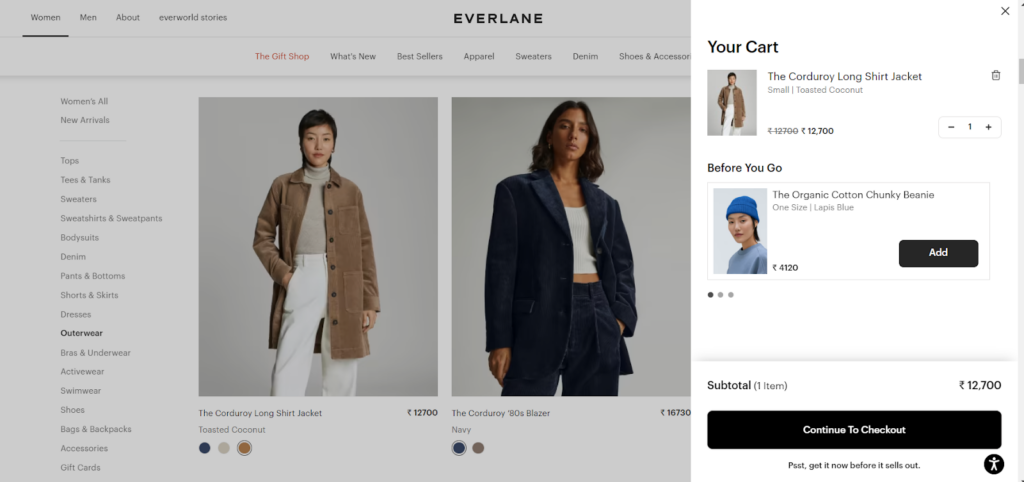
You can make the mini cart flyout more actionable with some of these elements.
Recommendations
CTA & Subtotal
Must have ecom page #9: Cart Page
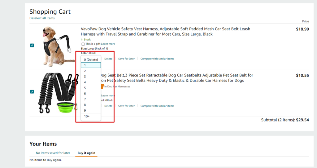
The cart page is the page where users find all their selections, along with
- prices
- estimated shipping cost
- ability to increase, decrease, & remove the units
It’s usually the first step toward the checkout process. The idea of transparency is to prevent users from straying to any other website. You don’t want to disappoint users on the final checkout page. So the cart page sets up the tone for the final purchase.
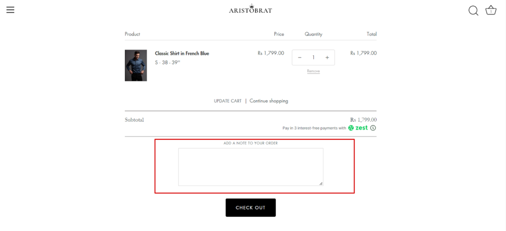
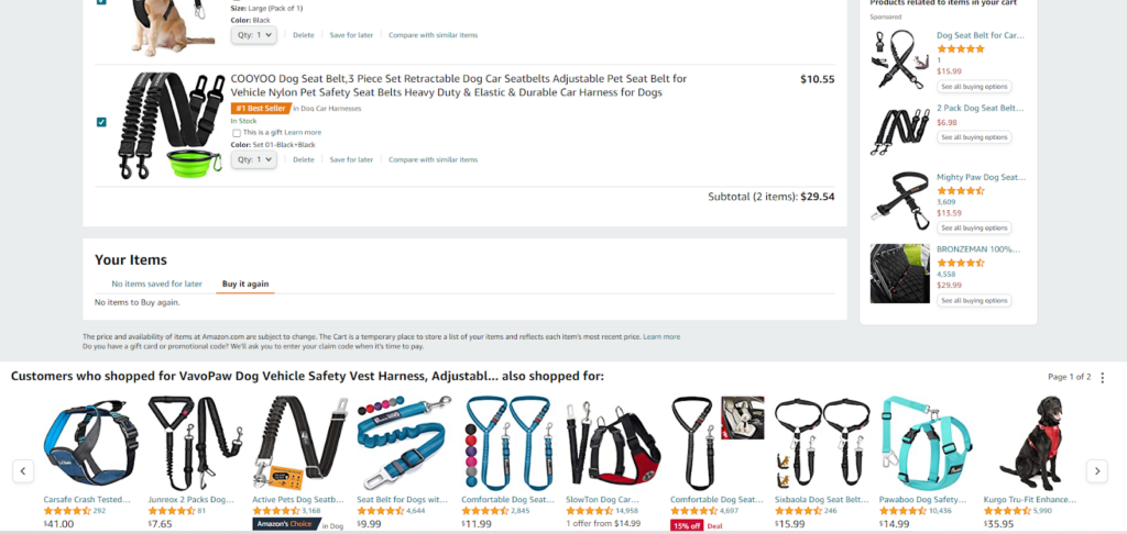
Many online stores use cart pages to upsell as well. Here are the elements which help the cart pages to set the tone for final buyouts.
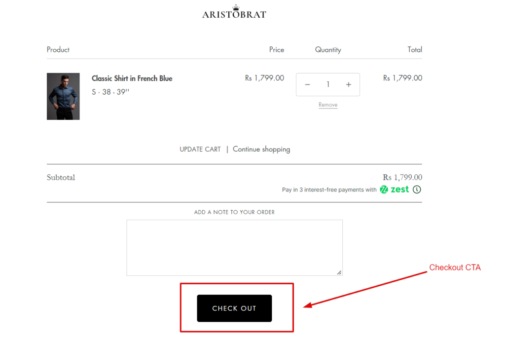
Subtotal & Offer

Order Note For Personalisation
Recommendation On Cart Page
Quantitative Changes
Checkout CTA
Must have ecom page #10: Checkout Information Page
After viewing the cart, the user will move to the checkout information page. Now you can have three types of checkouts:
- new user logins (saves all the information for faster checkout & makes them returning user for the next time)
- returning users
- guest checkouts
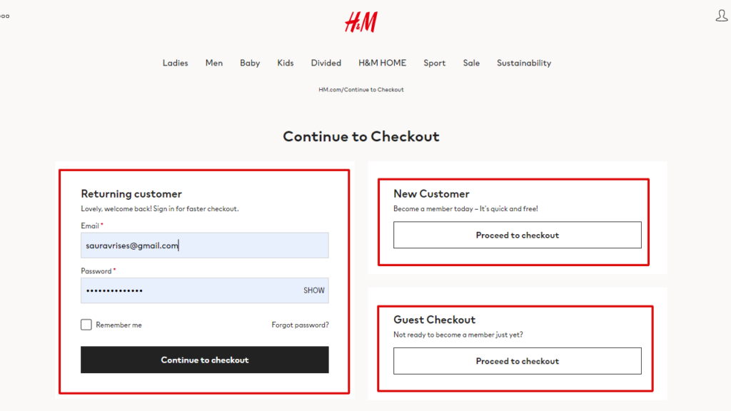
It’s a good practice to have all types of checkouts because not every user wants to become a member of your store. Plus, you also want to remind them they have already signed up with the “returning user” copy.
Traditional Checkout Vs. Guest Checkout
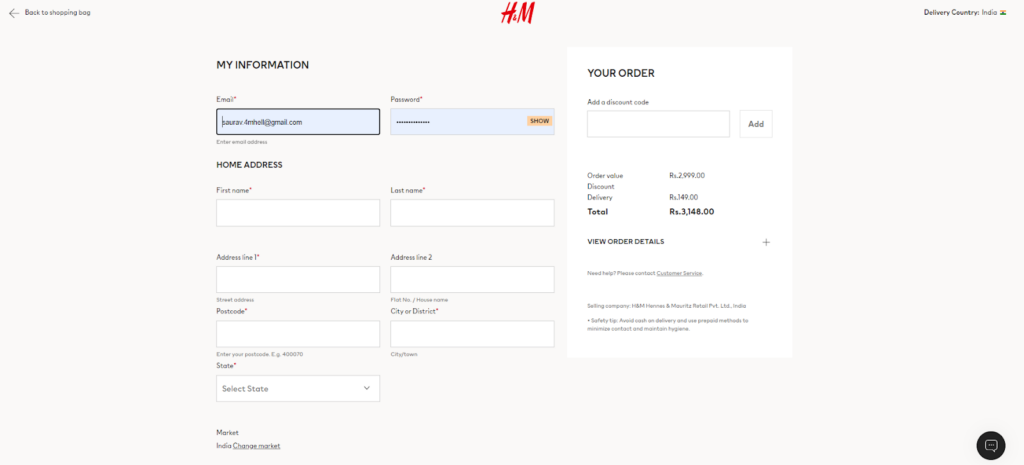
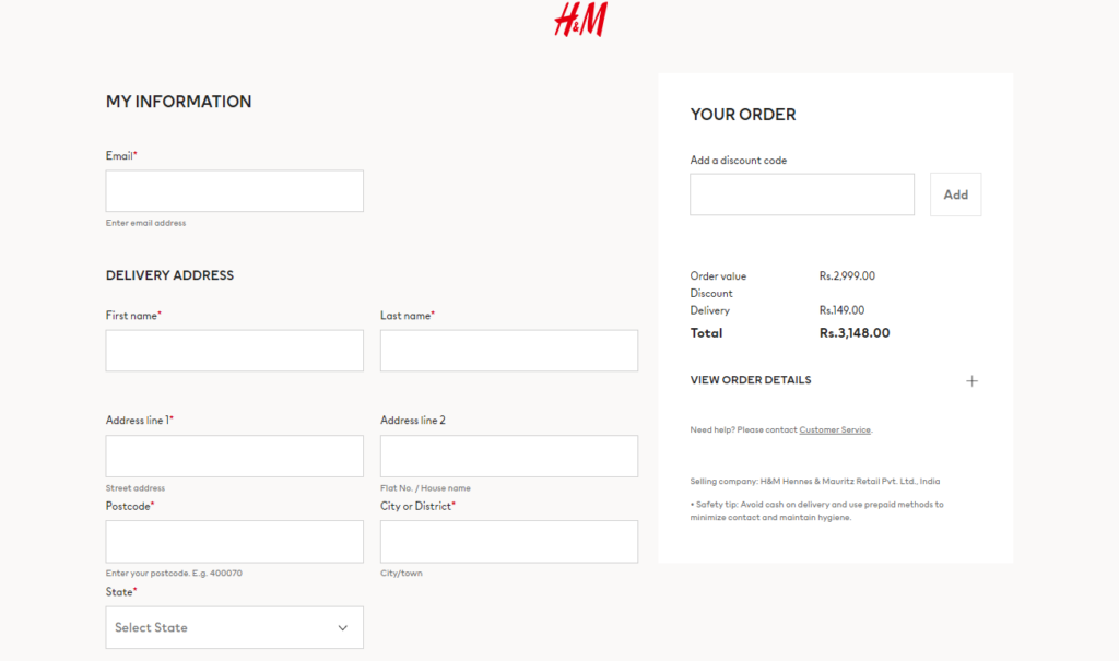
There’s not much difference in the look and feel of both pages. But once you’ve added details in the traditional checkout, here’s how it will save data for the next checkout.
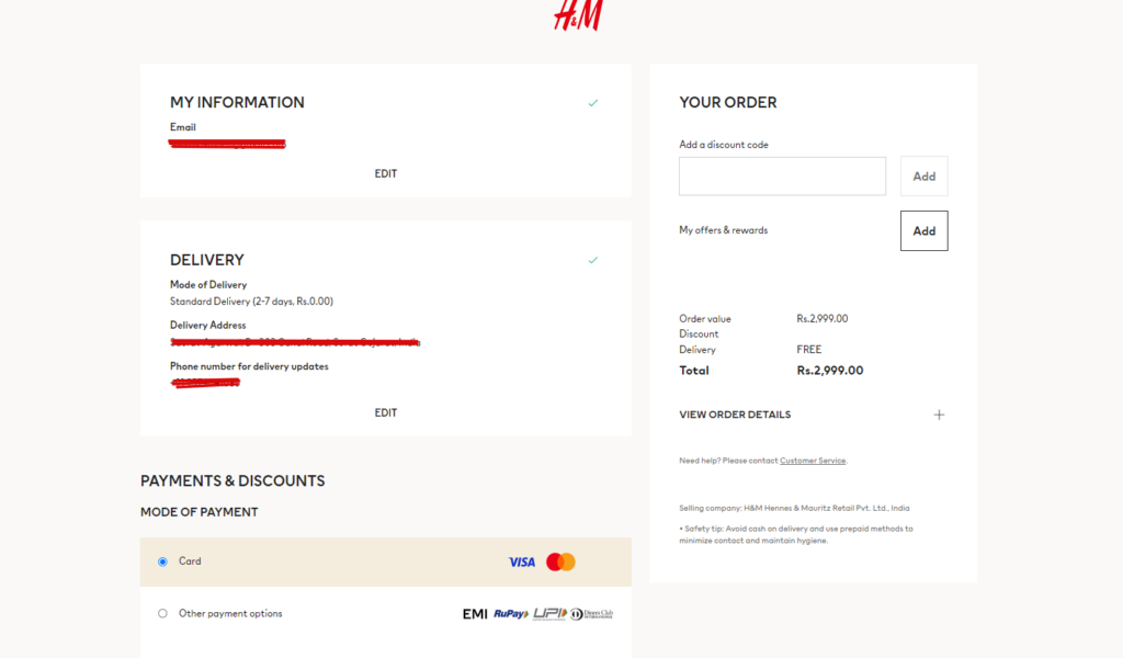
Must have ecom page #11: Shipping
Next in the checkout step is the shipping page. Once your users fill in the details on the checkout information page, you want to show them the shipping details before the final payment takes place.
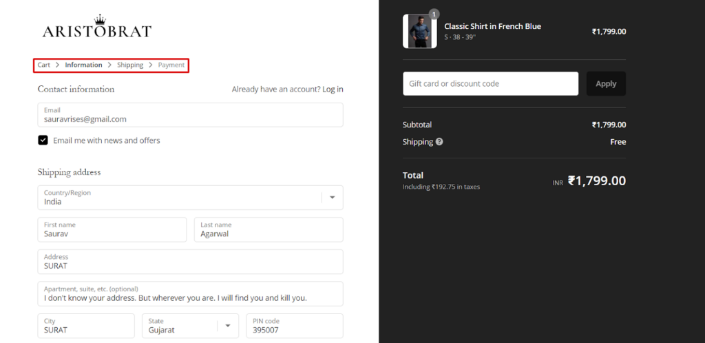
You need a few elements for the shipping page as well.
Shipping Method
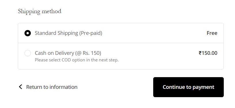
Address Change
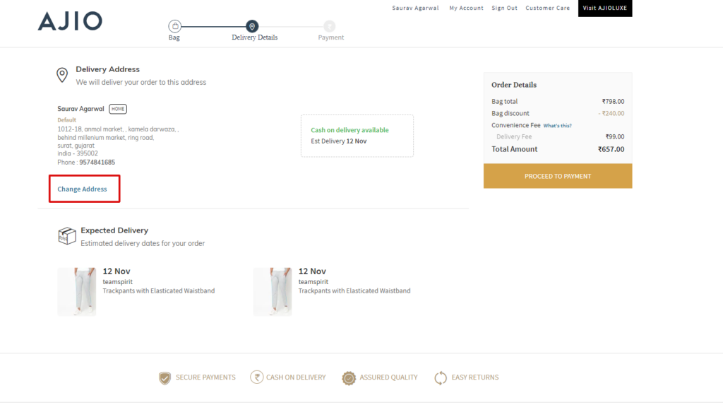
Payment CTA
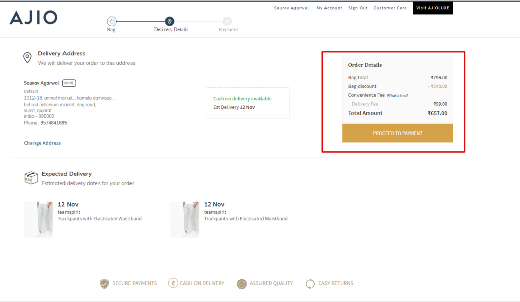
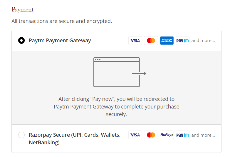
Must have ecom page #12: Payment Methods Page
The payment page is the fourth page of the four-step checkout process. You want to allow users to choose their preferred payment methods.
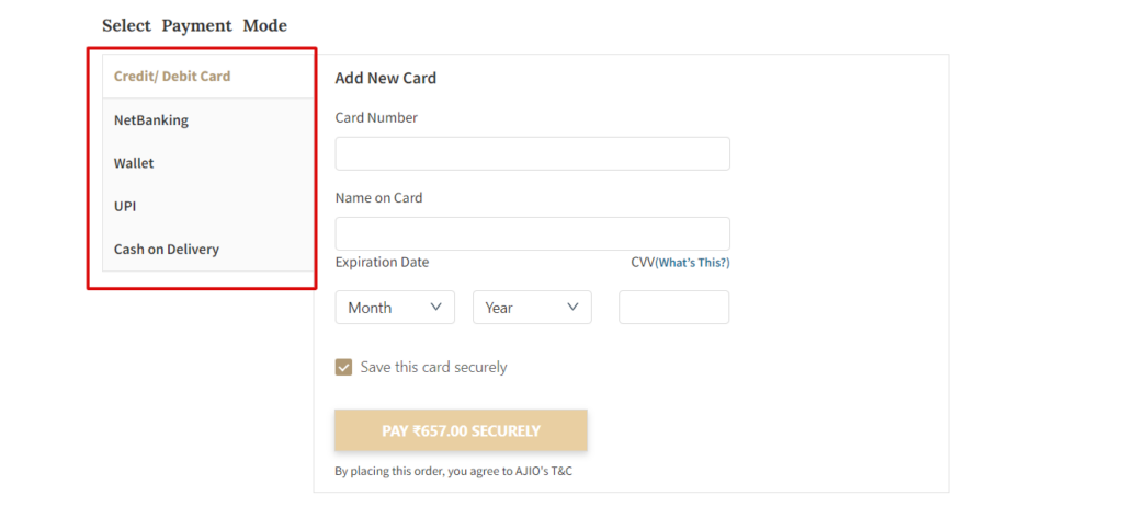
This is also where you give users the last offer.
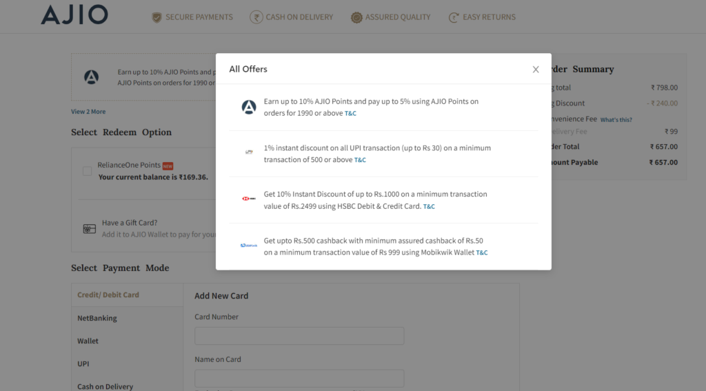
There is much more to it. You also want to have these necessary elements.
Multiple Payment Methods
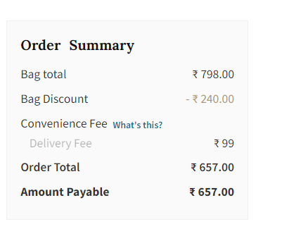
Order Summary
Billing Address Setting & Return To Shipping
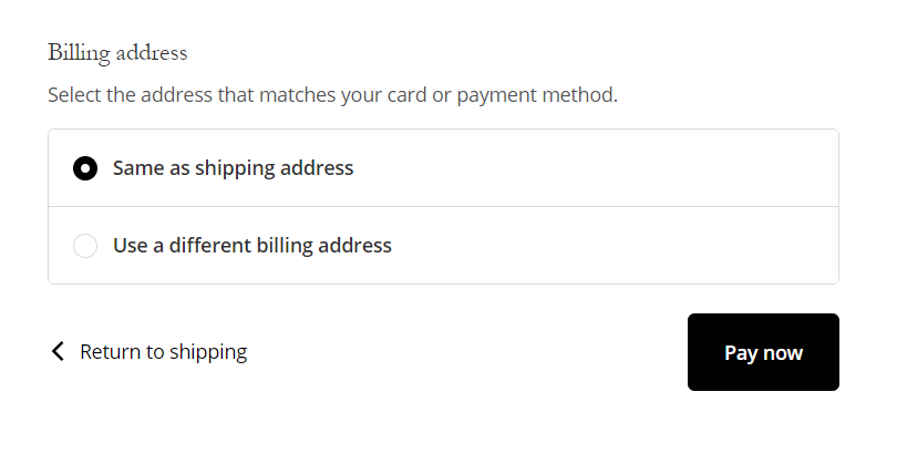
Must have ecom page #13: Payment Failed Page
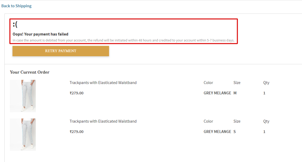
It’s one of the most underrated pages. Not many businesses implement it. When a payment fails, you want to guide users to take the payment action as early as possible.
Repeating the order details followed by the retry payment CTA is a good practice. Have a look at these elements.
Retry Payment CTA
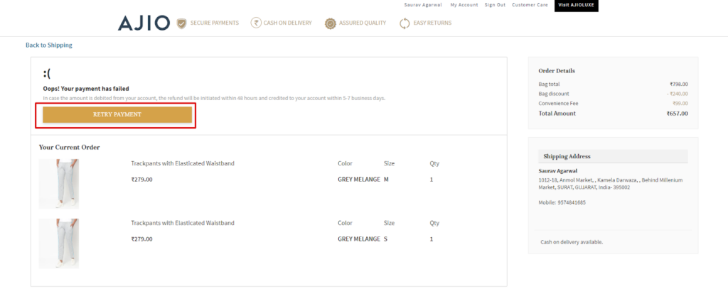
Payment Retry Copy & Selected Orders
Must have ecom page #14:Order Confirmed Page
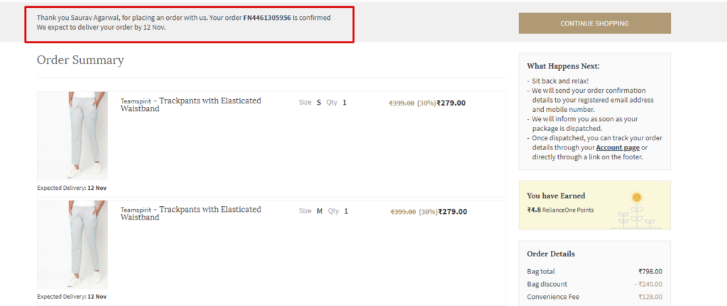
Some merchants like to call it a thank you page. Order confirmed pages show the details of the products you’ve bought (order summary), the shipping details, and the tracking code.
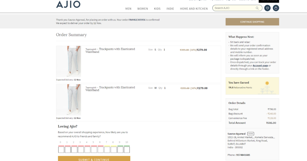
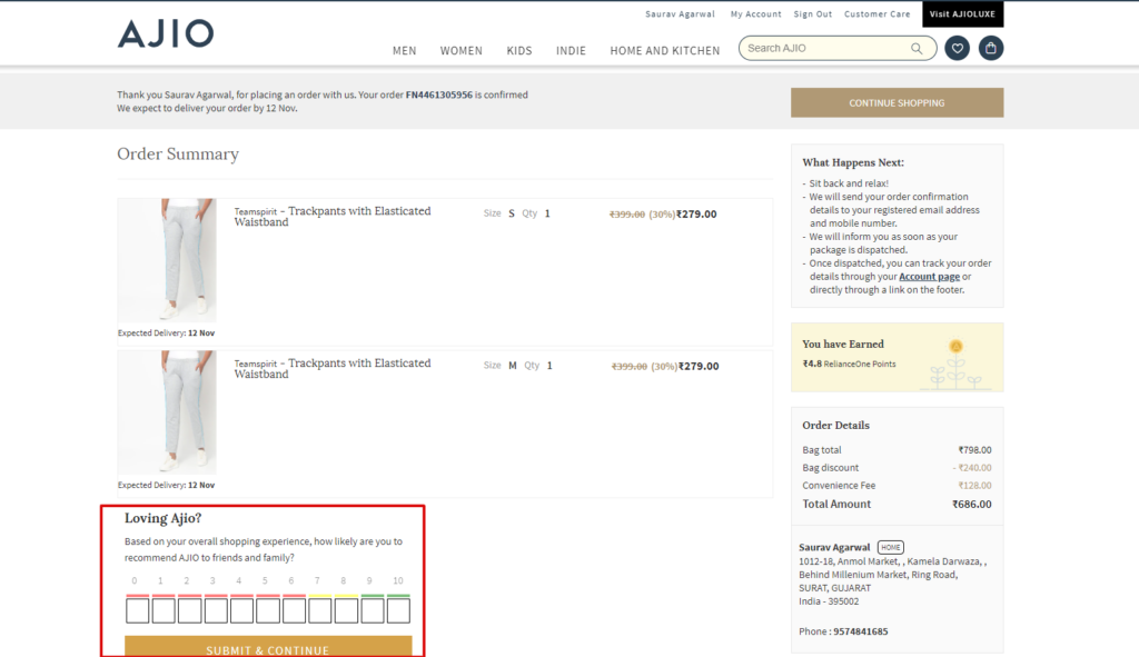
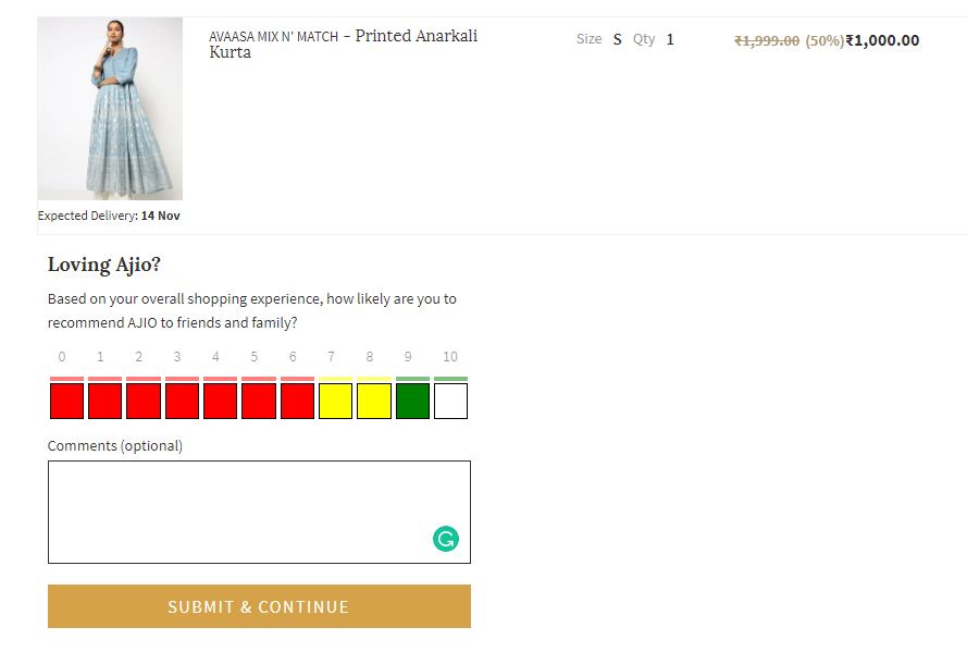
Businesses like Ajio add ratings to the thank you page to learn about customer experience. Here are the elements for you.
Ratings & Reviews
Thank You Message & Tracking Details
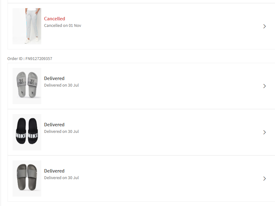
Must have ecom page #15: Orders/Order History
As the name suggests, you need to have an order & order history page for the users who have created accounts with you. It’s just to keep track of previous purchases. The users should also be able to track their open orders.
Here’s what makes an order history page a good page.
Date-Wise Filter
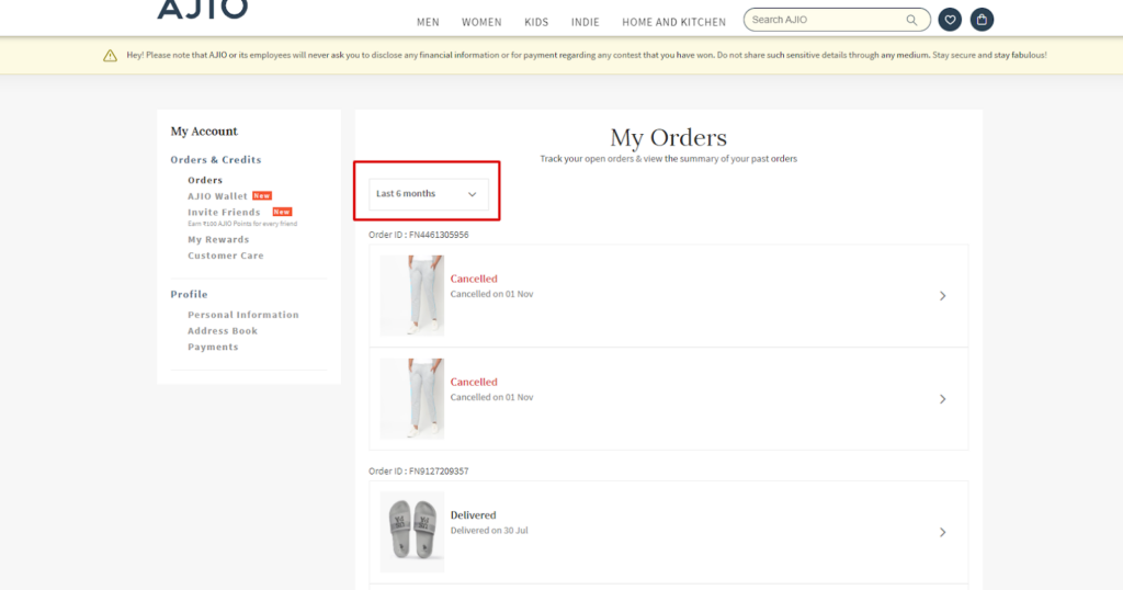
Summary Of All Types Of Order
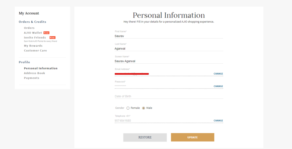
Must have ecom page #17: Profile Settings
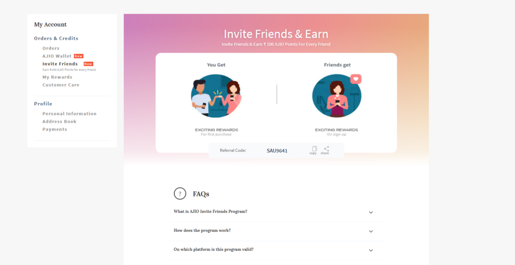
Call it Profile Setting, Account Setting, Personal Information Setting, or My Account; you want to give users the power to change their personal information. Again, please don’t treat this page as optional because it’s not.
The page may have other elements, such as rewards, invite options, and customer care. Let’s take a look at them.
Profile Info
Rewards
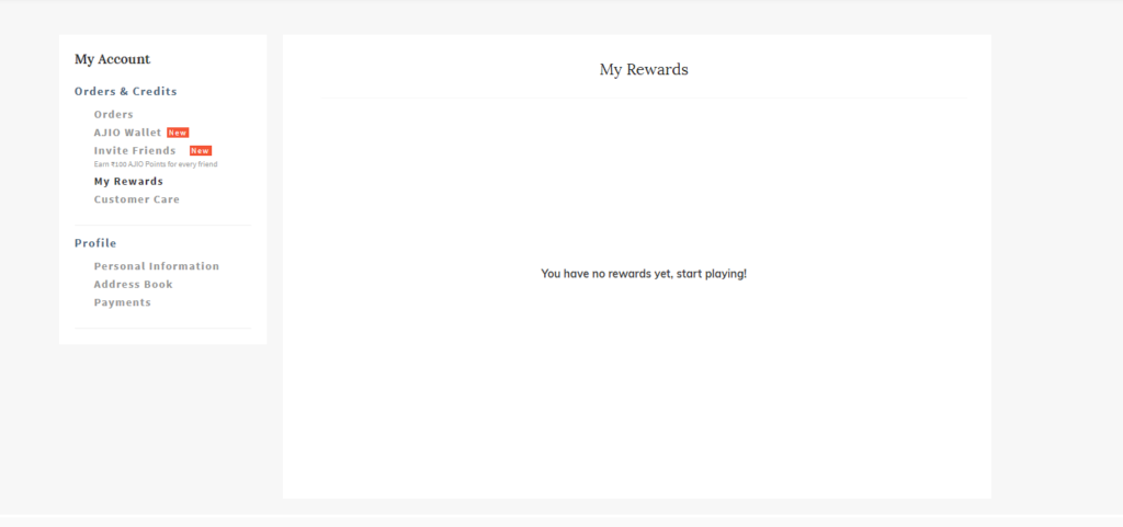
Loyalty Program
Must have ecom page #18: Payment Settings
As the name suggests, you will have to give users the ability to change their payment details as well. Cards expire! New cards are updated. You’ll need a separate page on your eCommerce to keep up with the latest payment details.
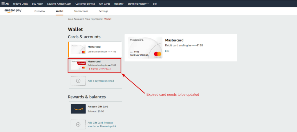
Here are some elements you need on the payment setting pages
Add Payment Method

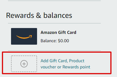
Rewards & Balance
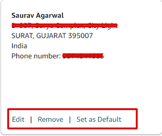
Must have ecom page #19: Addresses
Like payment details, an address page is a must. Addresses change! Users want to add multiple addresses! Or they may also want to delete the address. A separate page would mean you’re allowing them to change their shipping details.
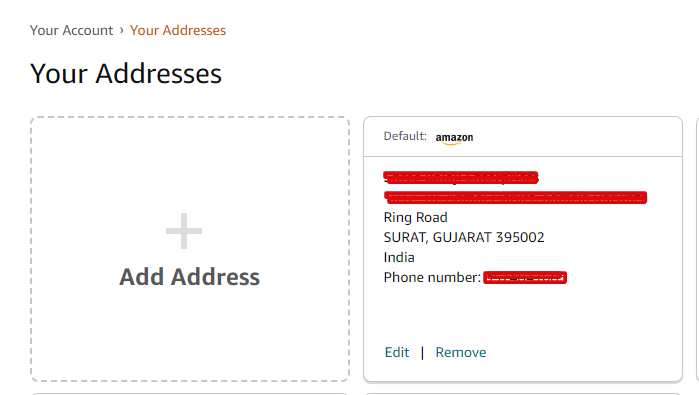
The three most essential elements on the address page would be edit, remove, and set as default.
Edit, Remove, & Set As Default
Must have ecom page #20: SMS & Email Sign Up
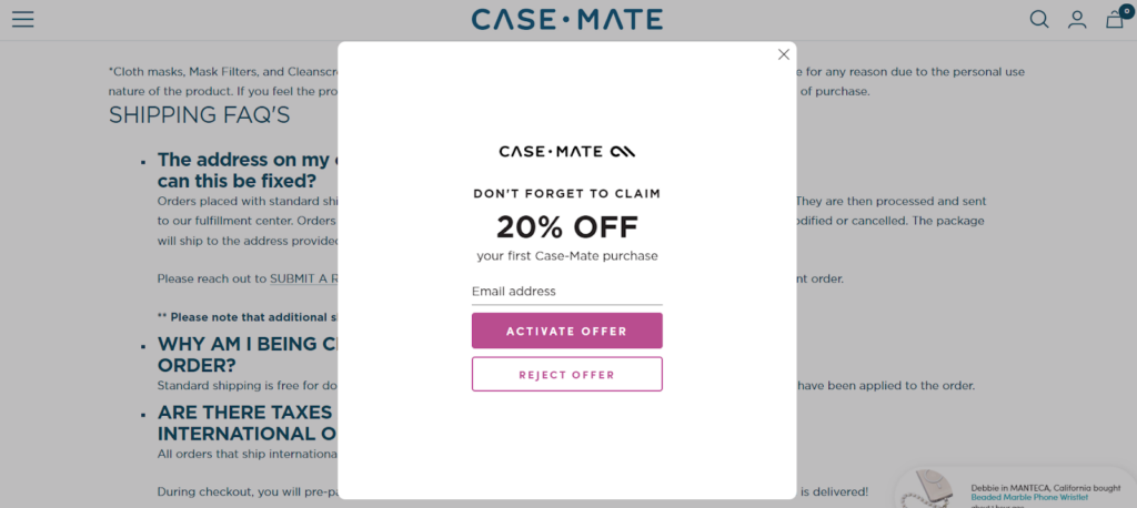
eCommerce email sign-up is like a subscription element on any website. It just makes it easier for your users to sign up with you.
You use email sign-ups to convert new prospects and also to retarget the audience who didn’t finish the purchase or abandoned the cart. You can also mix and match emails and SMS to give lucrative offers to your audience.
Again, it’s not necessary to have a separate page for it. Most eCommerce businesses use it consistently sitewide to have maximum opt-ins. A separate would mean no opt-ins unless the user visits the page.
You don’t need much to execute this. Just a couple of important fields.
- Website copy
- Email address textarea
Many eCommerce businesses cover this segment with pop-ups.
Must have ecom page #21: Return Policy & Center
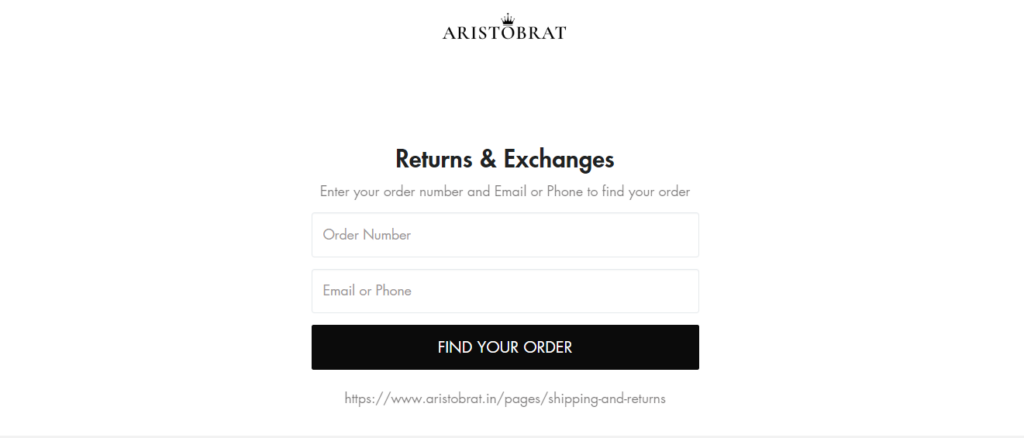
If product pages are the most important pages for buying. Return pages are essential for making returns. It needs a dedicated page with the utmost clarity of terms and conditions and returns packaging.
You can support your return policy with a return center. Just as you allow an order tracking feature for new purchases, it’s always good to have it reversed for user experience. Let users track where they’re in the return process and how far they are from return/exchange.
Must have ecom page #22: Shipping details
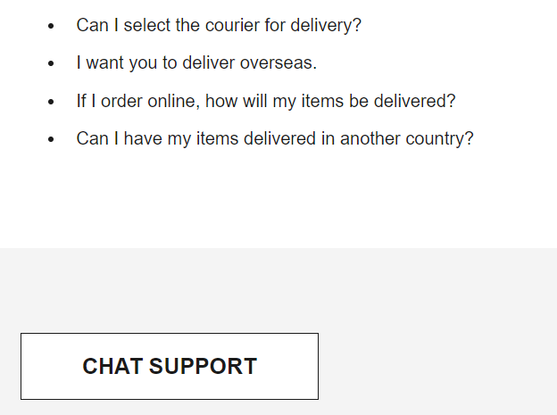
Shipping details, like refund policy, should have a clear link in the footer. It would be best if you covered all the shipping aspects like:
- Estimated shipping time
- Estimated shipping cost
- List of countries your ship
- International shipping policies
- International shipping cost
Here’re some elements you can introduce on the shipping page to make it more effective.
Question & Answers
Chat Support For Immediate Shipping Enquiry
Must have ecom page #23: Order Track
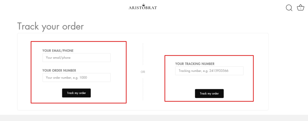
Order tracking is another essential footer link, although you can also place it in the navigation menu. As the name suggests, you want to give users the superpower to track their orders. Order tracking gives the users insight into order packaging and shipment status.
The best order tracking page is where users can track their orders through email handles, phone numbers, or tracking ID codes. So, they’re must-need elements on this page.
Email, Phone Number, & Order Number Based Tracking
Must have ecom page #24: Help/Contact Us/FAQ
This is one of those pages we’d have on any eCommerce blindly! Call it a question bank, help section, or FAQ section; the page looks to answer every query related to your store and products.
You can easily classify questions into as many categories. Answer the questions people are asking you. Think like users who may have genuine queries with you. Document all of them in one space and categorize them for clarity. Wait! Here’s how it should look.
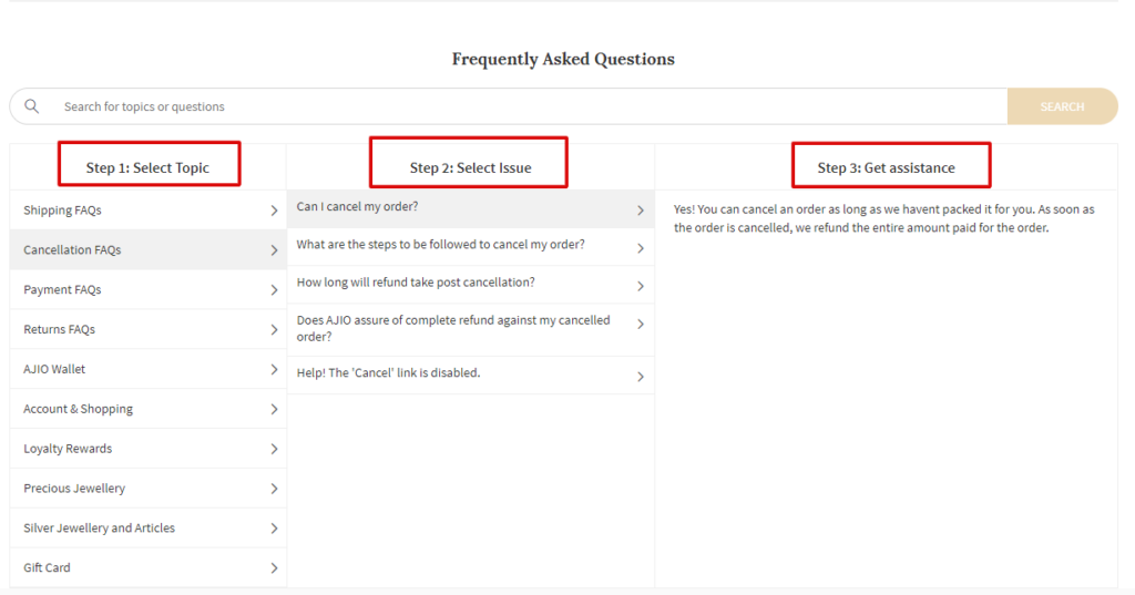
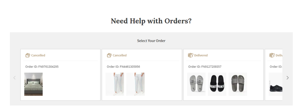
You can insert additional elements to improve the experience further down.
Search Bar

Help With Orders
Must have ecom page #25: Store Locator
Not all users are looking to buy online. If you have physical stores, some may visit your website only to locate the nearest store. Or, if you don’t have any physical location, but retailers sell your products, you may still want to present the store location details.
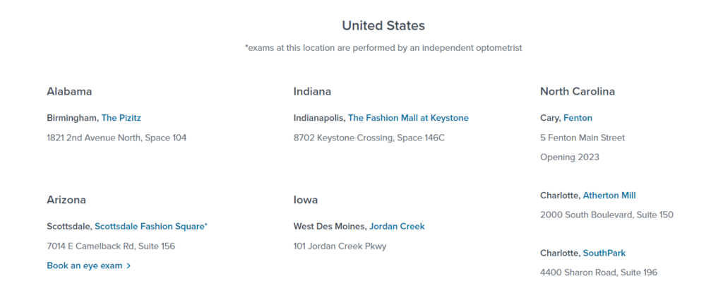
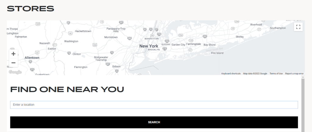
You also want to target the users who search on the web. But buy in physical stores. We call them the “skeptical ones.” Here’s how any store locator would look like.
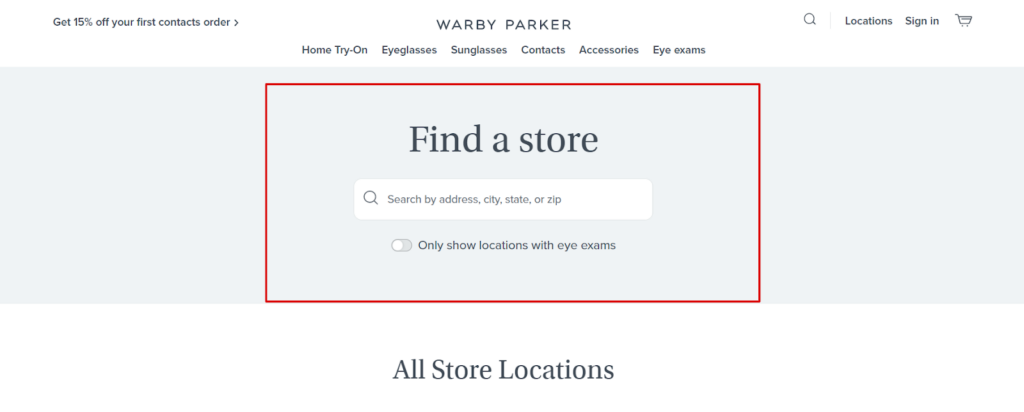
A grid view of all store locations also makes it easier for your users to browse through the list.
Locations In Gridview
Map & Location Search Bar
Must have ecom page #26: About Us/Who We Are Page
The About Us page needs minimal explanation. But it’s one of the most challenging pages to execute. Why? Because most eCommerce stores fail to explain themselves. You only need to take care of two principles:
- Who are you?
- What’s your story?
Who Are You

What’s Your Story

And that’s it. You can choose to keep it no-indexed.
Must have ecom page #27: Terms & Conditions
Now we’re talking about legalities. As with any online business, the terms and conditions page is inevitable. It would be best if you had it for all the good and bad reasons.
- Good because you want to stay clear and focused on your stance.
- Bad because it’s one page which will prevent you from any legal matter.
The terms and conditions page is broken down into:
- Terms And Conditions For Usage Of The Platforms
- Access To Images & Files
- Disclaimer Of Warranties, Inaccuracies Or Errors
- Availability And Accessibility Of The Platforms
- Third-party Interaction And Links To Third-party Sites
- Trademark
And many more terms.
Must have ecom page #28: Privacy Policy
You can’t escape death and privacy policy pages. They’re mandatory on any website. Much like the terms and conditions page, the privacy policy page covers everything about
- the information collected,
- the use of information collected,
- disclosure of Information Collected,
- cookies policy,
- opt-out policy,
- the governing laws
And many other things related to privacy and cookies.
These pages may not seem mandatory, but you need them should there be any grievances. We also call these pages the “safety net” for any eCommerce website.
Must have ecom page #29: FAQs
The FAQ page is a bit different from the help FAQ pages. The help page categorizes all the critical questions related to your business, such as Shipping, refund, return, cancellation, etc.
On the other hand, FAQs will include all the questions related to your products. You can have a separate FAQ page for all the products on your website. But having a separate page for all the products might become cumbersome. Instead, you can use FAQ schemas on all the product pages and answer all the questions.
Note: Please use schema markup for all FAQs. It gets easier for Google to recognize rich results.
Must have ecom page #30: Feedback/Customer Reviews
Feedback or customer review pages help you know what customers think of you. Not many eCommerce store owners use the page, but this is the best way to improve.
One way to have reviews and feedback is to offer a recommendation score meter right after the purchase.
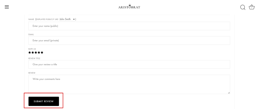
Another way is to have a separate page asking for the overall web experience.

You don’t need much to execute this. Just a simple form and submit button.
Review Form & Submit Button
Must have ecom page #31: Thank You Page
If you’d ask us which is the most ignored page, we would say thank you. And even if they’re used, they’re not optimized for conversion.
Listen! You will need Thank You Pages to track the goal conversion of your category pages. But if you use the same URI (not URL) for all the product purchases, it’s almost as good as not tracking them.
- thank-you is a big no
- thank-you-1, thank-you-2, …. thank-you-n across different categories will make it easier for you to track purchases.
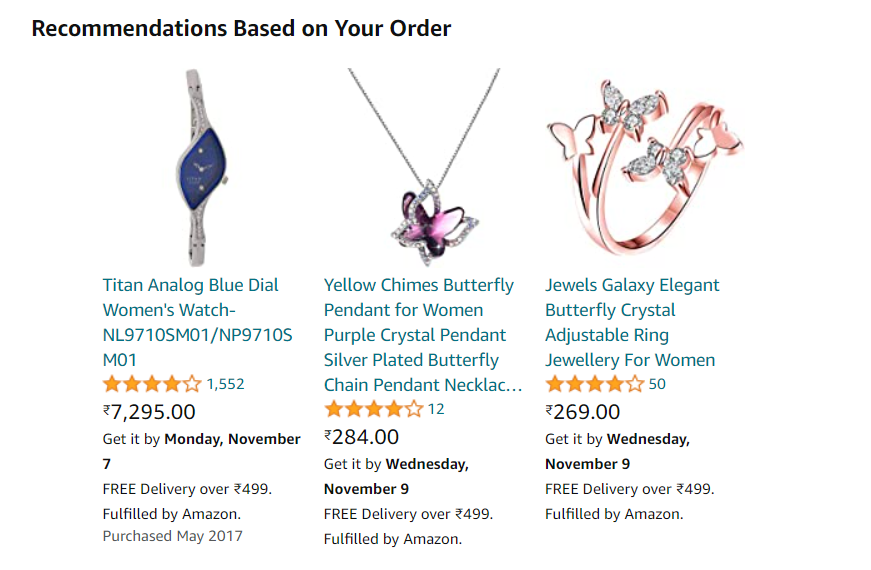
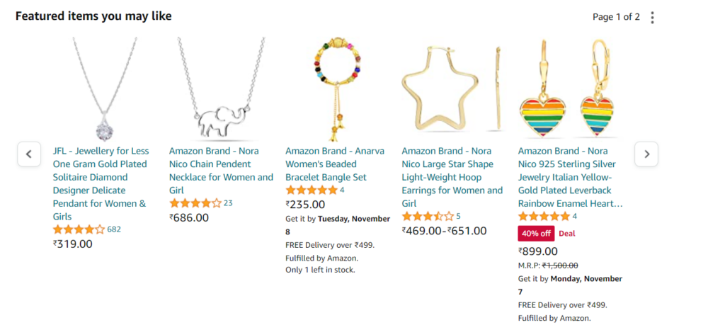
Also, you can use a thank you page with lucrative recommendations for upselling.
Recommendations Based on Your Order
Featured Items You May Like
Conclusion
31 pages are all you need to start your eCommerce business.
You can always experiment with a page or two, less or more. Look! What we have shared with you has much to do with our existing clients. We have followed these strategies for our clients, Miko and Fitnessbug, who have been nailing their sales figures with the bare minimum of pages. You can follow the same process and let us know how it works for you.
We’d also like to give honourable mentions to some pages that missed out:
- Wishlist
- Blog
- Career pages
And a few more. But your eCommerce can do without them as well. Also, remember all these page principles work across any eCommerce platform. Lastly, you can be as creative with your pages depending on the product you sell.
If your niche demands a coupon page. Just go for it. Or, if your niche sells fresh items, go for the Fresh Arrivals page. Only the sky’s the limit here. Once you’re done with adding these pages, the next step would be optimizing those pages. We have discussed one such optimization for product pages in eCommerce that you’d like to check.
Frequently Asked Questions
An eCommerce site is an online store selling products and services to people worldwide. The main difference between an eCommerce site and a traditional site is how they’re structured for their respective purposes. The eCommerce site will have a category, product, cart, and shipping page, while the traditional website will mainly have service and blog pages.
Generally, the home page is the most important page of the website. But since we’re discussing an eCommerce store, the chain of pages is essential. Homepage>> Category page >> Product page >> Cart >> Information Page >> Shipping details page >> Payment details page. Please notice every page has its role. If one creates direct conversion, the other assists.
An eCommerce website should include a home page, category overview, category page, product page, login page, user account page, terms and condition page, shipping policy page, FAQs page, cart page, shipping details page, payment details page, thank you page, to name a few. All these pages should be well-designed and SEO-friendly.
You can make your eCommerce website more attractive by adding visual hierarchy, using a minimalism designing formula, less contrasting colors, few fonts and typographies, and adding copies where needed. Take the help of eCommerce design experts to design the store.
An eCommerce website may cost you anything between $500 to $40,000, depending on the expertise you seek, the agency you hire, the area you live in, and the complexity of your project. If you have a large SKU set, expect the cost to go high.


