25 Use Cases For Shopify Plus Checkout Page Customization

So, you’ve upgraded your online store to Shopify Plus and want to customize your checkout page. And like many NEW “Plus” merchants, you’re not sure how to do that.
Again, as we all know, the higher version unlocks many opportunities, but how is it beneficial for customizing your checkout page?
I know, I know, you’ve too many questions in your mind, but don’t worry, you’re about to reach the answers very soon. This blog will explain everything about Shopify Plus checkout page customization and show how many ways you can do that.
So, keep reading and make your understanding better which can help you in seamless customization of your Shopify plus one page checkout.
Let’s first start with the basics!
What is Shopify Plus Checkout?
Shopify Plus Checkout is the ultimate checkout experience designed specifically for high-volume and fast-growing eCommerce businesses. Unlike the standard plans, Shopify Plus offers a checkout customization and control that’s truly next-level.
Having the same checkout page layout and can’t do anything about that may feel like a curse with Shopify. But with Shopify Plus Checkout, you’re not just processing orders; you’re crafting a seamless shopping journey that’s as unique as your brand. It gives you more control over the layout, functionalities, and experience of the checkout page
No, it’s not like you don’t get customization options with other Shopify plans, but they are very limited. To know more about it, check out how to optimize the Shopify checkout page without Shopify Plus.
Now, you might be wondering what makes Shopify Plus Checkout different. We’ll understand this in the next section.
How Shopify Plus Checkout Customization Differs?
As I mentioned above, you have the customization options with standard Shopify plans. But Shopify Plus takes things to a whole new level.
In Basic Shopify or Higher plans, you can access the checkout and accounts editor for basic tweaks, and utilize eligible apps for thank you and order status page modifications. However, direct control over information, shipping, and payment pages is restricted.
While apps can extend functionalities, they often have limitations and might not perfectly align with your specific needs.
Whereas Shopify Plus offers you:
- Checkout Blocks: This visual editor allows for advanced checkout branding without the need for API calls.
- Checkout Branding API: Using the Checkout Branding API, you can create custom form fields and options for a truly unique checkout experience.
- Payment Method Customization: Shopify Plus merchants have greater flexibility in renaming, hiding, reordering, or sorting payment fields, including credit card options.
- Checkout Scripts: These allow for complex logic and customizations, such as conditional discounts or personalized messaging.
- Checkout Extensibility: Shopify Plus offers Checkout Extensibility that allows you to add apps and advanced branding customizations while maintaining upgrade safety and integration with Shop Pay.
This is how Shopify Plus checkout customization differs from the normal checkout customization.
Now, I know, you want to explore these advanced customization options and learn how to create a unique checkout experience for your customers.
So, the wait is over, the next section shows all the options available for customizing your checkout page with Shopify Plus.
How to Customize Checkout Page in Shopify Plus?
Are you ready to make changes or fully redesign your checkout page?
Of course yes! But, did you know you can do that in many ways?? Yes, Shopify Plus unlocks various customization options. So, here, we shall show you how you can customize your checkout page in different ways.
Here are the Shopify Plus checkout page customization ideas:
1. Checkout Page Redesign
I know, the first thing you would like to change on your Checkout page is the appearance (layout) itself.
The Shopify Plus upgrade is best when you need a complete unique look and feel for your checkout page. Wondering how?? 👇
It’s the ability to create checkout page templates in the theme editor!!
Have you ever seen it in your Shopify theme editor before?? No, right? The higher version unlocks access to a checkout page template and the checkout.liquid file. Now, you can redesign your checkout page the way you want using the Shopify sections and blocks (as shown in the image below).
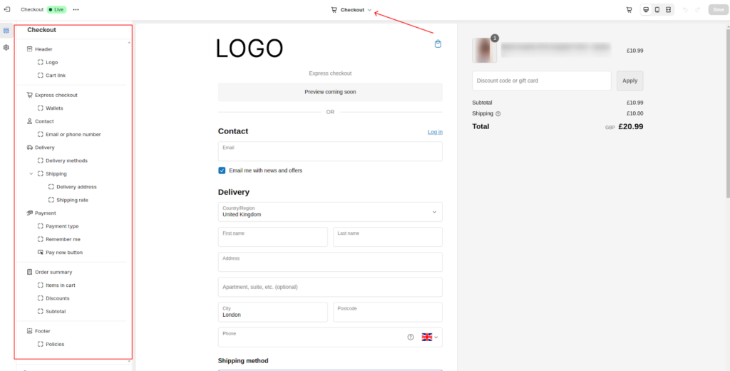
So, this way you can craft a fully branded checkout experience for your shoppers and can directly address the issues that drive to cart abandonment.
2. Custom Billing Form
Wanted to squeeze the checkout form size for longer?? Now, it’s possible with the Plus plan.
A long checkout form can be a major turn-off for customers. Shopify Plus gives you the power to simplify this. So, you can minimize the number of fields required at checkout.
For example, instead of separate fields for address lines 1, 2, street, etc., you can consider using a single address field.
So, the standard checkout billing form has approx. 9 fields (as shown below):
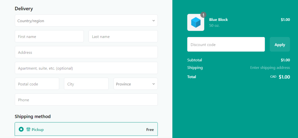
We can reduce it up to 7 and customize the appearance as shown in the picture below for your reference.
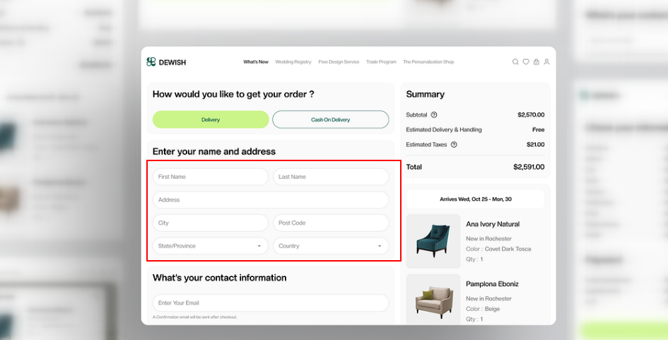
Checkout Billing Information by Odama
This not only saves space but also improves the checkout experience by reducing clicks.
3. Gift Wrapping and Messaging
A big chunk of your online shoppers could be gift buyers and might require little personalization in their orders. Offering gift wrapping and personalized messaging is a fantastic way to enhance their shopping experience.
Now, you can easily set up different gift wrapping options with corresponding prices. Customers can then choose their preferred option and add a personalized message directly on the checkout page.
True Classic offers the gifting experience with a simple “Is this a gift?” tickbox beneath the order summary at checkout. If someone ticks the box, a short text box appears for customers to write their customized message.
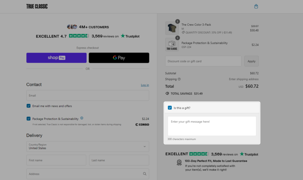
This small addition can significantly increase customer satisfaction and even boost your average order value.
4. Delivery Package Selection
If you’ve different packaging options, why not ask the shopper’s preference??
Shopify Plus lets you offer different wrapping options (like standard, deluxe, or eco-friendly) at an extra cost. This means they can choose between different-sized boxes or even eco-friendly packaging.
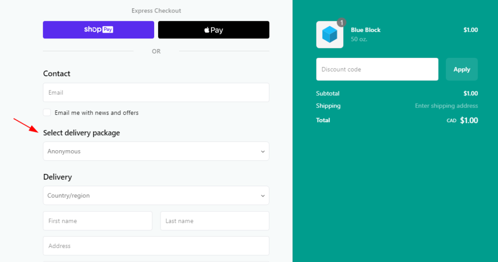
This option not only caters to different preferences but also aligns with growing environmental concerns. Additionally, offering a variety of package choices can help you upsell or cross-sell additional products, such as gift wrapping or branded merchandise.
5. Order Summary Customization
Yes, it’s about Checkout Order Summary where customers see a breakdown of what they’re buying, how much it costs, and any applicable taxes or discounts, etc.
With Shopify Plus, you have the power to fully customize this section to match your brand and enhance the customer experience. You can modify the layout, content, and even the visual appearance of the order summary.
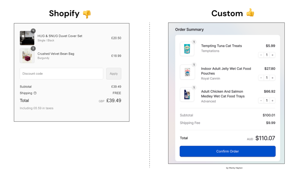
You can also add custom fields, change the font, and even rearrange the information to highlight specific products or promotions. Want to see an example of live Shopify Plus store with a customized order summary??
Here it is… Endicia’s checkout page does have the same section for order summary. They’ve chosen to be different by styling their checkout page.
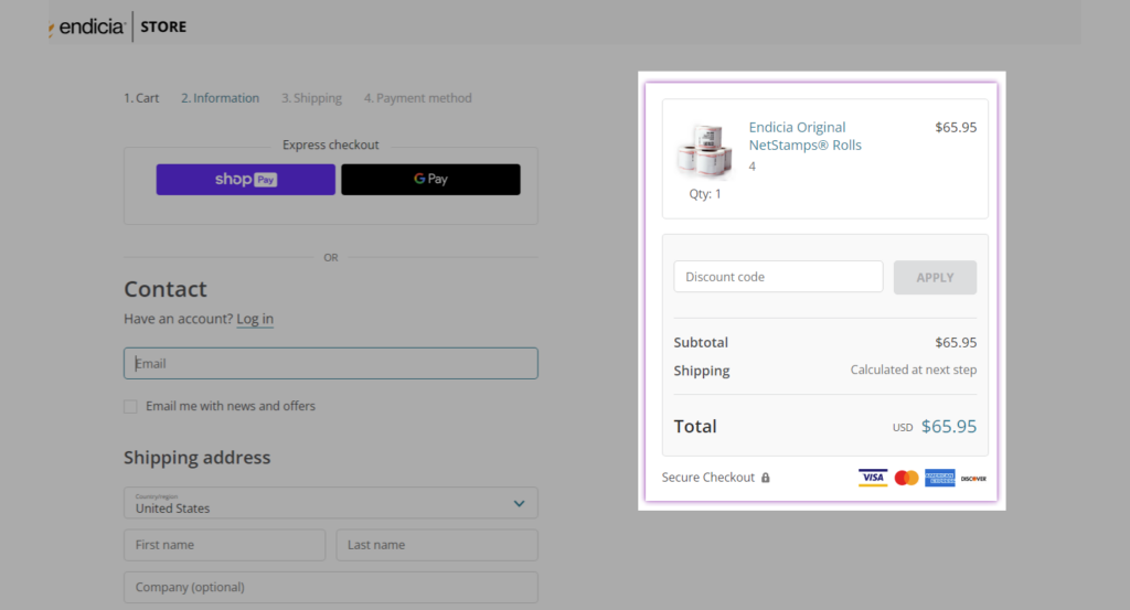
This level of customization allows you to create a more engaging and informative checkout experience.
6. Banners for Event Promotions
What if you could place a banner on the (empty space of) checkout page???
Yes, this is also possible!
Unlike other Shopify plans, Plus gives you the freedom to design and place custom banners anywhere on your checkout page. This means you can highlight upcoming events, limited-time sales, or other programs through image banners, and invite more shoppers to your website during sales.
There could be many ways you can add the banner image to your checkout page but I’ll show you the easiest way here. There’s a Shopify app named “Checkout Bear” that allows the Plus stores to place static banner images on the checkout page.
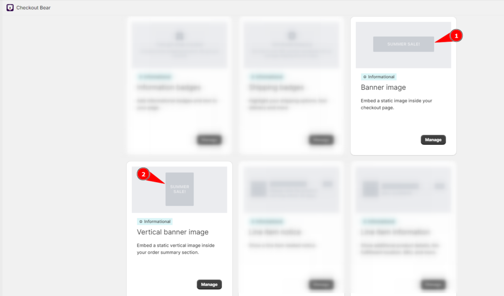
Amazing… right? You can further customize the event display with a real-time countdown timer. So, next time you’re planning a big event, remember that your checkout page can be a powerful ally.
7. Product Upsell and Cross-sell
If I’m not wrong you must be using the upsell and cross-sell everywhere in your Shopify store, isn’t it? But do you know where these strategies work the best? At the bottom of the sales funnel…..!!
……And, that’s your checkout page.
Your customer has already decided to buy. They’re one click away from completing the purchase. This is the perfect moment to suggest additional items that complement their order or enhance their shopping experience.
See how beautifully Soylent has placed the product recommendation right below the order summary on their checkout page.
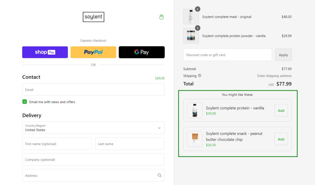
Shopify Plus lets you experiment with different product recommendations based on the customer’s cart, offer bundle deals, or highlight popular items.
Read more: Top 6 Personalized Recommendations Strategies [Must Try]
8. Internationalization and Localization
Merchants usually opt for “Shopify Plus” when they scale their business globally and need more extensibility and flexibility support from the platform.
So, what does that mean for your checkout page? Well, it’s like opening your store to a whole new world of customers! Shopify Plus makes it easier to cater to shoppers from different countries and cultures.
Suppose your eCommerce website automatically adjusts to the customer’s language, currency, and even shipping options based on their location. This is where internationalization and localization come into play.
Now, this would be applicable to the entire website, then what new can be done for the checkout page??
So, you can personalize your checkout experience to specific regions by considering factors like address formats, tax calculations, and payment methods. This level of customization is essential for building trust and converting international customers.
9. Discount Code Selection
I know, I know… the discount code field is already available on the standard Shopify checkout page. But, what if we can do more customization and transform this static coupon code into a dynamic one?
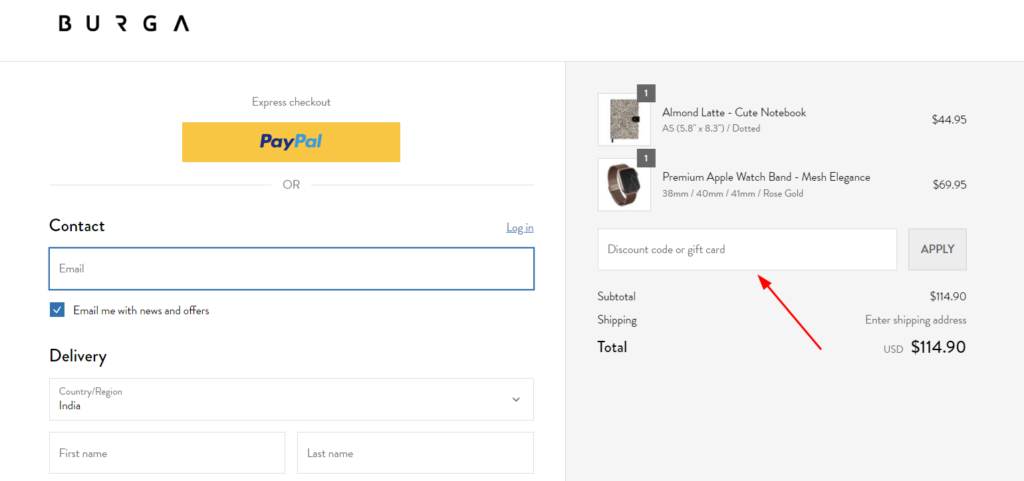
The static discount code forces shoppers to remember the coupon codes and manually type them in the input field to claim the discount. However, with the dynamic discount code functionality, you can display available discount codes directly on the checkout page.
This means you can display different discount offers based on the customer’s purchase amount, product category, or other criteria —to ease the discount application process for them.
CUPSHE has implemented it in the right way. When the shoppers click on the “Coupon Available” option, it shows all the available discount codes using a slider (without changing the page).
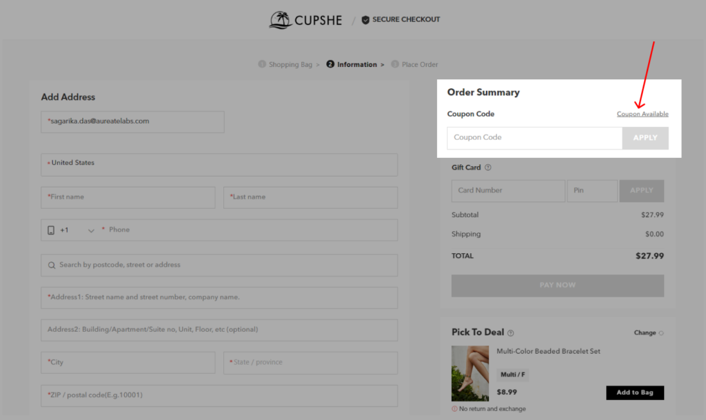
I found another Shopify Plus store that directly applies the discount code when the customer reaches the checkout page.
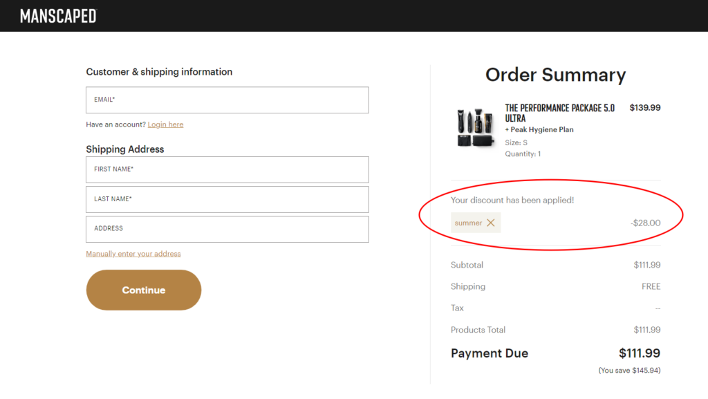
Now, when the shopper finds the discounted value he/she is getting with the purchase they won’t be able to step back and lose the discount. Just a super smart way to reduce cart abandonment!
Plus, you can customize the look and feel of the discount code section to match your brand. This way, you can create a more engaging and personalized experience for your customers.
10. Stock Countdown or Timers or Alerts
Whether you add a product upsell or an exclusive offer (on the checkout page) how about making it time-sensitive??
Adding a countdown timer can create a sense of urgency and encourage customers to act quickly. You can use them for flash sales, limited-time discounts, or even to create scarcity around popular products. The possibilities are endless!
Check out Pura Vida—how they have implemented a countdown to complete the checkout process within the given time.
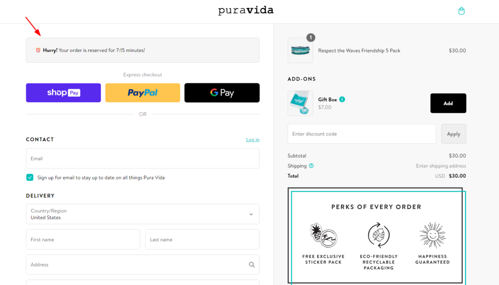
So, you can also make appropriate use of this strategy on your checkout page and influence the shopper during the checkout process.
11. Free Shipping or gifts on Specific Cart Value
Free shipping used to be a big deal, right? Now, it feels like everyone offers it.
And every customer expects it! But the truth is shipping costs can eat into your profits. So, how do we balance customer expectations with our bottom line?
By offering free shipping on a specific cart value. It’s a win-win! You encourage customers to spend more (which boosts your average order value) while still giving them that free shipping they crave.
Here’s an example of a live Shopify Plus store using it!
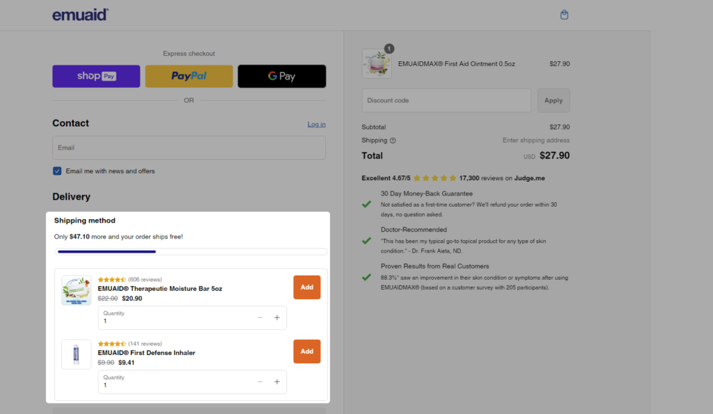
Check out the example of how you can implement a Free Shipping threshold on the checkout page using the Checkout Block (Shopify app)!
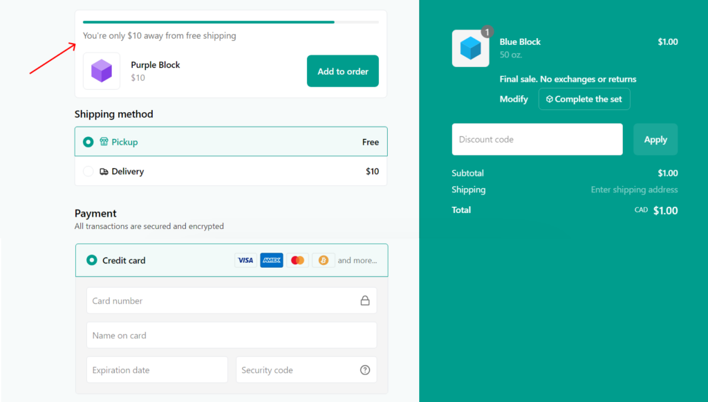
If your cart total is below a certain amount, this will show you a little message saying how much more you need to spend to unlock free shipping. It’s a subtle nudge that can make a big difference.
12. Social Login Integration
As a shopper when I checkout at the ASOS website, they just redirected me to the account login/creation page…
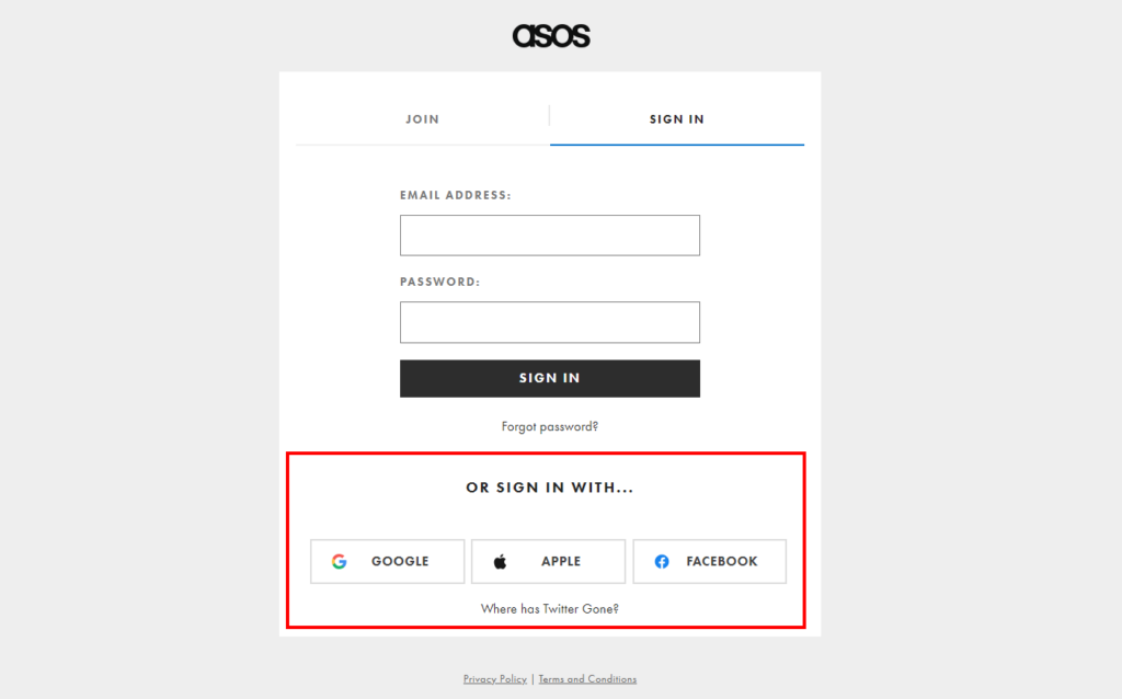
Well, I didn’t want to sign in but, wait… I found an easy way to tackle this — Social sign-in options!!
If you can’t offer a guest checkout option, then you can provide an easy way to create an account that doesn’t involve form filling or additional delays. This would be even more amazing if you could add the Social Login options (like Google, Facebook, or Apple) right at the checkout, what say?
Not only does this save time for your customers, but it also collects valuable customer data that you can use for marketing and personalization.
13. Dynamic Content Placement
There could be many occasions when you’d like to notify your customers about delivery delays, product substitutions, or even special offers. For that, dynamic content placements can help you.
Here’s how it will look like:
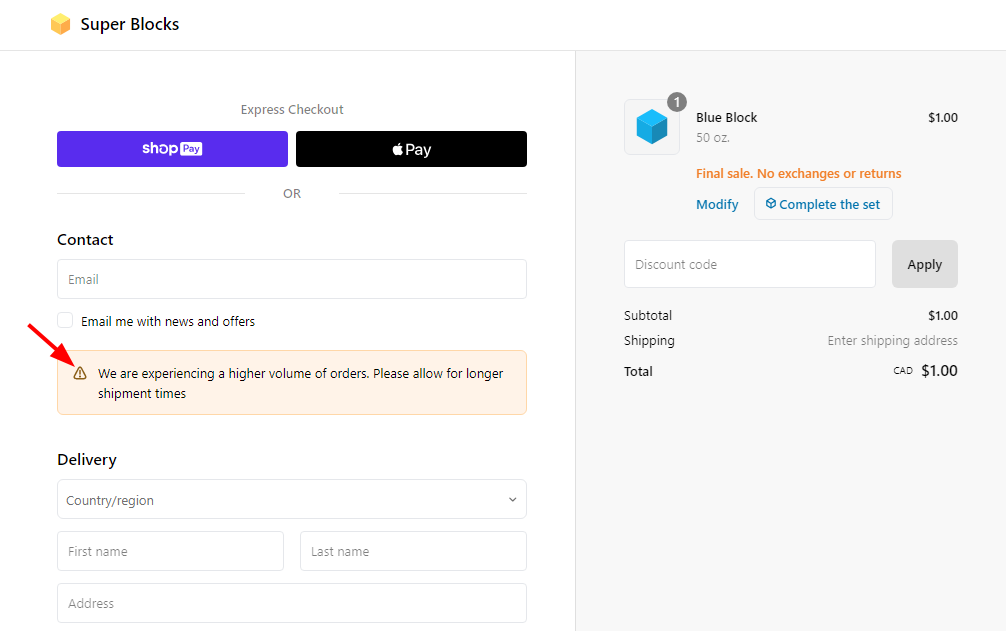
With this, you’ll be able to quickly update your checkout page with important messages without having to touch any code. That’s the power of dynamic content. Shopify Plus allows you to create content blocks that can be easily added, removed, or modified based on specific conditions.
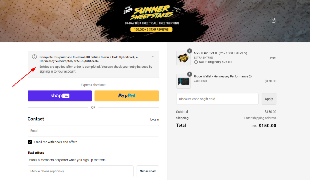
One more example of how The Ridge uses the dynamic content placements on their checkout page!
14. USP or Social Proof
Reviews, testimonials, and even just showing off how many people love your stuff can make a huge difference.
Check out Duradry. They’re killing it with social proof on their checkout page. Right at the top, , you’ll find a glowing 5-star review from a happy customer.
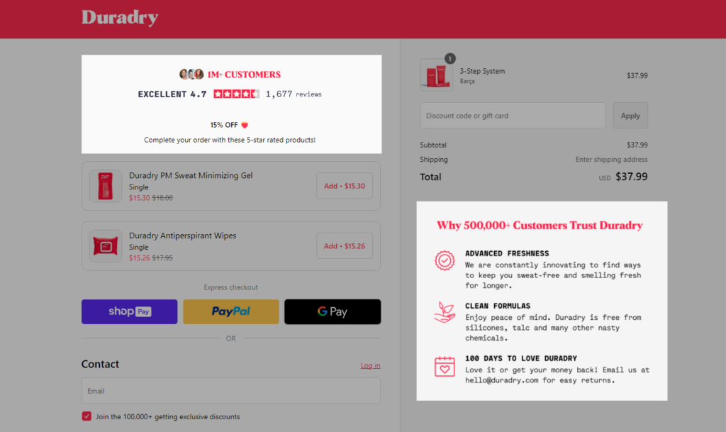
And below that, they’ve got a section called “Why 500,000+ Customers Trust Duradry.” It’s a clever way to show off their popularity and build trust.
You can also showcase customer photos, and video testimonials, or even integrate live chat to answer questions. The goal is to build trust and confidence in your brand.
15. Customer Loyalty Program
Retaining existing customers is much easier than acquiring new ones, isn’t it??
So, one of the great strategies for retaining customers is loyalty programs and big brands mostly generate most of their revenue from their existing customers.
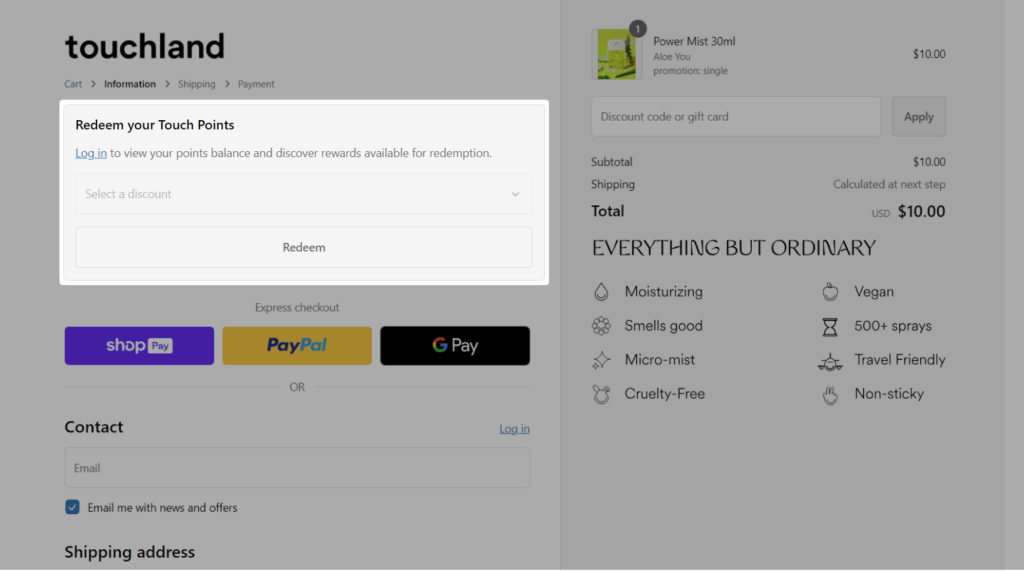
Are you one of them?? If yes, you can incorporate an option to redeem reward points for your existing customers at the checkout page.
Here’s an example!
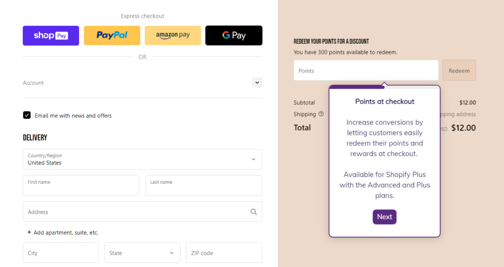
It’s a smart Shopify checkout customization to engage first-time shoppers too. If people know repeat purchases result in cheaper prices, they may be more likely to create an account and shop again in the future.
This is how Touchland encourages their shoppers to sign up and earn/redeem their reward points.
16. SMS Opt-in Consent
Text messages get opened way more often than emails, and a huge chunk of customers actually buy stuff after getting a text.
But for that, you need permission to text your customers. That’s what you can take right at your checkout page. You can add a simple checkbox on their checkout where customers can opt-in to receive SMS messages, just like Ruggable has implemented!
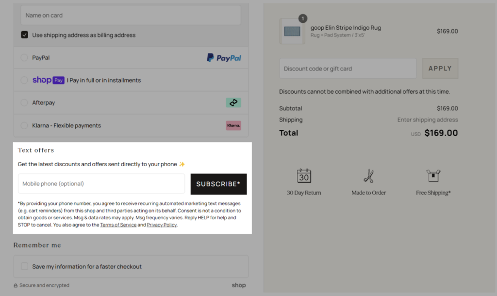
They’ve used the smart technique to motivate shoppers for SMS opt-in. 😉
17. Shipping Insurance Options
Stats show that a good chunk of large packages gets damaged during shipping, which can lead to returns and refunds. That’s a major headache for any business!
Why not add another little checkbox to offer shipping or order protection? By offering such insurance, you can protect yourself from these headaches and even make a little extra cash.
See how SNOW has implemented it. They’ve got a clear and simple order protection option right there on their checkout page.
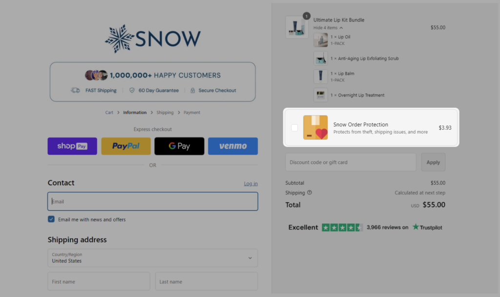
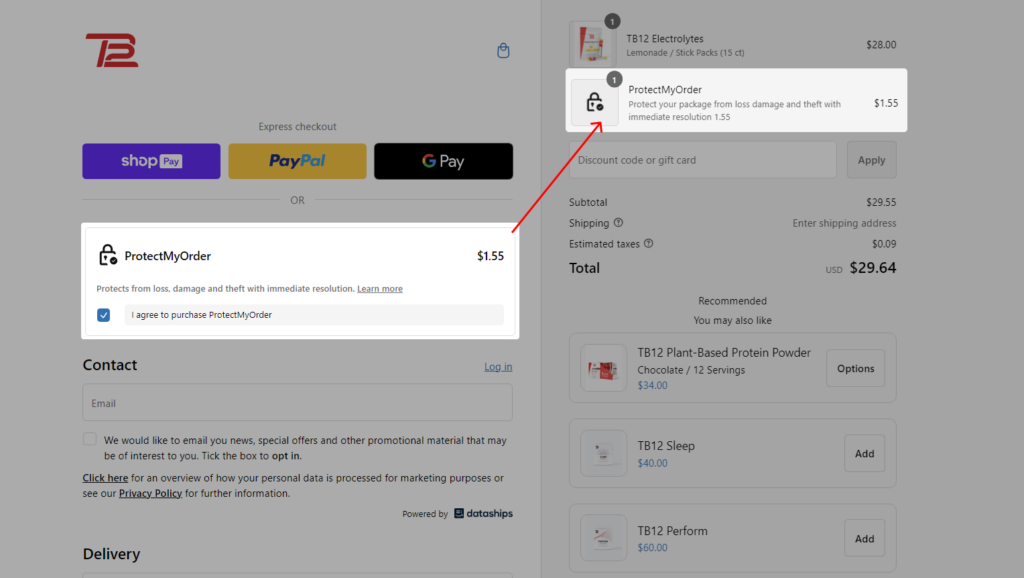
It’s a smart way to pass the risk onto an insurance company while giving your customers peace of mind. Want to see one more example with a different placement??
Here it is:
18. Delivery Method Customization
In case you offer different delivery or shipping methods, your existing checkout page might show it as below:
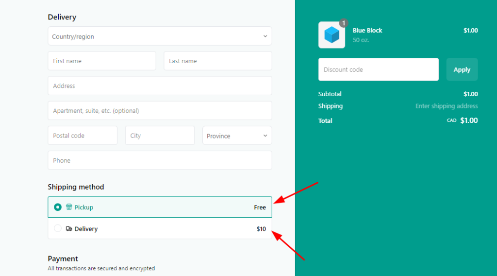
Most Shopify stores look similar in this area. But, some stores believe in standing out from the crowd.
Check out how the Bee Inspired clothing store has customized the delivery method section on their checkout page.
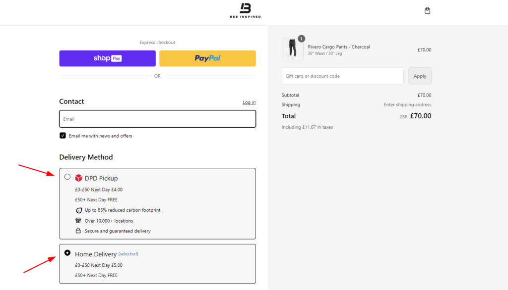
It’s a great example of how you can make this area more visually appealing and informative.
You can do so much more than just list shipping options. You can highlight delivery speeds, add images, or even include estimated delivery dates. Here’s one more example where the Shopify store “Princess Polly” has offered the option to find the nearest collection point as an alternative.
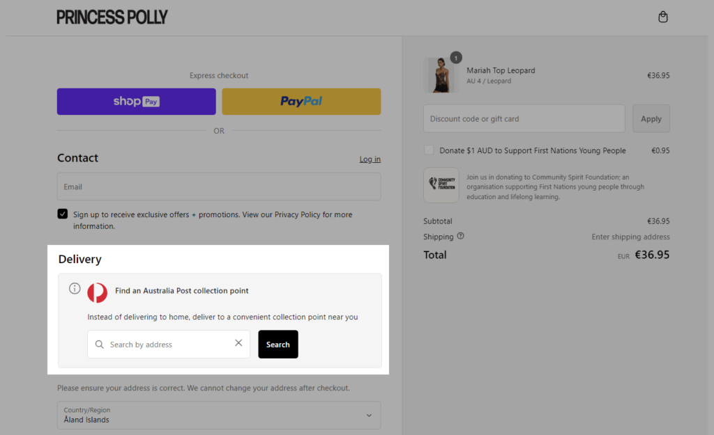
By customizing this section, you can make the checkout process more engaging for your customers.
19. Security Trust Badges
A lot of new shoppers get cold feet at checkout because they’re worried about security. And that’s the big reason for cart abandonment!
This makes it necessary to have trust badges on the checkout page itself. Trust badges reassure shoppers that their information is safe, and their purchase is protected.
Schoolyard Snacks solves this problem by displaying various trust badges on its Shopify checkout.
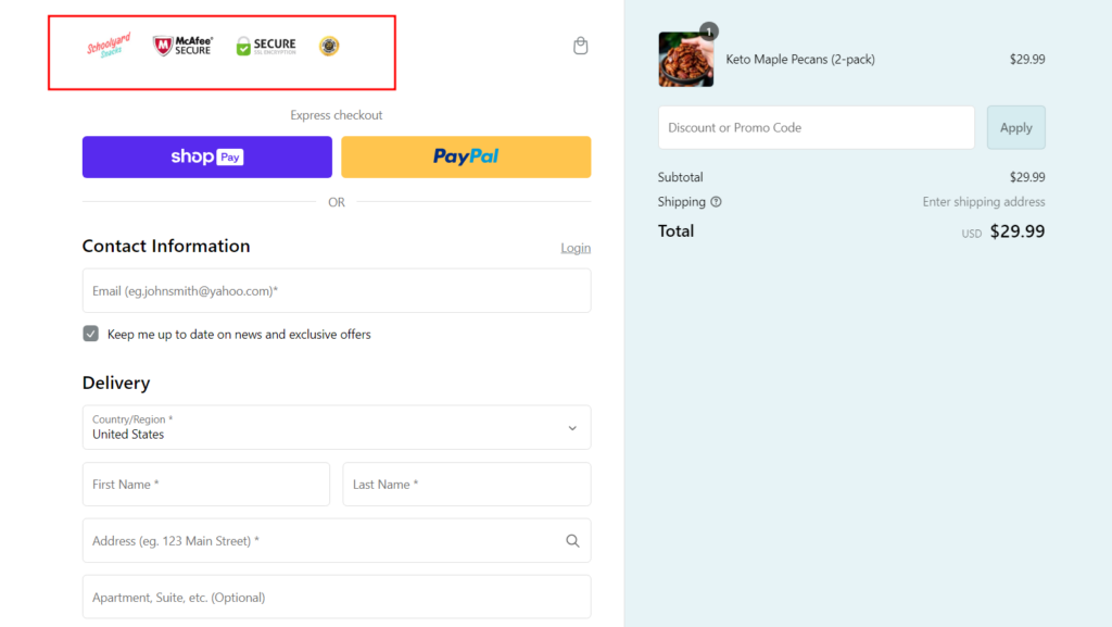
Trust badges can be anything from security certifications like Norton Secured or McAfee Secure, to payment method logos like Visa, Mastercard, and PayPal. You can also include badges that show your commitment to privacy, like GDPR compliance.
There are also badges that highlight your hassle-free returns, customer reviews, and even your business age.
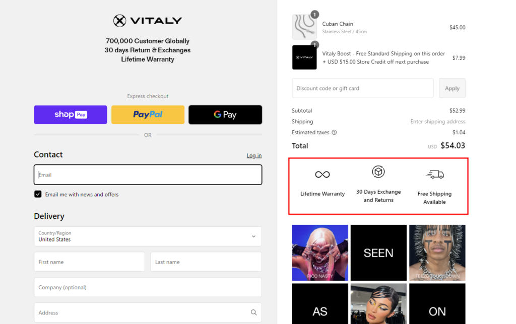
All of these can boost customer confidence and help you convert more sales.
20. Contact Information Display
Most brands don’t dare to show their contact numbers on their website. But, do you know it can be the biggest turn-on for your shoppers??
Trust me, people love to know they can reach out for help if needed.
By displaying your contact information, you’re showing customers that you’re available and ready to assist. It builds trust and can even help reduce cart abandonment. Plus, it’s a great way to encourage direct communication with your customers.
Check out POLENE. They’ve smartly placed their contact information right on their checkout page.
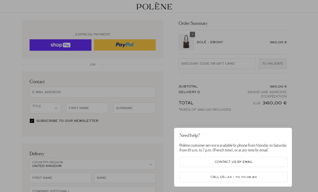
Even they have mentioned their availability, so shoppers would understand if there’s a delay in response.
21. Donation Checkbox
People love to be part of social welfare. It’s a great way for businesses to give back to the community and show customers that they care.
A donation checkbox on your checkout page is a simple yet effective way to encourage customers to contribute to a cause they believe in. It’s a small gesture that can make a big difference.
Princess Polly is a great example of a brand that uses a donation checkbox on their checkout page.
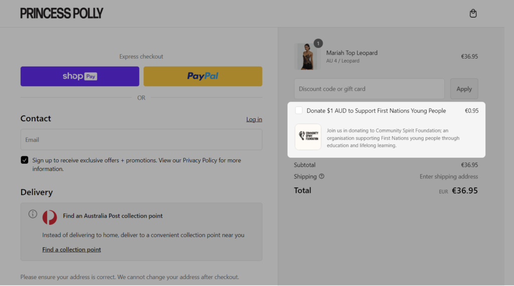
They partnered with a specific charity and offered customers the option to donate a small amount to the cause.
Not only does this help the charity, but it also enhances your brand’s reputation and can even increase customer loyalty.
22. Invoice Preference
Let’s start with the example first!
Arduino gives an invoice preference at the checkout page that encourages the customer to register or login to the website.
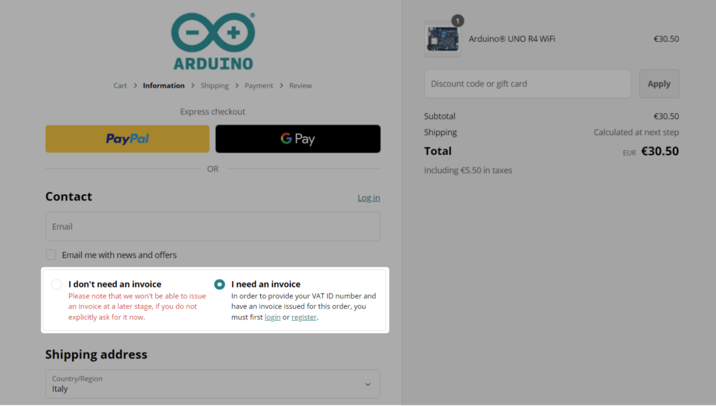
This was new to me and I really liked the trick.
If shoppers select “I don’t need an invoice” they have to explicitly ask for it later if required (which couldn’t be a complex process). So, they will go for the second option “I need an invoice” which will save them from the hassle.
This is a clever way to encourage customer registration or login. It also simplifies the invoice process by giving customers control and making their shopping experience engaging.
23. Subscription Nudge
This can be the best use case of Shopify Plus checkout customization for eCommerce businesses that have a subscription model.
Suppose a customer is about to complete a purchase of a product that’s also available as a subscription. Wouldn’t it be great to give them a gentle nudge to consider the subscription option?
Tabs, for instance, Tabs Chocolates has experimented with subscription options in the past. While they might not currently have it on their checkout, it’s a great example of how a brand can leverage this strategy.
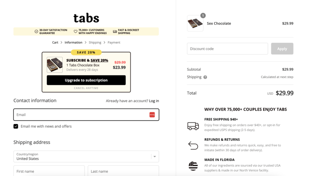
They’ve shown how offering a subscription at the checkout can significantly boost recurring revenue.
By strategically placing a subscription option on your checkout page, you can increase customer lifetime value and create a steady stream of revenue.
24. Delivery Date Picker
Yes, it’s true…. You can also add a calendar and let them select a convenient date for order delivery. It’s all about giving your customers control and flexibility.
This feature is best suited for products that require planning, like furniture or appliances.
Check out how Alaskan does it. They offer a delivery date picker right on their checkout page. It’s super convenient for customers and helps with order management on your end.
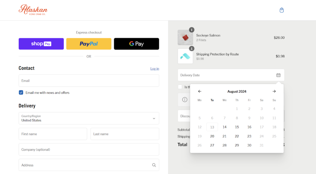
It’s super convenient, right?
It shows your customers that you value their time and preferences. Plus, it can help you manage your order fulfillment process more efficiently.
25. FAQ Section within Checkout
Your shoppers can be curious about the shipping, returns, or other aspects of order fulfillment. You can address that on the checkout page itself.
How?? By having a mini-FAQ section right there where customers can quickly find answers to their questions without leaving the page. It’s like having a helpful assistant guiding them through the checkout process.
You could include answers to common questions you receive from your shoppers about shipping, returns, and order tracking. For example,
- How long does shipping take?
- What happens if my order is lost or damaged?
- Can I change my shipping address after placing an order?
- What if I received the wrong item?
- What if the item is defective?
- How long do I have to return an item?
- What is the condition of the item for a return?
- Who pays for return shipping?
- How will I get a refund?
- What should I do if my package is delayed?
This section not only alleviates concerns but also reduces the dependency on the customer support team.
So, this kind of flexibility and checkout customization you get is super powerful when you’re on Shopify Plus.
Now, instead of getting this privilege, some brands don’t prefer checkout customization. In such a case, you should take a look at the next section that explains the benefits you get with Shopify Plus checkout customization.
What are the Advantages of Shopify Plus Checkout Customization?
Here are the 10 key advantages of Shopify Plus Checkout Customization:
- Enhanced brand consistency and customer experience
- Access to advanced features and integrations
- Reduced cart abandonment rates
- Greater flexibility in pricing and promotions
- Easier to sell internationally
- Improved customer loyalty through personalized experiences
- Ability to collect valuable customer data
- Increased average order value (AOV)
- Differentiates your brand from competitors
- Ability to test and iterate checkout designs
Let’s understand them in detail.
1# Enhanced brand consistency and customer experience
I still remember, I visited a funky store (designed on Shopify), full of bold colors and styling text. But when I entered the checkout page, it was bland and unexciting. After a joyous shopping experience, it felt like I came to a totally different world.
No doubt, the standard Shopify checkout is fully optimized and functional. However, it cannot truly reflect your brand’s unique identity. This may make your shoppers feel the disconnection between your store and checkout experiences.
With Shopify Plus checkout customization, you can create a seamless transition from browsing your store to the checkout process.
2# Access to advanced features and integrations
With Shopify Plus, the possibilities are almost endless. It gives you access to a whole bunch of advanced features and integrations that can supercharge your checkout experience.
We’ve already seen what additional functionalities are possible with Shopify Plus checkout customization (in the above section). Whether you want to integrate these features or any custom ones, you can easily achieve them to personalize your checkout process.
You’re not just limited to the basic tweaks; you can integrate advanced features and apps that take your checkout to the next level.
3# Reduced cart abandonment rates

On average, 7 out of 10 shoppers fill their shopping carts with products but don’t actually complete their purchase. And even after knowing the main reasons belong to your checkout page, you can’t do anything about it (if you’re on a basic Shopify plan).
But, Shopify Plus checkout customization lets you streamline the process, reduce friction, and make it super easy for customers to complete their purchase.
When you optimize your checkout flow, you’re not just making it easier for customers to buy; you’re increasing the chances of them completing their purchase. Less abandoned carts, more happy customers, and more money in your pocket – sounds like a win-win, right?
Read More: 12 Tips to Lower Your Customer Acquisition Cost
4# Greater flexibility in pricing and promotions
One of the major benefits of Shopify Plus checkout customization is more control over the checkout elements.
You can offer special deals, gifts, or even freebies to your favorite customers, right there on the checkout page. You can even create different customer groups and tailor your promotions to each one.
For example, if you wish to offer a discount to first-time buyers, a free gift with purchases for loyal customers, or even special pricing for bulk orders, that’s totally possible! Shopify Scripts, an exclusive tool for Shopify Plus users, makes it super easy to set up these custom promotions. You can trigger discounts based on specific products, cart values, or even discount codes.
So, by having this level of control over your pricing and promotions, you can increase sales, reward loyal customers, and experiment with different offers to see what works best.
5# Easier to sell internationally

Selling globally can be a headache with different currencies, taxes, and shipping rules.
With Shopify Plus, you can create separate checkout experiences for different countries. You can display prices in their local currency, calculate taxes accurately, and offer shipping options that make sense for them.
They’ll see prices in their own currency and won’t be surprised by unexpected fees. This means you can avoid losing potential customers due to complicated checkout processes or unexpected costs.
So, not only does this make life easier for you, but it also creates a smoother shopping experience for your international customers.
6# Improved customer loyalty through personalized experiences
With the standard checkout page, do you think you can give your customers reasons to come back? It’s pretty generic, right?
With checkout customization, you can create a truly personalized shopping experience for your returning customers. For example, if you run a loyalty program, you can show their available reward points and the option to redeem them right at checkout (use case 15!).
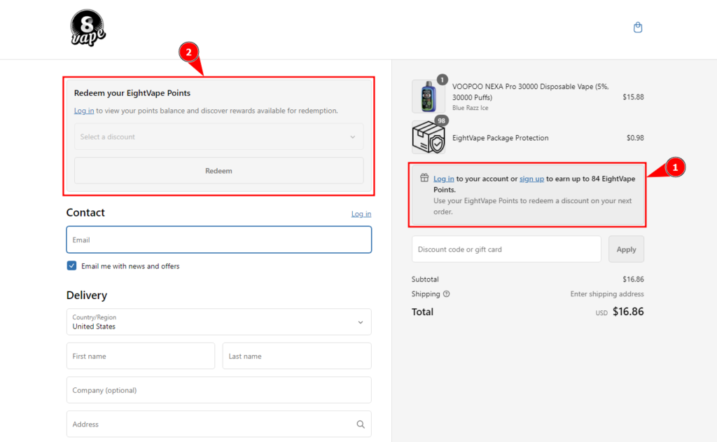
Or how about offering exclusive discounts or early access to new products for loyal customers? These little efforts go a long way in building a strong connection with your customers.
7# Ability to collect valuable customer data
Checkout is the place where shoppers leave their personal information as well as their preferences for shipping and payment. With Shopify Plus checkout customization, you can go beyond the basic info and collect even more valuable insights.
For example, you can find out whether they like product suggestions or opt for gift wrapping or order protection upgrades. Also, you can ask them if they want to be part of your loyalty program or if they’d prefer to receive updates via email or SMS.
This way, you can gather information on their interests, preferences, and even their spending habits. This kind of information helps you to tailor your marketing efforts, improve product recommendations, and create personalized shopping experiences.
8# Increased average order value (AOV)
I bet you have a ton of creative upselling and cross-selling ideas floating around in your head (including the use cases discussed above). With Shopify Plus checkout customization, you can finally bring those ideas to life; right where it matters most – the checkout page.
Customers are already in buying mode, so this can be a great opportunity to encourage them to spend a little extra. You can suggest complementary items or offer bundle deals based on what’s already in the customer’s cart. Or even you can highlight various upselling options to avail premium shopping experiences.
This little push will maximize your average order value as well as automatically reduce the customer acquisition cost (CAC).
9# Differentiates your brand from competitors
Don’t mind, but the standard Shopify checkout page feels like your store is wearing a uniform – similar to millions of other Shopify stores out there. And, it’s hard to stand out without checkout customization!
Customizing your checkout page with Shopify Plus makes sure you have a unique outfit that makes you instantly recognizable. You can create a checkout experience that matches your brand’s unique personality and style.
Maybe you want to add a touch of humor, or perhaps you prefer a minimalist approach. Whatever your style, Shopify Plus lets you bring it to life. When your checkout page is a reflection of your brand’s DNA, it leaves a lasting impression on your customers.
10# Ability to test and iterate checkout designs
If you’re not sure what would work for your audience, it’s okay.
Shopify Plus gives you the freedom to experiment and see what sticks. You can modify your checkout page designs, test different layouts, colors, CTAs, and even the order of checkout steps, and see which one performs best.
Testing different elements will help you identify what works and what doesn’t. Maybe you find that a particular layout leads to higher conversion rates, or that a specific call to action is more effective.
It’s all about finding the perfect formula for your customers. So, by testing and iterating, you can create a checkout page that not only looks great but also converts.
Quick Summary!
So, hope you got the answers you were looking for about customizing your Shopify Plus checkout page! Now, you can head towards the execution –
- planning what customizations your checkout page needs
- finding the ideal solution to implement the changes
- getting your checkout page customized
- finally, start seeing the difference!!
Exciting…..right?? But, in the entire process, the only thing you should ensure is that it doesn’t harm your existing store performance. If you think, you need a professional who understands both the problems and the solution well and helps you in seamless checkout customization, you can find experienced Shopify Plus experts in Aureate Labs!
We can help you get the desired results with our varied expertise in Shopify Plus services (which includes CRO-focused designing, store development, migration, and performance optimization).


Post a Comment
Got a question? Have a feedback? Please feel free to leave your ideas, opinions, and questions in the comments section of our post! ❤️