13 Best PWA Examples in 2022

Before we cover PWA examples, let’s get into why we need it.
Native mobile apps are effective in interacting with customers but creating an app is costly, time-consuming, and requires numerous iterations.
And for them to function on multiple operating systems across devices and browsers, you need different app versions compatible with that OS.
Obviously, creating and managing apps can be a lot of work and is not always feasible for businesses.
That’s why the demand for Progressive Web Applications (PWA) is rapidly increasing.
Progressive Web Apps allow merchants to create web-based apps that generate near-native level experience for users. They can operate on any browser and across all devices without downloading or installing the app.
PWAs are quick to build and deploy and great at offering a positive user experience by creating a fast, seamless browsing and purchasing experience.
So it’s no surprise that companies that implemented PWAs have got excellent results. For instance:
- By reducing the size of their app by nearly 97%, Twitter observed a 65% boost in pages per session, 75% more Tweets, and a 20% decrease in bounce rate.
- Nikkei witnessed 2.3 times more organic traffic, 58% more subscriptions, and 49% more daily active users after converting to a PWA.
- Hulu saw a 27% boost in repeat visitors after switching from a platform-specific desktop experience to a Progressive Web App.
Here are some stunning PWA examples from various industries to give you a better idea of how the technology helped to scale businesses.
PWA Examples #1: Flipkart
After its Android app, Flipkart’s progressive web app, known as Flipkart-Lite, is the company’s second-largest transaction channel.
But in 2015, Flipkart, one of the most prominent eCommerce in India and the biggest competitor of Amazon India, wanted to shut down its mobile website.
Here’s what happened next that led to the implementation of Flipkart PWA.
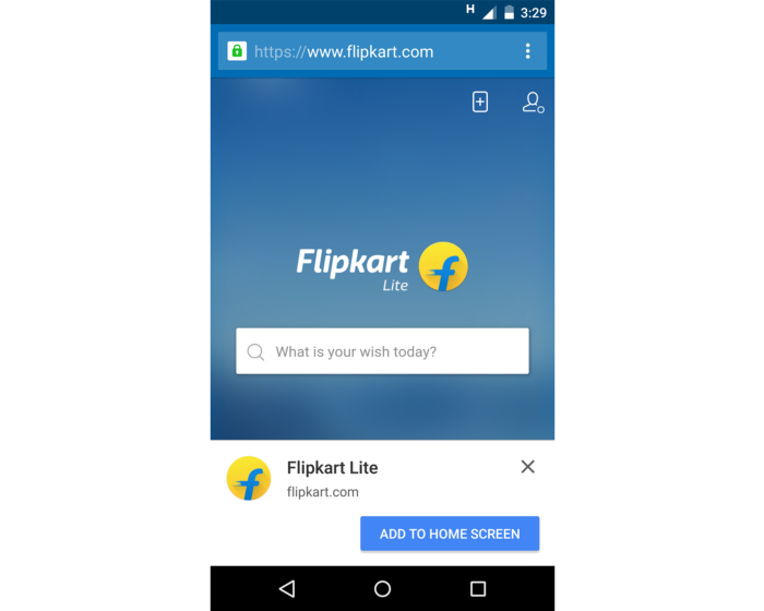
Image: Medium
Challenges
In 2015 the company decided to allow buyers to place orders only through the mobile app and cease mobile website operation due to poor user experience. They discovered that delivering a user experience as efficient as the mobile app was becoming increasingly difficult. In fact, the same year, Flipkart also wanted to discontinue its desktop site!
“(The previous mobile website experience) was not good enough,” Amar Nagaram, vice-president of engineering at Flipkart, told The Economic Times.
But then the company decided to rethink its strategy for mobile web and develop a Progressive Web App to allow an app-like fast browsing experience.
Implementation
They started developing Flipkart Lite, a Progressive Web App that combines the greatest features of the web and the main Flipkart app. To provide a fast-loading mobile web experience that consumes less data, and re-engages consumers, the PWA uses new, open web APIs. As a result, users get a quick, native app-like user interface (UI) when browsing the web. Even on shaky networks, it loads almost immediately when they return.
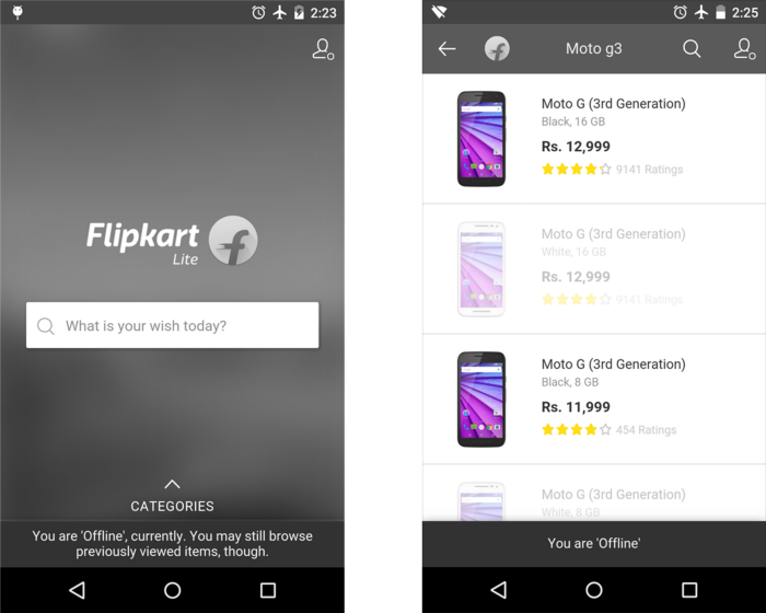
Flipkart Lite Offline Experience. Image: Medium
Results
The eCommerce marketplace’s web app is only 100KB in size, i.e., 100 times less than the 10MB Android app and 300 times smaller than the iOS app. It also requires fewer data to download.
Notable improvements:
- Average time on site increased to 3.5 minutes from previously 70 seconds before the implementation of Flipkart Lite.
- User time spent on the site was tripled.
- People who access Flipkart Lite via the home screen icon account for 60% of all visits to Flipkart Lite and have 70% greater conversion.
- 40% higher re-engagement rate.
- Three times lower data usage.
PWA Examples #2: Uber
The next PWA example comes from the ride-hailing company Uber.
For Uber, the desktop website is as essential as their native app. The company says first-time users were likelier to book their first ride online than download the app. So it makes sense to build something that ensures superior web browsing for those customers.
Uber chose a Progressive Web App called m.uber to offer their users a dependable, trustworthy, and lightning-fast solution.
The new Uber Progressive Web App is accessible via almost all major browsers, even on low-end devices, and from anywhere.
Challenges
Uber aims to give their customers an easy way to access their service whenever they needed, especially in an emergency, irrespective of the network speed, location, and device.
PWA seemed to be the perfect solution for Uber. It’s a time- and cost-effective option to maintain a solid online presence that can function flawlessly even with a weak connection and offer a lightning-fast page load experience.
Implementation
Their goal was to allow Uber users to request a ride as soon as possible. So the company implemented some changes for their new PWA.
m.uber is written in ES2015+ with ES5 transpilation using Babel and is intended to operate quickly, even on 2G networks.
According to Uber, they wanted to maintain the excellent user experience of the native app while reducing the client footprint and speed.
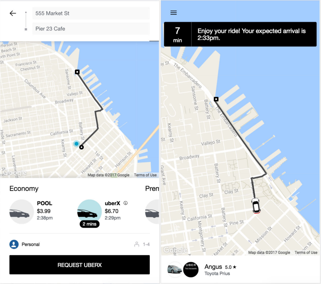
Image: Uber
Results
Riders using low-end devices, including those not supported by the native client, can use m.uber, which is compatible with all major browsers and provides an app-like experience. The size is also incredibly small, only 50kB, making it possible for the app to load swiftly even on 2G networks.
PWA Examples #3: Debenhams
Debenhams was dealing with a typical issue in the modern web world. Although mobile traffic was growing, conversions were not keeping up.
The squeeze was evident. It was time to give its mobile web strategy priority. So the team went ahead with PWA, which eventually increased their revenue by 40%.
Challenges
Not seeing conversions going up despite heavy traffic, Debenhams thought their users might have encountered obstacles that kept them from converting.
Jim Hingston, Head of Digital Product at Debenhams, said “If we didn’t improve conversions and traffic continued to shift, our digital and overall growth would slow.”
Debenhams decided to undergo a significant digital makeover in order to avoid loss of sales, especially during busy shopping seasons.
Their previous internet strategy was preventing online conversions. They realized that a subpar web strategy was unsustainable and that they needed to boost mobile growth.
Implementation
The team strategically created a Progressive Web App because the mobile web attracted more customers than the Debenhams native app. Hingston says, “We decided to launch a PWA because the customer experience drives it, it’s credible technology, it offers an app-like experience on the web, and it offers the best performance.”
Debenhams used the Mobify Platform To build a PWA. The strategy improved mobile customer experience and prepared them for future transformation initiatives.
Results
Image: YouTube
Thanks to their initiatives, Debenhams boosted their customer journey from browsing to purchasing from 2X to 4X.
They also noticed:
- A 40% boost in mobile revenue.
- A 20% increase in conversions.
- And overall above-market online growth was brought about by Debenhams’ PWA.
PWA Examples #4: BMW
Since its inception, BMW has been known as the epitome of design, perfection, fashion, innovation, and performance. Needless to say, when BMW’s digital team made the decision to update and improve its mobile website, they had specific expectations for how it should function, appear, and feel.
They wanted to create a mobile website that functions just as well as their automobiles and “wow users with high-quality images, smooth full-screen videos and state-of-the-art interactive design.”
Here’s how it all happened.
Challenges
The BMW team prioritizes the needs of their consumers, and the same applies to the website. “From the start, our goal was to attract new car enthusiasts with highly engaging content – and in a way that tangibly reflected our vehicles. To do that, we needed the brand’s new digital home to become a data-driven content platform, built around high-performance technologies,” said Joerg Poggenpohl, Global Head of Digital Marketing at BMW.
Present-day users have high expectations and a short attention span. They expect the website to load quickly and remain responsive, with minimal delays.
Therefore, the BMW team wanted to make sure users got exactly what they wanted.
Implementation
The BMW team and their marketing agency collaborated with Google’s team of mobile experts and utilized various web technologies, including PWA.
They put effort into rebuilding BMW.com in such a way that users can’t help but adore it. The website has a classy touch; it loads quickly, maintains stability, and provides easy navigation even in the most challenging network situations.
Image: BMW Mobile Web
Results
The team created a website that set new benchmarks for performance, design, and usability.
Key improvements:
- People clicking from BMW.com to a BMW sales site increased fourfold – from 8% to 30%.
- Four times faster page loading speed without compromising on the quality.
- The number of mobile users increased by 50%.
- The new site got 49% more online visitors than the previous site.
PWA Examples #5: Pinterest
It would amaze you to know how Progressive Web Apps can boost a business, as happened to Pinterest. That’s why we consider Pinterest to be a classic PWA example.
If you don’t know yet, Pinterest’s new mobile web experience is a Progressive Web App. Pinterest PWA started because they wanted to expand globally, which brought them to the development of mobile web.
But they realized their outdated, slow online experience only converted 1% of users into new sign-ups, logins, or app installations. So the team decided to invest in the PWA because they thought it would significantly increase the chances of new conversions.
Challenges
The previous version of Pinterest’s mobile website was a monolith. It contained substantial amounts of JavaScript that affected the time to load and time to get interactive.
It took approximately 23 seconds before the UI was usable, writes Addy Osmani from Google.
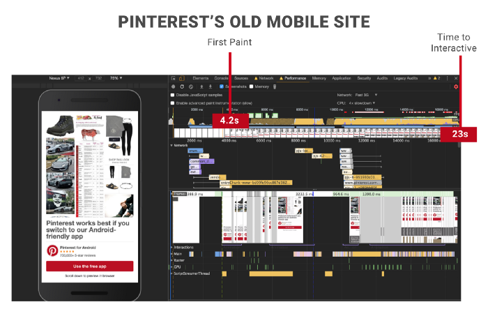
Image Source: Medium
As discussed earlier, their conversion rate was also taking a hit because of slow responsiveness.
Implementation
Zack Argyle, an Engineering Manager at Pinterest during that time, says in his article that in 2017 they started rewriting their mobile website from scratch as a PWA.
Among several changes, the team reduced heavy JavaScripts, and brought down the First Meaningful Paint and Time To Interactive to a few seconds.
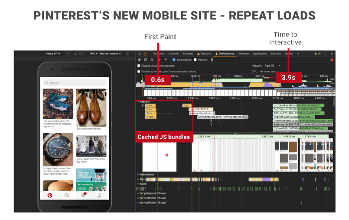
Image Source: Medium
Results
Their mobile web revamps resulted in a significant enhancement of core business metrics and performance.
- Weekly active mobile web users have grown 103% YoY, with 156% growth in Brazil and 312% in India.
- In terms of engagement, consumers were 295% more likely to save a Pin to a board, and the number of Pins seen grew by 401%, while session length increased by 296%.
- There was an increase of 843% in new signups and a 370% increase in logins YoY.
- Mobile browser surpassed all other platforms for new sign-ups since the release and became the #1 platform.
- Additionally, 800K weekly users started using the PWA less than six months after it was fully released.
PWA Examples #6: Rakuten 24
Rakuten 24, provided by its parent company Rakuten Group, Inc., is one of Japan’s best-performing digital marketplace platforms. Rakuten 24 is an online store that works with big international and local companies to offer a wide range of products people need daily, like medicine, drinks, pet supplies, baby products, and more.
The primary objective behind building a PWA was to increase mobile consumer retention and re-engagement.
The results post-PWA implementation are remarkable. Rakuten 24 saw a 450% increase in visitor retention rate over one month after making their web app installable compared to the prior mobile web flow.
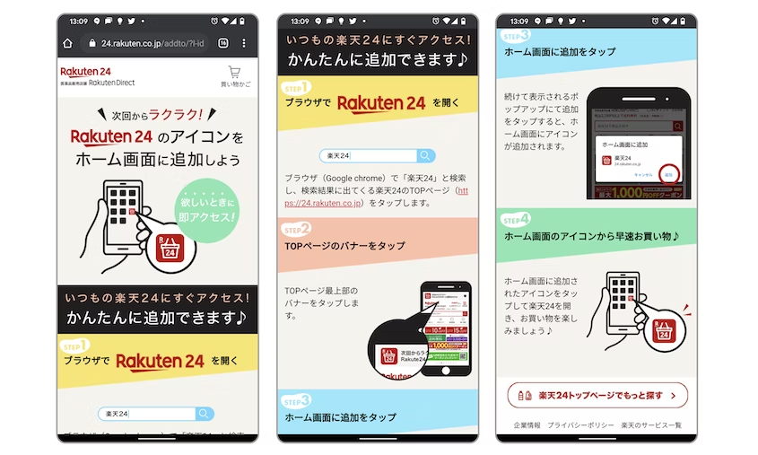
Image: Web.Dev
Challenges
Rakuten 24 recognized the following areas to work on and increase market share with customer experience:
1. As a new service, Rakuten 24 was not in a position to invest the time and money in developing platform-specific apps for iOS and Android. An alternative option was required to address the needs of their online consumers.
2. Many people mistakenly believe that Rakuten 24 is a seller on Rakuten-Ichiba, the largest e-commerce service in Japan. The team realized they needed to make investments for growing brand awareness and user retention.
Implementation
Rakuten 24 made the decision to implement Progressive Web App (PWA) features on an incremental basis, starting with installability. This helped them with enhanced traffic, visitor retention, average sales per customer, and conversions.
The team created an install prompt using the beforeinstallprompt event to have greater flexibility and control over the behavior of their install dialog.
They also created custom installation instructions for users who couldn’t install the PWA from the banner. To ensure that their PWA worked properly even when the user was offline or on a poor network, the Rakuten 24 team used the workbox-webpack-plugin.
They also adopted a cache-first strategy for CSS and JS assets. And it used “stale-while-revalidate” for images that remain unchanged to increase network resilience.
Results
For a period of over a month, the team noticed the following benefits:
- Compared to the rest of their online users, Rakuten 24 boosted visit frequency per user by 310%.
- Additionally, it observed a 200% boost in conversion rate.
- A 150% increase in sales per customer.
- And a 450% increase in visitor retention.
PWA Examples #7: Spotify
Spotify, an audio streaming and media services provider, uses 100s of AI tools like personalized AI analytics, lyrics scrapers, and music visualizer functionality. But what sets up this audio streaming site from other streaming companies is it has one of the largest audio database with millions of songs and podcasts and their progressive web app is capable of handling it all..
Similar to what Debenhams experienced, Spotify also saw a poor conversion rate despite having a large user base.
As The Fader estimated in 2015, out of 75 million monthly Spotify users, only 20 million were paying subscribers. That’s just about a 26.6% conversion rate, which is low for a famous brand like Spotify.
Fast forward to 2019, 100 million premium members and 217 million active users as of the first quarter with a conversion rate of 46%.
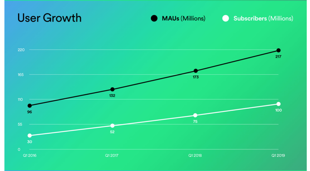
Image Source: The Verge
How did they achieve this exponential growth?
The answer is simple – by building Spotify PWA, known as open.spotify.com.
Here’s how they’d done it.
Challenges
Spotify is a household name, but even then, prior to developing PWA, the conversion rate was low. So among many changes and updates, PWA also made it to the list.
Implementation
In comparison to its desktop app, Spotify PWA is significantly better. It’s more adaptive, reactive, and responsive. It also has better in-app animations. Taken together, these modifications create a seamless and customized experience for users.
Results
Spotify PWA offers a native look and feel. It delivers a fantastic user experience for desktop users, with optimal accessibility, speed, functionality, and responsiveness.
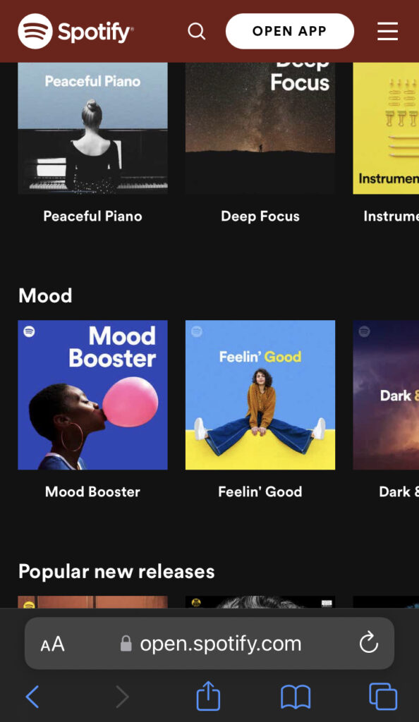
Image: Spotify PWA on Mobile Web
With the help of a PWA, Spotify continued giving its users an excellent listening experience.
Following the implementation, Spotify’s free-to-paid conversion is said to have increased from 26.6% in 2015 to a record-breaking 46% in 2019 before skyrocketing to a staggering 58.4% in 2021.
PWA Examples #8: Starbucks
In 2015, Starbucks made its mobile app available across the country, but the online ordering was still not available through the web browser. Meaning, if someone wanted to order, they needed to download the app for it.
The Starbucks team realized it was time to add online ordering capabilities to the website to keep up with the growing online customer base, especially those who couldn’t use the app.
The Starbucks team wanted to build a system that would be accessible and available to both existing and new markets. This led them to develop Starbucks Progressive Web Application.
Challenges
The Starbucks team wanted to design a shopping experience that works even when users are offline. They wanted customers to explore the menu, personalize orders, and add products to their shopping carts even when they weren’t connected to the internet.
Since we already know that Progressive Web Apps work great in slow and poor networks, rural settings, and places where internet connection is relatively unstable, PWA was an obvious choice.
Starbucks also wished for a similar ordering experience at par with the native mobile app and a platform with images, animations, and interactions, while still meeting the requirements for a PWA.
Clearly, the team needed to put in a lot of effort to check all the boxes and to make sure the ordering system was easy to use and reliable so that the customers and the company – both parties would enjoy the interaction.
Implementation
Starbucks used GraphQL to turn an outdated API into an effective, efficient one and structured the complicated data set and business logic for use across all clients.
They also created the offline mode functionality by setting up caching. It helped them to download the data for each menu item, store the data on prior orders, and store static pages so the PWA could work without the internet.
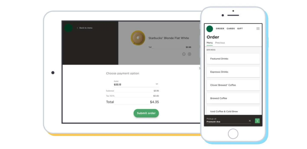
Image: Starbucks PWA. Source: Formidable
Results
Starbucks PWA is quick, effective, and simple to use yet still retains the native app’s look and feel. The app’s smooth animations give it a native feel, and its small size makes it snappy and incredibly responsive.
Customers can use the PWA without an internet connection, view menus and nutritional data, and personalize orders.
Because a large portion of the app may be accessed without an internet connection; it can be used by users who occasionally experience internet outages in regions that may not always have reliable access to the internet. Plus, Starbucks PWA is also faster and 99.84% smaller than the iOS app.
TL;DR: it’s everything that the team wanted and planned for!
PWA Examples #9: Twitter
Twitter is not only a social media platform, but it’s also the place where people come to find out what’s happening all over the world. 328 million active users each month use it to access, produce, and share information on the social media platform.
Twitter wanted its mobile web experience to be quicker, more dependable, and more entertaining because over 80% of users surf using mobile devices.
The goal behind building Twitter Lite was rapid loading, higher user engagement, and reduced data consumption.
And since 2017, Twitter Lite became the default for all Twitter users on the mobile web.
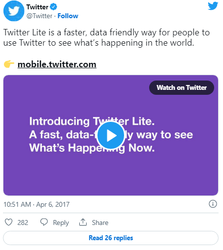
Twitter Lite Progressive Web App also blends contemporary web and native capabilities to give the users an app-like experience.
Challenges
Every month, hundreds of millions of users use mobile.twitter.com. Several users from rural setups, and places with flaky networks needed a better, faster, and a reliable solution to use Twitter.
Implementation
Twitter used an incremental approach to employing service workers for offline and network resilience, beginning with a special offline page that was displayed anytime a network connection was unavailable.
To speed up return visits, they then switched to offline caching of static resources like CSS, pictures, and JavaScript bundles. The application shell offline caching capability was the final feature they introduced. As a result, when a user returns to the PWA, Twitter Lite starts up in under 3 seconds, even on sluggish mobile devices or networks.
Results
Millions of people now have easier access to Twitter thanks to Twitter Lite; all they need is a smartphone or tablet with a browser.
Twitter Lite is a mobile web experience that uses fewer data, loads quickly even on slower connections, is resilient on unreliable mobile networks, and only occupies a small portion of the device’s memory (less than 1MB).
The team also improved the speed, with up to 30% faster launch times and faster navigating across Twitter.
Twitter Lite offers all of the essential features of Twitter, including a timeline, Tweets, Direct Messages, trends, profiles, media uploads, notifications, and more.
Twitter Lite offers additional features in Google Chrome and other modern browsers on Android devices. Users can receive push notifications, stay up-to-date on the news, and do more with it.
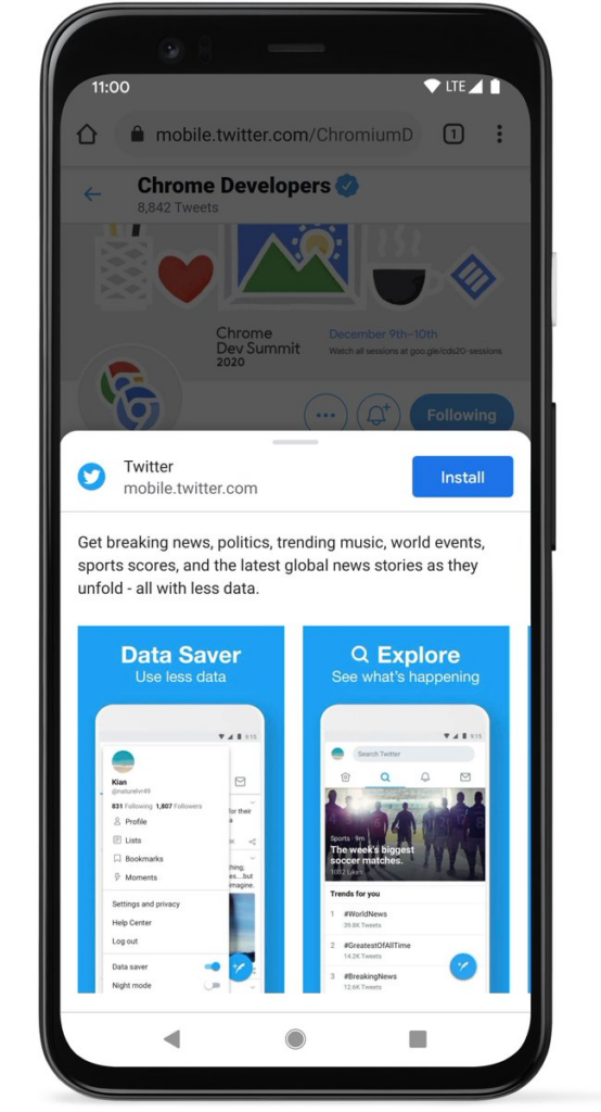
Image: Twitter
A temporary loss of connection doesn’t interrupt browsing because Twitter Lite also provides offline support.
Key improvements after implementing Twitter PWA:
- Pages per session increased by 65%
- 75% more Tweets were sent.
- The bounce rate was reduced by 20%.
PWA Examples #10: Nikkei
Nikkei is one of Japan’s most reputable media companies, with a publishing history spanning more than 140 years. They receive approximately 450 million monthly visits to their digital platforms in addition to their print publication. In November 2017, Nikkei successfully launched a Progressive Web App at https://r.nikkei.com to enhance user experience and advance their online business.
Challenges
With more people primarily using their cellphones to access the internet, Nikkei witnessed a sharp increase in mobile traffic trying to access the website.
However, they discovered that their site wasn’t properly optimized for mobile web and was extremely slow to load.
“The value of speed is indisputable, especially for financial news. We made speed one of our core metrics, and our customers have appreciated the change.” Taihei Shigemori, Manager, Digital Strategy, told Google.
Their website averaged 10 seconds on the Speed Index and took about 20 seconds to become consistently interactive. Nikkei wanted to improve the user experience by decreasing the load time and speeding up.
Implementation
Nikkei developed and released a Progressive Web App to create a better user experience. They employed responsive design, vanilla JavaScript, and a multi-page architecture. They could deliver predictable performance regardless of the network by adding a service worker.
This ensured that the top articles were always available and loaded almost instantly because they were stored using Cache Storage.
They introduced a web app manifest which, when combined with their service worker, allowed the users to easily install the PWA.
They also optimized the third-party JavaScript to ensure performance was entirely within their control.

Image: Web.Dev
Results
Nikkei saw significant performance improvements and positive business impact:
- Two times better speed index.
- Time-to-interactive is 14 seconds faster.
- 75% faster load time with prefetch.
- 2.3 times as much organic traffic.
- 58% more subscriptions.
- Daily active users increased by 49%.
- Page views each session increased by double.
PWA Examples #11: The Washington Post
In 2019 The Washington Post launched a lightning-fast mobile web experience, significantly improving its mobile news site’s load times for both content and advertising.
The Post improved the user experience by combining its own technology with Accelerated Mobile Pages (AMP) and PWA.
Chief technology officer for The Washington Post, Shailesh Prakash said, “Mobile is the future. Our goal was to create the fastest mobile news site, setting a new standard of speed.”
“Consumers demand light and fast ads, and with ad blocking and viewability concerns across the industry, this new technology moves us even closer to a solution,” said Jed Hartman, chief revenue officer for The Post.
He went on adding, “Ad experience and user experience go hand in hand, and we are committed to helping our advertisers improve their results and create a better experience for their audience with faster content delivery.”
Challenges
The old mobile site of The Post was significantly slower compared to the new PWA version. As a news publishing company delivering and making trillions of news articles available at lightning speed without compromising on the quality or user experience, PWA seemed to cater to it all.
When readers are using slow or 2G or 3G networks, load time becomes an issue. So even on that front, a Progressive Web App is a smart choice.
Implementation
The Washington Post PWA is a single-page web app that uses the browser’s “service workers” to prefetch and cache material in the background. This results in a browsing performance so streamlined that it even functions offline.
Results
Image: The Washington Post
The new mobile site loads almost instantly—under one second—and is just as quick when a user is browsing offline or using airplane mode. Even in situations with limited bandwidth, shaky signals, or no wifi, when consumers click on a Post story, the text, advertisements, and photos load instantly.
The Washington Post’s Head of Product, Joey Marburger, stated in an interview with Beet.tv:
“In our public-facing beta of the PWA web app, we’ve seen about 5x engagement – page views per visit, a number of stories read.”
PWA Examples #12: Tinder
Tinder offers a PWA for desktop and mobile users called Tinder Online. This online dating and networking company has over 60M monthly users in over 250 countries.
It’s important to note that in comparison to their original app experience, Tinder Online, the new web experience sees more interactions, resulting in more swipes, more profile edits, and more time spent by users every session.
Challenges
As with some progressive web app examples we discussed previously, Tinder is no different when it comes to common challenges. Slow loading time hampered user engagement and user experience, and they were losing out on mobile web conversions as well as interactions.
Implementation
Tinder Online’s first goal was to get people to use it in new markets, and it tried to have the same features as V1 of Tinder on other platforms.
Tinder uses methods for Service Workers for network resilience, JavaScript speed optimization, and Push Notifications for chat engagement.
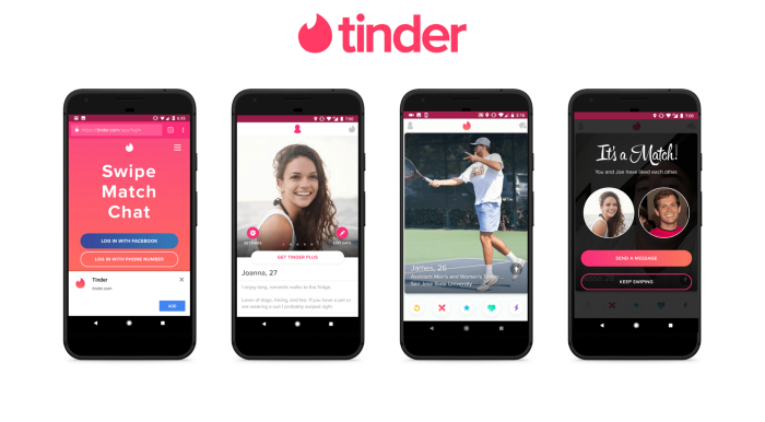
Image: Medium
Tinder’s PWA load times were reduced from 11.9 seconds to 4.69 seconds, and as a result, user engagement reached an all-time high.
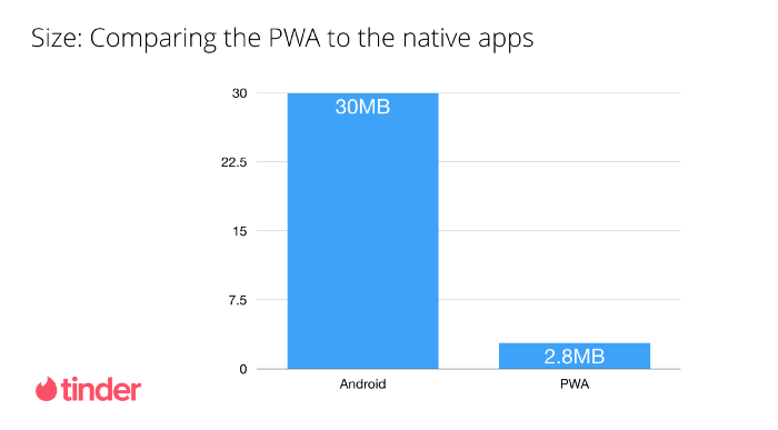
Image: Medium
Results
Tinder has seen amazing gains since launching its progressive web app. Most significantly, they’ve observed the following in comparison to their native apps:
- 61% faster app load speed, from 11.9 to 4.69 seconds.
- Delivering the core Tinder experience just requires 10% of the data investment cost.
- Web users swipe more frequently than the native app
- Compared to native apps, there are more user messages on the web.
- The web receives more profile updates than native apps.
- Web session times are longer than native app sessions per user.
PWA Examples #13: JD.ID PWA
JD.ID is an Indonesian e-commerce website offering delivery services for various goods, including electronics, home goods, apparel, accessories, and sports equipment. JD.ID, which already serves more than 350 locations in Indonesia, wanted to grow its online presence by improving performance and building a powerful network-independent experience for its Progressive Web App.
With this improved experience, JD.ID increased its overall mobile conversion rate (mCVR) by 53%- thanks to its conversion rate optimization technique. Its mCVR for installed users rose up by 200%, and its daily active users by 26%.
The results helped the company become one of the country’s most popular and trusted e-commerce companies.
Challenges
Due to unpredictable network accessibility across the country, JD.ID was seeking a solution that would maintain the functionality of its website and user experience at all times.
Users who had visited its website but hadn’t downloaded the iOS or Android app represented Jd’s sizable acquisition opportunity.ID didn’t want to miss it.
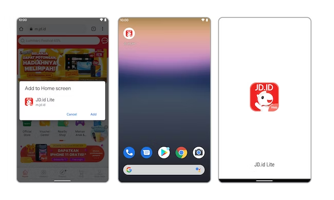
Image: Web.Dev
Implementation
In order to reduce network difficulties and enhance user experience, the JD.ID team used Workbox to make sure its PWA worked effectively even when the user was offline or on a poor network. Workbox made it simpler to implement their three-part PWA caching method:
1. Network first, falling back to the cache.
2. Cache first, falling back to the network.
3. Network only
Results
With caching techniques, installation, and push notifications, JD.ID increased its mobile conversion rate increased, and the company saw other benefits, like:
- The mCVR increased overall by 53%.
- Users’ mCVR increased by 200% after installing the JD.ID PWA.
- Due to higher re-engagement from push notifications, daily active users from mobile platforms grew by 26%.
Conclusion
Delivering exceptional user-friendly experiences beyond the usual limits is the only way for businesses to succeed in the digital age.
Superior user experience, uninterrupted browsing, and fast loading pages are essential to make your customers happy so they keep using your product.
Today’s PWA examples helped us understand how other businesses reaped the benefits of Progressive Web Apps and encouraged more businesses to adopt this technology.
You can also be on the list if you implement the right PWA solutions for your eCommerce. We offer PWA Magento and PWA Shopify solutions to merchants to see their businesses make the list similar mentioned above.


Post a Comment
Got a question? Have a feedback? Please feel free to leave your ideas, opinions, and questions in the comments section of our post! ❤️