A Complete UI/UX Guide for Magento Stores – Tips & Strategies

Is your Magento store failing to impress your users?
Well, it’s a concern shared by many Magento store owners. One common mistake they make is focusing solely on store functionality and business management while neglecting the importance of how the store looks and performs.
Imagine going to a party with great food, drinks, and games. But when you arrive, there are no decorations or staff to greet you. In this situation, you don’t know if joining the party would be a good idea. The same happens with your poorly designed and low-performing Magento website — users won’t be sure about exploring your products.
Because let’s be honest, APPEARANCE and PERFORMANCE matter!
The first impression of your Magento store is determined by its visual appeal. If you’ve overlooked the aesthetics and store performance, your users might perceive your store as just another online shop, leaving them feeling neutral about your business.
If not store design and performance, what else would excite your users to explore more?
NOTHING.
But don’t worry, this UI/UX guide is here with help. In this article, we’ll explore ten strategies that you can implement to provide a better user experience. Moreover, you’ll also learn how you can implement these strategies when you have concerns over your niche and the Magento store in particular.
Before we discuss strategies, let me clear your basic doubts about UI and UX.
What is UI and UX for the Magento Store?
UI (User Interface) is the front end of your website. It includes everything that users can see and interact with, such as; screens (homepage, product pages, checkout, etc.), layouts and design, buttons and menus, text and fonts, images and videos, and more.
UX (User Experience) goes beyond the visuals and focuses on what a user experiences while interacting with the interface of your store.
Let me explain it with an example. First, let’s suppose your website to be a garden.
In the garden, the first view (such as; trees, walkways, benches, and play area) of a user can be visualized as UI in technical terms. What they experience when interacting (such as; sitting on a chair, playing in the play area, or enjoying a walk with a dog) with those garden elements can be considered UX.
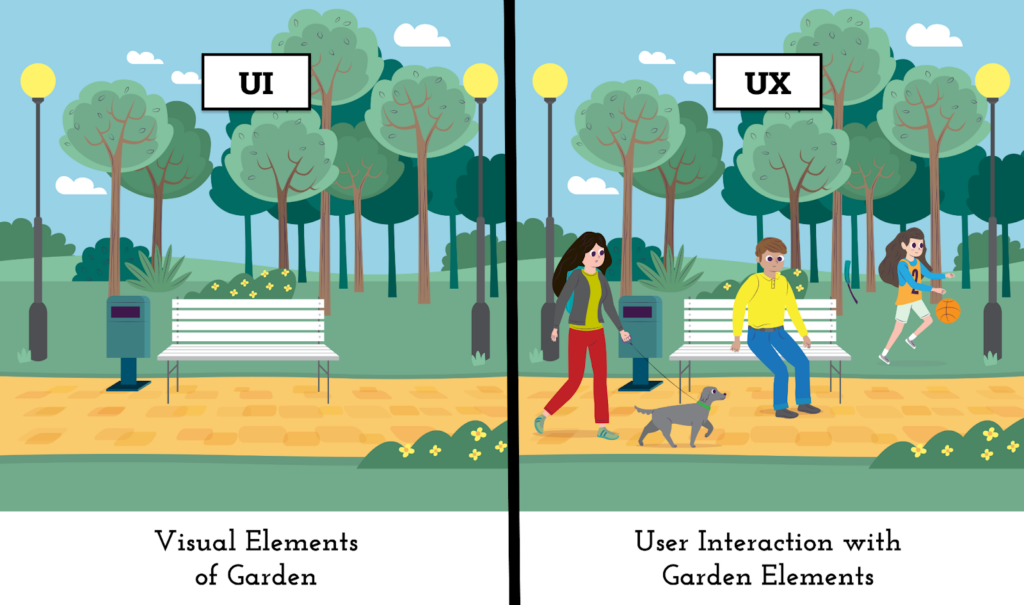
I hope this example shared a clear idea of what a UI and UX can be for your Magento store.
Earlier, we also discussed the importance of visual elements and the user experience with those elements that impact conversions.
let’s dive into the strategies and best practices for creating a Magento store that is perfect in both design (UI) and performance (UX).
What Are Top Strategies to Improve UI/UX For Magento Store?
A good UI/UX design is about creating a website that is accessible, user-friendly, and problem-solving instead of making things hard for the user. Below I’m writing on some of the most frequent and helpful strategies to improve UI/UX for various parts of your Magento store.
Let’s get going.
#Key UI/UX Principles
Here, we’ll discuss some key principles for UX-friendly website design that you should care about.
1. Choose Usability Over Complexity
Every Magento owner wishes to have a feature-packed website. However, multiple times they tend to integrate functionality without analyzing its need, which in turn builds a complex website.
For example, multiple websites use hamburger menus for their desktop versions.
Hamburger menus can be great when implemented for smaller screen devices. Now, on desktop websites that have a lot of space in the header, do we need them?
No, we don’t.
Hamburger menus hide critically important content that should be visible to a visitor at a glance. They force users to click twice, usually on every page they browse, to navigate through your products.
This was just an example of how a small functionality can have a big impact on the user journey. So, think on both sides of the coin before integrating any functionality into your Magento Store.
2. Think Twice On Your UI Choices
Sometimes, to create a unique and inspiring store, we make decisions to add bizarre interface components into the store design. This often results in a poor user experience.
Here we can take Zara’s website as an example. To give a minimal and classy look, Zara uses very small fonts for titles, descriptions, and even CTAs. This forces users to strain their eyes to understand the information and can be frustrating, especially for users with accessibility needs.
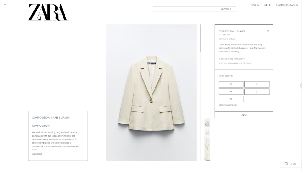
Sacrificing usability for fleeting design trends is a bad idea for any eCommerce niche. Your Magento store should consist of design elements that serve their purpose easily and effortlessly.
In short, be mindful of each design choice, and only nod YES to elements that truly add value to your user.
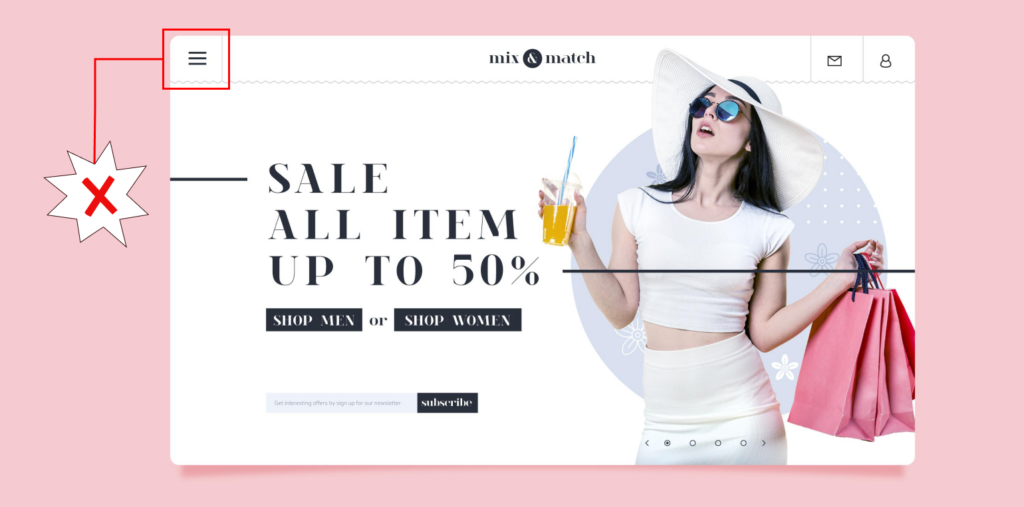
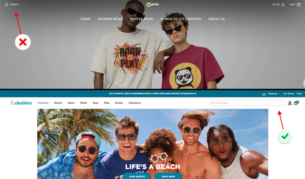
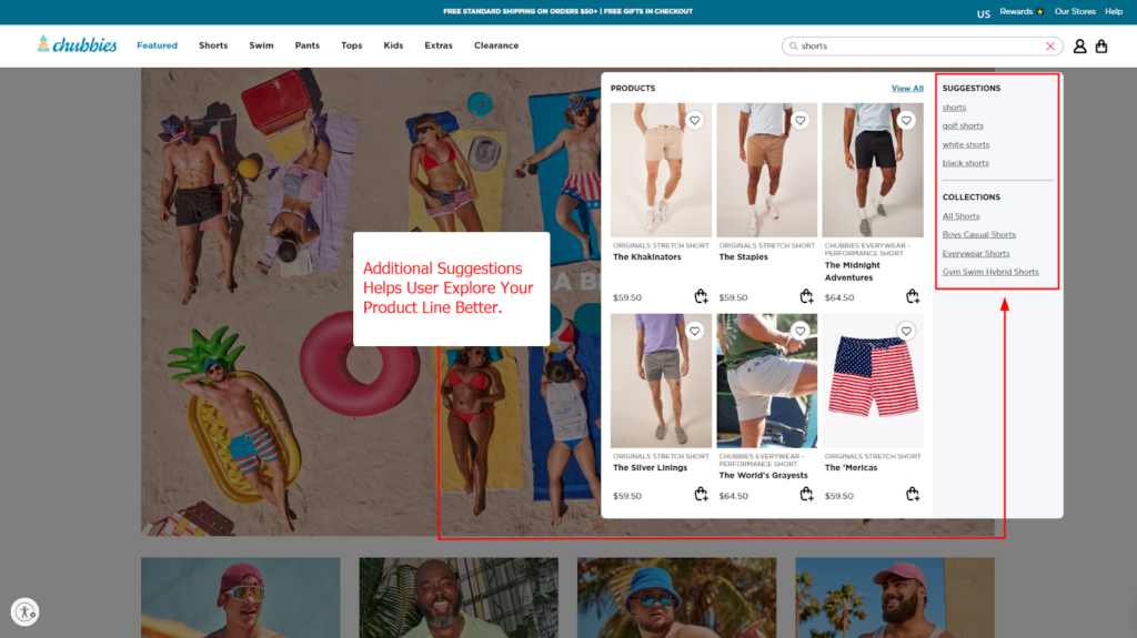
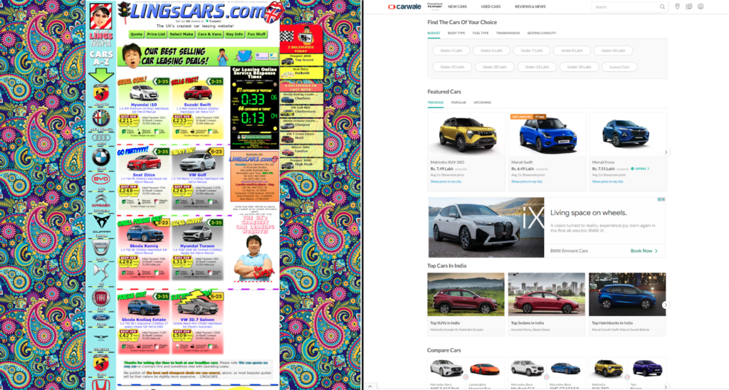
3. Is Your Search Box Visible?
Nearly 70% of customers head straight to your website’s search bar, as they know what they’re looking for.
What if your search functionality isn’t visible enough? Or isn’t working well? It’s easy, converting those potential customers will become a major challenge for you.
On any e-commerce site, search functionality should be prominent and easy to find. Using only a search icon might make it difficult for users to locate and could lead to frustration. Below, I’ve attached an example for the same.
For further improvisation in search functionality, you can choose to add relevant product recommendations in search results, it will help your user reach their desired product quickly.
4. Know “NO SIGN UP” Rule
While collecting customer data is important, understand that forcing users to create an account during checkout is a major turn-off. A recent study by Baymard showed that 26% of users abandoned their cart as the website asked them to create an account.
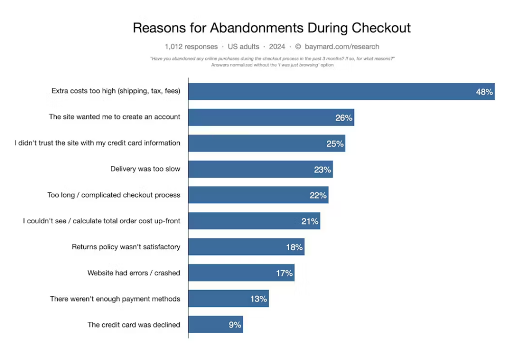
So, instead of only offering a sign-up option, provide a guest checkout option or social login option.
This provides a sense of relief for users, as they prefer not to share their details on every website they visit and avoid the hassle of typing in all their information.
5. Fix Broken Elements
There is a big difference between minor glitches & some serious malfunctions.
While minor glitches (like misaligned elements) can impact user experience, critical issues (like broken links, missing product images, error messages, and unexpected behavior) can hinder customers’ ability to interact with your store or complete purchases.
As these issues can turn your users away, it’s highly necessary for you to regularly test your store for functionality and fix any issues promptly.
6. Be Worryful About Whitespace
Your Magento store design needs a breath!
And that’s only possible if your website design has whitespace surrounding a page’s content and design elements. A necessary amount of whitespace prevents your users from being overwhelmed by information and is pleasant to the user’s eye.
This example showcases how a website overloaded with design elements whitespace and drives away user attention. Conversely, a website with well-utilized whitespace helps users focus on the product and creates a clear visual hierarchy.
Moreover, it’s all about balancing design elements and whitespace. Remember, additional whitespace on your web page can also ruin your website’s visuals and aesthetics.
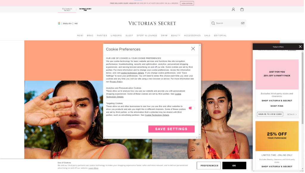
7. Excessive Pop-Ups Are Annoying
Wait, let me share something with you.
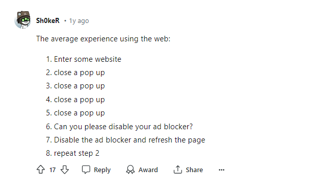
Yes, the pop-up frustration is real.
Users land on your website with a motive to explore your products. They are not interested in accepting cookies, sign-up process, location permissions, alerts, newsletter subscriptions, or anything that you’re trying to achieve by throwing multiple pop-ups.
Yes, as a store owner pop-ups are necessary. However, if they are taking away your user’s interest in your product, they are not worthy at all. So make sure to use least amount of pop-ups to improve user experience on your website.
Below, I’ve added an example of excessive usage of pop-ups. See, how frustrating it looks. 🤯
For swiping through the web page or for clicking any element, I’ll first need to tackle all these pop-ups. And as a customer it’s big turn-off.
Moreover, many store owners add pop-ups on product detail pages to explain product descriptions. However, this approach is not recommended for mobile user experience.
Here’s why: When a user opens the pop-up, all the other content on the screen is obscured.
Instead, consider building a structure that places key information in a drop-down menu, using a concise format. This menu can then link to a separate page for more detailed information.
8. Show Your Emotions on About Us Page
Users love engaging with brands and are open to talking and fixing world affairs.
So, take up your emotion pills and be the one who cares about the environment. This will give your users, another reason to shop from you. Below, I’ve added an example from Everlane, a clothing brand.
You can see how impactful they are talking about their brand vision and mission.
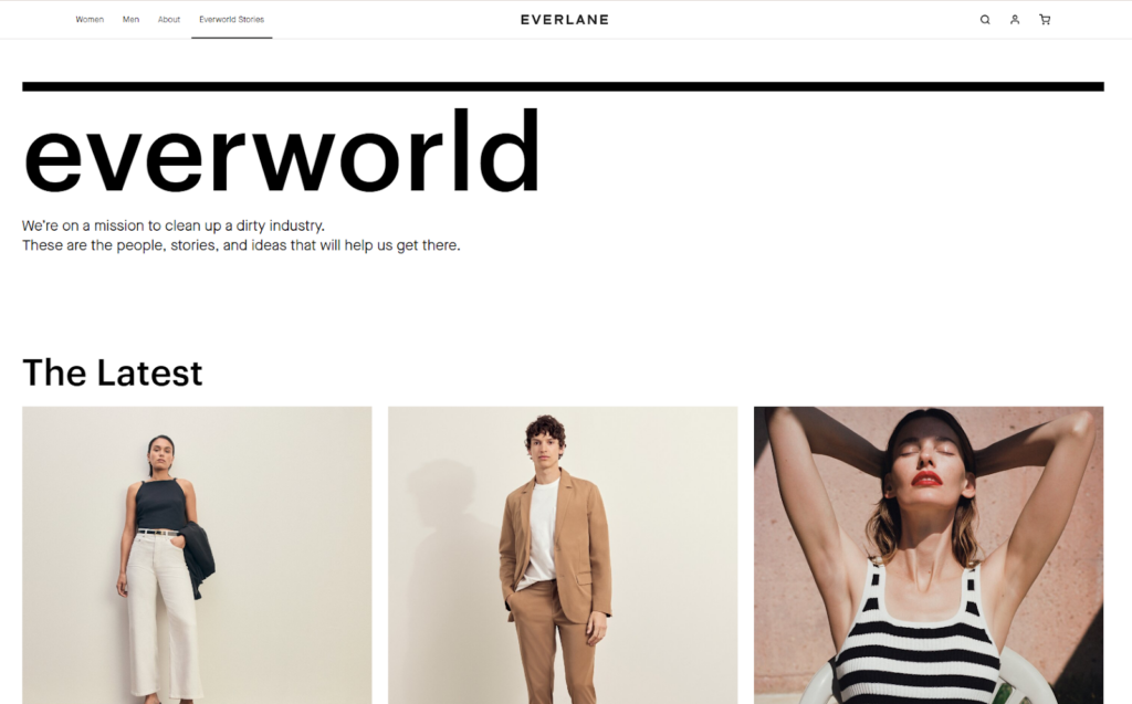
A basic copy works wonders to explain their motive engagingly while also keeping their products to be the center of attraction.
9. Don’t Compromise on Live Chat Option
Live chat option is the only immediate and convenient way your customer gets to talk to your staff.
If you don’t have a live chat option, or it does not work effectively, your customers might need to wait for email replies or struggle to find answers through FAQs — which is annoying.
This is because not everyone has the time or ability to make phone calls or wait for email responses. Live chat offers a more accessible way for customers to connect, especially for those who prefer a quick and easy communication method.
Here’s a perfect example of how a live chat should be.
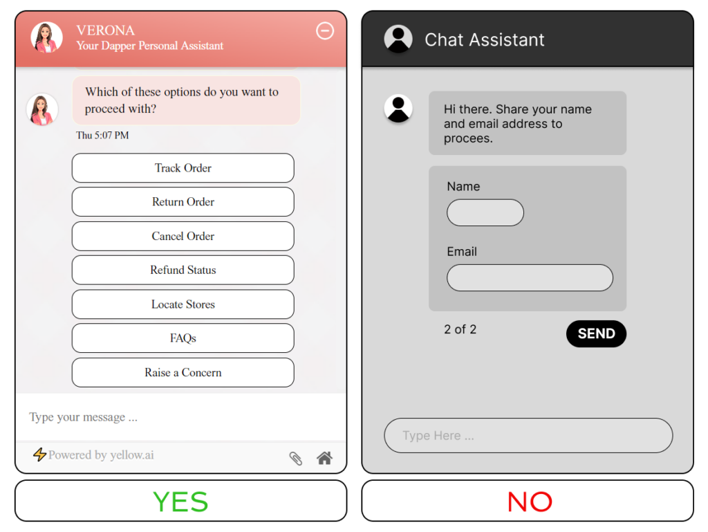
You can see how the first live chat option first asks about their concerned areas instead of putting the burden of typing in personal information. This effectively leads to effective communication with your customer, and later you can gather their email addresses and other details to keep them in touch.
Okay, so far we’ve covered some of the fundamental UI/UX principles that apply throughout your Magento website. Now, let’s explore some specific strategies you can implement for different parts of your store, starting with navigation.
#UI/UX Strategies — Navigation and User Flow
Your Magento store needs to be clear enough for users to visit and explore.
Imagine walking into a grocery store (or any other) where you see no signs that indicate where to find specific products. It’s like a maze, where a customer needs to run from place to place and still ends up with the wrong item.
This can happen to your online Magneto store as well if you haven’t organized navigation or have yet to define user flow. But don’t worry, here are some strategies to make things easy. 😉
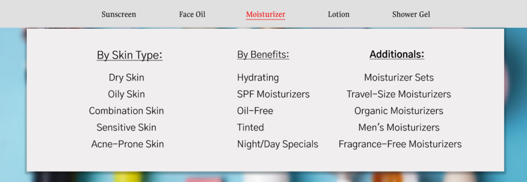
10. Mega Menu Will Make it Easy
When you worry about taking your visitor to their desired product nothing comes in as handy as a mega menu. Here, check an example of a mega menu.
When your product range is huge and the customer has multiple items to explore, they’d feel lost when landing on your website. In this situation, a detailed mega menu (including links to each of your product categories) can work as a guide, making product exploration easy for them.
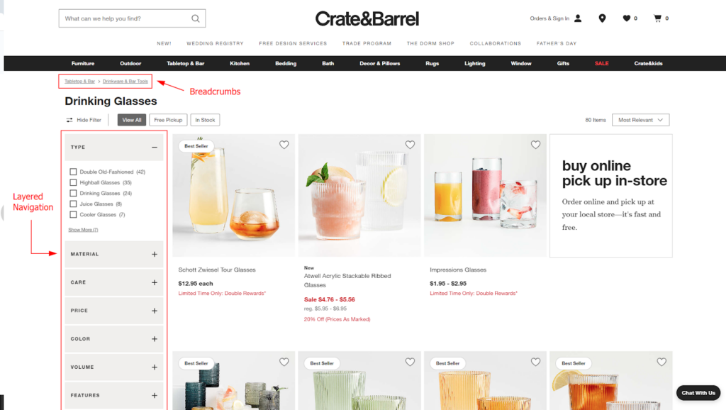
11. Sprinkle Breadcrumbs With Layered Navigation
Multiple times when exploring your product collection, users may feel lost, unsure of the current category or how to navigate back to a previous one.
This can lead to frustration and hinder their shopping experience. When implemented on category and product pages, breadcrumbs provide a clear visual path to your store visitors by showing them their location within your website and navigating between pages.
This seemingly minor navigation element holds big importance by simplifying product search and enhancing user experience.
Another, navigation feature, the layered navigation, which is a standard filtering feature in Magento, is great for improving product exploration. With this feature, your customers will find their desired product quickly, hence, an enjoyable user experience.
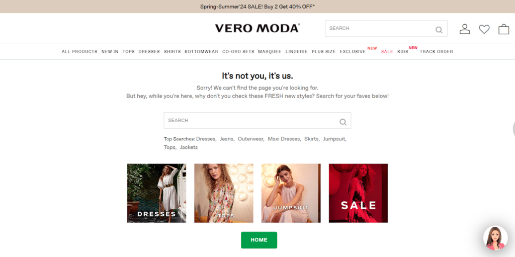
12. Take Extra Care of 404 Pages
404 errors are a major turn-off for your customers, but here lies a chance to turn them on even better.
See, no matter how hard we try, there will be times when your users and your 404 error page will connect, such as when the entered URL is wrong, or a page may have been deleted, or moved, and more.
So, rather than only sharing disappointing news, turn up your creativity mode.
And build your 404 page to be your advertising page, where you suggest your products to your customers, with creative design elements and engaging copy. After all, who wants things to go boring? 😉
Well, here’s an example of an exciting 404 error page to take inspiration from.
Now, let’s move on to understanding strategies that define your Magento store’s performance in the user’s eye.
#UI/UX Strategies — Website Speed and Performance
The speed and performance of your Magento store will matter most to your users.
What if your website didn’t perform well enough and they left in a hurry? Of course, it’s a bad user experience and bad news for conversions. So, here are some strategies that you follow. 😀
13. Don’t Forget The Need For Speed
If you’ve long been in the eCommerce business, you know the need for speed.
Your user will expect your website to load within the blink of an eye. However, many times Magento stores aren’t well-optimized to load correctly. So, as a result, the Magento store ends up taking forever to load.
One of the best things I can suggest for improving load speed in Magento is Hyvä themes.
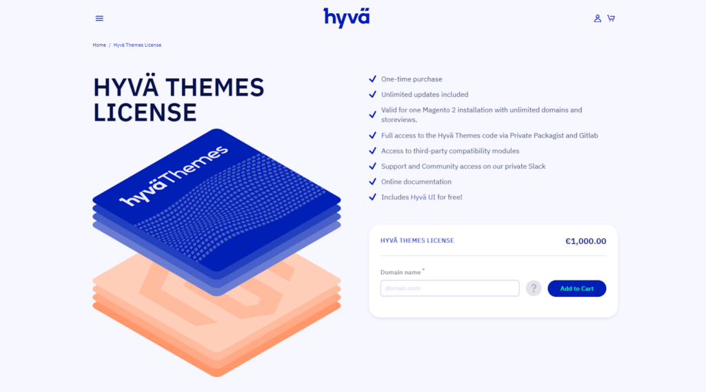
Hyvä themes were recently launched in the Magento market, which uses lightweight elements that allow your store to load quickly. Apart from speed, the Hyvä theme has another plus point — it is a blank canvas, where you can do your magic and build your store aesthetics independently with their UI Components.
But… But… But… What if you have less time to spend on the design phase?
Well, for that, Aureate Labs have recently launched a Hyvä Theme Accelerator, named InstaBuild. InstaBuild offers pre-built templates that are the best alternatives to custom Hyva development, helping you build a store in minutes and sell in days.
Know More: How Hyvä Theme Helps Improve at UI/UX
14. Mobile Responsiveness Is Key
It’s 2026, and we’re all glued to our mobile phones all day long, whether it’s for scrolling through Instagram reels or online shopping. Do we even care about desktop screens except for serious work tasks? No, mobile phones hold dominance now.
So, don’t you think your Magneto store must perform seamlessly on mobile devices?
This is important because the majority of your visitors will be accessing your website from their mobile devices. If they encounter a poorly performing website, it will take them only a few taps to switch to your competitor and abandon your site altogether.
One key strategy to prioritize mobile responsiveness is using a mobile-first approach when designing your Magento store. This involves designing your website specifically for mobile devices first, and later adapting it to other screens (such as desktop, laptop, tablet, and more). This ensures that your website design is optimized to perform well on mobile devices.
That’s all for improving UI/UX from a speed and responsiveness angle. Let’s move to another impactful area.
#UI/UX Strategies — Product Categories
Product categories are a huge part of the user’s purchase journey on your website.
There are multiple UI/UX principles that you should follow when designing category pages for your Magento store. Here I’ve listed some of them.
15. Consistency For Categories
To navigate through your product line, your customers will visit your mega menu displaying all your categories. You must design it attractive, consistent, and clear enough for a user to understand.
And for that, your main concern should be the structure. If for one category, you’ve added bold text with underlining, all the categories should follow the same styling format. When the design elements are equal for all the categories, it becomes easier for users to scan and choose the one they wish to visit.
Here’s an example of an unstructured mega menu. Notice how the categories are displayed inconsistently, making it difficult for users to scan the collection and find what they need.
16. Single-Item Categories Will Make it Boring
Category pages are the center point for related products, allowing users to visit products falling in similar groups. It’s generally recommended to not create a separate category page for single products.
For example, if you have only one wine glass listed in the ‘Wine Glasses’ category, users might find it pointless to visit, as it wastes their precious time. So, instead, you can find alternative ways to promote this product, such as highlighting that single product within a relevant category or through other channels.
17. Don’t Overcrowd Your Product Grid
When running through category pages, the product grid is where your users see all the necessary details of individual products. When designing your Magento store, don’t forget to create a pleasant design for product grids.
It may sound dramatic but overcrowding your product grid is like throwing a bag of information on your user’s face. 😐 So yes, it’s a big take-care area.
This is because too many products added together on a product grid creates a cluttered mess, making it hard for users to focus on anything specific. This will take their interest away, which is a major bummer for your sales.
Here’s a perfect example of a messy and well-designed product grid.
That’s all about product categories, now, let’s learn some strategies for your product detail page.
#UI/UX Strategies — Product Details and Display
The quality of your product detail page has a big impact on your sales!
Users don’t buy when product information is incomplete, incorrect, or poorly placed. This is because your customers can’t physically interact with the item they are buying. So, in this case, if the digital form of information is also not enough, the user will have doubts when clicking the ‘buy now’ button.
To make your job easy, here I’ve added some tips that will help you build an informational yet engaging product detail page.
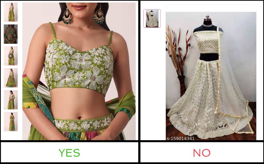
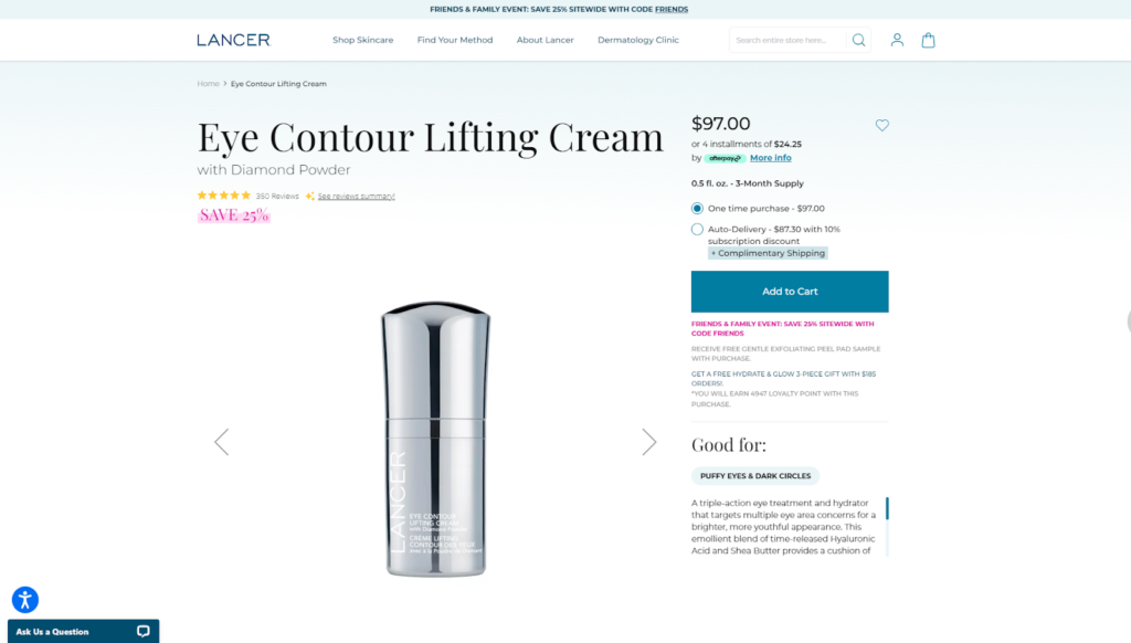
18. Ensure Product Images Are Crisp And Clear
When purchasing online, your customer’s perception of your product relies heavily on how they see your product in the product images you’ve added. Be it product features, design, or quality, customers will define it all through the product images.
Investing in professional photography with well-lit and detailed shots from various angles increases customer confidence in the product’s authenticity and your brand’s credibility. Therefore, you must add better quality images or your entire product collection.
Below are examples of product images on a website: one with poor quality and another with great quality. And the difference in image quality allows you to see which product is worth buying.
19. Know That Product Descriptions Matter
Online shopping has only one exception, which is the lack of a sales representative.
On your online store, you won’t have anyone to explain your products to your customers. Your customers are required to figure out on their own if the product matches their needs. Product descriptions are the way to bridge this gap.
And every eCommerce store owner writes product descriptions, however, simply writing them isn’t enough. You need to make the process of “knowing your product” engaging. This can be achieved through tutorial videos, photos, usage tips, and further guidance.
Additionally, design and the placement of detailing elements play a big role. So, take your time and build a well-structured product description strategy that works well for your entire product collection.
Here’s an example of a good and poor way to explain product description. You can clearly spot the one that’s more pleasing to the eye.
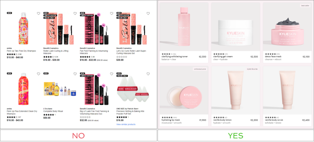
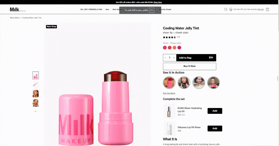
20. Don’t Feel Shy To Up-sell And Cross-sell
Upselling and cross-selling are effective ways to increase your sales numbers. In eCommerce, they are often referred to as personalized product recommendations, which help add more products to the user cart.
Magento offers a built-in option to introduce cross-selling and upselling functionality in your store. However, the relevancy of those product recommendations is all that matters!
When you choose to upsell, showcase products that provide better value than the original product. Similarly, if you choose to cross-sell, make sure the offered products complement the initial purchase of the customer or the product they are currently viewing.
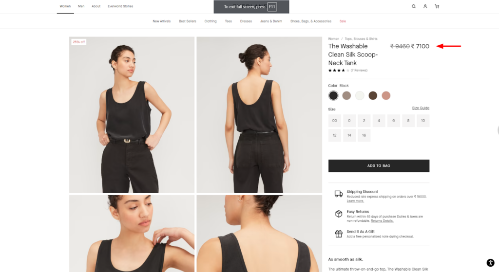
21. Make Your CTA Stand Out
It’s a basic understanding that CTA is the most important element on a website. It should draw user attention at first glance to the product detail page, as you can see in the example below.
A clear and prominent CTA button makes it easy for customers to take the next step, which is typically adding the product to their cart or buying it outright. By removing any confusion about what action to take, you can significantly increase your conversion rates.
When your CTA button is placed prominently, your users get the hint of taking the next step, which is typically adding product to cart or buying it outright. This effectively helps you improve your conversion rates as it makes it clear on what action your user should take to further join the purchase journey.
Also, don’t overdo.
Many times, store owners also add multiple CTA or other information, with brighter colors to attract users. However, most time this confuses users about what option to go with.
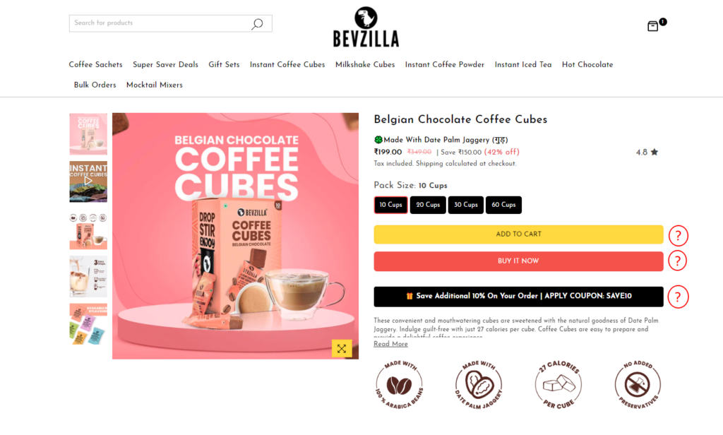
22. Put Price In Pleasant Way
If there’s something secretive about your product’s pricing, then you can definitely find your benefits in hiding it. However, in most cases, it’s best to display the price clearly and pleasantly on your product page.
Why? Here are some customer reactions that will backfire for your sales when you keep your hide your product prices.
- Oh, this one doesn’t have a price tag, let’s skip this product.
- Oh, this brand is not showing pricing for any of their products, they might be expensive. Let’s move to alternative brands.
Ah, now you see the loss, right?
Therefore, it’s always necessary for you to mention the product pricing prominently, so that is highlighted enough for the user to find in their first glance.
23. Add UGC As Reviews
Before hitting the “BUY NOW” button, your customers have a list of doubts. Such as;
- Is this product/brand genuine?
- Will this product work for me?
- Does it look the same in person as in the photos?
Now, you must solve those doubts. And UGC can be a great help for that.
Seeing real people (like them) endorsing the products or saying that the product worked for them, customers can build confidence in your products. This is because customers tend to trust words from existing customers more than your marketing efforts.
So, remember, a UGC section is a must for your PDP. And here’s a perfect example of how you place it.
That’s all for how you design your product page to work well on user experience. Now, let’s move to understanding tips for another necessary element of the user journey.
#UI/UX Strategies — Checkout
When your customers is on your checkout page, understand that they trust your brand. So here, you go the extra mile to ease their further journey. Below are some tips that work best.
24. Keep it Short or Shorter
Till the time your customers reach the checkout page, they are tired already.
See, first, they start to explore your products, compare them all, and choose the best ones that meet their needs. And now they’re standing in a payment queue (almost similar). And after this, if your checkout process is long and lengthy enough to bore them, you’re gonna face a hard time converting them.
So, understand that it’s your website’s responsibility to treat them nicely and provide a quick billing option. Here are some steps you can consider taking to improve your Magento checkout process.
- Don’t ask for unnecessary information
- Offer one-page and guest checkout option
- Add a progress bar
- Implement autofill option for faster checkout
- Maintain a clear and organized layout
- Ensure mobile-friendly design
Lastly, if you find it complex to look after all these areas, I have a solution for you.
Hyvä Checkout. Yes, when integrating Hyvä checkout, you get all these options built-in, with the additional benefit of faster load times.
25. Provide Plenty of Payment Options
Customers appreciate having choices and the flexibility to pay how they want.
So, first figure out the most used payment options by your target audience based on their age group, location, and more. And provide your customers with enough options to choose from as often times limited payment options are one reason why online shoppers abandon their carts.
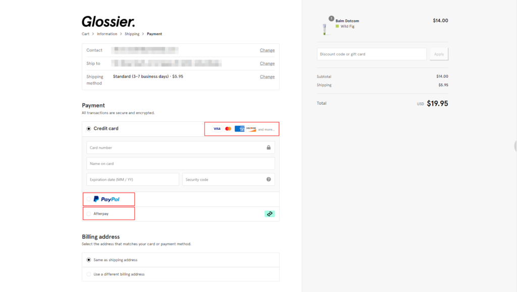
That’s all about the checkout section.
Until now, we have seen multiple strategies or best practices for improving UI/UX.
But, how do you improve it for your Magento store in particular? Are there any areas to consider before implementing these? Sure, there are. Let’s learn about them in the next section.
How Do You Improve UI/UX for Your Magento Store In Specific?
Learning these strategies was all good and fun. However, their implementation also needs some strategic work performed. Here’s a roadmap for you. 😀
Step 1: Analyze — Know your users
Users are unique for every business and every niche.
They’ll also have different age groups, locations, concerns, and pain points that you need to consider before you design the UI/UX for your Magento store. You can create buyer personas and understand their needs, expectations, and browsing behaviors.
When you know your target audience well enough, you can move forward. Also, understanding and optimizing core web vitals can be a starting point.
Step 2: Design — Shape your Magento Store
Once you’ve learned all the information about your users, it’s time to design your Magento store.
Here, you’ll use all the information you gathered about your target audience to create a visually appealing design that works well for them. This is also the stage where you analyze each of the strategies we discussed above and figure out if they fit your target audience.
If the strategies seem to work for your customer personas, implement them without hesitation.
Moreover, our UI/UX design experts are eager to help design the front end for your Magento store. Explore our UI/UX services here. 😀
Step 3: Test — Gather Feedback and Insights
Once your design is prepared, it’s time to test it on your customers.
So, conduct a user testing session, gather your teammates, and try interacting with your web design as a user. This will help you understand the usability issues and areas for improvement.
Step 4: Improve — Make the necessary changes
Now, based on your testing results you’ll have to adjust your store design.
Also, consider the testing and improvement phase as a part of an ongoing process as user preferences and technology evolve.
That was all about the steps of improving UI/UX for your Magento store.
LAST WORDS
Remember that a well-designed Magento store is an investment that will pay off in the long run.
By following the UI/UX best practices outlined in this guide, you’ll be well on your way to creating a user-friendly Magento store of your dreams. Lastly, you can always reach out to our UI/UX experts to help design a conversion-friendly Magento store.


Post a Comment
Got a question? Have a feedback? Please feel free to leave your ideas, opinions, and questions in the comments section of our post! ❤️