
In today’s article, I will be guiding you on how to run JavaScript only on mobile in Hyva themes.
Sometimes we need some components to Display on Desktop Devices and hidden on Mobile Devices and vice versa.
In this situation, Generally, everyone uses the CSS Display property to Display that component on Desktop Devices and hide it on Mobile Devices. But when a component is only hidden with CSS, all DOM elements still count to the total DOM size by Google and decrease the page speed, even though they serve no purpose and are hidden for the visitor.
So, To hide the component on Mobile Devices and to avoid counting in the DOM by browser, we need to use matchMedia with Alpine JS “X-if” template syntax. If the condition is not fulfilled then the HTML content inside the “X-if” template is not rendered on the page and it is not counted as DOM elements by Google or the browser.
<script>
function initSomeComponent() {
return {
isMobile: true,
init() {
const matchMedia = window.matchMedia('(max-width: 768px)');
// set the initial value
this.isMobile = matchMedia.matches;
// trigger update value on changes
if (typeof matchMedia.onchange !== 'object') {
// fallback for iOS 12/13, where addEventListener does not accept an event type parameter
matchMedia.addListener((event) => this.isMobile = event.matches);
} else {
matchMedia.addEventListener("change",
(event) => this.isMobile = event.matches)
}
}
}
}
</script>
<div x-data="initSomeComponent()" x-init="init()">
<!-- This HTML element will be render on Desktop and will not be rendered on the Mobile Devices -->
<template x-if="!isMobile">
<div>None of the HTML elements within this <code><template></code> is counted as DOM elements by Google or the browser on <strong>Mobile Devices</strong>. </div>
</template>
<!-- This HTML element will be render on Mobile Devices and will not be rendered on the Desktop Devices -->
<template x-if="isMobile">
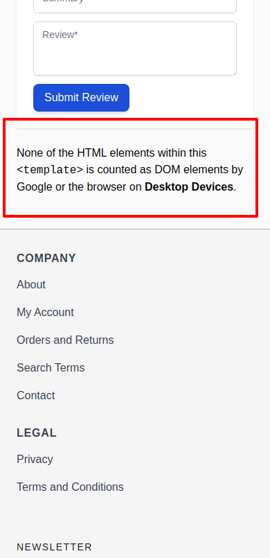
<div>None of the HTML elements within this <code><template></code> is counted as DOM elements by Google or the browser on <strong>Desktop Devices</strong>. </div>
</template>
</div>Output: Desktop Devices
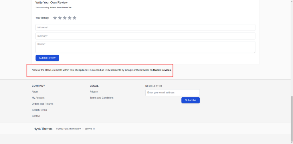
Output: Mobile Devices
Learn about the Hyvä Theme from scratch!
We can use matchMedia with any port size required and we can create conditions as needed and use this instead of using the “Display:none” property of CSS.
For more information on the window.matchMedia, please refer to the mdn documentation.
For more information on Alpine JS x-if template syntax, you can read the below Alpine JS documentation.
Read more resources on Hyva themes:
- Check out the InstaBuild for Hyvä Themes: Ready-made Hyva theme templates for faster storefront development!
- Hyva Themes Development – For Online Merchants
- Hyvä Theme Benefits that your store needs
- 10 Best Hyva Compatibility Extension Providers For Magento 2 Stores
- Hyvä VS PWA: Where to Invest?
- How a Slow Magento Website Can Cost You Advertising Dollars
- Mobile Commerce: How Hyva Themes Boost Mobile Conversions


Post a Comment
Got a question? Have a feedback? Please feel free to leave your ideas, opinions, and questions in the comments section of our post! ❤️