Top 5 eCommerce Checkout Optimization Secrets for You

If you’re an eCommerce owner, I’m assuming an abandoned cart scares you more than Annabelle and Paranormal Activity, and that is why eCommerce checkout optimization is one of the most important thing on your mind.
And why shouldn’t it?
You put so much effort into pushing the users through the sales channel…
You even try psychological gimmicks to convert them…
But it doesn’t end the way you want.
- They abandon you on the eCommerce checkout page.
- They never show up again.
- And worst of all, if they turn out stubborn, they don’t get back even with a blitz of emails and push notifications.
It hurts more because eCommerce checkout flow best practices are literally an inch away from hooking ‘that’ fish.
Facts about eCommerce checkout I have learned it the hard way…
Nothing comes easy with eCommerce.
The bar is way too high.
So high you have to optimize your website even in the final sprint: the eCommerce checkout stage.
Sadly, most customers succumb at this point
- either because you’ve underestimated this stage,
- or you haven’t taken care of their satisfaction.
This stage may seem like a little last step, but 70% of the customers abandon you here.
Now that’s huge!
In fact, the new global average abandonment rate is close to 77%.

Be it tablet, desktop, or phone; if you’re not giving an interactive and hassle-free eCommerce checkout page, you’re going to have hard time minting money.
Have a look at these stats… gosh!
85% of the mobile users don’t complete the purchase.
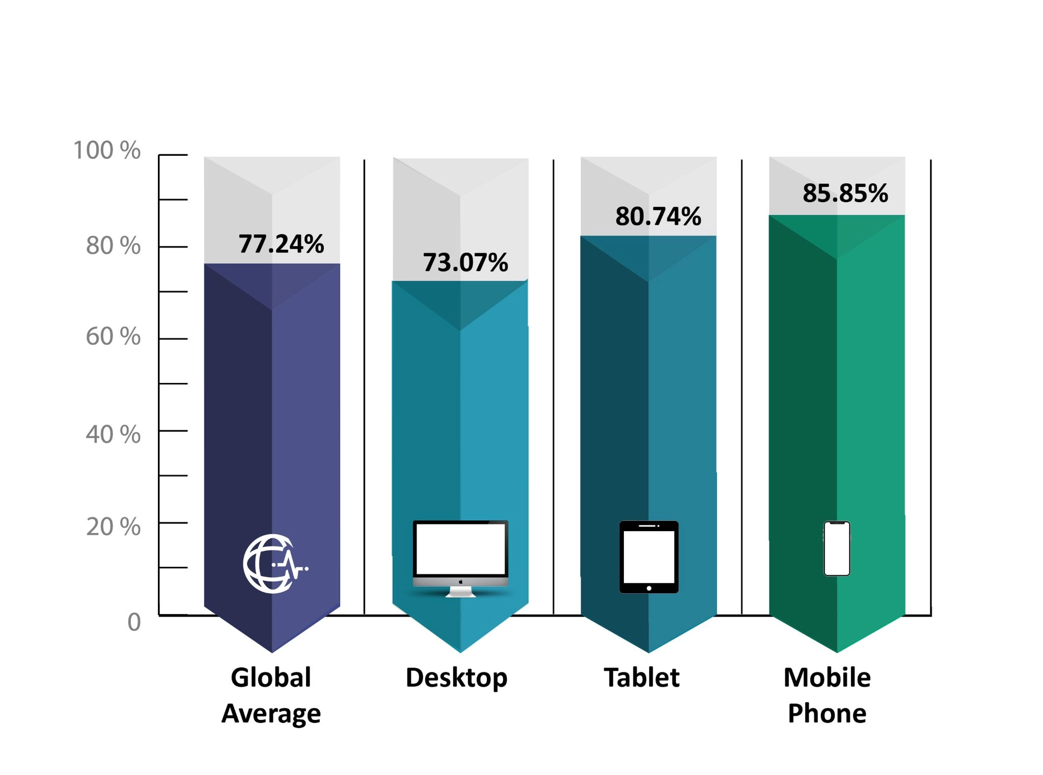
Cart abandonment rate— device wise
You’ll have to be more proactive to force their credit cards out
But before that, you have to understand why users abandon carts on the checkout pages.
Of all the reasons— shipping charges accounted for 53% of the abandonment, the most by any.
Take a look at other reasons users usually pick to desert your store during checkouts.
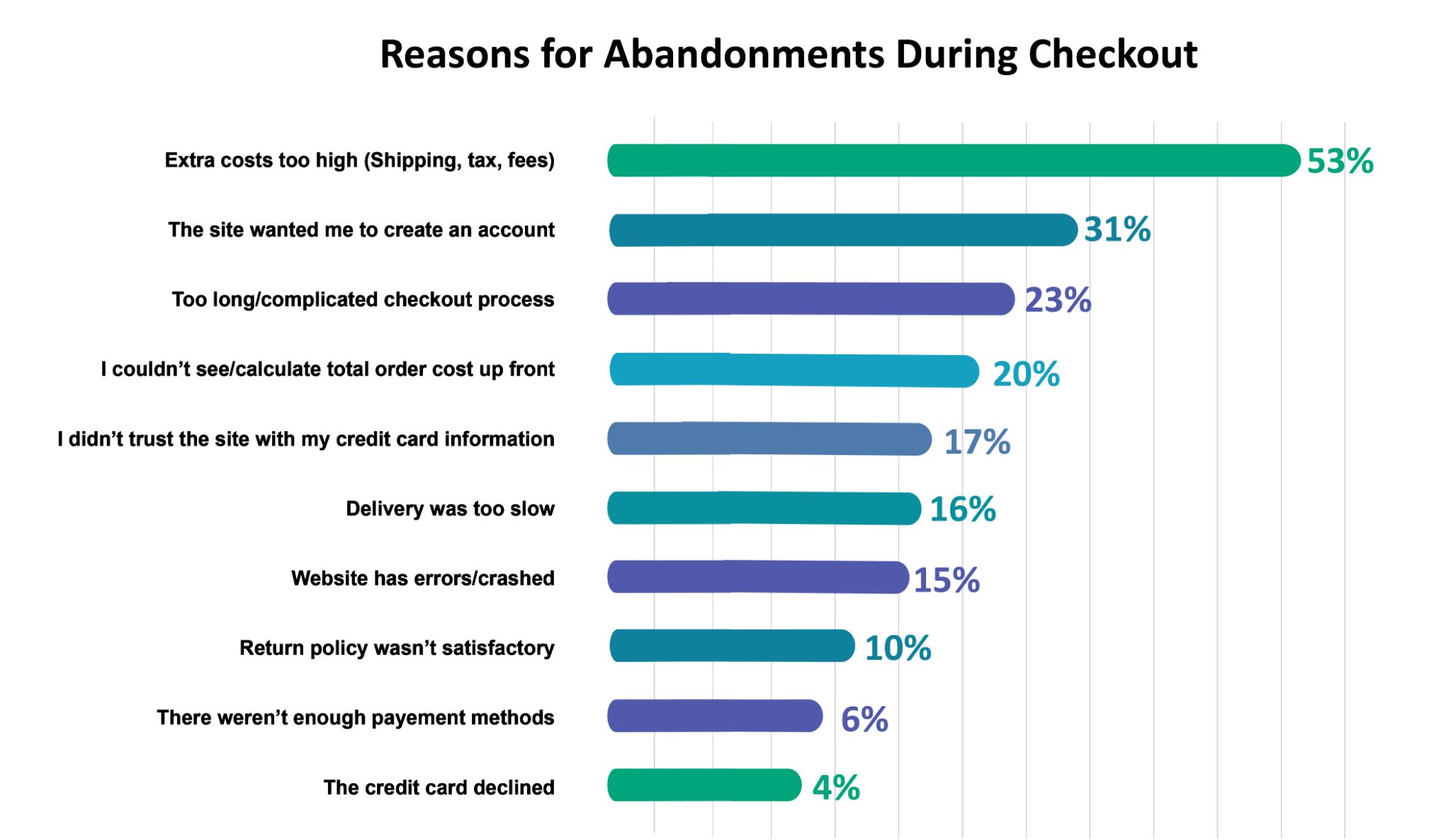
Top reasons why users abandon online stores at checkout stage
I’m sure you know what costs your sales at the checkout process now.
So let’s apply the key learnings to avoid these eCommerce checkout mistakes…
Let me remind you, these are not in order of priority.
You can implement them the way you want for fast checkout.
Learning #1: Fix the god-damn long process to optimize eCommerce checkout process
Let’s say you frittered away half an hour pushing trolleys in the supermarket.
The next moment, they ask to spend 30 mins more on the billing counter.
That’s boring.
And annoying!
Online stores were birthed to rule out long, irritating processes.
But unfortunately, eCommerce has evolved.
The store owners take pleasure in having countless products in their arsenals.
Well, big congratulations for making it on a “grand-scale”!
But most users don’t feel the same.
They feel they’re lost in the maze of categories, menus, and catalogs.
So online purchases are getting too overwhelming and time-consuming for them.
What can you do?
You’ll be surprised to know a slight change in the checkout design can increase your conversion by 35%. (1)
So,
- Separate your checkout into blocks and steps (optimize them as well. Don’t go for a 10-step process if it’s manageable in 3-4 steps).
- Streamline the checkout process with simple and user-friendly designs.
- Use simple forms and gather limited data only.
- Put a progress bar at your checkout for transparency. The idea is to let them know where they’re in the buying process.
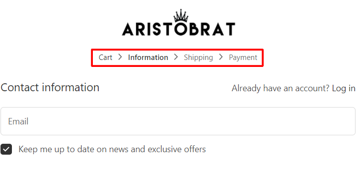
Aristobrat shows checkout steps.
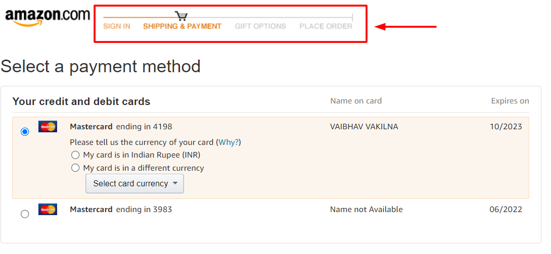
Amazon hammers the checkout steps in its classic form.
Learning #2: Not buyers; they’re your family
Do you question your family members or guests when they come home?
Of course, not! Right?
So why do you push customers to give registration data every time they buy with you?
And the sin is far graver if they hit your store for the first time.
Yeah. Yeah! I get you.
You want to learn more about customers & their behaviors…
And offer them even better services…
But there’s a thin line between encouraging and forcing them to put the details.
Look!
The bitter crux of the matter is: they don’t have worldly times!
Plus, they care about privacy more than ever.
Asking them to fill in essential details when they’re buying for the first time is like… scrutinizing them as strangers without letting them in.
The maximum that will happen if you don’t force them is: you’re not going to have an email or know their age or gender.
But it will ensure your cash register keeps ringing.
So what’s your priority? Email or money straight into the account?
What can you do?
Over 23% of people abandon eCommerce checkout carts because they had to create an account, the second most after shipping charges. (2)
So,
- Ask yourself if having a user profile is a must. Don’t throttle your decisions on them if it isn’t.
- Let users make purchases without registrations.
- Help them with the guest accounts.
- Ask no more than name, phone number, and shipping details.
- Don’t put content marketing strategy on the front seat when they’re willing to pull out the money on the actual sales.
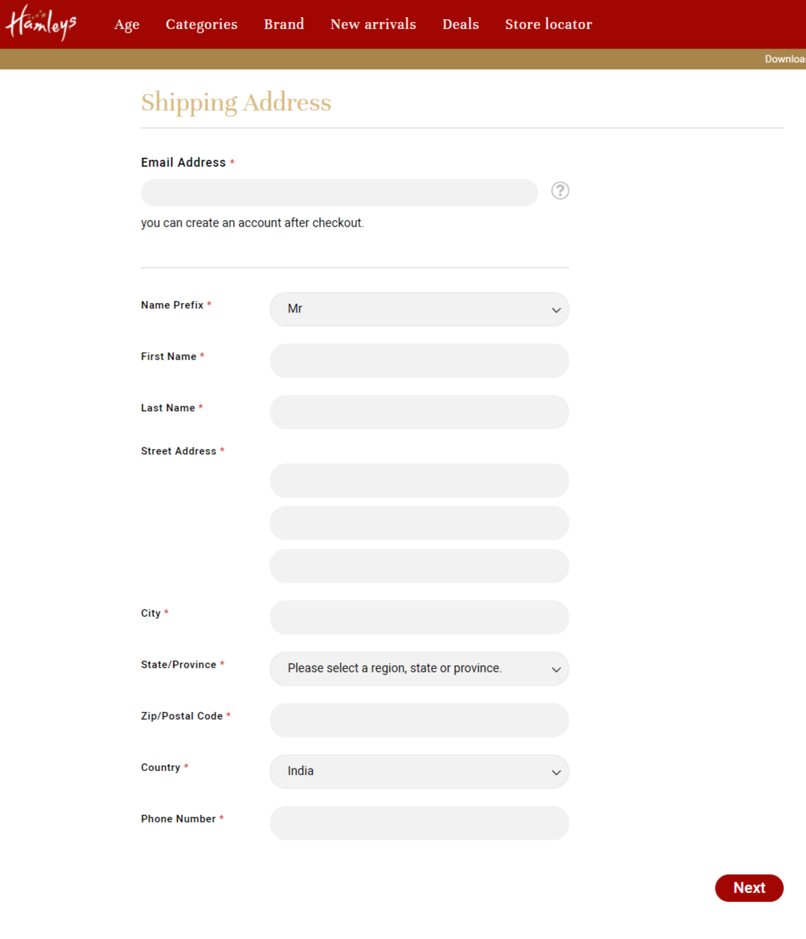
A long eCommerce checkout form by Hamley. This is the best example of what you shouldn’t do with your check out page.
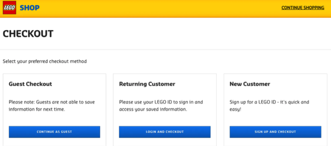
Lego nails it with their three different checkout pages.
Learning #3: Users don’t like to type much at the end of eCommerce checkout process
The need to type everything in an online store can be super-frustrating.
I would instead take immense pride in abandoning the cart because that seems a viable option against typing long forms.
So you want to sweep away your customers’ load as much you can.
Of course, I am not asking you to hack into their systems and fill in their names and addresses magically.
That’d be too much a task to please your customers.
But what I mean is:
you want to minimize their efforts to type…
you want to have them a seamless experience with you…
And you want to lower typing errors creeping in…
And I don’t mean it only for the eCommerce checkouts, but everywhere in their journey— be it search bar or credit card details.
What can you do?
- Use autocomplete in the search bar.
- Integrate your store with an autofill API that learns data from the browser and fills it automatically for your customers.
- Configure your store with Google Maps API that fetches multiple email addresses in a drop-down list. It makes one field less for your buyer to type.
- Help them save credit card details, so they don’t have to enter every time they buy with you.
- Max out from the data they left in the previous purchase cycle.
- Try to give a correction suggestion in both search bars and checkout pages should there be any mistyping.
- Reduce the form field size.
- In short, please don’t make them type any detail twice in your store. Shopify Online store 2.0 gives you the right edge in doing all this easily.
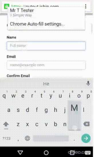
Autofill at the checkout page puts less workload on customers.
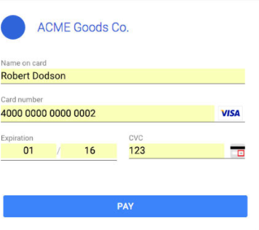
Auto-detecting card details for the returning customers.
Learning #4: Shipping cost is the most hated eCommerce term
Your customers can pay 1000$ for the products.
But you’re turning them off with even a 5$ shipping cost.
No matter how big or small the cost is, it’s an added cost for them.
I understand it’s not possible to deliver everything for free when you’re barely squeezing out any profit from the sales.
But you should know you’re playing with fire if you haven’t let your customers know the shipping costs in advance.
Think of it this way: you barely made your mind for a product, and when you reach the checkout stage— you find a jaw-dropping shipping charge levied on your bill.
Damn! That isn’t very reassuring. You wasted so much time not buying anything!
You’re definitely putting the buyers away if:
- You have an expensive shipping
- You don’t have a free shipping
- Your users are not aware of shipping costs
Again, I am not asking you to go unrealistic and give your profit.
No! All I am saying is make them pay for the quick deliveries, not standard shipping.
What can you do?
32% of the users abandon shopping carts because the purchase cost is too high for them. (3)
Additional shipping cost is only shooting your own legs.
So,
- Introduce a shipping calculator early in the checkout process. Rather than making your user “guesstimate,” let the calculator estimate the additional costs for them.
- Include a table or a chart that mentions everything about the fixed costs. More importantly, please include them in all the product sheets and FAQs.
- Let users switch between currencies to have more payment options.
- Try giving free shipping if it’s possible for you. Please note, wisdom lies in offering free shipping but covering up with other skills such as upselling and cross-selling.
- Have a currency converting calculator in your store. You don’t want to make a commercial suicide by detracting them to another page.
- Pop up a shipping summary on each page of your eCommerce business. It stops more conscious users from going to the checkout tab again and again.
There’s no alternative for free shipping.
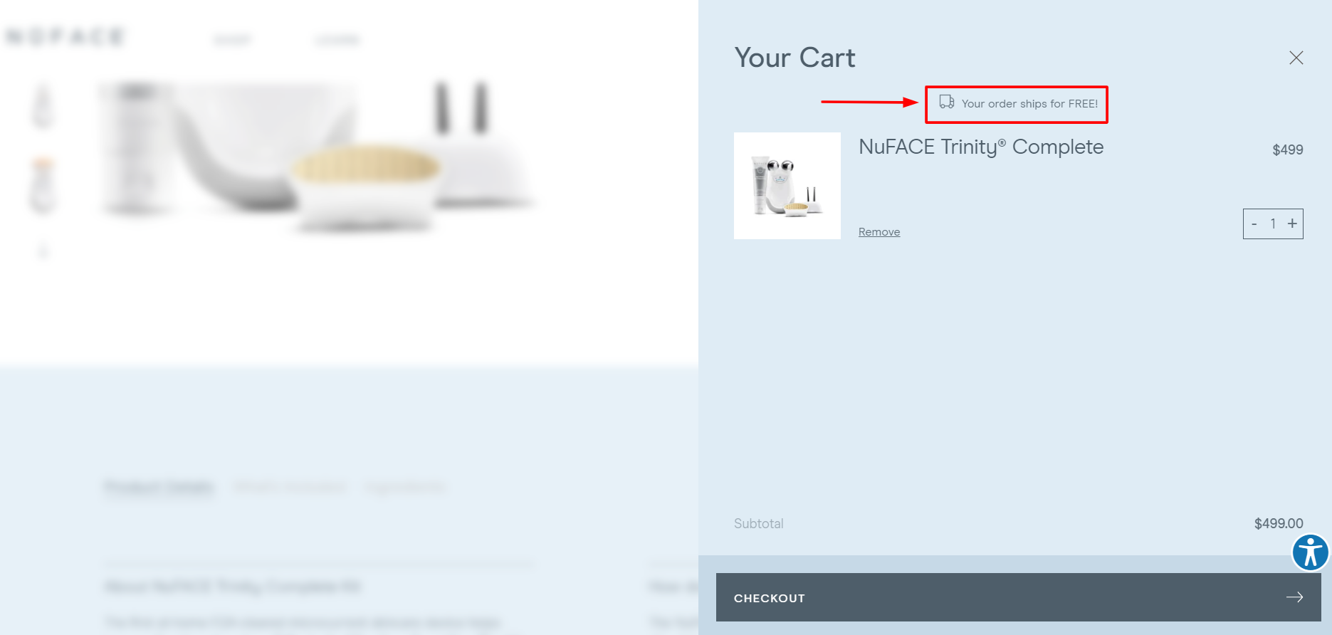
Nuface ships its order for free.
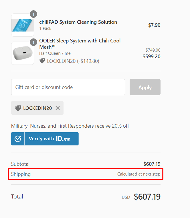
Chilisleep doesn’t tell the shipping charges in advance. Big shame for a brand of its stature.
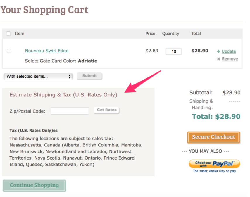
A good example of shipping calculation. Enter postal code and know your charges well in advance.
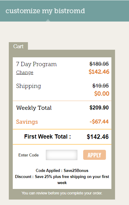
BistroMD shows by far the best shipping details even before you’ve logged in.
Learning #5: Every customer is a world in themselves. Give them their favorite payment mode for best eCommerce checkout experience.
Gone are the days when you paid with Visa and MasterCard only.
They are literally the parts of history books & I won’t be surprised if they add up as curriculums.
But we’re into the present where every customer wants a suitable payment mode for themselves.
And it’s important because it’s where transactions happen.
Without giving them the option they want, there’s no money for you.
Now you might put an argument that some payment companies will charge you more transaction fees.
I get you completely!
But again, it’s all about learning your customers’ preferences.
Some prefer cash on delivery because they want to see the parcels from naked eyes.
Others have preferences for specific cards because they would get bonuses or offers.
Some also have good transacting terms with the company!
You must have seen many eCommerce checkout carts adding bitcoin as a payment alternative.
What could be more of a radical change than this?
Either way, you want to give the payment options, so they buy with your competitors.
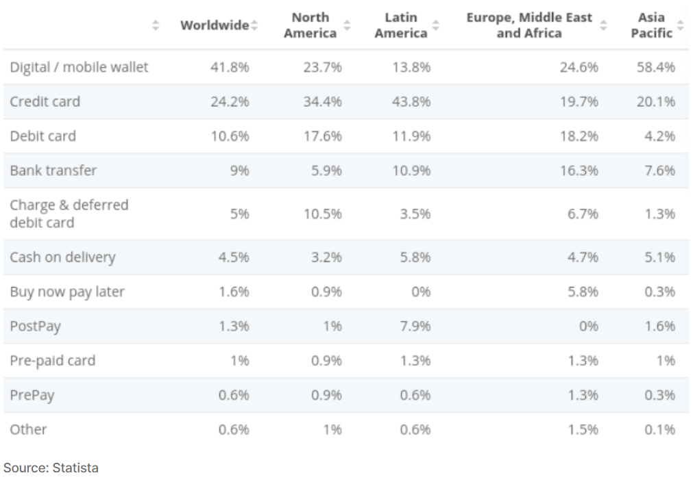
Accepted form of payment modes— continent wise.
What can you do?
54% of users like to buy from the stores with multiple payment alternatives. (4)
Now… you can only assume your sales figure with those kinds of numbers.
So,
- Add as many payment gateways like Stripe, PayPal, Google Pay, Amazon Pay, and Apple Pay. You can go for Progressive web apps development.
- Integrate crypto payments if it’s feasible.
- Accept newer types of payment with wide arms.
- Don’t hesitate to accept unconventional modes of payments as well.
- Add a few payment modes in the product page itself.
B9hZZ1.webp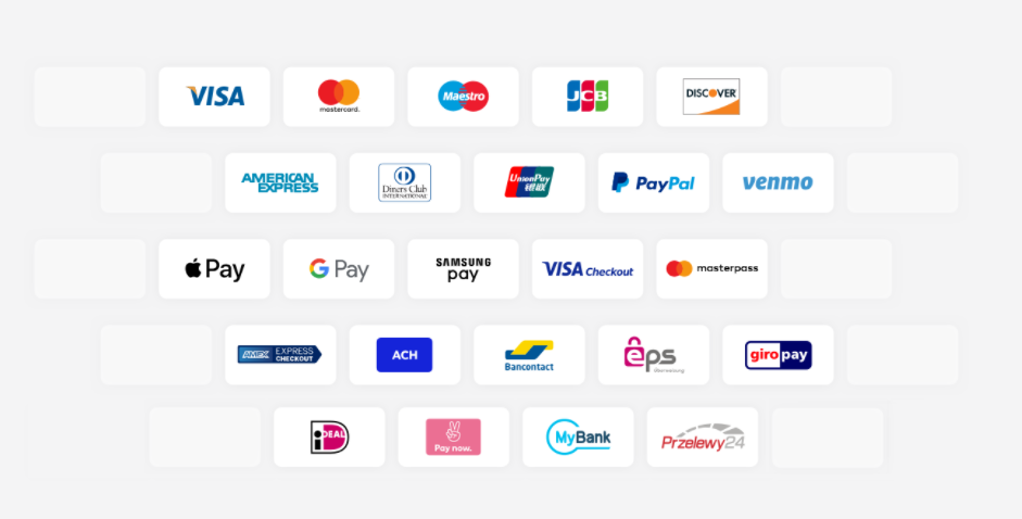
Multiple payment gateways.

Somavedic shortens the checkout process by putting PayPal buy in the product page itself. It’s an express checkout.
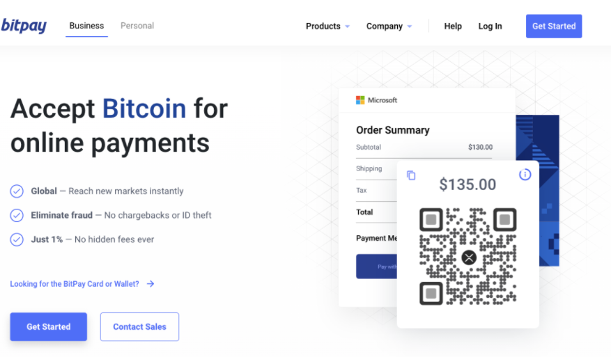
Bitpay accepts Bitcoins for online payments.
Some other learnings to avoid eCommerce checkout mistakes
- There’s no point in hiding return policies. Be clear! Whether you take returns or not.
- Users like to edit shopping carts at the checkout processes. Blocking the cart would mean forcing them to go back and fill the form again.
- Buyers respect the store when you respect their security and privacy. So keep them secure at every point of the purchase cycle.
- Live assistance pushes them through the last stage of the buying cycle. Don’t wait for users to reach out to you personally. Instead, get in touch upfront.
- Appealing to their need for instant gratification can get you sales even if you have a mediocre checkout process.
- One-page eCommerce checkout is the key to quick conversion.
What you learned about eCommerce Checkout optimization…
You learned… the shorter the purchase cycle, the better the conversion.
You learned… the customers are your family.
You learned… the less load you put on customers, the more faithful they come out to you.
You learned… Shipping cost is a big no-no!
You learned… More payment modes —> Less cart abandonment
Image Credit: Web


Post a Comment
Got a question? Have a feedback? Please feel free to leave your ideas, opinions, and questions in the comments section of our post! ❤️