Chapters Close

Think of a domain extension as the shop front window for your eCommerce store. It comes into view just as a customer passes through your store. 

A generic domain extension is like a cluttered display of your products, leaving the customer confused about your offerings. But a well-thought and relevant extension makes your products recognizable and entices them to enter your store. 

It adds personality to your domain name and tells the customers exactly what you offer. For example, the best domain extension for an eCommerce store selling cosmetics could be “CurlyHairHaven.beauty”. 

If you’d like to check out more options, keep reading! Below are 11 best domain extensions for eCommerce businesses. 

Domain ExtensionsPricingDomainsMarket Share
NameCheapGoDaddyName
.net$12.98/yr$14.99/ 1st yr$16.98/yr20,950,9467.57%
.online$0.98/yr$0.99‬/1st yr$2.05/yr3,512,1989.39%
.shop$0.98/yr$1.49/1st yr$30.88/yr2,972,1817.94%
.store$0.98/yr$0.99/yr$3.08/yr1,676,7124.48%
.trade$5.98/yr$7.99/1st yr$8.23/yr20,7780.06%
.boutique$3.48/yr$4.99/1st yr$5.14/yr14,4280.04%
.eco$69.98/yr$109.99/yr$77.24/yr8,9300.02%
.shopping$29.98/yr$45.99/yr$15.44/yr8,7760.02%
.supply$20.98/yr$31.99/yr$29.86/yr7,4160.02%
.cheap$5.98/yr$9.9‬/1st yr$10.29/yr3,8920.01%
.luxury$24.99/1st yr$25.74/yr3,1550.01%

1. .shop 

.shop is a short and easy-to-remember domain extension for eCommerce. It’s best for brands selling merchandise and willing to establish a strong online presence. It leaves an impression on customers, portraying your eCommerce store as the only one in your market.

.shop domain also indicates your store’s focus on online sales and appeals to an international audience. It gives a niche identity to your website. 

Best For

  • Online retailers
  • Brick and mortar stores expanding online
  • Niche retailers
  • Dropshipping businesses

Pros

  • internationally recognized
  • eCommerce relevant
  • brings targeted traffic as online shoppers
  • helps in digital marketing efforts
  • higher availability of preferred domains

Cons

  • not limited to eCommerce 
  • less familiar than other domains
  • lack of trust persists

Examples

2. .shopping

.shopping is a broad and descriptive extension, more like a shopping mall with several stores inside. It can suit multiple business types from product-based to information-based. Unlike .shop extension which reflects a curated selection of products, .shopping aggregates a variety of online stores.

It’s a newer extension compared to others, making it easy to grab it with a preferred domain name. Also, if you deal in multiple product lines, .shopping is a better option. 

Best For

  • Retailers of all sorts
  • Comparison tool websites
  • Shopping-related information/service websites
  • eCommerce blogs
  • Coupon websites
  • Fashion and entertainment industries

Pros

  • available to anyone and anywhere worldwide
  • new in the market
  • helps in eCommerce SEO
  • brings targeted traffic

Cons

  • lack of trust 
  • difficult to market
  • less specific about products
  • quite expensive than other extensions

Examples

3. .store

.store is a modern and eCommerce-specific extension that screams “Buy Now”. It could either be used as a standalone extension or secondary web address to direct users to your website’s shopping section. The extension gives customers an instant impression — the website sells products. 

It brings in more traffic and visibility than other domains. Besides, if you sell via an eCommerce marketplace, you don’t even need a website to use .store.

Best For

  • Retailers selling digital storage
  • Organic food sellers
  • Furniture stores
  • Departmental stores
  • Handmade goods sellers

Pros

  • short, slick, and creative
  • get a keyword-rich domain
  • helps in brand awareness
  • internationally recognized

Cons

  • low availability of preferred domain names
  • less common than other extensions

Examples 

4. .online

    .online has the reputation of a versatile and easy-to-recognize domain extension for eCommerce. It is a top choice for online stores across industries and business types. The reason — it has a professional image and a global identity among other extensions. 

    .online gives your website a level of authority and trust — no matter if you are just starting out or an established business. It portrays a strong online presence for your store. 

    Best For

    • Brick-and-mortar stores
    • Startups
    • Tech companies
    • all types of eCommerce businesses

    Pros

    • suits all eCommerce businesses
    • a clear indication of a store’s online presence
    • improved visibility and search rankings
    • connects better with digital community
    • higher availability of preferred domain names

    Cons

    • lack of familiarity among customers
    • not industry-specific
    • less resale value

    Examples

    5. .net

      Due to its obvious connection to the internet, .net extension is common in eCommerce businesses offering technology-related products. It gives credibility to your business and establishes a sense of trust among your customers. 

      If you’re targeting a tech-savvy audience for your eCommerce store, .net is your best option. It gives a clear indication of your offerings to potential customers. 

      Best For

      • Internet service providers (ISPs)
      • Networking services
      • Community sites

      Pros

      • higher availability of preferred domains
      • global recognition
      • broader appeal
      • suits both personal and professional businesses

      Cons

      • needs more marketing efforts to build a presence
      • difficult for new stores to establish trust
      • lower credibility

      Examples

      6. .eco

        .eco extension clarifies your intent of selling eco-friendly and environmentally sustainable products. It shows your dedication to the environment and instantly attracts an audience that shares your vision. It’s the reason why several established businesses and environmental groups use .eco.

        The only requirement for using .eco is — you need to be open about your initiatives for a sustainable environment and commit to continue working towards the same. 

        Best For

        • Organic clothing stores
        • Solar panel installers
        • Recycling companies
        • Energy-efficient appliance stores
        • Reusable product companies
        • Electric vehicle manufactures and dealers

        Pros

        • Shows commitment towards a cause
        • proved credible by UN Environment Program 
        • attracts targeted audience
        • higher availability of preferred domain names

        Cons

        • limited awareness 
        • appeals to a limited audience
        • very expensive
        • SEO uncertainty

        Examples 

        7. .supply

          .supply extension helps suppliers and related businesses to streamline their inventory, purchase, and sales operations. They can use this extension to store and publish supply lists and inventory-related information in one place. It makes accessing this information easy for supply, purchasing, and inventory teams.

          .supply also indicates commitment. It shows the business will get the job done no matter how big it is. 

          Best For

          • medical or industrial suppliers
          • Wholesale businesses
          • Manufacturing companies
          • Industry-specific suppliers
          • Artisanal or craft good suppliers
          • Subscription box companies 

          Pros

          • clarifies your intent of supplying products
          • higher availability of preferred domain names
          • can target niche audience
          • trendy and modern feel

          Cons

          • lack of awareness
          • requires more effort in marketing a website
          • less resale value

          Examples 

          8. .boutique

            .boutique is the best domain extension of eCommerce businesses offering specialty or exclusive products. It houses all the boutique owners across the world, selling one-of-a-kind products to a niche audience. For businesses that want to portray themselves as high-end merchandise sellers, .boutique is a sophisticated choice. 

            It gets you the attention you deserve from your audience — dedicated to your brand. 

            Best For

            • Fashion designers
            • High-end electronic appliances 
            • Jewelry stores
            • Accessories stores
            • Specialty beauty shops
            • Florists
            • Specialty food stores

            Pros

            • attracts highly targeted audience
            • boosts brand image
            • higher availability of preferred domains
            • gives exclusivity to a brand
            • makes customers feel special

            Cons

            • lesser-known extension
            • limited reach
            • uncertain SEO rankings

            Examples

            9. .luxury

              As the name clearly indicates, .luxury extension is perfect for businesses selling high-end, premium quality, and exclusive products. It appeals to affluent customers seeking rich and prestigious products to enhance their lifestyle. Consumers who don’t settle for anything less than luxe, .luxury is the only way to entice them.

              .luxury domains have a touch of personality to them — attracting an elite customer market — the right audience for your product line.

              Best For

              • Real estate
              • Architecture
              • Interior design
              • Travel
              • Jewelry
              • Home décor
              • Designer apparel

              Pros

              • higher availability of preferred domains
              • strong visual impact
              • enhances marketing communication
              • high searchability
              • attract a distinguished audience

              Cons

              • limits reach to a specific audience
              • potentially inflated expectations
              • perceived inauthenticity due to newer extension

              Examples 

              10. .cheap

                .cheap extension targets the broadest consumer market — the one that searches for the cheapest version of products online. So if you deal in second-hand or cheap products, .cheap domains are your best choice. It instantly gives the idea to your customers, who are looking for affordable products. 

                .cheap domains also streamline product hunts for customers who find it difficult to scour the internet for a good bargain.  

                Best For

                • Thrift stores
                • Second-hand goods sellers
                • Comparison websites
                • Coupon websites
                • Bookstores

                Pros

                • attracts a broader audience
                • helps in SEO
                • improves website visibility

                Cons

                • often deemed as untrustworthy
                • requires more marketing efforts to build trust
                • perceived lack of quality

                Examples 

                11. .trade

                  .trade gives a modern appeal to the age-old barter system! Businesses that deal in online trading — exchanging goods and services online — can rely on .trade extension to convey their message to the audience. 

                  With .trade, it becomes easier for trading companies to market their services online and communicate with their customers. It also streamlines buying and selling of goods.

                  Best For

                  • Stock exchange businesses
                  • Internationally operating trade businesses
                  • B2B eCommerce businesses
                  • Trade show organizers 

                  Pros

                  • highly targeted audience
                  • clearly communicates industry focus
                  • higher availability of preferred domains
                  • potential SEO benefit

                  Cons

                  • lack of awareness
                  • limited reach
                  • less versatility

                  Examples

                  Industry-specific domain extensions for eCommerce

                  If you are looking for niche domain extensions for your eCommerce business, we have several options for you. Instead of going for general top-level domains, look for niche options that define your industry well. Some industry-specific domain extensions include:

                  1. .fashion, 
                  2. .tech, 
                  3. .jewelry, 
                  4. .gifts, 
                  5. .game, 
                  6. .shoes, 
                  7. .guitars, 
                  8. .coffee, 
                  9. .fishing, 
                  10. .blackfriday, 
                  11. .clothing,
                  12. .beauty

                  Promotional domain extensions for eCommerce

                  If sales and discounts are a common thing for your eCommerce store, you should go for domain extensions like:

                  1. .discount, 
                  2. .sale, 
                  3. .coupons, 
                  4. .deals, 
                  5. .bargains

                  Country-specific domain extensions for eCommerce

                  If you’re a local or region-specific eCommerce store, location-based extensions are the right choice for you. They communicate to your readers that you are local and boost trust. Some examples include:

                  1. .co
                  2. .co.uk
                  3. .de
                  4. .ca
                  5. .br.com

                  Choose the right domain extension for your eCommerce business

                  Confusion is the last thing you need on your mind when you’re choosing a domain extension for eCommerce. The best way to choose the right extension is to look for options that suit your niche. 

                  While general domain extensions are credible and trustworthy, niche extensions describe your businesses in a jiffy. Of course, budget and availability are primary considerations when selecting an extension, but it must speak for your brand. 

                  If you’re still wondering about the best domain extension for eCommerce, contact Aureate Labs for a quick consultation call

                  In this article, I am explaining how to use Nested Components with Alpine.js v2.

                  Alpine.js version support with different Hyva theme versions:

                  • The Hyvä theme 1.1.x uses Alpine.js version 2.
                  • The Hyvä theme 1.2.x uses Alpine.js version 3.

                  What is the issue with Nested Components with Alpine.js v2?

                  Sometimes, when implementing business logic that requires the use of Alpine.js components nested inside another component, the inner component needs access to the state of the outer component.

                  In Alpine.js v3, nested components already allow access to the parent scope, but in v2, the outer scope is not accessible.

                  Let’s explain this with one example:

                  Assume you have defined the ‘foo’ property through the x-data attribute in the main component. You want to access this ‘foo’ property inside its child component in Alpine.js v2. However, this is not allowed, and an error is displayed in the console stating ‘foo is not defined.’ Put the code below in your Hyva theme with Alpine.js v2 & Alpine.js v3 on any page and check the output.

                  <div x-data="{ foo: 'bar' }">
                    <span x-text="foo"><!-- Will output: "bar" --></span>
                    <div x-data="{ bar: 'baz' }">
                        <span x-text="foo"><!-- Will output: "bar" --></span>
                        <div x-data="{ foo: 'bob' }">
                            <span x-text="foo"><!-- Will output: "bob" --></span>
                        </div>
                    </div>
                  </div>

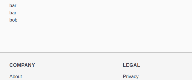
                  Output in Alpine.js v2:

                  Output in Alpinejs v2

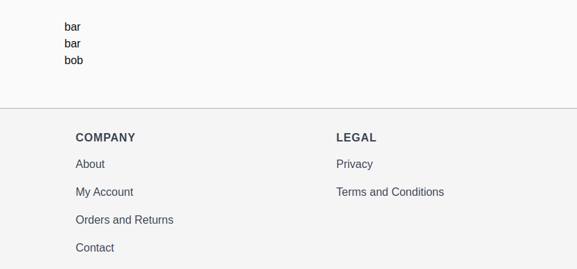
                  Output In Alpine.js v3:

                  With Alpine.js v3, this works as expected, and there’s no need for any additional adjustments.

                  Output In Alpinejs v3

                  So, how can we work around this limitation? Don’t worry; please check the different approaches below to overcome this constraint.

                  • Storing shared state on a parent element data attribute
                  • Sharing state with events
                  • Sharing state through a global variable
                  • Calling parent scope methods

                  Let’s go through each of these approaches one by one.

                  New to Hyvä?? Learn about the Hyvä Theme from basics!

                  Storing shared state on a parent element data attribute

                  This approach utilizes the DOM to store shared data. It is likely the simplest solution, and if it fits your use case, we recommend following this pattern.

                  Please check the below example:

                  <div x-data="{ foo: 'bar' }">
                    <span x-text="foo"><!-- Will output: "bar" --></span>
                  
                    <div :data-foo="foo">
                        <div x-data="{ bar: 'baz', parentFoo: null}" x-init="parentFoo = $el.parentElement.dataset.foo">
                            <span x-text="parentFoo"><!-- Will output: "bar" --></span>
                  
                            <div x-data="{ foo: 'bob' }">
                                <span x-text="foo"><!-- Will output: "bob" --></span>
                            </div>
                        </div>
                    </div>
                  </div>

                  In this example, I declare the parent component with x-data=”{ foo: ‘bar’ }”. Next, I set the value of the ‘foo’ property in the div data attribute using :data-foo=”foo”.

                  Subsequently, I pass this value to the child component using x-init=”parentFoo = $el.parentElement.dataset.foo”. This allows me to access the parent component’s value in the child component using the parentFoo property.

                  Output

                  parent component's value in the child component

                  Examples with iterate over some objects:

                  <script>
                    'use strict';
                    function initDatasetExample() {
                        return {
                            items: [
                                {sku: 'Item A', price: 10, isSalable: true},
                                {sku: 'Item B', price: 7, isSalable: true},
                                {sku: 'Item C', price: 5, isSalable: false},
                            ]
                        };
                    }
                  </script>
                  <div x-data="initDatasetExample()">
                    <h2>Nested Components with dataset</h2>
                    <template x-for="item in items">
                        <div :data-item="JSON.stringify(item)">
                            <div x-data="{open: false, item: null}"
                                 x-init="item = JSON.parse($el.parentElement.dataset.item)"
                                 class="mb-1">
                                <button type="button" class="btn mb-1" @click="open = !open" x-text="`Show ${item.sku}`"></button>
                                <template x-if="open">
                                    <table class="my-4">
                                        <tr>
                                            <th class="text-left">SKU</th>
                                            <td x-text="item.sku"></td>
                                        </tr>
                                        <tr>
                                            <th class="text-left">Price</th>
                                            <td x-text="hyva.formatPrice(item.price)"></td>
                                        </tr>
                                        <tr>
                                            <th class="text-left">Salable?</th>
                                            <td x-text="item.isSalable ? 'In Stock' : 'Out of Stock'"></td>
                                        </tr>
                                    </table>
                                </template>
                            </div>
                        </div>
                    </template>
                  </div>

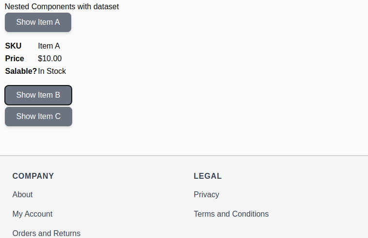
                  Output:

                  iterate over some objects

                  Sharing state with events

                  This approach employs an events-based mechanism to assign consecutive values to nested components. Please refer to the example below.

                  <script>
                    'use strict';
                  
                    function initEventsExample() {
                        return {
                            items: [
                                {sku: 'Item D', price: 10, isSalable: true},
                                {sku: 'Item E', price: 7, isSalable: true},
                                {sku: 'Item F', price: 5, isSalable: false},
                            ]
                        };
                    }
                  </script>
                  <div x-data="initEventsExample()">
                    <h2>Nested Components with events</h2>
                    <div class="prose">This solution uses the single threaded nature of JavaScript to assign consecutive values</div>
                    <template x-for="item in items">
                        <div>
                            <div x-data="{open: false, item: {}, receiveItem($event) {
                                if (! this.item.sku) {
                                    this.item = $event.detail.item;
                                    $event.stopPropagation();
                                }
                            }}"
                                 @next-item.window="receiveItem($event)">
                                <button type="button" class="btn mb-1" @click="open = !open" x-text="`Show ${item.sku}`"></button>
                                <template x-if="item && open">
                                    <table class="my-4">
                                        <tr>
                                            <th class="text-left">SKU</th>
                                            <td x-text="item.sku"></td>
                                        </tr>
                                        <tr>
                                            <th class="text-left">Price</th>
                                            <td x-text="hyva.formatPrice(item.price)"></td>
                                        </tr>
                                        <tr>
                                            <th class="text-left">Salable?</th>
                                            <td x-text="item.isSalable ? 'In Stock' : 'Out of Stock'"></td>
                                        </tr>
                                    </table>
                                </template>
                            </div>
                            <div x-text="$dispatch('next-item', {item: item})"></div>
                        </div>
                    </template>
                  </div>

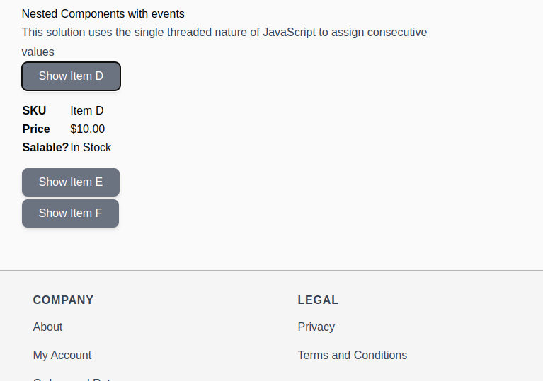
                  Output:

                  Nested Components with events

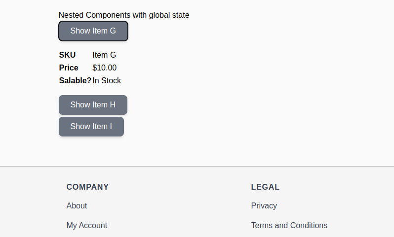
                  Sharing state through a global variable

                  This approach utilizes a global state object and an array-based ordering of items to access the relevant records. Please check the example of this approach.

                  It can also work well in cases where the shared state is modified and needs to still be accessible by both the parent and the child component.

                  <script>
                    'use strict';
                    function initGlobalExample() {
                        if (! window.globalSharedStateExample) {
                            window.globalSharedStateExample = {};
                        }
                        window.globalSharedStateExample.items = [
                            {sku: 'Item G', price: 10, isSalable: true},
                            {sku: 'Item H', price: 7, isSalable: true},
                            {sku: 'Item I', price: 5, isSalable: false},
                        ];
                        return {
                            items: window.globalSharedStateExample.items
                        };
                    }
                  </script>
                  <div x-data="initGlobalExample()">
                    <h2>Nested Components with global state</h2>
                    <template x-for="item in items">
                        <div x-data="{open: false, item: {}}"
                            <?php // previous siblings: <h2> and <template>. We subtract 2 to get array index for current item ?>
                             x-init="item = window.globalSharedStateExample.items[Array.from($el.parentElement.children).indexOf($el) -2]">
                            <button type="button" class="btn mb-1" @click="open = !open" x-text="`Show ${item.sku}`"></button>
                            <template x-if="open">
                                <table class="my-4">
                                    <tr>
                                        <th class="text-left">SKU</th>
                                        <td x-text="item.sku"></td>
                                    </tr>
                                    <tr>
                                        <th class="text-left">Price</th>
                                        <td x-text="hyva.formatPrice(item.price)"></td>
                                    </tr>
                                    <tr>
                                        <th class="text-left">Salable?</th>
                                        <td x-text="item.isSalable ? 'In Stock' : 'Out of Stock'"></td>
                                    </tr>
                                </table>
                            </template>
                        </div>
                    </template>
                  </div>

                  Output:

                  Nested Components with global state

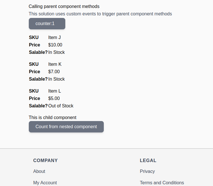
                  Calling parent scope methods

                  This can be easily achieved using events. Please refer to the example below.

                  <script>
                    'use strict';
                  
                    function initMethodCallExample() {
                        return {
                            counter: 0,
                            count() {
                                this.counter++;
                            },
                            items: [
                                {sku: 'Item J', price: 10, isSalable: true},
                                {sku: 'Item K', price: 7, isSalable: true},
                                {sku: 'Item L', price: 5, isSalable: false},
                            ]
                        };
                    }
                  </script>
                  <div x-data="initMethodCallExample()" @count="count()">
                    <h2>Calling parent component methods</h2>
                    <div class="prose">This solution uses custom events to trigger parent component methods</div>
                    <span class="btn w-32" x-text="'counter:' + counter"></span>
                    <template x-for="item in items">
                        <div>
                            <table class="my-4">
                                <tr>
                                    <th class="text-left">SKU</th>
                                    <td x-text="item.sku"></td>
                                </tr>
                                <tr>
                                    <th class="text-left">Price</th>
                                    <td x-text="hyva.formatPrice(item.price)"></td>
                                </tr>
                                <tr>
                                    <th class="text-left">Salable?</th>
                                    <td x-text="item.isSalable ? 'In Stock' : 'Out of Stock'"></td>
                                </tr>
                            </table>
                        </div>
                    </template>
                    <div x-data="{title: 'This is child component'}">
                        <h2 x-text="title"></h2>
                        <button type="button" class="btn" @click="$dispatch('count')">Count from nested component</button>
                    </div>
                  </div>

                  Output:

                  calling parent component methods

                  With the above approach, you can access the properties and call the functions of the parent component in Alpine.js v2 from the child component.

                  More resources on Hyva themes:

                  What is the Hyvä UI Library?

                  Hyvä UI Library is a collection of pre-designed user interface elements that can be easily integrated into Hyvä Themes. This UI Library likely provides ready-to-use components, templates, or styles to enhance the user interface of websites built with Hyvä Themes.

                  Hyvä UI is a Library: It implies a collection of UI elements, possibly including components like Header, Footer, accordion, banners, etc., designed to work seamlessly with Hyvä Themes.

                  Ready-to-Use Elements: The library offers elements ready to be used without extensive customization. Developers can simply copy and paste these elements into their Hyvä Themes.

                  Available for Hyvä Theme License Holders: Access to the UI Library might be restricted or provided as a bonus for those with a valid Hyvä Theme license.

                  More details can be found on the Hyvä UI page and the release announcement

                  This approach is common in web development where UI libraries or component libraries provide a consistent and efficient way to build user interfaces, saving time and effort for developers.

                  Instead of plain HTML templates though, Hyva Team provides fully functional .phtml files with all the logic required to make the elements work on your Magento store, built with Hyvä.

                  New to Hyvä?? Learn about the Hyvä Theme from scratch!

                  How to use this UI Library?

                  Explore the complete set of components either in the PDF overview or through the Figma Community (refer to the section below).

                  Every individual component is located within the ./components/ directory, accompanied by a dedicated README.md file in its respective folder, offering precise instructions.

                  To integrate most components into your Hyvä theme, you’ll need to copy the template file. At times, minor adjustments to the Tailwind CSS configuration, a CSS file, or Layout/Theme XML might be necessary. Thoroughly review the Readme for each component to understand specific requirements closely.

                  Some components are built to be pasted directly into your Magento admin panel, using the Hyvä CMS JIT compiler.

                  If you have not created a child theme then you need to, first follow the instructions to create your Child Theme via our documentation.

                  This is not a Magento Module, Even though you can download Hyvä UI via Private Packagist (if you are a Hyvä Theme licensee), this repository is not a Magento Module. You can download it as a resource and then copy/paste individual components into your custom Hyvä Theme.

                  You shouldn’t copy all the Hyvä UI components into your project’s code base, as it would have some unwanted side effects:

                  • More Tailwind CSS classes would be generated than needed, bloating your styles.css file.
                  • In the future, the Hyva Team might remove, rename, or change components in a backward incompatible manner, breaking your site.
                  • The idea is really to copy the templates into your project and adjust them as needed for a given Magento store.

                  Installation process

                  The Hyvä UI library is not designed for installation as a project dependency. Instead, you should individually copy components into your theme and customize them according to your requirements.

                  To ensure exclusive access to the Hyvä UI for Hyvä license holders, access to the components is granted through Composer:

                  1). If you’ve got the Hyvä Theme Packagist key configured in your project, just run this composer command:


                  Copy Code
                  composer require --dev hyva-themes/hyva-ui

                  Or, for Hyvä Theme V1.1.X (using Tailwind CSS and AlpineJS version 2):


                  Copy Code
                  composer require --dev hyva-themes/hyva-ui:1.0.0

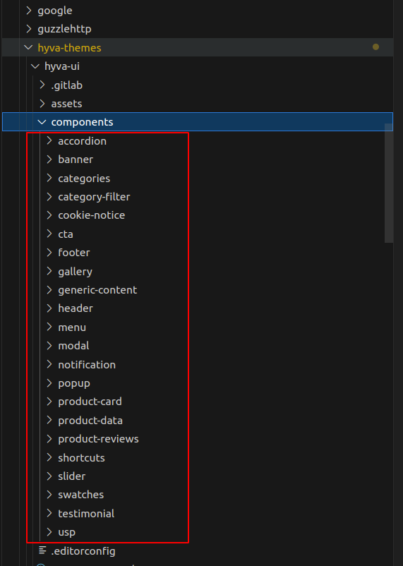
                  Here you can see all components on this path: vendor/hyva-themes/hyva-ui/components

                  component path

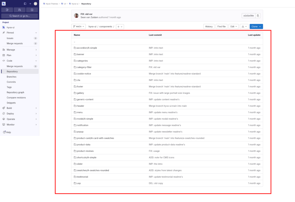
                  2). If you have a Hyvä-Themes license and GitLab access as a partner/contributor, you can find the UI Elements here.

                  You can see the available components on the above links and the attached below screenshot for reference: 

                  UI elements in Hyva-themes

                  Usage

                  Each component has a dedicated README.md file in its folder with component-specific usage instructions.

                  For most components, using them only requires the template file to be copied into your Hyvä theme, possibly followed by some tailwind configuration adjustments.

                  Usage – CMS

                  1. Ensure you’ve installed CMS Tailwind JIT module in your project

                  2. Copy the contents from `cms-content` into your CMS page or Block

                  3. Adjust the content and code to fit your own needs and save

                  4. Refresh the cache

                  Usage – Template

                  1. Copy or merge the following files/folders into your theme:

                     Ex : *`Magento_Cms/templates/elements/banner-a.phtml`

                  2. Adjust the content and code to fit your own needs and save

                  3. Create your development or production bundle by running `npm run watch` or `npm run build-prod` in your theme’s tailwind directory

                  How to Make a Banner Section on the Home page using Files?

                  • Create an app/design/frontend/Your_Vendor/Your_Theme/Magento_Cms/templates/elements/banner-a.phtml file in your active Hyvä theme and copy the below content in this file.

                  You need to copy and paste the required files into your current Hyva theme. 


                  Copy Code
                  <?php
                  declare(strict_types=1);
                  
                  use Magento\Framework\Escaper;
                  use Magento\Framework\View\Element\Template;
                  
                  /** @var Template $block */
                  /** @var Escaper $escaper */
                  
                  $imageUrl = "https://unsplash.com/photos/F7D7oWb8aO0/download?force=true&auto=format&fit=crop&w=1200&q=80";
                  // Or, get an image from `web/images/` in your theme:
                  // $imageUrl = $escaper->escapeHtmlAttr($block->getViewFileUrl('images/banner.jpg'));
                  ?>
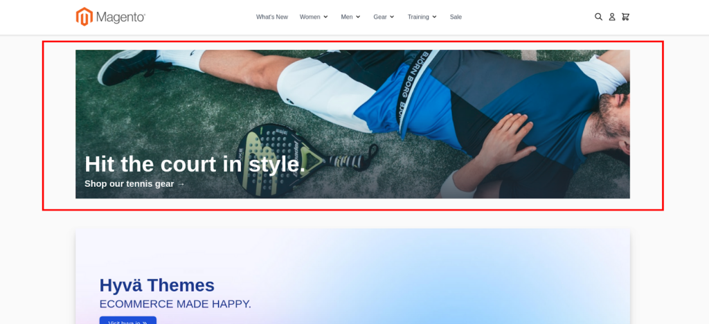
                  <div class="relative my-2 h-[600px] sm:h-[500px] md:h-[400px]">
                     <img class="absolute w-full h-full object-cover"
                          alt="Hit the court in style"
                          src="<?= $escaper->escapeHtmlAttr($imageUrl) ?>"
                          width="1200"
                          height="800"
                          loading="lazy"
                     />
                     <div class="absolute bottom-0 w-full p-6 pt-28 bg-gradient-to-t to-transparent from-gray-800/75">
                         <div class="mb-2 text-white text-6xl leading-none font-bold"><?= $escaper->escapeHtml(__('Hit the court in style.')) ?></div>
                         <a href="<?= $escaper->escapeUrl($block->getUrl('home')) ?>" class="block text-white text-2xl leading-8 font-semibold"><?= $escaper->escapeHtml(__('Shop our tennis gear →')) ?></a>
                     </div>
                  </div>
                  • Call this section anywhere on the home page.

                  Now, create an app/design/frontend/Your_Vendor/Your_Theme/layout/cms_index_index.xml

                  file in your active Hyvä theme and copy the below content in this file.


                  Copy Code
                  <page xmlns:xsi="http://www.w3.org/2001/XMLSchema-instance" xsi:noNamespaceSchemaLocation="urn:magento:framework:View/Layout/etc/page_configuration.xsd">
                     <body>
                         <referenceContainer name="content">
                             <block name="banner-a" template="Magento_Cms::elements/banner-a.phtml" before="hero" />
                         </referenceContainer>
                     </body>
                  </page>

                  Your directory structure might look something like this:


                  Copy Code
                  app/design/frontend/Your_Vendor/Your_Theme/
                  |-- layout/
                     |-- cms_index_index.xml
                  |-- templates/
                  |   |-- elements/
                  |   |   |-- content-1.phtml
                  • Adjust the content and code to fit your own needs and save
                  • Create your development or production bundle by running `npm run watch` or `npm run build-prod` in your theme’s tailwind directory.

                  Execute the build script using the following command on this path: app/design/frontend/Your_Vendor/Your_Theme/web/tailwind/

                  For Developer mode, run the below command: 


                  Copy Code
                  npm run watch

                  For Production mode, run the below command : 


                  Copy Code
                  npm run build-prod 
                  • Last step is to run the below command on this path: app/design/frontend/Your_Vendor/Your_Theme/


                  Copy Code
                  php bin/magento setup:upgrade && php bin/magento c:f

                  Remember to clear your Magento cache after making these changes to ensure the new styles are applied. 

                  You can check the banner output:

                  Magento cache banner output

                  Conclusion

                  By adopting a copy-and-paste integration method and allowing individual component customization, developers gain flexibility and control over the design process. 

                  This approach minimizes potential issues associated with unnecessary code generation and ensures that the use of Hyvä UI components remains exclusive to license holders, fostering a seamless and user-friendly experience in building sophisticated and visually appealing Hyvä Themes.

                  Read more resources on Hyva themes:

                  1. Check out the InstaBuild for Hyvä Themes: Ready-made Hyva theme templates for faster storefront development!
                  2. Hyva Themes Development – For Online Merchants
                  3. Hyvä Theme Benefits that your store needs
                  4. 10 Best Hyva Compatibility Extension Providers For Magento 2 Stores
                  5. Hyvä VS PWA: Where to Invest?
                  6. How a Slow Magento Website Can Cost You Advertising Dollars
                  7. Mobile Commerce: How Hyva Themes Boost Mobile Conversions

                  In this article, we will address a common challenge faced by Magento 2 Hyva Theme users: the Checkout Button is not working on the cart page and mini cart page. We’ll walk you through the steps to identify and resolve the issue, ensuring a seamless checkout experience for your customers.

                  If the checkout button is not working in the cart or the mini-cart, the reason is probably that the authentication-popup block was removed from the header-content.

                  How does the checkout button work?

                  Clicking the checkout buttons dispatches an event toggle-authentication, which is processed by the authentication-popup block template.

                  The Magento_Customer/templates/account/authentication-popup.phtml template triggers a login form before redirecting to the cart if guest checkout is disabled.

                  The authentication-popup block is declared in Magento_Customer/layout/default.xml

                  <block class="Magento\Customer\Block\Account\Customer" name="authentication-popup"
                         as="authentication-popup"
                         template="Magento_Customer::account/authentication-popup.phtml"/>

                  The authentication-popup template is rendered by the parent template Magento_Theme/templates/html/header.phtml.

                  New to Hyvä?? Learn about the Hyvä Theme from basics!

                  How do I find out if I’m missing the authentication-popup?

                  To check if the authentication-popup block is missing, compare the Magento_Theme/templates/html/header.phtml template in your theme to the original at

                  vendor/hyva-themes/magento2-default-theme/Magento_Theme/templates/html/header.phtml

                  The template in your theme is probably missing the line given below:

                  <?= $block->getChildHtml('authentication-popup'); ?>

                  Delving into Frontend Scripts

                  Beyond the authentication-popup block and JavaScript events, frontend scripts responsible for handling the checkout button’s behavior could be playing a role in its unresponsiveness. Here’s a step-by-step guide to delve into and potentially resolve the issue:

                  Troubleshooting Steps

                  Step 1: Locate the Checkout Button Script

                  Access your Hyva theme’s frontend scripts directory, often found in app/design/frontend/[Vendor]/[Theme]/web/js.

                  Step 2: Identify the Checkout Button Handling Script

                  Look for the script that manages the checkout button’s behavior. This script might be specific to your theme or customization.

                  Step 3: Review Script Logic

                  Open the identified script and review the logic related to the checkout button. Pay attention to any conditions, functions, or event listeners associated with its functionality.

                  Step 4: Verify Dependencies

                  Confirm that the script has all the necessary dependencies, especially those related to the checkout process. Check for any missing or conflicting dependencies that might impact the checkout button.

                  Step 5: Check for Theme Compatibility

                  Ensure that the script is compatible with the Hyva theme. Theme updates or changes might introduce compatibility issues, so it’s crucial to adapt the script accordingly.

                  Step 6: Debugging with Console Logs

                  Insert console log statements at relevant points in the script to track its execution. Check the browser console for any error messages or unexpected behaviors when interacting with the checkout button.

                  Step 7: Recompile and Clear Cache

                  After making adjustments to the script, recompile your assets and clear the Magento cache to apply the changes.

                  The steps end here. Hope it was helpful!

                  Let me know if you have any questions in the comment below.

                  More resources on Hyva themes:

                  Icons play a crucial role in web design, providing visual cues and enhancing the user experience. In the case of Hyvä, a modern Magento 2 theme, the Hyvä SVG Icon Extensions offer a powerful and flexible way to incorporate scalable vector icons into your website. 

                  In this blog post, we will explore the steps involved in installing and using the Hyvä SVG Icon Extensions to enhance your Hyvä theme.

                  The Hyvä SVG Icon Extensions are a set of extensions specifically designed for the Hyvä theme. They allow you to easily add and manage scalable vector icons in your Hyvä-powered website. These extensions provide a wide range of icons that can be customized and styled to match your brand’s aesthetics.

                  Hyvä SVG Icon Extensions

                  Hyvä already includes both the Outline and Solid versions of the  Heroicons v1 SVG icon pack.

                  On this blog, we gather links to additional icon packs.

                  For Icons packs, visit: https://github.com/topics/hyva-icons.

                  How to install Payment Icons

                  This Magento 2 module adds the option to use Payment Icons in your Hyva frontend.

                  This requires that you have a working Hyva frontend, this icon pack was made specifically for Hyva Themes and will not work out of the box with any other frontend.

                  This feature has been supported since Hyva v1.1.12.

                  Install the theme package:

                   composer require siteation/magento2-hyva-icons-payment

                  Next, run the Magento installer:

                   php bin/magento setup:upgrade

                  New to Hyvä?? Learn about the Hyvä Theme from basics!

                  How to use Payment Icons

                  Respectively the `PaymentIcons`, `PaymentIconsMono`, and `PaymentIconsFlat` ViewModels, are located in `Siteation\HyvaIconsPayment\ViewModel\`.

                  To use this icon pack instead of the default Hyva icons, add the following code to your phtml file:

                  <?php
                  use Hyva\Theme\Model\ViewModelRegistry;
                  /** @var ViewModelRegistry $viewModels */
                  /* Start For Payment Default icons*/
                  use Siteation\HyvaIconsPayment\ViewModel\PaymentIcons;
                  /** @var PaymentIcons $paymentIcons */
                  $paymentIcons = $viewModels->require(PaymentIcons::class);
                  /* End For Payment Default icons*/
                  /* Start For Payment Flat icons*/
                  use Siteation\HyvaIconsPayment\ViewModel\PaymentIconsFlat;
                  /** @var PaymentIconsFlat $paymentIconsFlat */
                  $paymentIconsFlat = $viewModels->require(PaymentIconsFlat::class);
                  /* End For Payment Flat icons*/
                  ?>

                  And similarly, use the Payment Icons as the HeroIcons in Hyva.

                  <?= $paymentIcons->idealHtml('p-1', 64, 48, ["aria-label" => "Pay with iDeal"]) ?>
                  <?= $paymentIcons->maestroHtml('p-1', 64, 48, ["aria-label" => "Pay with maestro"]) ?>
                  <?= $paymentIconsFlat->klarnaHtml('p-1', 64, 48, ["aria-label" => "Pay with klarna"]) ?>
                  <?= $paymentIconsFlat->paypalHtml('p-1', 64, 48, ["aria-label" => "Pay with PayPal", "aria-hidden" => "true"]) ?>

                  Your preview looks like the screenshot below.

                  HeroIcons in Hyva Preview

                  Note: Make sure, if you use the payment icon through CMS static block then there is no need to install any other icons module. Because payment icons will not work.

                  How to install and use heroicons2

                  Then, install the theme package:

                  composer require hyva-themes/magento2-heroicons2

                  Next, run the Magento installer:

                  There are currently 3 implementations: solidoutline and mini.

                  Respectively the `Heroicons2Solid`, `Heroicons2Outline`, and `Heroicons2Mini` ViewModels, are located in `Hyva\Heroicons2\ViewModel`.

                  The available icon render methods can be found at `vendor/hyva-themes/magento2-heroicons2/src/ViewModel/Heroicons2Interface.php`

                  /* For Heroicons2 Outline */
                  
                  $heroicons2 = $viewModels->require(\Hyva\Heroicons2\ViewModel\Heroicons2Outline::class);
                  
                  /* For Heroicons2 Solid */
                  
                  $heroicons2Solid = $viewModels->require(\Hyva\Heroicons2\ViewModel\Heroicons2Solid::class)

                  and use the HeroIcons2 in a similar manner as the HeroIcons in Hyva;

                  <?= $heroicons2->userCircleHtml('h-6 w-6 text-slate-800 hover:text-black', 32, 32); ?>
                  
                  <?= $heroicons2Solid->shoppingCartHtml('h-6 w-6 text-slate-800 hover:text-black', 32, 32); ?>

                  Your preview looks like the screenshot below.

                  HeroIcons2 In Hyva

                  How to use heroicons2 icons in Magento admin CMS content in Hyvä

                  The icons can also be rendered in CMS content, using the `{{icon}}` directive. Find the path of the SVG inside `vendor/hyva-themes/magento2-heroicons2/src/view/frontend/web/svg/`, and remove the `.svg` at the end.

                  {{icon "heroicons2/24/solid/shopping-cart" classes="w-6 h-6" width=12 height=12}}
                  
                  {{icon "heroicons2/24/outline/academic-cap" classes="w-6 h-6" width=12 height=12}}

                  Hyvä Themes – Heroicons 2 Gitlab.

                  How to install and use Awesome Hyvä

                  The awesome Hyvä extension by JaJuMa enables the use of Font Awesome 5 & Font Awesome 6 icons as SVGs on Magento 2 & Mage-OS sites with Hyvä Themes.

                  Then, install the theme package:

                  composer require jajuma/awesomehyva

                  Next, run the Magento installer:

                  Require one of the view models in your template:

                  JaJuMa “Awesome Hyvä” module provides 3 view models for Font Awesome v5:

                  • For Font Awesome v5:
                  • AwesomeiconsSolid
                  • AwesomeiconsRegular
                  • AwesomeiconsBrands

                  For Font Awesome v5 Awesome icons Solid:

                  /** @var \Jajuma\AwesomeHyva\ViewModel\AwesomeiconsSolid $awesomeiconsSolid */
                  
                  $awesomeiconsSolid = $viewModels->require(\Jajuma\AwesomeHyva\ViewModel\AwesomeiconsSolid::class);

                  For Font Awesome v5 Awesome icons Regular:

                  /** @var \Jajuma\AwesomeHyva\ViewModel\AwesomeiconsRegular $awesomeiconsRegular */
                  
                  $awesomeiconsRegular = $viewModels->require(\Jajuma\AwesomeHyva\ViewModel\AwesomeiconsRegular::class); 

                  For Font Awesome v5 Awesome icons Brands:

                  /** @var \Jajuma\AwesomeHyva\ViewModel\AwesomeiconsBrands $awesomeiconsBrands */
                  
                  $awesomeiconsBrands = $viewModels->require(\Jajuma\AwesomeHyva\ViewModel\AwesomeiconsBrands::class);

                  JaJuMa “Awesome Hyvä” module provides 3 view models for Font Awesome v6:

                  • For Font Awesome v6:
                  • AwesomeiconsSolid
                  • AwesomeiconsRegular
                  • AwesomeiconsBrands

                  For Font Awesome v6 Awesome icons Solid:

                  /** @var \Jajuma\AwesomeHyva\ViewModel\Awesomeicons6Solid $awesomeicons6Solid */
                  
                  $awesomeicons6Solid = $viewModels->require(\Jajuma\AwesomeHyva\ViewModel\Awesomeicons6Solid::class);

                  For Font Awesome v6 Awesome icons Regular:

                  /** @var \Jajuma\AwesomeHyva\ViewModel\Awesomeicons6Regular $awesomeicons6Regular */
                  
                  $awesomeicons6Regular = $viewModels->require(\Jajuma\AwesomeHyva\ViewModel\Awesomeicons6Regular::class);

                  For Font Awesome v6 Awesome icons Brands:

                  /** @var \Jajuma\AwesomeHyva\ViewModel\Awesomeicons6Brands $awesomeicons6Brands */
                  
                  $awesomeicons6Brands = $viewModels->require(\Jajuma\AwesomeHyva\ViewModel\Awesomeicons6Brands::class);

                  Then render the icons like this:

                  <?= $awesomeiconsSolid->addressBookHtml('text-black-500', 24, 24) ?>
                  
                  <?= $awesomeiconsRegular->addressBookHtml('text-black-500', 24, 24) ?>

                  Or you may also pass additional attributes like this as an array:

                  <?= $awesomeicons6Solid->addressBookHtml('text-black-500', 24, 24, ['style'=>'position:relative']) ?>
                  
                  <?= $awesomeicons6Regular->addressBookHtml('text-black-500', 24, 24, ['style'=>'position:relative']) ?>

                  Your preview looks like the screenshot below.

                  brand icon preview

                  How to use Font Awesome icons in Hyvä Themes in CMS content

                  The Awesome Hyvä module adds an icon directive to render icons in filtered content, such as CMS blocks or pages. This allows you to add icons in text/code blocks using the following syntax:

                  {{icon "awesomeicons/solid/address-book" classes="text-black-500" width=24 height=24}}
                  
                  {{icon "awesomeicons6/solid/address-book" classes="text-black-500" width=24 height=24}}

                  Font Awesome 5 & 6 SVG icons for Hyvä Themes Demo are available with both list view and detail view. You can copy and paste the code to use the icons in your project.

                  Awesome Hyvä by JaJuMa Github.

                  You can also install the following icons in your Hyvä theme:

                  Conclusion

                  In conclusion, the Hyvä SVG Icon Extensions is a valuable tool for developers and designers working with the Hyvä-themed Magento stores. It simplifies the management and usage of SVG icons, providing a seamless integration with the Hyvä framework. By following the installation and usage instructions outlined in this blog post, you can enhance your web projects with high-quality SVG icons and improve the overall user experience.

                  More resources on Hyva themes:

                  Tailwind CSS is a popular utility-first CSS framework that allows developers to rapidly build modern and responsive user interfaces. It provides a wide range of pre-built utility classes that can be easily customized to create unique designs. 

                  However, one challenge that developers often face is ensuring that their Tailwind CSS-based websites are compatible with older browser versions. In this article, we will explore how to support Tailwind CSS in older browser versions of the Hyvä theme.

                  As of the current moment, the incorporated Alpine.js version in Hyvä 1.3.0 is 3.12.3, which extends compatibility to Safari on iOS versions 12.2 (rolled out on 2019-03-25) and more recent iterations.

                  It’s worth noting that for the Tailwind CSS classes employed by Hyvä, the requisite Safari version on iOS is 14.5, which became available on 2021-04-21.

                  Native Alpine.js 3.12.3 vs the Hyvä Bundle

                  The original Alpine.js 3.12.3 inherently caters to Safari on iOS 13.4 (unveiled on 2020-03-24) due to its utilization of the Nullish coalescing operator.

                  However, in the case of Hyvä 1.2.6, it incorporates a modified iteration of Alpine.js that extends support to Safari on iOS 12.2.

                  Enabling compatibility with earlier versions necessitates the implementation of JavaScript polyfills for specific methods and the revision of Tailwind classes within templates.

                  New to Hyvä?? Learn about the Hyvä Theme from basics!

                  Alpine and Tailwind v2 versions of Hyvä

                  The most straightforward approach to accommodate older browsers is to base your development on a Hyvä version that integrates Alpine.js and Tailwindcss v2. As of the current writing, the most recent release featuring Alpine.js and Tailwind v2 is 1.1.25.

                  No Support

                  Kindly note that support for Hyvä releases in the 1.1.x series has been discontinued. Ongoing development and new features are exclusively tailored for versions that leverage Alpine v3 and Tailwind v3.

                  Nevertheless, opting for an older Hyvä release could be a viable decision, particularly when older browser support is essential, and the existing feature set adequately meets your requirements.

                  In general, Tailwind CSS v3.0 is designed for and tested on the latest stable versions of Chrome, Firefox, Edge, and Safari. However, it does not support any version of Internet Explorer, including IE 11.

                  queueMicrotask

                  Incorporating a polyfill for queueMicrotask will broaden compatibility to include Safari on iOS 12.0.

                  For example: 

                  <script>
                  if (typeof window.queueMicrotask !== 'function') {
                      window.queueMicrotask = function(callback) {
                          Promise.resolve()
                              .then(callback)
                              .catch(e => setTimeout(() => {
                                  throw e;
                              }));
                      };
                  }
                  </script>

                  Array flat and flatMap

                  Integrating a polyfill for Array.prototype.flat and Array.prototype.flatMap will expand compatibility to encompass even earlier versions of Safari on iOS.

                  For example: 

                  <script>
                  if (!Array.prototype.flat) {
                      Object.defineProperty(Array.prototype, 'flat', {
                          configurable: true,
                          value: function flat () {
                              var depth = isNaN(arguments[0]) ? 1 : Number(arguments[0]);
                  
                              return depth ? Array.prototype.reduce.call(this, function (acc, cur) {
                                  if (Array.isArray(cur)) {
                                      acc.push.apply(acc, flat.call(cur, depth - 1));
                                  } else {
                                      acc.push(cur);
                                  }
                  
                                  return acc;
                              }, []) : Array.prototype.slice.call(this);
                          },
                          writable: true
                      });
                  }
                  if (!Array.prototype.flatMap) {
                      Object.defineProperty(Array.prototype, 'flatMap', {
                          configurable: true,
                          value: function flatMap (callback) {
                              return Array.prototype.map.apply(this, arguments).flat();
                          },
                          writable: true
                      });
                  }
                  </script>

                  Required CSS changes

                  In conjunction with Alpine.js integration, adjustments are essential for styling purposes as well. Specifically, Hyvä Tailwindcss relies on the gap property within flexbox for styling across various templates, utilizing Tailwind classes such as gap-x-2, gap-x-4, gap-y-0, gap-y-1, gap-y-2, and gap-y-16.It’s important to note that Safari for iOS started supporting the gap property for flexbox from version 14.5, which was released on April 26, 2021.

                  To ensure compatibility with older versions of Safari for iOS, modify the Tailwindcss classes to utilize the space property. For instance, replace gap-x-2 and gap-y-2 with space-x-2 and space-y-2, respectively. This adjustment should be made for every instance where the gap-* classes are employed in conjunction with flex.

                  The Tailwind classes in the form of space-* correspond to the CSS property margin, which enjoys universal support across all versions of Safari on iOS. It is essential to review the layout after each modification and be ready to implement further adjustments if necessary.

                  Adding content to the page <head>

                  To ensure compatibility with older versions, we suggest incorporating the polyfill code directly within the <head> section of your page. To render a template within the <head>, it’s imperative to declare a child for the head.additional block.

                  For example: 

                  <page xmlns:xsi="http://www.w3.org/2001/XMLSchema-instance"
                        xsi:noNamespaceSchemaLocation="urn:magento:framework:View/Layout/etc/page_configuration.xsd"
                  >
                      <body>
                          <referenceContainer name="head.additional">
                              <block name="head.alpinejs.polyfills" 
                                     template="Magento_Theme::page/js/alpinejs-polyfills.phtml"/>
                          </referenceContainer>
                      </body>
                  </page>

                  That’s it !!

                  Thanks & Happy Coding!

                  More resources on Hyva themes:

                  In today’s article, I will explain to you how to create nested popups in Hyva Theme

                  Steps to Open Hyvä  Nested Popup Dialog in Magento 2

                  Step 1: Setting up the Layout for Magento 2 Hyva Theme Popup Modal

                  Create the Module Directory:

                  Inside the app/code directory, create a directory for your module. Create Aureatelabs and HyvaNestedPopup

                  app/code/Aureatelabs/HyvaNestedPopup

                  Create Module Registration File:

                  Create a registration.php file in the module directory.

                  
                  # app/code/Aureatelabs/HyvaNestedPopup/registration.php
                  <?php
                  \Magento\Framework\Component\ComponentRegistrar::register(
                      \Magento\Framework\Component\ComponentRegistrar::MODULE,
                      'Aureatelabs_HyvaNestedPopup',
                      __DIR__
                  );

                  Create Module Configuration File:

                  Create a module.xml file in the etc directory of your module.

                  <!-- app/code/[VendorName]/[ModuleName]/etc/module.xml -->
                  <?xml version="1.0" ?>
                  <config xmlns:xsi="http://www.w3.org/2001/XMLSchema-instance" xsi:noNamespaceSchemaLocation="urn:magento:framework:Module/etc/module.xsd">
                      <module name="Aureatelabs_HyvaNestedPopup" setup_version="1.0.0"/>
                  </config>

                  Inside the layout folder, create a default.xml file and add the following code And add the code as follows 

                  app/code/Aureatelabs/HyvaNestedPopup/view/frontend/layout/default.xmlUse block default class (class=”Magento\Framework\View\Element\Template”)

                  <?xml version="1.0" encoding="UTF-8"?>
                  <page layout="3columns" xmlns:xsi="http://www.w3.org/2001/XMLSchema-instance"
                     xsi:noNamespaceSchemaLocation="urn:magento:framework:View/Layout/etc/page_configuration.xsd">
                     <body>
                   <referenceContainer name="content">
                         <block class="Magento\Framework\View\Element\Template" name="nested-popup"  after="-"
                             template="Aureatelabs_HyvaNestedPopup::nested-popup.phtml" />
                     </body>
                  </referenceContainer>
                  </page>

                  Step 2: Creating the Template for Magento 2 Hyva Theme  Popup Modal

                  To generate a template for a Magento 2 popup modal within the Hyva Theme, proceed as follows:
                  1. Establish a template directory at the subsequent location: app/code/Aureatelabs/HyvaNestedPopup/view/frontend/templates/

                  2. Integrate nested-popup.phtml file into the templates directory and inject the provided code.

                  <?php
                  $heroicons = $viewModels->require(\Hyva\Theme\ViewModel\HeroiconsOutline::class);
                  $modal = $viewModels->require(\Hyva\Theme\ViewModel\Modal::class)
                     ->createModal()
                     ->withDialogRefName('popup-dialog')
                     ->withContent('
                         <div class="w-2/3 h-px max-w-1xl md:h-auto">
                             <div class="absolute top-4 right-4 rounded-t dark:border-gray-600">
                                 <button @click="hideModal" type="button" class="h-10 w-10 rounded-full bg-gray-200 p-2">' . $heroicons->renderHtml('x') . '</button>
                             </div>
                       
                             <!-- Modal body -->
                             <div class="p-6 space-y-6">
                                 <h1>What is Lorem Ipsum?
                                     Lorem Ipsum is simply dummy text of the printing and typesetting industry. Lorem Ipsum has been the industry\'s standard dummy </h1>
                             </div>
                             <button @click="nestedOpenModal">Open another nested Modal</button>
                         </div>'
                     )->addDialogClass('relative sm:w-1/2 md:w-1/2 lg:w-1/3 xl:1/3 2xl:1/3', 'm-2');
                  
                  $nestedModal = $viewModels->require(\Hyva\Theme\ViewModel\Modal::class)
                     ->createModal()
                     ->withDialogRefName('popup-dialog')
                     ->withContent('
                         <div class="w-2/3 h-px max-w-1xl md:h-auto">
                             <div class="absolute top-4 right-4 rounded-t dark:border-gray-600">
                                 <button @click="nestedHideModal" type="button" class="h-10 w-10 rounded-full bg-gray-200 p-2">' . $heroicons->renderHtml('x') . '</button>
                             </div>
                       
                             <!-- Modal body -->
                             <div class="p-6 space-y-6">
                                 <h1>Why do we use it?
                                     It is a long established fact that a reader will be distracted by the readable content of a page when looking at its layout.</h1>
                             </div>
                         </div>'
                     )->addDialogClass('relative sm:w-1/2 md:w-1/2 lg:w-1/3 xl:1/3 2xl:1/3', 'm-2');
                  ?>
                  
                  <div x-data="{
                     showModal: false,
                     nestedShowModal: false,
                     hideModal() {
                         this.showModal = false;
                     },
                     nestedHideModal() {
                         this.nestedShowModal = false;
                     },
                     openModal() {
                         this.showModal = true;
                     },
                     nestedOpenModal() {
                         this.nestedShowModal = true;
                     }
                  }" x-init="init()">
                     <button @click="openModal">Open nested Modal</button>
                     <template x-if="showModal">
                         <?= $modal ?>
                     </template>
                     <template x-if="nestedShowModal">
                         <?= $nestedModal ?>
                     </template>
                  </div>

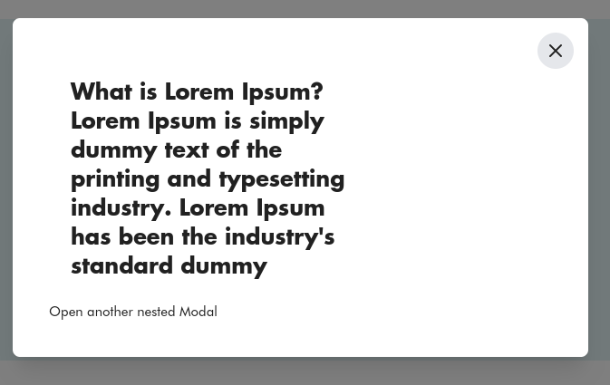
                  This code sets up a two-level nested modal system using the Hyva theme in Magento 2. It includes two modals with distinct content and uses Alpine.js for state management. Clicking buttons toggles the visibility of the main and nested modals, allowing for a nested modal experience.

                  bin/magento setup:upgrade
                  bin/magento setup:di:compile
                  bin/magento c:f

                  For apply CSS changes need to  run (npm run build-prod)  at (app/design/frontend/vendor/module/web/tailwind)

                  Please check its output. “Happy coding”

                  Output : 

                  nested popup output

                  Hope this helps! Let us know if you have any questions in the comments below.

                  More resources on Hyva themes:

                  In today’s article, we will guide you on How to create custom Product detail page (PDP) section cards in Hyva themes.

                  Whenever a user intends to showcase new, additional, or customized product details in distinct sections on the Product Details Page, the PDP section card becomes the appropriate tool for this purpose.

                  Utilizing the layout XML file, we render the block on the product detail page. The significance of the block tag attribute group becomes crucial for displaying the section card on the product detail page.

                  Please follow the below steps to make a detail page section card.

                  Step 1: Initialization

                  • Navigate to the app/design/frontend/Your_Vendor/Your_Theme/Magento_Catalog/layout/ path in your Magento installation directory.
                  • Check if the file named catalog_product_view.xml already exists at the specified location.

                  – If the file exists, open it and put the below code.

                  – If the file doesn’t exist, create a new file or edit with the name catalog_product_view.xml in the specified directory.

                  • Insert the following code.
                  Path: app/design/frontend/Aureatelabs/hyva/Magento_Catalog/layout/catalog_product_view.xml
                  
                  <page layout="1column" xmlns:xsi="http://www.w3.org/2001/XMLSchema-instance" xsi:noNamespaceSchemaLocation="urn:magento:framework:View/Layout/etc/page_configuration.xsd">
                     <referenceBlock name="product.info.details">
                         <block name="my.section"
                                template="Magento_Catalog::product/view/section.phtml"
                                group="detailed_info">
                             <arguments>
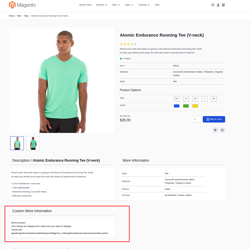
                                 <argument name="title" xsi:type="string" translate="true">Custom More Information</argument>
                                 <argument name="sort_order" xsi:type="number">-10</argument>
                             </arguments>
                         </block>
                     </referenceBlock>
                  </page>
                  • Please don’t forget to mention the group attribute which is highlighted on the above code block.
                  • If you want to add a template file for adding the Product Section Card’s title then you can use title_template argument for it. For more references please check the following:
                  <block name="my.section"
                        template="Magento_Catalog::product/view/section.phtml"
                        group="detailed_info">
                     <arguments>
                         <argument name="title_template" xsi:type="string">Magento_Catalog::product/view/sections/description-title.phtml</argument>
                     </arguments>
                  </block>

                  New to Hyvä?? Learn about the Hyvä Theme from basics!

                  Step 2: Please create a View File for the Product Section Card

                  • Please create a view file for the PDP Section card as mentioned in a layout file Magento_Catalog::product/view/section.phtml

                  I have created the app/design/frontend/Aureatelabs/hyva/Magento_Catalog/templates/product/view/section.phtml file and added the following content on it as per requirements.

                  <h1>Demo section</h1>
                  <h2>Your things are displayed here what you want to display.</h2>
                  <h2>Thank you.</h2>

                  Step 3: Deployment

                  • Please run the deployment on your store and verify your changes. Don’t forget to clear the cache.

                  By following these steps, you should be able to display the view file using the block on the product details page. Adjust the block class, template file, and any other specifics based on your requirements.

                  Here’s the output!

                  deployment on your store

                  Hope this guide helps! Let us know if you have any questions in the comments below.

                  More resources on Hyva themes:

                  In this post, I will be guiding you on how to load External JavaScript to improve page speed scores in Hyva themes.

                  Generally, the main problem with loading external javascript files is that it usually has a negative impact on Google page ranking metrics, such as PageSpeed Insights.

                  This happens because script block rendering slows down the overall and perceived visual page-load of the page. So to increase the page speed, we should defer loading external library/javascript files until they are actually required.

                  Depending on the external library/javascript files, it is best to defer loading until one of the below events.

                  1. User’s interaction with the page (anywhere on the page)
                  2. User interacts with a particular part of the page (For example, clicks on a video ‘play’ button, or opens a modal popup)
                  3. The user scrolls down to a certain part of the page (example given, where the script/library is used on the page)

                  Deferring scripts until a user interacts with the page

                  Many external scripts have nothing to do with the user interface(UI), or user experience(UX), yet they block the rendering process of the page, which will negatively impact page performance.

                  So Instead of loading the external scripts on page load, it is better to defer these scripts/libraries until the user interacts with the page. We can use below kind of scripts like:

                  • Google Tag Manager
                  • Google Analytics
                  • Bing Universal Event Tracking
                  • Facebook Pixel
                  • Digital marketing/email campaign tracking scripts (e.g. Mailchimp)
                  • User monitoring scripts (e.g. HotJar)

                  This is essentially any touch, mouse, or keyboard interaction, which you can listen for using native JavaScript event listeners.

                  A further, unintended benefit to this approach is it helps filter out bots from your analytics, given they don’t make the same interactions as a human user.

                  In Hyva, by default, they have created one init-external-scripts event for deferring scripts until any user interaction.

                  The init-external-scripts event is triggered when any of the standard interaction events (touch start, mouseover, wheel, scroll, key down) are fired, and it also handles the cleanup, so the event is only fired once.

                  Please check the below example of Deferring the GTM script until a user interaction.

                  // The below shows an example of loading Google Tag Manager
                  // However, you could load/run any external script you need here
                  window.addEventListener('init-external-scripts', () => {
                  
                    // Load Google Tag Manager (where `GTM-XXXXXX` is your container ID)
                    (function(w,d,s,l,i){w[l]=w[l]||[];w[l].push({'gtm.start':
                        new Date().getTime(),event:'gtm.js'});var f=d.getElementsByTagName(s)[0], j=d.createElement(s),dl=l!='dataLayer'?'&l='+l:'';j.async=true;j.src='https://www.googletagmanager.com/gtm.js?id='+i+dl;f.parentNode.insertBefore(j,f);
                    })(window,document,'script','dataLayer','GTM-XXXXXX');
                  
                  }, {once: true, passive: true});

                  Given many use cases for these scripts are analytical, on the order success page, the event is fired on page load, rather than waiting for interaction. This is to ensure conversion data is always tracked(even though it’s almost impossible to not interact with the page, including if you are closing the tab/window).

                  Note: The init-external-scripts event is only available in Hyva Themes versions 1.1.20 and 1.2.0 and above. We can’t use this in the earlier version.

                  For compatibility with earlier Hyva versions, we can use the below way to differ scripts until any user interaction. We can also use this approch in the default Magento Luma websites.

                  // differ scripts until any user interaction
                  (events => {
                    const loadMyLibrary = () => {
                      events.forEach(type => window.removeEventListener(type, loadMyLibrary))
                      // Load the library programatically here
                    };
                    events.forEach(type => window.addEventListener(type, loadMyLibrary, {once: true, passive: true}))
                  })(['touchstart', 'mouseover', 'wheel', 'scroll', 'keydown']);

                  Example with GTM:

                  <script>
                      (events => {
                    const initGtm = () => {
                      events.forEach(type => window.removeEventListener(type, initGtm));
                  // Load Google Tag Manager (where `GTM-XXXXXX` is your container ID)
                      (function(w,d,s,l,i){w[l]=w[l]||[];w[l].push({'gtm.start':
                  new Date().getTime(),event:'gtm.js'});var f=d.getElementsByTagName(s)[0],
                  j=d.createElement(s),dl=l!='dataLayer'?'&l='+l:'';j.async=true;j.src=
                  'https://www.googletagmanager.com/gtm.js?id='+i+dl;f.parentNode.insertBefore(j,f);
                  })(window,document,'script','dataLayer','GTM-XXXXXX');
                  
                    };
                    events.forEach(type => window.addEventListener(type, initGtm, {once: true, passive: true}))
                  })(['touchstart', 'mouseover', 'wheel', 'scroll', 'keydown'])
                  
                  </script>

                  New to Hyvä?? Learn about the Hyvä Theme from basics!

                  Programmatically loading a script when needed

                  It’s common for external library vendors to request you add an external script request to the <head>.

                  <script type="text/javascript" src="https://www.example.com/render-blocking-script.js"/>

                  Directly loading scripts in the head will lower the page rank metrics and have a negative impact on page performance. 

                  Instead, load the script programmatically when it is needed. To achieve this we can use the below approach.

                  const script = document.createElement('script')
                  script.src = 'https://www.example.com/render-blocking-script.js';
                  script.type = 'text/javascript';
                  document.head.append(script);

                  Deferring scripts until a specific user interaction

                  The following example will load a script when a form input is focused.

                  Other user interactions won’t trigger the library to load.

                  <form x-data="initMyForm($el)" x-init="init()">
                      <input type="text" name="example">
                      <!-- other fields -->
                  </form>
                  
                  <script>
                  
                      function initMyForm(form)
                      {
                        // Function to load external script. Return promise to be able to take action when loaded
                        function load() {
                          return new Promise(resolve => {
                              const script = document.createElement('script');
                              script.type = 'text/javascript';
                              script.src = '<?= $escaper->escapeJs($block->getViewFileUrl('Example_Module::js/library.js')) ?>';
                              script.async = true;
                              script.onload = resolve;
                              document.head.appendChild(script);
                          })
                        }
                  
                        return {
                          init() {
                            const inputs = Array.from(form.elements);
                  
                            const initExternalScript = () => {
                              // Remove event listener from all fields, so it is loaded once only
                              inputs.forEach(input => {
                                input.removeEventListener('focus', initExternalScript)
                              });
                  
                              // Load the external library and then call a method that does something with it
                              load().then(() => this.doSomethingWithTheLibrary());
                            };
                  
                            // Add onfocus event listener to every form element
                            inputs.forEach(input => {
                              input.addEventListener('focus', initExternalScript, {once: true, passive: true})
                            })
                          },
                          doSomethingWithTheLibrary() {...}
                        }
                      }
                  </script>

                  The above code works. However, often scripts need to be loaded on any user interaction.

                  To simplify and standardize this process, Hyvä has its own custom init-external-scripts event you can listen to.

                  Facade Approach

                  In some cases external scripts may not only hamper performance on page load, but also impact the UI/UX of the page and can’t be loaded after user interaction, because then some elements on the page may be missing, and adding them later would cause layout shifts.

                  In these cases, it’s still better to load/run the external scripts on user interaction, either on the entire page (i.e., any interaction), or on a specific element.

                  However, a facade should be created that takes up the same amount of space on the page to avoid shifts. In addition, it could also be styled to look visually similar.

                  The facade is displayed on page load and then swapped out with the ‘real’ version following interaction.

                  Examples of external resources that can benefit from a facade approach include:

                  • Live chat widgets
                  • Videos (e.g., YouTube, Vimeo)
                  • Search providers

                  Example: live chat facade

                  Most live chat solutions have a button/icon/link that triggers opening the live chat.

                  However, this button is often rendered after the external script has loaded and run. This in itself can cause layout shifts.

                  Therefore, if you want to defer loading/running of the live chat script, you need to recreate the button, which the user can then see and interact with (which will then trigger the external script loading).

                  <button data-role="init-live-chat"
                          class="btn btn-primary /* add styles here to reserve space, recreate button display and avoid layout shifts */">
                      <?= $escaper->escapeHtml(__('Click to chat!')) ?>
                  </button>
                  
                  <script>
                      const liveChatButton = document.querySelector('[data-role="init-live-chat"]');
                      liveChatButton.addEventListener('click', () => {
                          // Implement live chat 
                          // This may be a script include or embed code, depending on the vendor
                  
                          // Programmatically trigger 'click' of actual live chat button to open panel/window (but ensure live chat library has loaded first)
                          liveChatButton.click();
                      }, {once: true});
                  </script>

                  Example: Youtube video facade

                  For videos, more details and recommended libraries for creating facades can be found on Chrome Developers.

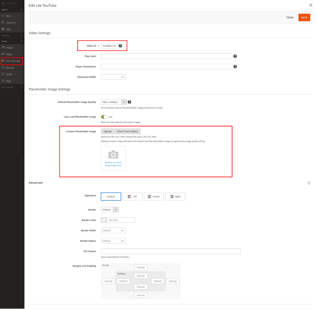
                  Magento specific and Hyvä supported implementation for YouTube, MageQuest has published an open-source module that adds support for use within Page Builder (or manually): magequest/magento2-module-lite-youtube.

                  You can install this extension by the below command.

                  composer require magequest/magento2-module-lite-youtube
                  php bin/magento module:enable MageQuest_LiteYouTube
                  php bin/magento setup:upgrade
                  php bin/magento c:f

                  You can get more details regarding the extension on their github page.

                  Demo: 

                  After installing the extension you will get the Lite Youtube element in pagebuilder. You can use this in CMS block and CMS pages via Pagebuilder or you can also manually add <lite-youtube> element via HTML code. 

                  Lite Youtube element in pagebuilder

                  Same thing as live chat we can implement for third-party script Search providers using the facade approach.

                  More resources on Hyva themes:

                  In today’s article, I will be explaining the most Useful Hyva JavaScript Events that can be used while working with the Hyva theme.

                  private-content-loaded event

                  In contrast to how Default Magento luma works, Hyva loads all customer section data together. It is loaded as a single data structure, and then – when the data is available – the event private-content-loaded is dispatched.

                  We can get the private section data using both Native Javascript and Alpine.js. 

                  Using Native Javascript:

                  <script>
                  window.addEventListener("private-content-loaded", function(event) {
                      console.log(event.detail.data);
                  });
                  </script>

                  Using Alpine JS:

                  <div x-data="" @private-content-loaded.window="console.log($event.detail.data)">
                  </div>

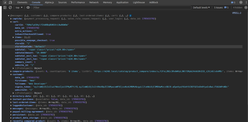
                  Note: All section data are available in the event.detail.data object. The object keys are the section names.

                  Output: You will get the below response in the browser console when private section data is loaded.

                  private section data output

                  reload-customer-section-data event

                  Reloading/Invalidating Section Data on the client side can be done with the dispatching “reload-customer-section-data” event.

                  window.dispatchEvent(new CustomEvent("reload-customer-section-data"));

                  Note: 

                  • In contrast to Magento Luma themes, in Hyvä private content sections data are not invalidated/reloaded individually.
                  • The whole section data is only reloaded from the server if the current data is older than 1 hour, or the “private_content_version” cookie is changed.
                  • This can be either after a POST-request, or when the data is more than 1 hour old.

                  When we dispatch the “reload-customer-section-data” event, it will cause the Section Data to be reloaded if it is expired or the “private_content_version” cookie is changed,  then the private-content-loaded event will be triggered again.

                  If you want to force-reload the Section Data, we can do this by removing the “mage-cache-sessid cookie” before dispatching the “reload-customer-section-data” event.

                  // remove the mage-cache-sessid cookie
                  hyva.setCookie('mage-cache-sessid', '', -1, true);
                  // reload the section data
                  window.dispatchEvent(new CustomEvent("reload-customer-section-data"));

                  The private-content-loaded event will always be triggered after reloading the section data, regardless if it was requested from the server or read from local storage.

                  New to Hyvä?? Learn about the Hyvä Theme from basics!

                  toggle-authentication event

                  The “toggle-authentication” event triggers the Hyva authentication popup. You can trigger the event using the below code.

                  window.dispatchEvent(new CustomEvent("toggle-authentication"));

                  The effect of this event depends on the below two things.

                  • Whether the customer is logged in or not.
                  • If guest checkout is enabled or not from the configuration.

                  If the customer is not logged in and Guest checkout is disabled, the toggle-authentication event trigger will open the Hyva authentication popup and the customer can able to login. After the customer login, it redirects the customer to the checkout page.

                  Note: If the authentication popup already is open, further toggle-authentication events do not hide the authentication popup again.

                  If the customer is not logged in and guest checkout is enabled, the toggle-authentication event trigger will redirect the customer to the checkout page.

                  If the customer is already logged in and toggle-authentication event trigger will redirect the customer to the checkout page.

                  By default customer is redirected to the checkout page when the customer logged in using an authentic popup, but you can give an alternate URL as the redirect target by setting detail.url on the event argument.

                  window.dispatchEvent(new CustomEvent("toggle-authentication", {detail: {url: "/"}}));

                  toggle-cart event

                  You can use the toggle-cart event to open the mini-cart popup. You can trigger the event using the below code.

                  window.dispatchEvent(new CustomEvent("toggle-cart")); // open mini-cart Popup

                  Once the mini-cart popup is visible, consecutive triggering toggle-cart events will not hide the mini-cart again.

                  Since Hyvä 1.3.0, it’s possible to close the mini cart popup by adding the {isOpen: false} in the event detail parameter.

                  window.dispatchEvent(new CustomEvent("toggle-cart", {detail: {isOpen: false}}));

                  Note: this event would still open the mini-cart in earlier versions of Hyvä.

                  configurable-selection-changed event

                  This event is dispatched when selecting/updating the configurable option or swatches on the product detail page.

                  The event payload is

                  {
                   productId: (string) the configurable productId,
                   optionId: (string) the newly selected optionId,
                   value: (string) the newly selected option value,
                   productIndex: (string) productId of the simple product used to display the image,
                   selectedValues: (array) map of selected optionIds to option values,
                   candidates: (array) productIds matching the current selection,
                  }

                  If there is only one product ID in the candidate’s array, all required options have been selected.

                  If there are multiple candidates, the selection is incomplete.

                  You can use this event to make some changes after the configurable option or swatches updates. You can use the below code to observe the configurable-selection-changed event.

                  <script>
                  window.addEventListener('configurable-selection-changed', function(event) {
                  
                     var eventData = event.detail;
                  
                     if (eventData) {
                         console.log("selected option attribute Id=>"+eventData.optionId);
                         console.log("selected Option Value=>"+eventData.value);
                         console.log("child product Id=>"+eventData.productIndex);
                         console.log("Configurable product Id=>"+eventData.productId);
                         console.log("selected optionIds to option values=>", eventData.selectedValues);
                     }
                  });
                  </script>

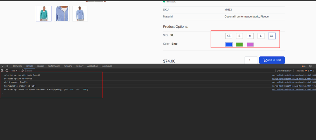
                  Output:

                  Event updating output

                  listing-configurable-selection-changed event

                  This event is dispatched whenever a configurable product option or swatches is selected on the product listing page.

                  The event payload is

                  {
                   productId: (string) the configurable productId,
                   optionId: (string) the newly selected optionId,
                   value: (string) the newly selected option value,
                   productIndex: (string) productId of the simple product used to display the image,
                   selectedValues: (array) map of selected optionIds to option values,
                   candidates: (array) productIds matching the current selection,
                  }

                  If there is only one product ID in the candidates array, all required configurable products options or swatches have been selected.

                  If there are multiple candidates, the selection is incomplete.

                  This event can be observed to update parts of the page whenever a configurable product option or swatches are selected. You can use the below code to observe the listing-configurable-selection-changed event.

                  <script>
                     window.addEventListener('listing-configurable-selection-changed', function(event) {
                  
                         var eventData = event.detail;
                  
                         if (eventData) {
                             console.log("selected option attribute Id=>"+eventData.optionId);
                             console.log("selected Option Value=>"+eventData.value);
                             console.log("child product Id=>"+eventData.productIndex);
                             console.log("Configurable product Id=>"+eventData.productId);
                             console.log("selectedValues=>", eventData.selectedValues);
                             console.log("candidates=>", eventData.candidates);
                         }
                     });
                  </script>

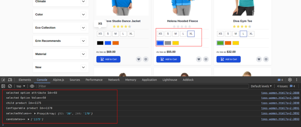
                  Output:

                  selection-changed event output

                  update-product-final-price event

                  This event is only relevant on the product detail page. This event is dispatched when a customer selects product options that influence the product price.

                  The product options component observes the event and recalculates option price changes accordingly. Some components that need access to the current final price can also observe this event.

                  <input @update-product-final-price.window="recalculateWithFinalPrice(event.detail)" />

                  update-prices-<?= (int)$product->getId() ?> event

                  This event is only relevant on the product detail page and product listing page.

                  This event is dispatched when the customer selects the options that select the different associated simple products.

                  On product detail pages the values are given using the keys oldPrice and finalPrice if the price is including tax, and baseOldPrice and basePrice if the price is displayed excluding tax.

                  On product listing pages such as categories, the keys always are finalPrice and oldPrice.

                  update-qty-<?= (int)$product->getId() ?> event

                  This event is only relevant on product detail pages.

                  This event is dispatched, whenever the product quantity for the add-to-cart input changes. The new quantity is passed in event.detail.

                  Components that need the quantity field value can observe this event.

                  <script>
                     const updateQtyEventName = 'update-qty-<?= (int)$product->getId() ?>';
                     window.addEventListener(updateQtyEventName, function(event) {
                         console.log("current product Qty=>", event.detail);
                     });
                  </script>

                  This event is only relevant on product detail pages. It is dispatched to change the images in the product gallery.

                  The event payload contains an array of objects describing the new images to display. Those image objects in the event.detail array has the following structure:

                  {
                     thumb: "https://...small image url",
                     img: "https://...medium image url",
                     full: "https://...large image url",
                     caption: "the image label",
                     position: 1,
                     isMain: false,
                     type: "image",    // or 'video',
                     videoUrl: null    // or 'https://...youtube or vimeo video url'
                  }

                  We can dispatch the update-gallery event to update the visible product images or observe the event to be able to do some custom changes after image changes happen.

                  // It will update the visible product image in the gallery
                  window.dispatchEvent(new CustomEvent('update-gallery', {detail: [{
                     thumb: "https://m246.local/media/catalog/product/w/t/wt09-yellow_main_1.jpg",
                     img: "https://m246.local/media/catalog/product/w/t/wt09-yellow_main_1.jpg",
                     full: "https://m246.local/media/catalog/product/w/t/wt09-yellow_main_1.jpg",
                     caption: "image Label",
                     position: 1,
                     isMain: false,
                     type: "image",  
                     videoUrl: null 
                  }]}));

                  To revert the gallery to the initial image, dispatch the update-gallery event with an empty image array in event.detail.

                  window.dispatchEvent(new CustomEvent('update-gallery', {detail: []}));

                  More resources on Hyva themes:

                  Grow your online business like 2,210 subscribers

                    * This site is protected by reCAPTCHA and the Google Privacy Policy and Terms of Service apply.
                    envelope

                    Thank You!

                    We are reviewing your submission, and will be in touch shortly.