90% of all eCommerce businesses fail!
Now you are holding major eCommerce problems, must be wondering, what sets the remaining 10% of successful eCommerce owners apart? And what are the strategies they are following to reach success?
Seems like a mystery, right? But it’s not! All they do is take good care of ‘user experience’. And in most cases, this is the only mistake that 90% of eCommerce owners (that may include you) are making. And making mistakes is fine! We’re here and ready to make a difference, right?
For that, I have the most compelling solution, which is an ‘eCommerce UX audit’. As it can help you detect those problematic areas that are provoking your users to go away.
Well, to some people “eCommerce UX Audit” may seem overwhelming, but it’s not. With the right guidelines, processes, and tools, you can easily conduct a UX audit for your eCommerce store on your own.
I’ve written this comprehensive guide on eCommerce UX audit to make sure you follow the right process. And at the end of the guide, you’ll be left with a clear idea of;
- What is UX?
- What is UX audit?
- How it impacts your business?
- What is the process of an eCommerce UX audit without an expert eye?
- How to improve UX issues on your eCommerce? that improve user experience, retain more visitors, and increase sales.
And the cherry on top, I’ve also included an eCommerce UX audit checklist for you to download and conduct a UX audit on your own.
But before we jump into the nitty-gritty of eCommerce UX audit, let’s start with the basics.
What is eCommerce UX?

eCommerce UX (user experience), in simple words, is your user’s overall experience or interaction with your online store or brand.
UX matters from the time a user lands on your eCommerce site, they start sensing how effortless and smooth their eCommerce journey is with your brand. Whether it’s a search box placement, scroll bar, or checkout, each and every element of your eCommerce site will impact the overall user experience and will decide if your user will come back or not.
In short, Better eCommerce UX = Satisfied Customers + Higher Sales
And there are higher chances that improving eCommerce UX will give you a shift to that 10% of successful eCommerce owners. Before you ask “How”, I’m already explaining that below.
How eCommerce UX works best for conversions?

Conversion is the primary goal of any eCommerce, and once the conversion is on track, you can believe that your eCommerce is climbing the stairs of success.
But some eCommerce owners question, what user experience has to do with conversions.
Well, everything! A UX design is the main deciding factor for the success and failure of your online store. And let me also confirm to you that; UX design ≠ Aesthetics. Even the man who invented the most valuable brand in the world agrees with that.
“Good design is not how it looks and feels, it’s about how it works” – Steve Jobs
Just as I told you that user starts forming their own experience (“Do I like it?” Or “It’s just irritating and wasting my time?”) with your website right after landing within 5-10 seconds, if your eCommerce meets the UX guidelines, you’ll achieve the power to retain customers and it will ultimately lead towards improvement in conversion rates.
Keep up with User Expectations
Now after knowing the impact of eCommerce UX on your conversion rate, you must be eager to know how you’re going to make it, right? So, to make that happen you need to meet your user’s expectations.
Many eCommerce merchants believe that the quality of their products and services is enough to meet users’ expectations, which works, but in very rare cases. In reality, you always need to follow some extra steps to meet the users’ expectations.
And mostly user expectations (except for products/services) are limited to having a hassle-free journey on your eCommerce site and below are some ways to help you meet their expectations.
1. Offer them a buttery smooth user interface, so they don’t mind rolling between products and categories for hours.
2. User and Search engines both love speed a lot, so keep your site optimized to load quickly within 2 seconds.
3. Even a robust website can’t last forever, so keep your eCommerce website updated with the most accurate design new features and information.
4. And lastly, a website UX audit will help you identify all those areas where you may be missing to meet user expectations, and industry standards, so why not learn more about that?
What is an eCommerce UX audit?

An eCommerce UX audit is the process of finding weak points on your website – and usually helps in finding elements that are creating problems in the user’s purchase journey.
Other than improving user experience, an eCommerce UX audit can help you get better insights into optimizing conversions and product designs. An eCommerce UX audit should be a part of your process when your eCommerce store starts to grow.
Now, I’m sure you’re excited to know what benefits you can get if you conduct a UX audit for your eCommerce store. And that’s what I’m explaining below.
Benefits of eCommerce UX audit
Before benefits, let me tell you that, I’ve seen many merchants ignoring UX Audits and only focusing on inventory and shipping when they hit growth, as they don’t know the benefits eCommerce UX audit holds. And studies show that;
90% of eCommerce stores that ignore the importance of UX audit fail.
Before you end up making the same mistake, I’ve stated the benefits of an eCommerce UX audit report.
- Reduction in cart abandonment rate
- Keeps your website updated with the latest eCommerce trends
- Helps you identify usability issues on your website
- Improves conversion rate and growth of your eCommerce
- Makes your user’s journey easy and obstacles-free
- Decreases bounce rate of your website
- Helps you understand your user’s behavior
Apart from these major benefits, there are some basic benefits of conducting an eCommerce UX audit, that give you major information about your website. They include understanding:
- Which function is working and Which is not?
- Which data are being collected? Which metrics should be collected?
- Which trends you’re already following? What is the impact of those trends on metrics?
- Which trends should you follow?
- Who are your users? How do they react?
These benefits may seem so basic but they have a huge impact. Now, let’s see what is actually done in a UX audit.
What do UX auditors review during auditing?

While conducting a UX audit, an auditor will use various UX methods, tools, and metrics to analyze all the areas on your website from a user’s perspective.
As you’re doing a website UX audit on your own without an expert eye, knowing areas considered by a UX auditor will help you do it better way.
Below are the areas that are usually reviewed by UX auditors while auditing.
- Studying user goals and company goals
- Reviewing conversion data
- Analyzing customer service data
- Analyzing traffic and engagement levels
- Verifying consistency with UX standards
- Implementing usability heuristic evaluation
- Evaluating wireframes and prototypes
- Applying UX best practices
Now we know some areas experts look at. But when are you supposed to review these areas? let’s look at that too.
When should you conduct an eCommerce UX audit?

Well, an eCommerce UX audit is like a health check-up we humans do for ourselves. And that should be done regularly at certain intervals. Same as that, you should conduct an eCommerce UX audit regularly as well as at the time when;
- You’re in the development stage
- You’re redesigning your website
- You’re launching a new product or functionality
- You’re facing a low conversion rate
- You’re receiving negative feedback from the customers
- Or you’ve noticed a change in industry trends
But if you want to avoid problems with your eCommerce website and ensure it runs smoothly all year round, I recommend conducting a UX audit at least once a quarter.
How to prepare for an eCommerce UX audit?

This time calls for final preparations, where we’ll ensure we’ve everything we need to conduct an uninterrupted eCommerce UX audit.
The preparation will be about discovering your ultimate purpose/goal for this UX audit. After all, a job well done is a job well-prepared, right?
So, take some time and ask yourself some relevant questions and answer them by yourself. Here are some questions for that.
- What is your reason to conduct an eCommerce UX audit? To improve sales? User experience? or to identify usability issues?
- Who is your target audience? And what are their expectations and demands?
- Where your users are facing issues? And which steps you’ll take to improve user experience in that area?
- Which are some main problem areas that need to work perfectly in order to achieve the main objective of an eCommerce store?
- Are there any KPIs or metrics (such as; bounce rate and cart abandonment rate) that you’re looking to improve with the UX audit?
- What are the strengths and weaknesses of your website in comparison to best industry practices, and which are some areas that can be improved?
- Is there any unique functionality that needs to be added to achieve the heights of success?
- How you’ll use the results of the UX audit to improve your eCommerce website?
This Q&A round will help you gain valuable insights on what are your expectations from this UX audit. Once you figure out answers to these questions, you are all set to get started with the eCommerce UX audit process. Shall we start it then?
eCommerce UX audit process

Finally, we’re here to the main process of how you’re going to conduct an eCommerce UX audit. So let me tell you that it will be a step-by-step process where we’ll be learning about each area separately. And if you’ve any question stuck in the corner of your head, this process will definitely solve it.
Step:1 Understand your business goals

First, you have to know your business goals. And I can call this the most necessary thing to do before starting with the UX and the usability testing audit. If you don’t know the goals clearly, you can’t improve anything, and the entire usability audit process will be worthless.
If you’re not looking to think more about your goals, here I’m adding this small list of goals and business objectives that any eCommerce has in common. These are;
- To inform your visitors about your products and services
- To convert your visitors into newsletter subscribers
- And lastly to sell products and services to visitors, which is a very obvious goal.
After understanding them properly, you can conduct a meeting with your stakeholders. Discuss the specific areas of your website design and know if it aligns with your business goals or not. Areas that you can discuss are;
- What was the purpose of website design?
- Which specific business goals are achieved with the current website design?
- What are some issues running in website design?
- What are some improvements that you would like to see?
If you can’t conduct a face-to-face meeting you can go for an online meeting. Or any survey tool will also help.
Step:2 Create a user persona and know your users’

The term “user persona” seems a little hard to understand, right? But fear not, I’m shedding some light on that, too.
So, creating a user persona is like creating a fictional character (let’s imagine a superhero) that is the same as your ideal customers and has qualities such as; unique needs, desires, pain points, and more.
Now you may think that how it will help with the UX audit process. Well remember that; “You’ll help your users if you’ll know them” and the user persona does the exact same thing of introducing your customers to you in a better way.
To create a user persona, you can use website analytics, conduct a poll or question a small group of website visitors and determine;
- Who are your customers? (Get to know their age, nationality, ethnicity, gender, marital status, income, education, and employment)
- What are they doing on your website? (Looking for a product, support, contact details, your past story, or anything else)
- Where did they come from? (By a Google search, product search, referral, or through paid ads)
- What are they trying to achieve on your website? (Find a product, contact details, order details, or are trying to place an order)
- What are their concerns? (Is it security, trustworthiness, user experience, support, reviews, or shipping and delivery)
- What is their decision-making process? (Starting from product search, comparing products, and making purchases to evaluating the website after purchase)
- What is preventing them from achieving their goal? (High prices, lack of trust, poor UX, limited payment options, lack of product info, or security concerns)
With all this information in hand, create your own fictional superhero which seems the same as your target audience.
Step:3 Identify the user flows

Once you’re done with creating a user persona, you can impersonate yourself as that user persona and visit your website, it will help you see user flows and identify gaps. You don’t have to randomly run through web pages, you need to actually think as your customer. To figure out:
- How the user persona may navigate your website?
- How the user persona may feel about any unique functionality?
- How the user persona may react to any non-working functionality?
Moreover, you can use tools such as empathy maps to identify customer journey maps. It will show you the real-life issues faced by users on your eCommerce site. Note down these issues and move to the next step.
Step:4 Gather analytical data from your website

So once you know who your customers are and what are their needs, you can start analyzing your website data.
When it comes to analytics, people tend to ignore Google Analytics and run after other fancy analytic tools. Well, it’s true that those alternative analytics tools have something dazzling to offer, but none of them can match what Google Analytics has to offer you.
So don’t go on a hunt for the best analytics tool, as Google Analytics is the only one you can rely on. For your additional needs, you can subscribe to Hotjar, Kissmetrics, and CrazyEgg.
All these tools will share in-depth information about user journeys and where users are coming from. Moreover, they also share information about what user does on your website through heatmaps. Heatmaps highlight mostly viewed spots by users on your mobile apps and website, and below I’ve added an example of what heatmaps look like.

Gathering analytical data helps you with producing clear end results for your eCommerce UX audit, as you get an idea of how users navigate through your website and you’ll have the power to ease the user journey.
Step:5 Conduct a heuristic usability evaluation

Now is the time to check the user-friendliness of your website, and a heuristic usability evaluation will help you with that. You’ll need to apply all the knowledge you gained about your store visitor’s user actions and user journeys. Get the user persona you created in the second step and start analyzing your website for flaws.
Some of those flaws can be;
- Slow loading website
- Non-responsive website design
- Confusing navigation
- Poor search functionality
- Unclear product information
- Complicated checkout process
- Unexpected fees on time of checkout
- Inconsistent design and branding
- Unavailability of various payment options
- Unavailability of trust indicators
While you’re following this process, keep notes and screenshots to capture every twist and turn along the way that may harm the user experience. It’s always better if more than one head is working on this process, as there will be more data collected and fewer chances of missing any areas during the evaluation process.
Step:6 Find accessibility issues
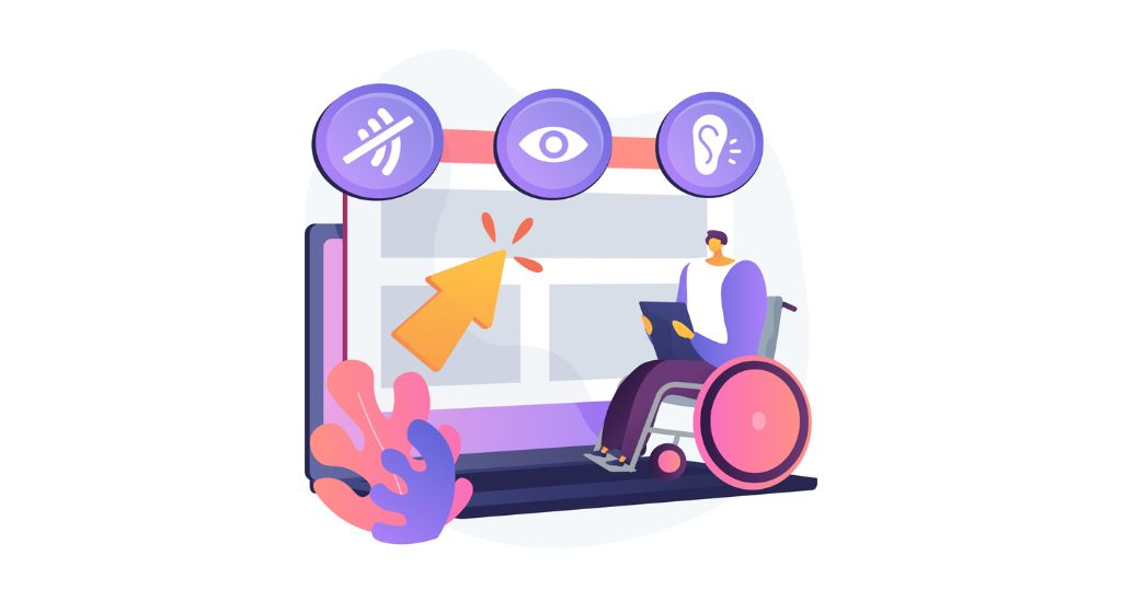
Finding accessibility issues means making sure that your website is accessible to each & every user, including those with any disabilities. As some users may have visual impairments, such as; color blindness or low vision. You need to test accessibility by identifying usability issues and welcoming every type of user with open arms. Because you can’t make any customer feel left out, right?
For making your process easier, below I’ve listed some of the most common ways you can keep up with accessibility.
- Use high-contrast color combinations
- Text labels are available
- Avoid using small or thin fonts
- Use larger font sizes and clear typography
- Use clear and concise language for each piece of content available on the site
- Ensure that the site is compatible with a variety of mobile devices and other screen sizes
- Use high-quality images with zoom-in functionality
- Use alt tags for all images to provide text descriptions
- Use icons or symbols
- Take knowledge from accessibility design guidelines
- Test the site with screen readers to ensure that it is accessible to users with visual impairments.
- Test with color blindness simulators
These are some of the basic areas you can cover for improving accessibility factors on your website. Once you’re done with that, you can start with the last point of the process that I’ve added below.
Step:7 Compile findings and make recommendations

At this point in time, you’ll have each and every piece of data available in your hand, so put all those data together on a table, invite your team members, and start analyzing where your user faces difficulties.
Also, keep notes or screenshots of each area you may suspect is hindering user satisfaction or experience. And present your team with actionable recommendations that arise from your finding. Take their review on how to implement it and how it will play an effective role.
That’s it! Your eCommerce UX audit process is completed here. Below I’ve started an eCommerce UX checklist where I’ll be sharing each and every possible thing that helps you conduct an eCommerce user experience audit successfully. So keep reading!
eCommerce UX audit checklist

We understood the entire process of eCommerce UX audit, but to some people, it may seem overwhelming and tricky. So, here’s me making it easier and explaining the entire eCommerce UX audit in the form of a checklist, where I will be sharing how you can improve UX for specific areas on your website.
So, if you didn’t understand even a single stuff that we discussed above, this checklist is for you.
First, we’ll classify your usability audit into a few categories, so that you can easily digest the number of areas you need to look after. It will also help you focus on key areas where you’re looking to improve your UX.
The audit areas we’ll be covering are:
- Primary Areas: Impacts all-over website
- Home Page
- Category Page
- Product Page
- Cart Page
- Checkout Page
- Thank you Page
In short, you just need to follow this checklist, and at the end of the guide, you’ll have your eCommerce UX audit completed with perfection.
Okay, so now we’re starting with the checklist. Ready for it?
Primary Areas: Impacts all-over site experience
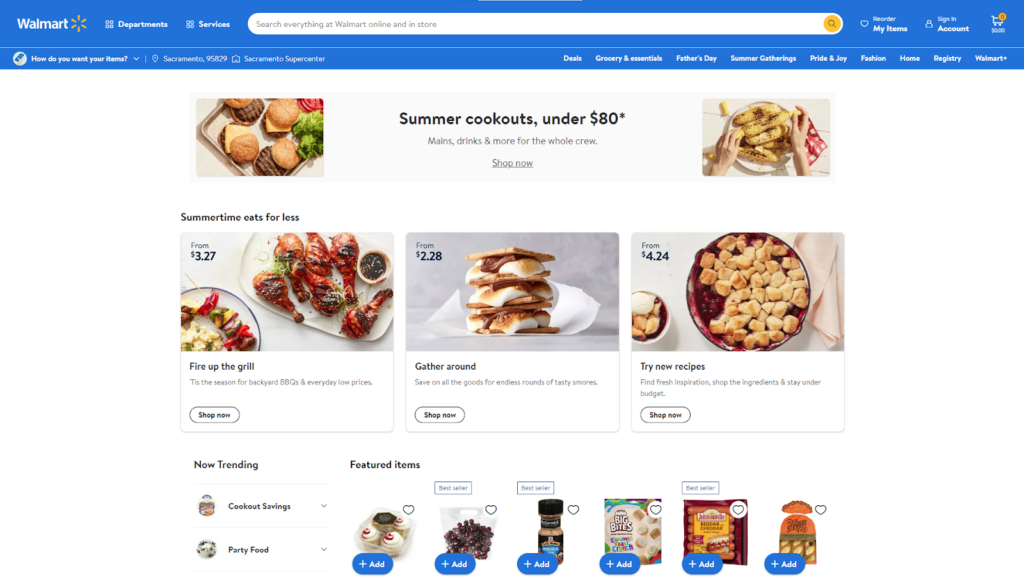
When conducting an eCommerce UX design audit, every person prioritizes various pages (home page, product page, and more), and no one cares about primary areas that are operating site-wide.
Well, UX audits for these specific pages are important, of course, it is. But general elements are those that your user may use at any time while navigating through your website, which makes them more necessary to be optimized for UX, Right?
That’s why I’ve added general topics at first here. Below I’ve added a list of general elements you need to look after on your eCommerce website while conducting a UX audit.
- Header
- Design
- Typography
- Errors
- Permissions
- Footer
- Support
So, these are some of the MVPs (Most valuable players) that matter site-wide and have a huge impact on how the user interacts with your site.
Home Page
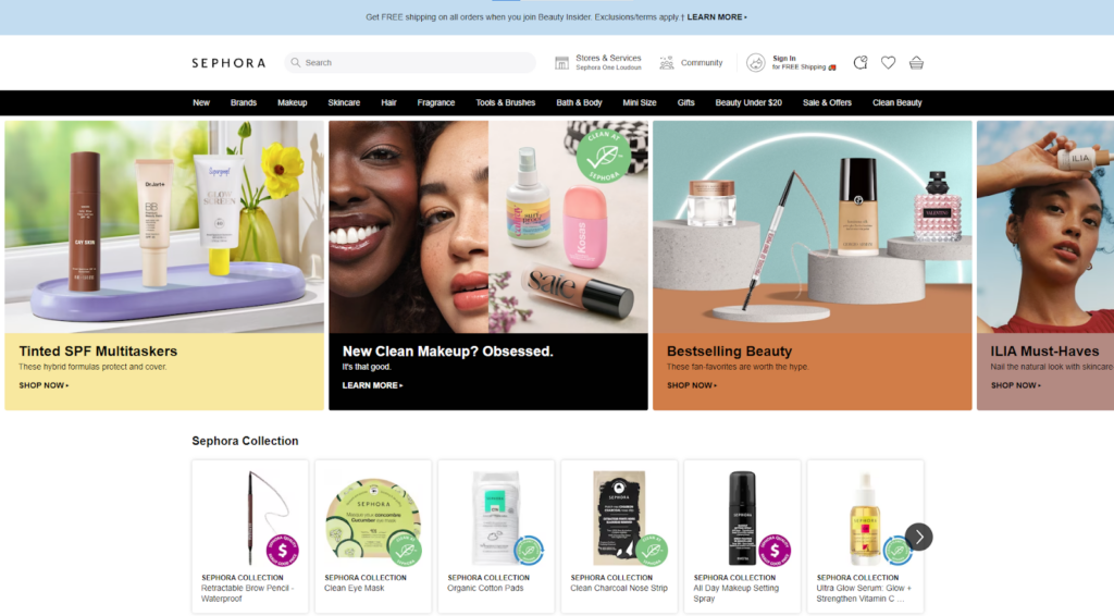
On any website, whether eCommerce or not, you must’ve noticed that Home pages have the most amount of views than other pages of the website. And do you know why?
It’s because the home page is the abstract of your entire website that includes your brand story, products or services, and also the special offers that you’ve for them. Which describes the important it is for you to keep your home page optimized for UX.
Let’s learn some critical areas that you will need to improve on your home page to provide a user experience that is closer to perfection. Here is the list.
- Branding
- Navigation menu
- Hero section
- Featured products or categories
- Recently viewed products
- Testimonials or customer reviews
- Promotions and deals
- Newsletter signup
Now that you’ve got to know them, you can start improving these areas on your eCommerce store to stay ahead of the user experience.
Category page
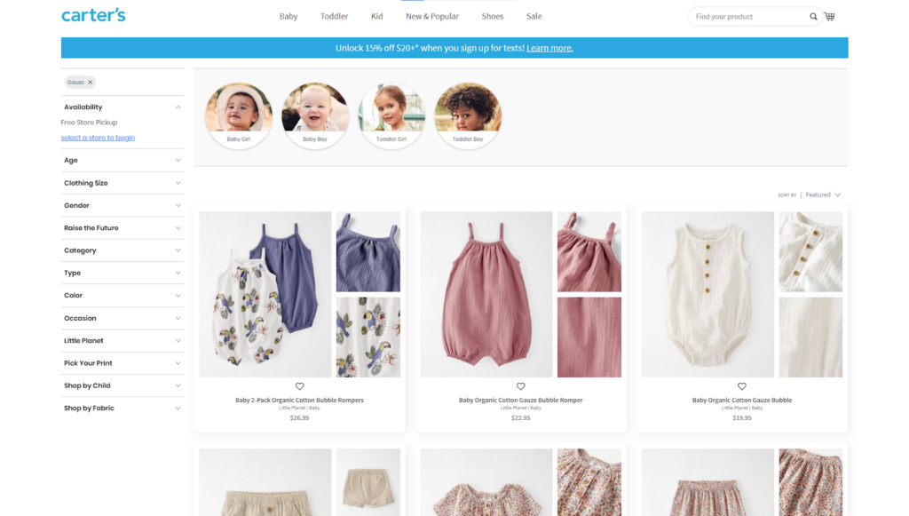
After the home page, comes the category page; a page that displays various product options and takes your visitor to their desired product.
The usual thing you may’ve done for your category pages would be a basic overview of products and no extra help. Right?
It is the same as entering an electronics shop, where the salesperson guides you to the refrigerator section and takes your leave by wishing you good luck.
Those various refrigerators standing in front of you will definitely leave you confused and frustrated, as you know nothing about them, not even their good and bad points to make a decision on purchasing or exploring more.
The same thing happens to your eCommerce category page when a user clicks and does not see extra efforts made for them. So it’s necessary to improve user experience with your category pages.
This is the list of things you can improve on your category page other than adding a basic list of products.
- Filters and sorting options
- Product cards
- Social proof
- CTAs
Improvement in these areas will speed up the decision-making process of your customers.
Product Page

Okay, now we’ve reached the hot spot, i.e. the product page. It is the page that matters most for your shoppers.
Shoppers can purchase anything from your website without visiting your Home page or category page, but that final call for purchasing is made only after visiting the product page.
That’s the reason UX experts calls product page the heart of eCommerce. And that heart needs to function well, in order to keep your eCommerce business alive on the stairs to success. We know that a product page is made of dozens of blocks and features, and you need to keep them all optimized for user experience. Be it;
- Product Title
- Product images
- Product videos
- Product descriptions
- Product reviews and ratings
- CTAs
- Product variants
- Cross-sell blocks
- Or Product availability badges
Each of the above elements holds immense significance and has the power to shake your customer’s decision. hence, it’s a necessity to scan each aspect for its flawlessness.
Landing Page

I’ve seen many people get confused between the product page and the landing page as they share many features. And they treat landing pages the same as product pages, which of course, won’t help.
Landing pages are different from product pages. they are built to capture users’ attention and convince them to take action, and absolutely they have different ways to improve user experience with them.
Below are some best practices you need to consider while you’re conducting a UX audit for a landing page.
- Don’t include a navigation bar
- Don’t expect your landing page to work on more than one goal
- Keep it as straightforward as possible
- Include customer reviews
- Try to match your website theme
These were some of my best practices for landing pages that every time works, so consider them while auditing your landing pages for UX.
Cart Page
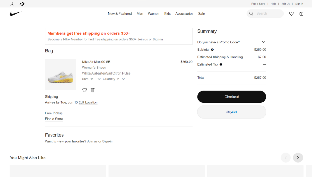
Usually, eCommerce merchants believe that, once their users have added a product to the cart they will definitely make a purchase. But no, there are chances for them to still leave your site if anything goes wrong on the cart page.
To avoid that it’s better for you to focus on design flaws on the cart page as well. For that, I’ve added below some areas of the cart page that you should pay close attention to.
Here are some of them:
- Notify customers when the item is added to the cart
- Easy to customize cart page design
- Attractive and bold CTA
- Trust indicators below the main CTA
- The progress bar is implemented
- Add upselling and cross-selling
Even small basic things can make or break your user’s purchasing decision, so it’s necessary for you to work on these elements that guarantee a smooth journey from the cart page to the checkout page.
Checkout Page
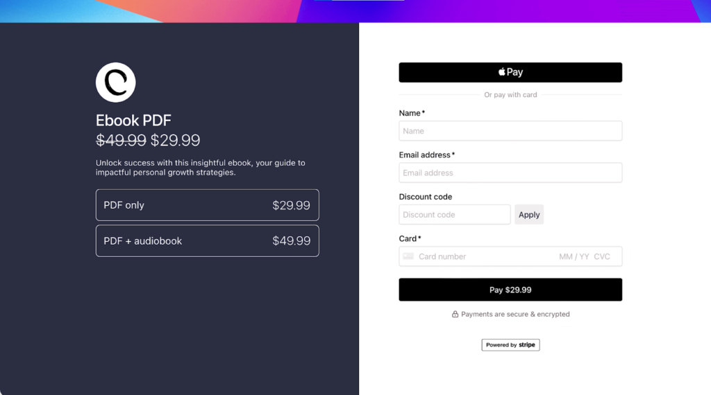
Mention that, if your Checkout page is not optimized, it can be the most difficult and confusing phase for your shoppers and can result in “cart abandonment. And the cause of that confusion can be anything, such as;
- Unclear instructions
- Lengthy forms
- Unexpected fees
- Difficult checkout process
- Or Fear of sharing personal information.
So it’s necessary for you to conduct a UX audit by focusing more on the convenience of your shoppers. As even a single thing left by you can play against you and harm your user’s experience.
Thank You Page

Once checkout is done, everyone thinks they’ve reached the ending point. But no, there are still chances to win more with thank you page.
Thank you page is not only for thanking your customer for making a purchase. It’s also about getting an opportunity to get feedback about their overall shopping experience and making them add more items to their recent purchase. But let me tell you the truth that this trick will only work if the information on the thank you page is presented in an appropriate way. Or else it may not send you the expected results.
So it’s necessary for you to look out for some ways and improve user experience on the thank you page. here’s where our checklist ends, and below I’ve put a surprise for you!
Conclusion
And that’s it!
We’ve reached a conclusion. As promised, I shared an entire idea of “What is UX audit” and “Why is it the most important thing” for reserving a place in that 10% of successful eCommerce owners.
All I can hope is that you’ve understood each point perfectly, and this guide has added value to your knowledge of UX audit. However, if you still have any doubts, no matter how small, do not hesitate to contact us. We are here to provide you with all the potential solutions.

